Presenting data
1/39
There's no tags or description
Looks like no tags are added yet.
Name | Mastery | Learn | Test | Matching | Spaced | Call with Kai |
|---|
No analytics yet
Send a link to your students to track their progress
40 Terms
Scientific Research
Have a hypothesis and use scientific methods to draw a conclusion
Variable
Anything that varies
Data
Values that variables receive in measurements
Results
Systematic variation in the data that is related to the hypothesis and research question.
Analysis
The process of revealing or testing patterns in data to produce results.
Three ways of presenting results
Text, table, graphics
Text
A verbal description used to present results, which establishes unambiguous meaning and logical relationship but risk to get lost in details.
Table
A spatially organized representation of precise specifications. communicate larger number of details but meaning/logical relationships aren’t communicated
Graphics
Visualization of data patterns used to highlight main patterns in data and communicate different kinds of information in parallel.
But specific details get lost and visual interpretation may depend on viewer
2 main uses of graphics
To assess quality of data (detects faults in your experiment, characterise data distribution and identifying outliers)
Visualise results (highlights and explains main results)
What do you need to focus on when making graphics?
dimensionality and format
How to use graphic tools
How many variables
Types of variation
Types of scale
Resolution
Pattern
Types of variation
independent variation, dependent variation, other variation (noise) not part of testing logic, but interferes with the tested variation and defines reliability of results
How to decrease resolution?
Through aggregation (eg by categorising for nominal data or for quantitative data using mean and standard deviation) to avoid clutter
Freedom rating
more freedom, more versatile so describes more complex relationships but also less organised
Pie chart
low freedom rating
Variable 1 - a a continous, ratio-scaled axis is represented as a circle
Variable 2 – discrete data is show as wedges

Evaluation of pie charts
Advantage – Part-whole relationships – relate parts to the whole
But limited scope – limited to 2 sources of variation (no error bars) and requires ratio-scale and finite data

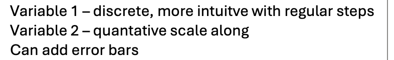
Bar chart
has the next higher freedom rating
Variable 1 – discrete, more intuitve with regular steps
Variable 2 – quantative scale along
Can add error bars
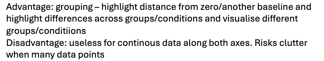
Bar chart evaluation
Advantage: grouping – highlight distance from zero/another baseline and highlight differences across groups/conditions and visualise different groups/conditiions
Disadvantage: useless for continous data along both axes. Risks clutter when many data points
Line chart
has even higher freedom rating
Variable 1 – continous, at least ordinal scale (otherwise connecting line misleading)
Variable 2 – continous, at least ordinal scale
Error bars
Additional continous variables: grouping of ata by seperate lines identified by visual appearance
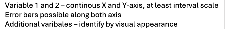
Scatter chart
has highest freedom rating
Variable 1 and 2 – continous X and Y-axis, at least interval scale
Error bars possible along both axis
Additional varibales – identify by visual appearance
Scatter chart evaluation
Advantage: covariation
Disadvantage: lacks structure, risks clutter

Typically use graphics to..
See whether it is nominal or skewed distribution
used to highlight main results for comparison and reference
Proportion
A part, share or number considered in comparative relation to a whole (fraction) = relative frequency
What pattern to use for nominal?
pie chart, but can also ue bar chart
What pattern to use for ordinal?
bar chart
What pattern to use for ratio scale?
scattergram
Continuous data aggregation….
by frequency is useless so we use binning which is transforming continuous data into discrete data by allocating it to intervals (bins)
Histogram
A bar chart using bins to display continuous data
Frequency data
frequency of data per equal interval (frequency/ bin size). Allows estimation of probability density, which is fundamental for statistical testing
Probability density
probability of data per value
cumulation
A collection of objects laid on top of each other
Cumulative sum: sum up progressively
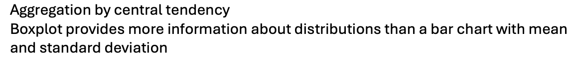
Aggregation by central tendency
By obtaining the mean and standard deviation. Can plot mean and standard deviation in bar chart making it much more simple
Mean and SD can only be sed for…
symmetrical distribution and misrepresents asymmetrical distribution
median and quartiles do not assume symmetry
Boxplot
Does not assume symmetry. Shows outliers and interquartile range (which is the width of the box)
Qualitative IV and Qualitative DV (nominal/ordinal)

Use bar chart as pie charts are difficult to compare

Qualitative IV (nominal/ ordinal) and Quantitative DV (interval/ratio , discrete)
Aggregation by central tendency

Aggregation by central tendency
Boxplot provides more information about distributions than a bar chart with mean and standard deviation
Quantitave IV (interval/ratio , discrete) and quantitive DV (interval/ratio continous/discrete)

Use line graph

Quantitative IV (interval/ratio , continous) and quantitative DV (interval/ratio discrete/continous)

line graph
Bivariate distribution
use scattergram