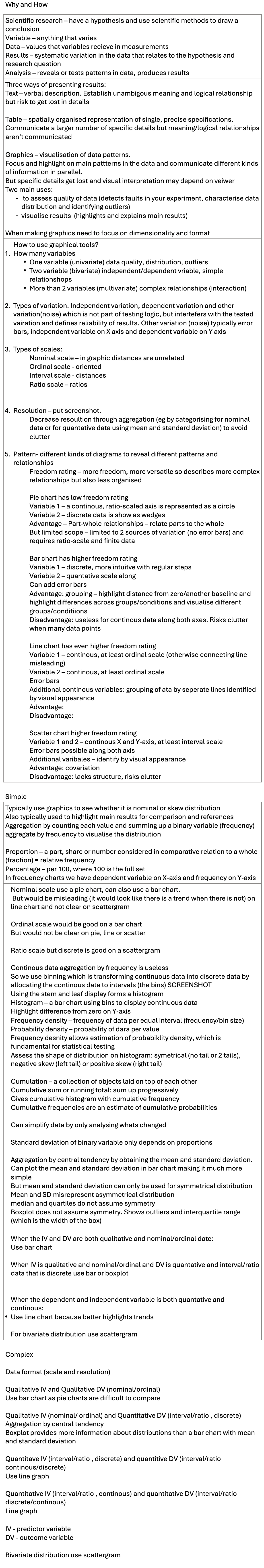
Presenting data

Why and How  

Scientific research – have a hypothesis and use scientific methods to draw a conclusion 

Variable – anything that varies 

Data – values that variables recieve in measurements  

Results – systematic variation in the data that relates to the hypothesis and research question  

Analysis – reveals or tests patterns in data, produces results  

Three ways of presenting results: 

Text – verbal description. Establish unambigous meaning and logical relationship but risk to get lost in details 


Table – spatially organised representation of single, precise specifications. Communicate a larger number of specific details but meaning/logical relationships aren’t communicated 


Graphics – visualisation of data patterns.  

Focus and highlight on main pattterns in the data and communicate different kinds of information in parallel.   

But specific details get lost and visual interpretation may depend on veiwer 

Two main uses:

  •  to assess quality of data (detects faults in your experiment, characterise data distribution and identifying outliers)

  • visualise results  (highlights and explains main results)


When making graphics need to focus on dimensionality and format 

  • How to use graphical tools? 

    1. How many variables  

      • One variable (univariate) data quality, distribution, outliers 

      • Two variable (bivariate) independent/dependent vriable, simple relationshops  

      • More than 2 variables (multivariate) complex relationships (interaction) 


    1. Types of variation. Independent variation, dependent variation and other variation(noise) which is not part of testing logic, but intertefers with the tested vairation and defines reliability of results. Other variation (noise) typically error bars, independent variable on X axis and dependent variable on Y axis 


    1. Types of scales: 

    Nominal scale – in graphic distances are unrelated 

    Ordinal scale - oriented 

    Interval scale - distances 

    Ratio scale – ratios 


    1. Resolution – put screenshot.  

    Decrease resoultion through aggregation (eg by categorising for nominal data or for quantative data using mean and standard deviation) to avoid clutter 


    1. Pattern- different kinds of diagrams to reveal different patterns and relationships 

    Freedom rating – more freedom, more versatile so describes more complex relationships but also less organised 


    Pie chart has low freedom rating  

    Variable 1 – a continous, ratio-scaled axis is represented as a circle 

    Variable 2 – discrete data is show as wedges 

    Advantage – Part-whole relationships – relate parts to the whole  

    But limited scope – limited to 2 sources of variation (no error bars) and requires ratio-scale and finite data 


    Bar chart has higher freedom rating  

    Variable 1 – discrete, more intuitve with regular steps  

    Variable 2 – quantative scale along 

    Can add error bars 

    Advantage: grouping – highlight distance from zero/another baseline and highlight differences across groups/conditions and visualise different groups/conditiions 

    Disadvantage: useless for continous data along both axes. Risks clutter when many data points 


    Line chart has even higher freedom rating  

    Variable 1 – continous, at least ordinal scale (otherwise connecting line misleading) 

    Variable 2 – continous, at least ordinal scale  

    Error bars 

    Additional continous variables: grouping of ata by seperate lines identified by visual appearance 

    Advantage: 

    Disadvantage: 


    Scatter chart higher freedom rating  

    Variable 1 and 2 – continous X and Y-axis, at least interval scale  

    Error bars possible along both axis  

    Additional varibales – identify by visual appearance 

    Advantage: covariation  

    Disadvantage: lacks structure, risks clutter  


Simple

Typically use graphics to see whether it is nominal or skew distribution  

Also typically used to highlight main results for comparison and references 

Aggregation by counting each value and summing up a binary variable (frequency) 

aggregate by frequency to visualise the distribution  


Proportion – a part, share or number considered in comparative relation to a whole (fraction) = relative frequency 

Percentage – per 100, where 100 is the full set 

In frequency charts we have dependent variable on X-axis and frequency on Y-axis 

  • Nominal scale use a pie chart, can also use a bar chart. 

     But would be misleading (it would look like there is a trend when there is not) on line chart and not clear on scattergram 


    Ordinal scale would be good on a bar chart 

    But would not be clear on pie, line or scatter 


    Ratio scale but discrete is good on a scattergram  


    Continous data aggregation by frequency is useless  

    So we use binning which is transforming continuous data into discrete data by allocating the continous data to intervals (the bins) SCREENSHOT 

    Using the stem and leaf display forms a histogram  

    Histogram – a bar chart using bins to display continuous data  

    Highlight difference from zero on Y-axis 

    Frequency density – frequency of data per equal interval (frequency/bin size) 

    Probability density – probability of dara per value 

    Frequency desnity allows estimation of probabiklity density, which is fundamental for statistical testing 

    Assess the shape of distribution on histogram: symetrical (no tail or 2 tails), negative skew (left tail) or positive skew (right tail) 


    Cumulation – a collection of objects laid on top of each other  

    Cumulative sum or running total: sum up progressively 

    Gives cumulative histogram with cumulative frequency 

    Cumulative frequencies are an estimate of cumulative probabilities 


    Can simplify data by only analysing whats changed 


    Standard deviation of binary variable only depends on proportions 


    Aggregation by central tendency by obtaining the mean and standard deviation. Can plot the mean and standard deviation in bar chart making it much more simple 

    But mean and standard deviation can only be used for symmetrical distribution 

    Mean and SD misrepresent asymmetrical distribution 

    median and quartiles do not assume symmetry 

    Boxplot does not assume symmetry. Shows outliers and interquartile range (which is the width of the box) 


    When the IV and DV are both qualitative and nominal/ordinal date: 

    Use bar chart 


    When IV is qualitative and nominal/ordinal and DV is quantative and interval/ratio data that is discrete use bar or boxplot 


    When the dependent and independent variable is both quantative and continous: 

    • Use line chart because better highlights trends 


    For bivariate distribution use scattergram 


Complex


Data format (scale and resolution)


Qualitative IV and Qualitative DV (nominal/ordinal)

Use bar chart as pie charts are difficult to compare


Qualitative IV (nominal/ ordinal) and Quantitative DV (interval/ratio , discrete)

Aggregation by central tendency

Boxplot provides more information about distributions than a bar chart with mean and standard deviation


Quantitave IV (interval/ratio , discrete) and quantitive DV (interval/ratio continous/discrete)

Use line graph


Quantitative IV (interval/ratio , continous) and quantitative DV (interval/ratio discrete/continous)

Line graph


IV - predictor variable

DV - outcome variable


Bivariate distribution use scattergram