CSC 308. Exam 1 (Ch 1-4)
1/70
There's no tags or description
Looks like no tags are added yet.
Name | Mastery | Learn | Test | Matching | Spaced |
|---|
No study sessions yet.
71 Terms
Chapter 1
This code chains the head() method to the mean() method:
df.head().mean()
df.mean.head()()
df.mean()df.head()
df.mean().head()
df.mean().head()
The Pandas module provides methods for
data visualization
plotting
data analysis
data analysis and plotting
data analysis and plotting
Data analysis includes all but one of the following:
data mining
descriptive analysis
predictive analysis
data visualization
data mining
The whos Magic Command displays
the names of all of the variables in the Notebook
the names and memory use of the active variables
the names of the active variables
the names and data types of the active variables
the names and data types of the active variables
This Magic Command returns the run time for the entire cell:
$time
%time
$$time
%%time
%%time
A runtime error occurs when a Python statement
can’t be run because it’s out of sequence
when the Python syntax is okay but the statement can’t be executed
violates one of the rules of Python coding
can’t be run because the data is faulty
when the Python syntax is okay but the statement can’t be executed
This is a list comprehension for the numbers 1 through 20:
pd.comprehension(1,20)
(x for x in range(1,20))
[x for y in range(1,20)]
[x for x in range(1,20)]
[x for x in range(1,20)]
This code creates a dictionary :
('1-4':'01-04 Years','5-9':'05-09 Years')
{'1-4':'01-04 Years','5-9':'05-09 Years'}
'1-4':'01-04 Years';'5-9':'05-09 Years'
['1-4':'01-04 Years','5-9':'05-09 Years']
{'1-4':'01-04 Years','5-9':'05-09 Years'}
To get the tooltip for a method, you place the cursor
in the name of the method or the parentheses of the method and press Shift+Enter
anywhere in the cell and press Shift+Tab
in the name of the method or the parentheses of the method and presss Shift+Tab
in the parentheses for the method and press Shift+Tab
in the name of the method or the parentheses of the method and presss Shift+Tab
This Markdown language creates a level 2 heading for “Clean the data”:
<h2>Clean the data</h2>
##Clean the data##
##Clean the data
%%Clean the data%%
##Clean the data
What kind of error would the following code generate? df[['year']
Logic error
Runtime error
Syntax error
Memory error
Syntax error
This code imports the pandas module with the name pd:
from urllib import pd
import pandas as pd
from pandas import pd
import pd from pandas
import pandas as pd
To run a cell in JupyterLab, you can
click the + button in the toolbar
press Shift+Enter
press Ctrl+Shift+Enter
select the Run > Current Cell command
press Shift+Enter
Although there is some overlap between the phases, data analysis consists these phases:
get, clean, prepare, and analyze
get, clean, analyze, and visualize
clean, prepare, analyze, and visualize
get, clean, prepare, analyze, and visualize
clean, prepare, analyze, and visualize
Chapter 2
This statement returns all columns in the fires DataFrame in which the row value in the Year column is equal to 1900:
fires.Year.query(1900)
fires.query(Year == 1900)
fires.query(fires.Year == 1900)
fires.query('Year == 1900')
fires.query('Year == 1900')
To apply more than one method to a group of columns in a DataFrame, you can use the
chain the agg() method to the groupby() method
chain the agg() method to the pivot() method
pivot() method
groupby() method
chain the agg() method to the groupby() method
To get data into a DataFrame, you can either import the data
from a file or database or you can use the DataFrame() constructor to build it
from a file or database, or you can read it from a pickle file
from a file or you can use the DataFrame() constructor to build it
from a file or you can read it from a pickle file
from a file or database or you can use the DataFrame() constructor to build it
For each column in a DataFrame, the info() method returns
the name, the number of non-null values, and the data type
the name, the number of unique values, and the data type
the number of non-null values, the number of unique values, and the data type
the name, the number of non-null values, and the number of unique values
the name, the number of non-null values, and the data type
To prepare a DataFrame for plotting by the Pandas plot() method, you can use all but one of the following to set an index. Which one is it?
groupby() method
pivot() method
melt() method
index() method
melt() method
This statement mortality_data[['AgeGroup','DeathRate']].max()
returns the maximum value for just the DeathRate column
causes a syntax error because brackets are coded within brackets
causes a runtime error because AgeGroup isn’t a numeric column
returns the maximum value for two columns
returns the maximum value for two columns
This statement displays all of the columns but only five of the rows of a DataFrame named fires:
A. with pd.option_context('display.max_rows', 5,
'display.max_columns', None): display(fires)
B. with pd.option_context('display.max_rows', 5,
'display.max_columns', All): display(fires)
C. with pd.option_context('display.max_rows', 5,
'display.max_columns', Yes): display(fires)
D. with pd.option_context('display.max_rows', None,
'display.max_columns', None): display(fires)
A. with pd.option_context('display.max_rows', 5,
'display.max_columns', None): display(fires)
This statement sorts the rows in the fires DataFrame by the fire_size variable from largest to smallest:
fires.sort_values('fire-size', ascending=False)
fires.sort_values('fire-size')
fires.sort('fire-size', ascending=False)
fires.sort_values('fire-size', descending=True)
fires.sort_values('fire-size', ascending=False)
After this statement is executed
mortality_wide = mortality_data.pivot(
index='Year', columns='AgeGroup', values='DeathRate')
the values in the AgeGroup column will be summarized by Year
each unique value in the AgeGroup column will be a column name
each value in the AgeGroup column will be a column name
each value in the DeathRate column will be a column name
each unique value in the AgeGroup column will be a column name
The statement
mortality_data.AgeGroup.replace(
{'1-4 Years':'01-04 Years','5-9 Years':'05-09 Years'})
a Pandas method to replace the data in one column
a Python method to replace the data in one column
a Python method to replace the data in one column, but doesn’t change the DataFrame
a Pandas method to replace the data in one column, but doesn’t change the DataFrame
a Pandas method to replace the data in one column, but doesn’t change the DataFrame
Assume that this URL points to a valid CSV file:
url = 'https://www.murach.com/python_analysis/forest_fires.csv'
Then, this statement imports a DataFrame named fires from the data in the CSV file:
fires.read_csv(url)
fires = pd.import_csv(url)
fires.import_csv(url)
fires = pd.read_csv(url)
fires = pd.read_csv(url)
The describe() method returns these statistics for each numeric column in a DataFrame
row count, column count, mean, minimum value, and maximum value
row count, unique value count, mean, standard deviation, and maximum value
row count, mean, standard deviation, minimum value, and maximum value
row count, non-null count, mean, standard deviation, min value, and max value
row count, mean, standard deviation, minimum value, and maximum value
A DataFrame consists of an index, column data,
column labels, and attributes
row labels, column data types, and attributes
column labels, and column data types
column labels, column data types, and attributes
column labels, column data types, and attributes
This code accesses the fire_size column in the fires DataFrame:
fires.'fire_size'
fires[fire_size]
fires.[fire_size]
fires.fire_size
fires.fire_size
A Series object
does provide methods for working with the data but a DataFrame doesn’t
doesn’t provide methods for working with the data but a DataFrame does
has only one column but a DataFrame can have one or more
can have one or more columns but a DataFrame has only one
has only one column but a DataFrame can have one or more
When you melt the data in four columns of a DataFrame, you
end up with the same number of rows
end up with twice as many rows
melt the data into one column
end up with four times as many rows
end up with four times as many rows
To access a subset of rows and columns, you can
use a slice to get the columns and dot notation or brackets to get the rows
use a slice to get the rows and dot notation or brackets to get the columns
use the query() method to get the rows and dot notation or brackets to get the columns
use the query() method to get the columns and dot notation or brackets to get the rows
use the query() method to get the rows and dot notation or brackets to get the columns
Assume that the rows variable contains tabular data and the names variable contains the column names for the data. Then, this statement builds a DataFrame named fires
DataFrame(data=rows, columns=names)
fires = pd.DataFrame(data=rows, columns=names
fires.to_dataframe(data=rows, columns=names)
fires = pd.to_dataframe(data=rows, columns=names)
fires = pd.DataFrame(data=rows, columns=names)
This statement displays the first and last columns and rows of a DataFrame named fires:
fires
fires.head().tail()
fires.tail()
fires.head()
fires
The shape attribute of a DataFrame tells you the number of
rows
rows and columns
columns
elements
rows and columns
The columns attribute of a DataFrame tells you the
data types of the columns
number of columns
names of the columns
size of the columns
names of the columns
When you set an index for a DataFrame,
the index can’t have duplicate values
you can verify that the index doesn’t have duplicate values
the index must be based on a single column
you can’t return to the original index
you can verify that the index doesn’t have duplicate values
Chapter 3
One of the following isn’t a data visualization library for Python. Which one is it?
numpy
altair
ggplot
seaborn
numpy
When compared to long data, wide data
has more columns and fewer rows and works better for Pandas plots
has more columns and fewer rows and works better for Seaborn plots
has fewer columns and more rows and works better for Pandas plots
has more columns and fewer rows and works better for Pandas plots
If you don’t set any parameters, the Pandas plot() method creates a line plot with the index values
on the y-axis and all numeric columns on the x-axis
on the y-axis and all columns on the x-axis
on the x-axis and all columns on the y-axis
on the x-axis and all numeric columns on the y-axis
on the x-axis and all numeric columns on the y-axis
This This type of plot shows the relationships between two columns of data, often over time:
line plot
histogram
bar plot
box plot
line plot
This This type of plot shows the frequency of the datapoints:
bar plot
histogram
line plot
box plot
histogram
This type of plot is used to chart data in categories:
histogram
box plot
line plot
bar plot
bar plot
Bar plots
are horizontal while histograms are vertical
plot the values of the data while histograms plot the distribution of the values
plot the distribution of the values while histograms plot the values of the data
use bins for the data but histograms don’t
plot the values of the data while histograms plot the distribution of the values
When you use Pandas to create a plot with subplots
each subplot can have its own title
the layout parameter determines whether grid lines are displayed
the subplots must share the x and y axis values
long data usually works the best
each subplot can have its own title
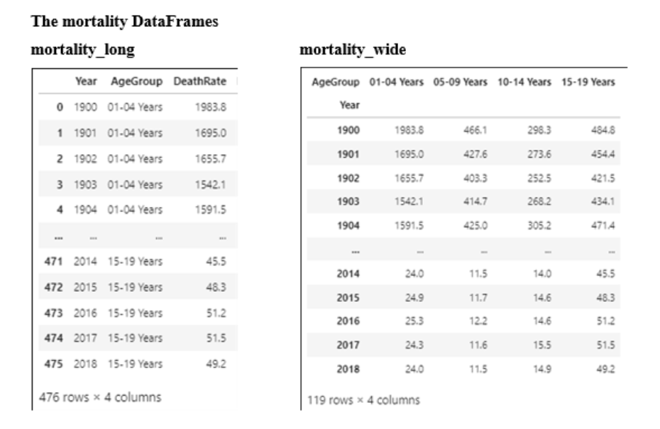
Refer to the mortality DataFrames. This code creates a line plot with a different colored line for each age group:
mortality_long.plot.line()
mortality_wide.plot.line()
mortality_long.plot.line
mortality_wide.plot.line
mortality_wide.plot.line()
Refer to the mortality DataFrames. This code creates a histogram that puts the death rates into 8 bins:
mortality_long.plot.hist(y='DeathRate', bins=8)
mortality_long.plot.hist(x='DeathRate', bins=8)
mortality_wide.plot.hist(x='DeathRate', bins=8)
mortality_wide.plot.hist(y='DeathRate', bins=8)
mortality_long.plot.hist(y='DeathRate', bins=8)
Refer to the mortality DataFrames. This code creates a scattter plot of the death rates in each of the four age groups by year, but with all of the dots the same color:
mortality_long.plot.scatter(x='Year', y='DeathRate')
mortality_wide.plot.scatter(x='Year', y='AgeGroup')
mortality_wide.plot.scatter(x='Year', x='AgeGroup')
mortality_long.plot.scatter(x='Year', x='DeathRate')
mortality_long.plot.scatter(x='Year', y='DeathRate')
Refer to the mortality DataFrames. This code creates a line plot with the x-axis ranging from the year 2000 through 2018 and the y-axis ranging from 0 through 100:
mortality_wide.plot.line(xlim=(2000,2018), ylim=(0,100))
mortality_wide.plot.line(x_limit=(2000,2018), y_limit=(0,100))
mortality_wide.plot.line(x_limit=(2000:2018), y_limit=(0:100))
mortality_wide.plot.line(xlim=(2000:2018), ylim=(0:100))
mortality_wide.plot.line(xlim=(2000,2018), ylim=(0,100))
Refer to the mortality DataFrames. This code creates a line plot with four subplots in two rows that share both the x-axis and the y-axis:
mortality_wide.plot.line(sharey=True, subplots=True, layout=(2:2))
mortality_wide.plot.line(sharex=True, sharey=True, layout=(2,2))
mortality_wide.plot.line(sharex=True, sharey=True, layout=(2:2))
mortality_wide.plot.line(sharey=True, subplots=True, layout=(2,2))
mortality_wide.plot.line(sharey=True, subplots=True, layout=(2,2))
Refer to the mortality DataFrames. This code creates a bar plot for the mean of each age group:
mortality_wide.mean().plot.bar()
mortality_wide.plot.bar().agg=mean
mortality_wide.plot.bar().mean()
mortality_wide.mean().plot()
mortality_wide.mean().plot.bar()
Refer to the mortality DataFrames. This code creates a horizontal bar plot for each of the four age groups but for just the years 1900 and 2018:
mortality_long.query('Year in (1900,2018)').plot.bar()
mortality_wide.query('Year in (1900,2018)').plot.bar()
mortality_long.query('Year in (1900,2018)').plot.barh()
mortality_wide.query('Year in (1900,2018)').plot.barh()
mortality_wide.query('Year in (1900,2018)').plot.barh()
Chapter 4
Unlike Seaborn’s specific methods for plotting, its general methods
return Axes objects and provide for categorical plots
return FacetGrid objects and provide for subplots
return Axes objects and provide for subplots
return FacetGrid objects and provide for categorical plots
return FacetGrid objects and provide for subplots
A Seaborn bar plot is a type of
relational plot
distribution plot
categorical plot
linear model plot
categorical plot
A Seaborn histogram is a type of
categorical plot
relational plot
distribution plot
linear model plot
distribution plot
A Seaborn distribution plot shows
the distribution of the data in each category
the relative distribution of the data in each category
how numeric data is distributed across a range of values
how data is distributed across a range of values
how numeric data is distributed across a range of values
The basic parameters for most Seaborn general plots are
kind x, y, and legend
data, kind, x, and y
data, kind x, y, and legend
kind, x, and y
data, kind, x, and y
The one type of Seaborn plot that doesn’t require a y parameter is a
relational plot
distribution plot
scatter plot
categorical plot
distribution plot
The confidence interval in a Seaborn line plot
is 95 percent
shows the likelihood that new datapoints will fall within the top and bottom limits that are shown
shows the top and bottom limits of past data
shows the top and bottom values in the data that’s plotted
shows the likelihood that new datapoints will fall within the top and bottom limits that are shown
To create a Seaborn plot that has subplots, you need to use these parameters:
col, col_wrap, and aspect
col and col_wrap
col, col_wrap, and hue
hue and col_wrap
col and col_wrap
To add a title and a y label to a specific Seaborn plot, you can use code like this:
A. ax = sns.lineplot(data=mortality_data,
x='Year', y='DeathRate', hue='AgeGroup')
ax.set(title='Deaths by Age Group', ylabel='Death Rate')
B. sns.lineplot(data=mortality_data,
x='Year', y='DeathRate', hue='AgeGroup')
ax.set(title='Deaths by Age Group', ylabel='Death Rate')
C. sns.lineplot(data=mortality_data,
x='Year', y='DeathRate', hue='AgeGroup')
g.set(title='Deaths by Age Group', ylabel='Death Rate')
D. g = sns.lineplot(data=mortality_data,
x='Year', y='DeathRate', hue='AgeGroup')
ax.set(title='Deaths by Age Group', ylabel='Death Rate')
A. ax = sns.lineplot(data=mortality_data,
x='Year', y='DeathRate', hue='AgeGroup')
ax.set(title='Deaths by Age Group', ylabel='Death Rate')
To add a title and a y label to a general Seaborn plot, you can use code like this:
A. sns.relplot(data=mortality_data, kind='line',
x='Year', y='DeathRate', hue='AgeGroup', aspect=1.5)
ax.set(title='Deaths by Age Group', ylabel='Death Rate')
B. g = sns.relplot(data=mortality_data, kind='line',
x='Year', y='DeathRate', hue='AgeGroup', aspect=1.5)
ax.set(title='Deaths by Age Group', ylabel='Death Rate')
C. g = sns.relplot(data=mortality_data, kind='line',
x='Year', y='DeathRate', hue='AgeGroup', aspect=1.5)
for ax in g.flat:
ax.set(title='Deaths by Age Group', ylabel='Death Rate')
D. g = sns.relplot(data=mortality_data, kind='line',
x='Year', y='DeathRate', hue='AgeGroup', aspect=1.5)
for ax in g.axes.flat:
ax.set(title='Deaths by Age Group', ylabel='Death Rate')
D. g = sns.relplot(data=mortality_data, kind='line',
x='Year', y='DeathRate', hue='AgeGroup', aspect=1.5)
for ax in g.axes.flat:
ax.set(title='Deaths by Age Group', ylabel='Death Rate')
This code adds a super title to a Seaborn plot that has its FacetGrid object in a variable named g:
g.ax.fig.suptitle('Deaths by Age Group (1910-1930)', y=1.025)
g.suptitle('Deaths by Age Group (1910-1930)', y=1.025)
g.fig.suptitle('Deaths by Age Group (1910-1930)', y=1.025)
g.ax.suptitle('Deaths by Age Group (1910-1930)', y=1.025)
g.fig.suptitle('Deaths by Age Group (1910-1930)', y=1.025)

Refer to the mortality DataFrame. This code creates a scatter plot for the death rates by year with the dots for each age group in a different color:
A. sns.relplot(data=mortality, kind='scatter',
x='Year', y='DeathRate', hue='AgeGroup')
B. sns.relplot(data=mortality, kind='scatter',
x='Year', y='DeathRate')
C. sns.relplot(data=mortality, kind='scatter',
x='Year', y='DeathRate', palette='AgeGroup')
D. sns.relplot(data=mortality, kind='scatter',
y='Year', x='DeathRate')
A. sns.relplot(data=mortality, kind='scatter',
x='Year', y='DeathRate', hue='AgeGroup')
Refer to the mortality DataFrame. This code creates a vertical bar plot for the death rates in 1950 and 2000 with no confidence interval shown:
A. sns.catplot(data=mortality.query('Year in (1950,2000)'),
kind='bar', y='Year', x='DeathRate', ci=None)
B. sns.catplot(data=mortality.query('Year in (1950,2000)'),
kind='bar', x='Year', y='DeathRate', ci=None)
C. sns.catplot(data=mortality.query('Year in (1950,2000)'),
kind='bar', x='Year', y='DeathRate')
D. sns.catplot(data=mortality.query('Year in (1950,2000)'),
kind='bar', y='Year', x='DeathRate')
B. sns.catplot(data=mortality.query('Year in (1950,2000)'),
kind='bar', x='Year', y='DeathRate', ci=None)
Refer to the mortality DataFrame. This code creates a KDE plot with one subplot for the death rates in each age group and two subplots in each row:
A. sns.displot(data=mortality, kind='kde', x='DeathRate',
col='DeathRate', row_wrap=2)
B. sns.displot(data=mortality, kind='kde', x='DeathRate', hue='AgeGroup',
col='AgeGroup', col_wrap=2)
C. sns.displot(data=mortality, kind='kde', x='DeathRate', hue='AgeGroup',
col='AgeGroup', row_wrap=2)
D. sns.displot(data=mortality, kind='kde', x='DeathRate',
col='DeathRate', col_wrap=2)
B. sns.displot(data=mortality, kind='kde', x='DeathRate', hue='AgeGroup',
col='AgeGroup', col_wrap=2)