ISC 100: Final- second half
1/112
There's no tags or description
Looks like no tags are added yet.
Name | Mastery | Learn | Test | Matching | Spaced |
|---|
No study sessions yet.
113 Terms
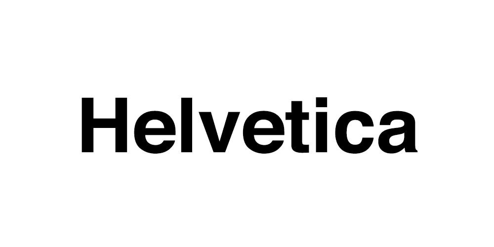
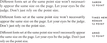
Typeface
The design of a set of characters
-aesthetic and visual form
Ex: Helvetica or Garamond
Font
The variation in weight, size, and style of a typeface
-enables the use of a typeface
Ex: 10 pt Helvetica or 24 pt bold Garamond
Type Foundry
Where people design and produce typeface (and font)
-used to be a physical type
-now designed for your computer

Sort
A piece of moveable type representing a particular character
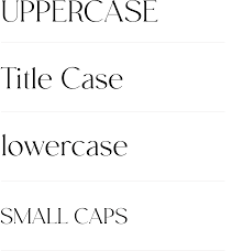
Case (don’t only use small caps)
Uppercase, lowercase, etc.
CAPS
SMALL CAPS
Sentence
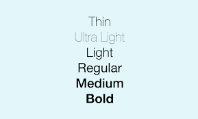
Weight
Boldness of the stroke
ultralight
Medium
Bold
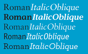
Posture
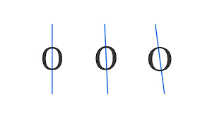
Relationship of vertical axis to baseline
Roman
Italic
Oblique
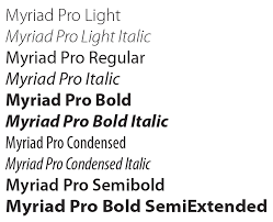
Font family
All a font’s variation and styles
Ex: Myriad Pro: Light
Light Italic
Regular
Italic
Bold
Bold Italic
Type Anatomy
Ex:
bowl
Stem
Terminal
Title
Bracket
Serif
Closed counter
Open counter
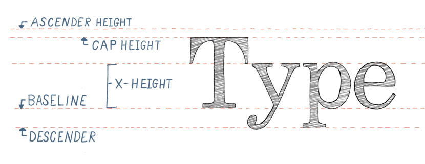
Axis
Describes the posture
(Draw a line through the thinnest part of a letter)
Stroke variation
Change in thickness
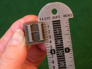
Measuring type: Fournier & Didot
Devised a point system (mid 1700s)
-two units of measurement
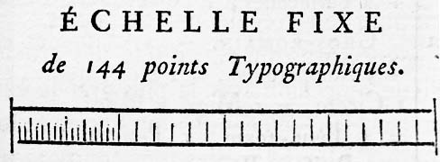
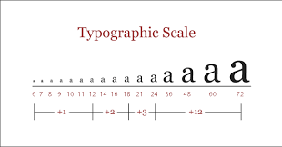
Measuring type: Points
Heights of letters, space between two lines of type
Measuring type: Picas
Length of lines, column depths, margins, space between columns of type
12 points=1 pics
6 picas=1 inch
72 points=1 inch
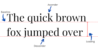
How is type measured
Type is measured from ascender to descender
-type can be larger than what you measure, but never smaller
⭐️x-height matters
Measuring vertical space: Line spacing
Vertical space occupied by a line of type plus the space between the two lines
-measure in points from baseline to baseline
-line space-type size=leading
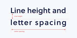
Measuring vertical space: Leading
Space separating two lines of type
measure in points
Most design programs including Adobe
Measuring vertical space: Needs more leading when
large x-height
Strong vertical stress
Sans serif
Small type size
Longer line lengths
⭐️10/12
Type size/line spacing
ten on twelve = 2 pt leading?
Measuring horizontal space: Wordspacing
Space between words in a line
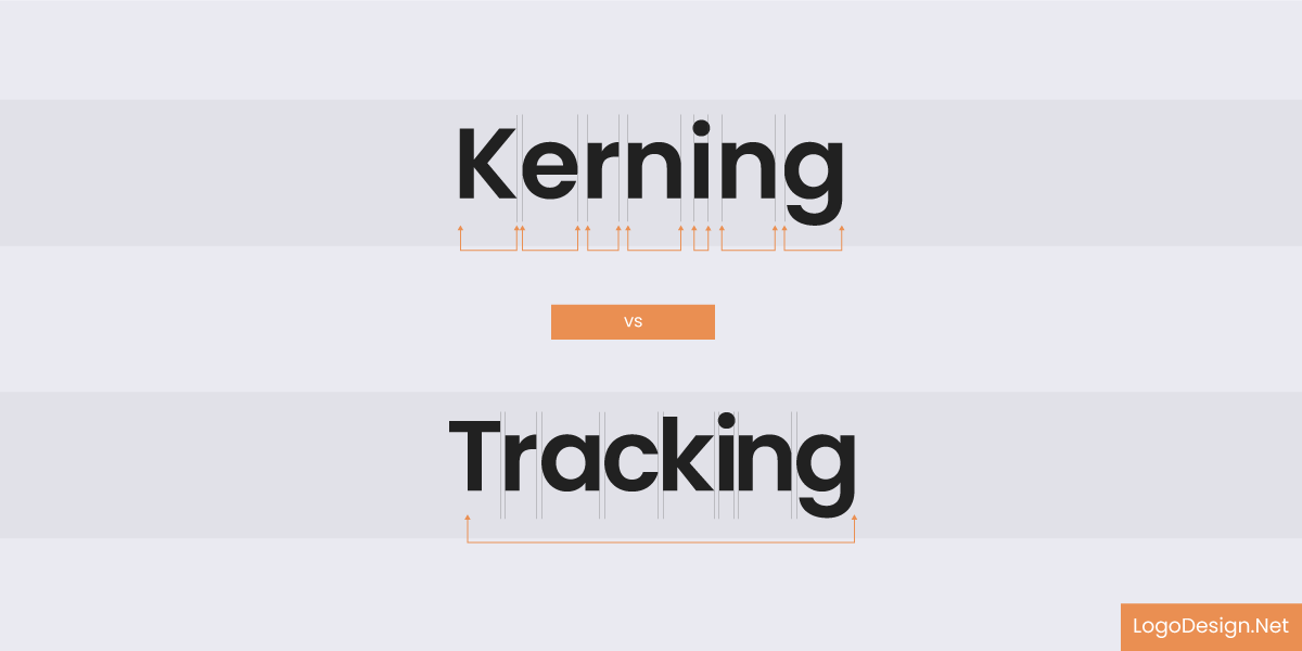
Measuring horizontal space: tracking
Consistently manipulates the space between ALL letters

Measuring horizontal space: kerning
Reducing the space between specific letter pair
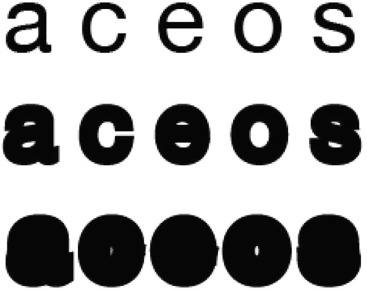
Type Classification
“Typography exists to HONOR CONTENT.” - Robert Bringhurst
⭐️typeface matters
Classifies type=when to choose it
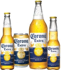
Type Classification: Blackletter
Based on the decorative handwriting of monks
-used by Gutenberg (1450)
-never in all caps/never body copy
Design: heavy, thick letters
Ornate/sharp diagonal lines
Connotations: history, traditional, classical, dangerous, ominous
Ex: Fraktur, Cloister Black, Old English
Some common uses: newspaper, beer labels, motorcycles
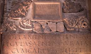
Serifs
Also called Romans
-based on the carvings of the ancient Roman’s
-all have serifs, some degree of stroke variation and an axis
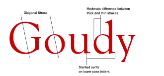
Old style serifs: design
Stroke variation: yes, but not as distinct as others
Serif: heavy with rounded ends
Brackets: yes
Axis: oblique
Other: rounded letters
Connotations: history, mellow, friendly, traditional
Ex: old style, Garamond, etc
Common text: long printed text (newspapers, books, magazines)
Does it lean? =
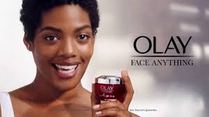
Transitional serifs: design
Stroke variation: obvious difference
Serif: wider, sharper serifs with flat bases
Brackets: yes
Axis: vertical or almost vertical
Connotations: strong, stylish, ubiquitous (everywhere)
innocuous (not harmful, modern, historical, everywhere)
Ex typefaces: Times New Roman, Baskerville
Some common uses: paper, long text
Does it have brackets? =
Ex: Olay ad
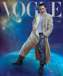
Modern Serif: Design
Stroke variation: strong difference
Serif: hairline unless bold, flat
Brackets: none
Axis: vertical
Connotations: structured, elegant, modern, cold, severe
Ex typefaces: Bodoni, Didot
Common use: arts & culture application
-not good for body copy
Is it super thin, vertical? =
Ex: vogue, pottery barn
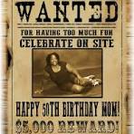
Slab Serifs
(Also known as Egyptians design)
Stroke variation: none (or almost none)
Serif: thick, block-like, heavy
Brackets: none
Axis: vertical
Connotations: authoritative, friendly, pitch of quirkiness, Wild West, wanted posters
Ex: Rockwell, Stymie
Common use: ads, posters
Sans Serif
Sans=without
More modern (Carlson in 1846)
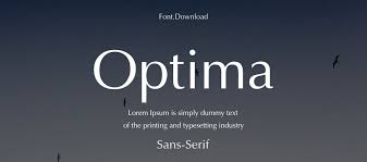
Humanist Sans Serif: design
Stroke variation: some variation
Serif: none
Brackets: none
Axis: mostly vertical
Connotations: warmth, personal, friendly, human, odd
Ex: Optima/Gill Sans
Common use: long reading + small text
(Online + print/body copy + headlines)
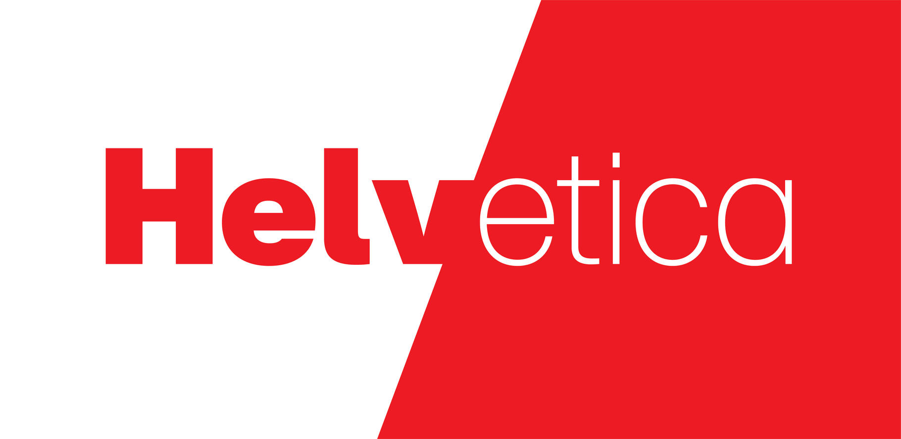
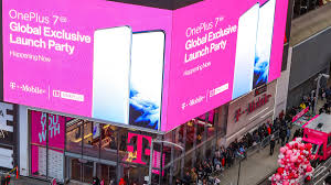
Transitional Sans Serif: Design
Stroke variation: none
Serif: none
Brackets: none
Axis: none
Connotations: unassuming, modern, no nonsense, ubiquitous, innocuous
Ex typefaces: Helvetica, Arial
Common use: transportation, technology
O=oval
Ex: T-Mobile Billboard
Geometric Sans serif: design
Stroke variation: none
Serif: none
Brackets: none
Axis: none
Other: based on geometric shapes
Connotations: modern, stylish, objective, analytical?
Ex: Century Gothic, Avant Garde
Common use: science, architecture, branding
O (not oval) = o (circle)
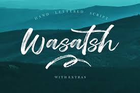
Scripts
Looks like handwriting
Never in all caps/never body copy
Design: - formal or informal
-connecting or non-connecting
Connotations: personal, human touch
Ex typefaces: brush script, zapf chancery
Common use: headlines or display type
Decorative
Everything else
-rarely in all caps/never body copy Design
Design- varies
Connotations- varies
(Bad) example typefaces- hobo/curlz/papyrus
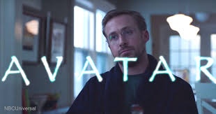
Ex: Papyrus used in avatar, SNL Papyrus Ryan Gosling Clip, Great Gatsby Movie Ad
Why we use type anatomy?
to classify type
When to choose it (connotations)
Know how to pair it
Type relationships: concordant
One font family
-quiet/calm/formal/can be dull
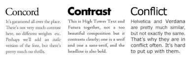
Type relationships: contrasting
Typefaces are clearly distinct
Visually appealing/exciting

Type relationships: Conflicting
Typefaces are similar but not the same
Disturbing/distracting/should be avoided

Type pairing tips
+ Bad Ideas
-classic mistakes
Art not science
+similar typefaces, typefaces from the same classification (or sub-classification), more than 3 typefaces in a layout
-two decorative typefaces, two script typefaces, two script typefaces, detailed script + serif, script + italic
Type pairing good ideas
+classic combos
one font family
Two different classifications
Very different typefaces
Distinct + neutral
Just two typefaces
+
Serif + sans serif
Script + sans serif
Decorative + sans serif
never forget that your point is to communicate
Combining different typefaces should enhance the communication, not confuse it!
Legibility
The ease with which one letter can be told from the other when reading
related to the design of typeface and the shape of the characters
Controlled by the type creator (chosen by the designer)
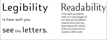
Readability
Refers to how the font is arranged (or typeset)
factors include: type size, type case, line spacing, line, length, readability
Controlled by the designer

How we read
We read in saccadic jumps
(Clusters of words & sentence fragments)
these jumps take in about 5-6 characters at a time
We depend largely on the shape of words when we read (particularly the shape of the upper half of the word)
These shapes are called “coastlines”
We don’t want too many or too few jumps per line
-it’s annoying (hurts readability)
Line length
50-75 characters (including spaces & punctuations)
Alphabet 2-3x ?
(Side note: this is also a good rule of thumb for online reading - although type is a bit more complicated)
Other mistakes: widows & orphans (help them)
Widows: left alone at the end of type
Orphans: left alone at begging of type

Hyphens
+
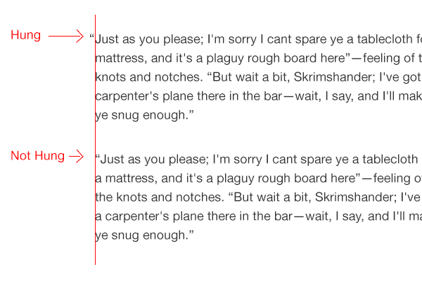
Hanging Quotes
Pay attention! (Don’t want to have too many)
+
So pretty
❌ “ Lallla….”
✅ “Lallla….”
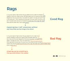
Good Rags
(Tight rags ✅)
So clean
(Loose rags❌)
all caps where it doesn’t belong
Poor line length
Windows & orphans
Bad hyphens
Not hanging quotes
Bad rags
More than one space after punctuation
Incorrect quotation mark
Incorrect apostrophes
Wrong dashes
Underlining
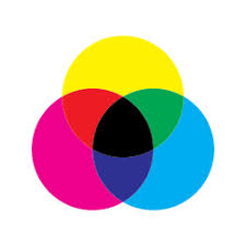
CMYK
Cyan, magenta, yellow, key
-subtractive
-print (magazines, books, newspapers…)
remember you can’t print white!
(White is a absence of ink, Black is subtractive - getting darker as more ink is added)
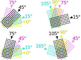
Rosette Pattern
Magenta 75
Cyan 15
Black 45
Yellow 0
angles
the beautiful, flower-like texture formed when halftone dots of Cyan, Magenta, Yellow, and Black inks overlap at specific, different angles (e.g., 15°, 75°, 45°, 0°), creating the illusion of continuous color and depth in printed images
(CMYK) which subtracts light to create colors
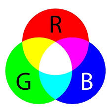
RGB- red, green, blue
-additive
-light (computers, phones, TV, projectors…)
-mixing of light (white) - additive!
light colors are added together, starting from darkness, to create a spectrum of colors on digital screens, with full intensity of all three resulting in white
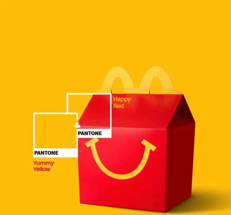
Spot color: Pantone Matching System (PMS)
Reproduces images or type in a single, specific color
pre-mixed ink
Recipes for mixing inks
Guaranteed accuracy
Ex: McDonald’s Pantone: Yellow 122 C, Red 485 C
When to use Pantone
-no full?
-color photos + uses only 1 or 2 colors
-need a color that cannot be accurately reproduced W/ CMYK (ex: logo color)
-need multiple color consistency
-need even coverage over a large area
-need more vibrant colors than CMYK inks produce
-need specific effects such as metallic or fluorescent
-limited on technology?
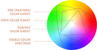
Why does color model matter? Color Gamut
The range of colors that can be produced by any given process or device
-almost infinite number of colors possible
Human eye= 1mil-10 mil
Chickens=more than humans (they have an extra cone)
CMYK= 4000 colors
RBG=even more
9% of men have some degree of color blindness
Less than 3% of women have color blindness
Things to disagree w/ from book
CMYK ❌=RGB
they are similar but, not the same
don’t work in RGB if you need CMYK
work in your designed color mode, switching can drastically change colors
Denotation vs. connotation
D: the strict dictionary meaning of a word
Ex: cheap=doesn’t cost a lot
Bargain= doesn’t cost a lot
Vs.
C: the emotional and imaginative association sounding a word
Ex: cheap=low quality
Bargain= a good deal
Color is culturally dependent
Different meanings in different cultures & simulations?
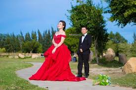
Red= eastern cultures= prosperity, happiness, good luck, worn by brides
Red= South Africa= Mourning
Red= Communism
Red= AIDS Awareness
Red= Finance= Loss
Red= Engineering = hot or danger
Red= medical field= danger or emergency
a good designer knows the difference
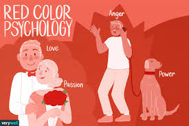
Red
Blood, fire
-cures hunger
-raises blood pressure + respiration
Connotations: anger + violence, love + passion, Cupid + devil, importance + elegance, danger
Seeing red= mad
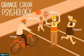
Orange
Autumn, fire, fruit
Connotations: energy, cozy, safety, vitality, zest, change, happy+ cheerful
Ex:) Orange Fanta ad
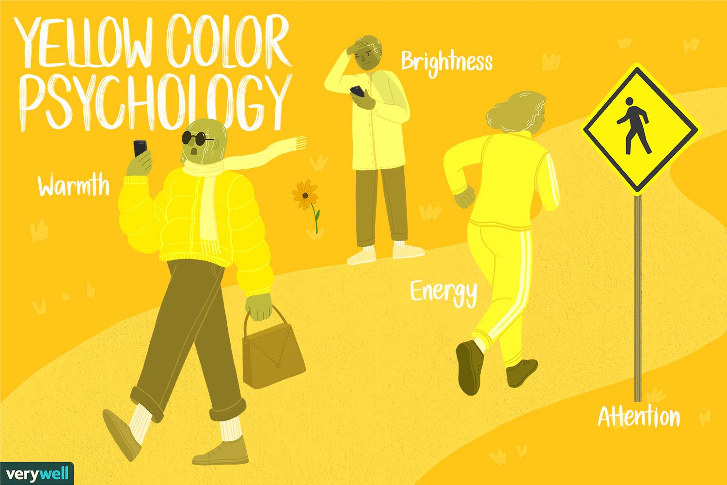
Yellow
Sun, warnings in nature, quickly noticed, highest reflectivity
Connotations: happiness + cheerfulness, hope, positivity, caution, deceit + cowardliness
You’re yellow=coward, chicken
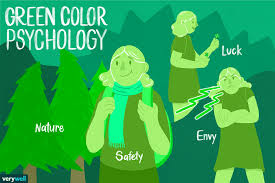
Green
Nature, spring, money (US)
Connotations: new beginnings + growth, environmental, abundance + wealth, jealousy, poison
Ex: she’s green=young, green w/ envy= jealous
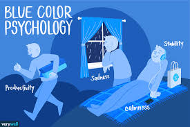
Blue
Sky, sea
Connotations: sadness, calm + tranquility, responsible + corporate, technology, strength, masculinity
Ex: feeling blue=feeling sad, Great Gatsby, Surgeon Scrubs teal=complementary of red!
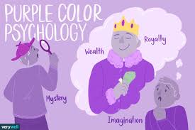
Purple
Wine, grapes
Connotations: sensuality + decadence, royalty + luxury, creativity
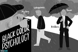
Black
Darkness
Connotations: evil + ominous, unknown, mystery, elegance
Ex: black sheep=odd one out, black magic, black mail
Gray
Urban, storm clouds
Connotations: impersonal, modern, technology, conservative, drab, elegant + formal
Ex: a gray day=bleh/okay day
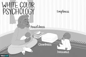
White
Cleanliness
Connotations: purity, virtue, lightness
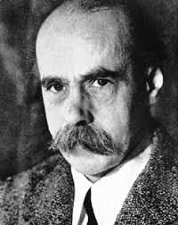
Max Wertheimer
1880-1943, father of Gestalt psychology
-what you see, not always what it is
Ex: movie billboard light, stroboscopic
Gestalt
German word for form
-a way of organizing visual information
-the whole is different form and more important than the sum of its parts
Gestalt explains how the eye and brain organize elements into patterns & patterns into a whole
Based on what objects look like … not what they are like
OLHEW
Individual elements in a design can be separately evaluated, analyzed, and considered
-each element has its own meaning, but the meaning of the whole is different and greater
Whole vs. whale
we call this the click factor
Vs.
it means that changing one part forces a reorientation of all parts & changes the whole
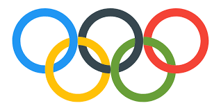
Laws of Gestalt: 1.) Law of Pragnanz
Law of symmetry and order
Pragnanz=German for good figure
-our brains organize patterns in the simplest manner possible (our brain is programmed to recognize faces)
Ex: the Olympic rings
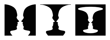
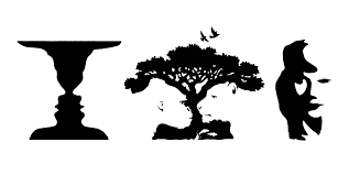
Laws of Gestalt: 2.) Law of Figure & Ground
Deals w/ positive and negative space
Figuer: (positive space) = object that stands out from the field
Ground: (negative space) = background or field behind the object
-cannot be seen simultaneously only sequentially
-people look at figures first
Figure/ground relationship: stable figure/ground vs. unstable figure/ground
Stable figure/ground: undercharging relationship of object against background/figure and ground are clear
Vs.
Unstable figure/ground: relationship is ambiguous interpretation alternates between figure and ground
Figures
Have more meaning and power in design
-are seen as having boundaries (ground is boundless)
-have shape and form (ground doesn’t)
-appear closer to the ground
-occupy less area than ground
-are seen in simpler shapes before complex ones
-are seen in symmetrical shapes before asymmetrical
-are seen in brighter areas before dull ones
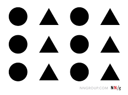
Laws of Gestalt: 3.) Law of Similarity
We visually group similar objects anomaly- an object can be emphasized if it is dissimilar to the others
Laws of Gestalt: 4.) Law of Proximity
Visually group objects that are closer together

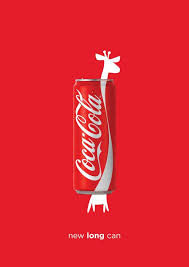
Laws of Gestalt: 5.) Law of Continuation
Elements placed close together w/ few interruptions will be perceived as moving in the same direction (implied lines)
-also at work as we read
-jumping the space from word to word
-an element in the opposite direction creates tension
Ex: Coke Giraffe ad
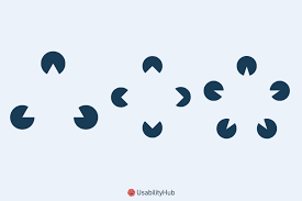
Law of Gestalt: 6.) Law of Closure
We group nearly complete familiar shapes so they form complete shapes
Ex: absoluto?, Fed Ex (figure ground), NBC (figure ground, closure)
-in image (brain wants you to say triangle)
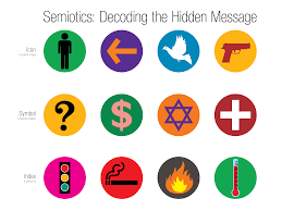
Semiotics
Study of signs
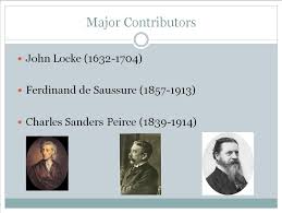
Father(s) of Semiotics
-Ferdinand Saussure
-Charles Sanders Peirce (1839-1914)
Sign vs. signified vs. signifier
-anything that stands for something else
-meaning that is made
-thing that makes meaning
Ex: you stopping=signified, stop sign=signifier
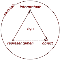
Interpretant, representation, object
I: (the mother realizing the baby is hungry)
R: (crying baby)
O: (the baby’s hunger)
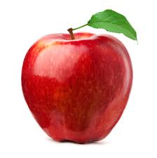
Sign Types: iconic
The sign resembles the object it stands for
(Photo of apple means apple)
(Photo of smoke is smoke)
-cross cultural boundaries
Ex: American Flag: Flag
Apple iPhone Logo: Apple itself (the logo/company)
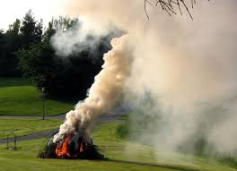
Sign Types: Indexical
The sign suggests a logical connection to something that can be figured out
-cross cultural boundaries
-a smile means that you are happy
(Smoke on this level represents fire)
(Footprint a symbol for something that made it)
Ex: American Flag: America
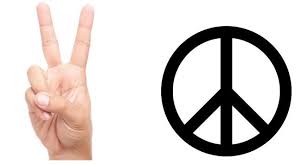
Sign Types: Symbolic
The sign’s meaning must be learned
(Two fingers means peace)
-don’t cross cultural boundaries
Ex: Apple iPhone Logo: expensive, product itself, factory
Ex: American Flag: Freedom, service, lack of acceptance, 4th of July
The legal slide of ethics in advertising
United States: self-regulated, minimal regulations, internal ethics
European Union: government regulated, more regulations, external ethics
Federal Trade Commission (US)
Purpose: works to stop deceptive ads
-claims to be truthful cannot be deceptive or unfair must be evidence-based
Special Rules: influencers/endorsements/reviews, environmental marketing, made in USA, health claims, children
Non-compliance: periodically monitors the internet for deceptive claims + violators can be fined
Advertising Advertising Federation (US)
Purpose: (clubs+lobbyists)
Legislative Comments & Testimony: provides comment and testimony on legislative and regulatory issues affecting the advertising community
Government Reports: provides a brief overview of advertising - related policy and legislative developments on the federal, state, and local levels
Advertising Ethics: Institute for advertising ethics (US)
Purpose: independent body (non-profit) to address the urgent and complex issues of ethical standards and practices across all aspects of advertising components
⭐️know what they stand for + what they do!
Practices & Principles: “The one constant is transparency and the need to conduct ourselves, our business, and other relationships w/ consumers in a fair, honest, and forth-right manner.”
ethical practices: is it legal?, is it ethical?, what kind of images should we take, share, tell? (ex: UK healthcare Rock Climbing Ad)
Portrait Painting
Henry VII - Anne of Cleves
deceived by the portrait (didn’t want to marry)
Napoleon Crossing the Alps Painting (tall, strong, horse rider) vs. actual: short, couldn’t ride a horse, didn’t have a hand
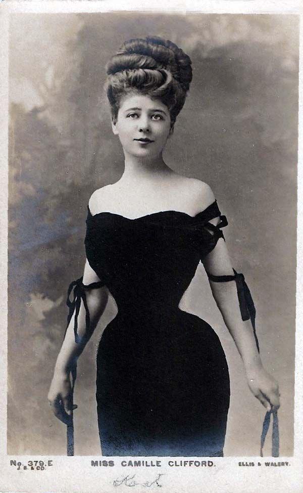
Photo Manipulation
Started by the first photo take
-it’s not new but its everywhere
Ex: Camille Clifford: posed in front of blank backgrounds, people drew a small waist
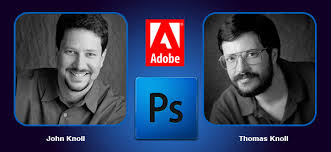
Photoshop
Thomas and John Knoll
-sold the distribution license to Adobe System Inc in 1988
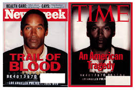
Digital Image Manipulation
Adding, cropping, changing (lighting/angles/makeup/filters/AI)
-it’s everywhere but is it ethical?
Ex: JCREW & Vans AI ad created ad, Coke AI ad, Wisconsin (fake) diversity shot, OJ Simpson Time Magazine Cover, Lady Gaga Versace
RYB
Red, yellow, blue
-subtractive
Pigment: (paint, crayons, markers)
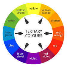
Color Wheel
Sir Isaac Newton (1704)
-working with prisms
-assigned a musical note to each other
-helps us understand color relationships
-allows us to pick color palettes that work
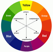
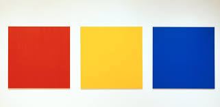
Primary Colors
Colors we can’t make
-red, blue, yellow
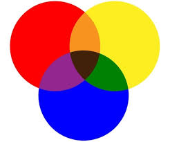
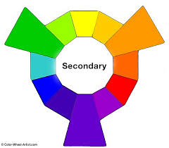
Secondary Colors
Mixing two primary colors
-orange, green, purple
Tertiary Colors
Mixing primary + secondary colors
-red-orange, red-purple, yellow-orange, yellow-green, blue-green, blue-purple

The color wheel has:
3 primary
3 secondary
6 tertiary
Warm colors
Have red and yellow as base
-fall, fire, sunrise, and sunset
-energizing, positive, and passionate
-come forward