Micro economics diagrams

0.0(0)
Studied by 0 people
call kaiCall Kai
Locked
learnLearn
examPractice Test
spaced repetitionSpaced Repetition
heart puzzleMatch
flashcardsFlashcards
GameKnowt Play
Card Sorting

1/38

encourage image

There's no tags or description

Looks like no tags are added yet.

Last updated 8:10 AM on 8/28/26
Name
Mastery
Learn
Test
Matching
Spaced
Call with Kai
Chat

No analytics yet

Send a link to your students to track their progress

39 Terms

1
New cards

PPC

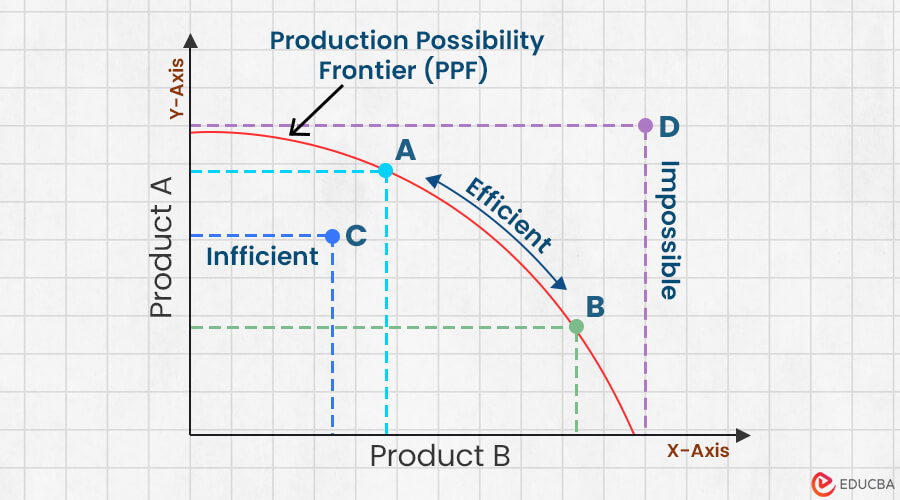
What it shows: the maximum possible combinations of two goods (or categories of goods) an economy can produce with all its resources fully and efficiently employed, given a fixed amount of resources and a fixed state of technology.

Any point on curve= productively efficient

Curved, as you shift production from good A to B you give up increasing amounts of A (law of increasing opportunity cost)

Movement along the curve shows reallocation of resources

Skewed shift/ non-symmetrical, shifts on one side more than the other,happens if company is more focused on improving one.

When needed to be used- explaining the basic economics problem, effciency, investment decisions like cap v con good trade offs

It’s a simplifed model, assumes resources and assumes resources are fixed and technology is constant at any one point in time, which is unrealistic in the short run when discussing rapid technological change. Doesn’t show price.
<p><strong>What it shows:</strong> the maximum possible combinations of two goods (or categories of goods) an economy can produce with all its resources fully and efficiently employed, given a fixed amount of resources and a fixed state of technology.</p><p>Any point on curve= productively efficient </p><p>Curved, as you shift production from good A to B you give up increasing amounts of A (law of increasing opportunity cost) </p><p>Movement along the curve shows reallocation of resources </p><p>Skewed shift/ non-symmetrical, shifts on one side more than the other,happens if company is more focused on improving one.</p><p>When needed to be used- explaining the basic economics problem, effciency, investment decisions like cap v con good trade offs</p><p>It’s a simplifed model, assumes resources and assumes resources are fixed and technology is constant at any one point in time, which is unrealistic in the short run when discussing rapid technological change. Doesn’t show price.</p>
2
New cards

Supply and demand curve

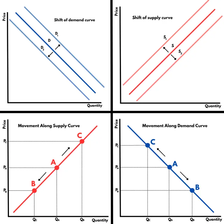
Shows relationship between price of a good and quantity demanded/supplied (x axis)

Non-price determinants for demand shift- income, price of substitutes and complements, tastes/preferences, expectations of future price changes, interest rates.

Non-price determinants for supply shift- cost of production, technology, num of firms in market, taxes, subsidies, weather (agricultural markets), expectations of future prices.

Only price causes movement along the curve

When to use- consumer behaviour, market changes, foundation before equilibrium diagrams
<p>Shows relationship between price of a good and quantity demanded/supplied (x axis)</p><p>Non-price determinants for demand shift- income, price of substitutes and complements, tastes/preferences, expectations of future price changes, interest rates.</p><p>Non-price determinants for supply shift- cost of production, technology, num of firms in market, taxes, subsidies, weather (agricultural markets), expectations of future prices.</p><p>Only price causes movement along the curve</p><p>When to use- consumer behaviour, market changes, foundation before equilibrium diagrams</p>
3
New cards

Supply and demand- Market equilibrium, consumer/producer surplus

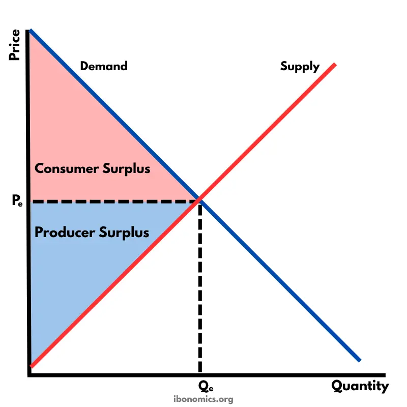
Market equilibrium where quantity demanded equals quantity supplied

Excess demand- (shortage) occurs when price is below equilibrium, demand is higher than supply, puts upward pressure onto price.

Excess supply(shortage)-visa-versa

Equilibrium quantity is the quantity bought and sold at equilibrium price, which is where demand equals supply so tendency to change price.

When to use- basic explanation of how prices determined,

Consumer surplus and producer surplus used to measure change in economics welfare like tax, subsidy, price control affects consumers/producers differently
<p>Market equilibrium where quantity demanded equals quantity supplied</p><p>Excess demand- (shortage) occurs when price is below equilibrium, demand is higher than supply, puts upward pressure onto price.</p><p>Excess supply(shortage)-visa-versa</p><p>Equilibrium quantity is the quantity bought and sold at equilibrium price, which is where demand equals supply so tendency to change price.</p><p>When to use- basic explanation of how prices determined,</p><p>Consumer surplus and producer surplus used to measure change in economics welfare like tax, subsidy, price control affects consumers/producers differently</p>
4
New cards

PED

Price elasticity of demand, shows how responsive quantity demanded is to change in price.

ONLY MAGNITUDE

Perfectly elastic demand (PED = ∞) — a horizontal straight line. Any change in price causes an infinite change in quantity demanded (theoretical extreme

Perfectly inelastic demand (PED = 0) — a vertical straight line. Quantity demanded doesn't change at all regardless of price

Elastic demand (PED > 1, ignoring sign) — a relatively flat/shallow curve. A given % change in price causes a proportionally larger % change in quantity demanded.

Inelastic demand (PED < 1) — a relatively steep curve. A given % change in price causes a proportionally smaller % change in quantity demanded.

Unitary elastic demand (PED = 1) — a curve where % change in price always equals % change in quantity demanded

Factors affecting- more subsitutes=more elastic, percentage of income spent on good, necessity vs luxury, more elastic over time as consumers adjust, addictiveness.

When to use- explaining/predicting effect of price change on firm revenue, if firm should raise or lower price if inelastic raise price increases revenue,

<p>Price elasticity of demand, shows how responsive quantity demanded is to change in price.</p><p>ONLY MAGNITUDE</p><p><strong>Perfectly elastic demand (PED = ∞)</strong> — a horizontal straight line. Any change in price causes an infinite change in quantity demanded (theoretical extreme</p><p><strong>Perfectly inelastic demand (PED = 0)</strong> — a vertical straight line. Quantity demanded doesn't change at all regardless of price</p><p><strong>Elastic demand (PED &gt; 1, ignoring sign)</strong> — a relatively flat/shallow curve. A given % change in price causes a proportionally larger % change in quantity demanded.</p><p><strong>Inelastic demand (PED &lt; 1)</strong> — a relatively steep curve. A given % change in price causes a proportionally smaller % change in quantity demanded.</p><p><strong>Unitary elastic demand (PED = 1)</strong> — a curve where % change in price always equals % change in quantity demanded </p><p>Factors affecting- more subsitutes=more elastic, percentage of income spent on good, necessity vs luxury, more elastic over time as consumers adjust, addictiveness.</p><p>When to use- explaining/predicting effect of price change on firm revenue, if firm should raise or lower price if inelastic raise price increases revenue, </p>
5
New cards

PES

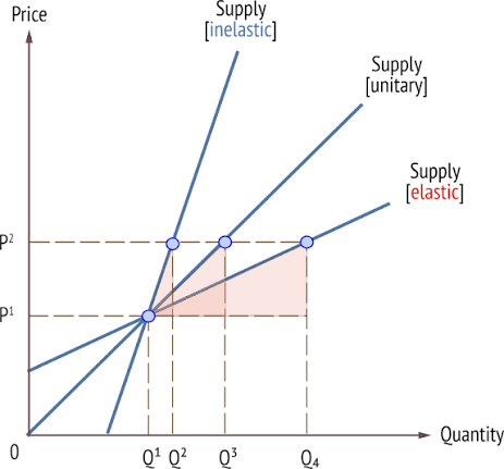
Perfectly elastic supply (PES = ∞) — horizontal line.

Perfectly inelastic supply (PES = 0) — vertical line (e.g. classic example: land, or perishable goods that must be sold immediately regardless of price — fresh produce at a market on a given day).

Elastic supply (PES > 1) — shallow/flat curve.

Inelastic supply (PES < 1) — steep curve.

Unitary elastic supply (PES = 1) — a straight line through the origin (a special case — any straight-line supply curve passing through the origin has PES = 1 at every point

Factors affecting- spare production capacity, ability to store good, more elastic over time, how easily you can switch between resources, length of production process

When to use- to explain why prices are more/less volatile in certain markets, government policy.
<p><strong>Perfectly elastic supply (PES = ∞)</strong> — horizontal line.</p><p><strong>Perfectly inelastic supply (PES = 0)</strong> — vertical line (e.g. classic example: land, or perishable goods that must be sold immediately regardless of price — fresh produce at a market on a given day).</p><p><strong>Elastic supply (PES &gt; 1)</strong> — shallow/flat curve.</p><p><strong>Inelastic supply (PES &lt; 1)</strong> — steep curve.</p><p><strong>Unitary elastic supply (PES = 1)</strong> — a straight line through the origin (a special case — any straight-line supply curve passing through the origin has PES = 1 at every point</p><p>Factors affecting- spare production capacity, ability to store good, more elastic over time, how easily you can switch between resources, length of production process</p><p>When to use- to explain why prices are more/less volatile in certain markets, government policy.</p>
6
New cards

YED

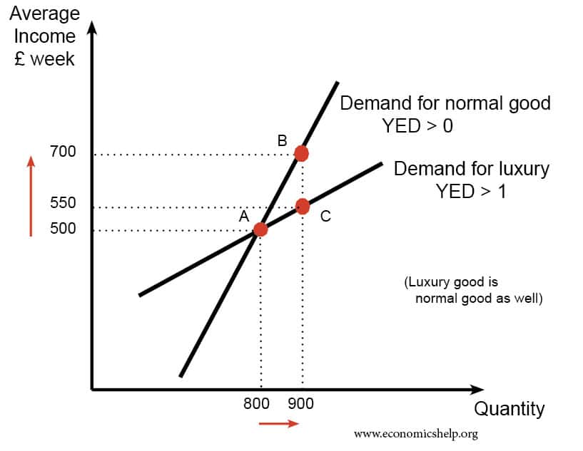
Income elasticity of demand

Normal good positive YED, necessities YED between 0 and 1 so positive but inelastic, demand rises less proportionally to income. Luxuries YED is greater than 1 positive and elastic .

Inferior good negative YED, down sloped lined.

When to use- classifying goods, explain how demand for a firm’s product might change over the economci cycle.
<p>Income elasticity of demand </p><p>Normal good positive YED, necessities YED between 0 and 1 so positive but inelastic, demand rises less proportionally to income. Luxuries YED is greater than 1 positive and elastic .</p><p>Inferior good negative YED, down sloped lined.</p><p>When to use- classifying goods, explain how demand for a firm’s product might change over the economci cycle.</p>
7
New cards

XED

Cross elasticity of demand- diagram is not required

Substitutes, positive XED price of B rises, demand for A rises

Complements, negative XED, price of B rises, demand for B falls

Close substitutes/complements have a larger magnitude

When to use- Analysing competitive markets and how firms' pricing decisions affect rival/complementary products. Useful in evaluation for oligopoly/business strategy questions

<p>Cross elasticity of demand- diagram is not required</p><p>Substitutes, positive XED price of B rises, demand for A rises </p><p>Complements, negative XED, price of B rises, demand for B falls</p><p>Close substitutes/complements have a larger magnitude </p><p>When to use- Analysing competitive markets and how firms' pricing decisions affect rival/complementary products. Useful in evaluation for oligopoly/business strategy questions</p>
8
New cards

Indirect tax-Specific tax diagram on supply

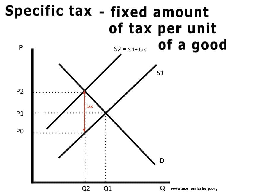
Specific tax — a fixed amount of tax charged per unit of a good, regardless of price (e.g. duty on fuel, alcohol, cigarettes).

What it shows: the effect of a government tax charged per unit of a good on the market.

Original supply curve (S1) and demand curve (D).

New supply curve (S2) shifts vertically upward (parallel shift) by the exact amount of the tax — because a specific tax adds the same fixed £ amount at every level of output.

New equilibrium point at a higher price and lower quantity.

Consumer Burden: The rectangle between prices P1 and P2, up to quantity Q2.

Producer Burden: The rectangle between prices P0 and P1, up to quantity Q2.

Total Tax Revenue: The entire rectangle between prices P0 and P2, up to quantity Q2.

Deadweight Loss: The triangle bounded by prices P0 and P2 on the left, pointing to the original equilibrium at P1, Q1.

When to use it: questions on indirect taxation of goods with a fixed unit tax (fuel duty, alcohol duty), or evaluating government revenue


<p><strong>Specific tax</strong> — a fixed amount of tax charged per unit of a good, regardless of price (e.g. duty on fuel, alcohol, cigarettes).</p><p><strong>What it shows:</strong> the effect of a government tax charged per unit of a good on the market.</p><p>Original supply curve (S1) and demand curve (D).</p><p>New supply curve (S2) shifts <strong>vertically upward (parallel shift)</strong> by the exact amount of the tax — because a specific tax adds the same fixed £ amount at every level of output.</p><p>New equilibrium point at a higher price and lower quantity.</p><p><span><strong>Consumer Burden:</strong> The rectangle between prices <strong>P1 and P2</strong>, up to quantity <strong>Q2</strong>.</span></p><p><span><strong>Producer Burden:</strong> The rectangle between prices <strong>P0 and P1</strong>, up to quantity <strong>Q2</strong>.</span></p><p><span><strong>Total Tax Revenue:</strong> The entire rectangle between prices <strong>P0 and P2</strong>, up to quantity <strong>Q2</strong>.</span></p><p><span><strong>Deadweight Loss:</strong> The triangle bounded by prices <strong>P0 and P2</strong> on the left, pointing to the original equilibrium at <strong>P1, Q1</strong>.</span></p><p><strong>When to use it:</strong> questions on indirect taxation of goods with a fixed unit tax (fuel duty, alcohol duty), or evaluating government revenue</p><p></p><p></p>
9
New cards

Indirect tax-Ad valorem tax diagram on supply

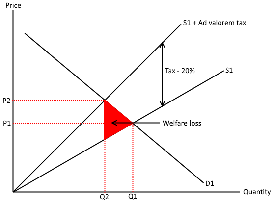
Ad valorem tax- tax charged as a percentage of the price of a good

The new supply curve (S2) is not parallel to S1 — instead it pivots, starting from the same point on the Y-axis as S1 (at zero output, no tax exists), and diverging further from S1 as price/quantity rises, because the tax is a percentage of price so it gets bigger in absolute terms as price rises.

Everything else (new equilibrium, consumer/producer burden, deadweight loss triangle) works the same way conceptually as the specific tax.

When to use it: used for VAT-style taxes, i.e. most taxes on general goods and services (VAT in the UK is the standard real-world example).
<p>Ad valorem tax- tax charged as a percentage of the price of a good</p><p>The new supply curve (S2) is <strong>not parallel</strong> to S1 — instead it <strong>pivots</strong>, starting from the same point on the Y-axis as S1 (at zero output, no tax exists), and diverging further from S1 as price/quantity rises, because the tax is a percentage of price so it gets bigger in absolute terms as price rises.</p><p>Everything else (new equilibrium, consumer/producer burden, deadweight loss triangle) works the same way conceptually as the specific tax.</p><p><strong>When to use it:</strong> used for VAT-style taxes, i.e. most taxes on general goods and services (VAT in the UK is the standard real-world example).</p>
10
New cards

Subsidy on supply diagram

Supply curve shifts vertically downward (parallel shift) by the amount of the subsidy per unit — S1 to S2.

New equilibrium at a lower price and higher quantity.Supply curve shifts vertically downward (parallel shift) by the amount of the subsidy per unit — S1 to S2.

New equilibrium at a lower price and higher quantity.

Consumer subsidy is benefit to consumer, producer subsidy is benefit to producers

When to use it: analysing government support for merit goods (e.g. renewable energy, public transport, education) or industries the government wants to encourage.

Evaluation points to know: cost to the taxpayer, whether the subsidy is fully passed on to consumers


<p>Supply curve shifts <strong>vertically downward (parallel shift)</strong> by the amount of the subsidy per unit — S1 to S2.</p><p>New equilibrium at a <strong>lower price</strong> and <strong>higher quantity</strong>.Supply curve shifts <strong>vertically downward (parallel shift)</strong> by the amount of the subsidy per unit — S1 to S2.</p><p>New equilibrium at a <strong>lower price</strong> and <strong>higher quantity</strong>.</p><p>Consumer subsidy is benefit to consumer, producer subsidy is benefit to producers</p><p><strong>When to use it:</strong> analysing government support for merit goods (e.g. renewable energy, public transport, education) or industries the government wants to encourage.</p><p><strong>Evaluation points to know:</strong> cost to the taxpayer, whether the subsidy is fully passed on to consumers</p><p></p>
11
New cards

Price ceiling diagram

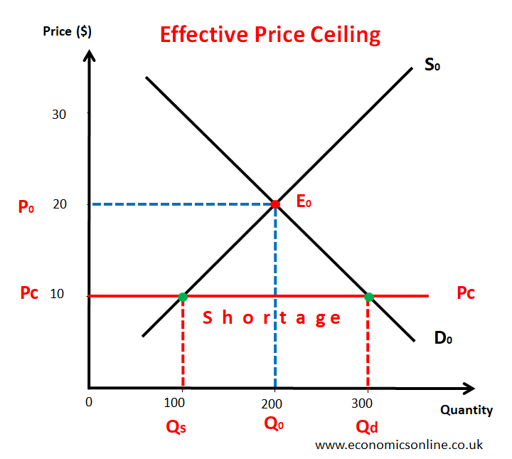
Maximum price (price ceiling) — a legally imposed price set by the government below the free market equilibrium price, making it illegal to charge more than this price.

Pmax so max price is set below the equilibrium, forcing the price to change to become cheaper, but demand increases as less flats are avaliable and less people decide to keep a product up for that price

When to use it:Rent controls, price caps on essential goods (e.g. energy price cap context in the UK). Explaining unintended consequences of intervention — e.g. shortages, potential for a black market/informal market to develop, reduced incentive for producers to supply, decline in quality (since producers can't compete on price, they might cut quality to save costs).

Evaluation points: shortages often lead to non-price rationing methods (queuing, favouritism), which can be inefficient or unfair; may need to be paired with other policies (like guaranteed minimum supply or rationing) to work properly.
<p><strong>Maximum price (price ceiling)</strong> — a legally imposed price set by the government below the free market equilibrium price, making it illegal to charge more than this price.</p><p>Pmax so max price is set below the equilibrium, forcing the price to change to become cheaper, but demand increases as less flats are avaliable and less people decide to keep a product up for that price</p><p><strong>When to use it:</strong>Rent controls, price caps on essential goods (e.g. energy price cap context in the UK). Explaining unintended consequences of intervention — e.g. shortages, potential for a black market/informal market to develop, reduced incentive for producers to supply, decline in quality (since producers can't compete on price, they might cut quality to save costs).</p><p><strong>Evaluation points:</strong> shortages often lead to non-price rationing methods (queuing, favouritism), which can be inefficient or unfair; may need to be paired with other policies (like guaranteed minimum supply or rationing) to work properly.</p>
12
New cards

Price floor diagram

Minimum price (price floor) — a legally imposed price set by the government above the free market equilibrium price, making it illegal to charge less than this price.

Set above equilibrium

creates surpluses, which may require government intervention to deal with (e.g. buying up the surplus — this links directly to the buffer stock diagram below), costly to firms/government if surplus needs storing or destroying, can protect producer incomes but distorts the market and raises prices for consumers.

When to use, min alcohol prices, agricultural support scheme

<p><strong>Minimum price (price floor)</strong> — a legally imposed price set by the government above the free market equilibrium price, making it illegal to charge less than this price.</p><p>Set above equilibrium </p><p>creates surpluses, which may require government intervention to deal with (e.g. buying up the surplus — this links directly to the buffer stock diagram below), costly to firms/government if surplus needs storing or destroying, can protect producer incomes but distorts the market and raises prices for consumers.</p><p>When to use, min alcohol prices, agricultural support scheme</p>
13
New cards

Buffer stock diagram

Buffer stock scheme — a form of government (or agency) intervention that aims to stabilise the price of a good, typically agricultural, by buying up excess supply when prices are low and releasing stored stock when prices are high.

Why it's used: commonly linked to agricultural markets, where supply is often volatile (weather-dependent, inelastic in the short run) causing large price swings that hurt either farmers (low prices) or consumers (high prices) depending on the season.

When to use it:Agricultural market stabilisation questions. Discussing commodity price volatility (e.g. coffee, wheat, cocoa markets).

Pros: stabilises farmer incomes, protects consumers from extreme price spikes, encourages investment since farmers face less income uncertainty.

Cons: costly to store/maintain stock (storage costs, spoilage risk for perishable goods), requires significant funding, government/agency needs accurate market predictions to set the price band correctly, risk of running out of funds to buy surplus or running out of stock to release, may not work well if there's a persistent long-term shift in supply/demand rather than short-term fluctuation.


<p><strong>Buffer stock scheme</strong> — a form of government (or agency) intervention that aims to stabilise the price of a good, typically agricultural, by buying up excess supply when prices are low and releasing stored stock when prices are high.</p><p><strong>Why it's used:</strong> commonly linked to agricultural markets, where supply is often volatile (weather-dependent, inelastic in the short run) causing large price swings that hurt either farmers (low prices) or consumers (high prices) depending on the season.</p><p><strong>When to use it:</strong>Agricultural market stabilisation questions. Discussing commodity price volatility (e.g. coffee, wheat, cocoa markets).</p><p><strong>Pros:</strong> stabilises farmer incomes, protects consumers from extreme price spikes, encourages investment since farmers face less income uncertainty.</p><p><strong>Cons:</strong> costly to store/maintain stock (storage costs, spoilage risk for perishable goods), requires significant funding, government/agency needs accurate market predictions to set the price band correctly, risk of running out of funds to buy surplus or running out of stock to release, may not work well if there's a persistent long-term shift in supply/demand rather than short-term fluctuation.</p><p></p>
14
New cards

Negative externality of Consumption

What it shows: a situation where the consumption of a good creates a cost to third parties (e.g. secondhand smoke, drink-driving accidents affecting others).

Real-world examples: smoking, alcohol consumption, junk food.

When to use it: demerit goods questions — anything about goods that are overconsumed relative to what's socially desirable.

One supply line (doesn't change — the factory making cigarettes isn't the problem here). Two "benefit" lines going down: MPB (how much the smoker personally enjoys it) and MSB (the benefit to society overall, which is lower because it includes the harm to others from secondhand smoke). MSB is drawn lower down than MPB.

The simple story:

  • Smokers only think about their OWN enjoyment (MPB), so they keep buying/smoking until MPB crosses supply — giving "the market amount."

  • But society would prefer less smoking overall, once you factor in the harm to others (MSB).

  • So people consume too muchnegative consumption externality = overconsumption.

One-line summary: Consumer ignores harm to others → consumes more than they should → triangle of waste.
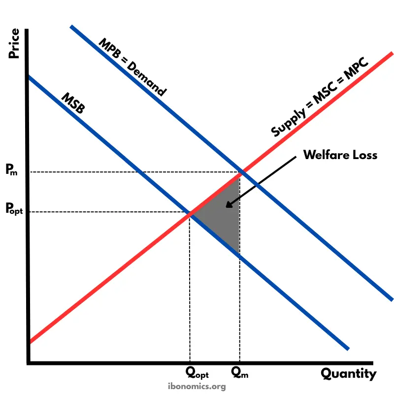
<p><strong>What it shows:</strong> a situation where the <strong>consumption</strong> of a good creates a cost to third parties (e.g. secondhand smoke, drink-driving accidents affecting others).</p><p><strong>Real-world examples:</strong> smoking, alcohol consumption, junk food.</p><p><strong>When to use it:</strong> demerit goods questions — anything about goods that are overconsumed relative to what's socially desirable.</p><p>One supply line (doesn't change — the factory making cigarettes isn't the problem here). Two "benefit" lines going down: <strong>MPB</strong> (how much the smoker personally enjoys it) and <strong>MSB</strong> (the benefit to society overall, which is lower because it includes the harm to others from secondhand smoke). MSB is drawn <strong>lower down</strong> than MPB.</p><p><strong>The simple story:</strong></p><ul><li><p>Smokers only think about their OWN enjoyment (MPB), so they keep buying/smoking until MPB crosses supply — giving "the market amount."</p></li><li><p>But society would prefer <strong>less</strong> smoking overall, once you factor in the harm to others (MSB).</p></li><li><p>So people consume <strong>too much</strong> — <strong>negative consumption externality = overconsumption.</strong></p></li></ul><p><strong>One-line summary:</strong> Consumer ignores harm to others → consumes more than they should → triangle of waste.</p>
15
New cards

Negative Externality of Production

What it shows: a situation where the production of a good creates a cost to third parties (e.g. pollution from a factory), causing the social cost to exceed the private cost.

What's on the graph:

  • Two "cost" lines going up: MPC (the cost to the factory itself — wages, materials etc.) and MSC (the cost to society — the factory's costs PLUS the damage caused to people living near the river).

  • MSC is drawn higher up than MPC, because pollution adds an extra cost that society pays but the factory doesn't.

  • One demand line (this doesn't change — the public buying the product isn't causing the externality, so we don't need MSB/MPB separately here

The simple story:

  • The factory only cares about ITS OWN costs (MPC), so it keeps producing until MPC crosses demand. This gives a certain quantity — let's call it "the market amount."

  • But if we included the pollution cost too (MSC), the "right" amount for society would actually be lower.

  • So the factory produces too much — this is the key takeaway: negative production externality = overproduction.

  • The gap between "how much they actually made" and "how much they should have made" is wasted welfare — a small triangle you shade in between the two cost lines.

Real-world examples: factory pollution, carbon emissions from manufacturing.

When to use it: any question about production processes causing environmental/social harm to third parties.
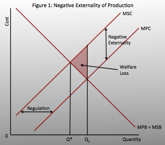
<p><strong>What it shows:</strong> a situation where the <strong>production</strong> of a good creates a cost to third parties (e.g. pollution from a factory), causing the social cost to exceed the private cost.</p><p><strong>What's on the graph:</strong></p><ul><li><p>Two "cost" lines going up: <strong>MPC</strong> (the cost to the factory itself — wages, materials etc.) and <strong>MSC</strong> (the cost to society — the factory's costs PLUS the damage caused to people living near the river).</p></li><li><p>MSC is drawn <strong>higher up</strong> than MPC, because pollution adds an extra cost that society pays but the factory doesn't.</p></li><li><p>One demand line (this doesn't change — the public buying the product isn't causing the externality, so we don't need MSB/MPB separately here</p></li></ul><p><strong>The simple story:</strong></p><ul><li><p>The factory only cares about ITS OWN costs (MPC), so it keeps producing until MPC crosses demand. This gives a certain quantity — let's call it "the market amount."</p></li><li><p>But if we included the pollution cost too (MSC), the "right" amount for society would actually be <strong>lower</strong>.</p></li><li><p>So the factory produces <strong>too much</strong> — this is the key takeaway: <strong>negative production externality = overproduction.</strong></p></li><li><p>The gap between "how much they actually made" and "how much they should have made" is wasted welfare — a small triangle you shade in between the two cost lines.</p></li></ul><p><strong>Real-world examples:</strong> factory pollution, carbon emissions from manufacturing.</p><p><strong>When to use it:</strong> any question about production processes causing environmental/social harm to third parties.</p>
16
New cards

Positive Externality of Production

What it shows: a situation where the production of a good creates a benefit to third parties (e.g. a firm training its workers, which benefits other firms if those workers move jobs later).

Real-world examples: staff training, R&D, renewable energy production.

What's on the graph:

  • Two "cost" lines: MPC and MSC. This time MSC is drawn lower than MPC, because society actually benefits from the training (so the "true cost" to society is less than what the firm pays).

  • One demand line (unchanged).

The simple story:

  • The firm only sees its own cost (MPC) — training is expensive for the firm, so it trains fewer people than would be ideal for society.

  • If we included the benefit to society (lower MSC), the "right" amount would be higher.

  • So the firm produces (trains) too littlepositive production externality = underproduction.
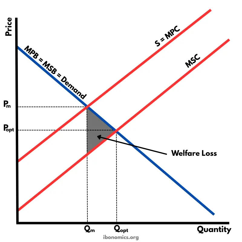

<p><strong>What it shows:</strong> a situation where the <strong>production</strong> of a good creates a benefit to third parties (e.g. a firm training its workers, which benefits other firms if those workers move jobs later).</p><p><strong>Real-world examples:</strong> staff training, R&amp;D, renewable energy production.</p><p><strong>What's on the graph:</strong></p><ul><li><p>Two "cost" lines: <strong>MPC</strong> and <strong>MSC</strong>. This time MSC is drawn <strong>lower</strong> than MPC, because society actually benefits from the training (so the "true cost" to society is less than what the firm pays).</p></li><li><p>One demand line (unchanged).</p></li></ul><p><strong>The simple story:</strong></p><ul><li><p>The firm only sees its own cost (MPC) — training is expensive for the firm, so it trains fewer people than would be ideal for society.</p></li><li><p>If we included the benefit to society (lower MSC), the "right" amount would be <strong>higher</strong>.</p></li><li><p>So the firm produces (trains) <strong>too little</strong> — <strong>positive production externality = underproduction.</strong></p></li></ul><p></p>
17
New cards

Positive Externality of Consumption

What it shows: a situation where the consumption of a good creates a benefit to third parties (e.g. education, healthcare, vaccinations).

Real-world examples: education (a classic AQA example — an educated individual benefits society through higher productivity, lower crime, etc.), vaccinations (protects others from disease, not just the person vaccinated).

When to use it: merit goods questions — anything about goods that are underconsumed relative to what's socially desirable, and used to justify government subsidies/free provision (e.g. free healthcare, free education).

What's on the graph:

  • One supply line (unchanged).

  • Two "benefit" lines: MPB and MSB. This time MSB is drawn higher than MPB, because society gets extra benefit on top of what the individual personally gets.

The simple story:

  • People only think about their own personal benefit (MPB) when deciding how much education to "buy," so they choose less than what's ideal for society.

  • If we included society's extra benefit (MSB), the "right" amount would be higher.

  • So people consume too little educationpositive consumption externality = underconsumption.


18
New cards

Tradeable pollution permits

Tradeable pollution permit — a government-issued permit that allows a firm to emit a certain amount of pollution; firms can buy and sell these permits with each other, creating a market for the right to pollute.

How changes are shown:

  • If the government reduces the number of permits (tightens the cap over time to reduce pollution), the vertical supply line shifts left, which — combined with an unchanged/rising demand curve — increases the price of permits. This is the standard way the scheme is designed to work over time, gradually forcing pollution down.

  • If demand for permits increases (e.g. economic growth, more firms needing to pollute), the demand curve shifts right, raising the price of permits (with quantity of pollution unchanged, since supply is fixed).

Why it's used / how it works conceptually:

  • Firms that can reduce pollution cheaply will do so and sell their spare permits for profit.

  • Firms for whom reducing pollution is expensive will buy extra permits instead.

  • This creates a market-based incentive to cut pollution where it's cheapest to do so, theoretically achieving the pollution target at the lowest total cost to the economy.

When to use it: environmental policy questions, comparing market-based solutions to negative production externalities (like pollution) against alternatives like taxation or regulation.

Pros: creates a financial incentive to reduce pollution, allows the market to find the cheapest way to cut emissions overall, government can control total pollution precisely by setting the number of permits (unlike a tax, where the exact quantity effect is less certain).

Cons: difficult to set the "right" number of permits (if too many are issued, price stays low and there's little incentive to cut pollution); administrative/monitoring costs to prevent cheating; can be regressive if higher costs are passed on to consumers; firms may relocate to countries without such schemes ("carbon leakage").


<p><strong>Tradeable pollution permit</strong> — a government-issued permit that allows a firm to emit a certain amount of pollution; firms can buy and sell these permits with each other, creating a market for the right to pollute.</p><p><strong>How changes are shown:</strong></p><ul><li><p>If the government <strong>reduces the number of permits</strong> (tightens the cap over time to reduce pollution), the vertical supply line shifts <strong>left</strong>, which — combined with an unchanged/rising demand curve — increases the price of permits. This is the standard way the scheme is designed to work over time, gradually forcing pollution down.</p></li><li><p>If <strong>demand for permits increases</strong> (e.g. economic growth, more firms needing to pollute), the demand curve shifts right, raising the price of permits (with quantity of pollution unchanged, since supply is fixed).</p></li></ul><p><strong>Why it's used / how it works conceptually:</strong></p><ul><li><p>Firms that can reduce pollution cheaply will do so and sell their spare permits for profit.</p></li><li><p>Firms for whom reducing pollution is expensive will buy extra permits instead.</p></li><li><p>This creates a market-based incentive to cut pollution where it's cheapest to do so, theoretically achieving the pollution target at the lowest total cost to the economy.</p></li></ul><p><strong>When to use it:</strong> environmental policy questions, comparing market-based solutions to negative production externalities (like pollution) against alternatives like taxation or regulation.</p><p><strong>Pros:</strong> creates a financial incentive to reduce pollution, allows the market to find the cheapest way to cut emissions overall, government can control total pollution precisely by setting the number of permits (unlike a tax, where the exact quantity effect is less certain).</p><p><strong>Cons:</strong> difficult to set the "right" number of permits (if too many are issued, price stays low and there's little incentive to cut pollution); administrative/monitoring costs to prevent cheating; can be regressive if higher costs are passed on to consumers; firms may relocate to countries without such schemes ("carbon leakage").</p><p></p><p></p>
19
New cards

Indifference Curves and Budget Lines

What it shows: how a consumer chooses the best combination of two goods to buy, given their income and the prices of the goods, based on their preferences.

One-line summary: the budget line shows what you can afford, the indifference curves show what makes you equally happy, and your best decision is where they just touch.

<p><strong>What it shows:</strong> how a consumer chooses the best combination of two goods to buy, given their income and the prices of the goods, based on their preferences.</p><p><strong>One-line summary:</strong> the budget line shows what you can afford, the indifference curves show what makes you equally happy, and your best decision is where they just touch.</p>
20
New cards

Diminishing marginal utility

When to use it:

  • Explaining why demand curves slope downward (this is one of the underlying justifications for the law of demand — as you consume more of a good, its marginal utility falls, so you're only willing to pay a lower price for additional units).

  • Linking consumer behaviour theory to real-world downward-sloping demand curves.

The two graphs:

  • Total utility (top graph): your OVERALL happiness so far, adding up all the slices. This keeps climbing — you're not unhappy from eating more pizza (yet) — but it climbs more and more slowly each time, and if you eat too much, it can eventually start to dip down (feeling sick).

  • Marginal utility (bottom graph): just the EXTRA happiness from the latest slice, on its own. This one is clearly going downhill — sloping down and to the right, since each slice adds less than the last.

The one link to remember: the exact point where marginal utility hits zero (the extra slice adds NO happiness at all) is exactly the same point where total utility is at its highest peak.
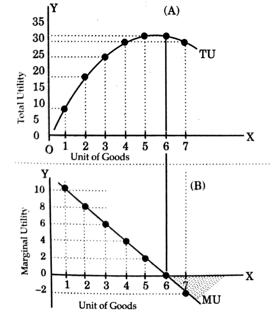

<p><strong>When to use it:</strong></p><ul><li><p>Explaining why demand curves slope downward (this is one of the underlying justifications for the law of demand — as you consume more of a good, its marginal utility falls, so you're only willing to pay a lower price for additional units).</p></li><li><p>Linking consumer behaviour theory to real-world downward-sloping demand curves.</p></li></ul><p><strong>The two graphs:</strong></p><ul><li><p><strong>Total utility (top graph):</strong> your OVERALL happiness so far, adding up all the slices. This keeps climbing — you're not unhappy from eating more pizza (yet) — but it climbs more and more slowly each time, and if you eat too much, it can eventually start to dip down (feeling sick).</p></li><li><p><strong>Marginal utility (bottom graph):</strong> just the EXTRA happiness from the latest slice, on its own. This one is clearly going downhill — sloping down and to the right, since each slice adds less than the last.</p></li></ul><p><strong>The one link to remember:</strong> the exact point where marginal utility hits zero (the extra slice adds NO happiness at all) is exactly the same point where total utility is at its highest peak.</p><p></p>
21
New cards

Short run cost curves

AC AVC AFC MC

When to use it:

  • Explaining a firm's short-run cost structure and how it makes production decisions.

  • Foundation for market structure diagrams later (perfect competition, monopoly etc. all use MC/AC curves to determine profit-maximising output).

  • Explaining the law of diminishing returns.

Fixed costs = things you pay no matter what,

Variable costs = things that change with how much you bake — flour, electricity, extra staff. AVC is this cost per loaf.

AC = your total cost per loaf (fixed + variable combined).

MC = the cost of baking just ONE more loaf.

Why the curves dip then rise (U-shaped): at first, hiring a bit more staff/using your oven more efficiently makes each extra loaf cheaper to produce. But eventually your kitchen gets crowded, ovens are maxed out, workers get in each other's way — so each EXTRA loaf starts costing more and more to make. That's why MC (and then AVC and AC) eventually curve back upward.

The one weird rule to remember: the MC line always crosses AVC and AC exactly at their lowest points.


<p>AC AVC AFC MC</p><p><strong>When to use it:</strong></p><ul><li><p>Explaining a firm's short-run cost structure and how it makes production decisions.</p></li><li><p>Foundation for market structure diagrams later (perfect competition, monopoly etc. all use MC/AC curves to determine profit-maximising output).</p></li><li><p>Explaining the law of diminishing returns.</p></li></ul><p><strong>Fixed costs</strong> = things you pay no matter what,</p><p><strong>Variable costs</strong> = things that change with how much you bake — flour, electricity, extra staff. <strong>AVC</strong> is this cost per loaf.</p><p><strong>AC</strong> = your total cost per loaf (fixed + variable combined).</p><p><strong>MC</strong> = the cost of baking just ONE more loaf.</p><p><strong>Why the curves dip then rise (U-shaped):</strong> at first, hiring a bit more staff/using your oven more efficiently makes each extra loaf cheaper to produce. But eventually your kitchen gets crowded, ovens are maxed out, workers get in each other's way — so each EXTRA loaf starts costing more and more to make. That's why MC (and then AVC and AC) eventually curve back upward.</p><p><strong>The one weird rule to remember:</strong> the MC line always crosses AVC and AC exactly at their lowest points.</p><p></p>
22
New cards

LRAC

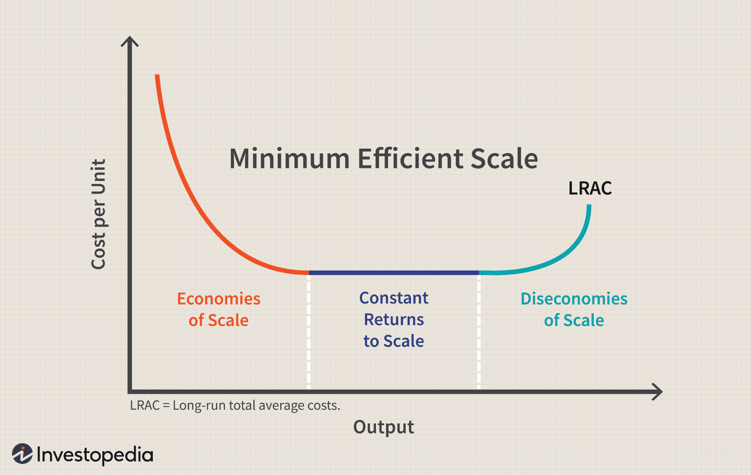
Long run average cost curve

When to use it:

  • Explaining why firms grow, and the limits to how big is beneficial.

  • Comparing industries with different minimum efficient scales (e.g. natural monopoly — link to Section 9 — occurs when MES is so large relative to market demand that only one firm can efficiently supply the whole market).

  • Evaluating merger/takeover decisions.

This time, imagine the bakery can build a bigger factory (unlike before, NOTHING is fixed anymore — everything can change, including the size of the building).

  • As the bakery grows bigger (more ovens, bulk-buying flour cheaper, hiring specialist bakers), the cost per loaf falls — this is called economies of scale.

  • At some point, it hits its cheapest possible cost per loaf — the "sweet spot" size.

  • But if it grows even bigger than that (say, becomes a huge factory), things start going wrong — managers can't keep track of everyone, communication breaks down, workers feel like just a number — so cost per loaf starts rising again. This is diseconomies of scale.

DOS-3C’s communication control coordination

One-line summary: Same U-shape idea as before, but this time it's about the SIZE of the whole business, not just how much you produce today with your current setup.

<p>Long run average cost curve</p><p><strong>When to use it:</strong></p><ul><li><p>Explaining why firms grow, and the limits to how big is beneficial.</p></li><li><p>Comparing industries with different minimum efficient scales (e.g. natural monopoly — link to Section 9 — occurs when MES is so large relative to market demand that only one firm can efficiently supply the whole market).</p></li><li><p>Evaluating merger/takeover decisions.</p></li></ul><p>This time, imagine the bakery can build a bigger factory (unlike before, NOTHING is fixed anymore — everything can change, including the size of the building).</p><ul><li><p>As the bakery grows bigger (more ovens, bulk-buying flour cheaper, hiring specialist bakers), the cost per loaf <strong>falls</strong> — this is called economies of scale.</p></li><li><p>At some point, it hits its cheapest possible cost per loaf — the "sweet spot" size.</p></li><li><p>But if it grows even bigger than that (say, becomes a huge factory), things start going wrong — managers can't keep track of everyone, communication breaks down, workers feel like just a number — so cost per loaf starts <strong>rising again</strong>. This is diseconomies of scale.</p></li></ul><p>DOS-3C’s communication control coordination</p><p><strong>One-line summary:</strong> Same U-shape idea as before, but this time it's about the SIZE of the whole business, not just how much you produce today with your current setup.</p><p></p>
23
New cards

Total, average and marginal revenue curve

When to use it:

  • Essential building block for market structure diagrams (Section 9) — you need AR and MR curves to find the profit-maximising output level in any market structure diagram (monopoly, oligopoly, monopolistic competition all use MR=MC to find optimal output).

  • Explaining the link between elasticity and revenue (when demand is elastic, MR is positive and cutting price raises TR; when demand is inelastic, MR is negative and cutting price lowers TR)

One-line summary: AR is just your price; MR is the extra money from one more sale, which drops off faster than price does; and your total income peaks exactly when that "extra money from one more sale" hits zero. So when MR=0

<p><strong>When to use it:</strong></p><ul><li><p>Essential building block for market structure diagrams (Section 9) — you need AR and MR curves to find the profit-maximising output level in any market structure diagram (monopoly, oligopoly, monopolistic competition all use MR=MC to find optimal output).</p></li><li><p>Explaining the link between elasticity and revenue (when demand is elastic, MR is positive and cutting price raises TR; when demand is inelastic, MR is negative and cutting price lowers TR)</p></li></ul><p><strong>One-line summary:</strong> AR is just your price; MR is the extra money from one more sale, which drops off faster than price does; and your total income peaks exactly when that "extra money from one more sale" hits zero. So when MR=0</p>
24
New cards

Efficiency

Seen on diagrams these are properties

Productive efficiency — occurs when a firm produces at the lowest possible average cost, using the optimal combination of factors of production; no resources are wasted.

-On a cost curve diagram, lowest point of the AC curve

-On a PPF diagram


Allocative efficiency — occurs when resources are allocated in a way that matches consumer preferences exactly allocative efficiency means "are we making the stuff people actually want, in the right amounts?

-On a standard supply and demand diagram, allocative efficiency occurs exactly at the market equilibrium point, where the demand curve

-On market structure diagrams (Section 9), you check for allocative efficiency by seeing whether the firm produces where Price = MC. In perfect competition, this happens naturally. In monopoly, price is typically ABOVE marginal cost, so monopolies are allocatively inefficient — this is a very common exam comparison point.

When to use it:

  • Comparing market structures (is the firm producing the "right" amount for society, given consumer demand?).

  • Evaluating monopoly power, market failure, and government intervention questions.


X-inefficiency — occurs when a firm does not have the incentive to minimise its costs, resulting in production at a higher average cost than technically necessary; often associated with a lack of competitive pressure (e.g. monopolies).

Where it's shown:

  • On a standard AC/cost curve diagram: the firm is shown producing at a point ABOVE the AC curve, rather than on it — representing wasted resources/costs higher than the technical minimum for that output level.

  • Sometimes shown as a shift of the entire AC curve upward compared to a more efficient firm's AC curve, to represent generally bloated costs throughout.

Why it happens:

  • Lack of competition (e.g. a monopoly doesn't face pressure to cut costs since it has no rivals).

  • Poor management, complacency, lack of profit motive to be efficient (this is very relevant in discussions of nationalised/state-run monopolies too).

When to use it:

  • Evaluating monopoly power — a classic essay point is that while monopolies CAN benefit from economies of scale (lower costs from being big), they might also suffer from X-inefficiency (higher costs from lack of competitive pressure) — these two effects can partially cancel each other out, and this tension is a strong evaluation point AQA rewards.

  • Discussing privatisation/nationalisation debates — a common argument for privatisation is that introducing competition reduces X-inefficiency in previously state-run monopolies.


25
New cards

Perfect competition

  • Perfect competition — a theoretical market structure with many buyers and sellers, homogeneous (identical) products, perfect information, no barriers to entry/exit, and firms are "price takers."

  • Price taker — a firm that has no influence over the market price and must accept the price set by the whole market/industry.

Short run — can farmers make big profits?

  • Yes, temporarily! If carrots are selling for more than it costs the farmer to grow them (on average), the farmer is raking in extra ("supernormal") profit.

But here's the catch — the long run:

  • Because it's SO easy for anyone to become a carrot farmer (no barriers to entry), other people see those juicy profits and jump in too.

  • More farmers = more carrots grown overall = supply increases = price gets pushed back DOWN.

  • This keeps happening until the price falls so much that farmers are only making just enough profit to make it worth staying in business (called "normal profit") — no more, no less.

  • At that point, nobody new bothers entering (not enough extra profit to be worth it), and nobody currently farming bothers leaving either. This is the stable, long-run outcome.

One-line summary: Everyone sells identical stuff, nobody can charge more than anyone else, so profits above the bare minimum always get wiped out over time as new competitors pile in.

It is not one single diagram. It is two distinct diagrams drawn side-by-side to show the relationship between the whole industry (Supply and Demand) and one single firm (Short-Run Costs).

<ul><li><p><strong>Perfect competition</strong> — a theoretical market structure with many buyers and sellers, homogeneous (identical) products, perfect information, no barriers to entry/exit, and firms are "price takers."</p></li><li><p><strong>Price taker</strong> — a firm that has no influence over the market price and must accept the price set by the whole market/industry.</p></li></ul><p><strong>Short run — can farmers make big profits?</strong></p><ul><li><p>Yes, temporarily! If carrots are selling for more than it costs the farmer to grow them (on average), the farmer is raking in extra ("supernormal") profit.</p></li></ul><p><strong>But here's the catch — the long run:</strong></p><ul><li><p>Because it's SO easy for anyone to become a carrot farmer (no barriers to entry), other people see those juicy profits and jump in too.</p></li><li><p>More farmers = more carrots grown overall = supply increases = price gets pushed back DOWN.</p></li><li><p>This keeps happening until the price falls so much that farmers are only making just enough profit to make it worth staying in business (called "normal profit") — no more, no less.</p></li><li><p>At that point, nobody new bothers entering (not enough extra profit to be worth it), and nobody currently farming bothers leaving either. This is the stable, long-run outcome.</p></li></ul><p><strong>One-line summary:</strong> Everyone sells identical stuff, nobody can charge more than anyone else, so profits above the bare minimum always get wiped out over time as new competitors pile in.</p><p>It is not one single diagram. It is <strong>two distinct diagrams drawn side-by-side</strong> to show the relationship between the <strong>whole industry</strong> (Supply and Demand) and <strong>one single firm</strong> (Short-Run Costs).</p>
26
New cards

Monopoly

  • Monopoly — a market structure with only one dominant seller, high barriers to entry, and significant price-setting power. (Legally, the UK defines a monopoly as a firm with 25%+ market share, though the theoretical model assumes 100%.)

  • Barriers to entry — obstacles that prevent new firms from entering a market (e.g. high start-up costs, patents, brand loyalty, legal restrictions).

  • Price maker — a firm with enough market power to influence/set the price, rather than accept a given market price.

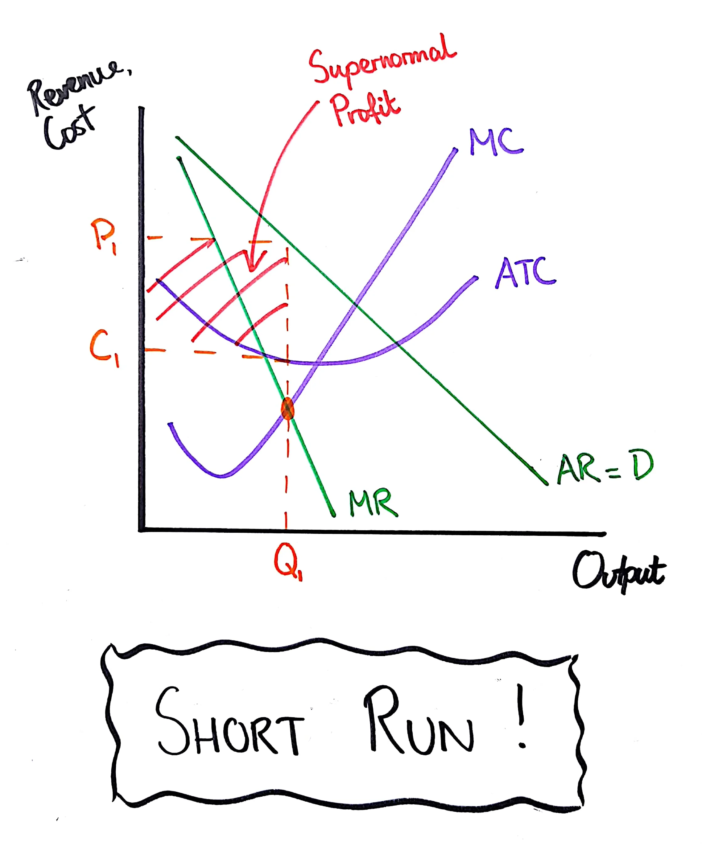
Key difference from monopolistic competition — profit is PERSISTENT:

  • Because of high barriers to entry, new firms CANNOT enter the market even if they see the monopolist making huge profits.

  • This means, unlike monopolistic competition, the AR curve does NOT shift left over time — supernormal profit can be sustained in the long run, not competed away. This is one of the most important comparison points AQA tests.

  • Allocative efficiency: monopolies set price ABOVE marginal cost (P > MC), so they are allocatively inefficient — society would prefer more output at a lower price.

  • Productive efficiency: monopolies don't produce at the lowest point of the AC curve either (same logic as monopolistic competition — the AR line isn't flat), so they're also productively inefficient... BUT (important exam nuance) monopolies might still have LOWER absolute costs than smaller competitive firms due to economies of scale (Section 7.2), even if they're not at the exact bottom of their own AC curve.

When to use it:

  • Any market dominated by a single firm (e.g. historically things like national rail infrastructure, utility companies, or firms with strong patents).

  • Comparing against perfect competition — a hugely common essay question ("compare welfare outcomes of monopoly vs perfect competition" — this links to Section 9's welfare loss diagram, coming up shortly).

<ul><li><p><strong>Monopoly</strong> — a market structure with only one dominant seller, high barriers to entry, and significant price-setting power. (Legally, the UK defines a monopoly as a firm with 25%+ market share, though the theoretical model assumes 100%.)</p></li><li><p><strong>Barriers to entry</strong> — obstacles that prevent new firms from entering a market (e.g. high start-up costs, patents, brand loyalty, legal restrictions).</p></li><li><p><strong>Price maker</strong> — a firm with enough market power to influence/set the price, rather than accept a given market price.</p></li></ul><p><strong>Key difference from monopolistic competition — profit is PERSISTENT:</strong></p><ul><li><p>Because of high barriers to entry, new firms CANNOT enter the market even if they see the monopolist making huge profits.</p></li><li><p>This means, unlike monopolistic competition, the AR curve does NOT shift left over time — <strong>supernormal profit can be sustained in the long run</strong>, not competed away. This is one of the most important comparison points AQA tests.</p></li><li><p><strong>Allocative efficiency:</strong> monopolies set price ABOVE marginal cost (P &gt; MC), so they are allocatively <strong>inefficient</strong> — society would prefer more output at a lower price.</p></li><li><p><strong>Productive efficiency:</strong> monopolies don't produce at the lowest point of the AC curve either (same logic as monopolistic competition — the AR line isn't flat), so they're also productively <strong>inefficient</strong>... BUT (important exam nuance) monopolies might still have LOWER absolute costs than smaller competitive firms due to economies of scale (Section 7.2), even if they're not at the exact bottom of their own AC curve.</p></li></ul><p><strong>When to use it:</strong></p><ul><li><p>Any market dominated by a single firm (e.g. historically things like national rail infrastructure, utility companies, or firms with strong patents).</p></li><li><p>Comparing against perfect competition — a hugely common essay question ("compare welfare outcomes of monopoly vs perfect competition" — this links to Section 9's welfare loss diagram, coming up shortly).</p></li></ul><p></p>
27
New cards

Monopolistic

When to use it:

  • Markets with lots of firms but branded/differentiated products — e.g. restaurants, hairdressers, coffee shops.

  • Comparing efficiency outcomes against perfect competition (a good essay point: monopolistic competition firms don't achieve productive efficiency, unlike perfectly competitive firms, because of the sloping demand curve — but they do offer more variety/choice for consumers, which perfect competition's identical products don't).

  • Monopolistic competition — a market structure with many firms, selling differentiated (not identical) products, with relatively low barriers to entry/exit.

  • Product differentiation — making a product distinct from competitors (through branding, quality, features), giving the firm some control over price.

How it's different from perfect competition (important distinction):

  • Because products are differentiated (not identical), the firm has SOME price-setting power — so unlike perfect competition, the demand/AR curve is downward sloping (not flat), though still relatively elastic since there are lots of close substitutes.

  • This means MR is also downward sloping, and steeper than AR (same MR/AR relationship as in Section 7).

Short-run diagram:

  • Downward sloping AR and steeper MR curves.

  • Usual U-shaped MC and AC curves.

  • Firm produces where MC = MR (profit-maximising rule).

  • If AR is above AC at this output, the firm makes supernormal profit — shown as a shaded rectangle between AR and AC at the profit-maximising quantity (same idea as perfect competition's short-run profit diagram, just with sloped AR/MR instead of flat).

Long-run diagram — profit gets competed away (similar logic to perfect competition):

  • Because barriers to entry are low, supernormal profits attract new firms offering similar (but not identical) products.

  • New entrants take away some customers from existing firms, shifting each existing firm's AR/demand curve left (they now sell less at every price, since customers have more options).

  • This continues until AR becomes tangent to (just touches) the AC curve — where the firm makes only normal profit, with no incentive left for further entry.


<p><strong>When to use it:</strong></p><ul><li><p>Markets with lots of firms but branded/differentiated products — e.g. restaurants, hairdressers, coffee shops.</p></li><li><p>Comparing efficiency outcomes against perfect competition (a good essay point: monopolistic competition firms don't achieve productive efficiency, unlike perfectly competitive firms, because of the sloping demand curve — but they do offer more variety/choice for consumers, which perfect competition's identical products don't).</p></li><li><p><strong>Monopolistic competition</strong> — a market structure with many firms, selling differentiated (not identical) products, with relatively low barriers to entry/exit.</p></li><li><p><strong>Product differentiation</strong> — making a product distinct from competitors (through branding, quality, features), giving the firm some control over price.</p></li></ul><p><strong>How it's different from perfect competition (important distinction):</strong></p><ul><li><p>Because products are differentiated (not identical), the firm has SOME price-setting power — so unlike perfect competition, the demand/AR curve is <strong>downward sloping</strong> (not flat), though still relatively elastic since there are lots of close substitutes.</p></li><li><p>This means MR is also downward sloping, and steeper than AR (same MR/AR relationship as in Section 7).</p></li></ul><p><strong>Short-run diagram:</strong></p><ul><li><p>Downward sloping AR and steeper MR curves.</p></li><li><p>Usual U-shaped MC and AC curves.</p></li><li><p>Firm produces where <strong>MC = MR</strong> (profit-maximising rule).</p></li><li><p>If AR is above AC at this output, the firm makes <strong>supernormal profit</strong> — shown as a shaded rectangle between AR and AC at the profit-maximising quantity (same idea as perfect competition's short-run profit diagram, just with sloped AR/MR instead of flat).</p></li></ul><p><strong>Long-run diagram — profit gets competed away (similar logic to perfect competition):</strong></p><ul><li><p>Because barriers to entry are low, supernormal profits attract new firms offering similar (but not identical) products.</p></li><li><p>New entrants take away some customers from existing firms, shifting each existing firm's AR/demand curve <strong>left</strong> (they now sell less at every price, since customers have more options).</p></li><li><p>This continues until AR becomes tangent to (just touches) the AC curve — where the firm makes only <strong>normal profit</strong>, with no incentive left for further entry.</p></li></ul><p></p>
28
New cards

Price discriminations

What it is: charging different customers different prices for the same product, where the price gap isn't due to different costs.

4 conditions needed for it to work:

  1. Firm has price-setting power (not perfect competition)

  2. Firm can identify/separate different customer groups

  3. No resale between groups possible

  4. Groups have different price elasticities of demand (PED)

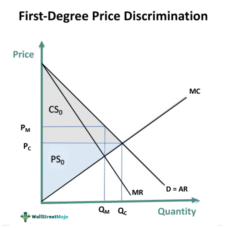
First-Degree (Perfect Price Discrimination)

  • Every single customer is charged their own personal maximum price (their exact "reservation price").

  • Diagram: one normal downward-sloping demand curve. MR = AR = the SAME line (no separate MR below it), because the firm never has to lower price for existing customers to sell more — each person just pays their own price.

  • Firm produces where MC crosses this combined AR/MR/demand line.

  • Result: firm captures ALL consumer surplus as extra profit.

  • Rarely fully achievable in reality — closest real examples: auctions, personalised online pricing.

Third-Degree (Market Segmentation)

  • Firm splits customers into a few identifiable GROUPS and charges each group ONE single price (not individual prices).

  • Diagram: typically 3 panels — sub-market A, sub-market B, and a combined market.

  • Inelastic group (few alternatives, e.g. business travellers) → steeper demand curve → HIGHER price charged.

  • Elastic group (lots of alternatives, e.g. students) → flatter demand curve → LOWER price charged.

  • Same MC=MR rule applied separately within each sub-market.

  • Real examples: peak/off-peak train tickets, student discounts, business vs economy flights.

second-degree price discrimination exists as a concept (charging different prices based on the QUANTITY consumed, not who the customer is — e.g. bulk-buy discounts, "buy one get one half price,"Each of the two panels in the third-degree diagram is essentially a mini version of the MONOPOLY diagram you already know

<p><strong>What it is:</strong> charging different customers different prices for the same product, where the price gap isn't due to different costs.</p><p><strong>4 conditions needed for it to work:</strong></p><ol><li><p>Firm has price-setting power (not perfect competition)</p></li><li><p>Firm can identify/separate different customer groups</p></li><li><p>No resale between groups possible</p></li><li><p>Groups have different price elasticities of demand (PED)</p></li></ol><p>First-Degree (Perfect Price Discrimination) </p><ul><li><p>Every single customer is charged their own personal maximum price (their exact "reservation price").</p></li><li><p><strong>Diagram:</strong> one normal downward-sloping demand curve. MR = AR = the SAME line (no separate MR below it), because the firm never has to lower price for existing customers to sell more — each person just pays their own price.</p></li><li><p>Firm produces where MC crosses this combined AR/MR/demand line.</p></li><li><p>Result: firm captures ALL consumer surplus as extra profit.</p></li><li><p>Rarely fully achievable in reality — closest real examples: auctions, personalised online pricing.</p></li></ul><p>Third-Degree (Market Segmentation) </p><ul><li><p>Firm splits customers into a few identifiable GROUPS and charges each group ONE single price (not individual prices).</p></li><li><p><strong>Diagram:</strong> typically 3 panels — sub-market A, sub-market B, and a combined market.</p></li><li><p><strong>Inelastic group</strong> (few alternatives, e.g. business travellers) → steeper demand curve → <strong>HIGHER</strong> price charged.</p></li><li><p><strong>Elastic group</strong> (lots of alternatives, e.g. students) → flatter demand curve → <strong>LOWER</strong> price charged.</p></li><li><p>Same MC=MR rule applied separately within each sub-market.</p></li><li><p>Real examples: peak/off-peak train tickets, student discounts, business vs economy flights.</p></li></ul><p><strong>second-degree price discrimination</strong> exists as a concept (charging different prices based on the QUANTITY consumed, not who the customer is — e.g. bulk-buy discounts, "buy one get one half price,"Each of the two panels in the third-degree diagram is essentially a mini version of the MONOPOLY diagram you already know</p><p></p>
29
New cards

Contestable market

Key terms (AQA definitions):

  • Contestable market — a market with low barriers to entry AND exit, where firms face a constant threat of new competitors entering, regardless of the number of firms currently in the market.

  • Barriers to exit — costs or obstacles that make it difficult for a firm to leave a market (e.g. sunk costs — money spent that can't be recovered).

  • Sunk costs — costs that have already been incurred and cannot be recovered if a firm leaves the market (e.g. specialised machinery with no resale value).

  • Hit-and-run competition — the idea that a new firm can enter a market, take advantage of high profits, then leave quickly (with little cost) if incumbents retaliate or profits fall.

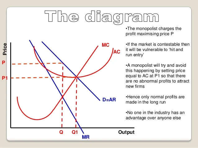
Important note about the diagram: contestable market theory doesn't have ONE single unique diagram shape you draw from scratch (unlike, say, the monopoly diagram). Instead, AQA usually wants you to apply the theory to an EXISTING diagram — typically the monopoly diagram — to show how the THREAT of competition changes a firm's behaviour, even if no actual new firm ever enters.

What's shown/how it's used:

  • Start with a normal monopoly-style diagram (AR, MR, MC, AC).

  • The theory argues that even though the firm LOOKS like a monopoly (one seller, downward-sloping AR), the constant THREAT of new entrants forces the firm to behave more like it's in a competitive market.

  • Because entry and exit are easy (low sunk costs), if the monopolist tries to charge the normal profit-maximising monopoly price (where MC=MR), a new firm could swoop in, undercut them, grab the profit, and leave again before the incumbent can retaliate.

  • To PREVENT this, the incumbent firm is forced to charge a LOWER price than the standard monopoly price — often pushed down toward normal profit only (AR = AC), similar to the long-run monopolistic competition outcome, or even down towards a price closer to average cost = price (limit pricing), to remove the incentive for anyone to bother entering.

  • So on the diagram, you'd show the theoretical monopoly profit-maximising point (MC=MR, big profit rectangle), then show/annotate a LOWER price closer to AC, labelled as "contestable market price" — demonstrating that the threat of competition alone drives price down towards a more competitive outcome, without a single new firm actually entering.

  • When to use it:

    • Explaining why some monopolies/oligopolies don't always charge the theoretical profit-maximising price predicted by the basic monopoly model.

    • Real-world examples: budget airlines (relatively low sunk costs — planes can be leased and moved to different routes), some retail sectors.

    • Evaluating deregulation policies — governments sometimes try to make markets MORE contestable (lowering barriers to entry/exit) as an alternative to breaking up a monopoly, in order to indirectly force lower prices/better behaviour through the threat of competition.

    Key evaluation points:

    • Pros: can deliver competitive-style outcomes (lower prices, better efficiency) without needing many actual firms in the market at once — cheaper/easier for regulators than trying to force literal market restructuring.

    • Cons: relies heavily on sunk costs actually being low in reality — many industries have unavoidable sunk costs (e.g. specialised infrastructure) making "hit-and-run" entry unrealistic; incumbents may also use aggressive tactics (predatory pricing, brand loyalty building) specifically designed to raise the effective barriers and deter contestability even if formal/legal barriers are low.

<p><strong>Key terms (AQA definitions):</strong></p><ul><li><p><strong>Contestable market</strong> — a market with low barriers to entry AND exit, where firms face a constant threat of new competitors entering, regardless of the number of firms currently in the market.</p></li><li><p><strong>Barriers to exit</strong> — costs or obstacles that make it difficult for a firm to leave a market (e.g. sunk costs — money spent that can't be recovered).</p></li><li><p><strong>Sunk costs</strong> — costs that have already been incurred and cannot be recovered if a firm leaves the market (e.g. specialised machinery with no resale value).</p></li><li><p><strong>Hit-and-run competition</strong> — the idea that a new firm can enter a market, take advantage of high profits, then leave quickly (with little cost) if incumbents retaliate or profits fall.</p></li></ul><p><strong>Important note about the diagram:</strong> contestable market theory doesn't have ONE single unique diagram shape you draw from scratch (unlike, say, the monopoly diagram). Instead, <strong>AQA usually wants you to apply the theory to an EXISTING diagram — typically the monopoly diagram</strong> — to show how the THREAT of competition changes a firm's behaviour, even if no actual new firm ever enters.</p><p><strong>What's shown/how it's used:</strong></p><ul><li><p>Start with a normal monopoly-style diagram (AR, MR, MC, AC).</p></li><li><p>The theory argues that even though the firm LOOKS like a monopoly (one seller, downward-sloping AR), the constant THREAT of new entrants forces the firm to behave more like it's in a competitive market.</p></li><li><p>Because entry and exit are easy (low sunk costs), if the monopolist tries to charge the normal profit-maximising monopoly price (where MC=MR), a new firm could swoop in, undercut them, grab the profit, and leave again before the incumbent can retaliate.</p></li><li><p>To PREVENT this, the incumbent firm is forced to charge a LOWER price than the standard monopoly price — often pushed down toward <strong>normal profit only</strong> (AR = AC), similar to the long-run monopolistic competition outcome, or even down towards a price closer to <strong>average cost = price</strong> (limit pricing), to remove the incentive for anyone to bother entering.</p></li><li><p>So on the diagram, you'd show the theoretical monopoly profit-maximising point (MC=MR, big profit rectangle), then show/annotate a LOWER price closer to AC, labelled as "contestable market price" — demonstrating that the threat of competition alone drives price down towards a more competitive outcome, without a single new firm actually entering.</p></li><li><p><strong>When to use it:</strong></p><ul><li><p>Explaining why some monopolies/oligopolies don't always charge the theoretical profit-maximising price predicted by the basic monopoly model.</p></li><li><p>Real-world examples: budget airlines (relatively low sunk costs — planes can be leased and moved to different routes), some retail sectors.</p></li><li><p>Evaluating deregulation policies — governments sometimes try to make markets MORE contestable (lowering barriers to entry/exit) as an alternative to breaking up a monopoly, in order to indirectly force lower prices/better behaviour through the threat of competition.</p></li></ul><p><strong>Key evaluation points:</strong></p><ul><li><p><strong>Pros:</strong> can deliver competitive-style outcomes (lower prices, better efficiency) without needing many actual firms in the market at once — cheaper/easier for regulators than trying to force literal market restructuring.</p></li><li><p><strong>Cons:</strong> relies heavily on sunk costs actually being low in reality — many industries have unavoidable sunk costs (e.g. specialised infrastructure) making "hit-and-run" entry unrealistic; incumbents may also use aggressive tactics (predatory pricing, brand loyalty building) specifically designed to raise the effective barriers and deter contestability even if formal/legal barriers are low.</p></li></ul></li></ul><p></p>
30
New cards

Natural monopoly

Natural monopoly — occurs when the most efficient number of firms in a market is ONE, because the minimum efficient scale (MES) is so large relative to total market demand that a single firm can supply the whole market at a lower average cost than two or more firms could

Why one firm is better here:

  • If you split the market between 2+ firms, each one produces LESS output individually — meaning each sits further LEFT on the still-falling LRAC curve, at a HIGHER cost per unit.

  • So having ONE firm supply everyone actually keeps costs lower than having several smaller competitors.

Real-world examples: water pipes, electricity grids, railway tracks — anything needing hugely expensive infrastructure that would be wasteful to duplicate.

Why it matters:

  • Justifies why these industries are often left as a single firm (or nationalised) rather than being broken up to "create competition."

  • BUT — since there's no competition, the firm could still exploit customers with high prices/restricted output, so governments usually regulate these firms (price caps, etc. — this links to Section 10).
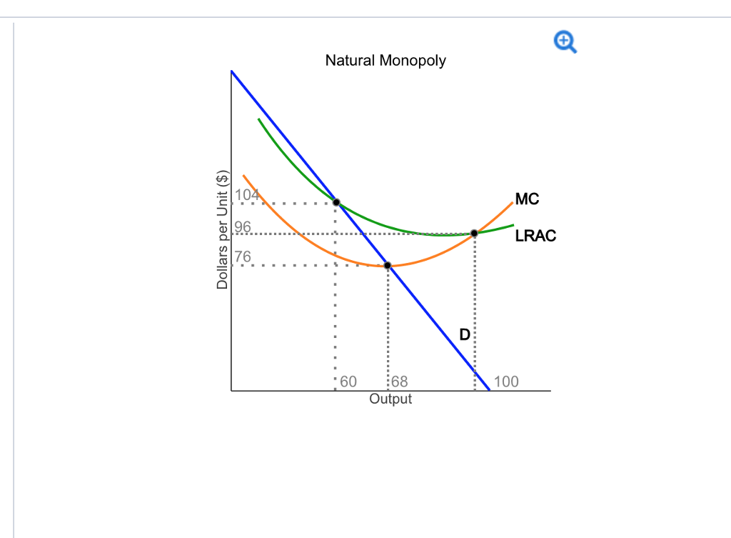

<p><strong>Natural monopoly</strong> — occurs when the most efficient number of firms in a market is ONE, because the minimum efficient scale (MES) is so large relative to total market demand that a single firm can supply the whole market at a lower average cost than two or more firms could</p><p><strong>Why one firm is better here:</strong></p><ul><li><p>If you split the market between 2+ firms, each one produces LESS output individually — meaning each sits further LEFT on the still-falling LRAC curve, at a HIGHER cost per unit.</p></li><li><p>So having ONE firm supply everyone actually keeps costs lower than having several smaller competitors.</p></li></ul><p><strong>Real-world examples:</strong> water pipes, electricity grids, railway tracks — anything needing hugely expensive infrastructure that would be wasteful to duplicate.</p><p><strong>Why it matters:</strong></p><ul><li><p>Justifies why these industries are often left as a single firm (or nationalised) rather than being broken up to "create competition."</p></li><li><p>BUT — since there's no competition, the firm could still exploit customers with high prices/restricted output, so governments usually regulate these firms (price caps, etc. — this links to Section 10).</p></li></ul><p></p>
31
New cards

Oligopoly-kinked demand curves

What happens if Tesco RAISES its price?

  • Asda and Sainsbury's think: "Great, let's just keep our prices where they are and scoop up all the customers who leave Tesco."

  • So Tesco loses LOADS of customers, because nobody follows them up.

  • This means: if you raise price, you lose a lot of sales → demand is very sensitive (elastic) above the current price.

What happens if Tesco LOWERS its price?

  • Asda and Sainsbury's think: "We can't let Tesco steal our customers — let's cut our prices too to match them."

  • So everyone cuts prices together, and Tesco doesn't actually gain that many extra customers, because its competitors just cut prices too and customers don't have much reason to switch.

  • This means: if you lower price, you don't gain much extra sales → demand is not very sensitive (inelastic) below the current price.

Put those two together and you get a "kinked" demand line:

  • Flat/shallow ABOVE the current price (raising price = big sales loss)

  • Steep BELOW the current price (lowering price = barely any sales gain)

  • The kink (bend) happens right at the current price

The MR curve — this is the most distinctive/testable feature:

  • Because of the kink in the demand curve, the MR curve has a vertical discontinuity (a gap/break) directly below the kink point — MR doesn't smoothly connect; it jumps down suddenly at that quantity.

  • This vertical gap in MR is the whole POINT of the model: it means that MC can shift up OR down within that gap without changing the profit-maximising price or quantity at all, since MC still crosses somewhere within the vertical break, giving the same MC=MR point.

Why this matters (the actual explanation, not just a rule):

  • Because MC can move around within that gap and MC=MR still lands on the SAME output/price point, this explains why oligopolists' prices can stay "sticky"/stable for a long time even if their costs change moderately — there's no incentive to change price because doing so (either up or down) would make them worse off given how rivals are expected to react.

When to use it:

  • Explaining price stability/rigidity in oligopolistic markets (e.g. supermarkets, petrol stations often observed to have relatively stable prices for periods, with competition happening through other means instead).

  • A good lead-in to discussing non-price competition (advertising, loyalty schemes, product differentiation) as the way oligopolists tend to compete instead of through price changes, since price wars are seen as risky/unprofitable under this model.

Limitations of the model (important evaluation points AQA likes):

  • It explains price stability but does NOT explain how the initial price (P1) was set in the first place.

  • Real-world oligopoly behaviour often doesn't perfectly match this model — price wars DO happen sometimes in reality, and collusion (formal or tacit) is common, which this model doesn't directly address.

  • It's considered a simplified/dated model by many economists — often criticised for being more of a theoretical curiosity than a fully accurate description of real oligopoly pricing behaviour.


<p><strong>What happens if Tesco RAISES its price?</strong></p><ul><li><p>Asda and Sainsbury's think: "Great, let's just keep our prices where they are and scoop up all the customers who leave Tesco."</p></li><li><p>So Tesco loses LOADS of customers, because nobody follows them up.</p></li><li><p>This means: if you raise price, you lose a lot of sales → demand is very sensitive (elastic) above the current price.</p></li></ul><p><strong>What happens if Tesco LOWERS its price?</strong></p><ul><li><p>Asda and Sainsbury's think: "We can't let Tesco steal our customers — let's cut our prices too to match them."</p></li><li><p>So everyone cuts prices together, and Tesco doesn't actually gain that many extra customers, because its competitors just cut prices too and customers don't have much reason to switch.</p></li><li><p>This means: if you lower price, you don't gain much extra sales → demand is not very sensitive (inelastic) below the current price.</p></li></ul><p><strong>Put those two together and you get a "kinked" demand line:</strong></p><ul><li><p>Flat/shallow ABOVE the current price (raising price = big sales loss)</p></li><li><p>Steep BELOW the current price (lowering price = barely any sales gain)</p></li><li><p>The kink (bend) happens right at the current price</p></li></ul><p><strong>The MR curve — this is the most distinctive/testable feature:</strong></p><ul><li><p>Because of the kink in the demand curve, the MR curve has a <strong>vertical discontinuity (a gap/break)</strong> directly below the kink point — MR doesn't smoothly connect; it jumps down suddenly at that quantity.</p></li><li><p>This vertical gap in MR is the whole POINT of the model: it means that MC can shift up OR down within that gap <strong>without changing the profit-maximising price or quantity at all</strong>, since MC still crosses somewhere within the vertical break, giving the same MC=MR point.</p></li></ul><p><strong>Why this matters (the actual explanation, not just a rule):</strong></p><ul><li><p>Because MC can move around within that gap and MC=MR still lands on the SAME output/price point, this explains why oligopolists' prices can stay "sticky"/stable for a long time even if their costs change moderately — there's no incentive to change price because doing so (either up or down) would make them worse off given how rivals are expected to react.</p></li></ul><p><strong>When to use it:</strong></p><ul><li><p>Explaining price stability/rigidity in oligopolistic markets (e.g. supermarkets, petrol stations often observed to have relatively stable prices for periods, with competition happening through other means instead).</p></li><li><p>A good lead-in to discussing <strong>non-price competition</strong> (advertising, loyalty schemes, product differentiation) as the way oligopolists tend to compete instead of through price changes, since price wars are seen as risky/unprofitable under this model.</p></li></ul><p><strong>Limitations of the model (important evaluation points AQA likes):</strong></p><ul><li><p>It explains price stability but does NOT explain how the initial price (P1) was set in the first place.</p></li><li><p>Real-world oligopoly behaviour often doesn't perfectly match this model — price wars DO happen sometimes in reality, and collusion (formal or tacit) is common, which this model doesn't directly address.</p></li><li><p>It's considered a simplified/dated model by many economists — often criticised for being more of a theoretical curiosity than a fully accurate description of real oligopoly pricing behaviour.</p></li></ul><p></p>
32
New cards

Game theory

  • Game theory — the study of strategic decision-making, where the outcome for one firm depends on the actions of another firm (or firms).

  • Payoff matrix — a table showing the possible outcomes (payoffs, usually profits) for two firms, based on the combination of strategies each one chooses.

  • Dominant strategy — a strategy that gives a firm the best outcome regardless of what the other firm chooses to do.

  • Nash equilibrium — an outcome where neither firm can improve its own payoff by changing its strategy alone, given what the other firm is doing (each firm's strategy is the best response to the other's).

  • Collusion — when firms agree (formally or informally) to cooperate rather than compete, e.g. by fixing prices or output, to increase their joint profits.

When to use it:

  • Explaining interdependence in oligopoly (linking back to why the kinked demand curve exists in the first place).

  • Explaining why cartels/collusion form, and why they're often unstable (each firm has an incentive to secretly "cheat" and undercut the other, since Low Price is still individually tempting even within a collusive agreement).

  • Government competition policy questions (why regulators try to prevent collusion).


<ul><li><p><strong>Game theory</strong> — the study of strategic decision-making, where the outcome for one firm depends on the actions of another firm (or firms).</p></li><li><p><strong>Payoff matrix</strong> — a table showing the possible outcomes (payoffs, usually profits) for two firms, based on the combination of strategies each one chooses.</p></li><li><p><strong>Dominant strategy</strong> — a strategy that gives a firm the best outcome regardless of what the other firm chooses to do.</p></li><li><p><strong>Nash equilibrium</strong> — an outcome where neither firm can improve its own payoff by changing its strategy alone, given what the other firm is doing (each firm's strategy is the best response to the other's).</p></li><li><p><strong>Collusion</strong> — when firms agree (formally or informally) to cooperate rather than compete, e.g. by fixing prices or output, to increase their joint profits.</p></li></ul><p><strong>When to use it:</strong></p><ul><li><p>Explaining interdependence in oligopoly (linking back to why the kinked demand curve exists in the first place).</p></li><li><p>Explaining why cartels/collusion form, and why they're often unstable (each firm has an incentive to secretly "cheat" and undercut the other, since Low Price is still individually tempting even within a collusive agreement).</p></li><li><p>Government competition policy questions (why regulators try to prevent collusion).</p></li></ul><p></p>
33
New cards

Monopoly vs perfect competition

Monopoly and perfect comp diagrams overlayed

The welfare comparison (the whole point of this diagram):

  • Under monopoly: consumer surplus SHRINKS (higher price, less output) — part of the lost consumer surplus is transferred to the monopolist as extra producer surplus/profit (a rectangle), and part of it is lost completely to society as a deadweight welfare loss triangle (between Qm and Qpc).

  • So monopoly results in: higher price, lower output, a transfer of surplus from consumers to the producer, AND a net loss of overall welfare to society (the triangle) that benefits nobody.

When to use it:

  • The classic essay/exam diagram for questions like "using a diagram, compare the welfare implications of monopoly versus perfect competition" or "assess the case against monopoly power."

Evaluation points to balance this out (important for a full-mark essay):

  • This model assumes the cost structure would be IDENTICAL whether the industry was run competitively or as a monopoly — in reality, monopolies might have LOWER costs due to economies of scale (Section 7.2), which could offset or even outweigh the welfare loss shown here.

  • Monopolies might reinvest profits into R&D/innovation (dynamic efficiency), potentially benefiting consumers in the long run in ways this static diagram doesn't capture.

  • The diagram assumes a monopoly charges a single uniform price — if the firm price discriminates (Section 9.4), the welfare loss picture changes (e.g. first-degree discrimination can actually restore output to the competitive level, removing the deadweight loss triangle, even though it transfers surplus differently).
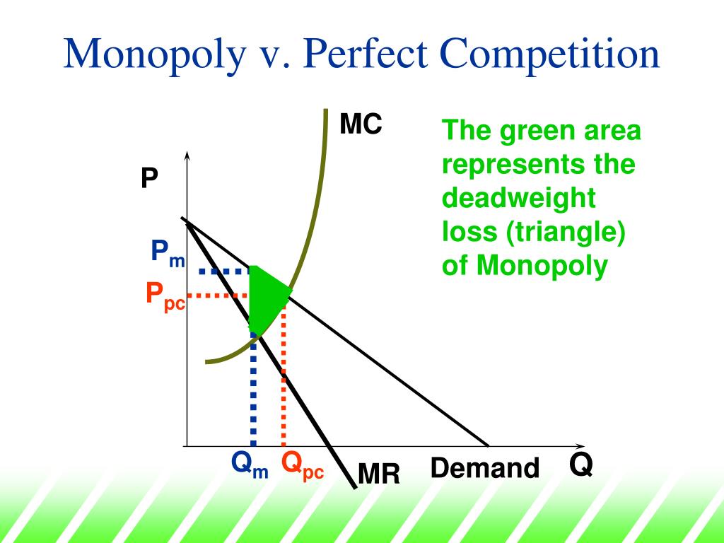

<p><strong>Monopoly and perfect comp diagrams overlayed </strong></p><p><strong>The welfare comparison (the whole point of this diagram):</strong></p><ul><li><p>Under monopoly: consumer surplus SHRINKS (higher price, less output) — part of the lost consumer surplus is <strong>transferred to the monopolist as extra producer surplus/profit</strong> (a rectangle), and part of it is <strong>lost completely</strong> to society as a <strong>deadweight welfare loss triangle</strong> (between Qm and Qpc).</p></li><li><p>So monopoly results in: higher price, lower output, a transfer of surplus from consumers to the producer, AND a net loss of overall welfare to society (the triangle) that benefits nobody.</p></li></ul><p><strong>When to use it:</strong></p><ul><li><p>The classic essay/exam diagram for questions like "using a diagram, compare the welfare implications of monopoly versus perfect competition" or "assess the case against monopoly power."</p></li></ul><p><strong>Evaluation points to balance this out (important for a full-mark essay):</strong></p><ul><li><p>This model assumes the cost structure would be IDENTICAL whether the industry was run competitively or as a monopoly — in reality, monopolies might have LOWER costs due to economies of scale (Section 7.2), which could offset or even outweigh the welfare loss shown here.</p></li><li><p>Monopolies might reinvest profits into R&amp;D/innovation (dynamic efficiency), potentially benefiting consumers in the long run in ways this static diagram doesn't capture.</p></li><li><p>The diagram assumes a monopoly charges a single uniform price — if the firm price discriminates (Section 9.4), the welfare loss picture changes (e.g. first-degree discrimination can actually restore output to the competitive level, removing the deadweight loss triangle, even though it transfers surplus differently).</p></li></ul><p></p>
34
New cards

Regulation of monopoly

  • Price cap regulation — a form of government/regulatory control that limits the maximum price a monopoly (often a natural monopoly/utility) can charge.

  • RPI-X regulation — a specific type of price cap where a firm's prices are allowed to rise by the Retail Price Index (RPI, a measure of inflation) MINUS a set percentage (X), which is meant to represent expected efficiency savings the firm should be making. This forces the firm's REAL prices to fall over time (in real terms), pushing it to become more efficient.

When to use it:

  • Discussing government regulation of utilities (water, energy, telecoms) — real-world UK regulators like Ofwat, Ofgem, and Ofcom use price cap regulation like this.

  • Evaluating alternatives to breaking up a natural monopoly (Section 9.6) — since splitting up a natural monopoly would increase costs (remember, natural monopolies are efficient specifically BECAUSE they're single firms), regulation is often preferred over structural breakup.

Evaluation points:

  • Pros: lower prices, higher output, keeps the cost benefits of a single large firm.

  • Cons: regulator doesn't know the firm's true costs as well as the firm does (information asymmetry) — hard to set the cap correctly; risk of "regulatory capture" (regulator becomes too cosy with the firm); might discourage investment if profits get squeezed too much.

One-line summary: the government caps the price a monopoly can charge, pushing it to produce more at a lower price (closer to the competitive outcome), but setting the right cap is tricky since the regulator doesn't know the firm's real costs as well as the firm itself does.
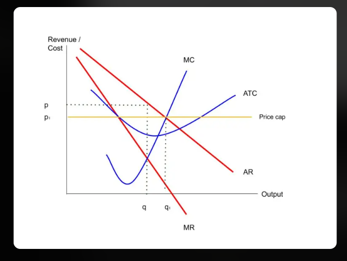

<ul><li><p><strong>Price cap regulation</strong> — a form of government/regulatory control that limits the maximum price a monopoly (often a natural monopoly/utility) can charge.</p></li><li><p><strong>RPI-X regulation</strong> — a specific type of price cap where a firm's prices are allowed to rise by the Retail Price Index (RPI, a measure of inflation) MINUS a set percentage (X), which is meant to represent expected efficiency savings the firm should be making. This forces the firm's REAL prices to fall over time (in real terms), pushing it to become more efficient.</p></li></ul><p><strong>When to use it:</strong></p><ul><li><p>Discussing government regulation of utilities (water, energy, telecoms) — real-world UK regulators like Ofwat, Ofgem, and Ofcom use price cap regulation like this.</p></li><li><p>Evaluating alternatives to breaking up a natural monopoly (Section 9.6) — since splitting up a natural monopoly would increase costs (remember, natural monopolies are efficient specifically BECAUSE they're single firms), regulation is often preferred over structural breakup.</p></li></ul><p><strong>Evaluation points:</strong></p><ul><li><p><strong>Pros:</strong> lower prices, higher output, keeps the cost benefits of a single large firm.</p></li><li><p><strong>Cons:</strong> regulator doesn't know the firm's true costs as well as the firm does (information asymmetry) — hard to set the cap correctly; risk of "regulatory capture" (regulator becomes too cosy with the firm); might discourage investment if profits get squeezed too much.</p></li></ul><p><strong>One-line summary:</strong> the government caps the price a monopoly can charge, pushing it to produce more at a lower price (closer to the competitive outcome), but setting the right cap is tricky since the regulator doesn't know the firm's real costs as well as the firm itself does.</p><p></p>
35
New cards

Labour demand and supply

  • Demand for labour = how many workers firms want to hire at each wage. Slopes DOWN — the higher the wage, the fewer workers a firm wants to hire (workers get expensive).

  • Supply of labour = how many people want to work at each wage. Slopes UP — the higher the wage, the more people want that job.

  • Where they cross = the going wage for that job, and how many people get hired.

  • One-line summary: exactly the same idea as a normal supply and demand diagram, just relabelled for jobs and wages instead of goods and prices.


<ul><li><p><strong>Demand for labour</strong> = how many workers firms want to hire at each wage. Slopes DOWN — the higher the wage, the fewer workers a firm wants to hire (workers get expensive).</p></li><li><p><strong>Supply of labour</strong> = how many people want to work at each wage. Slopes UP — the higher the wage, the more people want that job.</p></li><li><p>Where they cross = the going wage for that job, and how many people get hired.</p></li><li><p><strong>One-line summary:</strong> exactly the same idea as a normal supply and demand diagram, just relabelled for jobs and wages instead of goods and prices.</p></li></ul><p></p>
36
New cards

Monopsony

Imagine a small town with only ONE major employer — say, one big factory. If you want a job in that town, you basically have to work there — there's no other real option.

Why this changes things:

  • Because the factory is the ONLY buyer of labour, it has power over the wage — it can get away with paying LESS than it would have to in a town with lots of competing employers.

  • Here's the tricky bit though: if the factory wants to hire MORE workers, it has to raise wages to attract them. But — same idea as the umbrella-pricing example we did earlier — it can't pay the NEW worker more than existing workers doing the same job. So raising the wage to attract one extra person means giving EVERYONE a pay rise, not just the new hire.

  • This means the TRUE cost of hiring one more worker (MCL) is actually much higher than what the "going rate" wage line (ACL) suggests, because of that knock-on pay rise to everyone else.

How the factory decides how many people to hire:

  • It hires up to the point where the (very steep) true cost of hiring one more worker (MCL) matches how much extra value that worker brings in (MRP/demand).

  • Then, to find the WAGE it actually pays, look at the normal supply line (ACL) at that same number of workers.

The result: the factory ends up hiring FEWER workers AND paying a LOWER wage than it would if there were lots of competing employers in the area. This is basically "exploiting" its position as the only employer in town.

One-line summary: with only one employer, hiring one more worker means giving everyone a pay rise, so the employer deliberately keeps the workforce smaller and wages lower than a competitive market would.
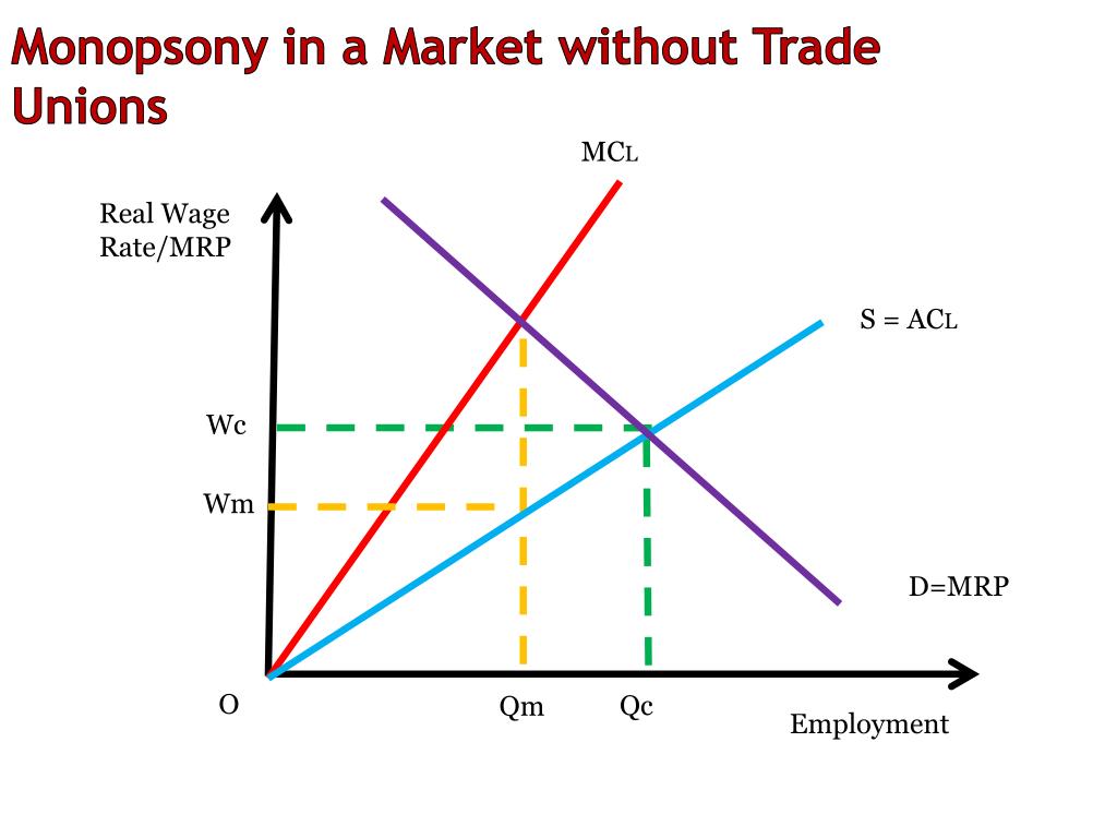
<p>Imagine a small town with only ONE major employer — say, one big factory. If you want a job in that town, you basically have to work there — there's no other real option.</p><p><strong>Why this changes things:</strong></p><ul><li><p>Because the factory is the ONLY buyer of labour, it has power over the wage — it can get away with paying LESS than it would have to in a town with lots of competing employers.</p></li><li><p>Here's the tricky bit though: if the factory wants to hire MORE workers, it has to raise wages to attract them. But — same idea as the umbrella-pricing example we did earlier — it can't pay the NEW worker more than existing workers doing the same job. So raising the wage to attract one extra person means giving EVERYONE a pay rise, not just the new hire.</p></li><li><p>This means the TRUE cost of hiring one more worker (MCL) is actually much higher than what the "going rate" wage line (ACL) suggests, because of that knock-on pay rise to everyone else.</p></li></ul><p><strong>How the factory decides how many people to hire:</strong></p><ul><li><p>It hires up to the point where the (very steep) true cost of hiring one more worker (MCL) matches how much extra value that worker brings in (MRP/demand).</p></li><li><p>Then, to find the WAGE it actually pays, look at the normal supply line (ACL) at that same number of workers.</p></li></ul><p><strong>The result:</strong> the factory ends up hiring FEWER workers AND paying a LOWER wage than it would if there were lots of competing employers in the area. This is basically "exploiting" its position as the only employer in town.</p><p><strong>One-line summary:</strong> with only one employer, hiring one more worker means giving everyone a pay rise, so the employer deliberately keeps the workforce smaller and wages lower than a competitive market would.</p>
37
New cards

Trade unions in a competitive labour market

Imagine a normal, competitive job market (lots of employers, lots of workers) — like retail assistants across a whole city. A trade union comes in and negotiates a HIGHER wage than the market would naturally settle at.

What happens:

  • At this new, higher wage, MORE people want these jobs (higher pay = more people applying) — but FEWER jobs are actually available, because it's now more expensive for shops to hire staff, so they hire fewer people.

  • You end up with more people wanting jobs than there are jobs available — that gap is unemployment.

The trade-off:

  • The people who KEEP their jobs are better off (higher wage).

  • But some people who would have had a job at the old, lower wage now don't have one at all.

One-line summary: a union pushing wages up in a normal, competitive job market helps the people who keep their jobs, but causes some job losses too.

<p>Imagine a normal, competitive job market (lots of employers, lots of workers) — like retail assistants across a whole city. A trade union comes in and negotiates a HIGHER wage than the market would naturally settle at.</p><p><strong>What happens:</strong></p><ul><li><p>At this new, higher wage, MORE people want these jobs (higher pay = more people applying) — but FEWER jobs are actually available, because it's now more expensive for shops to hire staff, so they hire fewer people.</p></li><li><p>You end up with more people wanting jobs than there are jobs available — that gap is unemployment.</p></li></ul><p><strong>The trade-off:</strong></p><ul><li><p>The people who KEEP their jobs are better off (higher wage).</p></li><li><p>But some people who would have had a job at the old, lower wage now don't have one at all.</p></li></ul><p><strong>One-line summary:</strong> a union pushing wages up in a normal, competitive job market helps the people who keep their jobs, but causes some job losses too.</p>
38
New cards

Bilateral monopoly

Imagine now the small town with ONE big employer (monopsony) — but this time, the workers are ALSO organised into a powerful trade union, not just individuals with no bargaining power.

What happens:

  • The employer wants to keep wages low (as in the monopsony story).

  • But now the union pushes back hard, demanding a much higher wage.

  • Two powerful sides are pulling in opposite directions — one strong buyer of labour, one strong seller of labour (via the union).

The result: there's no single, exact "correct" wage the diagram can predict — instead, you get a RANGE of possible wages, somewhere between the low monopsony wage and a higher union-demanded wage. Where it actually lands depends on who has more bargaining power/negotiating skill in that specific standoff — not something you can read cleanly off a graph.

One-line summary: when both a powerful employer AND a powerful union are negotiating against each other, the final wage isn't a single fixed point — it depends on who wins the negotiation, somewhere in a range between the two extremes.

<p>Imagine now the small town with ONE big employer (monopsony) — but this time, the workers are ALSO organised into a powerful trade union, not just individuals with no bargaining power.</p><p><strong>What happens:</strong></p><ul><li><p>The employer wants to keep wages low (as in the monopsony story).</p></li><li><p>But now the union pushes back hard, demanding a much higher wage.</p></li><li><p>Two powerful sides are pulling in opposite directions — one strong buyer of labour, one strong seller of labour (via the union).</p></li></ul><p><strong>The result:</strong> there's no single, exact "correct" wage the diagram can predict — instead, you get a RANGE of possible wages, somewhere between the low monopsony wage and a higher union-demanded wage. Where it actually lands depends on who has more bargaining power/negotiating skill in that specific standoff — not something you can read cleanly off a graph.</p><p><strong>One-line summary:</strong> when both a powerful employer AND a powerful union are negotiating against each other, the final wage isn't a single fixed point — it depends on who wins the negotiation, somewhere in a range between the two extremes.</p>
39
New cards

Minimum wage

NOT A DIAGRAM

This one splits into two completely different stories depending on what TYPE of labour market you're looking at:

In a NORMAL, competitive job market: exactly the same story and same diagram as the trade union one above — government sets a minimum wage above the natural rate, more people want jobs than there are jobs available, so some unemployment results.

In a MONOPSONY market (one dominant employer): here's the surprising twist — because that one employer was previously deliberately keeping wages low and hiring fewer people to save money, a well-set minimum wage can actually force them to pay more AND hire MORE workers at the same time. Why? Because the government has essentially removed the employer's need to "give everyone a pay rise" every time they hire someone new (the wage is now fixed by law), so hiring extra workers no longer costs the employer that extra knock-on expense.

One-line summary: minimum wage causes job losses in a normal competitive market, but can actually INCREASE jobs and pay together in a market with only one big employer.



