Statistics Chapter 2
1/14
Earn XP
Description and Tags
Graphical summaries for qualitative data & frequency distributions and their graphs
Name | Mastery | Learn | Test | Matching | Spaced |
|---|
No study sessions yet.
15 Terms
frequency
the number of times a category occurs in a data set
frequency distribution
a table that presents the frequency for each category
relative frequency distribution
represents the proportion of observations in a category, the frequency of the category divided by the sum of all frequencies
bar graph
a graphical representation of a frequency distribution,
classes
intervals of data with equal width that cover all the values that are observed
lower class limit
the smallest value that can appear in that class, ex. class: 50-99, answer is 50
upper class limit
the highest value that can appear in that class, ex. class: 50-99, answer is 99
class width
the difference between consecutive lower class limits, largest data value - smallest data value / number of classes
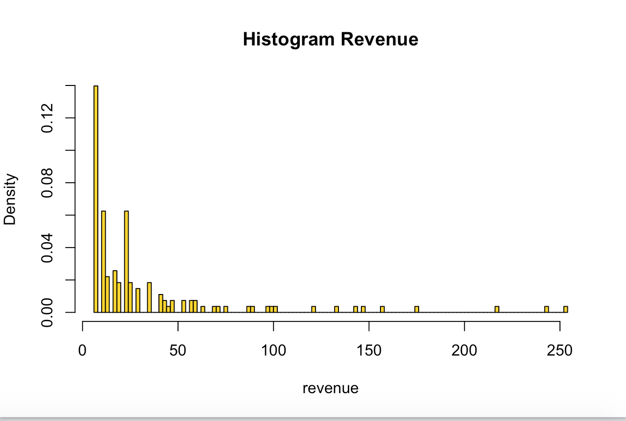
histograms
relative frequency distribution put into graphical form
open-ended classes
when a class has either no upper class limit or no lower class limit, ex. 85 or older
skewed to the right
histogram with a long right hand tail, or positively skewed
skewed to the left
histogram with a long left hand tail, or negatively skewed
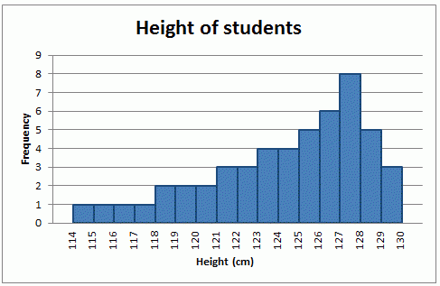
modes
a peak or high point of a histogram, unimodal or bimodal
frequency polygraph
displays the shape of a distibution
class midpoint
the average of a class lower limit and the next class lower limit, lower limit + next class lower limit / 2