Descriptive Statistics
1/45
There's no tags or description
Looks like no tags are added yet.
Name | Mastery | Learn | Test | Matching | Spaced |
|---|
No study sessions yet.
46 Terms
Tabular Methods
-Frequency Distribution
- Relative Frequency Distribution
- Percent Frequency Distribution
-Cumulative distributions
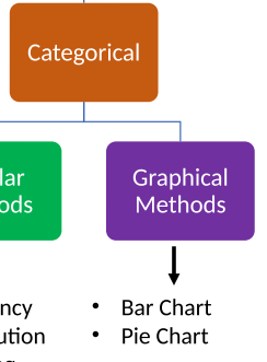
Graphical methods for Categorical Data
Bar and Pie chart
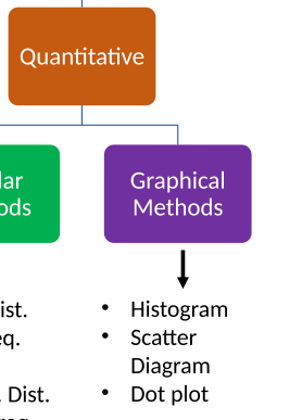
Graphical methods for quantitative methods
-Histogram
-Scatter Diagram
-Dot plot
How to calculate relative frequency?
Frequency of item/total
Cumulative frequency distribution
Shows the number of items with values less than or equal to the upper limit of each class.

Cumulative relative frequency distribution
Shows the proportion of items with values less than or equal to the upper limit of each class.

Cumulative percent frequency distribution
Shows the percentage of items with values less than or equal to the upper limit of each class

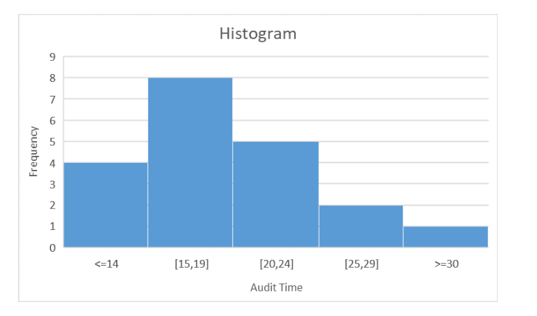
How does a histogram work?
-The variable of interest is placed on the horizontal axis.
- A rectangle is drawn above each class interval with its height corresponding to the interval’s frequency, relative frequency, or percent frequency.
-Histogram has no natural separation between rectangles
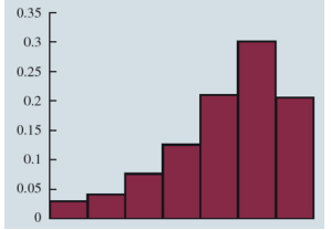
Moderately Right Skewed histogram picture(.)
.
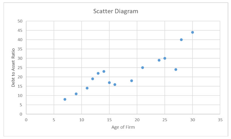
What is a Scatter diagram
-Graphical presentation of the relationship between two quantitative variables.
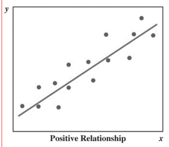
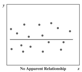
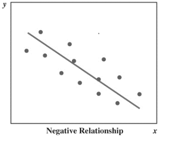
-The general pattern of the plotted points suggests the overall relationship between the variables
Positive correlation scatter graph picture(.)
.
No correlation scatter graph picture(.)
.
Negative correlation scatter graph picture(.)
.
Benefits of using sample over population?
Infeasible to study the whole population
Population definition
The complete set of individuals you would like draw conclusion
Sample definition
-A specific group (subset) of individuals from the population
When do you use Population parameters
If the measures are computed for data from a population
When do you use Sample statistics
If the measures are computed for data from a sample
Another word for mean?
Average
What are the measures of location?
Mean, median, mode, percentiles and quartiles
What is the mean
-Provides a measure of central location and is the average of all data values

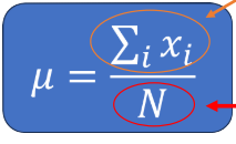
Population Mean(parameter) Calculation
Sum of all values in a population/ Number of Values in population

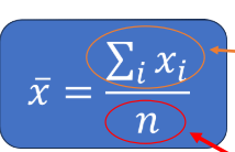
Sample mean calculation
Sum of all values in sample/ Number of values in population
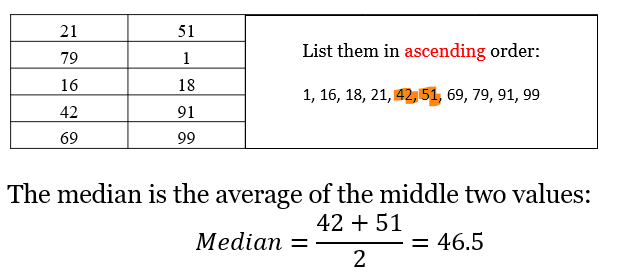
What is median and how do you calculate it?
-The median of a data set is the value in the middle when the data items are arranged in ascending order and select the value which is (number of values)n + 1/ 2
When is median most effective
Whenever a data has extreme values(outliers)
If there is an even number of observations in data set how do you calculate median?
As it is n+1/2 you will get a .5 so use lower value so -.5 and +.5 and then add both these values and divide by 2
Mode definition
The value that occurs with greatest frequency. This value can occur at two or more different models
What is having two modes called?
Bimodal
What is having more than two modes called?
Multimodal
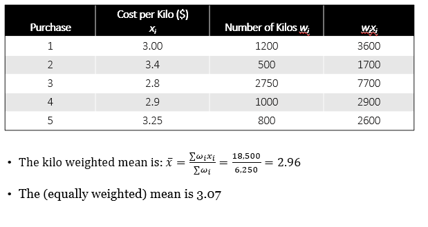
What is Weighted mean
Computed by giving each observation a weight that reflects its relative importance depending on question
Geometric mean
-Calculated by finding the nth root of the product of n values.
-It is used in analyzing growth rates in financial data

What is percentile?
Provides information on how data is spread over the interval so the xth percentile is the value that at lease x% take on this value or less
Example of percentile
Median which is a value such as at least 50% take on this value or less
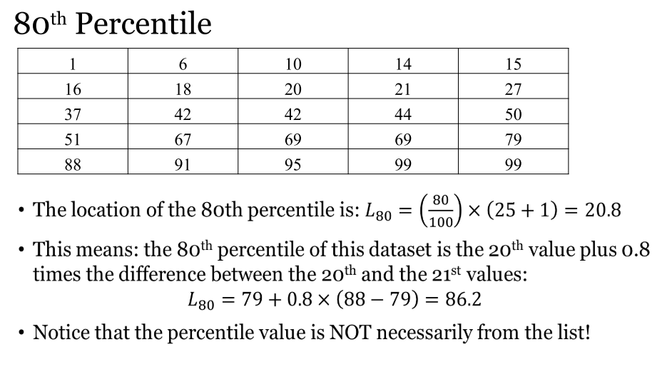
How to find the 80th percentile?
80/100×(n+1) then times this value based on what happened in nth term
First quartile percentile
25%
Third quartile percentile
75%
What are the measures of variability?
-Range, inter quartile range, Variance, standard deviation
Range definition
-Difference between the largest and smallest data values
-Simplest measure of variability and sensitive to outliers
What is the IQR(inter quartile range) and how do you calculate
-Range of the middle 50%
-Difference between the third quartile and first quartile
Advantages of using interquartile range(IQR) over range
-Overcomes sensitivity to extreme values
How do you calculate standard deviation from variance?
Calculate the positive square root of the variance
Co-efficient of variation Calculation
Standard deviation/ mean( of sample/population) *100 to see how much bigger the standard deviation is than the mean

Descriptive methods to measure relationship between two values
-Covariance and Correlation coefficient
What is co-variance ?
Measure of the linear association between two variables telling direction of the linear relationship
What is correlation-coefficient?
Like Co-variance it is another measure of linear association. However, it gives values between -1 and 1 which tell us the direction and strength of relationship
Is this statement true or false Correlation implies causation
NO