Research methods - Data types, graphs, descriptive statistics
1/56
There's no tags or description
Looks like no tags are added yet.
Name | Mastery | Learn | Test | Matching | Spaced | Call with Kai |
|---|
No analytics yet
Send a link to your students to track their progress
57 Terms
Quantitative data
Numerical data (eg. quiz scores, times, categories). Easy to analyse using descriptive and inferential statistics, therefore conclusions are objective and unbiased. Lack detail and oversimplifies reality so conclusions lack external validity and meaning
Qualitative data
Non-numerical/descriptive data (eg. interviews or observations). Detailed and meaningful insight so have a have a high external validity. Difficult to analyse and draw conclusions. Rely on subjective interpretations which are subject to bias (especially if there are expectations)
Primary data
New data - data collected by the researcher for a study first hand that is specifically related to the aims +/or hypothesis for the study. Did not exist before current study was conducted. Controlled by researcher to make sure it fits the aims and hypothesis of researcher’s current study. Expensive and lengthy process
Secondary data
Old data - data collected for a purpose/study that is not the one it is being used for, it come from before the study (eg. previous study, collected by other researchers or institutions). Used by meta-analysis studies. Quicker and cheaper to access. Research may not fit the aims and hypotheses of the study as the researcher has no control over the data.
Meta-analysis
Uses secondary data. A review of existing research. Identifies studies with the same aim and compiles data to calculate an overall effect size of difference or correlation. Increased external validity of conclusion as multiple studies means a large sample of participants is used. Prone to investigator effects when a researcher may not reference all relevant studies (leave out negative results) - incorrect conclusions would be made!
Measures of central tendency
Descriptive statistic used for quantitative data - provides researchers with an average. Consists of three measures: Mean, median and mode
Mean
The average for all participants considering the entire data set. Total data/no participants. Most sensitive measure of central tendency as it represents data as a whole by using all values in the data set. Easily distorted by extreme values
Median
Middle piece of data for all recorded data when in order. 1+num pts /2 = participant with median. Not distorted by extreme values. Less sensitive as does not include all values in data set in calculation.
Mode
Most popular/frequently occurring result from all pts. Not distorted by extreme values. Not useful when describing data if all values of data in a set are different.
Measures of Dispersion
Provide researchers with an indication of how spread out the data set is. Consists of two measures: range and standard deviation
Range
The spread of data in a data set. Largest piece of data - smallest piece of data = range. Easy to calculate. Distorted by extreme values.
Standard Deviation
Spread of data in a data set around the mean. The average distance from the mean. The lower this is the closer together the data is to the mean. Most sensitive measure of dispersion as includes all values of data set in the calculation. Distorted by extreme values
Graphical Representation
Used to represent quantitative data and acts as a visual aid to help observe patterns in data. All graphs need: a title, labels on axis, to operationalise variables clearly in the above and an appropriate scale.
Bar Graphs
They present discrete data and are divided into categories with no particular order. The space between each bar represents a lack of continuity. The IV must be operationalised on the X-axis and the DV must be operationalised on the Y-axis.
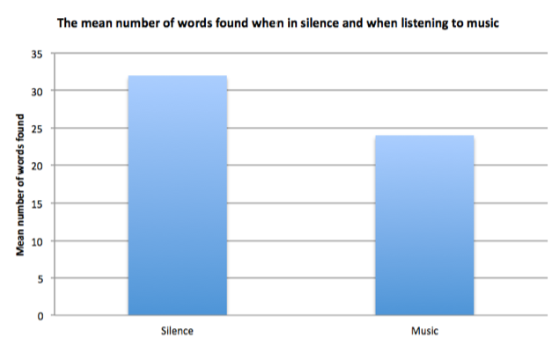
What does a bar graph look like?
Discrete data
Data that cannot be subdivided more than it already is (eg. between sound and silence)
Continuous data
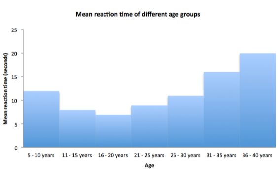
Can be meaningfully split into smaller groups (eg. Age or score on a quiz.
Histograms
The present continuous data which is divided into categories in a specific order. The bars touch to represent the continuity of the data. The IV and DV must be operationalised on the X-axis and Y-axis respectively.
What does a histogram look like?
Scattergrams
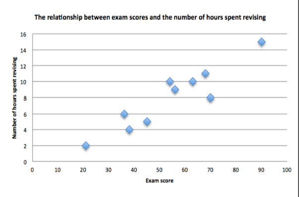
They present a correlation, one co-variable is presented on each axis. Points are plotted where the two variables meet and the pattern of points reveals the type of correlation (positive, negative or zero).
What does a scattergram look like?
Pilot Studies
A small-scale trial run of a study that is carried out before the main study to determine whether the research design works or not with a view to making improvements/fine-tuning. This allows the researcher to see what needs adjusting without investing large amounts of time or money. They are NOT interested in the study results
Problems that can be found with pilot studies…
Test is too easy or hard, Standardised instructions are not understood by participants, participants can’t fulfil the instructions.
Scientific reports
Located in scientific books and journals, used to document psychological research. Include: abstract, introduction, method, results, discussion and references.
Abstract - Scientific report
An abstract is the summary of a study which is used to determine if the report is worth reading/relevant. Contains: aim, hypotheses, procedure, results and conclusions
Introduction - Scientific report
A focussed review of existing theories and research which logically leads to the study being conducted (to convince reader of the reasons for this new piece of research). States aims and hypotheses with operationalised variables.
Method - Scientific report
Outline of what was done to provide detail for replications of the study. Include a description of method and design with justifications, details of the sample used (no pts + demographic details), apparatus descriptions, procedure + control - (order of events, details of testing environment + controls in place) and significant ethical issues + how delt with.
Results - Scientific report
An outline of what was found - dependant on type of data. Both state the accepted hypothesis.
Results - SR - Quantitative data
Includes: Descriptive statistics (measures of central tendency + dispersion) and inferential statistics (types of test + justification, significance level, calculated value and critical value)
Results - SR - Qualitative data
Includes: themes and quotes from interviews + data collected
Discussion - Scientific report
Summary of results and an explanation of what they show. Discusses study in relation to research reported in the introduction. Critiques method used, suggests improvements. Suggests implications of study for psychological theory and real world and suggests future research.
References - Scientific report
Give details of any journal articles or books mentioned to avoid plagiarism and so readers an source data in article
How to reference books in a scientific report…
Author’s surname, initial, year of publication, title of book, place of publication, publisher
How to reference articles in a scientific report…
Author’s surname, initial, year of publication, title of article, title of journal, volume number, part number, page number
Experimental methods
There are four main types of experiment: Laboratory experiment, field experiment, natural experiment and Quasi-experiment
Laboratory experiment
An experiment that is carried out in a controlled laboratory setting. Researchers manipulate the IV and measure the DV in a laboratory. Participants are aware they are being tested.
Laboratory experiment - strengths
Easier to control extraneous variable so experiment has a high internal validity
Easy for other researchers to replicate so it is easy to establish the reliability of findings
Laboratory Experiment - weaknesses
Experiment occurs in an artificial environment so research has a low ecological validity
Participants are aware they are being tested so it is likely for demand characteristics to act as extraneous variables
Field Experiment
An experiment that is carried out in a natural setting (e.g. school, hospital). Researchers manipulate IV and measure DV in the natural setting and participants may be not aware they are being tested.
Field experiment - strengths
Experiment occurs in a natural environment so its finding have a high ecological validity
Demand Characteristics are unlikely to acts as an extraneous variable as are participants are unaware they are being studied
Field Experiment - weaknesses
Difficult to control extraneous variables in a natural setting so the research has a low internal validity
Difficult for other researchers to replicate this type of research and therefore it cannot have reliability established
Natural Experiment
An experiment where the researcher does not directly manipulate the IV, but instead makes use of a naturally occurring different that is external to the participants - a situational variable. This difference would have occurred without research taking place (eg. weather events, new laws
Natural experiment - strengths
High ecological validity as it uses a naturally occurring difference (from the real world)
Natural Experiment - weaknesses
It is difficult to control extraneous variables as the IV is not directly controlled. Therefore experiments have a low internal validity
The naturally occurring situation a researcher wants to study may occur rarely. therefore, there are reduced available research opportunities
Quasi-experiment
An experiment where the researcher does not directly manipulate the IV, but instead uses a naturally occurring difference that is internal to the participants (participant variable - e.g. age/IQ). These experiments usually occur in laboratories so participants are aware they are being tested.
Quasi-experiment - strengths
Experiment has a high ecological validity as a naturally occurring difference is being studied.
Quasi-experiment - weaknesses
It is difficult to control extraneous variables as the IV is not directly controlled. Therefore, the experiment has a low external validity
Participants cannot be randomly assigned to conditions, therefore participant variables are more likely to act as extraneous variables
Experimental designs
There are three types a researcher can use: Repeated measures, Independent groups and Matched Pairs.
Repeated measures
When the same group of participants are tested in all conditions of the Independent variable
Repeated measures - strengths
Less participants are required than IGD for the same amount of data
Participant variables do not act as an extraneous variable because the same participants are being compared for each condition
Repeated measures - weaknesses
Order effects may act as an extraneous variable as participants may over/under perform in the second condition.
Demand characteristics are more likely to act as an extraneous variable as it is easier to guess the aims of an experiment when taking part in both conditions
Independent groups
A different group of participants are tested in each condition
Independent groups - strengths
Order effects don’t act as an extraneous variable because each group only experiences one condition
It is less likely demand characteristics will act as an extraneous variable because it is harder to guess the aim of an experiment from one condition
Independent groups - weaknesses
Participant variables act as an extraneous variable because pts. in one condition may perform better because they have certain characteristics in common rather than because of their condition
More participants are required in IGD than RMD for same amount of data
Matched pairs design
Participants are matched in pairs with the same characteristics, based on the participant variable that is relevant to the DV. One member of each pair is tested in each condition of the DV.
Matched Pairs - strengths
Order effects don’t act as an extraneous variable because pts only experience one condition
Demand characteristics are less likely to act as an extraneous variable because it is harder to guess the aims of an experiment from one condition
Participant variables are less likely to act as an extraneous variable due to participants being matched in each condition
Matched pairs - weaknesses
Matching participants is time consuming and expensive
There may be unknown, relevant variables that participants are not matched on - any differences in results of conditions could be due to these variables