Applied Probability and Statistics - C955
1/35
There's no tags or description
Looks like no tags are added yet.
Name | Mastery | Learn | Test | Matching | Spaced | Call with Kai |
|---|
No analytics yet
Send a link to your students to track their progress
36 Terms
Quantitative data (numerical data)
Consists of data values that are numerical, representing quantities that can be counted or measured.
Example: the number of employees at your firm or the average salary of an IT professional.
Categorical data (qualitative data)
Consists of data that are groups, such as names or labels, and are not necessarily numerical, but can still include numbers.
Example: the type of industry or firm
Pie chart
Categorical data set that displays parts of a whole.

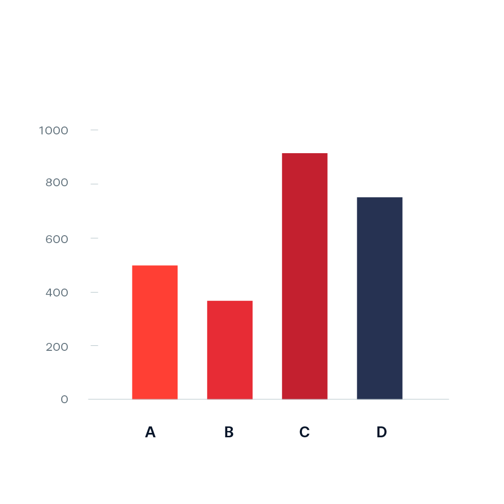
Bar chart (bar graph)
Categorical data set that counts or frequencies for the categories.
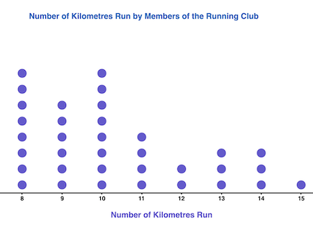
Dot plot
Quantitative data set useful to display the distribution of data, particularly clusters, gaps, and outliers. Most useful for smaller data sets.
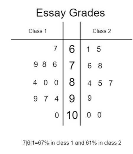
Stem plot (stem-and-leaf plot)
Quantitative data set useful to display the distribution or shape of data according to place values.
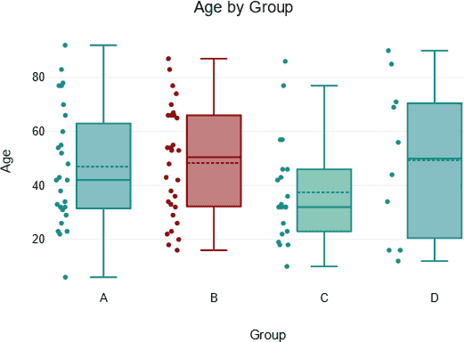
Box plot
Quantitative data set useful to display the center, spread, and outliers in a given data set.
Histogram
Quantitative data set useful to display the distribution (shape and spread) of quantitative data.
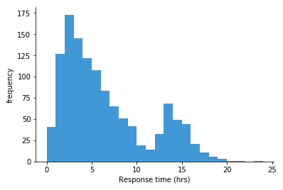
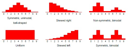
Types of skewing
Uniform, symmetrical, skewed right (positive), skewed left (negative), unimodal, bimodal, multimodal, bell shaped, and U-shaped.
Mean
The average of numbers.
Median
Middle number.
Mode
Most common number. Only exists when there is a repeating number.
Q2
Median of the numbers. If there is an odd amount of values in a set, it is the middle number. If there is an even amount of numbers in a set, it is the average of the two middle-most numbers.
Odd example: 3, 7, 9 | 12 | 15, 18, 21
Even example: 2, 5, 7, 8 | 9 | 10, 12, 14, 16
Even solution: 2, 5, 6, 7, 8 | 9 | 10, 12, 14, 16
Q1
Middle number between the start of the set and Q2 (median).
Odd example: 3, | 7 | 9 | 12 | 15, 18, 21
Even example: 2, 5, 7, 8 | 9 | 10, 12, 14, 16
Even solution: 2, 5 | 6 | 7, 8 | 9 | 10, 12, 14, 16
Q3
Middle number between the end of the set and Q2 (median).
Odd example: 3 | 7 | 9 | 12 | 15 | 18 | 21
Even example: 2, 5, 7, 8 | 9 | 10, 12, 14, 16
Even solution: 2, 5 | 6 | 7, 8 | 9 | 10, 12 | 13 | 14, 16
Interquartile range (IQR)
Q3 - Q1 = IQR.
Outliers
Positive outliers: (IQR * 1.5) + Q3
Negative outliers: Q1 - (IQR * 1.5)
1 standard deviation
68% of all values
2 standard deviations
95% of all values
3 standard deviations
99.7% of all values
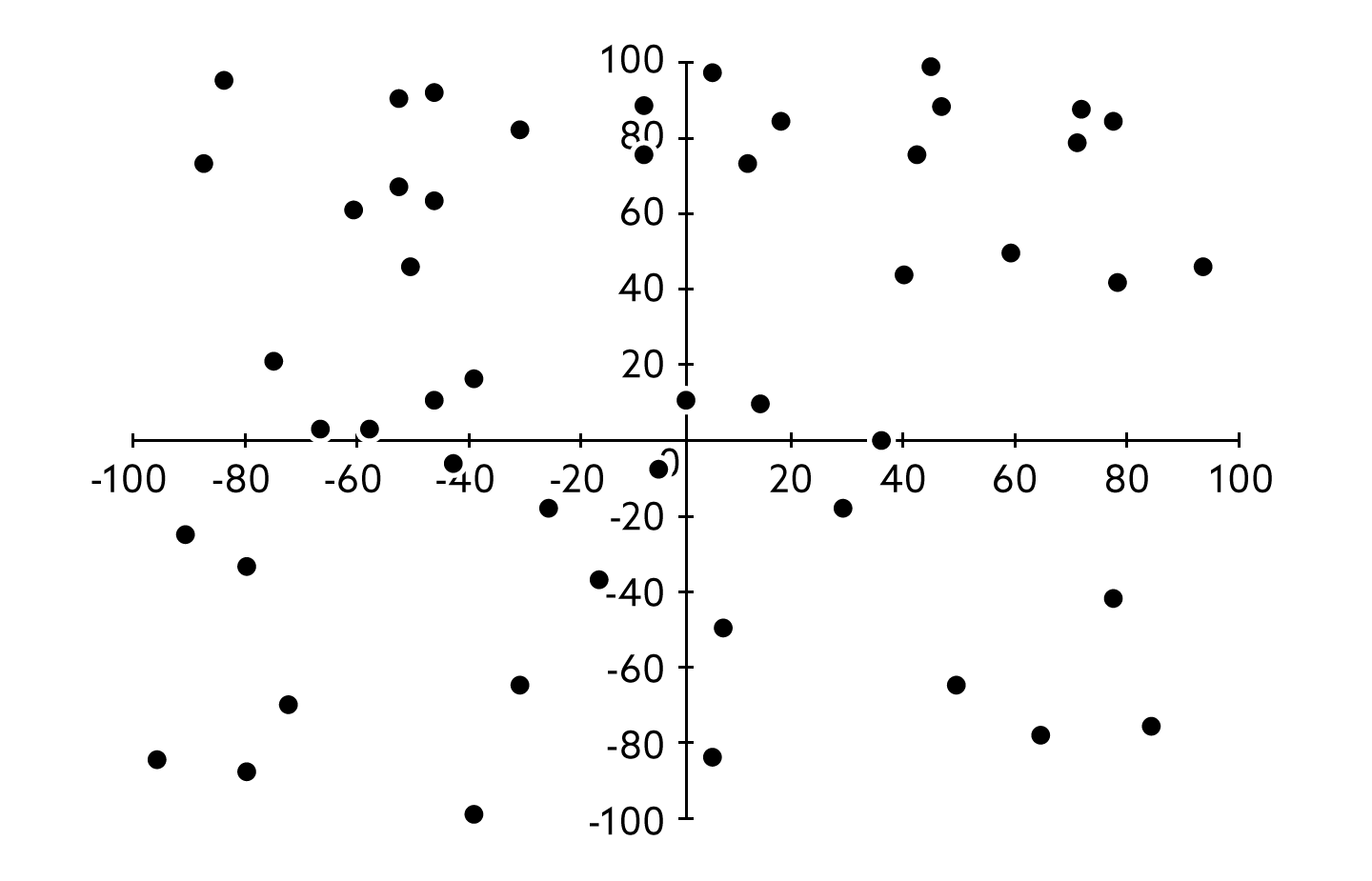
Scatterplot
A graph that uses dots on a corridnate plane to show the relationship between two quantitative variables.
Association
Weaker, a pattern or relationship between two variables. Can be determined through an observation.
Causation
Stronger, the relationship of cause and effect. Can only be determined through an experiment.
Control group
A group that does not get the new treatment being studied.
Lurking variable
A variable that is associated with both variables, but was not included in the study.
Simpson’s paradox
A counterintuitive situation in which a trend in different groups of data disappears or reverses when the groups are combined.
Experiment
A procedure that can be done repeatedly that has a well defined set of possible outcomes. (Also known as a trial.)
Example: a roll of the die is an experiment.
Outcome
A single possible result of an experiment.
Example: the number of dots shown on the die after the roll, such as a 2 or a 6.
Event
An outcome, or set of outcomes, whose chance of occurrence can be represented with a probability.
Example: the roll of an even number.
Fair
A situation in which all outcomes are equally likely.
Example: a die where all numbers are equally likely to be rolled.
Relative frequency
A way to approximate probability by dividing the number of times an event occurs in an experiment by the total number of trials.
Example: rolling a die multiple times and recording how many times each number occurs.
Impossible
0% probability.
Unlikely
0% < x < 40% probability.
As likely as unlikely
40% - 60% probability.
Likely
60% < x < 100% probability.
Certain
100% probability.