Thẻ ghi nhớ: WDU202c - UX/UI Design | Quizlet
1/189
There's no tags or description
Looks like no tags are added yet.
Name | Mastery | Learn | Test | Matching | Spaced | Call with Kai |
|---|
No analytics yet
Send a link to your students to track their progress
190 Terms
b
It acts as a bridge between the User and the Content
a. UX
b. UI
c. Screens
d. Buttons
b
Which among the following options are not a UI
a. Form
b. Wireframes
c. Aesthetics (thẩm mĩ)
d. look & feel
d
Which among the following options are not a UX
a. feel
b. navigation
c. story
d. Visual design
c
Statement 1: UI deals with more tangible & look and feel outputs
Statement 2: UX deals with the experience & proportion
a. Statement 1 is true & Statement 2 is False
b. Statement 1 is False & Statement 2 is True
c. Both the statements are True
d. Both the statements are False
b
While interacting with a product, we expect a _______________ in order to see if our interaction is actually working.
a. Design
b. Feedback
c. Input
d. Button
c
If the buttons look the same, they are expected to act in a similar way. This is called _____________.
a. Analog buttons
b. Digital buttons
c. Consistency (tính nhất quán)
d. Navigation
a
Providing a undo/redo button helps the user to _______________.
a. feel safe
b. have a secondary thought
c. feel confused
d. none of the above
b
A ____________ is a self contained object (self contained object) where you can click on and interact (tương tác) with.
a. Mouse
b. Button
c. Screens
d. Wireframes
d
Which among the following is a feature of a button
a. size and shape
b. colour and dimension
c. system
d. all the above
b
Statement 1: Size of the button is independent on screen resolution
Statement 2: Size of the button is dependent on the cursor and the finger
a. Statement 1 is true & Statement 2 is False
b. Statement 1 is False & Statement 2 is True
c. Both the statements are True
d. Both the statements are False
a
______________is a pictorial representation of a real object
a. Icon
b. Symbol
c. Signage
d. Graphics
b
______________is a non-pictorial representation of a real object.(một hình ảnh đại diện không phải là hình ảnh của một vật thể thực) They convey the idea (truyền tải) through (thông qua) different signs.
a. Icon
b. Symbol
c. Signage
d. Graphics
c
____________ is the place for navigation and here, the user takes a decision
a. Body
b. Footer
c. Header
d. Buttons
b
Body of a website holds the_______________.
a. Idea
b. Content
c. Text
d. Image
c
These are series of lines which obeys (tuân theo) a mathematical structure (cấu trúc toán học) for proper (đúng, phù hợp) alignment (căn chỉnh) on a screen
a. Body
b. Container
c. Grids
d. Pixels
c
Space between each column in a grid system
a. Margin
b. Padding
c. Gutter
d. Breathing space
Margin | Khoảng cách giữa phần tử và phần bên ngoài nó. |
Padding | Khoảng cách bên trong phần tử, giữa viền và nội dung. |
Gutter | Khoảng cách giữa các cột trong một lưới (grid). |
Breathing space | Cụm từ mang tính mô tả (không phải thuật ngữ kỹ thuật cụ thể), dùng để nói về khoảng trống giúp thiết kế "thở" – có thể là margin, padding hoặc gutter. |
b
__________________ means arranging (sắp xếp) the content based on its importance.
a. Highlight
b. Hierarchy (phân cấp)
c. Contrast
d. Navigation
d
Once you start designing a project____________ is the very first step done.
a. Survey
b. Wireframe
c. Designing UI
d. Problem identification
d
Pick up the odd one out (một số cái không phù hợp). Which among them is Not a part of data collection for a Project ?
a. Interviews
b. Phone calls
c. Online surveys
d. Solution
b
The group of customers for which whom we design a particular product is called__________.
a. Promising customers
b. Targeted customers
c. User journey map
d. Persona
b
An arrangement sắp xếp of images, materials, pieces of text, etc. intended mục đích to evoke gợi lên or project a particular style or concept.
a. Sitemap
b. Moodboard
c. Stylesheet
d. Wireframes
b
The promotion (quảng bá) of a particular (cụ thể) product or company by means of advertising and distinctive design is called__________________________.
a. Logo
b. Branding
c. Moodboard
d. Styleguide
d
In which of the following do we make use of Images ?
a. Mood
b. content
c. Navigation
d. All the above
d
In which of the following do we make use of Typography ?
a. Content
b. Interface
c. Branding
d. All the above
c
Statement 1: Texting is more economical (tiết kiệm)
Statement 2: Text can represent what cannot be depicted (mô tả )
a. Statement 1 is True & Statement 2 is False
b. Statement 1 is False & Statement 2 is True
c. Statement 1 is True & Statement 2 is True
d. Statement 1 is False & Statement 2 is False
a
Form is connected to function and experience
a. True
b. False
c
Statement 1: Speed is an invisible element (yếu tố vô hình) in design
Statement 2: Style is a visible element in design
a. Statement 1 is True & Statement 2 is False
b. Statement 1 is False & Statement 2 is True
c. Statement 1 is True & Statement 2 is True
d. Statement 1 is False & Statement 2 is False
b
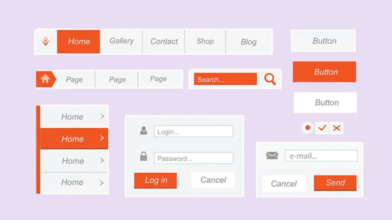
Which among the following is Not a State of button (trạng thái của nút)
a. Normal, Hover, Press, Inactive
b. Normal, Drag, Push and Pull
c. Active, Passive
d. Enable , disable
Trạng thái | Giải thích |
|---|---|
Normal | Trạng thái ban đầu, chưa tương tác. |
Hover | Khi con trỏ chuột di chuyển qua nút. |
Press / Active | Khi người dùng nhấn vào nút. |
Inactive / Disabled | Nút bị khóa, không thể bấm được. |
Enable | Trạng thái có thể bấm. |
a
The Viewing distance of a mobile app & desktop is __________ & __________ respectively.
a. 10 inches & 24 inches
b. 12 inches & 20 inches
c. 14 inches & 24 inches
d. 15 inches & 20 inches
c
An interface can be best described as a bridge between:
a. a screen and a system
b. a website and an app
c. a user and content
d. two users
a
Why is it helpful to rely on real world models within interface design? Choose the best answer.
a. Real world models are already familiar to a user, and therefore can help make the user's experience much more seamless.
b. It's easier for a designer to borrow an idea or concept that's already been created.
c. Real world models are much more believable and users are more likely to consume or buy a product that uses them.
d. None of the above
d
Which of the following examples are considered real world models?
a. A screen-based button.
b. The "trash bin" on your computer.
c. Camera shutter sound when using a
smartphone's built-in camera.
d. All of the above.
b
What is the rule of thumb for organizing (sắp xếp) content within an interface?
a. Along a grid
b. Systematically
c. Randomly
d. Alphabetically
b
While user interactions should occur (APPEAR) in as few steps as possible, in what situation might an extra step be appropriate?
a. ordering a sandwich.
b. withdrawing a large sum of money from an ATM.
c. buying a textbook online.
d. None of the above
d
Which physical relationship is NOT a factor for designing an interface?
a. the placement of an on-screen button in relationship to a user's thumb.
b. the distance of a user's eye from a screen.
c. the scale of a smartphone within a user's hand.
d. the relative position of one user to another.
a
Why is it important for the interface to react immediately when a user carries out an action? Choose the best answer.
a. The user needs confirmation from the interface that the system is working.
b. Users are inherently impatient.
c. The system behind the interface needs to process tasks very quickly in order to keep pace with competing systems.
d. None of the above
b
Context-specific design is best defined as:
a. When the designer uses different software programs to make an interface.
b. Shaping a design to reflect differences in content, goals, and users.
Định hình thiết kế để phản ánh sự khác biệt về nội dung, mục tiêu và người dùng.
c. What happens when emerging designers make websites.
d. A method of design that reflects the physical, geographical location where the design was made.
a
An interface should be immediate and intuitive. (trực quan và tức thời.)
a. True
b. False
a
The dreaded spinning circle on YouTube is an example of ______________.
a. Visibility (Khả năng hiển thị) of system status
b. Flexibility (linh hoạt) and efficiency (hiệu quả) of use
c. Help and documentation
d. Recognition rather than recall
b
Choose the heuristic that best applies to the following example: an automated chatbot "therapy" app that sends you warm, positive text messages throughout the day.
a. Aesthetic and minimalist design
b. Match between system and the real world
c. User control and freedom
d. Error prevention
d
Choose the heuristic that best applies to the following example: Gmail's notification when you have forgotten to attach a document to an outgoing email.
a. Flexibility and efficiency of use
b. Match between system and the real world
c. Aesthetic and minimalist design
d. Error prevention
b
The "Like" or "thumbs up" button across various platforms.
a. Error prevention
b. Consistency and standards
c. User control and freedom
d. Visibility of system status
b
True or False? Primary navigation menus (thanh menu chính) should always appear horizontally (chiều ngang) at the top of a page.
a. True
b. False
b
You have an important message that you want to share with the users of your website through a site alert. In which of the following sections would it be the most appropriate for the site alert to appear?
a. footer
b. header
c. sidebar
d. Content
b
You want to deter visitors to your website from copying or re-using your content by posting a copyright notice. In which of the following sections does a copyright notice usually appear?
a. header
b. footer
c. content
d. sidebar
d
Your website's business has multiple sponsors (nhà tài trợ) who are important contributors (người đóng góp) to the business and need to be recognized as such, but you don't want the placement of their logos to supersede (thay thế) your own. In which of the following sections would it be appropriate (phù hợp) to ads or affiliate links (liên kết nhà tài trợ) for these sponsors?
a. footer
b. content
c. header
d. sidebar
a
A client that runs a candy company has asked you to build a pop-up survey on their website to determine which of their top 8 chocolate bars have users consumed in the last year. Which of the following would be the most appropriate form element to collect this information?
a. checkbox
b. radio
c. dropdown menu (menu thả xuống)
d. text field
b
Interface metaphors (ẩn dụ) are NOT commonly used as part of a conceptual (khái niệm) design
a. true
b. false
c
A beer company has asked you to design a landing page for their website to ensure access (đảm bảo quyền truy cập) is restricted (giới hạn) to users aged 21 and up—the landing page will prompt users to enter their birthdate. Which of the
following would be an appropriate form element to use?
a. button
b. number stepper
c. date picker
d. dropdown menu
b
A software company would like to survey users about what mobile operating system they use most often—Android, iOS, Windows, or "Other". Which of the following would be an appropriate form element to use?
a. checkbox
b. radio
c. dropdown menu
d. text field
a
It is NOT usual for cognitive processes (các quá trình nhận thức) to occur (xảy ra) in isolation (riêng lẻ)
a. true
b. false
c
An organic farmer has enlisted your services to help her augment her online ordering system for her restaurant clients. She would like her users to be able to choose a specific quantity of fresh produce from a list of what will be harvested that week. Which of the following would be an appropriate form element to use?
a. radio
b. text field
c. number stepper
d. button
a
______________________ are more economical to develop.
a. Website
b. Advertisements
c. Application
d. Videos
d
It can be viewed across different devices and platforms (nền tảng khác nhau).
a. Videos
b. Advertisements
c. Application
d. Websites
b
____________ can be displayed on any device.
a. Advertisements
b. Websites
c. Application
d. Videos
c
It is easy to share content with others.
a. Advertisements
b. Application
c. Websites
d. Videos
b
Its content can be easily indexed (lập chỉ mục) by search engines.(công cụ tìm kiệt)
a. Application
b. Websites
c. Advertisements
d. Videos
a
It can be integrated into the operating system, allowing for access to advanced device capabilities, such as fingerprint or iris scanners.
a. Applications
b. Advertisements
c. Videos
d. Websites
a
It can be displayed only on the operating system it was designed for.
a. Websites
b. Applications
c. Advertisements
d. Videos
a
______________________ are easier to monetize (kiếm tiền).
a. Applications (ứng dụng)
b. Advertisements
c. Videos
d. Websites
a
It requires that users download and install it onto their devices.
a. Applications
b. Advertisements
c. Videos
d. Websites
a
It's easier to control how users can interact with and view content.
a. Applications
b. Advertisements
c. Videos
d. Websites
b
Copyright (bản quyền) is a part of_____________________
a. header
b. footer
c. sidebar
d. navigation
b
Privacy settings are displayed on____________ part of a website
a. header
b. footer
c. sidebar
d. navigation
c
Advertisements is best when they are placed at _______________ in a website
a. header
b. footer
c. sidebar
d. navigation
a
Tabs and headers are different
a. True
b. False
a
Menus are best when placed at________________
a. header
b. footer
c. sidebar
d. navigation
a
Logos are seen on both nav-bar and on footer
a. True
b. False
a
We must display only the required information on a website
a. True
b. False
c
The process of hiding information and converting (chuyển đổi) into a single module is called _________________
a. filtering
b. hierarchy
c. chunking
d. information architecture
;
Chunking là quá trình tổ chức và nhóm thông tin thành các phần nhỏ hơn (chunks), giúp người dùng dễ dàng hiểu và xử lý thông tin hơn.
a
It is good to have a full width background image on a landing screen
a. True
b. False
a
Websites do not have one size.
a. True
b. False
d
A mobile first approach (COME NEAR) helps us to focus the ____________________ on screen.
a. Animations
b. Text content
c. Images
d. most essential things
a
An approach (cách tiếp cận) to web design that makes web pages render well on a variety of devices and window or screen sizes.
a. Responsive web design
b. CSS
c. Brainstorming
d. None of the above
b
A ______________ tells us the look and feel of the website.
a. Gallery (Bộ sưu tập hình ảnh, không phản ánh trực tiếp)
b. Mood board
c. storyboard (thường dùng trong phim hoặc video, không phải thiết kế web.)
d. Color palette (Chỉ là tập hợp màu – không thể hiện đầy đủ)
b
The design property (thuộc tính) which relates a background and a foreground visibility. (khả năng hiển thị nền và tiền cảnh.)
a. Shape
b. Contrast
c. Elements
d. None of the above
d
H1, H2, H3 etc are tags for _____________________ in a website
a. Different font size
b. Different typography
c. Different headings
d. All the above
a
H1 is greater than H6
a. True
b. False
b
H3 is greater than H2
a. True
b. False
a
Rounded buttons are used for friendly themes
a. True
b. False
a
Buttons with zero border radius (tức là các góc vuông, không bo tròn)are used for serious themes
a. True
b. False
c
hovering, pressing, active and disable is related to ________________
a. states of buttons
b. states of icons
c. both
d. none
b
_________________ helps us to find the number of pages in a website
a. task flow
b. sitemap
c. both
d. none
b
________________ is prepared before the wireframe
a. task flow
b. sitemap
c. prototype
d. none
b
It shows the workflow (quy trình làm việc) of the website
a. wireframe
b. task flow
c. sitemap
d. prototype
a
Advertisements are best fit in a___________________ website
a. sidebar
b. header
c. footer
d. navigation
b
"Chat now" option with the computer generated guide is an example of a_____________.
a. animation
b. pop up
c. alert
d. navigation
b
A website is best when is non responsive
a. True
b. False
d
How do navigation elements relate to one another and the current page ?
a. sidebar
b. header
c. footer
d. navigation
c
How does the user get from one point to another ?
a. wireframe
b. task flow
c. sitemap
d. prototype
b
A navigation system (Hệ thống điều hướng) must be kept only on the top of a webpage.
a. True
b. False
b
_____________________ is a sub division of primary navigation.
a. Utility
b. secondary navigation
c. tertiary navigation
d. none
a
An "About us" page is a primary navigation.
a. True
b. False
a
"Know more about us" is a part of_____________________.
a. secondary navigation
b. utility navigation
c. tertiary navigation
d. primary navigation
a
"Product details" from the section "Product" is an example of ______________.
a. secondary navigation
b. utility navigation
c. tertiary navigation
d. primary navigation
b
"Subscribe" is an example of _______
a. secondary navigation
b. utility navigation
c. tertiary navigation
d. primary navigation
a
"Search" option is a tertiary navigation.
a. True
b. False
c
25 - 50 - 25 is a design rule for web page layout. What is 50 in this ?
a. Image
b. text
c. Main content
d. advertisement
b
In a 25/50/25 rule, 25 % is at the center of the screen.
a. True
b. False
d
25 - 50 - 25 is a design rule for web page ayout. What is 25 in this ?
a. Image
b. text
c. Main content
d. advertisement