7. Visualizing Multivariate Data
1/29
There's no tags or description
Looks like no tags are added yet.
Name | Mastery | Learn | Test | Matching | Spaced | Call with Kai |
|---|
No study sessions yet.
30 Terms
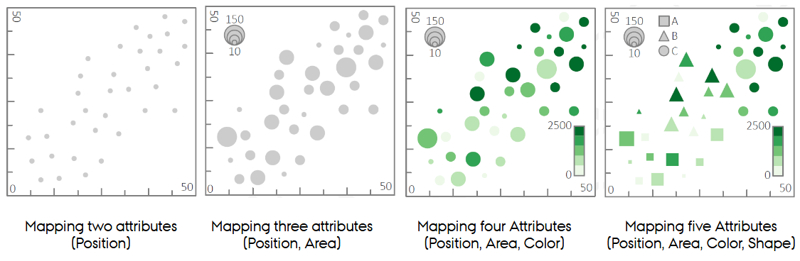
Why do we need dedicated multivariate visualization techniques?
Because mapping many attributes onto a single scatterplot via channels (size, color, shape) does not scale: channels interfere, attributes become unreadable, and interpretation collapses when you move beyond ~4-5 attributes.
What is the defining condition for using a ternary plot?
The three variables must be parts of a whole - they must sum to 1 or 100%. This is what makes barycentric coordinates meaningful.
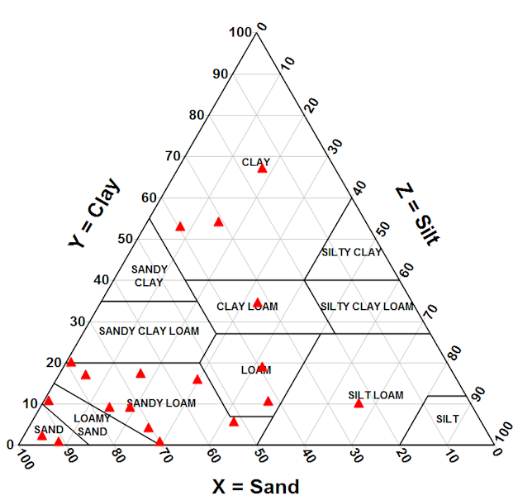
Why are 3D scatterplots discouraged, and how do ternary plots avoid that issue?
3D scatterplots suffer from non-anchored points, making depth impossible to judge.
Ternary plots stay in 2D while still depicting three variables.
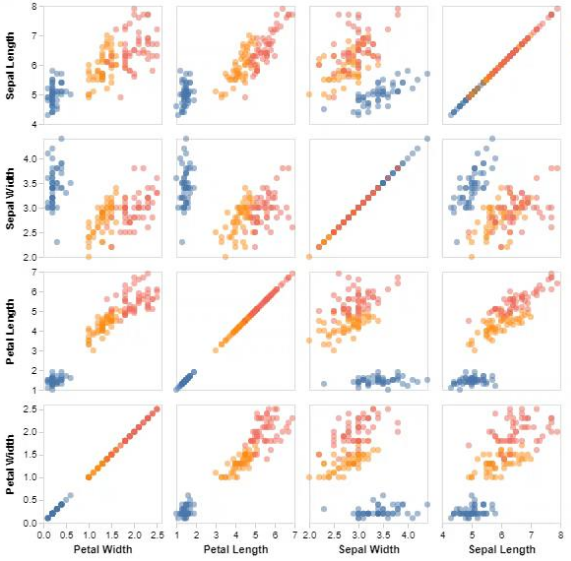
What is a Scatterplot Matrix?
A matrix of 2D scatterplots showing every pairwise attribute combination for an overview of relationships, correlations, and clusters.
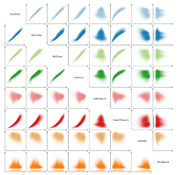
What are the two main types of unused space in a Scatterplot Matrix, and how can they be used?
The main diagonal, often filled with histograms or density plots.
The mirrored lower triangle, which can show density contours or other summaries.
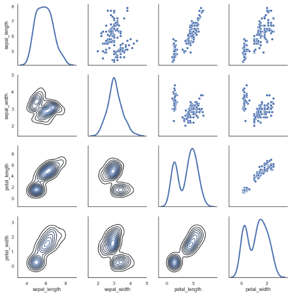
Why are linking & brushing essential in Scatterplot Matrices?
Because they let the viewer follow selected points across multiple projections, revealing structure across high-dimensional subspaces.
What problem does RadViz attempt to solve?
Visualizing many numerical attributes without small multiples by mapping each attribute to an anchor and placing points via spring-like forces (barycentric).
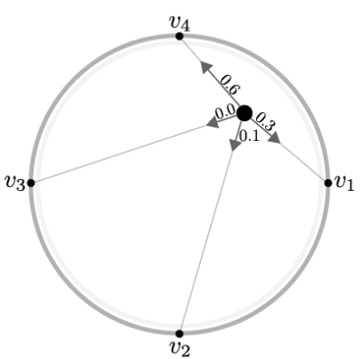
What is the major issue with original RadViz, and how does RadViz Deluxe fix it?
Correlated attributes placed opposite each other cancel out forces, distorting patterns. RadViz Deluxe reorders and spaces anchors based on correlations to reduce distortions.
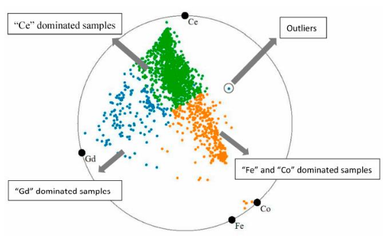
When is RadViz not appropriate?
When you need to interpret absolute positions in the original data space. RadViz only preserves relative structure and should not be used for precise numeric reading.
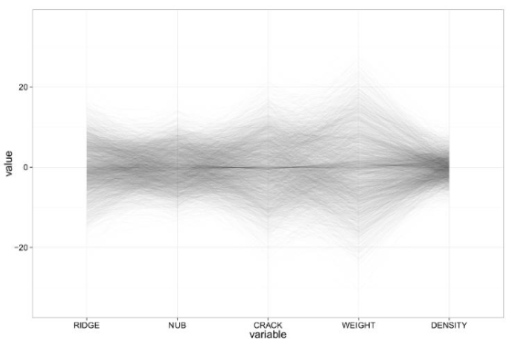
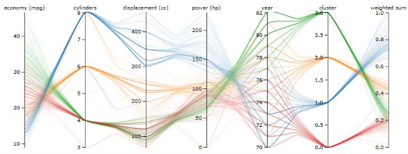
In parallel coordinates, what do correlations, negative correlations, and clusters look like?
Correlation: Lines approximately follow each other
Negative correlation: A fan or star shape where lines cross between two adjacent axes.
Clusters: Approximately horizontal bundles of lines
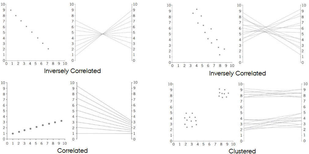
Why does the ordering of axes matter in parallel coordinates?
Because patterns (correlations, clusters) are only visible between adjacent axes. Interpretation depends entirely on axis order.
What interactions are especially important in parallel coordinates?
Reordering axes (since only neighboring axes can be compared)
Brushing for cross-filtering
Adding/removing axes, including duplicating an axis to compare it with multiple others
What is alpha blending used for in parallel coordinates?
To handle overplotting by making lines semi-transparent so density becomes visible.
What is line bundling in parallel coordinates?
Grouping similar trajectories (polylines) into bundles to reduce clutter and emphasize trends.
What is Parallel Sets?
A variation of parallel coordinates for categorical data that uses ribbons instead of polylines to show frequency-weighted flows between categories.
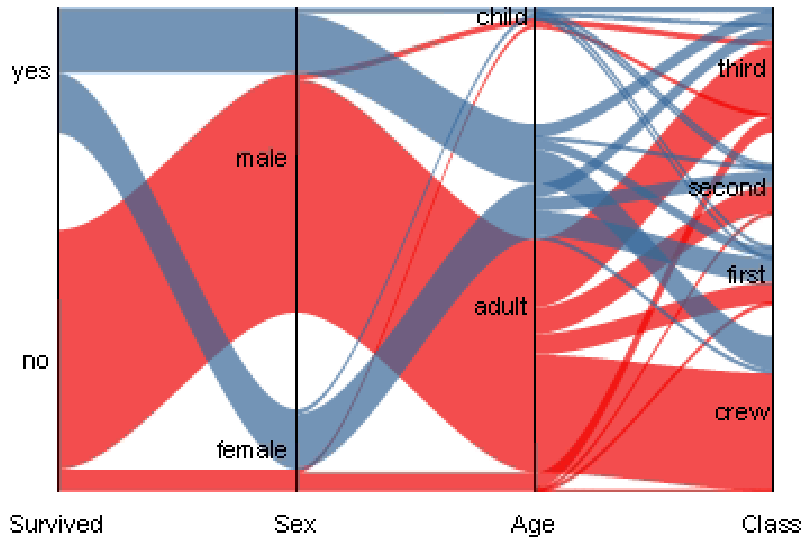
Why are Parallel Sets often superior to mosaic plots?
They provide clearer flow comparisons, show category distributions along each axis, and avoid the misinterpretation risks of area slicing.
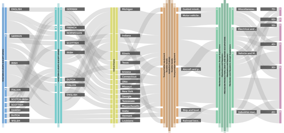
What are Parallel Hierarchies?
An extension of parallel sets allowing interactive hierarchical drilling and rolling up within categorical hierarchies. Useful when categories have many nested levels.
What is the central critique of radar charts?
Radar charts do not scale:
Hard to compare shapes across many axes
Circular layout imposes arbitrary geometry
Overplotting ruins readability
Hans calls them “completely useless” for multivariate analysis

What are radar chart “small multiples,” and do they solve the problem?
Showing one radar chart per data item. This helps slightly but still breaks down when attributes or items increase. Shapes become indistinguishable.
What is a trellis display (small multiples)?
A grid of repeated charts, each showing a subset of the data conditioned on categorical or binned numerical variables.
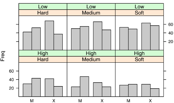
Why is linking & brushing usually not applicable in trellis displays?
Because each panel contains different subsets of the data; selected items do not appear in other panels.
What makes trellis displays powerful for continuous data?
Binning allows you to reveal structures invisible in aggregated scatterplots - e.g., the “fish-hook” pattern in deep earthquakes that only appears after depth-based slicing.
What is the basic construction rule of mosaic plots?
Repeated slice-and-dice subdivision: alternating vertical and horizontal splits to show proportions across categorical combinations.
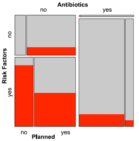
What is a common mistake when interpreting mosaic plots?
Treating the axes as continuous coordinate axes instead of understanding them as divisions of area, which leads to incorrect category identification.
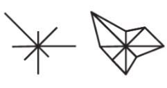
What are glyphs, and when are they used?
Visual objects whose features encode multiple attributes; used when embedding small multivariate indicators into spatial contexts (maps, matrices).
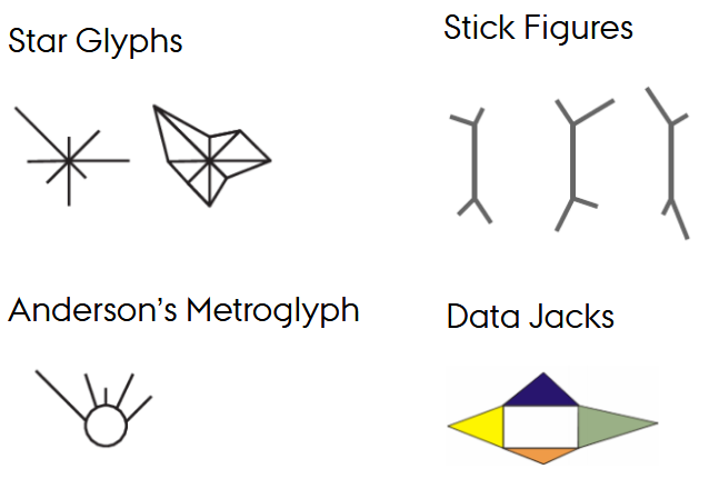
Why are Chernoff faces discouraged?
Experimental evidence shows that people do not reliably decode data from subtle facial variations.
They are the “rainbow color scale” of multivariate vis.
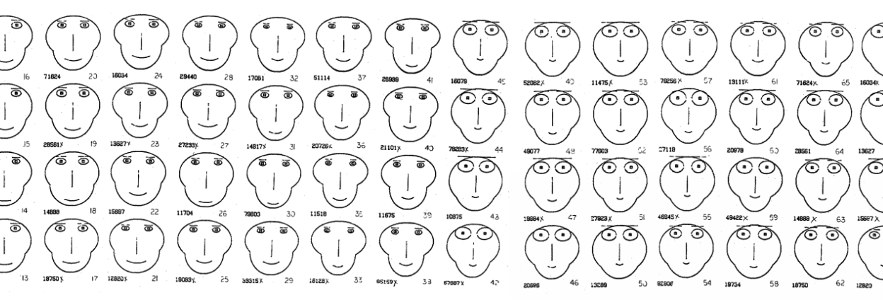
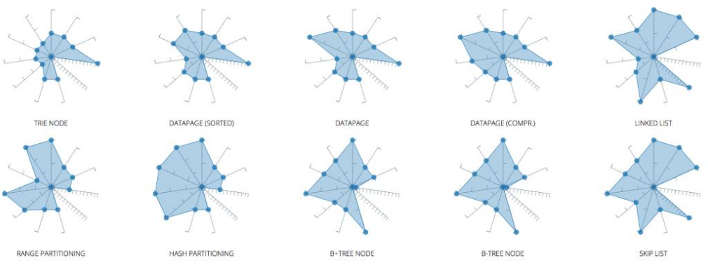
What are star glyphs / metroglyphs?
Glyphs where attribute values extend spokes or line lengths. These are more interpretable than faces but still limited when many glyphs overlap.
What is the main idea behind pixel-based techniques (Keim)?
Use each pixel as the smallest possible mark to display extremely high-dimensional or high-volume data without aggregation. Each attribute becomes a pixel map
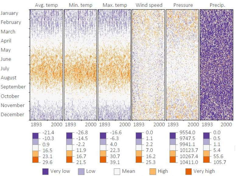
Why is arrangement crucial in pixel-based visualizations?
Because spatial layout (line-by-line, serpentine, Hilbert curve, calendar layout) determines which patterns become perceptible. Misarrangement hides structure.

When are pixel-based charts appropriate?
When completeness is required (e.g., climate data), and aggregation must be avoided. Also good for detecting anomalies over long temporal spans.
