pnb 2xc3: midterm 1 graphs
1/31
There's no tags or description
Looks like no tags are added yet.
Name | Mastery | Learn | Test | Matching | Spaced |
|---|
No study sessions yet.
32 Terms
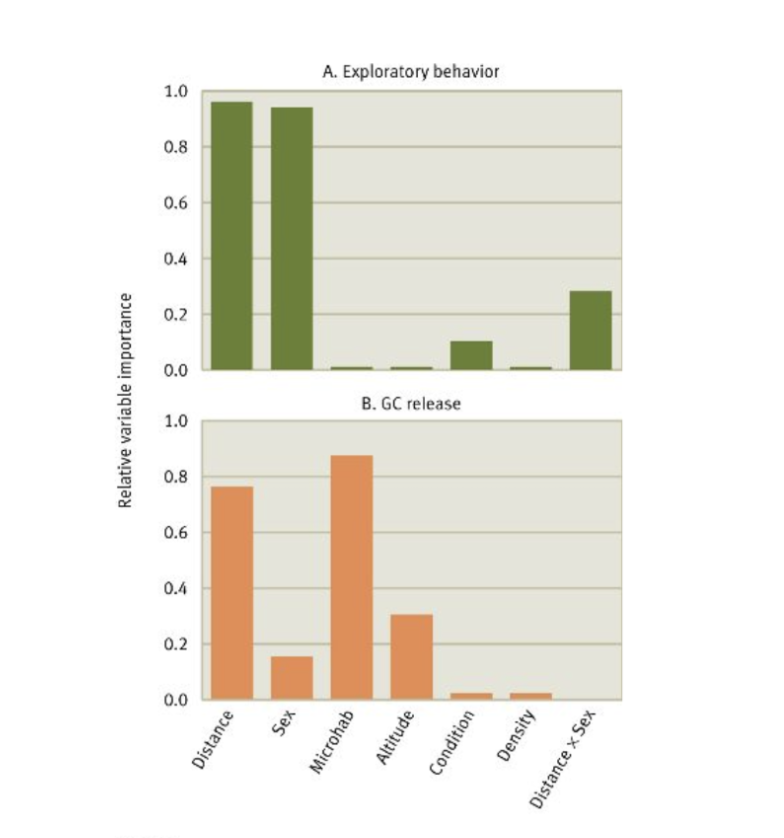
explains the correlation between distance from origin site in birds with relation to the stress hormone release and behaviours
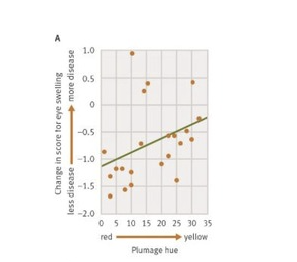
graph depicts how more yellow birds (less plumage) have more disease
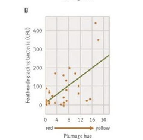
graph depicts how more yellow birds have feather-degrading bacteria
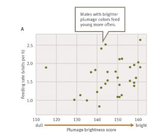
graph shows males with brighter plumage colours feed young more often
graph shows males with bright plumage coloration tend to produce sons with bright plumage

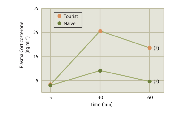
graph shows differences in penguin offspring born near toursits vs near naive (away from tourists)
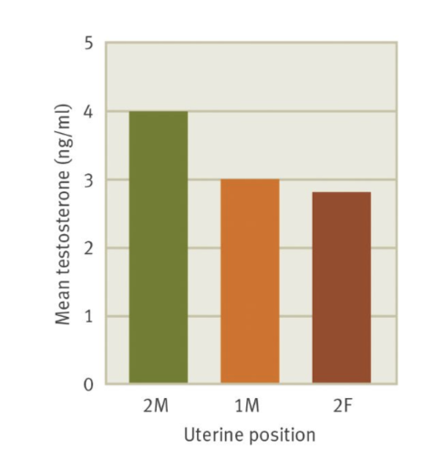
graph shows the distribution of testosterone levels between rodent prenatal position
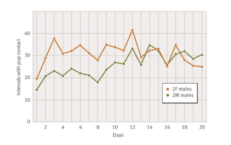
effects of pup contanct due to rodent in utero parental position effects
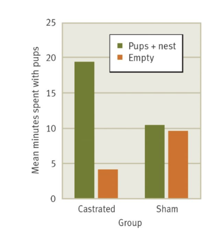
graph depicts the relationship between castrated and sham castrations with time spent with pups
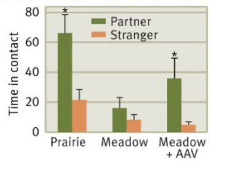
graph shows the difference in behaviour towards their partner with an altered AAV (vasopressin and oxytocin reception)
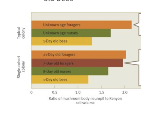
graph shows difference in mushroom body volumes depending on the type of bee

graph shows the difference in mushroom body volumes when the age of the bee is know, still dependent on the type of bee
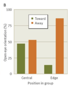
the graph shows the percentage of ducks in the centre of the group vs in the periphery that slept with their eyes open vs one eye open
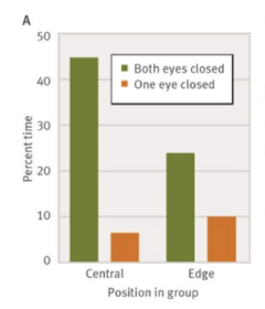
graph shows eye orientation relative to the position the duck is to the group
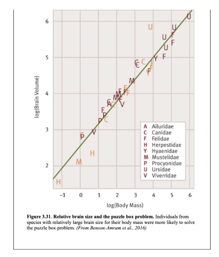
graph shows individuals from species with relatively large brain size for their body mass were more likely to solve the puzzle box problem (foraging)
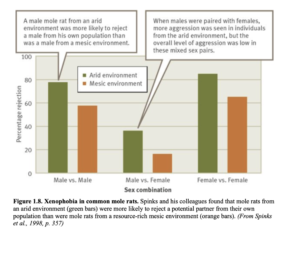
graph shows more rats from arid environments and mesic environment and level of rejection to aggressive mole rats dependent on sex of the mole rat
graph shows the relationship between treatment group of learning and random food arrangements in cockroaches and their growth rate

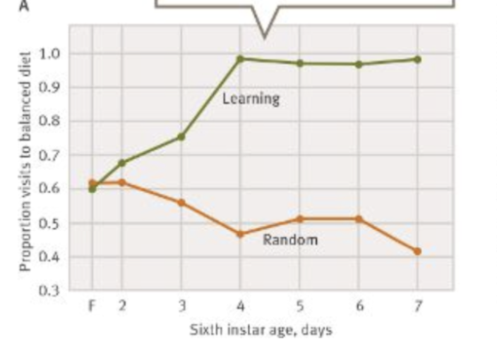
graph shows relationship between learning and random treatment groups in cockroaches and their proportion of visits to the balanced diet dish
graph shows the relationship between learning and random treatment groups in cockroaches and their proportion of time feeding on balanced diet (recognising the balanced diet)

graph shows the demonstators diet and the mean percent CO eaten by the observor
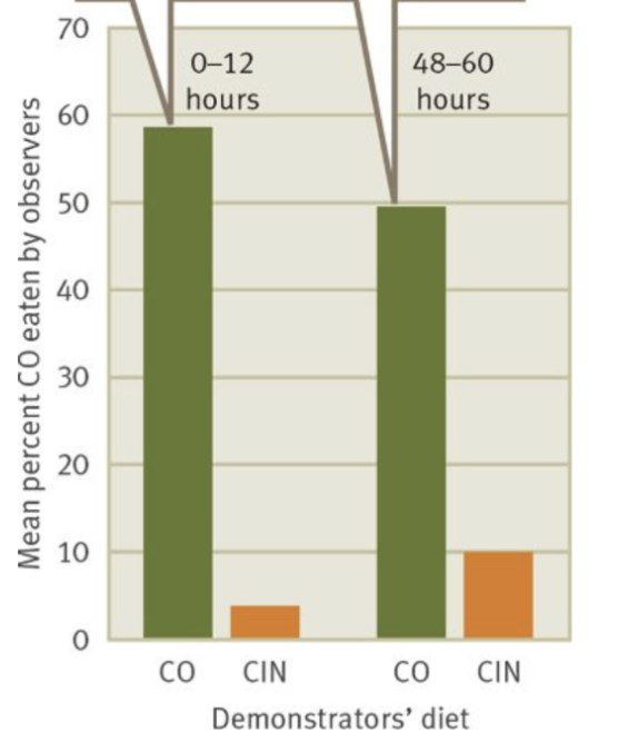
graph shows how observers are biased when not blind in the experiment → experimenter bias
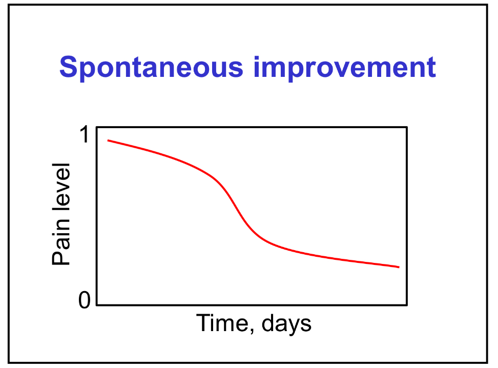
graph shows the relationship between pain level and number of days; indicating that pain will simply improve on its own
graph shows behavioural response to predator introduction in brown anoles
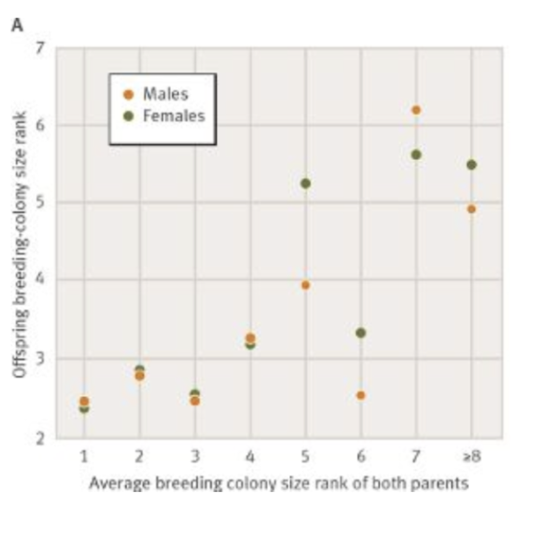
graph shows strong correlation between offspring and parent colony size for all offspring
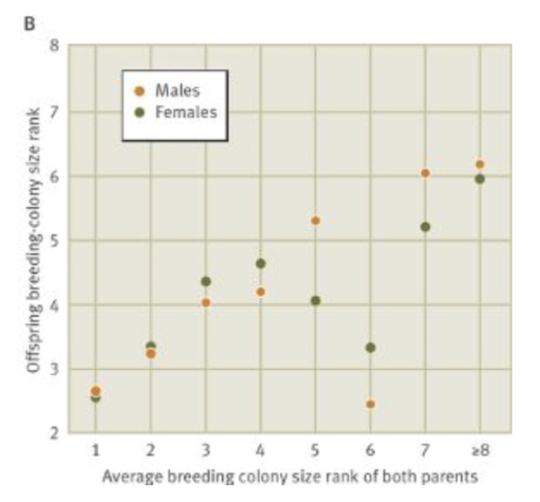
graph shows effects of offspring bred away from their natal site
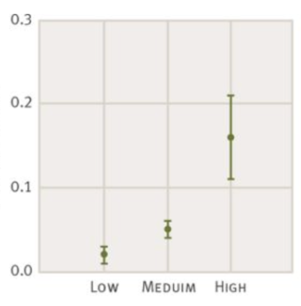
graph shows the relationship between degeneration and asymmetry
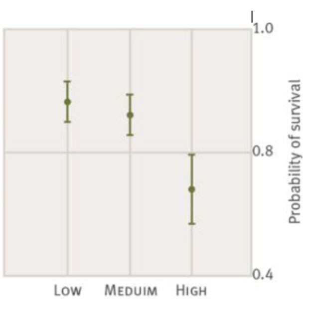
graph shows the relationship between degeneration and chances of survival
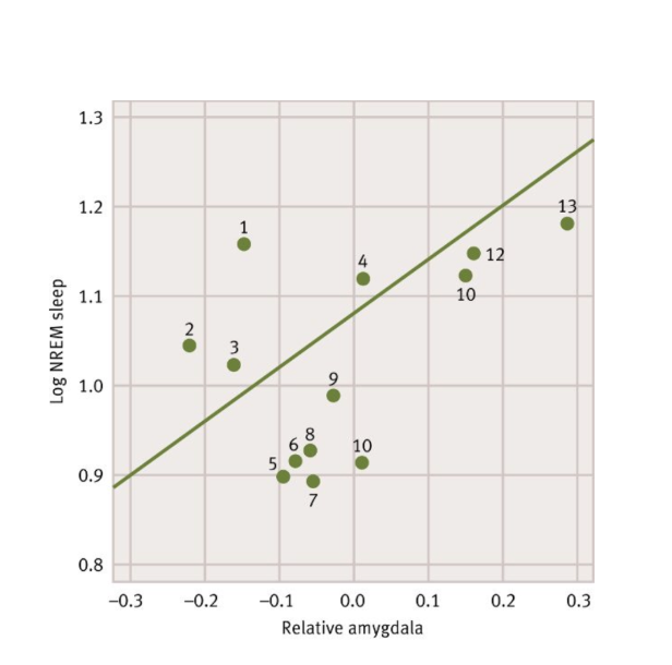
graph shows positive correlation betweeen amygdala and nREM sleep
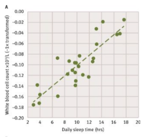
graph shows the more you sleep the higher the white blood cell count
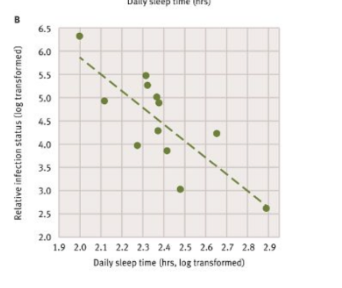
graph shows the more you sleep the less infection you get
graph shows mean stable hydrogen isotope signatures (SD) from Canada Geese of known migratory status
figured out that the population migrating was most likely the labradore geese due to hydrogen fuel isotopes

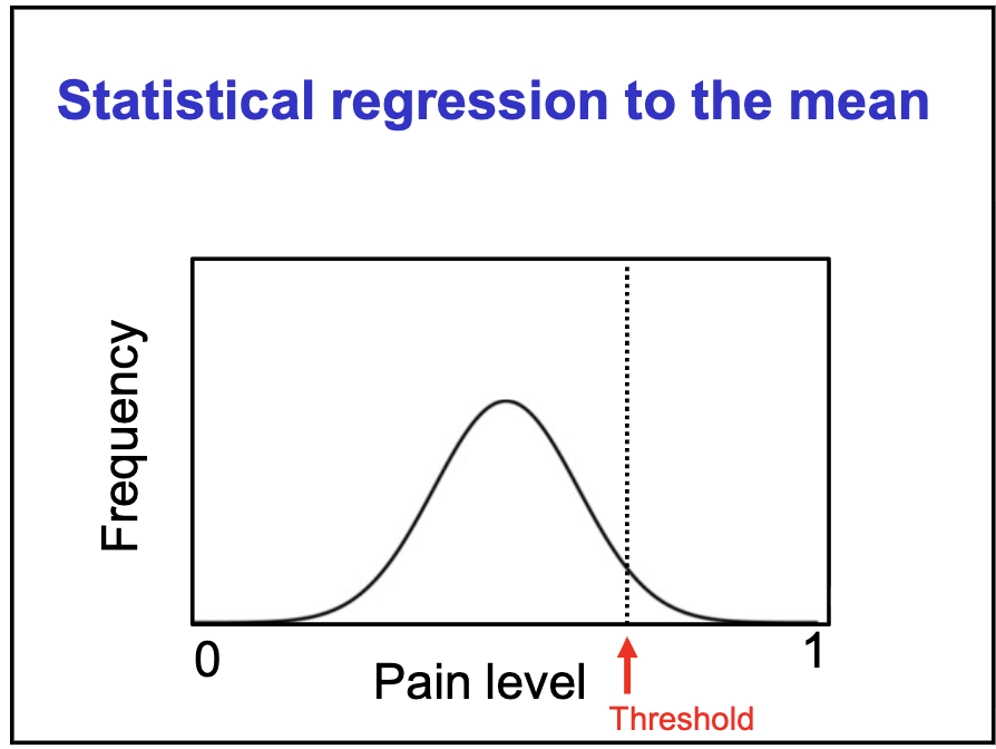
graph shows statistical regression to the mean
can trick people into thinking a treatment or intervention worked when it really didnt
when you measure again the second score will usually be closer to the average