Research Methods 2 Lecture 8
1/11
There's no tags or description
Looks like no tags are added yet.
Name | Mastery | Learn | Test | Matching | Spaced | Call with Kai |
|---|
No analytics yet
Send a link to your students to track their progress
12 Terms
How to visualize results
Clear vs credible
Rule of thumb: when you think the front is too big, increase front size a couple more points
Adjust scale to visually emphasize differences (only if differences are meaningful)
Clearly indicate the baseline (often 0)
Add visual support for categories → use meaningful colors for categories
Why should your plots be credible?
Because science is about convincing yourself and others!
No QRPs
No replication crisisIf your data are not convincing/credible, they will/should not have impact!
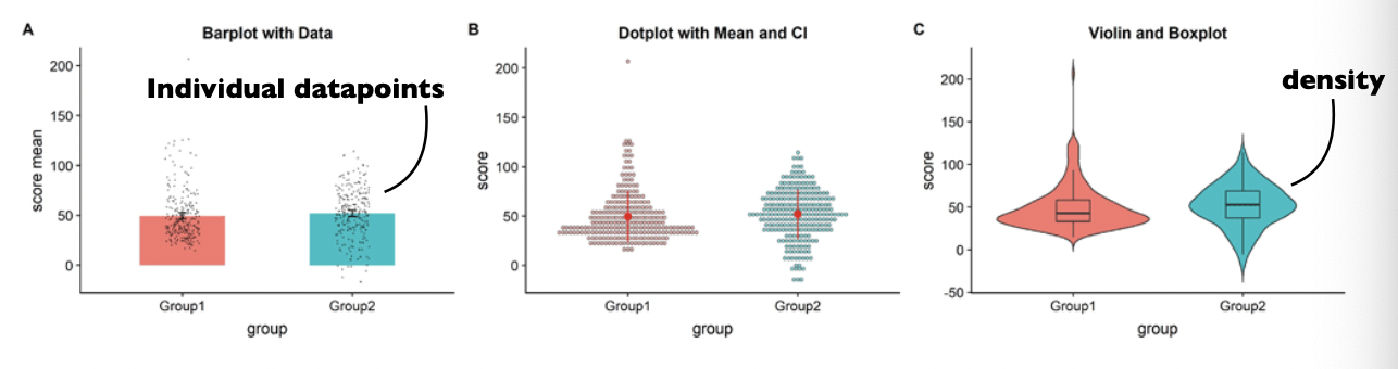
Typical solution: bar plot with error bars (but what you are used to is not always good)
Disadvantages of bar plot with error bars
Bar-plots hide information about the underlying distribution (correlations too)
It is often unclear what error-bars refer to
Error bars often do not reflect the relevant metric:
variability on raw conditions rather than variability on the relevant difference
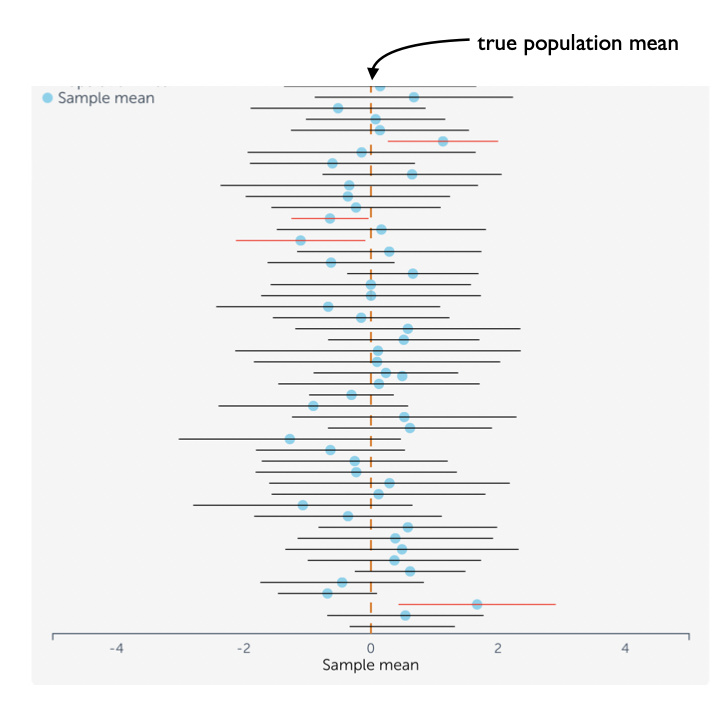
95% Confidence Intervals
In the long run (when you repeat the experiment many times) 95% of the 95% CIs contain the true population mean
It does NOT mean that 95% of estimated means fall within the bounds of a given 95% CI!
It does NOT mean that there is 95% probability that the true mean falls within a given 95% CI!
It also does NOT mean that the 95% CI contains 95% of the data!
If zero falls outside the boundary of a 95% confidence interval of a study, then p<0.05
How to visualize distributions?
Show individual datapoints
Show density
Clearly state what is on the x-axis and on the y-axis
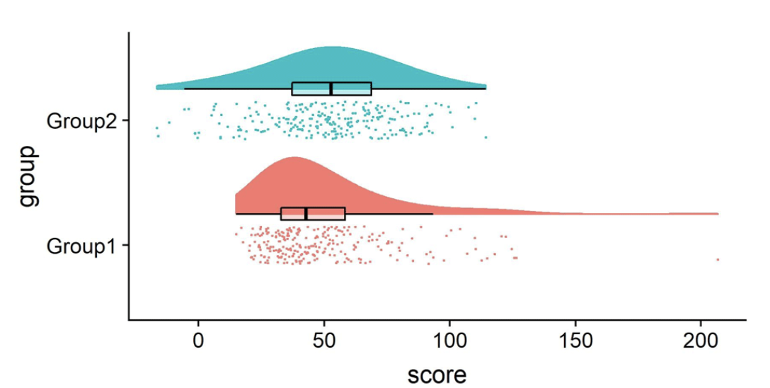
Boxplot:
Maximum: the highest data point in the data set excluding outliers
Third quartile (75th percentile): the median of the upper half of the dataset
Median (50th percentile): the middle value in the data set
First quartile (25th percentile): the median of the lower half of the dataset
Minimum: the lowest data point in the data set excluding outliers
Raincloud plots
The best of all worlds distribution, data, as well as box plots and/or confidence intervals
2×2 Factorial Design
Main effects: Marginal means differences
Interactions: Differences in differences
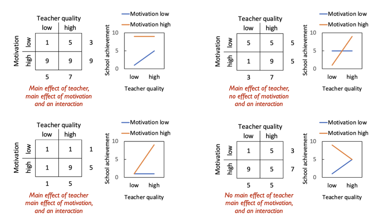
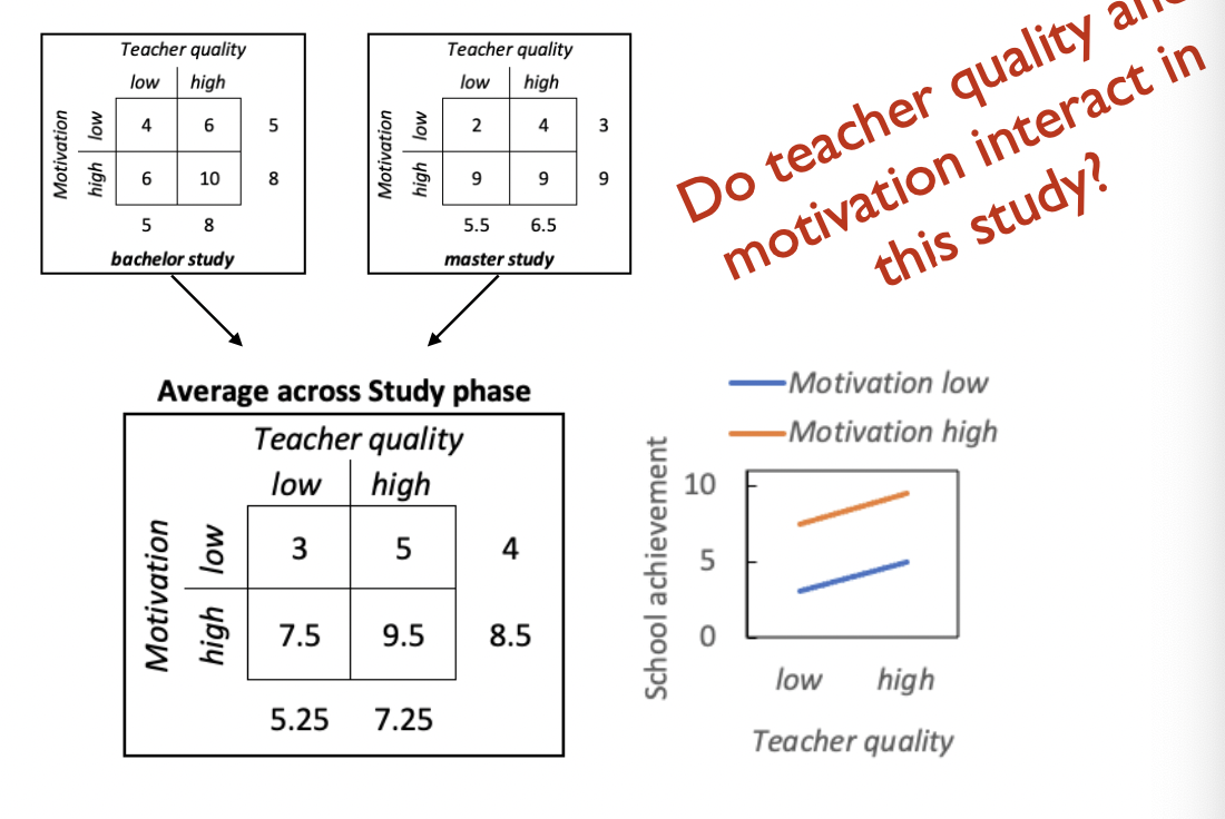
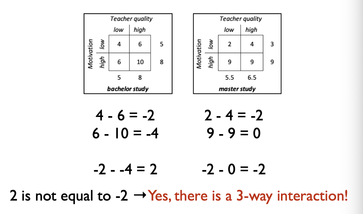
2×2×2 Factorial Design
Do teacher quality and motivation interact in this study? → To find out you must average across the third factor
How to do that without a figure? → Differences in differences
3-5 = -2
7.5-9.5 = -2
→ -2 is equal to -2 so no interaction
How to establish if there is a 3-way interaction?
You need the complete data
Ask yourself: Does the level of one of the factors change the interaction between the other two factors
Data Interpretation
Draw conclusions with respect to the data:
Compare results to predictions
Compare results to prior research
Try to sketch the bigger picture, but don’t claim things that are not supported by data:
Implications for theory, applications, future research, society
Shortcomings? Be open about what you can and cannot conclude!

In your discussion, you can pay attention to:
Construct validity: did you measure what you intended?
Internal validity: watch causality!
Statistical validity: E.g. did your study have sufficient power?
External validity: Be careful when trying to generalize
Significance ≠ importance: effect size? meaning?
Stay close to your data: describe rather than (over)interpret
Open Science
Pre-register your hypotheses and analysis plan if possible (no HARKING, no P-hacking)
Publish presentation scripts, analysis scripts and data in a public repository after finishing an experiment
Always try to publish open access (no paywall) and/or publish on a pre-print server