AP Statistics CH 3 Graphical Methods for Describing Data
0.0(0)
Studied by 2 peopleCard Sorting
1/13
Earn XP
Description and Tags
Last updated 6:51 AM on 11/2/22
Name | Mastery | Learn | Test | Matching | Spaced | Call with Kai |
|---|
No analytics yet
Send a link to your students to track their progress
14 Terms
1
New cards
relative frequency
frequency / total number of observations
2
New cards
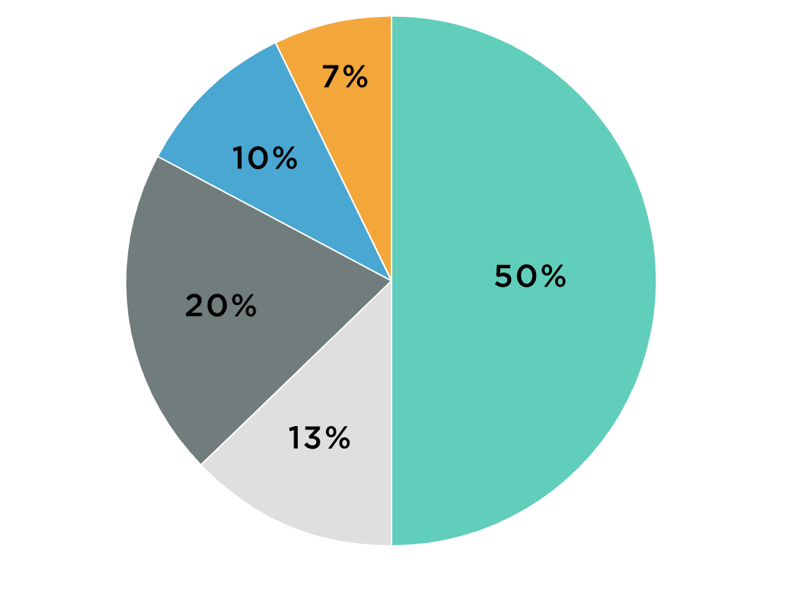
pie chart
1. title your graph
2. draw a circle to represent the entire data set
3. calculate the relative frequency (for each slice)
Describe:
- which category has the largest proportion
- which category has the smallest proportion
2. draw a circle to represent the entire data set
3. calculate the relative frequency (for each slice)
Describe:
- which category has the largest proportion
- which category has the smallest proportion
3
New cards
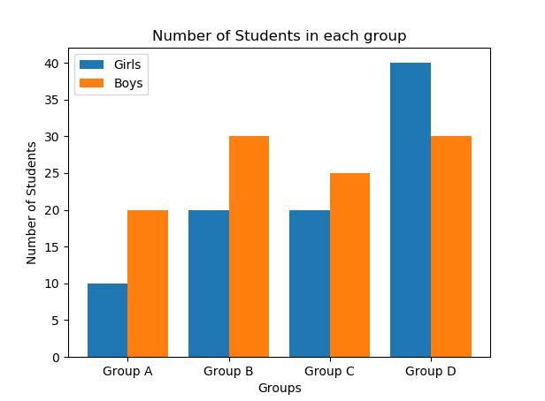
double bar chart
used when there are two (or more) groups
- for categorical data
1. calculate relative frequency
2. bars for each unit must touch. Bars for each category must be separate.
- for categorical data
1. calculate relative frequency
2. bars for each unit must touch. Bars for each category must be separate.
4
New cards
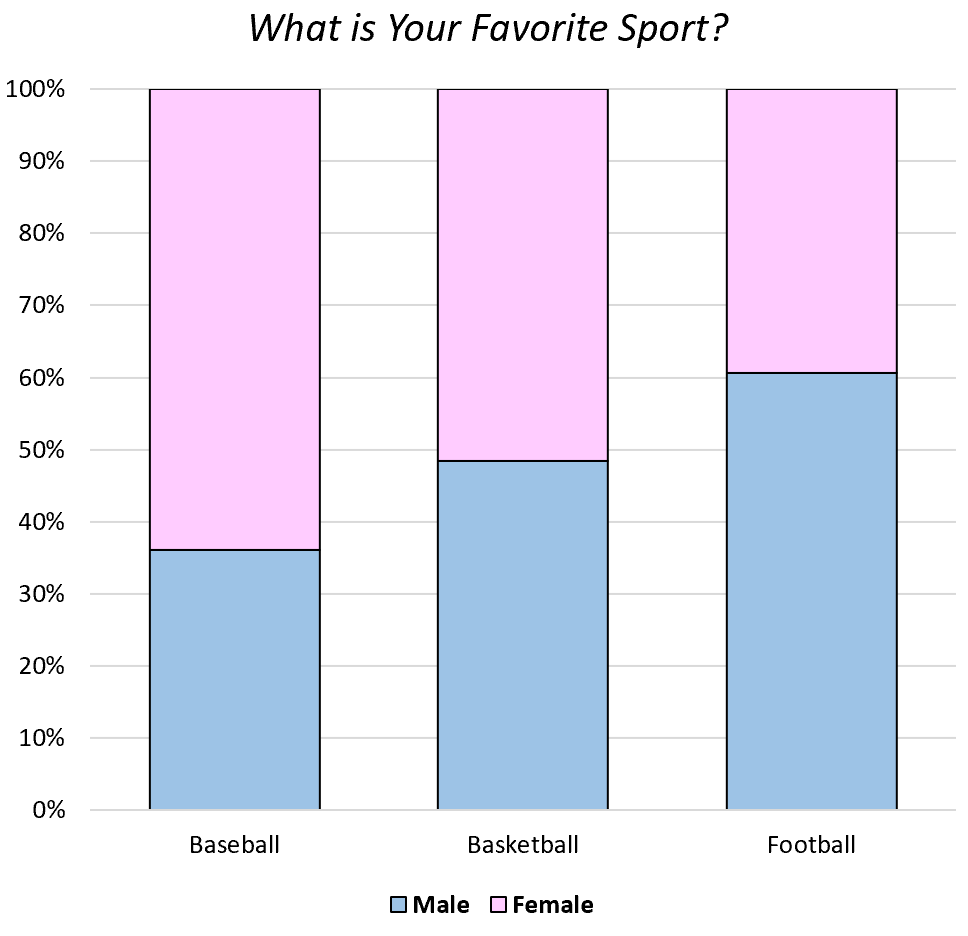
segmented bar graph
1. calculate relative frequency
3. draw a bar representing 100% of the group
3. divide the bar based on cumulative relative frequency
- for categorical data
3. draw a bar representing 100% of the group
3. divide the bar based on cumulative relative frequency
- for categorical data
5
New cards
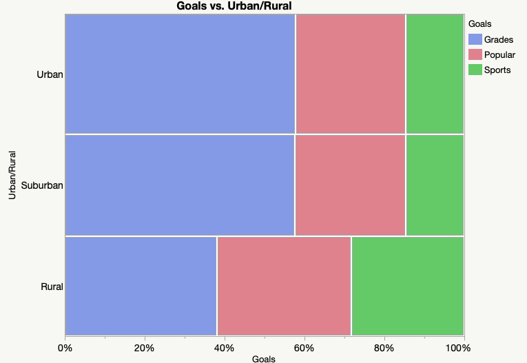
mosaic plot
- special type of stacked bar chart
- the width of the columns is proportional to the number of observations
- for categorical data
- the width of the columns is proportional to the number of observations
- for categorical data
6
New cards
univariate numerical data
data with one variable
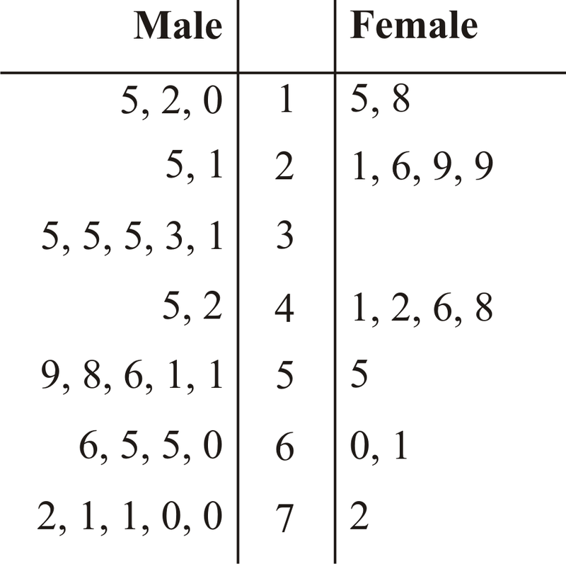
- stem and leaf plot
- comparative stem and leaf plot
- stem and leaf plot
- comparative stem and leaf plot
7
New cards
outlier
an unusually small or large data value
8
New cards
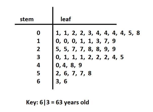
stem and leaf plot
- used for small to moderate-sized data sets
- for numerical data
1. stem: consists of the first digit(s)
2. leaf: consists of the last digit(s)
- for numerical data
1. stem: consists of the first digit(s)
2. leaf: consists of the last digit(s)
9
New cards
truncating data
shorten or simplify data
ex: 54.6 ---> stem=5, leaf=4
ex: 54.6 ---> stem=5, leaf=4
10
New cards
comparative stem and leaf plot
- for numerical data
11
New cards
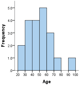
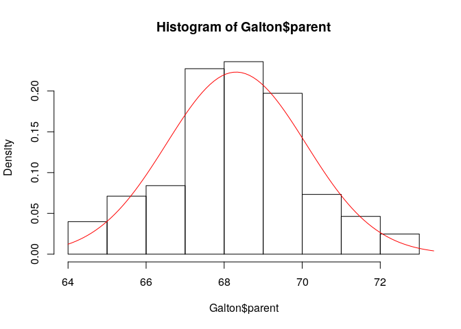
histogram
- for discrete numerical data: bars over the center of each value
- for continuous numerical data: bars over intervals
- can use frequency OR relative frequency
- bars must be touching
- for continuous numerical data: bars over intervals
- can use frequency OR relative frequency
- bars must be touching
12
New cards
density
relative frequency / interval width
- for histograms with unequal intervals
- on the vertical axis
- for histograms with unequal intervals
- on the vertical axis
13
New cards
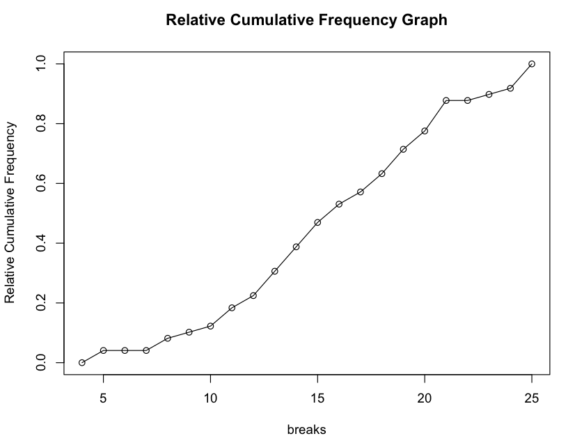
cumulative relative frequency plot
- used for percentiles
1. calculate relative frequency
2. plot each point corresponding to the upper end of each interval using the cumulative relative frequency
3. connect the points
1. calculate relative frequency
2. plot each point corresponding to the upper end of each interval using the cumulative relative frequency
3. connect the points
14
New cards
scatterplot
- for bivariate data
- explanatory variable on horizontal axis
- response variable on vertical axis
- explanatory variable on horizontal axis
- response variable on vertical axis
