GW Blok 6 Seminar 1.1 Descriptive statistics for one variable
1/32
There's no tags or description
Looks like no tags are added yet.
Name | Mastery | Learn | Test | Matching | Spaced | Call with Kai |
|---|
No analytics yet
Send a link to your students to track their progress
33 Terms
What is a variable in statistics?
A variable is a recorded characteristic that varies from one subject to another.
What are the two main types of variables and their subtypes?
Qualitative (categorical)
Nominal
Ordinal
Quantitative (discrete/continuous)
Interval
Ratio
What is a nominal variable and how does it differ from other types of variables?
Qualitative variable
These are variables for which the scores are only intended to distinguish between different categories. The scores itself do not have any meaning.
Specifically,
the categories are not ordered and
the space between the scores does not have any meaning.
One cannot also say that, e.g. the score 2 is twice as much worth as the score 1.
the zero point is arbitrary
Example: gender with the categories male or female and hair color with the categories brown, blond or red can be scored as 1, 2 and 3
What is a ordinal variable and how does it differ from other types of variables?
Qualitative variable
These are nominal variables for which the categories are ordered. We still can score the categories as 1, 2 and 3 or 3, 2, and 1.
Specifically,
the categories are ordered
the space between the scores does not have any meaning.
One cannot also say that, e.g. the score 2 is twice as much worth as the score 1.
the zero point is arbitrary
Example: SES with the categories low, middle and high.
What is a interval variable and how does it differ from other types of variables?
Quantitative variable
Interval variables contain the same information as nominal and ordinal variables plus the extra information that differences between scores can be meaningfully interpreted.
However, it does not make sense to say that 20 degrees Celsius is twice as warm as 10 degrees Celsius. The reason for this is because ‘zero’ is arbitrary and is chosen as the freezing point of water
Specifically,
the categories are ordered
the space between the scores does have any meaning.
One can also say that, e.g. the score 2 is twice as much worth as the score 1.
the zero point is arbitrary
Example: temperature on the Celsius scale. An increase of 10 degrees from 10 to 20 is the same increase as from 25 to 35 degrees Celsius. In both cases we can say that it is getting warmer by 10 degrees. But the zero point is arbitrary. Temperatures can be below 0.
What is a ratio variable and how does it differ from other types of variables?
Quantitative variable
We can compare different scores of a ratio variable, because there exists a fixed zero value. (zero of age or zero number of brothers).
Note that the variable ‘number of brothers’ is discrete and not continuous. In applied statistics, however, such ratio variables are often indicated as continuous variables (although quantitative is better)
Specifically,
the categories are ordered
the space between the scores does have any meaning.
One can also say that, e.g. the score 2 is twice as much worth as the score 1.
the zero point is not arbitrary
Example: the variable ‘age’. A 20 years old person is twice as old as another 10 years old person. Zero years old is the lowest your age can get.
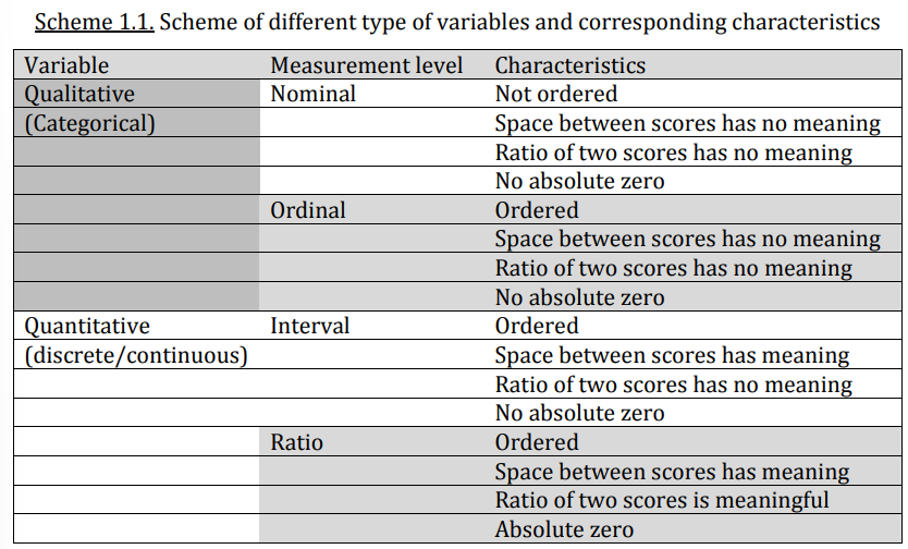
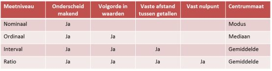
Scheme of different types of variables and corresponding characteristics
Level | Central tendency | Operations | Geschikte Grafieken |
|---|---|---|---|
Nominal | Mode | ❌ None | - Staafdiagram- Cirkeldiagram |
Ordinal | Median, Mode | ❌ None | - Staafdiagram- Boxplot (geen schaalverdeling nodig)- Cumulatieve frequentiegrafiek |
Interval | Mean, Median, Mode | ✅ + and - | - Histogram- Boxplot- Spreidingsdiagram |
Ratio | Mean, Median, Mode | ✅ +, −, ×, ÷ | - Histogram- Boxplot- Spreidingsdiagram- Staafdiagram (voor gemiddelden per groep) |
What does a frequency distribution/table show?
How data values are distributed across different intervals or values.
In the columns you can see:
Scores
Frequency (used with small sample size)
Percentage (used with larger sample size)
Valid percentage (with no missing values)
Cumulative percentage (it shows the percentage of observations that fall at or below a particular category or value)
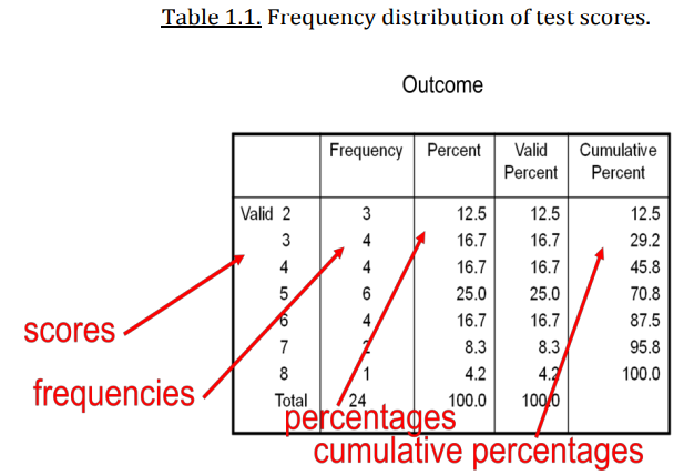
What is cumulative percentage?
Cumulative percentage in a frequency table is the running total of the relative percentages up to a certain point. It shows the percentage of observations that fall at or below a particular category or value.
Example:
Score
Frequency
Percentage
Cumulative Percentage
A
5
25%
25%
B
7
35%
60%
C
8
40%
100%
For B, the cumulative percentage is: 25% (A) + 35% (B) = 60%
For C, it's: 60% + 40% = 100%
Cumulative percentage helps you understand how much of your data is contained within or below certain categories — for example, to see what percentage of students scored A or B or less.
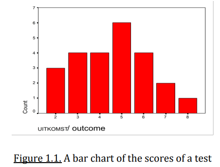
What does a bar chart show and when is it used?
Used for qualitative variables (nominal or ordinal)
The order of bars doesn’t matter if a nominal variable is displayed
A bar chart is a graph with a vertical axis representing the frequency (counts) and a horizontal axis representing the scores.
The bars are seperated because the categories are distinct and unconnected.
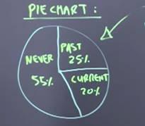
What does a pie chart show and when is it appropriate?
It is appropriate for categorical data
Represents the proportion or percentage of categories in a whole
Each slice of a pie chart represents the proportion or relative frequency of each category
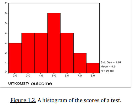
What does a histogram show and when is it used?
Used for quantitative variables (interval or ratio)
Y-axis shows the frequency of observations within intervals
X-axis shows the bins or intervals of the data — in other words, ranges of values for a quantitative (numerical) variable.
The width of each bar is meaningful
User determines the width
Now the scores are connected as it should for interval and ratio type of variables and there is a notion of distance on the x-axis.
How grouping quantitative data works and why do you do it?
Why? To simplify data presentation and make histograms easier to interpret.
How do you ensure bar area reflects frequency when class widths vary?
Divide frequency by the class width; use density on the Y-axis.
What is a measure of central tendency and what are the three main measures of central tendency?
It is a statistic that identifies a typical or central value in a data set.
Mean, median, and mode.
How do you calculate the mean and what is the interpretation?
It is the center of gravity or balance point of the distribution.
The mean= the sum of all values/the number of values.
What is the mean of 4, 3, 1, 6, 1, 7?
(4+3+1+6+1+7)/6 = 22/6 ≈ 3.67
The mean is sensitive to extreme values
Best not to use if the data is highly skewed or contains outliers
How do you calculate the median and what is the interpretation?
It is the middle number of the order of numbers
To calculate:
First order the numbers: 1 1 3 4 6 7
There are two middle numbers 3 and 4
Take the mean of 3 and 4 to find the median
3+4/2 = 3,5
0 7 50 10.000 1.000.000 → 50 the median
It is not affected by extreme values or skewness.
How do you calculate the mode and what is the interpretation?
The most common number in the data set
What is the mode of 4, 3, 1, 6, 1, 7?
1 — it appears twice, more than any other value.
A dataset can have more than one mode, such distributions are called bimodal or multimodal
Useful for categorical data or to identify the most common value in a distribution.
It is less affected by extreme values or skewness.
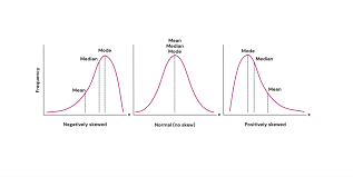
How are the three measures typically ordered in the three different distributions?
Negatively skewed = left skewed
Mean < Median < Mode
Most values are on the right, with a tail stretching to the left.
Normal distribution
Mean = median = mode
Positively skewed = right skewed
Mode < Median < Mean
Most values are on the left, with a tail stretching to the right.
If you know the distribution of the data you can predict the mode, median and mean
If you know the mode, median and mean of the data you can predict the distribution of the data
How do you calculate the range and what is the interpretation?
Is the difference between the largest and smallest value in a dataset. It measures the total spread.
Range: largest number of the dataset - smallest number of the dataset
Dataset 1: -10, 0, 10, 20, 30
= 30 - - 10 = 40
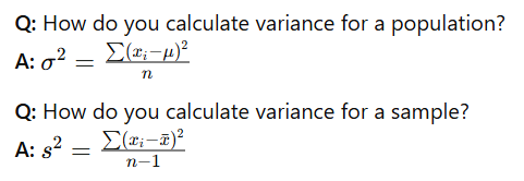
How do you calculate the variance and what is the interpretation?
Measures the average squared distance between each data point and the mean. It reflects how spread out the data is.
The average error (distance) between the mean and the observations made in units squared
Variance: (datapoint 1 - mean) 2 + (datapoint 2 - mean) 2 / number of datapoints used
N - 1 in a sample because it provides an unbiased estimate of the population variance, accounting for degrees of freedom.
De variance verandert niet, optellen of aftrekken heeft geen invloed op de spreiding.
Waarom?
Varianties en standaarddeviaties meten hoe ver de waarden van het gemiddelde afliggen.
Als je overal dezelfde waarde bij optelt of aftrekt, veranderen die afstanden niet.
What is "variation" in contrast to variance?
Variation is the total sum of squared differences without dividing by n; variance is the average of that.
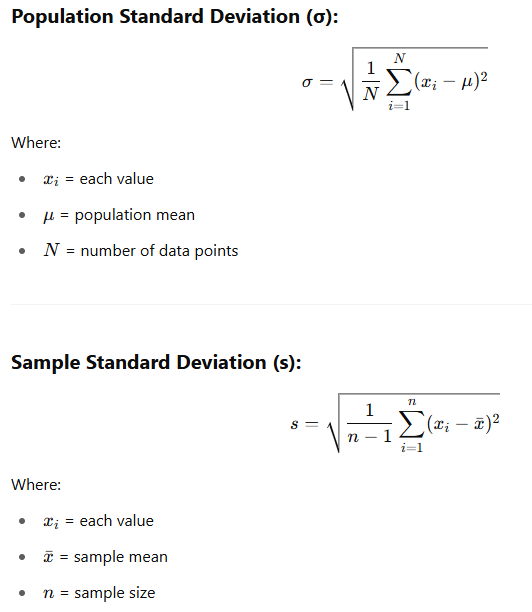
How do you calculate the standard deviation (SD) and what is the interpretation?
The standard deviation is the square root of the variance, representing the average distance from the mean in original units. It reflects how spread out the data is.
More usable than variance because it is expressed in the same dimension (scale) as the values.
Root of the variance
How do you calculate the interquartile range (IQR) and what is the interpretation?
It measures the spread of the middle 50% of data by subtracting Q1 (25th percentile) from Q3 (75th percentile).
IQR = Q3 − Q1
First sort the numbers: 4, 4, 6, 7, 10, 11, 12, 14, 15
Find the median: 10, the middle number
Find the median of the first part and the second part: 4+6/2 = 5 and 12+14/2 = 13
Median of second part - median of first part = 13 - 8 = 5
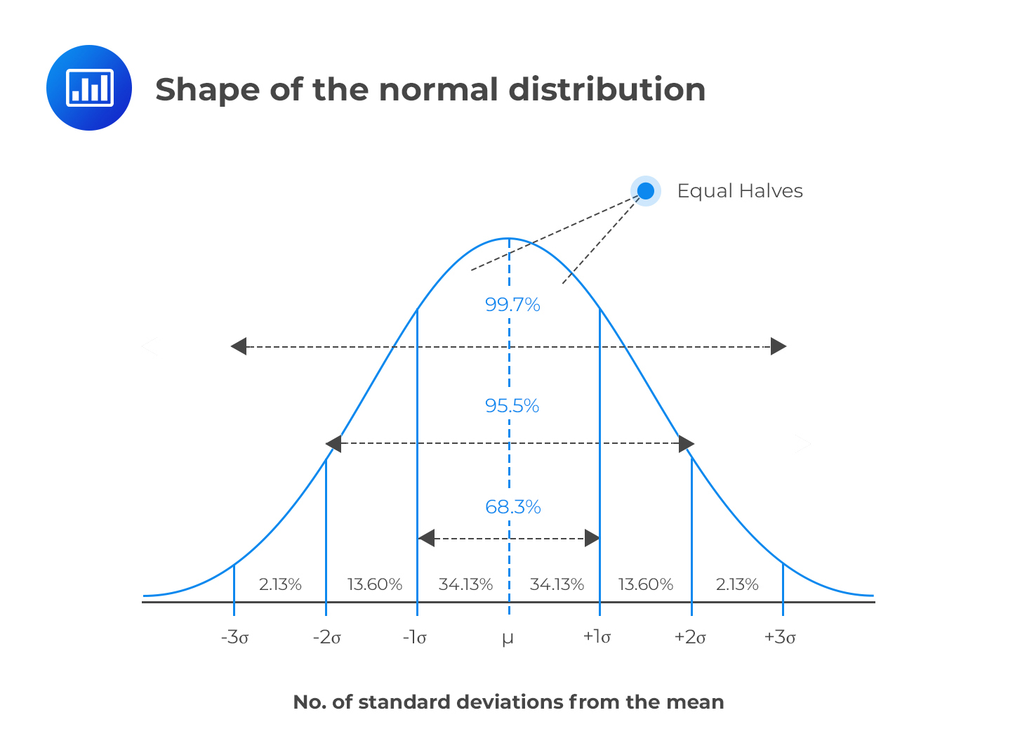
What are the characteristics of a normal distribution?
Characteristic 1: symmetrical (so, mean = median = mode)
Characteristic 2: empirical rule (68/95/99.7% rule)
68% of data falls within 1 standard deviation of the mean
95% of data falls within 2 standard deviations of the mean
99.7% of data falls within 3 standard deviations of the mean
Characteristic 3: bell-shaped
Characteristic 4: unimodal → one peak
Characteristic 5: centered around the mean
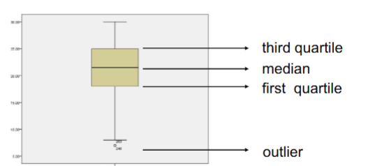
What does a boxplot show?
A more quantitative way of describing the distribution of a variable
Summarizes the data, shows you the middle of the data, distribution and the symmetrical aspects
Median: the value that splits the dataset in half — 50% of data lies above and 50% below it.
Q1: the value below which 25% of the data fall.
Q3: the value below which 75% of the data fall
IQR = Q3 − Q1; it represents the range of the middle 50% of the data
Minimum and maximum values: the largest and smallest data points within the fences (excluding outliers), all values excluding outliers
Outliers: values beyond the upper and lower fences
Upper fence: Q3 + 1.5 × IQR
Lower fence: Q1 − 1.5 × IQR
What is a theoretic distribution?
It is the distribution that would result if the number of observations (or classes) becomes very large, often used to represent populations.
The area under a theoretic distribution curve = 1
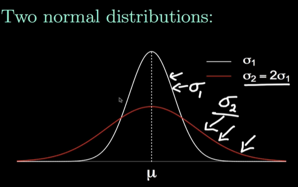
What happens when the standard deviation of a normal distribution increases?
The curve becomes flatter and wider, with more area in the tails.
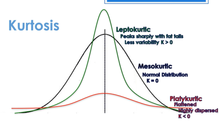
What is kurtosis?
It refers to the "peakedness" or "flatness" of a distribution.
K < 0: flattenend, highly dispersed, small tails
K = 0: normal distribution
K > 0: peaks sharply with fat tails, less variability
What is a standard normal distribution?
The standard normal distribution is a normal distribution with mean 0 and variance 1
Z = N (0 (mean), 1 (variance)
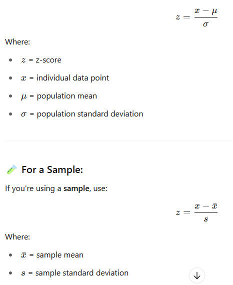
How do you calculate the Z-score and what is the interpretation?
The z-score is simply the standardized score
It tells how many standard deviations a score is away from the mean (this is not possible using the raw score!)
Z = (observed value – mean)/standard deviation
Z = 0 → the observation is exactly at the mean
Z = positive → the observation is above the mean
Z = negative → the observation is below the mean
Observations
Mean: 5
Variance: 4+0+4/2 = 4
SD = SQRT4 = 2
Z-transformation: Z formule
3: (3-5)/2 = -1
5: (5-5)/2 = 0
7: (7-5)/2 = 1
1, 0, 1 zijn de Z-waarden
Mean: 0
Variance: ((-1-0)^2 + (0-0)^2 + (1+0)^2)/(3-1) = 2/2 = 1
SD: SQRT1 = 1
What are the mean and variance of a Z-score distribution?
Mean = 0, Variance = 1.
Does the shape of the distribution change after a Z-transformation?
No, it remains the same (e.g., normal stays normal).
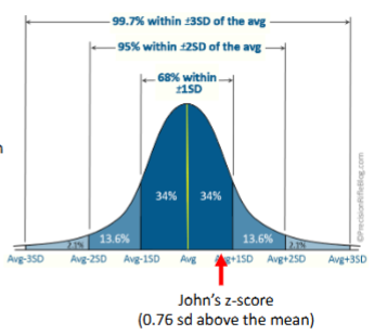
Example z-score
US: mile/hour en EU: km/hour, converting for comparing
In the speedy driver data, the average maximum speed is about 169 km/h with sd = 41 km/h for males.
John reported the maximum speed of 200 km/h
His score was 31 km/h (31 = 200 - 169) above the mean, but how many standard deviations was his speed above the mean?
Or yet another question, was he among the top 10% speedy drivers
Answers to these questions can be obtained by calculating the z-score
Z-score: z = (200 - 169)/41 = 0.76
So, John was 0.76 standard deviations above the mean
Was John among the top 10% speedy drivers?
No, because he is below 1 SD, zie de grafiek