IDS2935 Exam 1
1/46
There's no tags or description
Looks like no tags are added yet.
Name | Mastery | Learn | Test | Matching | Spaced | Call with Kai |
|---|
No analytics yet
Send a link to your students to track their progress
47 Terms
What are maps? (very broadly)
Maps show different aspects of the world (countries, direction, distance, etc.) depending on the type of map. They take the 3D globe and represent it on a 2D plane.
Why can’t a map accurately represent the 3-dimensional surface of the Earth?
It is not mathematically possible to take a 3D surface and represent it in 2D without some kind of distortion
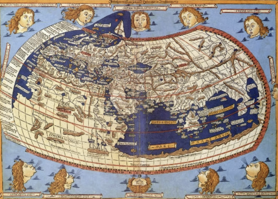
Ptolemy’s Geography (150 AD)
One of the oldest maps to show latitude and longitude; before weather patterns were well known, shows different gods blowing on the Earth

Al-Idrisi’s World Map (1154)
Shows Africa at the top (crescent shape) and Arabian peninsula in the middle; follows traditions of Muslim mapmakers, who considered Mecca due south; blends mapmaking traditions with physical geography (not overly scientific or overly religious)
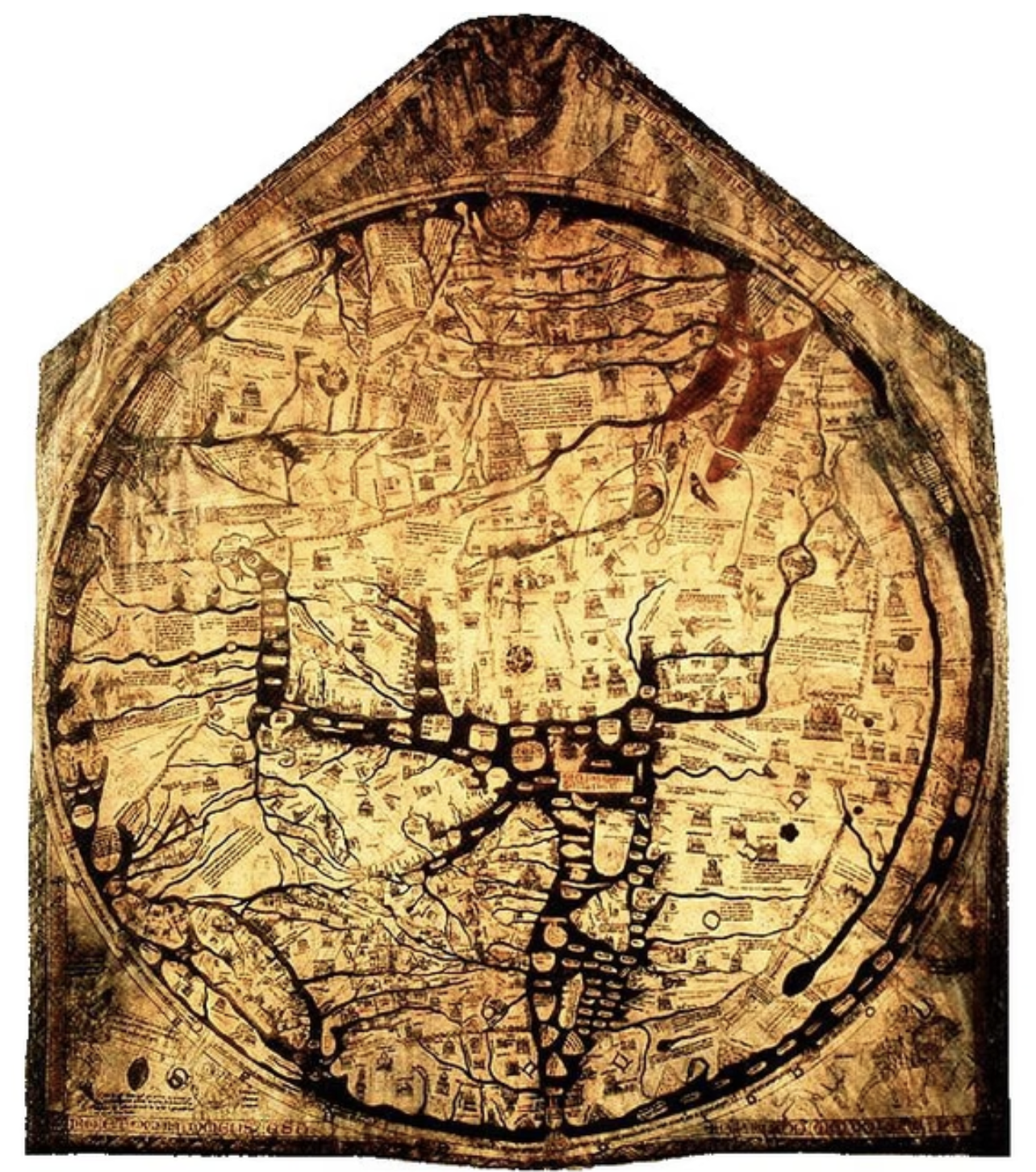
Hereford’s Mappa Mundi (1300)
Represents what world looked like to Medieval Christians; top of map is Christ’s face; center is Jerusalem, which is marked with a crucifix; edges show Africa, which has drawings of monsters in it
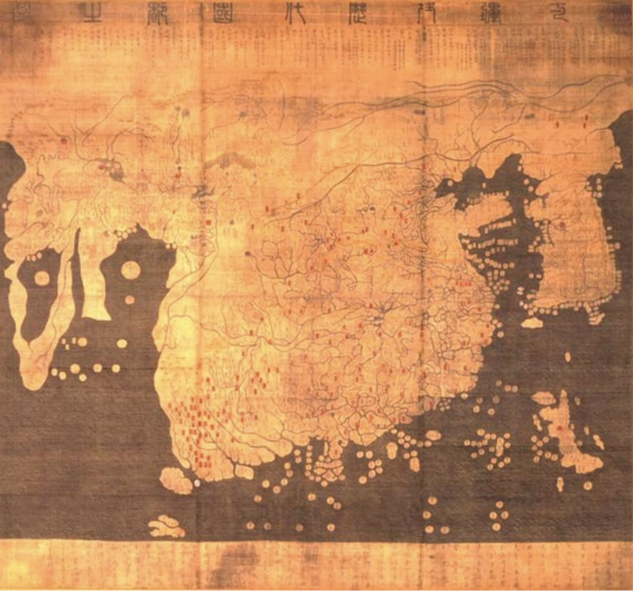
Kwon Kun’s Kangnido Map (1402)
One of the first maps that was north facing and resembling modern Western maps; China is big blob in center, Korea is to the right (disproportionately large), Japan is in bottom right, Africa to left, Arabian Peninsula between Africa and China, Europe somewhere in upper left (very small)
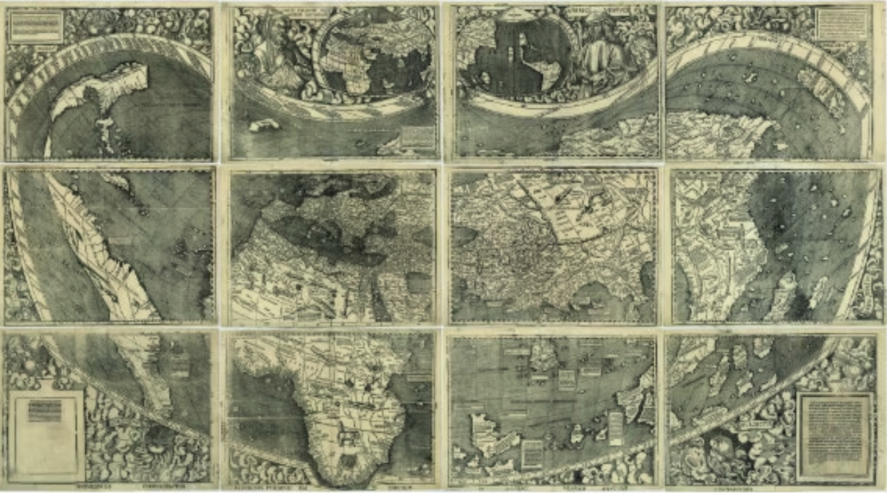
Waldseemuller’s Universalis Cosmographia (1507)
First map to recognize the Pacific Ocean and show the Americas; made of 12 different woodcut pieces
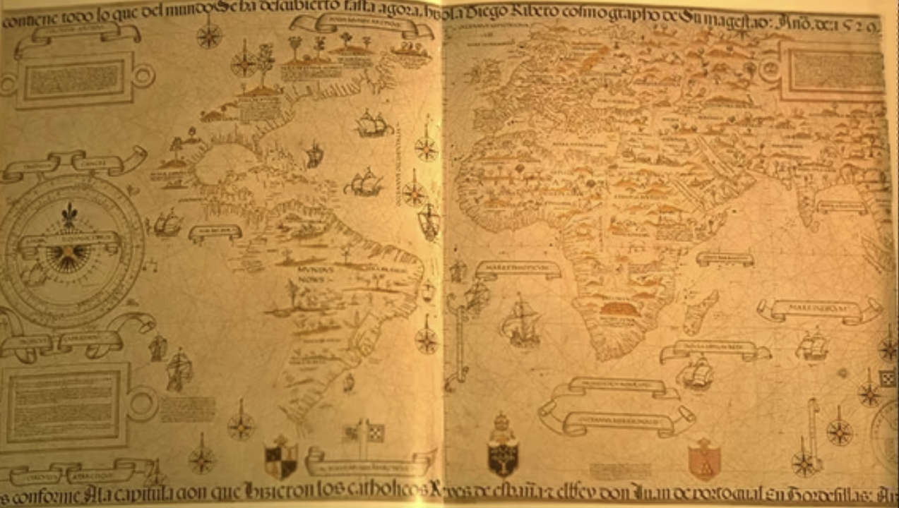
Ribeiro’s World Map (1529)
Diogo Ribeiro, a Spanish cartographer, placed the Spice Islands near Spain even though he knew they belonged to Portugal; one of the first examples of politics influencing maps
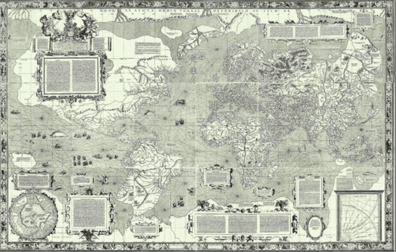
Mercator’s World Map (1569)
Allowed for a straight path to be drawn between countries (good for traveling); accused of being Eurocentric since distortion showed countries above the equator as larger than their actual size and below as smaller than their actual size
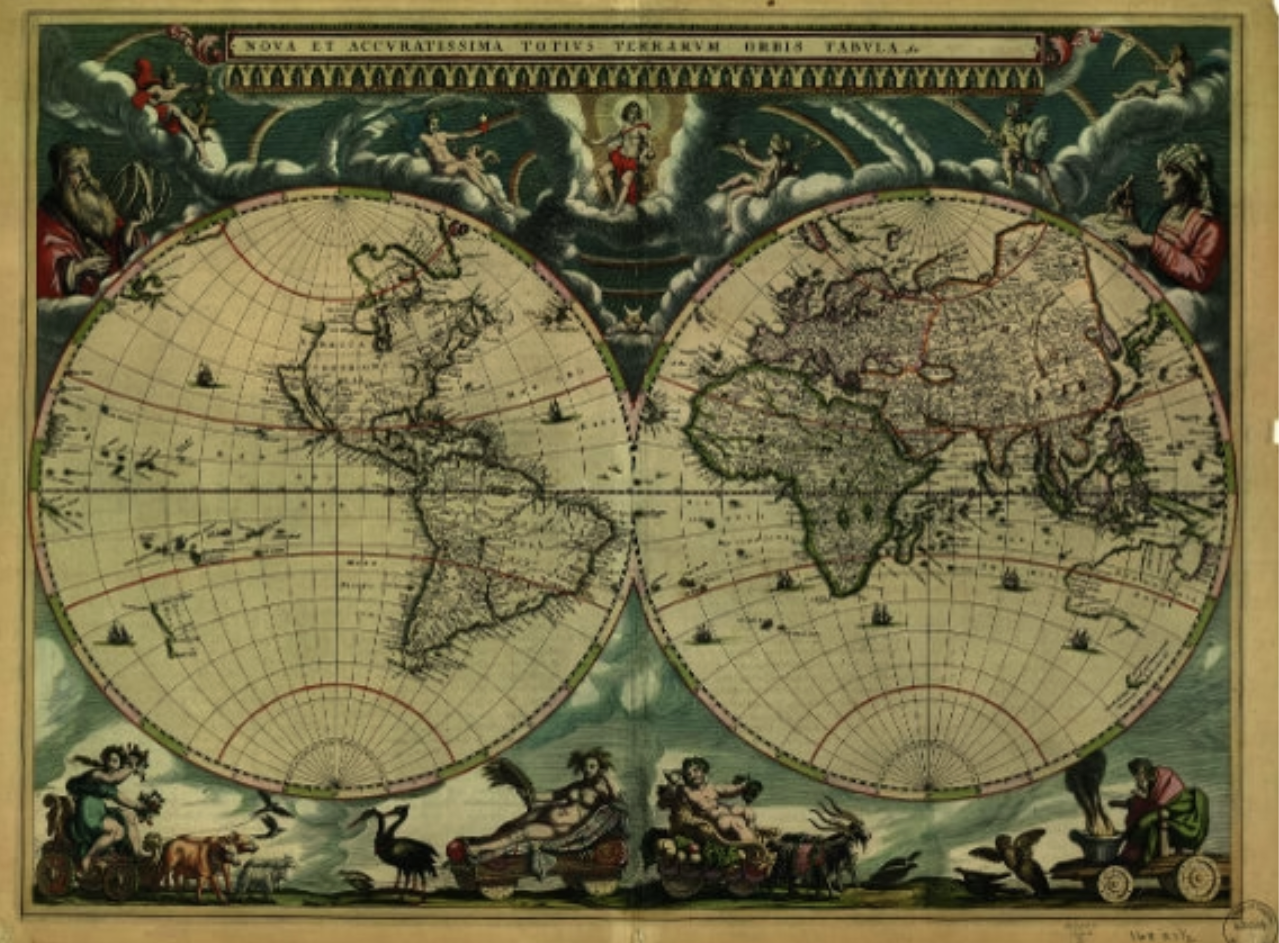
Blaeu’s Atlas maior (1662)
Sun is center of the map, one of the first references to heliocentrism in a map; showed different markets around the world
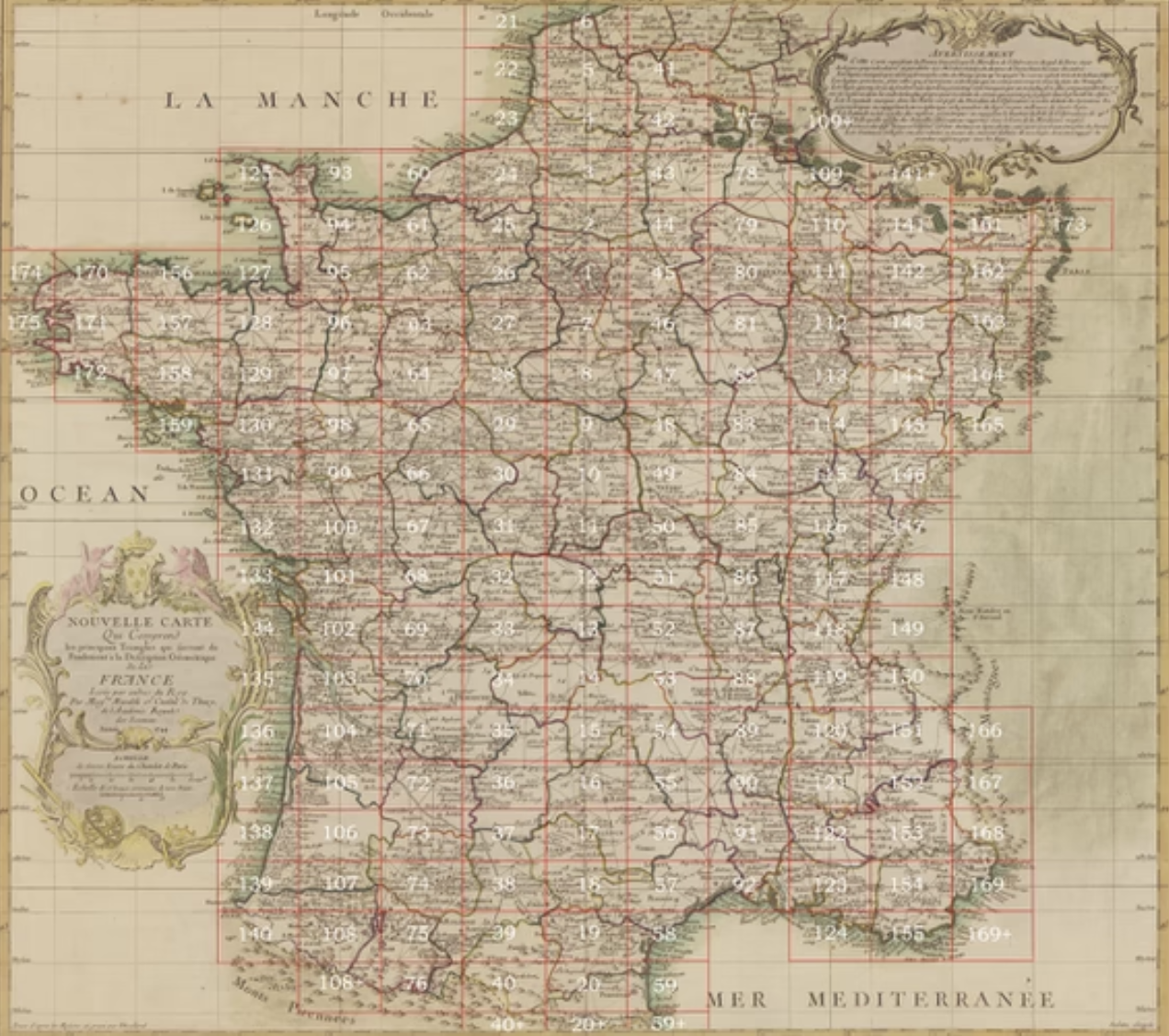
Cassini’s Map of France (1744)
Detailed map of France; each square was its own map that was put together into the giant map shown
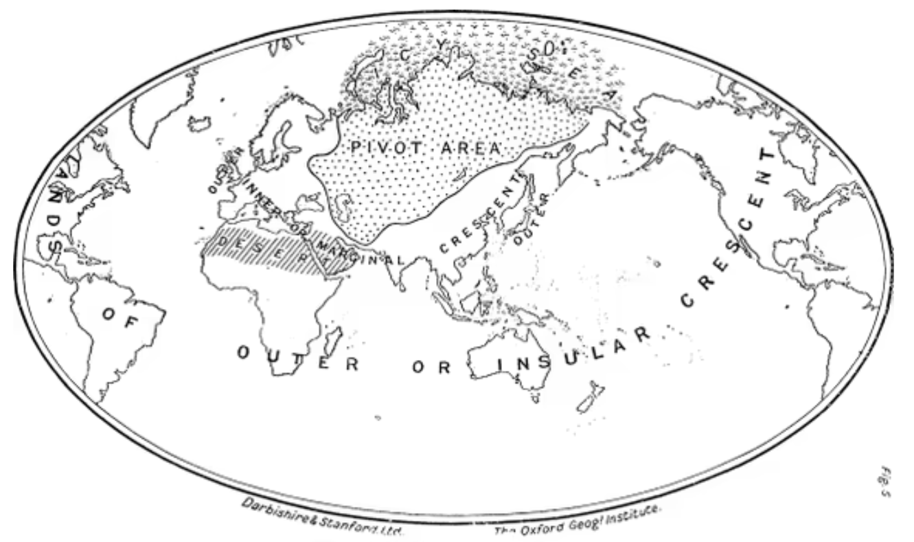
Mackinder’s Geographical Pivot of History (1904)
Showed which countries it was most beneficial to have control over (pivot area was most powerful)
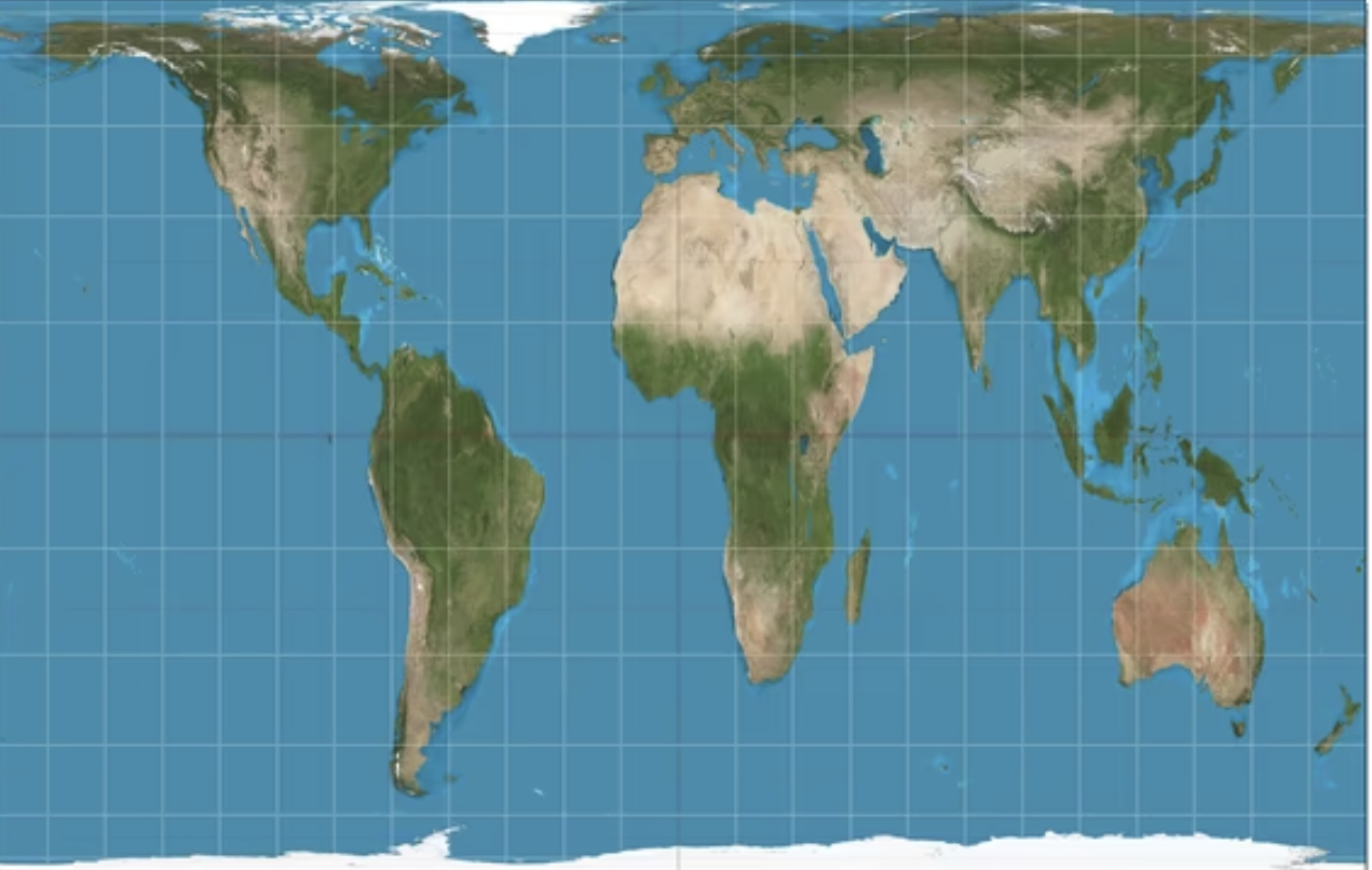
Peter’s Projection
Relative surface area of countries and continents was accurate; however, there was distortion with shape and distance
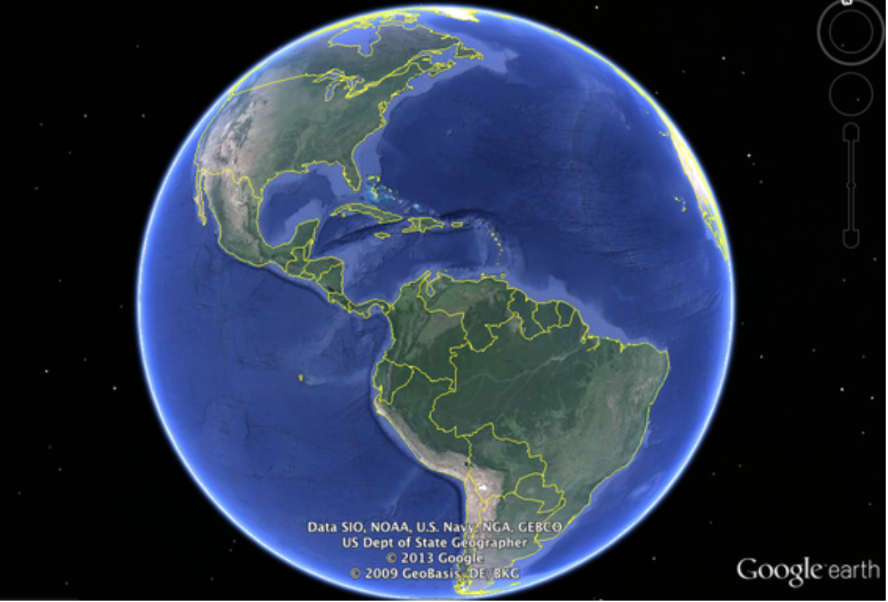
Google Earth
Source code of virtual mapping is hard to do peer reviews of; much more data and information than previous kinds of maps; can exclude places that may not be as popular
Cognitive mapping (mental mapping)
A process composed of a series of psychological transformations by which an individual acquires, codes, stores, recalls, and decodes information about the relative locations and attributes of phenomena in their everyday spatial environments
Wayfinding
The process of using spatial and environmental information to navigate to destination
Psychogeographies
The study of the precise laws and specific effects of the geographical environment, consciously organized or not, on the emotions and behavior of individuals
maps are based on our experiences and perspectives
egocentric: self-centered, things in relation to us, initially things are understood from an egocentric perspective
geocentric: orienting ourselves to the external environment
change from and egocentric to geocentric understanding of the environments
Basic purpose of maps
Visual snapshot of a particular place and time that allows their viewer to more fully understand the subject matter the map describes
We need projections because globes have some issues:
Not too much detail, very small scale
Expensive to product
Difficult to store
Can only see part of the world at once
Also:
Every view of the Earth is a compromise
No single projection does the job —> No single best projection
Each projection is suited to specifc tasks and maximizes different quanlities (shape, size, direction, etc.)
Intelligence vs. Information
Information: anything that can be known; facts and knowledge of the world
Intelligence: a TYPE of information that is processed for a certain, specific use
A process, product, organization, and information
All intelligence is information, but all information is not intelligence.
Components of geospatial intelligence
De jure definition: the exploitation and analysis of imagery and geospatial information to describe, assess, visually depict physical features and geographically referenced activities on the earth
Focus on geographic information systems and remotely sensed data
Automated data handling
Imagery perception, learning, communication, association, and reasoning
Actionable knowledge, a process, and a profession
3 components:
Imagery
Imagery intelligence
Geospatial information
How when, and why geospatial intelligence is used
Policymaking, natural disasters, and crisis mapping, geosurveillance
Small vs Large scale maps
Small scale: shows large areas of land and small amounts of detail
Large scale: shows small areas of land and large amounts of detail
Representative fraction
The ratio of a distance on the map to the same distance on the ground
Key aspects of symbology: shape, size, orientation, hue, shading
Six principal visual variable: size, shape, gratone, value, texture, orientation, hue
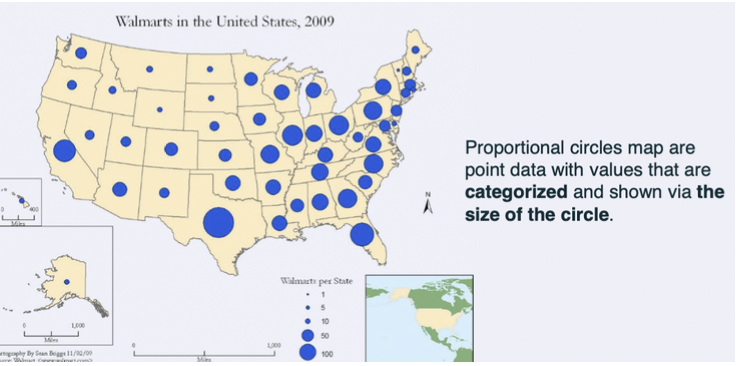
Point data maps
Basic, unmodified data showing you only the single location of a data point (map something static)
Proportion circles: point data with values that are categorized and shown via the size of the circle
Dot distribution map: include dots that represent two things — location and a value
Commonly rely on shape to show difference in kind and on size to show difference in amount
Line data maps
Shows cognitively correct network connectivity but geographically incorrect
Usually use hue or texture to distinguish rivers from railways and town boundaries from dirt roads
Subway maps, isoline maps, isotherm maps
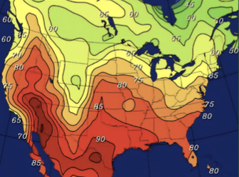
Isotherm maps: show the direction and amount of flow from point A to point B, categorized according to value and represented via the thickness of the line (ex. temperature maps on the weather channel)
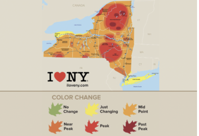
Polygon data maps
Show things that are not just points or just lines
Ex. how much the fall leaves on trees have changed color across New York State
Chloropleth map — shading
When and why you’d use different types of symbology and data
Size: more suited to showing variation in amount or count, such as the number of television viewers by market area
Graytone: preferred for portraying differences in rate or intensity, such as the proportion of the viewing audience watching the seventh game of the World Series
Orientation: useful for representing winds, migration streams, troop movements, and other directional occurrences
Isolines with example
Any line that connects points that have a constant value
Ex. contour map, isotherm map
Chloropleth Map
Area map with color intensity showing range of values within a particular administrative area (ex. amount of Americans that are between the ages 20-24, darker pink would mean a greater amount)
Different colors are used to represent different values on a a scale for the sake of comparison
limited by pre-existing administrative units (ex. counties)
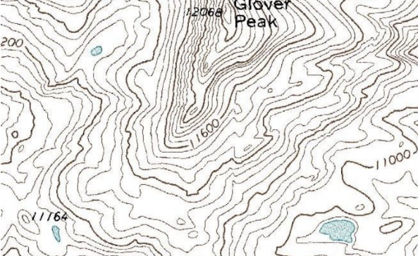
Contour Map
Shows elevation, the closer together the contour lines are, the sharper the slop that would exist in the real wold because there would be less distance between different elevations in that case
When contour lines are far apart, change in elevation is much softer, meaning areas are flat
Flow Map
Represents a frequency or value between points on the maps; allows us to illustrate more than just the orientation of data but also its relative value
Proportional Symbol Map
A thematic map that uses symbols of varying size to represent quantitative data
Cartogram
A map that distorts the size of regions to show how a variable varies across them (ex. travel time, population, or GNP)
How thematic maps use the items above
Order of communication of map info
Think about what the real world looks like
Determine the purpose of the map and your intended audience
Collect appropriate data
Design and construct the map
Determine whether users find it useful or informative
Be able to recognize the historical examples and their key details. You don’t have to recreate them, but you need to know them apart from one another.
BP- before present/ physics radiocarbondating 1950
Migration of anatomically modern human flowmap 15,000-16,000 years ago
First map - Catallhouyuk, bird’s eye view of settlemap
Map of the world- stone tablet 700-500bc Babylonian
Idaho guiding point in rock
Aborigineas river map in Australia
The impact of religion on early mapping
Roman map- functional use - relationship of things to other things- north to the left
Ptolemy - indian ocean land locked - religious elements
Madaba map - moseic floor - oldest cartographic description of the mapsholy land
Non- european were more accurate - driven by math and geometry, not religion
T and O map
Ebstorf Map - world held by Jesus
Compare early mapping practices of Europe vs. Middle East vs. China & East Asia
Different orientations of north and south
China Yu Chi Thu - accurate river map using surveying, charts for sailing
Egyptian Surveying - Nilometer
Eratosthenes from egypt - used geometry to estimate the size of the planet
Graticule and its two main elements
Latitude and longitudinal elements
Know a few historical examples from the BBC videos or Ends of the Earth readings
Map of Tenochtitlan 1524 - work of aztecs with latin texts for Emperor
The way to Rome 1500 - guides for pilgrims to Rome for travelers on the 1500th anniversary of the birth of christ
Behaim Globe 1492 - used accounts from portuguese voyages
Terrain mapping terminology
Relief: the contour of some portion of the surface of the Earth, with reference to its variation in elevation
Terrain: a tract of land considered with its natural features and configuration, especially in regards to specific use proposes
Topography: configuration of the surface of the Earth
Great Trigonometric Survey of India
Led to the most complex mathematical equations known to pre-computer age and led to the discovery of the world’s highest mountain
Terrain vs. Network mapping
Terrain: a tract of country considered with regard to its natural features and configuration, especially in regards to specific purposes (military use)
Network: an interconnected group of system of intersecting lines or channels
Nodes vs. Edges
Nodes: vertices
Edges: links with direction
Seven Bridges of Konlgsberg
Problem to devise a walk through Konigsberg, Prussia (Now, Kaliningrad, Russia) on each of the seven bridges once and only once; Euler proved it had no solution in 1736
Who was Harry Beck/what are Beck’s maps
Harry Beck — desinged London Underground map in 1933
Octilinearity
Every line on a map being drawn in one of only 8 directions, which are in multiples of 45 degrees, used to reduce geographic congruence; the design has been used of metro maps for decades, important for making complex transit networks easy to understand