IDSC 4210 Midterm Review
1/87
There's no tags or description
Looks like no tags are added yet.
Name | Mastery | Learn | Test | Matching | Spaced | Call with Kai |
|---|
No analytics yet
Send a link to your students to track their progress
88 Terms
One goal of data visualization
reduce the “time to insight”
For Data Analysts, Visualization helps you in..
Exploring data structure
Detecting Outliers and unusual Groups
Identifying trends and clusters
Presenting your results
Data Visualization allows you to
Simplify complex information (even from a large datasets)
Enhance Decision Making Process
Steps in Creating Data Visualization
What is your point: identify business objective (hypothesis)
How can you emphasize your point in your graph: identify data types, then choose graph type (proof)
What does the final graph show exactly: aesthetic mapping (color, shape, size) (explaining)
What is the 15 second rule?
Data visualizations should convey meaning in 15 seconds or less.
How quickly is a first impression made
7 seconds or less
select()
select variable
filter()
select rows
arrange()
order rows by variable
mutate()
create new variable
summarize()
aggregate the data
group_by()
group rows by variable
starts_with()
select based on prefix
ends_with()
select based on suffix
num_range()
select based on prefix & numeric range
contains()
matches a string within the variable
matches()
more general matching using regular expressions
one_of()
selects columns from a group of names
Filter(data, logical test)
==, >=, <=, !=(not equal too)
%>%
pipes: used to chain commands
desc()
sort variable in descending order
Pre-attentive attributes
generally the best way to present data because we can see these patterns without thinking or processing
What do pre-attentive attributes do?
Draw Users Attention to the intended place
create visual hierarchy
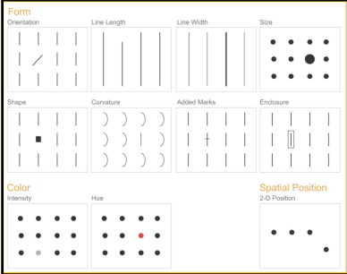
Pre-attentive attributes for bar charts
Form (length, width), color
Pre attentive attributes for line Graphs
Orientation, length, curvature, color, shape
Scatter Plots
2D position, color, form (shape, size)
What is the most important color consideration in data visualization?
Contrast
Color Best Practice
Limit number of colors
What is the 30, 60, 90 rule
use 60% of a neutral color, 30% of a supplementary color, 10% of a color that pops
Color in Mobile apps?
you can just use one single primary color with different brightness and saturations
Sequential Color in data visualization
data is ordered from high to low
Diverging Color
two sequential colors with a neutral midpoint
Categorical Color
contrasting colors for individual comparison
Highlight Color
color used to highlight something
Alert Color
Color used to get readers attention
Tufte’s 3 design principles
Graphical integrity: graph must be honest portrayal of data
Maximize Data to Ink Ratio
Chart Junk: all elements must be necessary
4 data types
Nominal/Categorical Data
Ordinal Data
Interval Ratio
Ratio Data
Nominal (categorical) Data
Data placed in categories according to a specified characteristic
Categories bear no quantitative relationship to one another
Ordinal (data)
Data that is ranked or ordered according to some relationship with one another
No fixed units of measurement (the athlete that wins gold could be way better than the silver but in terms of rank it won’t matter)
Interval Data
Ordinal data but with constant differences between observations
No true zero point - 0 degrees does not mean there is an absence in temperature
Ratios are not meaningful
Ratio Data
Continuous vales and have a natural, meaningful zero point
Ratios are meaningful
In tableau what data types are dimensions
Nominal (categorical) and Ordinal
In tableau which data would be considered a measure?
Interval and Ratio Data
What are line graphs used to convey
TREND DATA
y is a measure, x is a time series (dimmension)
what are scatterplots used to convey
CORRELATIONS
x and y are measures
What are bar graphs used to convey?
MEASURES ACROSS DIMENSIONS
y is measure
x is a dimension
Histogram- distribution of measure
aes()
Aesthetic attributes
geoms()
Geometric Objects
stats()
statistical transofrmation
coord()
coordinates
facet()
facets
label()
with labels
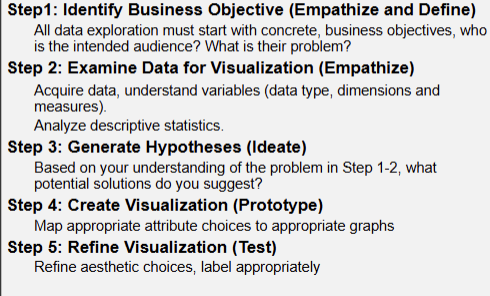
Design Thinking
a philosophy and toolkit that helps you solve
problems through a creative, and human-centered lens.
What is Step 1 in design thinking?
Empathize: Understand people/organizations, within the given context.
It is your effort to understand the way they do things
What is step 2 in design thinking?
Define: Define the problem you are taking on, based on what you have
learned about your user and about the context in Step 1
What is step 3 in design thinking?
Ideate: Suggest ideas that can help organizations to find solution/insight
(Hypotheses Generation).
What is step 4 in design thinking?
Prototype: Generate artifacts that can provide answer/insight to solve the
problem
What is step 5 in design thinking?
Test: Refine the prototype.
How do you apply design thinking to data visualization?
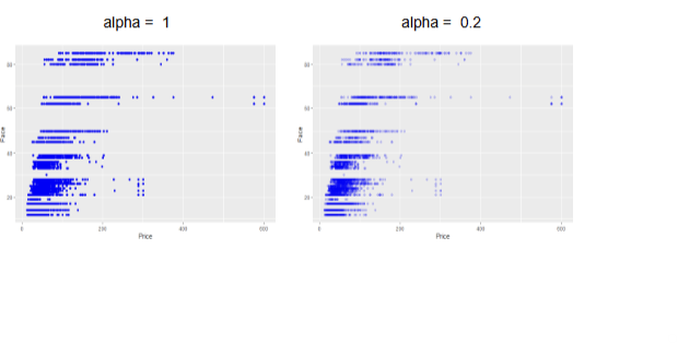
alpha()
a solution to overplotting, adds transparency to the data points, helping visualize overlapping data
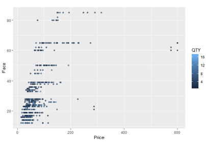
What does this code return?
prvfc + geom_point(alpha=.6, aes(color=QTY))
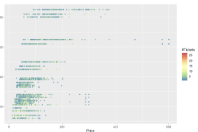
What does the following code return? prvfc + geom_point(alpha=.6,
aes(color=QTY))+scale_color_distiller(palette = "Spectral", name =
"#Tickets")
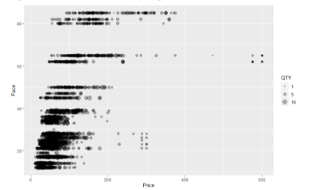
What does this code return? prvfc + geom_point(alpha=.3,
aes(size=QTY))+scale_size(breaks=c(1,5,15))
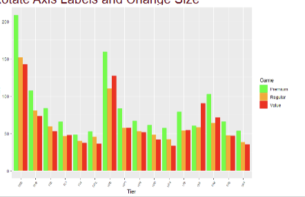
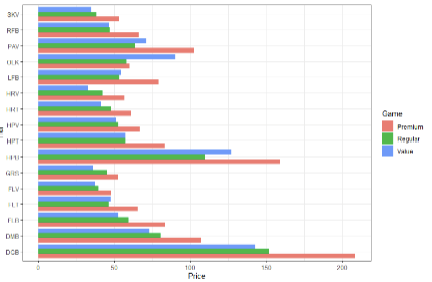
what does this code return? tpg+geom_bar(stat="summary",fun="mean",aes(fill=Game),position="dodge"
)+scale_fill_manual(values=c(Premium="Green",Regular="Orange",Value="R
ed"))+theme(axis.text.x = element_text(angle=45,hjust=1,size=6))
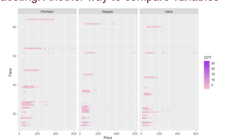
What does this Code return? prvfc + geom_point(alpha=.6,
aes(color=QTY))+scale_color_gradient(low="Pink",high="Purple")+
facet_grid(~Game)
What does this code return:pg+geom_bar(stat="summary",fun="mean",aes(fill=Game),position="dodge")+t
heme_bw()+coord_flip()
How many categories can you compare in a bar graph?
No more than 7 categories
How many categories can a horizontal bar chart have?
7-15 categories sorting ascendingly.
What is a correlation?
a statistical measure that indicates the
strength and direction of the relationship between two
quantitative variables, ranging from -1 to 1
What does a correlation of zero mean
no correlation, random assortment of points
what does a correlation of 1 or -1 mean?
perfect correlation all points on a single line
what is the magnitude of slope of a line?
slope coefficient y= mx+b
R-squared (coefficient of determination)
% of the variability in dependent variables Y explained by the independent variable X
In essence, it shows how well X explains the variation in Y
If R^2 = 0.75, 75% of the variation in Y can be explained by X
The remaining 25% is due to other factors
Tricks for over plotting
• First and foremost, check the stats:
correlation and regression
– This tells us about the relationship
• Take a sub sample
• Gradients (use alpha = )
• No fill
• Jittering
• Faceting
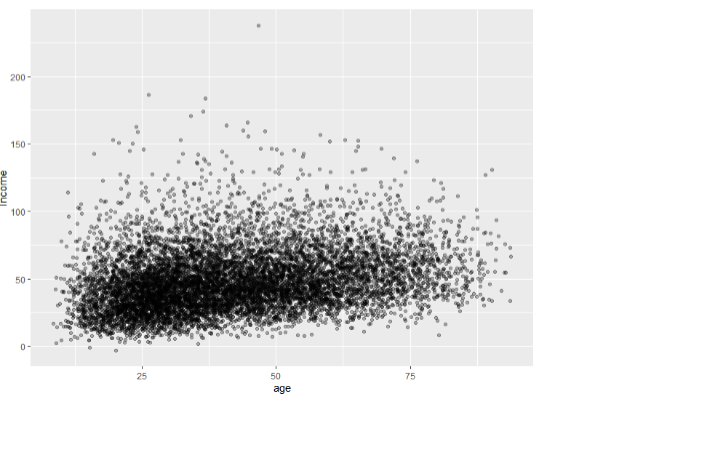
What will this code return?
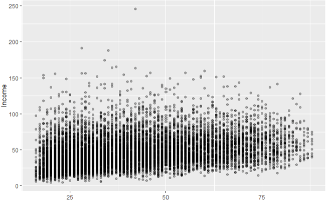
aialpha<- exp %>% ggplot(aes(x=age, y=Income))+geom_point(alpha=.3)
aialpha
gradient
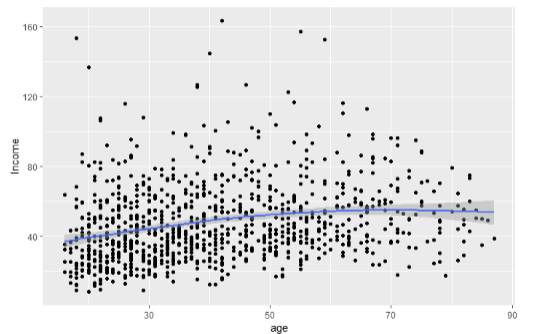
What does this code return? expsample <- sample_n(exp,1000)
aisam <- expsample %>% ggplot(aes(x=age, y=Income))+geom_point()+geom_smo
()
One trick to overcoming over-plotting is
sampling: quick and easy!!!
Sampling
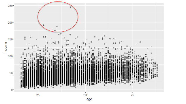
What does this code return:aismall<- exp %>% ggplot(aes(x=age, y=Income)) +
geom_point(shape=21)
no fill (often the best choice)
What does this code return: aijitter<- exp %>% ggplot(aes(x=age,
y=Income))+geom_jitter(height=8,width=8,alpha=.3)
Jittering
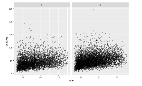
What does this code return: gexpf<-mutate(exp,sex=ifelse(gender==0,"F","M"))
aig <- gexpf %>% ggplot(aes(x=age, y=Income))+
geom_point(alpha=.3)+facet_grid(.~sex)
Matrix
What part to whole pie chart is generally not ever the best choice?
Pie Chart
Hard perceive area
Hard to show multiple data points
Hard to perceive angles
When there are 2 or mare categories and we want to show parts-to-whole what graph should we consider?
Stacked bar chart
If you want to use a stacked column chart with time intervals what do you have to do.
Make sure dates have the same time interval
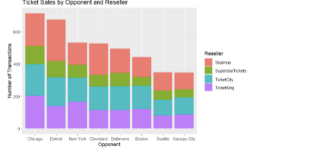
What does this code return: ggplot(tk, aes(x = reorder(Opponent, Opponent, function(x) -length(x)),
fill = Reseller)) + geom_bar(position = "stack") + labs(title = "Ticket Sales by
Opponent and Reseller", x = "Opponent", y = "Number of Transactions", fill =
"Reseller")
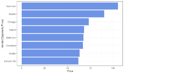
What does this return:orprice<-tk %>% ggplot(aes(x=reorder(Opponent,Price),y=Price)) + geom_bar(stat="summar
()
When looking at a time series what visualizations should we consider?
Line graph, bar graph, dot graph
When do you use dot plans?
when you have irregular intervals of time,
and/or when connection of dots is inappropriate