IB English Paper 1 Terminology
1/58
There's no tags or description
Looks like no tags are added yet.
Name | Mastery | Learn | Test | Matching | Spaced | Call with Kai |
|---|
No analytics yet
Send a link to your students to track their progress
59 Terms
Navigation Menu
a series of labels in the banner used to navigate to various pages of the website

Header
the top section of the website that includes the logo, branding, and navigation hierarchy

Banner
a horizontal advertising panel that is often found toward the top of the website

Footer
found at the bottom of the website and contains sitemap, logo, copyright information, and contact information. The footer improves the overall usability of the website.

Sidebar
section off to the side of the website's primary content area.

Call to Action Buttons
clickable buttons that allow the user to interact with the website and participate. These buttons often require the user to enter personal information and details.

Hyperlinks
directly takes users to content on another website or website

Logo
Symbol that represents the website brand

Images/Icons
visual content must be carefully chosen to elicit the desired response from the audience with respect to purpose

Font
Sarifs or sans serif font? Size? Weight? This all has an impact on how the reader interacts with the content.

Appeal to Ethos
how do speakers establish credibility and trustworthiness? Pay attention to the moves speakers use to reduce the distance between the speaker and the audience.
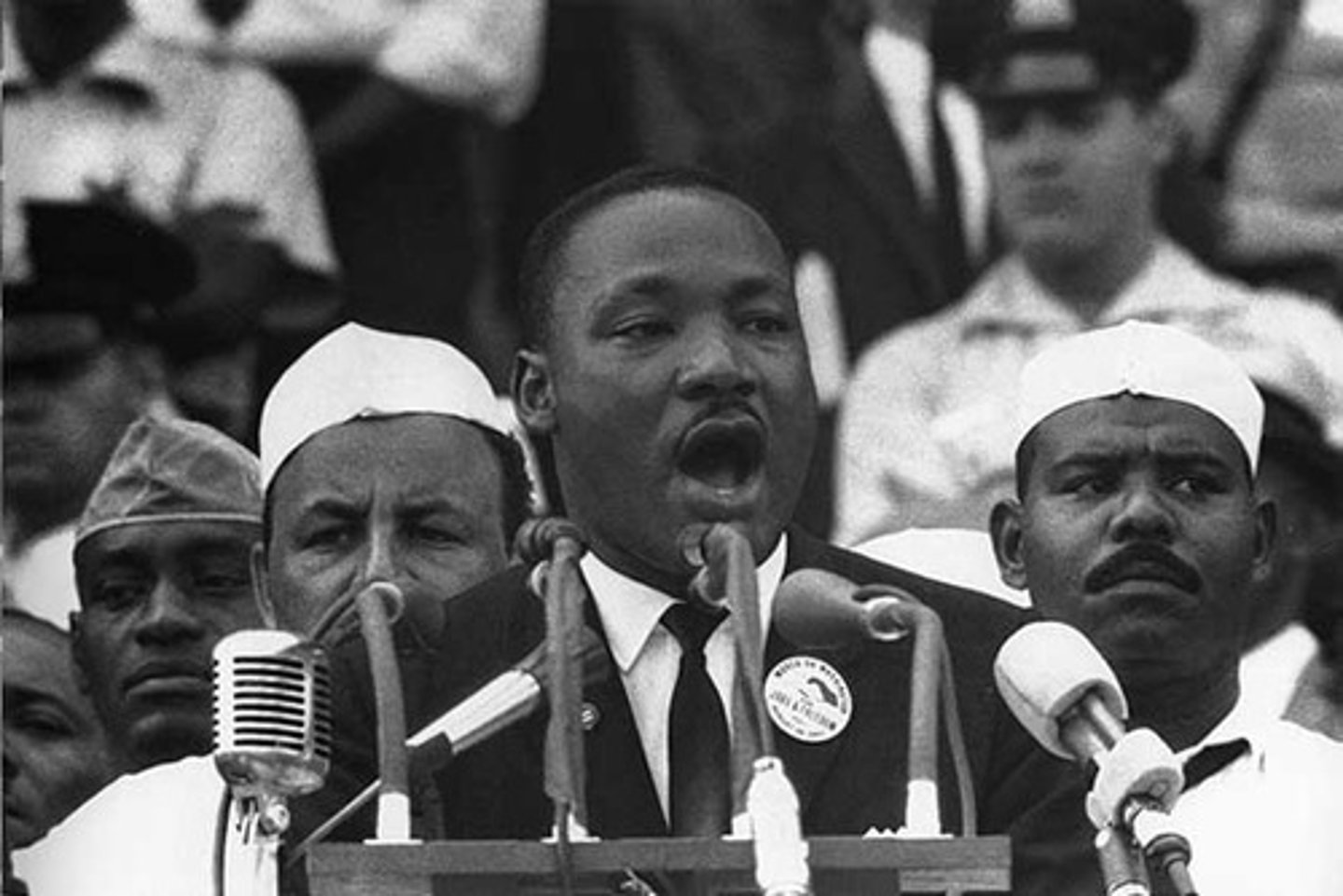
Appeal to Pathos
how do speakers evoke emotional responses from their audience? Look for loaded words and phrases that make the audience feel one way or the other

Appeal to Logos
every speech needs a logical argument. Read the text carefully to understand how evidence and facts are presented in a logical manner to persuade the listener to join the cause or take a certain position on a topic.

Modality
words such as "must", "might", "should", and "have to" may be small in stature, but they are important in meaning! Look for these keywords to understand the degree of certainty and the strength of feeling in the language of the speaker.

Structural moves (whole speech)
How does the speech begin? Did they deliver an anecdote or a joke? Did the speaker try to shock you with a provocative fact? How do they structure the main argument? What moves do they use at the end of the speech? Consider how speakers organize their arguments for effects on the listener.

Structural moves (sentence levels)
Look for short syntax to accentuate key points, parallel structure to illustrate patterns, and command terms when you want to call the listener to action. And, don't forget important techniques like antithesis that often are used to deliver the main claim toward the end of a speech.

Language moves
This is the time to consider figurative language and all the components. Think about connotation, denotation, euphemism, hyperbole, tone, and mood. Just like on other text types, isolate words and phrases, deconstruct them, and show how they shape meaning.

Name, date, address
How is the heading of the letter organized? Does the writer include a formal label such as "Dr." or "Mrs", or is the letter more informal? Is the address included, and does it look like a professional letter or a casual correspondence? Lots to upack.

Salutation
Yes, this is a fancy word for "greeting" and it can reveal the tone of the writer. Pay attention to words like "Dear", "To whom it may concern", etc.
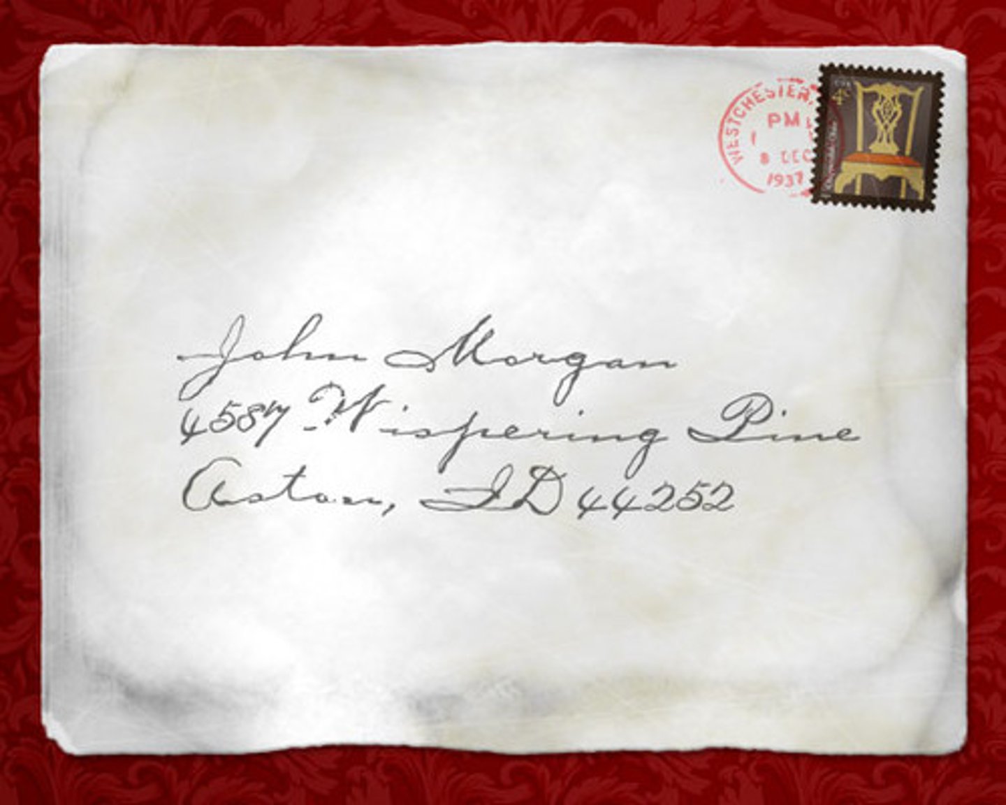
Statement of Purpose
usually found in the opening paragraph, this is often a short and clear statement outlining the reason for writing the letter. This purpose should come out very early in the letter.

Register
Pay attention to the distance between the writer and the recipient. Is the distance between them far or near? Cordial or formal? Pay attention to register.

Call to action
often found at the end of the letter, this final paragraph often states what the writer would like the reader to do in response to the letter.

Closing
Much like the salutation, the closing or "send off" can reveal much about both writer and recipient. Check for formal versus informal language, casual register versus formal register, and overall level of formality.

Credibility (Ethos)
Consumers need a reason to believe the reviewer. Watch out for information early in the review that identifies the reviewer as an expert in their field. How do they establish trust and credibility? Look for this information.

Personal Stories/ Anecdotes
Reviews, although informational, may contain literary elements as the reviewer attempts to engage the reader and entertain. Watch out for descriptive language and other narrative elements the writer uses to illustrate a precise time and context in which they used the product.

Industry trends
Reviewers understand the product, the competitors, and the evolution of their particular industry. Look for language that identifies why the consumer needs the product and how this version is better than the previous model.

Emotive language
If the reviewer likes and is recommending the product, look for words with positive connotations that capture those pleasant emotions. Conversely, if the reviewer does not like the product, look for emotive language that indicates their disappointment or dissatisfaction with the product.

Evaluative language
It's a review. Of course the reviewer needs to evaluate the product. Look for key words and sentences that evaluate the product and comment on quality.

Product specifications
Many consumers want to know the technical aspects of the product. If it's a computer, what kind of processor does it have? If it's a mobile phone, how many cameras does it have and how many pixels?

Product features
Once the product specs are identified and introduced, the reviewer will often mention the "special features" of the product that makes it unique and appealing. Look for descriptions of appearance and functionality.

Jargon
These "technical words'' or phrases are specific to the industry or field. The writer assumes the reader has some technical knowledge of the subject. Accordingly the writer uses topic-specific terminology other readers unfamiliar with the topic might not understand.

Comparisons
The reviewer will often consider the quality of a product in relation to the competition. Consumers want value for money, and they need to know how this product stacks up against similar products.

Hyperlinks
Hyperlinks allow an online reader to easily visit the company website, the websites of competitors, or any other content the reviewer wants to share with the reader to better advise them on how to spend their money

Panels
A page of graphic literature is divided into sections called panels, which are a distinct segment of the comic containing a combination of image and text.

Gutters
The gutter is the space between two panels within a comic strip or comic book. Scott McCloud explains the gutter is used to "take two separate images and transform them into a single idea".

Legisign iconography
When something is shown in the novel, it can be an action or an emotion, that could accrue in a real-life situation but it's not guaranteed.
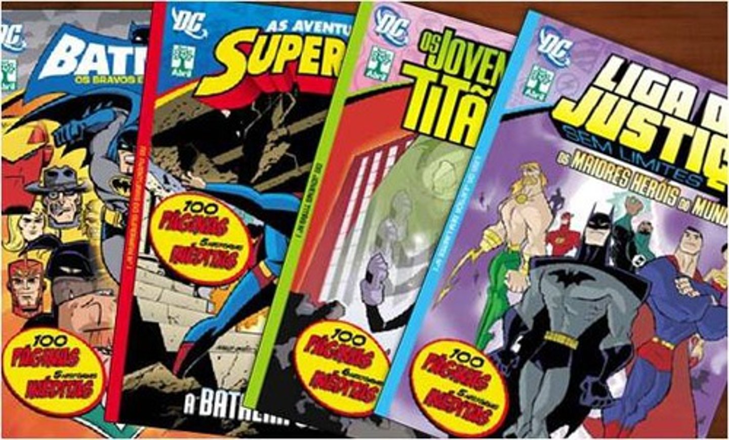
Graphic weight
A term that describes the way some images draw the eye more. than others, creating a definite focus using color and shading in various ways.

Chiaroscuro
The treatment of light and shade in drawing and painting. It is about the shading or shadows and highlights in an image. Typically high contrast chiaroscuro will have higher graphic weight.

Captions
The use of captions in comic books is one way that the writer chooses to narrate the story.

Word/ thought balloons
an iconic image of a comic book. In a word balloon, a bubble appears beside and points toward a character's head that tells the reader what they're saying. These thoughts can be an inner monologue or any other conscious process, but other characters generally do not recognize or see the contents of thought balloons.

Repetition
In comics, the simplest instance of repetition might be the "repeated panel" gag, most often the same image repeated across two panels. That repeated panel might be redrawn, traced, or photocopied. The second image might or might not contain some slight variation on the first.

Rhythm
a structuring element of the narrative discourse of comics.

Borders
AKA panel frame, the edge or outline of the comic page

Foreground
describes the objects in the scene that are closest to the viewer. It is the part in front of everything else and has the most detail.

Midground
The middle ground is considered the middle of the panel, where details are still in focus but slightly more vague.

Background
the part with the least amount of details and blurred colors.

Worm's Eye View
This simply means that the audience is looking at a subject from the perspective of a worm. However, it does not always mean the viewer is a worm.

Bird's eye view
shot that would resemble what a bird may see looking down from many feet above the air.

Emanata
This term refers to the teardrops, sweat drops, question marks, or motion lines that artists draw besides characters' faces to portray emotion.

Powerful images and icons
As visual texts, brochures rely on images and icons for communicating complex messages. Visuals are carefully constructed to push value messages and other associations

Titles, headings and subheadings
These words come in different fonts and sizes and serve to guide the reader through the text. Think of them as the title, thesis, and topic sentences of a written essay.

Use of font
There is a need to differentiate some information as more important than others, and changing font is a great way to emphasize key information on the brochure. Pay attention to font type and size as you deconstruct this text type.

Short sections or paragraphs
One purpose of the brochure is to convey key information in a shorter way. Thus, you will see clear and concise language throughout the text. Look for bullet points, check boxes, and other methods to simplify and divide content.
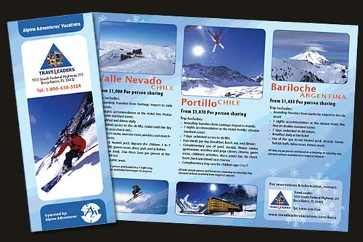
Negative space
Crowded brochures overwhelm the reader. Accordingly, the creator must leverage white space when considering the visual pathway of the reader. Think of them as page or paragraph breaks in a written essay.

Pull quotes or slogans
Organizations like to emphasize mottos, slogans, or other key quotes that help build the ethos of their brand. Also look for attempts to link to key emotions or values.

Symbolism
As visual texts with a purpose to inform and persuade, brochures incorporate carefully constructed images that push ideas and objectives. As such, consider abstract ideas and what images or icons might represent.

Strong rhetoric
Our good friends Ethos, Pathos, and Logos strike again. Consider how the organization is establishing credibility, appealing to emotion, and constructing a logical argument as they persuade the reader.

Simplification
Brochures aim to persuade by only providing the essential information. Due to the brevity of this text type, ideas must be omitted. This often includes the counter-argument! So, be highly critical of content and consider the other side of the issue.

Problem-Solution structure
This text type wants the reader to take action, and by providing a simple problem-solution approach, brochures intend to show just how easy it is to improve some aspect of your life or the world around you.
