Final exam history graphic design
1/20
There's no tags or description
Looks like no tags are added yet.
Name | Mastery | Learn | Test | Matching | Spaced | Call with Kai |
|---|
No analytics yet
Send a link to your students to track their progress
21 Terms
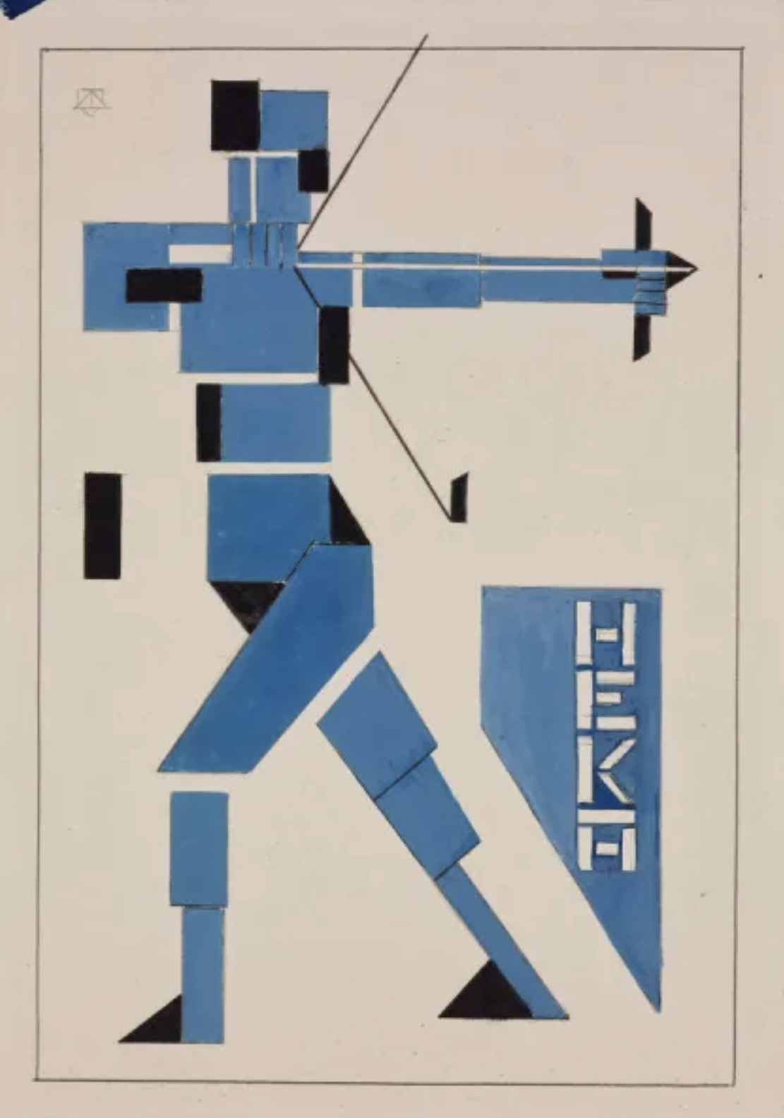
Constructivism style (1915–1930s)
Constructivism emerged in the Soviet Union after the Russian Revolution, blending art with industrial and social purpose. Rejecting decorative aesthetics, it embraced geometric abstraction, bold typography, and photomontage, often using striking red and black color schemes. Key figures like El Lissitzky saw design as a tool for political propaganda and mass communication, influencing later movements like the Bauhaus.
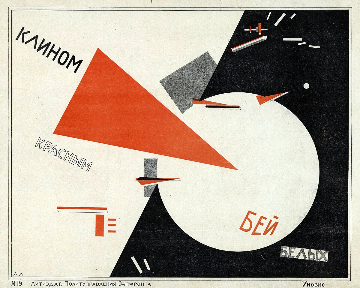
El Lissitzky, constructivism designer (1890–1941)
A pivotal figure in Constructivism, El Lissitzky developed the Proun series—abstract geometric compositions bridging painting and architecture. His iconic poster "Beat the Whites with the Red Wedge" (1919) demonstrated how visual language could convey political messages. He also collaborated with European avant-garde movements, shaping modern typography and layout principles that influenced the Bauhaus and De Stijl
Dada (1916–1923) & De Stijl (1917–1931)
Dada began in Zurich as an anarchic, anti-war movement that rejected logic and traditional aesthetics. Designers like Hannah Höch used chaotic typography, collage, and absurdity to protest bourgeois norms. In contrast, De Stijl (Dutch for "The Style") promoted order, abstraction, and universal harmony through rigid grids, primary colors, and sans-serif typography. Theo van Doesburg, its co-founder, spread these ideas through the journal De Stijl and later at the Bauhaus.
Theo van Doesburg (1883–1931)
A leader of De Stijl, van Doesburg advocated for pure abstraction, reducing art to horizontal/vertical lines and primary colors. He clashed with the Bauhaus’s expressionist leanings, pushing instead for a machine-age aesthetic. His own font was even square like and he tried to make it futuristic. His typographic work emphasized asymmetry and dynamic composition, bridging De Stijl and modernist design.
Bauhaus (1919–1933)
Founded by Walter Gropius in Germany in 1919, the Bauhaus merged crafts, fine arts, and technology under the motto "form follows function." It became a cradle for modernist design, emphasizing simplicity, functionality, and industrial materials. Key instructors like László Moholy-Nagy (photography, typography) and Herbert Bayer (universal typeface, minimalist graphics) shaped its legacy.
László Moholy-Nagy (1895–1946)
As a master at the Bauhaus from 1923 to 1928, he championed the integration of technology, light, and industrial materials into art and design. Moholy-Nagy’s groundbreaking use of photograms (camera-less photographs he called "photoplastics") explored the interplay of light and shadow, blurring the line between photography and abstract art. His typographic designs, often incorporating dynamic diagonals and sans-serif fonts, rejected decorative flourishes in favor of functional clarity. After fleeing Nazi Germany, he founded the New Bauhaus in Chicago (1937), later renamed the Institute of Design, where he promoted his philosophy of "the new vision"—a belief that art and technology could work together to improve society. His influence extended beyond graphic design into kinetic sculpture, film, and industrial design, making him a true polymath of modernism.
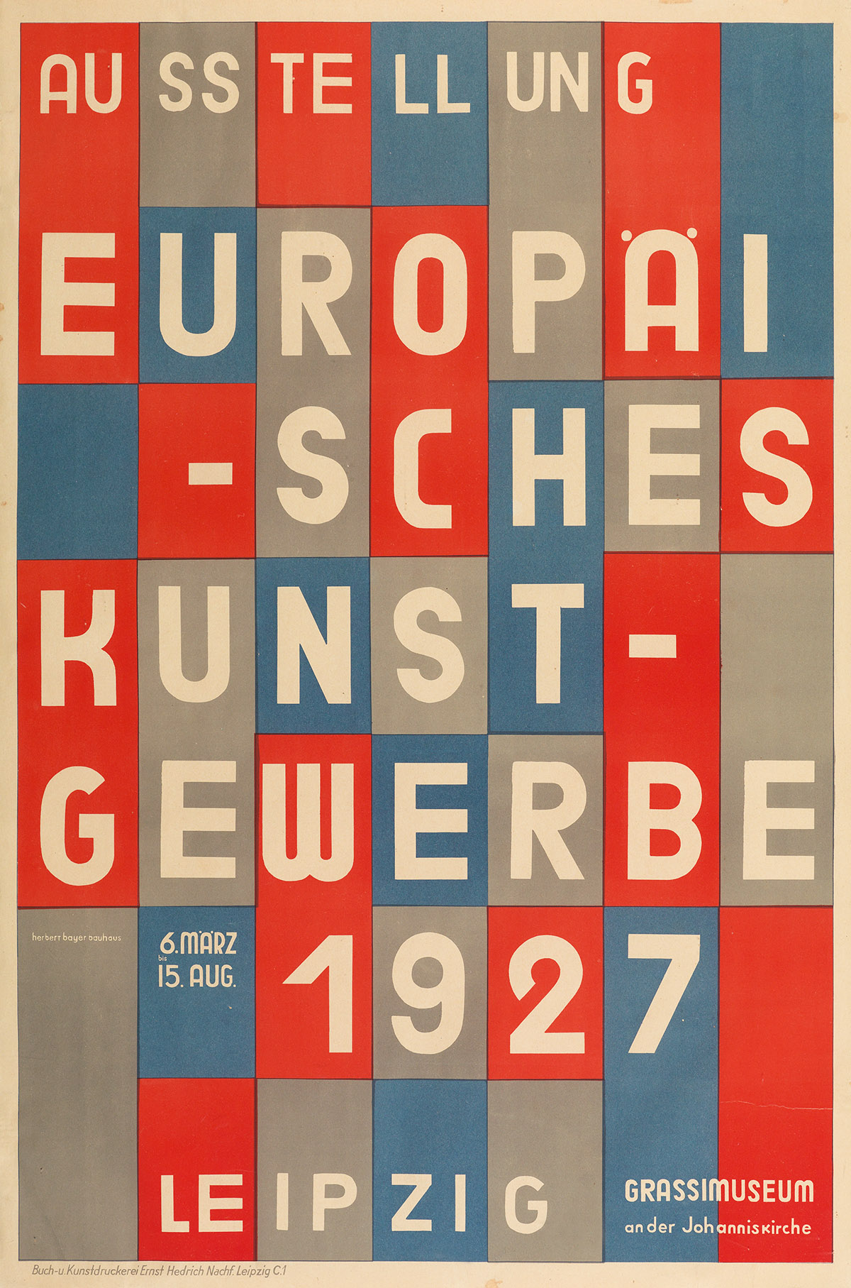
Herbert Bayer (1900–1985)
He was an Austrian-American designer whose work at the Bauhaus characterized the school’s principles of simplicity and universality. As both a student and later a teacher at the Bauhaus (1921–1928), Bayer played a pivotal role in shaping its typographic identity. He designed the universal typeface (1925), a geometrically constructed, lowercase-only sans-serif alphabet that embodied the Bauhaus’s utopian ideals of efficiency and accessibility. Bayer’s posters and advertisements, characterized by crisp grids, bold primary colors, and photomontage, became hallmarks of modernist graphic design. After emigrating to the U.S. in 1938, he applied his minimalist approach to corporate branding, environmental design, and even architecture, most notably in his "World Geo-Graphic Atlas" (1953), a masterpiece of information design. Unlike Moholy-Nagy’s experimentalism, Bayer’s work was more systematic, yet both shared a commitment to unifying art and industry.
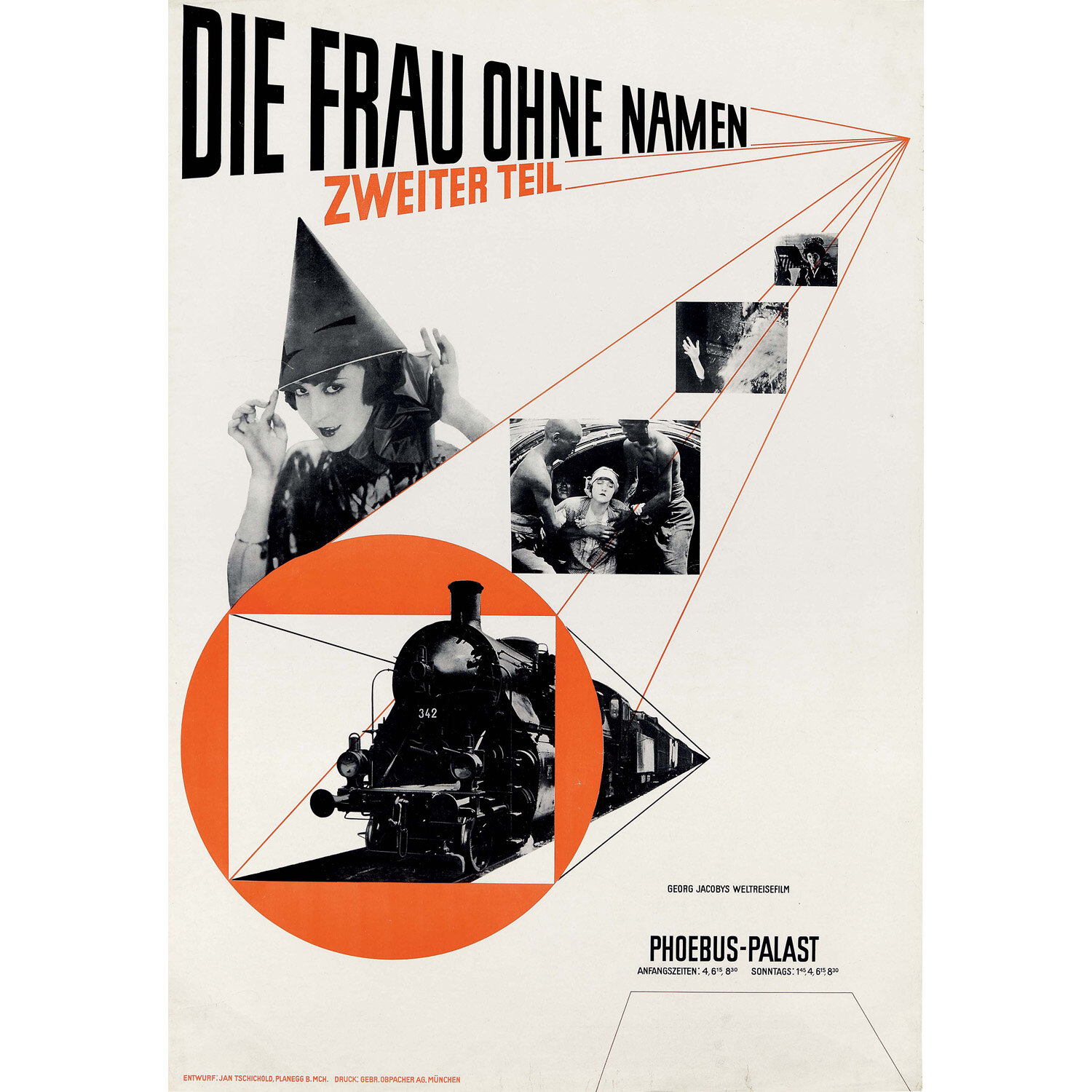
The New Typography, and the leader Jan Tschichold (1920s–1930s)
Emerging in Europe (primarily Germany) after WWI, it became the foundation for Swiss Style and corporate modernism. The 928 book Die Neue Typographie became a manifesto for modernist design, emphasizing grids, flush-left ragged-right text, lowercase, negative space, and sans-serif fonts like Helvetica. It set the new rules: “No serifs, no ornament, no centered text. Use typography as a tool for social progress.” he also redesigned the Penguin Books
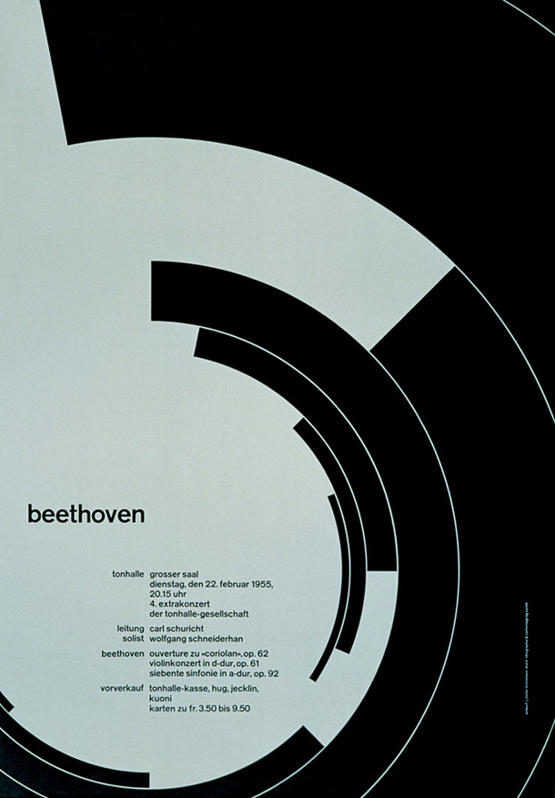
Swiss Style / International Typographic Style (1950s–1960s)
Evolving from the Bauhaus and New Typography, Swiss Style prioritized objectivity: grids, flush-left ragged-right text, and sans-serif fonts like Helvetica. Josef Müller-Brockmann epitomized this with his mathematically precise posters and use of the golden ratio. Grid systems are the epitome of modernity." The godfather of Swiss Style, Müller-Brockmann transformed graphic design into a science of clarity with his mathematical grids, objective typography, and militant minimalism. His work defined corporate modernism and set the standard for rational, universal communication. Style became synonymous with corporate and institutional design worldwide.
Massimo Vignelli (1931–2014)
Vignelli, a modernist icon, designed the 1972 NYC subway map and American Airlines’ branding, adhering to strict grids and Helvetica. Radical Simplification, he ditched geography for diagrammatic clarity (45° angles, color-coded lines). Designers to Think in System. His Unigrid and identity manuals paved the way for Apple’s UI guidelines and Pentagram’s branding work.

Rosmarie Tissi (b. 1937)
She was a trailblazer in Swiss typography, Rosmarie Tissi challenged the rigid principles of the International Style with her bold, experimental approach. While rooted in the precision of Swiss modernism, her work injected wit, spontaneity, and vibrant energy into graphic design, bridging the gap between structured grids and free expression. Respected Swiss principles but bent, broke, and subverted them with humor and spontaneity. She embraced collage, overlapping elements, and distorted type—prioritizing expressiveness over purity.
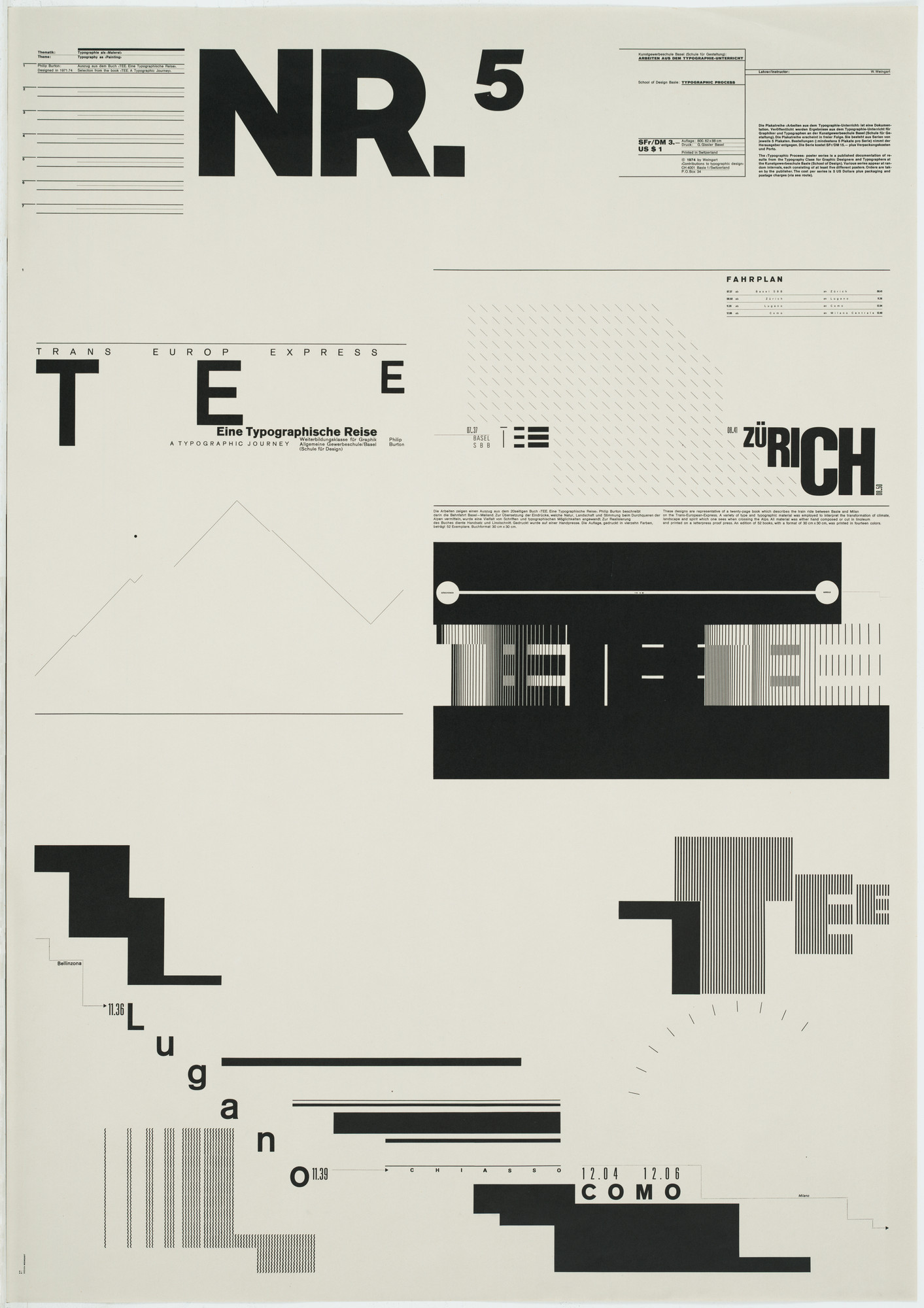
New Wave Typography & Wolfgang Weingart (1941–2021)
Emerging in the 1970s as a reaction against Swiss Style’s rigidity, New Wave embraced experimental layouts, layered textures, and diagonal type. He was considered the "father" of New Wave, taught at Basel, and inspired a generation of designers. His posters used stair-stepped type, fractured grids, and ink traps. Their designs embraced chaos, experimentation, and postmodern eclecticism. He became the most influential "anti-Swiss" Swiss designer, bridging the International Style and postmodern chaos.
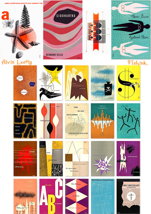
Alvin Lustig (1912–1955)
He was a pioneering American designer who bridged modernism and commercial design in the mid-20th century. Known for his book covers, corporate identities, and architectural graphics, He synthesized European avant-garde principles—particularly from the Bauhaus and De Stijl—into accessible, visually dynamic compositions. He was able to convey complex ideas through abstract shapes, bold typography, and symbolic imagery. He taught at black mountain college and argued that designers should be “problem-solvers, not decorators”—a Bauhaus ideal repurposed for postwar America.
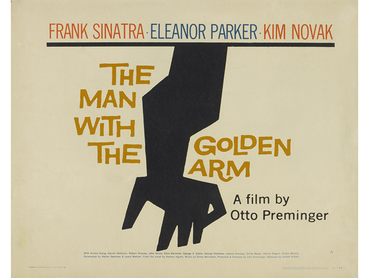
Saul Bass (1920–1996)
He revolutionized graphic design, particularly in film and corporate branding, with his minimalist, high-impact style. His iconic movie posters and title sequences—such as Vertigo (1958), Psycho (1960), and The Man with the Golden Arm (1955)—used stark silhouettes, kinetic typography, and symbolic simplicity to create unforgettable visual narratives. Beyond film, Bass designed timeless logos for AT&T, United Airlines, and Warner Communications, proving that simplicity and metaphor could forge enduring brand identities. His work epitomized the idea that design should communicate quickly and memorably.
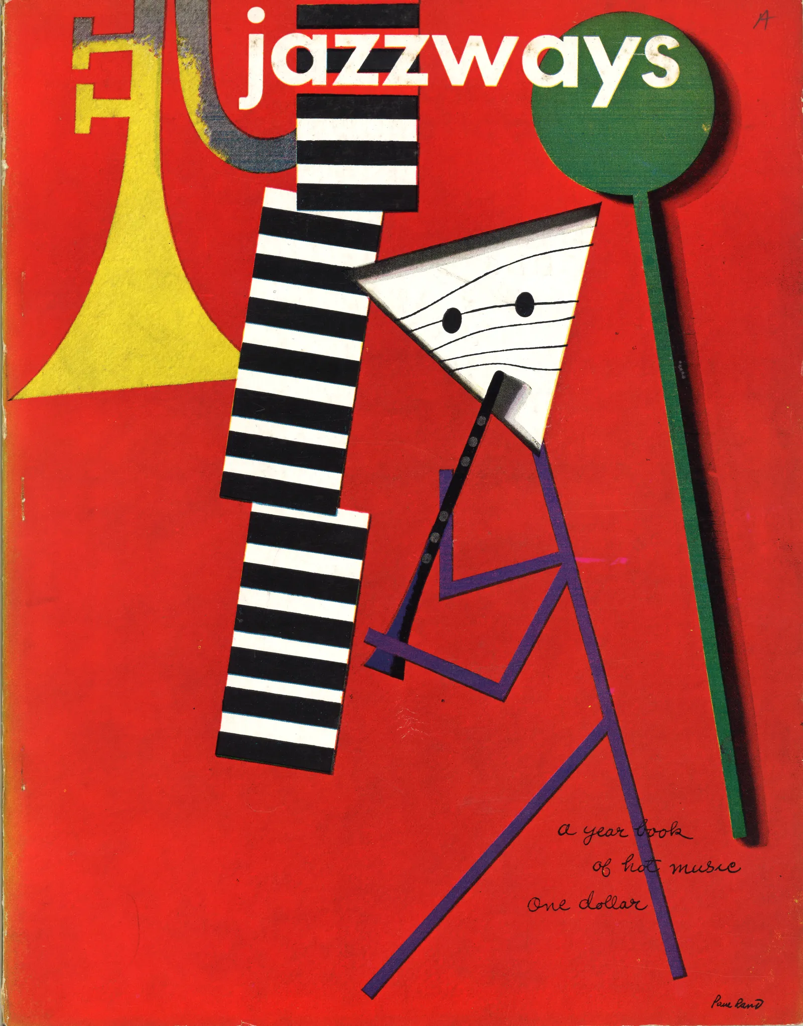
Paul Rand (1914–1996)
He was one of the most influential graphic designers of the 20th century, blending European modernism with American commercial appeal. His corporate logos—IBM, ABC, UPS, and NeXT—are master classes in simplicity, wit, and timelessness. Rand believed in the power of visual storytelling, often using playful juxtapositions and bold colors to make designs both functional and engaging. He also used clean sans-serifs (Akzidenz-Grotesk, later Helvetica), strict grids, and asymmetrical balance. His 1947 book Thoughts on Design articulated his philosophy that good design is a synthesis of form and function, influencing generations of designers. Rand’s collaborations with Steve Jobs on the NeXT identity further underscored his ability to merge art with business.
Milton Glaser (1929–2020)
Milton Glaser, best known for the "I ♥ NY" logo, was a defining figure in American graphic design, merging pop art, eclecticism, and humanist warmth. His work spanned posters (the psychedelic Bob Dylan silhouette), magazines (New York magazine co-founder), and branding (Brooklyn Brewery). Unlike the strict modernists, Glaser embraced historical references, hand-drawn elements, and vibrant color, proving that design could be both intellectually rigorous and emotionally resonant. His famous maxim, "Just enough is more," reflected his belief in clarity without sterility.

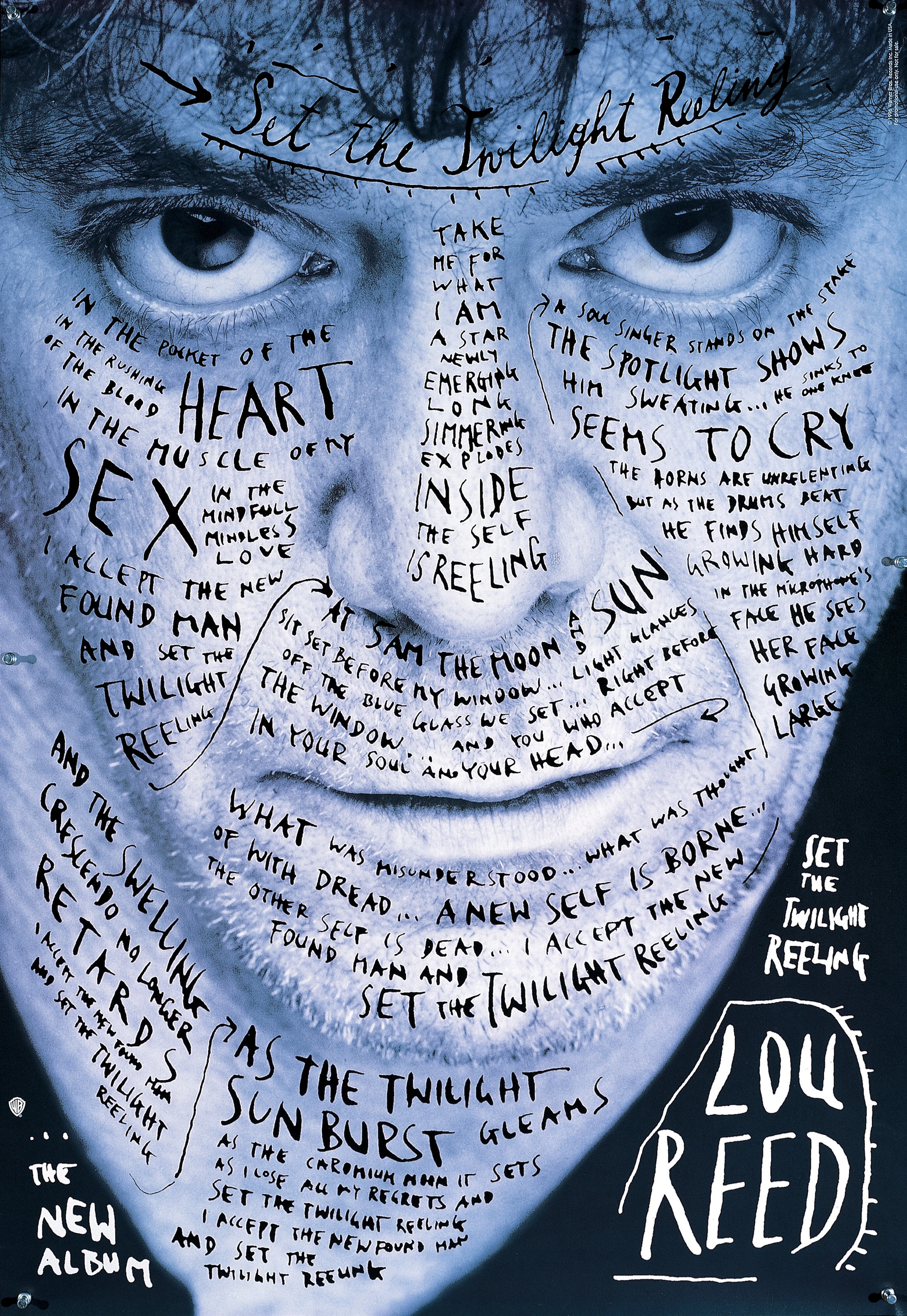
Stefan Sagmeister (b. 1962)
He was known for blending conceptual art, typography, and personal expression. His projects—like the AIGA poster where he carved text into his skin—challenge conventional notions of design’s purpose. Sagmeister’s work with music clients (Lou Reed, The Rolling Stones) and self-initiated projects (the "Things I Have Learned in My Life So Far" series) often explore psychology, humor, and imperfection. His later partnership with Jessica Walsh (Sagmeister & Walsh) pushed boundaries in digital and experiential design, proving that design could be deeply personal and experimental.
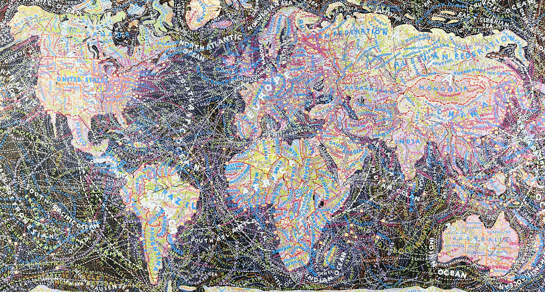
Paula Scher (b. 1948)
She is celebrated for her typographic mastery and bold, eclectic style. Her work is Super-condensed, overlapping, and loud with mixes of the Bauhaus grids, Dada collage, and Victorian ornaments, and overall had a very handmade energy. Her 1990s identity work for the Public Theater in NYC—using chaotic, layered type inspired by Russian Constructivism—revolutionized cultural branding. Scher’s maps (e.g., "The World" painting series) and corporate identities (Citibank, Microsoft Windows) showcase her ability to merge information design with expressive artistry. She famously said, "Design is the art of making order, but I like to make some disorder," reflecting her balance of structure and spontaneity.
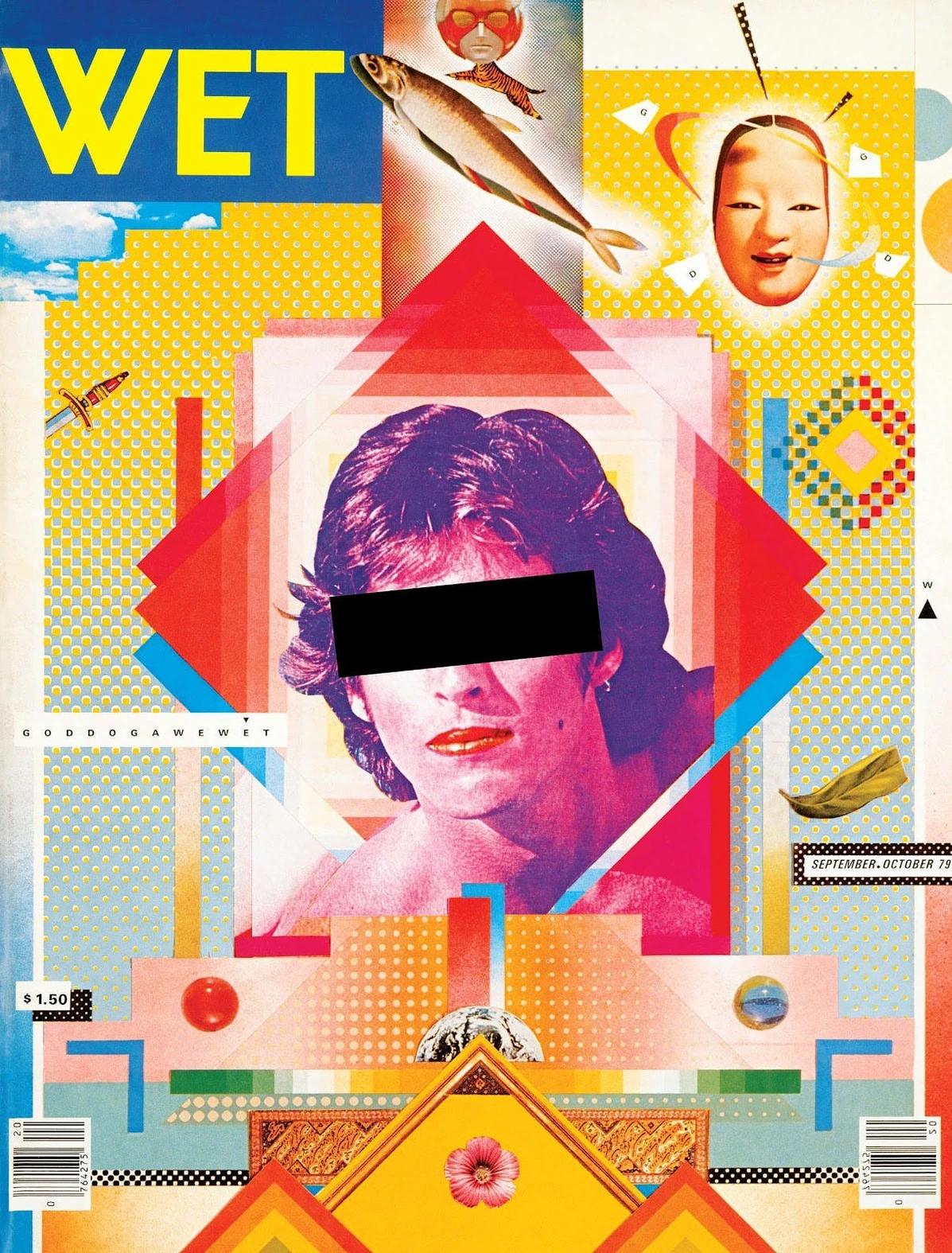
April Greiman (b. 1948)
She is a trailblazer in digital design, merging technology with avant-garde aesthetics. Her 1986 "Does It Make Sense?" issue for Design Quarterly—a hybrid poster/magazine created entirely on early Mac computers—was one of the first major works of digital design. Greiman’s style blends New Wave typography, photography, and pixelated graphics, rejecting rigid grids in favor of fluid, layered compositions. As a pioneer of the "California New Wave," she expanded design’s possibilities by embracing the imperfections of early digital tools.
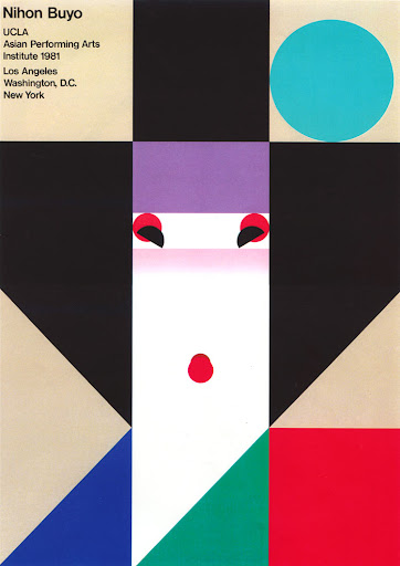
Ikko Tanaka
He was a groundbreaking Japanese graphic designer whose work masterfully blended traditional Japanese aesthetics with modernist principles. A key figure in post-war design, Tanaka bridged East and West, creating visually striking posters, logos, and branding that celebrated simplicity, geometry, and cultural symbolism. His style was characterized by bold colors, abstract forms, and a deep respect for Japanese art traditions like ukiyo-e and calligraphy, yet executed with the precision of Swiss typography and Bauhaus-inspired minimalism.
Fusion of Tradition aEllnd Modernism
Tanaka’s most famous work, like his 1981 poster "Nihon Buyo" (Japanese Dance), used flat, vivid colors and abstracted human figures reminiscent of kabuki theater, but arranged with the clarity of International Typographic Style grids.
Corporate and Cultural Branding
Designed the iconic logo for Muji (1980), embodying the brand’s "no-brand" philosophy with understated elegance.
Ellen Lupton
She began teaching at the Maryland Institute College of Art in 1997 and founded their MFA program in 2004
Before that, she discovered the “expressive potential of typography,” and she is known as “The Mother of Typography.” Her book “Thinking with Type” is a down-to-earth and approachable breakdown of typography. It is used as a textbook in many graphic design programs
- After finishing her degree, she worked as the curator at the Herb Lubalin
- Lupton best describes herself as a post-structuralist, not strictly a modernist or postmodernist.
- She is heavily influenced by Bauhaus designers like El Lissitzky and Moholy-Nagy.
- She desires a graphic design world of inclusivity.