IB Bio Graphing Notes
1/30
There's no tags or description
Looks like no tags are added yet.
Name | Mastery | Learn | Test | Matching | Spaced |
|---|
No study sessions yet.
31 Terms
How densely the data is distributed there — wider areas mean more data points (higher frequency), while narrower areas mean fewer data points (lower frequency).
What does the width of the violin plot at different points indicate about the distribution of data?
X axis.
Which axis is the indepenent variable?
Y axis.
Which axis is the dependent axis?
Distribution shape vs Summary stats
How does a violin plot differ from a traditional box plot in terms of the information it provides?
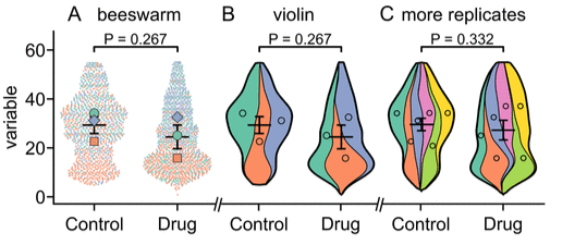
Violin Graph
What graph is this?
Kite Graph
What graph is this?
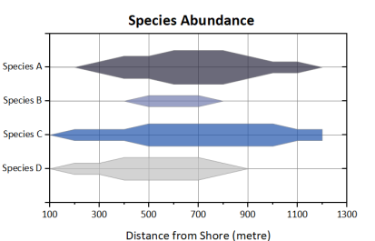
It widens the graph at that point.
How would an increase in one variable affect the overall shape of the kite graph?
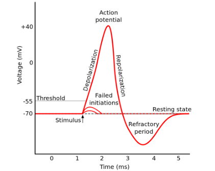
Neural Action Potential
What Graph is this?
Radar graph
What graph is this?
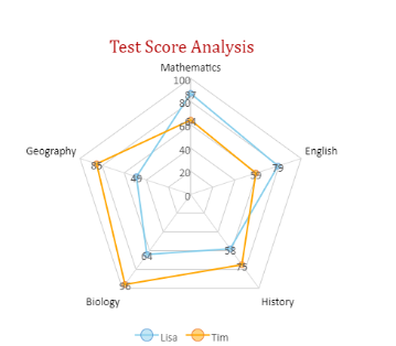
Outer points show strengths; inner points show weaknesses.
What does the shape of the radar graph tell you about the strengths and weaknesses of the variables being compared?
It would stretch the graph outward along that axis, creating an uneven, lopsided shape.
If one axis had a significantly higher value than the others, how would that affect the overall shape of the radar graph?
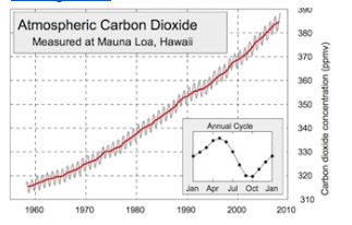
Keeling Graph
What graph is this?
Box and whisker plot
What graph is this?
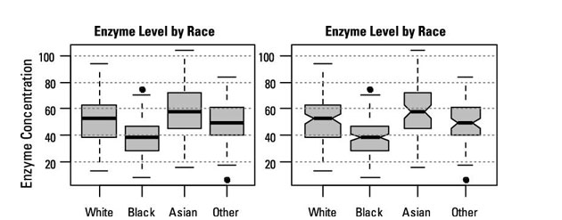
Longer lengths suggest a wider spread or greater variability, while shorter lengths indicate that the data is more tightly clustered around the median.
What does the length of the whiskers in a box and whisker plot indicate about data variability?
It’s an outlier.
If a data point lies outside the whiskers in a box and whisker plot, what does that suggest about the value?
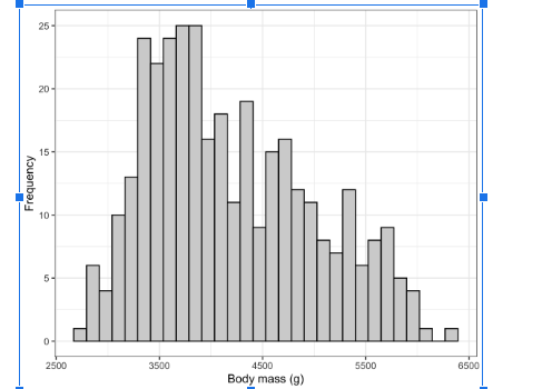
Contionous data distribution vs catagorical data.
How does a histogram differ from a bar graph in terms of data representation?
The mode.
What does the tallest bar in a histogram represent?
Histogram
What graph is this?
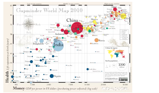
Bubble graph
What graph is this?
Back to back bar graph.
What graph is this?
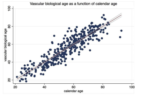
Scatter Plot
What graph is this?
Positive correlation.
A scatter plot shows has a line fo best fit that trends upwards. This is…
Negative corelation
A scatter plot shows has a line fo best fit that trends downwards. This is…
No correlation
A scatter plot shows has a line of best fit that trends straight. This is likely…
Line time series graph
What graph is this?
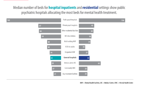
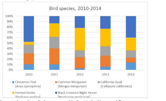
Stacked bar graph
What graph is this?
Combines subcategory values for easy total comparison.
How does a stacked bar graph make it easier to compare total values between categories?
A subcategory's contribution to the total value.
What does each section of a bar represent in the stacked bar graph?
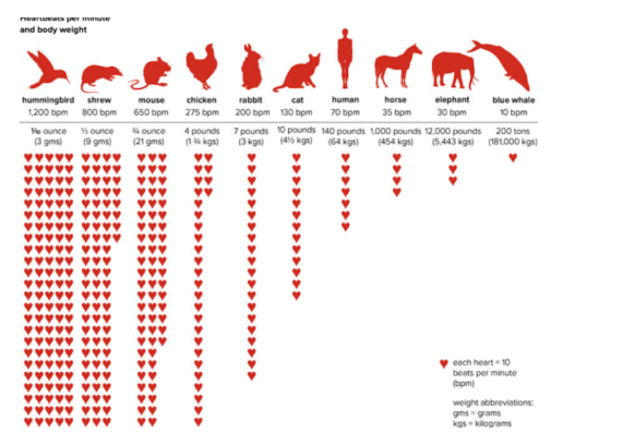
Pictograph.
What graph is this?
Tree diagram
What graph is this?
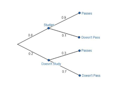
A possible outcome or decision path from a given point.
What does each branch on a tree diagram represent?