CH 1, CH 2, CH 3
1/70
There's no tags or description
Looks like no tags are added yet.
Name | Mastery | Learn | Test | Matching | Spaced | Call with Kai |
|---|
No analytics yet
Send a link to your students to track their progress
71 Terms
Statistics
statistics is the science that deals with the collection, preparation, analysis, presentation and interpretation of data
What are the 3 steps to good statistics?
Find the right data and prepare for analysis
choose the appropriate techniques for analyzing data
interpreting data into verbal and written form
data analysis
data analysis allows companies to effectively target and understand their customers
What two terms fall under the umbrella of data analysis?
data analysis
data privacy
data ethics
data privacy
data privacy is branch of data security related to the proper collection, usage and Transmation of data focusing on…
how data is legally collected and stored
if and how data is being shared with third parties
how data usage meets regulatory obligations
What are the key principles of data privacy?
conditionality- customer’s data and identify remain private
transparency- data collecting and risk must be transparent to the customer
accountability- data collection must have reasonable use and protection of the customer
What are the key principles of data ethics?
Human first- human interest should always come before commercial gain
no biases
What are the two types of statistics? What makes them different?
two types:
descriptive
inferential
What makes them different?
Descriptive statistics summarize and describe data, while inferential statistics analyze data to make predictions or draw conclusions about a larger population.
descriptive data
Descriptive data refers to the summary of important aspects of a data set
inferential statistics
Inferential statistics refers to drawing conclusions about larger set of data (population) based on smaller sets of data (sample)
A population consists of all items/members of ____.
A population consists of all items/members of interest
sample
sample is a subset of a population
What are the types of data collection? What makes them different?
types:
cross-sectional data
time series data
What makes them different?
Cross-sectional data captures information at a single point in time across multiple subjects (e.g., income levels of different households in 2025)
time series data tracks information about one subject over a period of time (e.g., monthly sales of a store from 2020 to 2025).
What are the types of data format? What makes them different?
types:
structed data
unstructed data
what makes the different?
structed data resides in pre-defined tables and lists, while unstructured data does not conform to pre-defined tables but instead uses text or social media.
variables
a characteristic of interest that differs in a degree among various observations
What are the two types of variables? What makes them diferent?
types:
categorical data (qualitive)
numeric data (quantitative)
what makes them different?
Categorical data represents labels or groups (e.g., colors, types), while numeric data represents measurable quantities or numbers (e.g., height, temperature).
What are the 4 types of major scales for variables?
Nominal- simplest type of scale used to label or categorize things without order or value
Ordinal- a way to measure things in a specific order.
Ex. Very happy, happy, natural, unhappy, very unhappy
Interval- can tell how much larger or smaller one number is to another. The scale does doesn’t have a starting point of zero.
Ex. tempture scale
Ratio- the most “powerful” type of scale. Numbers show how much or many of something. This scale allows to do calculations
Ex. length, width, age
What types are scales are categorical?
nominal and ordinal
what types of scales are numerical?
interval and ratio
What are the two stratifies to deal with missing values in a data set
omission strategy- missing values are excluded from the analysis of data
imputation strategy- missing values be replaced with a reasonable input
numeric variables: replace with average
categorical variables: replace with predominant category
subsetting
subletting is the process of extracting a portion of the data set to compare two subsets of data
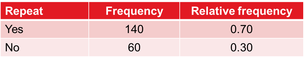
relative frequency
relative frequency is the fraction or percentage of item in each group
function: COUTNA
COUNTA- counts all cells that are not empty in a range
function: COUNTIF
COUNTIF- counts the cells that meet a specific condition you set
method to visualize a categorical variable
summarize the data with frequency distribution (fancy way to say table)
sort the data into groups and count how many items are in each group
then add relative frequency to the table
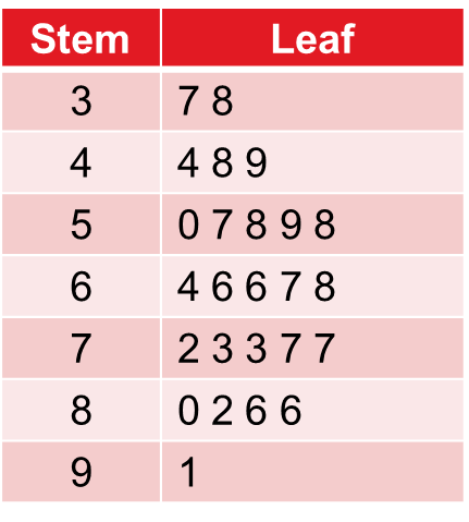
method to visualize numerical variables
frequency distribution to summarize a numerical variable. Instead of categories, we construct data into intervals
What are the decisions to make with intervals
the total number in the interval
try to use the least amount of numbers of intervals
approximation formula
(max-min)/ number of intervals wanted
cumulative frequency, cumulative relative frequency, and cumulative percent frequency
cumulative frequency: adds up total number of observations in a data set
For example, if 3 people scored 10, 5 people scored 20, and 7 people scored 30, the cumulative frequencies are:
Up to 10: 3
Up to 20: 3 + 5 = 8
Up to 30: 3 + 5 + 7 = 15
cumulative relative frequency: adds up the proportion of observations for each group based on the total
Example: If the total is 20 observations:
Up to 10: 3/20 =0.15
Up to 20: 8/20 =0.40
Up to 30:15/20 =0.75
cumulative percent frequency: adds up the percentage of observations for each group
Example (continuing from above):
Up to 10: 0.15 ×100 =15%
Up to 20: 0.4 ×100=40%
Up to 30: 0.75 ×100=75%
charts used to visualize a categorical variable
bar charts and pie charts
charts used to visualize a numerical variable
histogram and stem-and-leaf diagram
explain how to calculate a relative frequency for a frequency distribution?
Count the total number of entries and then divide the number of each individual entry by the total number of entries.
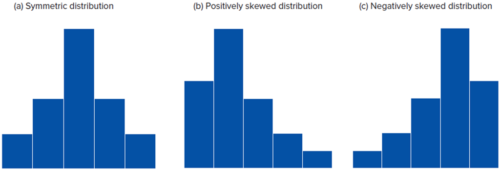
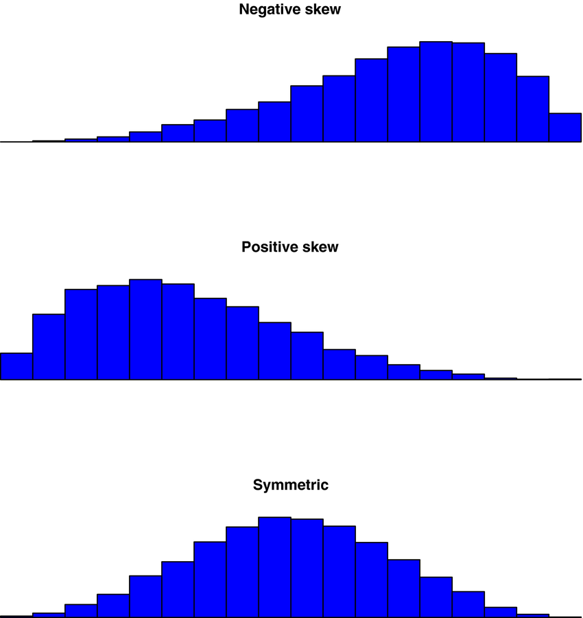
In general, the shape of most distributions can be categorized as…
In general, the shape of most distributions can be categorized as symmetric or skewed
A line chart with three lines requires how many variables?
4
You need one variable for each line's y-value and one more variable for the common x-axis value.
Heat maps are especially useful to identify combinations of the categorical variables that have economic significance.
central location
central location is how numerical data tends to cluster around some middle or central value
arithmetic mean (mean) and how do you calculate?
arithmetic mean is the primary measure of central location
calculate by adding all the observations and dividing by them by the total number of observations
what are the types of measure of central location
types of measures for central location:
mean
median
mode
population mean symbol
μ
sample mean symbol
X̄
median
median is the middle value; it’s the number right in the middle. Median is used when there are outliers in the data set because outliers offset the mean.
odd number of values: number in the middle is the median
even number of values: divide the two middle values by 2 to get the median
mode
mode is the value that appears most often in data. There can be one or more modes, or even no mode. Mode is the measure of central location for categorical values.
one mode: unimodal
two modes: bimodal
two or more: multimodal
weighted mean
weighted mean is when some observations contribute more than others. Used to calculate the mean for frequency distribution
histogram: symmetric & skewed
symmetric: if one side of the histogram is a mirror image of the other
positively skewed: mean is greater than the median (mean > median)
negatively skewed: the mean is less than the median (mean < median)
percentiles
percentiles are a way to show how a number compares to the rest of the data. It’s a measure of location. It’s common to divide percentiles into 4 quatres (25th, 50th, 75th)
Ex. if you are in the 90th percentile for height then you are taller than 90% of people
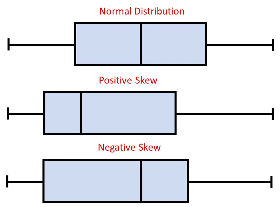
boxplots
boxplots are a visual representation of particular percentiles. They are a way to graphically display five-number summary. Can also be used to informally gauge the shape of the distribution.
symmetry: median center, whisker are equal
positive: median left, right whisker is longer
negative: median right, left whisker is longer
measures of dispersion
measures of dispersion tell how much data varies from the average
0= all observations are identical
increase: the observations are more diverse
range and formula
range is the simplest form of measure and is the difference between largest and smallest number. However, it’s not considered a good measure of dispersion because it focuses solely on the extreme values
range = max - min
interquartile range (IQR) and formula
interquartile range (IQR) is the difference between the third (75th) and first (25th) quartile. IQR helps understand how spread-out central values are without being affected by any high or low numbers.
IQR= Q3 - Q1
mean absolute difference (MAD)
mean absolute difference (MAD) is the average absolute difference of all values from the mean in a data set. We use MAD because it avoids using negative and positive numbers that would cancel while calculating the average
what are the two most widely used way to measure disoperation
to most widely used way to measure disoperation:
variance and standard deviation
how to calculate variance and standard deviation
find the differences between each value and the mean
square the difference between (this emphasizes larger differences)
calculate the average of the squared differences to find variance
to return to original units, we take the positive square root of the variance which will give us the standard devotion
Excel commands for growth and value finds
range: MAX - MIN
MAD: AVEDEV
standard deviation and variance: VAR.S and STDEV. S
coefficient of variation (CV)
coefficient of variation (CV) is a way to measure and compare how spread-out data is even if the data sets have different average and units. It is a relative measure of dispersion.
sample CV: s / X̄
population CV: σ / μ
sample size symbol
n
population size symbol
N
population variance symbol
σ2
population standard deviation
σ
in a distribution the mean, the median, and the mode are equal when…
in a distribution the mean, the median, and the mode are equal when its symmetric and unimodal
The pth percentile divides a variable into two parts. What percentage is greater than p?
(100 - p)
five-number summary
five-number summary is a way to describe a dataset by focusing on five key values. These five numbers give you a quick snapshot of the spread and center of the data.
Minimum: The smallest number in the set.
Q1 (First Quartile): The middle of the lower half of the data.
Median (Q2): The middle number of the entire dataset.
Q3 (Third Quartile): The middle of the upper half of the data.
Maximum: The largest number in the set.
In a boxplot, when is a data point considered an outlier
In a boxplot, a data point considered an outlier when it’s 1.5 x IOR from Q1 or Q3
What is the relationship between the variance and the standard deviation?
The standard deviation is the positive square root of the variance.
total sum symbol
∑
standard deviation symbol
s
A summary measure that is computed to describe a characteristic of a sample taken from a population is called
sample- statistic
population- parameter
When investigating one categorical variable and one numeric variable, what type of graph should you use?
Create a histogram for the numeric variable for each level of the categorical variable.
When investigating two categorical variables, what type of graphs should you use?
Create either two pie charts or two bar graphs to compare the categories.
When investigating two numeric variables, you should create a …..
Create a scatterplot to visualize the relationship between the two numeric variables.
How to get Descriptive Statistics for numeric data in excel
Click on Data Analysis Tab
select Descriptive Statistics,
highlight your data to define the input range,
check off Labels in First Row,
check off Chart Output, OK
width
width is the range of values in a class