AP Stats Unit 1: Displaying Data
1/40
Earn XP
Description and Tags
Might not correspond to Unit 1: Exploring One-Variable Data.
Name | Mastery | Learn | Test | Matching | Spaced | Call with Kai | Chat |
|---|
No analytics yet
Send a link to your students to track their progress
41 Terms
individuals
subject from which the categorical data is being taken (“who”)
variable
the thing being measured from the individuals (“what”)
categorical variable
variable that takes on values that are category names or group labels
bar graphs: can only show frequency or relative frequency (%)
pie charts: can only show relative frequency (%)
quantitative variable
takes on numerical values; for a measured/counted quantity
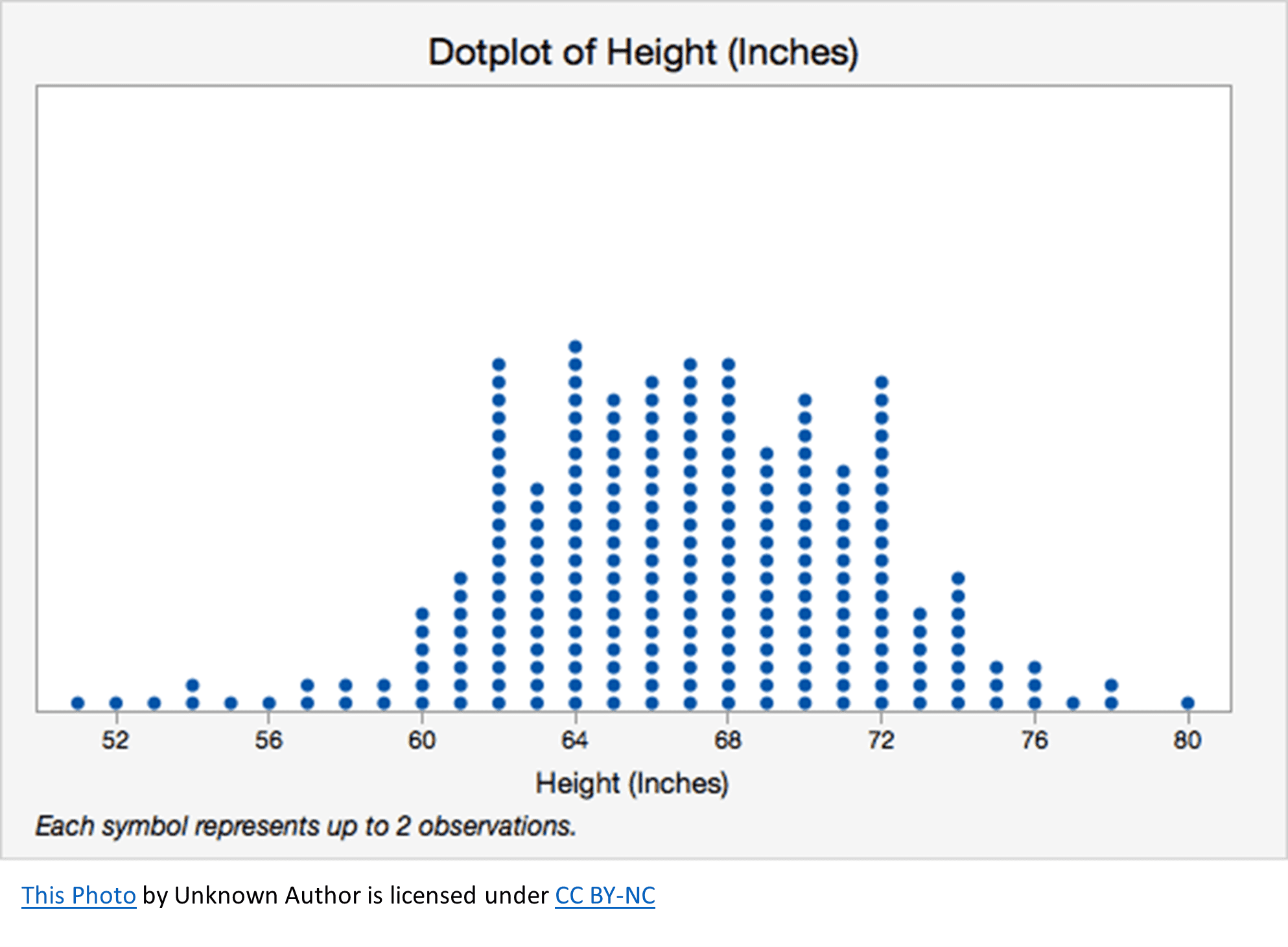
dot plots: displays numerical values on a number line with dots showing their frequencies
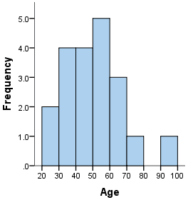
histogram: sorts numerical values into buckets and shows their frequencies; shows general shape of distribution
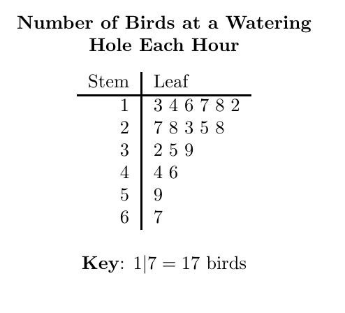
stem-and-leaf plots: shows first digit(s) as a “stem” on one side of a line, and then the final digit (or another digit that is specified in the key) as the “leaf”; retains all original data while showing distribution
box plots: for displaying 5-number summary & outliers on a number line
SECTION: CATEGORICAL VARIABLES
(if you’re shuffling this will make no sense)
association
where knowing the value of one variable (which variable it is) helps predict the likelihood of getting the other value(s)
basically, any difference in probability of getting a certain variable value after knowing one variable’s value
when changes in one variable affect another variable, i.e. if there is any difference in %s for a certain variable in any way for another variable
does NOT imply causation, only shows some kind of correlation within the dataset alone (no statistical significance required either)
interpreting segmented bar graphs in terms of association:
NO association: segmented bar graphs are the same (%s wise)
HAS association: segmented bar graphs are different (difference in %s)
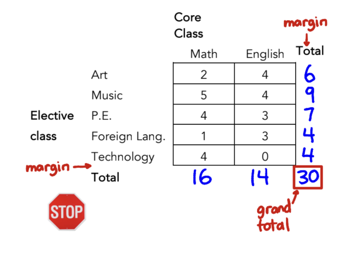
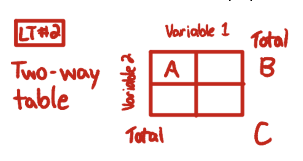
margin
edges of a table that represent the number of data points within smaller groups that all fulfill a certain variable

grand total
the total within a table that represents all possible data points summed across the groups (marginal totals on either side should both sum to the same number, the grand total)
frequency
flat number of how many data points fit a certain criterion
relative frequency
scaling a frequency to a %/to 100% or to 1
= marginal frequency/grand total
marginal relative frequency
(# within a margin)/(grand total) * 100%
= B/C
B = total of one specific margin/variable
C = grand total
joint relative frequency
(# that chose MULTIPLE things at once, that satisfies BOTH one variable AND another)/(grand total) * 100%
= A/C
A = chose two specific variables at once
C = grand total

conditional relative frequency
(# who chose something within a margin)/(marginal total) * 100%
= A/B
A = chose two specific variables at once
B = total within one of those variables (marginal total)

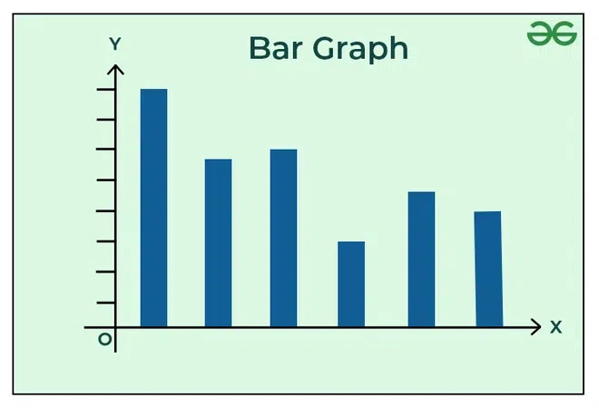
bar graph (*considerations)
graph that displays the frequencies or relative frequencies of different groups via bars whose vertical heights scale with those frequencies
*IMPORTANT CONSIDERATIONS:
vertical axis MUST start at 0, or else data can be misrepresented (can scale small changes too large, etc)
CANNOT use “images” or non-bar visuals for bar graphs, bc their area/width is not equal → can be misleading or make larger ones look too large/smaller too small
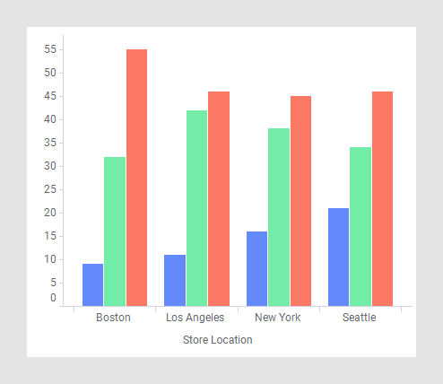
side-by-side bar graph
bar graph that displays one variable as “groups” of bars, and the other variable as bars within those groups of bars
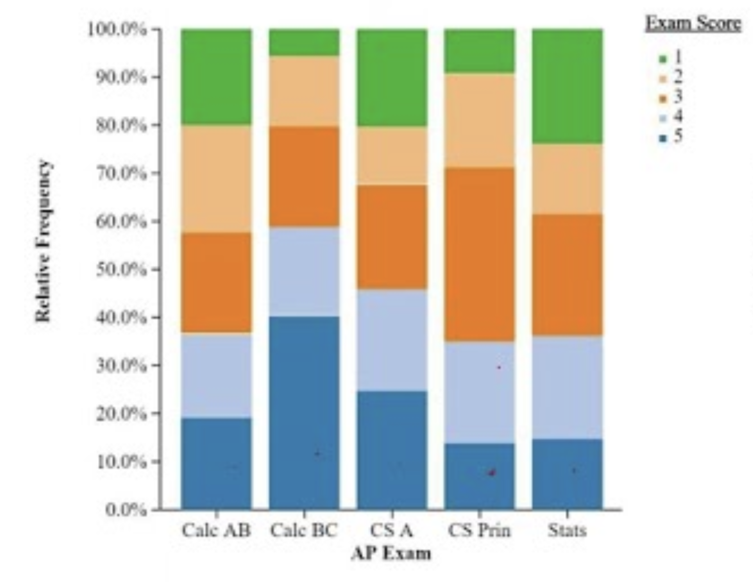
segmented bar graph
bar graph that has major bars representing one variable, then splits those bars into smaller “segments” for the other variable
*usually (for our purposes) shows all of them as relative frequencies and each of the bars as 100%; this is to distinguish them from a mosaic plot
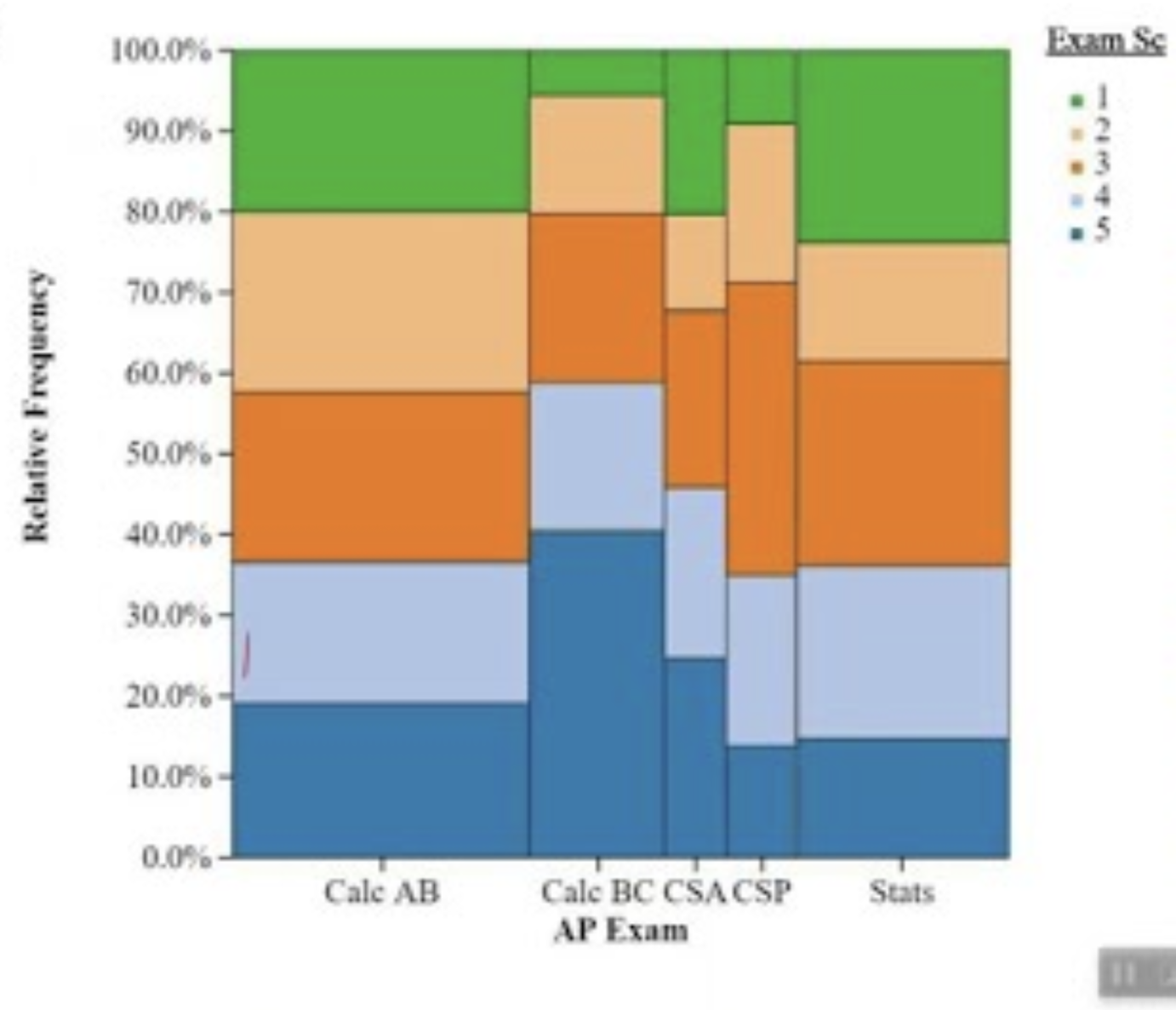
mosaic plot
segmented bar graph that scales the bars horizontally to represent the number of subjects within each of the variables on the x-axis
proportion
relative frequency as a decimal version of the relative frequency fraction
percent
relative frequency as a percent (proportion * 100%)
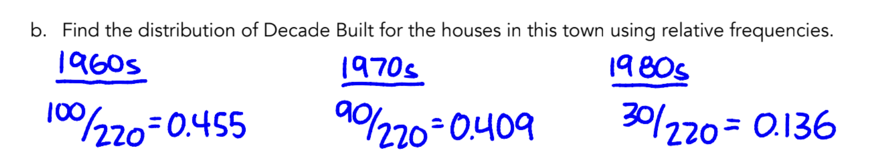
distribution
if asked to “find the distribution”:
list all of the “relative frequencies” but as proportions across the whole population
all of these results should add up to 1
SECTION: QUANTITATIVE VARIABLES
(if you’re shuffling this will make no sense)
discrete (quantitative) variable
quantitative variable that has a “countable” number of values where there are not an infinite number of intermediate values; instead, spaces exist between the values
continuous (quantitative) variable
quantitative variable where all intermediate values are okay (can go up to any precision level)
dot plot
plot that displays each individual response as a dot or marker (of equal size) above the value on a number line
technically usually used to show quantitative data because it’s on a number line; could potentially show categorical
stem and-leaf plot (stem plot)
shows first digit(s) as a “stem” on one side of a line, and then the final digit (or another digit that is specified in the key) as the “leaf”
REQUIRES A KEY: X | X = # (explaining how to interpret the formatting)
MUST LEAVE GAPS/blank spaces; cannot “skip” a | line because there aren’t any with that digit before it
accurately displays the distribution
retains all original data, while showing distribution* this is the goal of a stem-and-leaf plot
pros & cons:
pros: shows how data is spread out; allows us to visually see the shape of the distribution
cons: when too many numbers for one of the digits, hard to read (though this can be alleviated by splitting the stem)
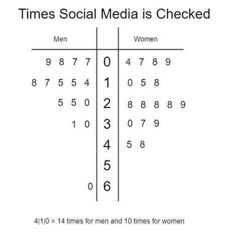
back-to-back stem and leaf plot (back-to-back stem plot)
shows two distributions of data side by side on the same stem, but leafs going on either side
histogram
sorts numerical values into buckets and shows their frequencies; shows general shape of distribution, not individual responses
NO spaces between bars in the histogram****
data on the dividing line of a bucket → goes into HIGHER BUCKET (bucket to the right)
if the data is discretely the bucket (e.g. the histogram is basically a dot plot that shows how many chose 1, how many chose 2, etc), then write dividing lines in the middle of the bars with the numbers
METHOD: describing a distribution**
SOCS/SOCV: shape, outliers, center, spread/variability
+CONTEXT: MUST STATE AT LEAST ONCE (describe what exactly the numbers are - the distribution of what? what’s being measured?)
shape: skew (if any), modality, where most values are (gaps or patterns if any)
skew:
skewed right: values or outliers trail off towards the right (more to the higher side than lower)
skewed left: values or outliers trail off towards the left (more to the lower side than higher)
symmetric: no/little skew to the left or right
modality:
unimodal: 1 major peak
bimodal: 2 major peaks
uniform: no peaks, almost all the same frequency across
gaps: places where there are no data points at all
*NOTE: if you note outliers, you don’t really have to say gaps as well bc outliers imply gaps. but you can. so this piece is kinda optional
outliers: data that is really off from the others
“there are possible outliers at…” → don’t need to show calculation
“there are outliers at…” → show calculation used to get the outlier status
IQR method (Q1 - 1.5IQR or Q3 + 1.5IQR)
SD method ± 2SD
center: either mean or median — depending on if there are OUTLIERS or not:
mean: used if shape is SYMMETRIC and NO outliers
median: used if shape is SKEWED and/or HAS outliers; more resistant to skew and outliers
spread/variability: range, IQR, or SD
range = max - min (single number): always allowed to use
SD = √(Σ(x - xbar)²/(n - 1)): should mostly use if you gave the mean in the last step
IQR = Q3 - Q1 (single number): should mostly use if you gave the median in the last step
standard deviation
s (sample) = √(Σ(x - xbar)²/(n - 1))
a typical (NOT average, bc n-1, not n) difference from the mean
for a population, σ = denominator with n (not n-1)
METHOD: describing standard deviation
“the context (variable) typically varies by standard deviation (value) from the mean of mean (value)”
variance
square of the SD
s2 = sample variance
σ2 = population variance
resistance to outliers?
mean: NOT resistant to outliers; changes significantly with an outlier at one end towards that end
standard deviation: NOT resistant to outliers; INCREASES significantly with outliers
median: in comparison, RESISTANT to outliers
IQR: in comparison, RESISTANT to outliers
so, for:
symmetric distributions: use mean, SD
skewed distributions/outliers: use median, IQR
median
middle value of a dataset (or average of two middle values)
easy calculation for the POSITION (not value): (n+1)/2
even: pick the two numbers around that number to average
odd: pick the number you get
*this is calculating the POSITION of the median within the list
Q1 & Q3 calculations
Q1: 25% percentile
Q3: 75% percentile
easy calculation:
split the data from the median into two sides depending on n:
even # of terms: split ALL data in half EVENLY, then get the medians of each side
(use the strategy for easy median calculation)
odd # of terms: DO NOT include median when splitting data in half, then get medians of each side
(use the strategy for easy median calculation)
five number summary
minimum: smallest value in the entire dataset
*can be an outlier
“0th percentile”
Q1: median of the lower half of the dataset
25th percentile
first quartile
median: median of the entire dataset
50th percentile
Q3: median of the upper half of the dataset
75th percentile
third quartile
maximum: largest value in the dataset
*can be an outlier
100th percentile
interquartile range (IQR)
IQR = Q3 - Q1 (a single value/number)
represents where 50% of the data falls
*MUST SHOW CALCULATION if you get the IQR as a question
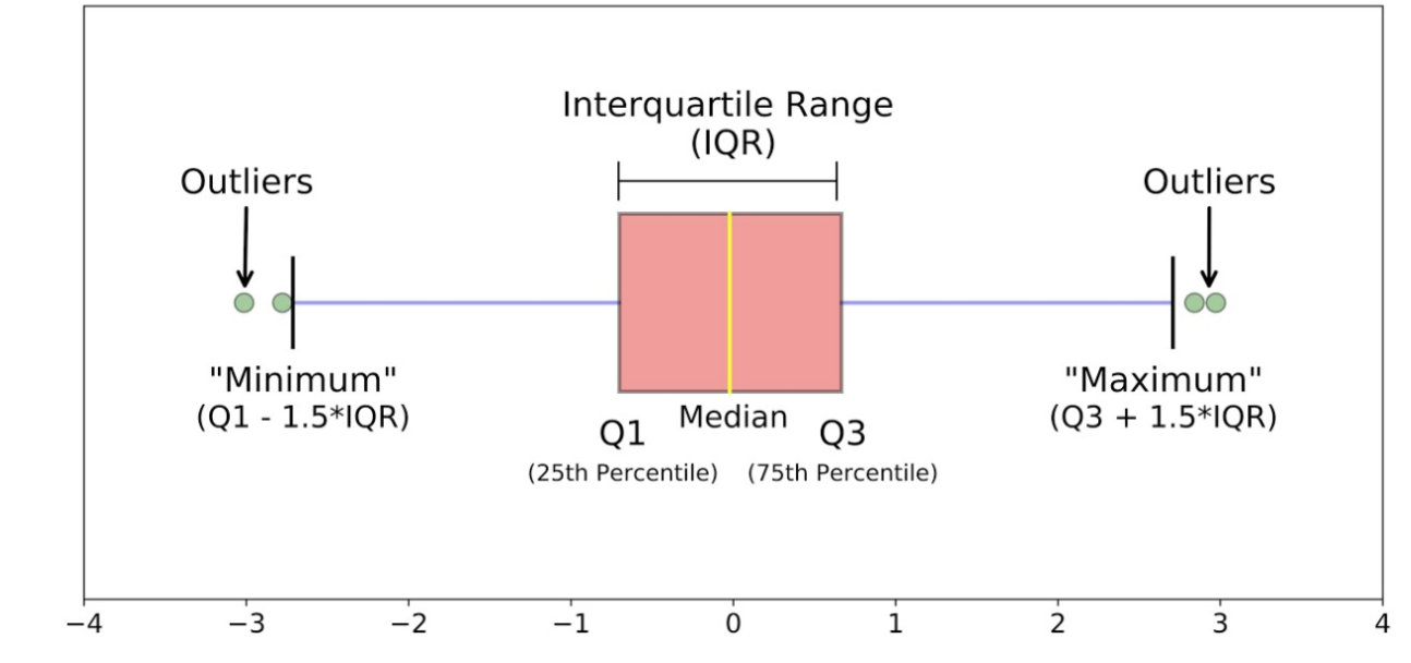
outliers: 1.5 IQR method
works better with medians; can be used if NOT symmetric (technically works with symmetric, but you should use means/SD in that case)
low outlier < Q1 - 1.5*IQR
high outlier > Q3 + 1.5*IQR
outliers: SD method
works with means/if you have a symmetric plot ONLY
low outlier < mean - 2*SD
high outlier > mean + 2*SD
boxplot
shows five-number summary of a quantitative set of data on a number line; can show outliers
MUST be on a number line
drawing:
draw a number line
draw vertical lines above each of the numbers in the 5-number summary
connect 3 lines in the middle (Q1-Q3, IQR) to each other, making a box
draw lines from the sides of the box out to the other two vertical lines, making “whiskers”
note outliers with an ASTERISK (*)
you have to change the whiskers so it DOESN’T go out to the outlier, but instead goes out to the next highest/lowest value that is NOT an outlier
comparing distributions
same as describing distributions, but need more context and COMPARATIVE LANGUAGE:
“___ is greater than ___” for each one
shape: can be compared (which one is more/less skewed, comparing if their skews are different)
outliers: simply state if they have outliers or not (though you can say if the high/low outliers are higher or lower)
center: state whether measures of center are higher or lower than each other
spread/variability: state whether variability/spread is higher or lower than each other
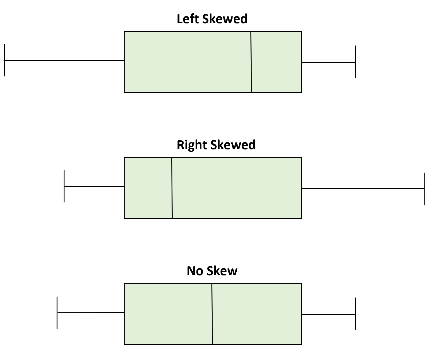
skew: in a boxplot
hard to tell for sure; these are general guidelines:
if the boxes/halves “look symmetric” ish: can assume that the distribution is roughly symmetric (probably)
if the boxes/halves look like TOP HALF (min - median) is more than 2x different than the BOTTOM HALF (median - max):
then, this is actually skewed
if the boxes/halves differ, but not as much as 2x, then slightly skewed