Frequency Distribution
1/16
There's no tags or description
Looks like no tags are added yet.
Name | Mastery | Learn | Test | Matching | Spaced | Call with Kai |
|---|
No analytics yet
Send a link to your students to track their progress
17 Terms
Frequency Distribution
Provides an organised tabulation of the number of individuals located in each category on the scale of measurement
Table or Graph; Various forms of graphs that can be utilised
NOTE: You can find the N (population/total participants) by summing only your entire frequency
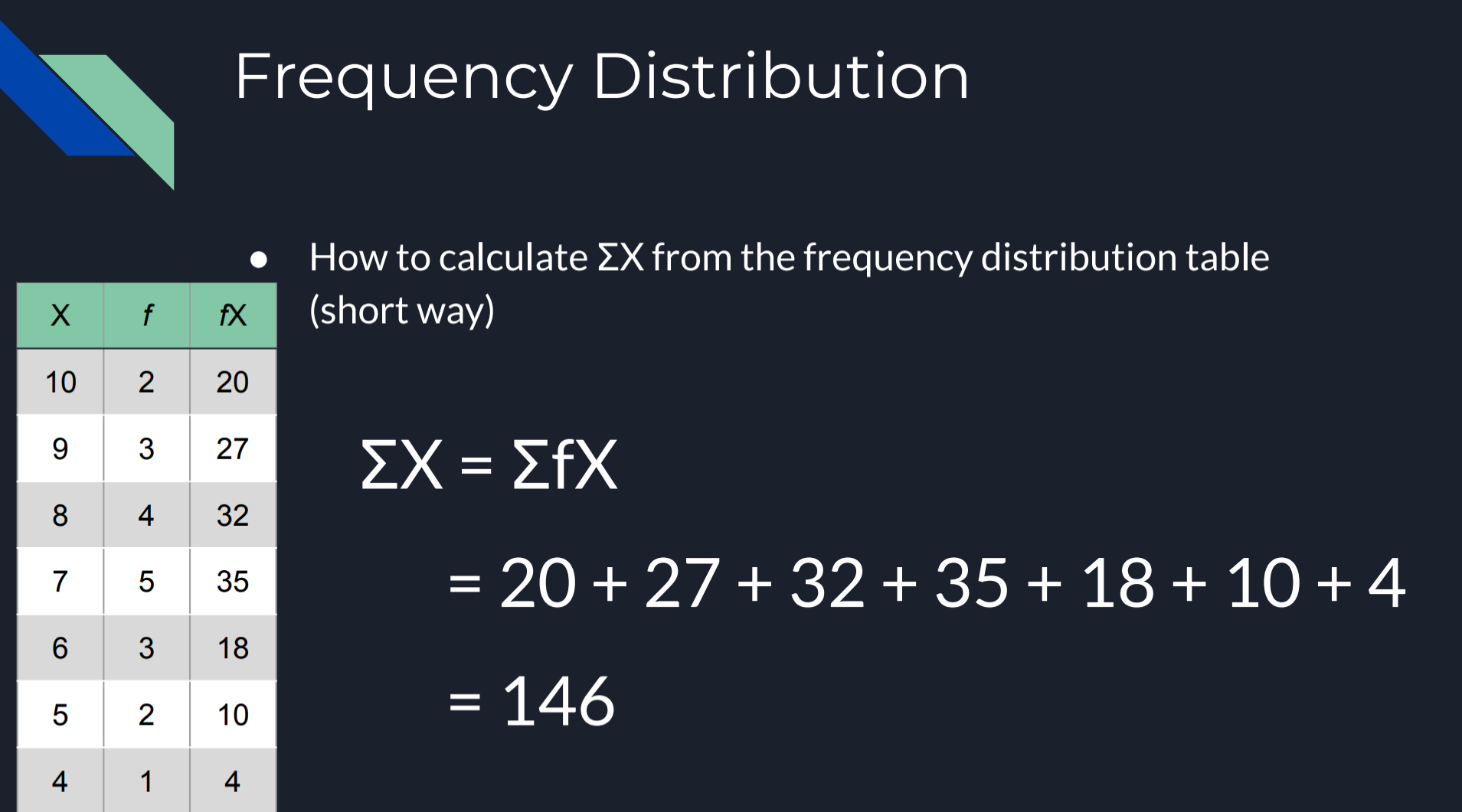
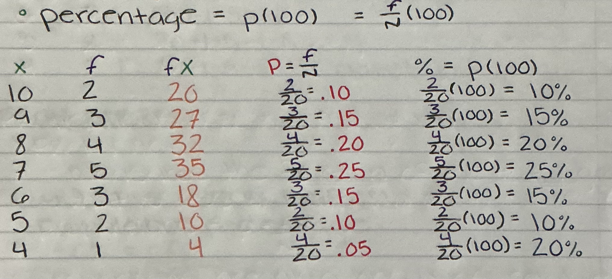
Calculation Frequency Distribution (Table)
Multiply your X variable by your f (frequency)
Sum all numbers together
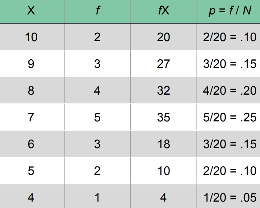
Proportions (Relative Frequency)
Measures the fraction of the total group that is associated with each score
FORMULA: P = f/N
Proportions are also known as relative frequencies because proportions describe the frequency (f) in relation to the total number (N)
Percentages
Two Ways to Calculate
Do the Formula; P = f/N *(100)
OR
From your Proportions calculation, you move the decimal over right twice; P*(100)
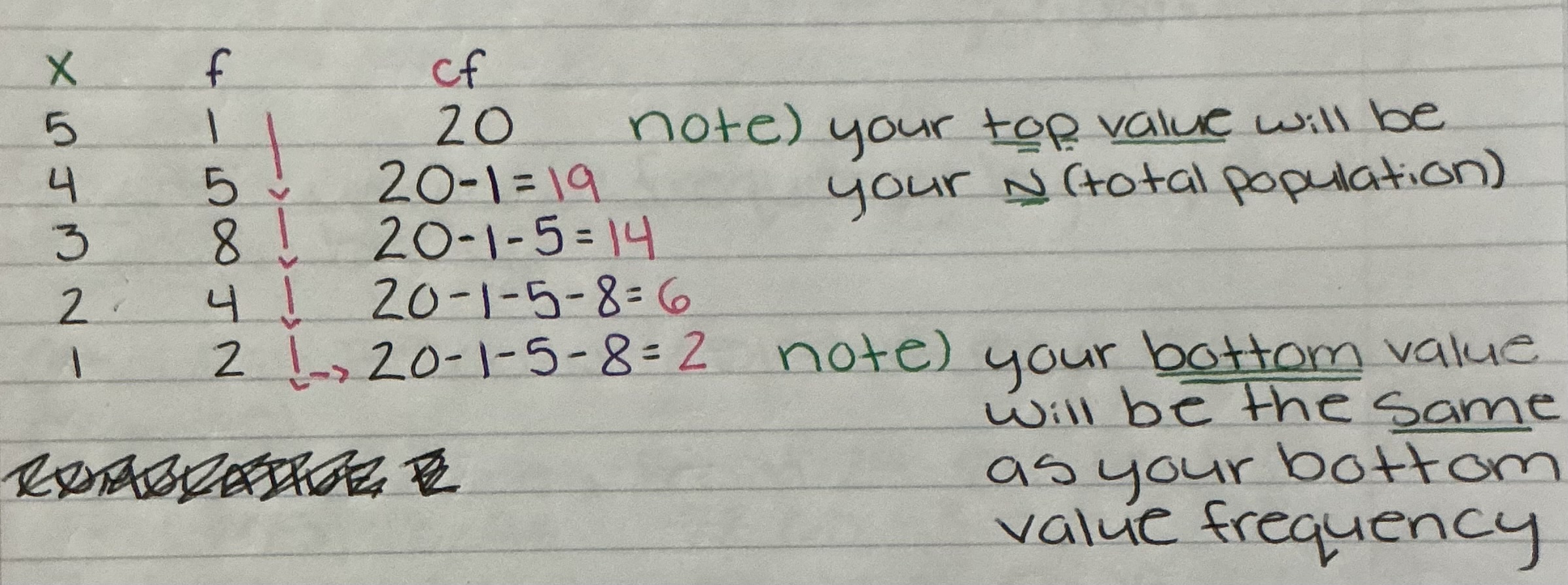
Cumulative Frequency (cf)
Your top value will be your N (total population)
Going down, you will subtract by the last frequency above (you will keep summing the frequencies as you go down and subtract by your N from that row, or your last calculated cumulative frequency); kinda like going diagonally \
Your bottom value will be the same as your bottom value frequency
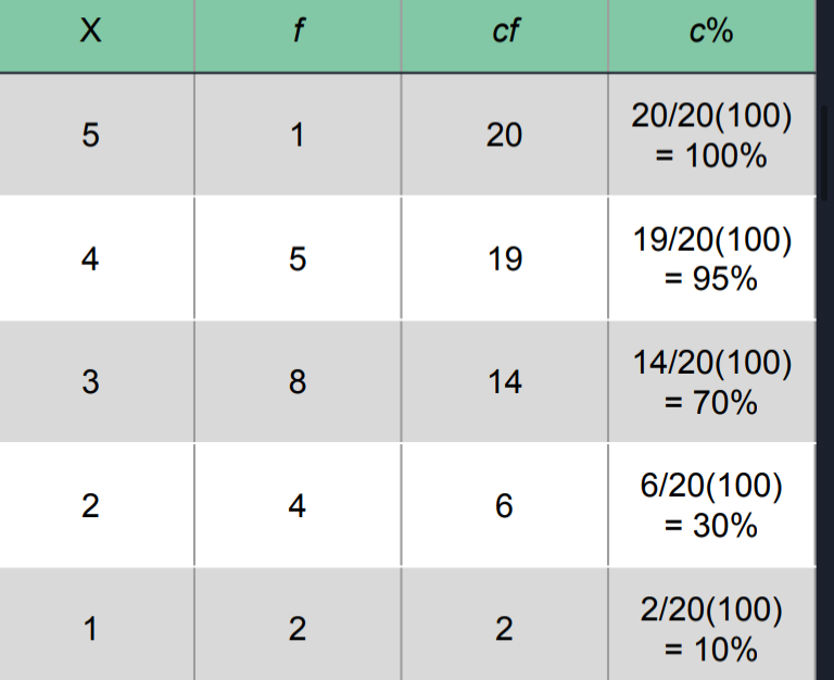
Cumulative Percentages (c%)
FORMULA: c% = cf/N *(100)
Real Limits; Interpret c% as the % of individuals accumulated by the time you reach the top of the interval (the upper real limit)
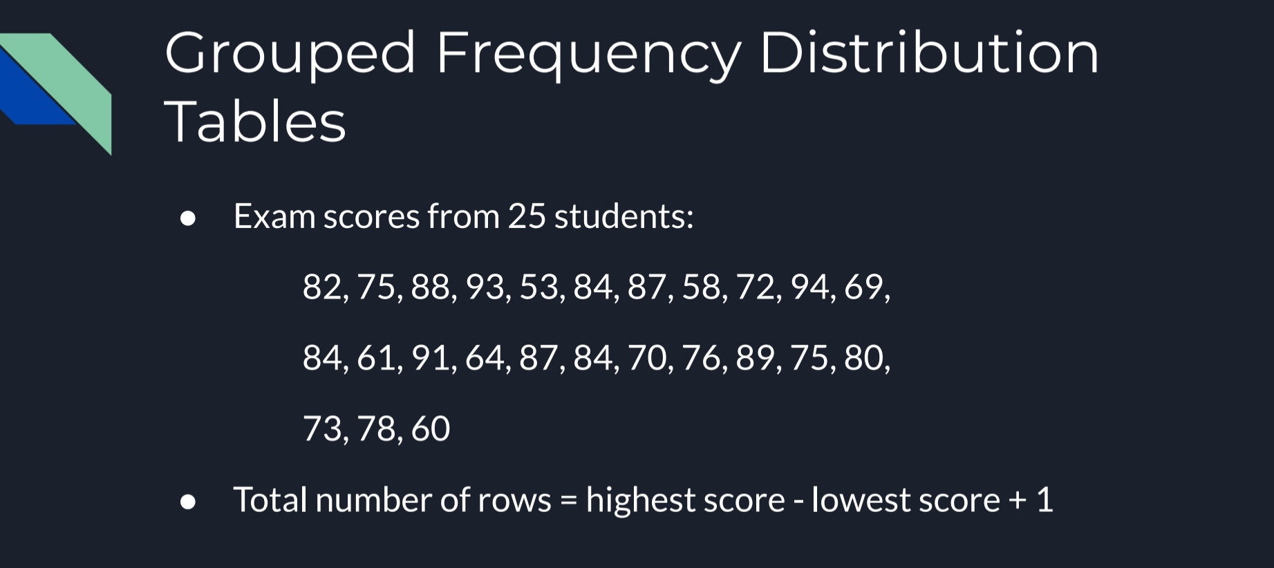
Grouped Frequency Distribution Tables
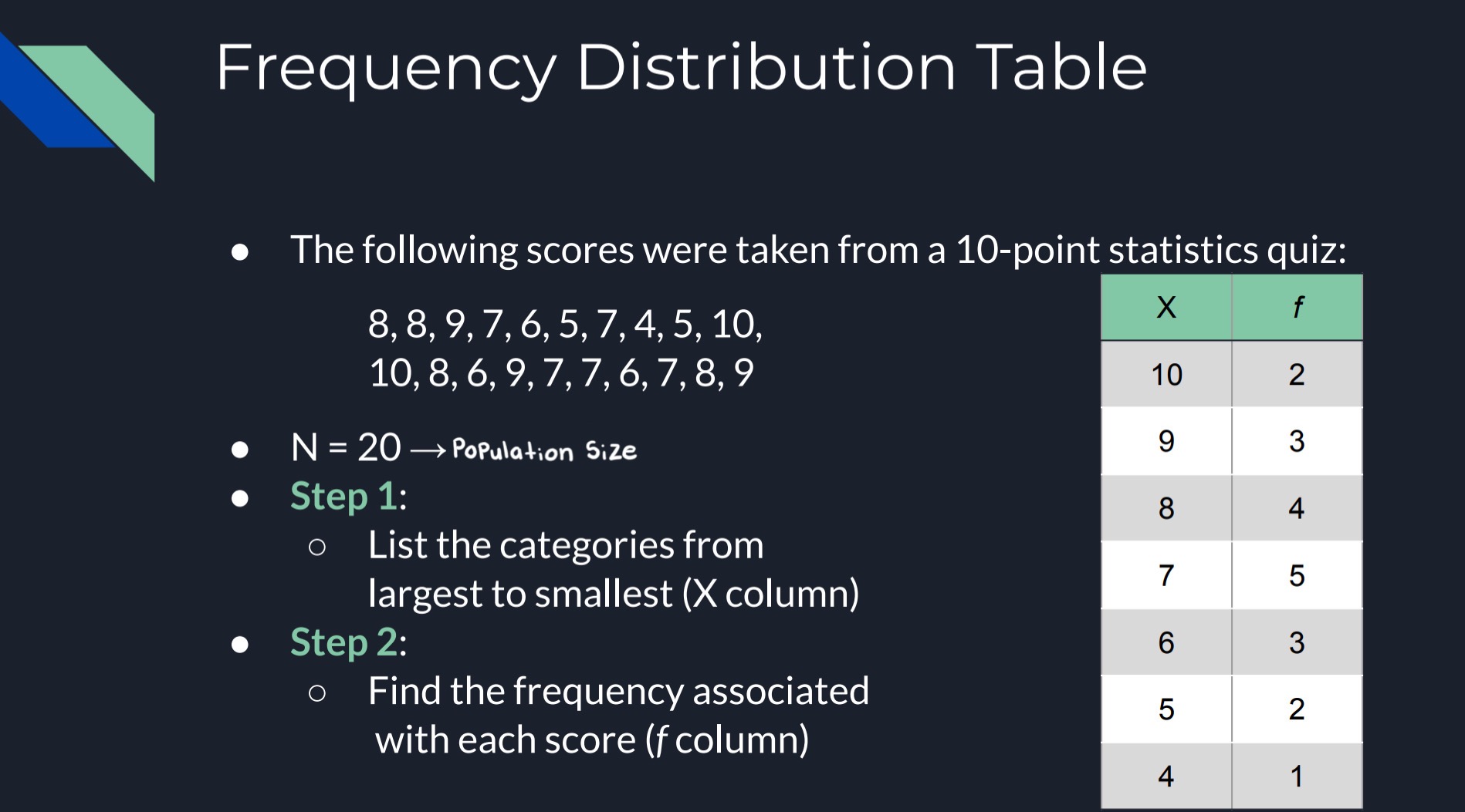
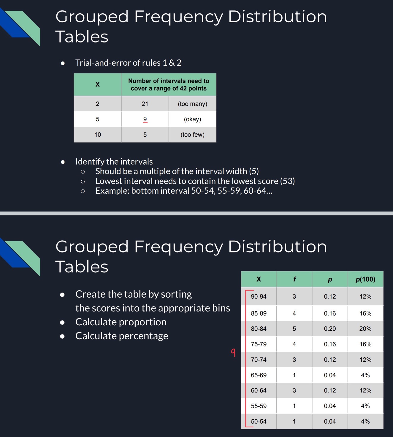
EXAMPLE
You have all different types of exam scores from your all your participants (N)
To get total number of rows, you take your highest score and subtract it by your lowest score and add one
94(highest score) - 53(lowest score) + 1 = 42 (range of score)
Grouped Frequency Distribution Table (shown continuation)
On a table, you need the proper construction rules so that the data is easy to read (42 is your range of score)
Table should have about 10 class intervals
Width of each interval should be a simple number (i.e., 2, 5, 10, or 20)
Bottom score of each interval should be a multiple of the width
All intervals should be the same width
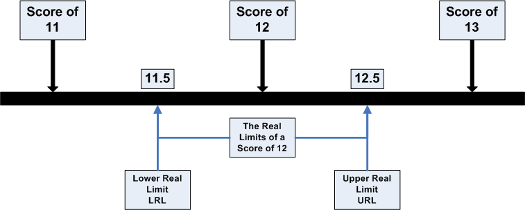
Real Limits
The boundaries of intervals for scores that are represented on a continuous number line
The real limit separating two adjacent scores is located exactly halfway between the scores
The upper limit is at the top of the interval, the lower real limit is at the bottom
EXAMPLE) differentiate 150 from 149 and 151
- X = 150
- Upper real limit = 150.5
- Lower real limit = 149.5
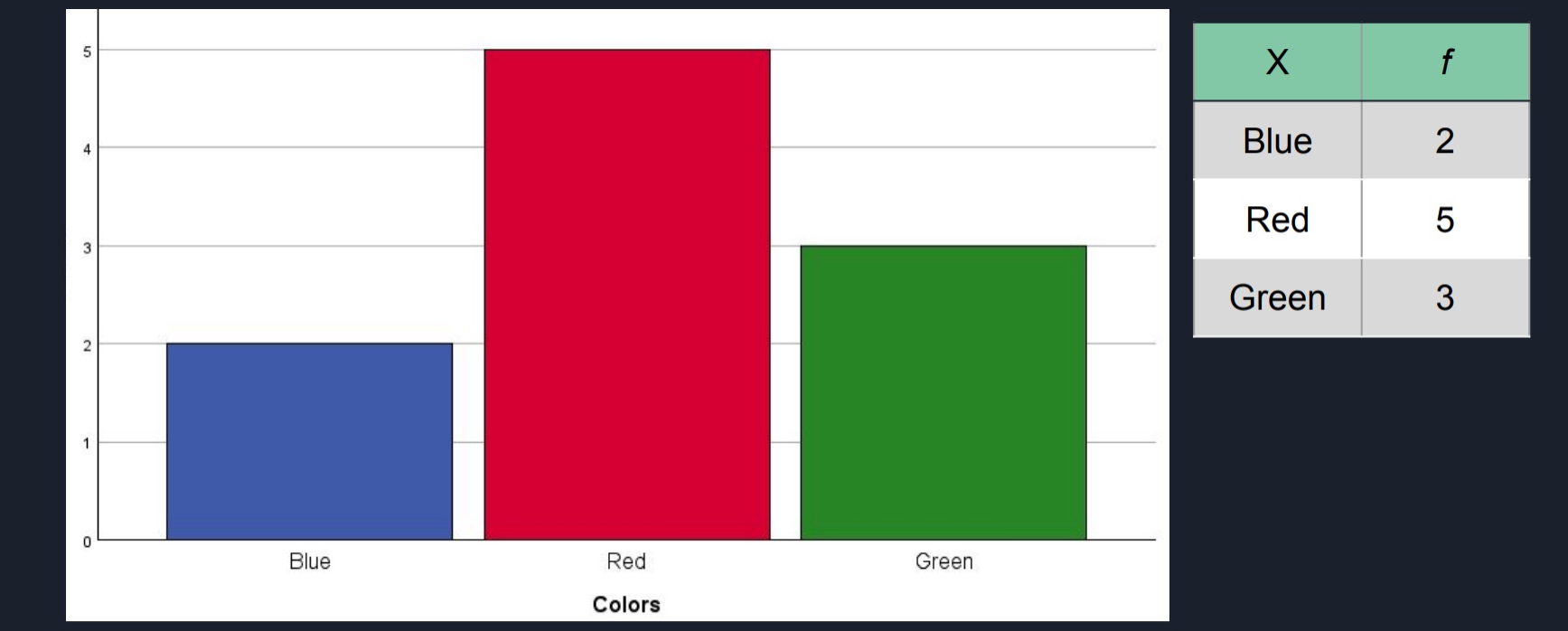
Bar Graphs
Used for Nominal or Ordinal level data
Frequency Distribution Graphs Histograms or Polygons
Designed for interval or ratio data
Construction Steps
List the numerical scores or intervals on the X-axis
Draw a bar above each X value so that:
The height of the bar corresponds to the frequency for that category
The width of the bar extends to the real limits of the category
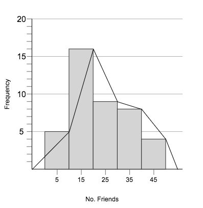
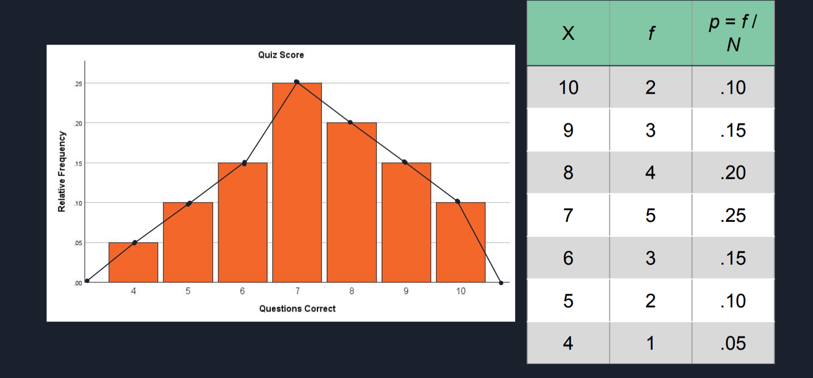
Frequency Distribution Graphs: Polygons
A dot is centered above each score so that the vertical position on the plot corresponds to the frequency for the category
A continuous line is drawn from dot to dot, connecting the entire series
Begin line and end line at the X-axis
Different Types of Distributions
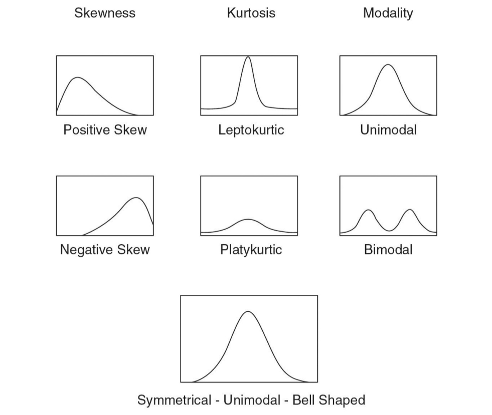
Symmetric Distributions
It is possible to draw a vertical line through the middle of the distribution so that one side of the distribution is a mirror image of the other
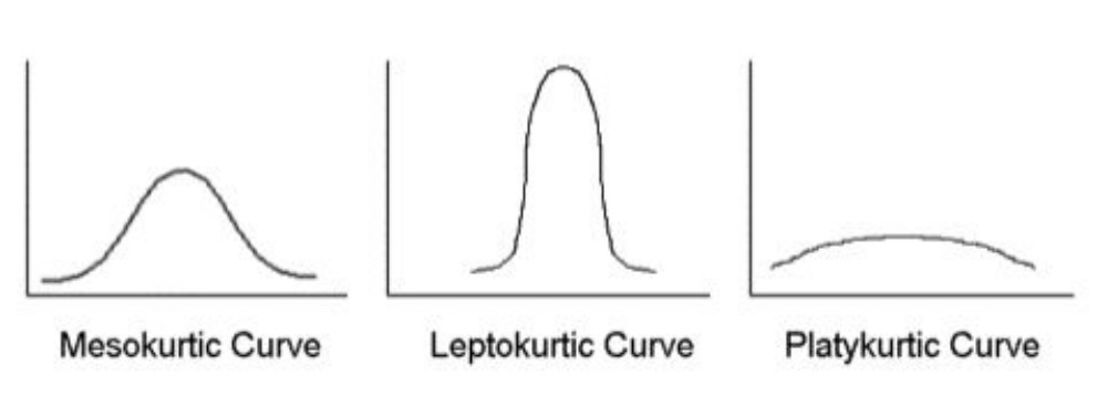
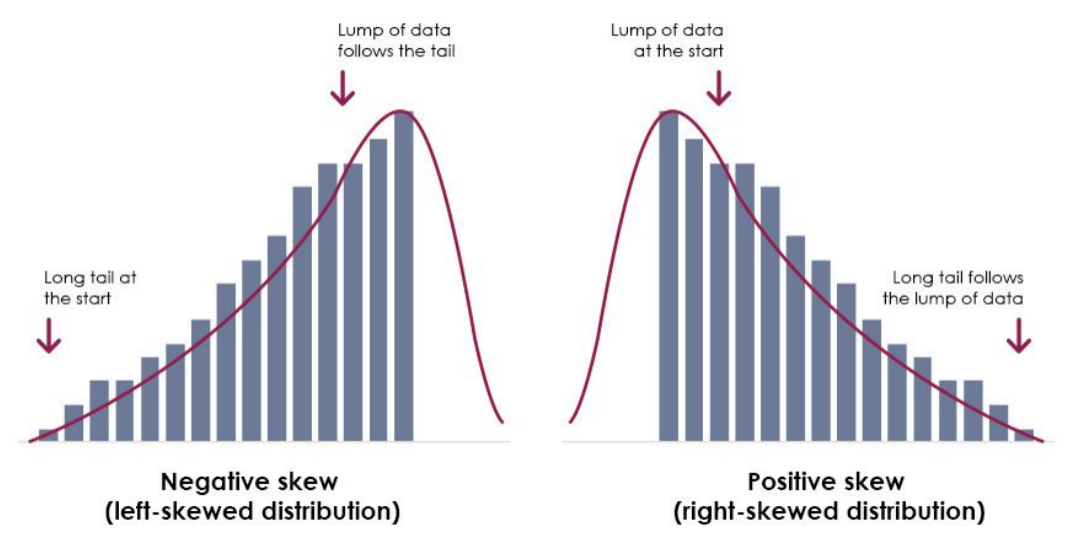
Skewed Distributions
The scores tend to pile up toward one end of the scale and taper off gradually at the other end
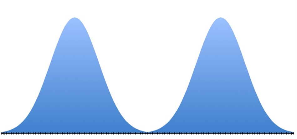
Bimodal
Mode: The most common score
Corresponds to the highest point in the distribution
Bimodal: a distribution with two modes
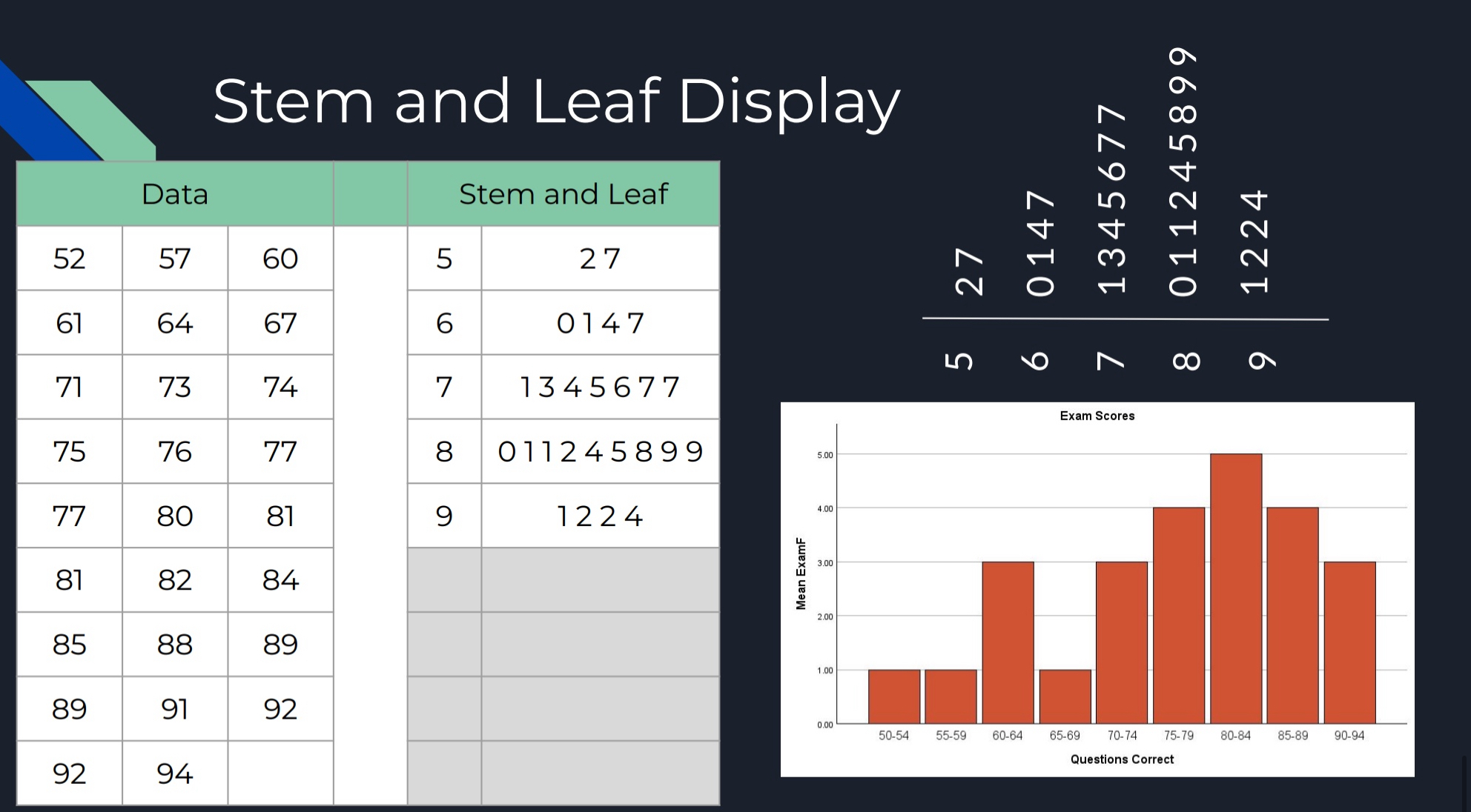
Stem and Leaf Display
Alternative to a frequency distribution
Separate the scores into two parts
STEM: the first digit (or digits if it’s in the tens, hundreds, etc.)
LEAF: The last digit