MIS Exam 2 - Chapter 2: Descriptive Statistics: Tabular and Graphical Displays
1/27
There's no tags or description
Looks like no tags are added yet.
Name | Mastery | Learn | Test | Matching | Spaced |
|---|
No study sessions yet.
28 Terms
bar chart
Data graphed as a series of bars.
categorical data
use labels or names to identify categories of like items
class midpoint
halfway between the lower and upper limit
crosstabulation
can be used with categorical or quantitative variables
crosstab.: row or column percentages
can provide additional insight about the relationship between the two variables
simpson's paradox
the reversal of conclusions based on aggregate and unaggregated data
data dashboard
-widely used data visualization tool that provides timly, summary info in an easy to read and interpret format.
-organizes and presents KPIs used to monitor an organization or process
data visualization
-describes the use of graphical displays to summarize & present info about a data set.
-the goal is to communicate as effectively and clearly as possible the key info about the data
dot plot
simplest graph, horizontal axis shows range of values
frequency distribution calculations
relative frequency: frequency/n
percent frequency: frequency/n*100
histogram
a bar graph depicting a frequency distribution
symmetric skewness
Left tail is the mirror image of the right tail
moderately skewed
longer tail to the left
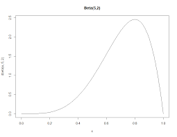
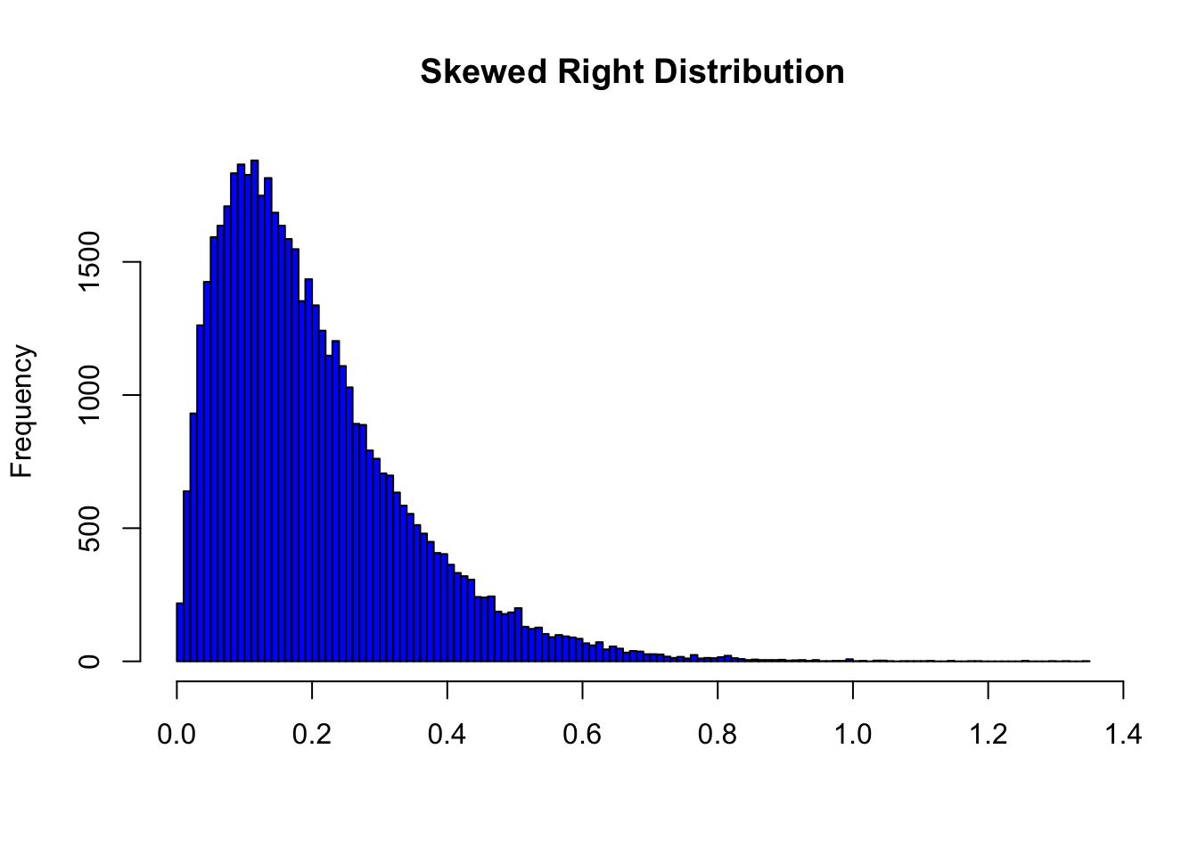
highly skewed right
longer tail to the right
pie chart
categorical data, presents relative frequency & percent frequency
quantitative data
numerical values that indicate how much or how many
distribution steps of quanti. data freq.
1. number of classes
2. width of the classes
3. class limits
relative frequency formula (quantitative variable)
frequency divided by total # of observations
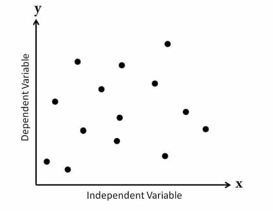
scatter diagram
useful in exploring the relationship between two variables
positive relationship (scatter diagram)
as one increases, the other increases
no relationship (scatter diagram)
line appears flat
negative relationship (scatter diagram)
as one increases, the other decreases
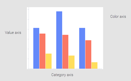
side-by-side bar chart
-compare two variables
-each cluster of bars reps. one value of first variable.
-each bar within cluster reps. one value of second variable
stacked bar chart
each bar broken into rectangular segments of different colors
stem-and-leaf display
-shows both rank, order, & shape of distribution of data
-shows actual data values & easier to construct by hand
percent frequency distribution
frequency/n*100
relative frequency distribution
frequency/n
trendline
provides an approx. of the relationship