GRAPHS AND CHARTS
1/9
There's no tags or description
Looks like no tags are added yet.
Name | Mastery | Learn | Test | Matching | Spaced | Call with Kai |
|---|
No analytics yet
Send a link to your students to track their progress
10 Terms
Bar Graph
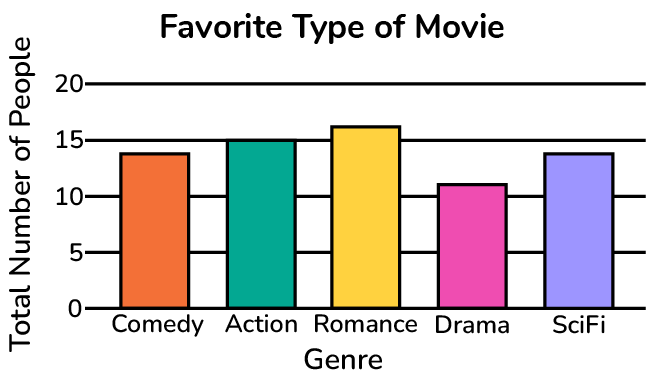
a visual representation of data which compares values in different categories
Example.
the number of people who prefer each genre of movie
Double Bar Graph
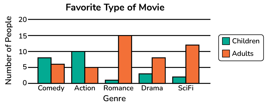
a visual representation of data which compares values in different categories and groups
Example.
the number of people, broken down by children and adults, who prefer each genre of movie
Line Graph
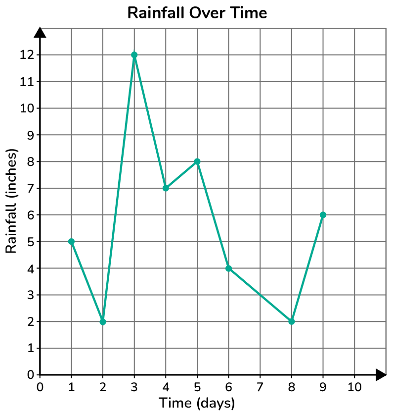
a visual representation of data which shows change over time or in response to a manipulated variable
Quantitative Data
data which is measured and usually expressed numerically
Example.
distance, time, temperature, test scores
Box-And-Whisker Plot / Boxplot
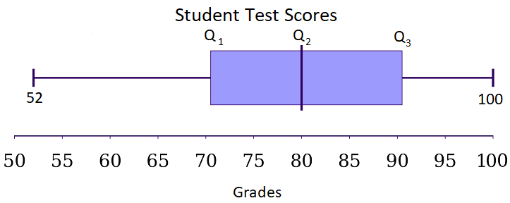
A boxplot splits the data set into quartiles, where the middle 50% of the data forms the box and the lower 25% and upper 25% form the whiskers. Boxplots are used with larger sets of data. You can easily identify the median, the shape or skewness of the graph, and the range on a boxplot.
Stem-and-Leaf Plot / Stemplot
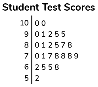
a plot that splits each data value into a "leaf" (usually the last digit) and a "stem" (the other digits). Stemplots are used for smaller sets of quantitative data. You can easily identify outliers, data clusters, or gaps on a stemplot.
Categorical Data
data recorded as categories/groups
Example.
color
Dot Plot
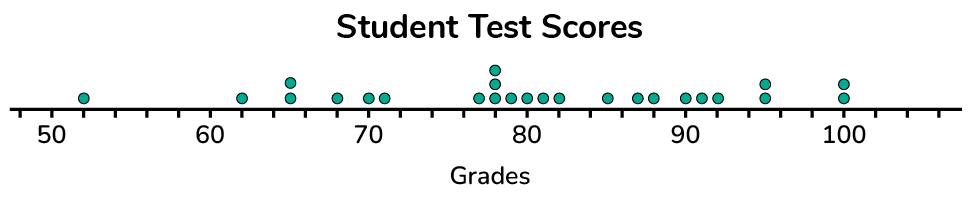
a graph that uses dots to show the frequency counts of a group of data. Dot plots are used for small sets of quantitative data. You can easily identify the mode, the shape or skew of the graph, and potential outliers on a dot plot.
Histogram
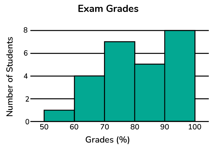
a visual representation of data which compares frequencies of different numeral intervals
Pie Chart
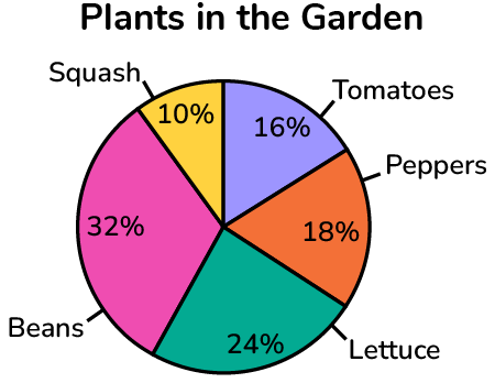
a type of chart in which a circle is divided into sectors that each represent a proportion of the whole; helpful when analyzing the relative distribution of categories