FBLA UX Design
 Studied by 2 people
 Call Kai
 Learn
Learn Practice Test
 Spaced Repetition
 Match
Match Flashcards
 Knowt Play
1/105
There's no tags or description
Looks like no tags are added yet.
Name | Mastery | Learn | Test | Matching | Spaced | Call with Kai |
|---|
No analytics yet
Send a link to your students to track their progress
106 Terms
Accessibility
the extent to which schemas and concepts are at the forefront of people's minds and are therefore likely to be used when making judgments about the social world
Types of Issues
Visual
Mobility
Auditory
Epilepsy
Learning
Environmental
Visual Impairments
problems with eyesight, such as blindness, color blindess
Mobility Impairments
conditions that cause difficulties in ambulation or movement(wheelchair users)
Auditory Impairments
a special need that involves the loss of hearing or some aspect of hearing
Risk of Seizures
epilepsy
Learning Impairments
ADHD, dyslexia
Incidental Issues
sleep deprivation, under the influence
Environmental Challenges
bad service, different devices
Web Content
The text, graphics, illustrations, images, animations, and videos that appear on a website.
User Agents
software to access the web( browsers, phone, apps).
Authoring Tools
are software programs that allow a content expert to interact with a computer in everyday language to develop courseware.
Sight and Hearing Accesibility
can pause, stop or adjust volumes of audio; images of text are resizeable, different representations other than color
Different Presentations
Headings, Settings to customize Presentations
Can be read aloud, enlarged, ajusted for size and color combinations
Text Alternatives
captions, audio descriptions, sign language
Functionality from a Keyboard
functions by mouse are available by keyboard
Web browsers and tools provide keyboard support(helps with voice recognition to operate sites and alternative keyboards)
Time to Read and Use Content
stop, extend, or adjust time limits
Pause, stop, or hide moving, blinking, or scrolling content
Postpone or suppress interruptions, except where necessary
Re-authenticate when a session expires without losing data
Content Does not Cause Seizures
Do not include content that flashes at particular rates and patterns
Warn users before flashing content is presented, and provide alternatives
Provide mechanisms to switch off animations, unless they are essential
Navigatable Content
Pages have clear titles and are organized using descriptive section headings
There is more than one way to find relevant pages within a set of web pages
Users are informed about their current location within a set of related pages
There are ways to bypass blocks of content that are repeated on multiple pages
The keyboard focus is visible, and the focus order follows a meaningful sequence
The purpose of a link is evident, ideally even when the link is viewed on its own
Differennt Ways to Use Besides Keyboard
Gestures that require dexterity or fine movement have alternatives that do not require high dexterity
Components are designed to avoid accidental activation, for example by providing undo functionality
Labels presented to users match corresponding object names in the code, to support activation by voice
Functionality that is activated by movement can also be activated through user interface components
Buttons, links, and other active components are large enough to make them easier to activate by touch
Understandable Information
Identifying the primary language of a web page, such as Arabic, Dutch, or Korean
Identifying the language of text passages, phrases, or other parts of a web page
Providing definitions for any unusual words, phrases, idioms, and abbreviations
Using the clearest and simplest language possible, or providing simplified versions
Predictability
Many people rely on predictable user interfaces and are disoriented or distracted by inconsistent appearance or behavior. Examples of making content more predictable include:
Navigation mechanisms that are repeated on multiple pages appear in the same place each time
User interface components that are repeated on web pages have the same labels each time
Significant changes on a web page do not happen without the consent of the user
Help to Avoid Mistakes
Forms and other interaction can be confusing or difficult to use for many people, and, as a result, they may be more likely to make mistakes. Examples of helping users to avoid and correct mistakes include:
Descriptive instructions, error messages, and suggestions for correction
Context-sensitive help for more complex functionality and interaction
Opportunity to review, correct, or reverse submissions if necessary
Meeting this requirement helps people who do not see or hear the content
Compatibility
Compatible on multiple platforms for past, present, and future devices
UX Designer
UX designers often perform some or all of the above roles, depending on the size of the company and team structure. It is a multifaceted job title that presents unique challenges. UX designers act as intermediaries; they advocate between different departments, teams, and stakeholders. They communicate complex concepts in terms that others can understand. A UX designer is responsible for knowing how a website or application functions, as well as how a user interacts with it. They must be able to communicate with end users, listen and respond with empathy, and quickly change strategy based on feedback. They are armed with some basic knowledge of information architecture, frontend code, and the capabilities of backend. And they must bridge the gap between functionality and visual design, while responding with agility to critique and remaining flexible and open minded to different solutions.
UI Designer
A UI designer focuses on the usability between a website and it's users. They make sure the targeted user can use the website with ease by designing elements to make their experience easy. Example: The UI of the website allowed the user to easily find the product they were searching for and make a purchase.
UX/UI Designer
Does entire process of research, prototypeing, user personas, journey maps, etc
UX Researcher
A type of researcher that conducts studies or interviews to learn about the users of a product and how people use a product
UX Writer
Create the language that appears throughout a digital product, like websites or mobile apps
UX Strategist
Uses negotions and communication
Combines Values of UX with design constraints of business strategies
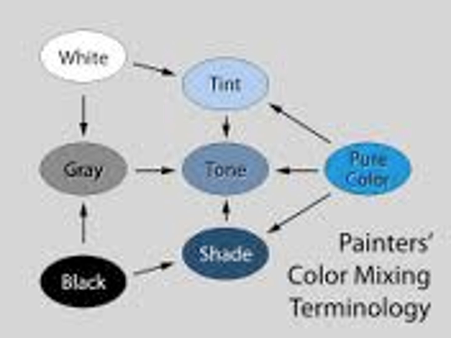
Hue
the dimension of color that is determined by the wavelength of light; what we know as the color names blue, green, and so forth

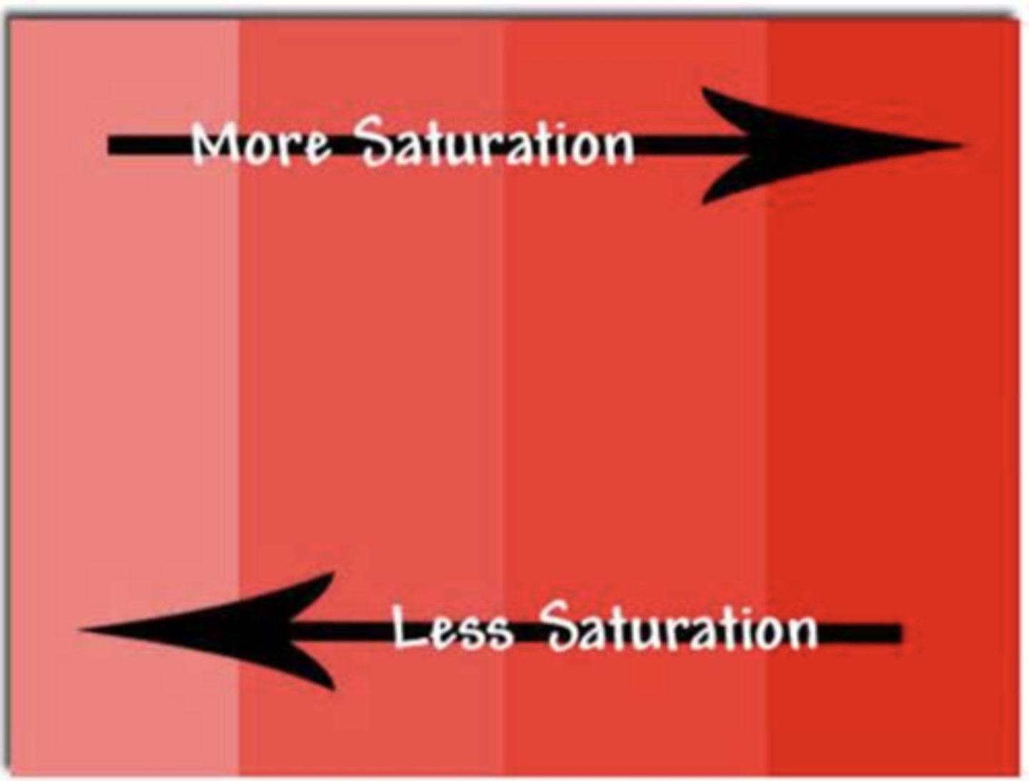
Saturation
intensity of color
Tone
mixing a color with grey

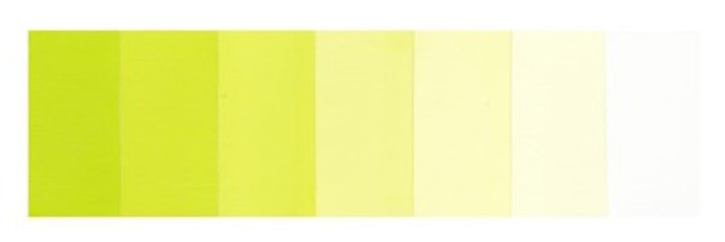
Tint
Adding white to a color
Color Scheme
an arrangement of colors designed to create a specific response
Relationships of Color
Monochromatic
Different shades of a single hue
Analogous
groups of three colors next to each other
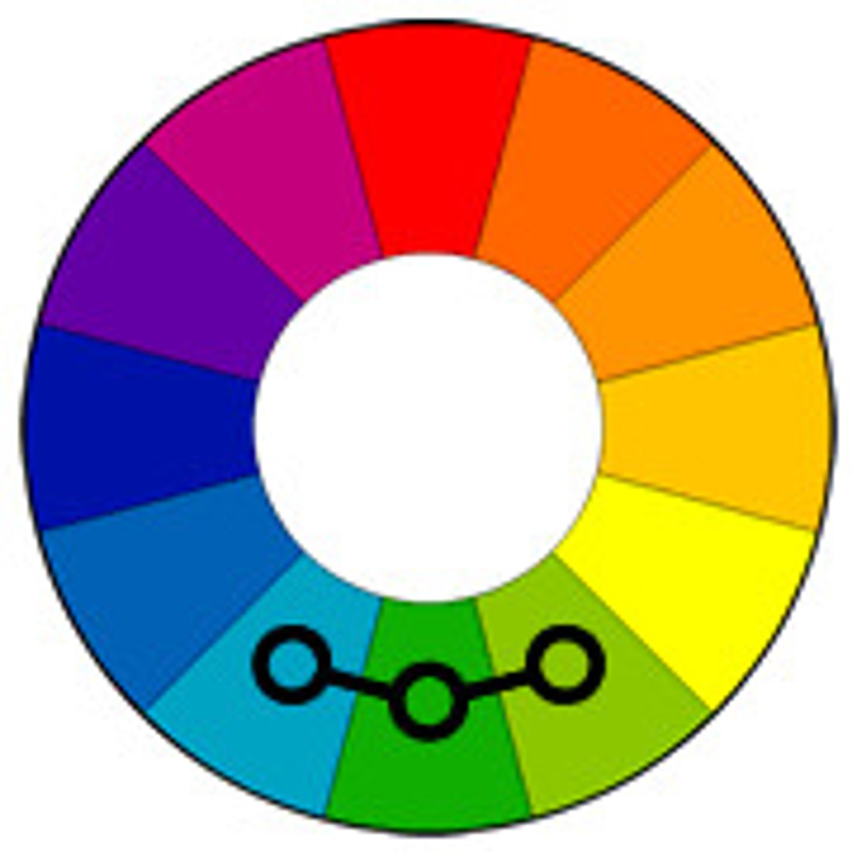
Complimentary Colors
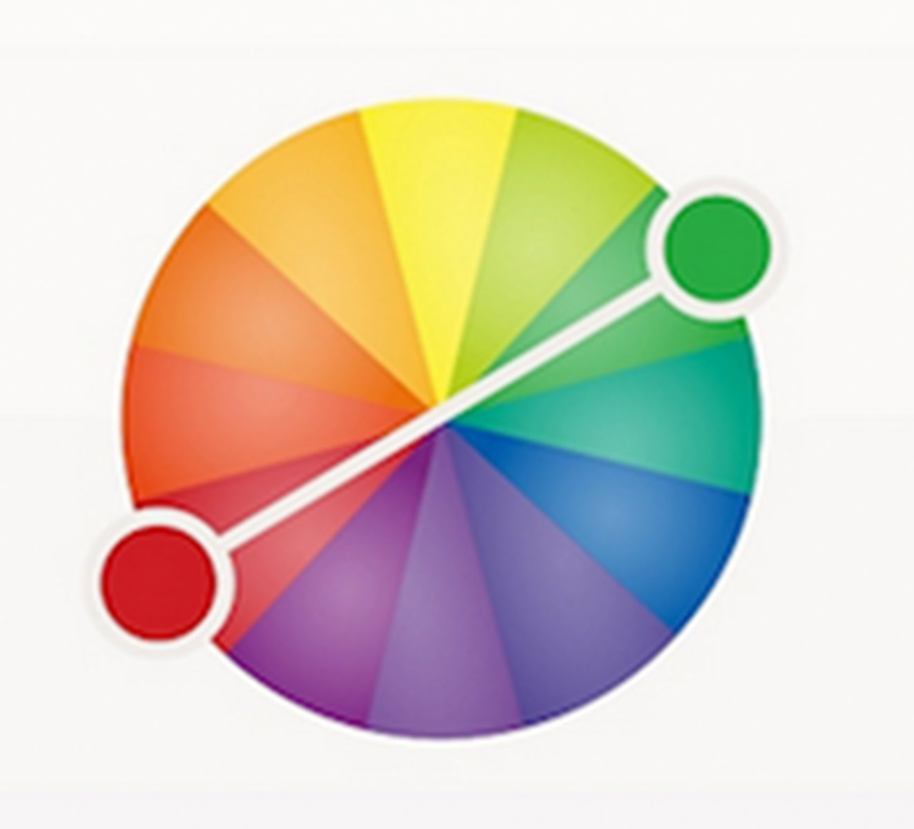
Colors opposite on the color wheel(contrast+vibrance)
Rules
Use three colors
60% dominant hue, 30% secondary color, 10% accent
Emotion of Red
Power, passion, danger, importance
Emotion of Orange
Playful, energetic, cheap
Emotion of Yellow
Cheerful, Friendly, Attention-Seeking
Emotion of Green
Natural, Safe, Fresh
Emotion of Blue
Calm, Reliable, Trustworthy
Emption of Purple
Luxury, romantic, spirituality
Emotion of Pink
Feminine, youth, innocence
Emotion of Black
Sophisticated, Edgy, Mysterious
Emotion of White
Cleanliness, Purity, Health
Emotion of Gray
Neutral, Formal, Sophistication
Accessibility in Color
Color scheme effective for color blindness
Multiple visual cues like indicators, text, patterns, and texture
High Color Contrast
Contrast Ratio
Difference in light intensity between the brightest white and the darkest black a monitor can produce
Design Process of Usability
Learnability
Efficiency
Memorability
Errors
Satisfaction
Learnability
Evaluates the ease with which a user learns how to use the website
Efficiency
Shows how well a user adapts to using the website to complete a task
Memorability
Refers to the ease with which a user remmebers how to navigate the website to re-do a task
Errors
Look at how many errors occur when a User Engages the WEbsite
Satisfaction
How pleasant the experience was for the user
Advanced Technology for Accessibility
Use software to detect color ratio of text, alternate tect for images
Accounts for needs of people
Voice User Interface
System the user controls with voice commands such as Siri, Alexa or google assistant.(Hands free option)
Design Principles of Accessibility
Font Size
Contrast
Discoverability
Repetition
Scale
Hierarchy
Font Size
Make the font size at least 16px, which is the recommended minimum font size for digital platforms. Making your font size smaller than the recommended size could increase readability issues.
Contrast
Focus on creating a distinct difference between two elements on a screen. Contrast can be created between the sizes of elements or color selections. For example, dark text on a light background of a web page helps to minimize readability or discoverability issues.
Discoverability
Use contrast to help users easily find information on a website. Using colors that are low in contrast to one another not only makes it difficult to find information but also increases errors when navigating the website.
Repetition
Repeat a single element many times in a design to help with memorability and guiding users through the website.
Scale
Monitor the scale of elements within proximity to other elements, as this can help emphasize parts of your design.
Hierarchy
Arrange visual information in a way that implies importance, such as making the headline of a body of text larger than the text below it.
Primary Design Principles
Unity, Variety, Hierarchy, Dominance, Proportion, Balance, Emphasis
Unity
Designs are typically composed of many individual parts, and the principle of unity in graphic design states that no single aspect is more important than another.
Emphasis
Designing with emphasis ensures that users understand what they are viewing and that they read the most important information first. For
Rhythm
Rhythm can be used to create a large spectrum of emotions, ranging from relaxation to excitement. In graphic design, rhythm is achieved through the arrangement of elements and spacing between them.
Design Thinking
Focus on end-users. The end-user plays a key role in the design thinking process—all key product design decisions are evaluated according to the end user's needs and wants.
Solid problem framing. Rather than accepting the problem as given, designers explore the problem space to find a root cause of the problem. The insights they gain can help designers reinterpret the given problem.
Creating tangible solutions. Convey design solutions using sketching and prototyping as opposed to presentations and slide decks.
Phases of Design Thinking
empathize, define, ideate, prototype, test
Empathize
Understand the problem of the user for whom you are designing.
Define
Form a problem statement.
Ideate
Generate creative solutions to this problem
Prototype
Build a tangible representation of this solution.
Test
Validate this solution with your target audience.
User Interviews(Empathy)
During user interviewers, interviewees are asked to tell a story about the last time they experienced the problem. The answer will help product creators understand how people currently solve the same or similar issues.
Contextual Inquiry(Empathy)
This is a technique of immersing yourself in your target users' physical environment so you can see how they interact with an existing product and gain a deeper personal understanding of the problems they face.
Empathy Map
An empathy map is a visualization tool used to summarize what a product team knows about its user. It describes what the user says, thinks, does, and feels. This information leads to a better understanding of the target audience.
User Journey Analysis(Define)
A user journey is a visual depiction of the trip the user takes across the solution. The user journey considers the steps that a user takes as well as their feelings, pain points, and moments of delight. User journey analysis will help you to identify key pain points in a journey.
Worst Possible Idea Method(Ideate)
Worst Possible Idea is an ideation method where team members purposefully seek the worst solutions. This technique can stimulate free thinking.
Sketching(Ideate)
Sketching is a fast and efficient way to visualize your ideas. You don't need to be a skilled artist to create sketches. As long as you can draw boxes and arrows, you can communicate your ideas to other people.
Paper Prototyping
Paper prototypes can help you quickly build and validate your design hypothesis with minimal effort. Build rough paper prototypes to find what's working and what's not.
Digital Prototyping
Hi-fi prototypes are great for validating user flows and identify areas that require further attention. You can collect more detailed feedback using hi-fi prototypes.
Prototyping Guidlines
Do not limit yourself to one prototype
Create a library of common elements
Think about technical feasibility and business viability
Moderated Usability Testing
You conduct a series of testing sessions with your solution so you can get feedback from people who represent your target audience. Moderators can ask clarifying questions and collect more detailed feedback from participants (i.e., why exactly do test participants act the way they do).
Focus Groups(Test)
Focus groups are typically small groups of people (six to nine participants) who come together to review and discuss a particular solution. Focus groups are great when you have a specific topic you want to explore (say, understanding how user onboarding makes users feel).
Universal Design
A design is considered "universal" when people with differing physical, sensory, mental, or intellectual abilities can use a product without any additional adaptation or modification.
Universal Design Principles
1. equitable use
2. flexibility in use
3. simple and intuitive use
4. perceptible information
5. tolerance for error
6. low physical effort
7. size and space for approach and use
Equitable Use
the design is useful and marketable to people with diverse abilities
Fexible Use
When your design is put to use, it should be flexible enough to adapt to the user's pace and the ways in which different users prefer to interact with it. For example, when you create a new device, its design should be optimized for right- or left-handed access.
Simple and Intuitive Use
Use of the design is easy to understand, regardless of the user's experience, knowledge, language skills, or current concentration level.
Perceptible Information
The design communicates necessary information effectively to the user, regardless of ambient conditions or the user's sensory abilities.
Tolerance for Error
The design minimizes hazards and the adverse consequences of accidental or unintended actions.
Minimal Physical Effort
Minimize physical effort with good ergonomics, repetitive actions, and comfortable features and interactions
Size and SPace
A service or product is designed so anyone can use it, interact with it despite limitations such as grip strength, moving, reaching, etc.
User Flow Analysis
Level 1- no significant problems
Level 2- Difficulty with particular product features
Level 3- Difficulty with mos tproduct features
Level 40 Unable to use the product
Principles of UX Writing
Useful
Concise
Clear
Prioritized
Consistent tone and voice
Easily Translatable
 Note
Note  Flashcards (20)