p3 fieldwork
1/54
There's no tags or description
Looks like no tags are added yet.
Name | Mastery | Learn | Test | Matching | Spaced | Call with Kai |
|---|
No analytics yet
Send a link to your students to track their progress
55 Terms
physical enquiry
Does river discharge increase downstream?
human enquiry
Has the urban regeneration of London Olympic park been successful?
whys is physical enquiry suitable
The hypothesis is suitable because river discharge can be measured accurately at different sites along the river, allowing reliable quantitative data to be collected and compared.
Geography theory, including the Bradshaw Model, suggests discharge should increase downstream due to tributaries adding water, so the hypothesis can be tested against real evidence.
whys is human enquiry suitable
This is a suitable hypothesis because the success of Stratford’s regeneration can be investigated using a range of primary data collected in the field, including questionnaires, environmental quality surveys, and observations.
It is also linked to urban regeneration theory and allows different social, economic, and environmental impacts to be evaluated before reaching a conclusion.
theory behind physical Q
The theory behind this hypothesis is the Bradshaw Model, which predicts that river discharge increases downstream as tributaries and runoff add more water to the channel.
theory behind human Q
The theory behind this investigation is that urban regeneration can improve an area economically, socially, and environmentally through investment, new housing, transport, and employment opportunities.
primary data collected w/ physical Q
River width
Measured using a tape measure.
Needed because discharge depends partly on channel size.
River depth
Measured at intervals across the channel using a metre ruler.
Used to calculate cross-sectional area.
River velocity
Measured using a flow meter or float method.
Needed to calculate discharge.
Discharge
Calculated using:
Discharge=Cross-sectional area×VelocityDischarge=Cross-sectional area×Velocity
This directly tests the hypothesis.
Observations/photos
Recorded channel shape, bedload size, and surrounding land use.
Helps explain unusual results.
justification for primary data (physical)
These methods produced quantitative data that was reliable and easy to compare between sites. Measuring width, depth, and velocity allowed discharge to be calculated accurately and directly tested whether it increased downstream.
secondary data collection methods (physical)
Maps (OS maps or GIS)
Used to identify river sites, tributaries, and drainage basin features.
Weather/rainfall data
Helped explain variations in discharge.
Existing river information
Used to compare findings with expected river patterns such as the Bradshaw Model
justification of secondary data
Secondary data provided background information about the river basin and helped explain patterns in the results. Maps and rainfall data also improved the accuracy of site selection and analysis.
urban primary collection methods
Questionnaires/interviews
Asked people about safety, environmental quality, transport, and employment opportunities.
Gave insight into public opinion on regeneration success.
Environmental Quality Survey (EQS)
Scored factors such as litter, graffiti, green space, noise, and building condition.
Allowed comparison of environmental quality across locations.
Land-use surveys
Recorded types of buildings and services.
Showed economic development and changes in the area.
Pedestrian/traffic counts
Measured activity levels and accessibility.
Indicated how attractive and busy the area has become.
Photographs and field sketches
Provided visual evidence of regeneration.
urban primary justification
These methods collected both quantitative and qualitative data, allowing social, economic, and environmental impacts of regeneration to be assessed. Surveys and counts also made it possible to compare different areas objectively.
urban secondary data collected
Census/deprivation data
Used to compare employment, income, and population changes before and after regeneration.
Government or London Legacy Development Corporation reports
Provided information about regeneration aims and investment.
Historical photographs/maps
Showed how Stratford changed over time.
Crime or house price statistics
Helped measure social and economic change.
justification of secondary collection methods
Secondary data gave historical and statistical context that primary data alone could not provide. It helped measure long-term changes and compare current conditions with conditions before regeneration began.”
what is random sampling
where samples are chosen at random
what is systematic sampling
takes samples at regular intervals
what is stratified sampling
is where u choose samples from different groups to get a good overall representation
why I collected river width, how I measured and recorded it and the sampling technique
River width
Why collected:
Width is needed to calculate cross-sectional area and discharge. The Bradshaw Model predicts width increases downstream.How measured:
A tape measure was stretched across the river from bank to bank.How recorded:
Measurements were written in a results table in metres.Sampling technique:
Measurements were taken at several sites downstream using systematic sampling because sites were selected at regular intervals along the river.
why I collected river depth, how I measured and recorded it and the sampling technique
River depth
Why collected:
Depth helps calculate cross-sectional area and shows how channel characteristics change downstream.How measured:
A metre ruler was placed vertically in the water at equal intervals across the channel.How recorded:
Depths were written in a table and an average depth was calculated.Sampling technique:
Systematic sampling was used because measurements were taken at regular distances across the channel.
why I collected river velocity, how I measured and recorded it and the sampling technique
River velocity
Why collected:
Velocity is needed to calculate discharge and investigate downstream changes.How measured:
A flow meter or float was used over a measured distance, and time was recorded with a stopwatch.How recorded:
Results were written in a table in metres per second (m/s). Repeats were averaged to improve reliability.Sampling technique:
Several readings were taken across the river using systematic sampling.
why I collected observations/photos , how I measured and recorded it
Observations/photos
Why collected:
To explain anomalies and provide supporting evidence about channel shape and land use.How measured:
Visual observations and photographs were taken at each site.How recorded:
Notes, annotated sketches, and labelled photos were included in the fieldwork booklet.
maps and GIS data why used, how collected and recorded
Maps and GIS (Geographical Information Systems) data
Why used:
To identify tributaries, drainage basin features, and suitable sites.How collected:
Information was taken from OS maps or digital mapping software.How recorded:
Locations were marked on printed maps or screenshots.
rainfall/weather data why used, how collected and recorded
Rainfall/weather data
Why used:
Rainfall affects river discharge and could explain unusual results.How collected:
Data was taken from weather websites or river monitoring sources.How recorded:
Figures and graphs were added to the investigation.
questionnaires why collected, how measured, how recorded and what sampling techniques
Questionnaires
Why collected:
To understand people’s opinions about whether regeneration improved the area socially and economically.How measured:
People were asked the same set of questions.How recorded:
Answers were ticked or scored on survey sheets and later turned into graphs.Sampling technique:
Usually random sampling was used to reduce bias by selecting different members of the public.
environmental quality survey why collected, how measured, how recorded and what sampling techniques
Environmental Quality Survey (EQS)
Why collected:
To measure environmental improvements such as cleanliness, green space, and building quality.How measured:
Different categories were scored using a rating scale, for example from -5 to +5.How recorded:
Scores were entered into tables and totals were calculated.Sampling technique:
Systematic sampling was often used because surveys were completed at regular locations around Stratford.
pedestrian counts why collected, how measured, how recorded and what sampling techniques
Pedestrian counts
Why collected:
High numbers of people may show the area is successful and attractive.How measured:
The number of pedestrians passing a point was counted for a set amount of time.How recorded:
Totals were written in tables and later displayed in graphs.Sampling technique:
Systematic sampling was used because counts were completed at selected intervals or locations.
land-use surveys why collected, how measured, how recorded and what sampling techniques
Land-use surveys
Why collected:
To identify economic changes and new developments.How measured:
Types of buildings and services were observed and categorised.How recorded:
Results were marked on maps or tally charts.Sampling technique:
Systematic sampling along a route through Stratford.
census statistics why used, how collected and how recorded
Census/deprivation statistics (these are official sets of data collected by the government about people and areas)
Why used:
To compare social and economic conditions before and after regeneration.How collected:
Data was taken from government statistics websites.How recorded:
Figures were shown in graphs and tables.
historical maps and photographs why used, how collected and how recorded
Historical maps and photographs
Why used:
To show how Stratford changed over time.How collected:
Images and maps were gathered from online archives or reports.How recorded:
They were included in presentations or annotated comparisons.
risks with the physical data collection methods
Deep or fast-flowing water
Measuring depth and velocity involved entering the river, which could lead to slipping or being swept by strong currents.
Slippery rocks and uneven river beds
Wet rocks increased the risk of falling and injury.
Weather conditions
Heavy rain could increase discharge suddenly and make conditions unsafe.
Cold temperatures
Standing in water for long periods could cause discomfort or cold-related problems.
how risks were reduced while data sampling from river
Fieldwork was only carried out in shallow sections of the river.
Students wore suitable footwear such as wellington boots with grip.
Work was completed in groups with teacher supervision.
Weather forecasts were checked before the visit.
Unsafe areas with fast currents or steep banks were avoided.
Equipment was carried carefully and instructions were given before entering the river.
why was the river location suitable
The river had safe access points and shallow water.
Several sites could be reached easily along the river, allowing downstream comparisons.
The river showed clear downstream changes predicted by the Bradshaw Model.
Sites were close enough together to collect data efficiently within the time available.
risks associated with urban data collection
Traffic and busy roads
Pedestrian counts and surveys near roads created a risk from vehicles.
Stranger danger
Conducting questionnaires with members of the public could create safeguarding concerns.
Crowded public areas
Busy locations increased the chance of students becoming separated from the group.
Weather conditions
Rain or extreme heat could affect comfort and data collection.
how urban data collection risks were reduced
Crossings and pavements were used when moving around Stratford.
Students worked in groups and stayed within designated areas.
Questionnaires were carried out politely in busy public spaces only.
Teachers supervised all activities.
Appropriate clothing and water were brought depending on weather conditions.
why was Straford a suitable location
Stratford has experienced major regeneration since the 2012 Summer Olympics, making it ideal for studying urban change.
The area contains clear evidence of social, economic, and environmental improvements such as transport links, green spaces, and new businesses.
Different land uses can be compared easily within walking distance.
The area is accessible by public transport and safe for school fieldwork.
how I presented my data for river, why I chose that option
Bar graphs
Used to show changes in river width, depth, velocity, or discharge between sites.
Bar graphs were chosen because they clearly compare results between different river sites.
Line graphs
Used to show the trend of increasing discharge downstream.
Line graphs were suitable because they show trends and changes downstream clearly.
Cross-sectional diagrams
Used to show the shape and size of the river channel at different sites.
These were used to visualise differences in channel shape and size more effectively than tables.
Scatter graphs
Used to identify correlations, for example between distance downstream and discharge.
Scatter graphs helped identify whether there was a positive correlation between distance downstream and discharge.
Located photographs/maps
Used to show where data was collected and support observations.
Located photographs and maps provided visual evidence and helped identify the exact fieldwork locations.
how I presented my data for urban, why I chose that option
Pie charts
Used to show questionnaire responses and land-use percentages.
Pie charts were chosen because they clearly show proportions and percentages of responses.
Bar graphs
Used to compare environmental quality scores or pedestrian counts at different locations.
Bar graphs allowed easy comparison between different locations in Stratford.
Choropleth maps
Used to display deprivation or census data across different areas.
Choropleth maps were useful because they showed spatial patterns in deprivation and regeneration clearly.
Annotated photographs
Used to show examples of regeneration such as new housing, transport, and green spaces.
These provided visual evidence of regeneration and helped explain field observations.
Radar/spider graphs
Used to compare Environmental Quality Survey results across categories.
Radar graphs helped compare multiple environmental quality categories at the same time in a clear visual format.
what I did, why it was appropriate and how I adapted my presentation method for my river data
What I did:
Presented data using line graphs and scatter graphs to show downstream trends
Used bar charts to compare values between different river sites
Calculated and plotted discharge values from raw data
Why it was appropriate:
Data was quantitative, so graphs made it easier to compare
Line/scatter graphs clearly showed relationships and trends downstream
Bar charts made differences between sites easy to see
Helped test whether discharge increases downstream
How I adapted presentation:
Calculated averages from repeated measurements before graphing
Converted raw measurements into discharge values
Removed or reduced impact of anomalies
Combined multiple variables into one final dataset for clarity
what I did, why it was appropriate and how I adapted my presentation method for my urban data
What I did (presentation):
Used pie charts for questionnaire results
Used bar charts for EQS scores and pedestrian counts
Used radar/spider graphs for environmental quality categories
Used choropleth maps for deprivation/census data
Why it was appropriate:
Data was mixed (quantitative + qualitative)
Pie charts showed proportions of opinions
Bar charts allowed easy comparison between sites
Maps showed spatial patterns of regeneration
Radar graphs compared multiple environmental factors at once
How I adapted presentation:
Grouped questionnaire answers into categories (positive/negative)
Converted EQS scores into averages per location
Simplified land use into clear categories (residential, commercial, etc.)
Turned raw counts into percentages for clearer comparison
river fieldwork data presentation effectiveness and improvements
Effectiveness:
Line and scatter graphs were very effective for showing the increase in discharge downstream because they clearly displayed trends and relationships.
Bar charts made it easy to compare individual sites, but were less effective for showing overall trends.
Tables were useful for organisation but harder to interpret quickly than graphs.
Possible improvements:
Use a larger range of scatter graphs (e.g. discharge vs distance downstream) to better show correlations.
Add trend lines to scatter graphs to make patterns clearer.
Include box plots to show variation and reliability in repeated measurements.
urban fieldwork data presentation effectiveness and improvements
Effectiveness:
Pie charts were effective for showing simple proportions of opinions, but become cluttered with too many categories.
Bar charts were very effective for comparing EQS scores and pedestrian counts across sites.
Radar/spider graphs were effective for comparing multiple EQS factors at once, but can be slightly hard to interpret.
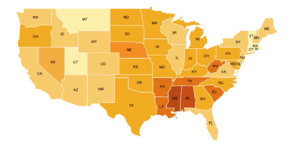
Choropleth maps (shown) were highly effective because they showed spatial (relating to space or location) patterns of deprivation and regeneration clearly.
Possible improvements:
Replace some pie charts with stacked bar charts, which are easier to compare across sites.
Add time-series graphs if data was collected at different times of day/week (especially pedestrian counts).
Use infographics combining photos + data to make regeneration evidence clearer.
patterns, correlations and anomalies in river data
📈 Patterns / correlations
There is a positive correlation between distance downstream and discharge.
Width, depth, and velocity generally increase downstream, leading to higher discharge.
📍 Specific patterns (what you could say)
Upper course sites had narrower, shallower channels and lower velocity
Middle/lower course sites showed rapid increases in discharge
The biggest jump in discharge usually appears after tributaries join the river
⚠ Anomalies
One site may show lower velocity than expected downstream
Possible reasons: vegetation, river bend, human interference
Depth might not increase smoothly if:
river bed is uneven
local erosion/deposition affects channel shape
statistical techniques used for river data
Mean averages (e.g. repeated velocity readings)
reduces random error
Range
shows variability in depth/velocity at each site
Scatter graphs with line of best fit
helps confirm correlation between distance and discharge
paterns, correlations and anomalies in urban data
📈 Patterns / correlations
Clear pattern of higher environmental quality closer to Olympic Park
Areas near Stratford station/Olympic Park show:
higher EQS scores
more footfall
more commercial land use
Strong link between regeneration investment and improved conditions
📍 Specific patterns
Central Stratford/Olympic Park:
high pedestrian counts
modern buildings
high EQS scores
Outer surrounding areas:
lower EQS scores
more variation in land use quality
Strong spatial pattern of regeneration “core” vs “periphery”
⚠ Anomalies
Some busy areas may have lower EQS scores
due to litter or noise despite regeneration
Some quiet areas may have high EQS scores
residential zones with less traffic but good upkeep
statistical techniques used / helpful for urban
- Mean EQS scores per site
makes comparisons more reliable
Percentages (questionnaire results)
easier to compare opinions
Range of EQS scores
shows consistency of environmental quality
Bar charts
compare sites clearly
Choropleth mapping
highlights spatial deprivation/regeneration patterns
why increasing discharge occurs downstream
The pattern of increasing discharge downstream happens because of natural processes in a drainage basin.
As the river flows downstream:
tributaries join the main river, increasing water volume
surface runoff and throughflow add more water
the channel becomes wider, deeper, and smoother, reducing friction
This results in a positive spatial correlation between downstream distance and discharge.
🔗 Why different data sets are linked
Width, depth, and velocity are all connected because they combine to form discharge:
Q = A x V
This means:
wider + deeper channel → larger cross-sectional area
faster flow → higher velocity
together → higher discharge
The pattern is explained by the Bradshaw Model:
downstream = more energy, less friction, larger channel
Fluvial processes like erosion (hydraulic action, abrasion) also deepen and widen the channel downstream.
why higher environmental quality and development near Olympic park exists
The pattern of higher environmental quality and development near Olympic Park exists because of targeted investment.
Regeneration increases:
infrastructure quality
transport accessibility
employment opportunities
green space and services
🔗 Why different data sets are linked
Different data sets measure different parts of the same idea: “urban success”
EQS → environmental quality
questionnaires → social perception
land use → economic change
pedestrian counts → economic activity and accessibility
These are linked because they all reflect levels of regeneration and urban change
Regeneration follows the idea of spatial inequality, where investment is concentrated in certain places (e.g. Olympic Park).
This creates a clear spatial pattern:
core area = high quality, high investment
surrounding areas = lower quality but improving
This can also link to urban change theory, including:
multiplier effect (investment attracts more investment)
gentrification (higher housing demand increases prices and changes population)
overall conclusion of river results in relation to the hypothesis, why it is correct and how my conclusion is useful in wider world
📊 Summary of results
Overall, discharge increased downstream.
Width, depth, and velocity also generally increased.
A few small anomalies occurred but did not change the overall trend.
The results support the hypothesis that river discharge increases downstream.
🌍 Why this is the answer
This is because tributaries, surface runoff, and throughflow add more water downstream.
The channel becomes wider and deeper, reducing friction and allowing faster flow.
This matches the Bradshaw Model.
🔎 How results provide evidence
Calculated discharge values showed a clear positive correlation with distance downstream.
Cross-sectional area and velocity increased in most sites, which directly increased discharge.
Graphs showed a consistent upward trend, supporting the hypothesis.
🌐 Wider geographical world / use
This conclusion helps explain river behaviour in other drainage basins.
It can be used in:
flood risk management (predicting where discharge increases)
river engineering (planning bridges, flood defences)
further studies comparing different river systems globally
overall conclusion of the success of Stratford regeneration, why it is correct and how my conclusion is useful in wider world
📊 Summary of results
Stratford showed generally high environmental quality in regenerated areas.
Pedestrian counts and land use suggested increased activity and development.
Some surrounding areas had lower scores, showing variation.
Overall, regeneration of Stratford Olympic Park has been largely successful, but with some uneven impacts.
🌍 Why this is the answer
Investment linked to the 2012 Summer Olympics improved infrastructure, transport, and land use.
This increased economic activity and improved environmental conditions in the core area.
However, surrounding areas show that benefits are not evenly distributed.
🔎 How results provide evidence
EQS scores showed higher environmental quality near Olympic Park.
Questionnaires showed mostly positive perceptions of regeneration.
Land-use surveys showed more commercial and recreational development.
These multiple data sets all support the idea of regeneration success.
🌐 Wider geographical world / use
Findings can help:
city planners design future regeneration projects
governments understand impacts of urban change and inequality
compare regeneration schemes in other cities (e.g. Manchester, Birmingham, global cities)
It also links to wider ideas of spatial inequality and gentrification, where benefits are not shared equally.
problems / limitations with river data collection methods
⚠ Problems / limitations with methods
Small dataset (limited number of sites)
may not fully represent the whole river
Velocity measurements may be inaccurate
float method affected by wind, human reaction time, or uneven flow
Depth readings can be inconsistent
river bed is uneven, so measurements may not be fully representative
Human error
stopwatch timing and reading rulers can introduce inaccuracy
Sampling bias
sites may have been chosen where access was easiest, not most representative
Short-term data
only shows river conditions at one point in time (not seasonal variation)
possible improvements to river collection methods
🔧 Improvements
Increase number of sampling sites downstream
Use more accurate equipment (e.g. flow meters + sonar depth gauges)
Repeat measurements more times and calculate means
Use random or stratified sampling for site selection instead of convenience sampling
Collect data in different seasons or after rainfall events
accuracy of river data results and validity of conclusion
📉 Accuracy of results
Results are moderately accurate, but affected by:
measurement error
limited sample size
This means small anomalies may not reflect true river conditions
❓ Validity of conclusion
The conclusion (discharge increases downstream) is valid overall
However, reliability is reduced because:
limited sites
possible measurement error
Still, the strong pattern supports the hypothesis, so conclusion is generally trustworthy
problems / limitations w data collection methods for Stratford
⚠ Problems / limitations with methods
Questionnaire bias
people may give socially desirable answers
sample may not represent all residents/visitors
Small sample size
limits how representative opinions are
EQS subjectivity
environmental scores depend on personal judgement
Time-specific data
pedestrian counts only reflect one time/day (not long-term patterns)
Location bias
data may focus on central Stratford, missing outer areas
Secondary data limitations
census/deprivation data may be outdated or averaged over large areas
improvements to data collection methods Stratford
🔧 Improvements
Increase questionnaire sample size and use random sampling
Repeat EQS at different times/days for reliability
Use more objective measures (e.g. air/noise pollution sensors)
Collect pedestrian counts at multiple times (weekday/weekend, morning/evening)
accuracy of urban results and validity of conclusion
📉 Accuracy of results
Results are fairly reliable but not fully accurate
Subjective methods (EQS, questionnaires) reduce precision
Time-limited sampling reduces representativeness
❓ Validity of conclusion
Conclusion (“regeneration is largely successful”) is mostly valid
Supported by multiple data sets (triangulation improves validity)
However:
bias and small sample sizes reduce certainty
results may not reflect long-term or wider area conditions
Therefore, conclusion is reasonable but not definitive