Chapter 2 - Associations between Variables
1/21
Earn XP
Description and Tags
Investigating the associations between variables - bivariate data.
Name | Mastery | Learn | Test | Matching | Spaced | Call with Kai |
|---|
No analytics yet
Send a link to your students to track their progress
22 Terms
Univariate v. Bivariate Data
Univariate Data (describes the “what”) | Bivariate Data (Compare data and focus on the “why”?) |
•What is the average height of people in this room? | •What is the relationship between age and height? |
•What is the most popular colour? | •Does gender play a role in someone’s favourite colour? |
•What is the average temperature in Melbourne? | •How do the average temperatures in all major Australian cities compare? |
Explanatory/Response Variables
Explanatory Variable: Explains changes in the response variable (can cause change).
Plotted on the x-axis.
Response Variable: Changes in response to the explanatory variable.
Plotted on the y-axis.
Explanatory Variable (EV) = Independent
Response Variable (RV) = Dependent
Association
A relationship between two variables where one variable impacts the other.
Example: Time taken to get to school depends on mode of transport.

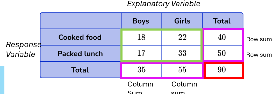
Contingency (Two-Way) Frequency Table
Joint Frequency: Each entry in a table.
Marginal Frequency: Sums of rows and columns.
Grand Sum: Total sample size.
Column: Explanatory Variable
Row: Response Variable
Note: EV is always at the top and RV is always on the side. This is a convention used in General Mathematics!
Comparing Two Sets of Data (Back to Back Stem-and-Leaf Plots)
Explanatory Variable (EV): Categorical variable
Response Variable (RV): Numerical variable
Used for small-medium data sets.
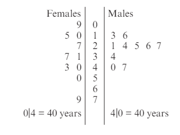
SOCS for Data Comparison of Back to Back SL Plots
Centre: Median
Spread: IQR (Interquartile Range)
Focus on centre and spread when analyzing small data sets using stem plots or dot plots.
Example Written Response for Data Comparison
Example: "Yes/No (ALWAYS YES HERE), the data does/does not support the contention that there is an association between the variables EV and RV."
Compare the median and IQR values for each category of EV.
Note changes in median and IQR from one category to another to assess the association.
Parallel Boxplots for Data Comparison
Explanatory Variable (EV): Categorical variable
Response Variable (RV): Numerical variable
Summary Statistics: Median, Range, IQR
Centre: Compare medians across EV categories.
Spread: Compare IQR or range (if no outliers).
Summary Statistic for Response Variable: Compare the median, IQR, or range across categories of the explanatory variable.
Useful for: Comparing medium-large data sets and features of distributions.

Analysing and Comparing Parallel Boxplots using SOCs
Outliers: Must state presence or absence of outliers.
Shape: Classify distribution shape (symmetrical, skewed).
Centre: Compare median values.
Spread: Compare IQR and comment on increase or decrease in spread.
Wide Range: Large spread
Clustered: Small spread
Parallel Dot Plots
Used for small data samples.
Explanatory Variable (EV): Categorical variable (label under the x-axis).
Numerical Variable (RV): Response variable.
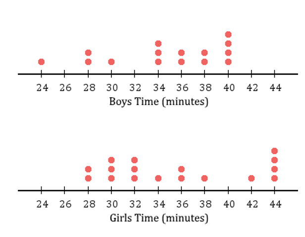
Sample Template for Parallel Dot Plots
Compare medians and IQR for both variables.
State whether there is an association between RV and EV based on changes in median and IQR.
Example template:
"The median number of variable 1 (state median) is higher than variable 2 (state median). The IQR increased/decreased from variable 1 to variable 2. Therefore, there is/not an association."
Answering Data Comparison Questions
Answer the Question:
Yes/No: Does the data support the contention?
Example: "Yes/No, the data does/does not support the contention that there is an association between the variables EV and RV."
Refer to Relevant Statistics:
Shape: Symmetrical, skewed, etc.
Centre: Compare medians across EV categories.
Spread: Compare IQR or range values.
Be specific with the values.
Example: "The median of RV has increased/decreased from ___ in EV(1) to ___ in EV(2). Additionally, the IQR of RV has increased/decreased from ___ in EV(1) to ___ in EV(2). Therefore, a clear/no clear association exists."
One of them needed only.
Graphical Display for Comparing Two Numerical Variables - Scatterplots
Explanatory Variable: Measured along the horizontal axis (x-axis).
Response Variable: Measured along the vertical axis (y-axis).
Purpose: To compare two numerical variables plotted on the Cartesian plane.
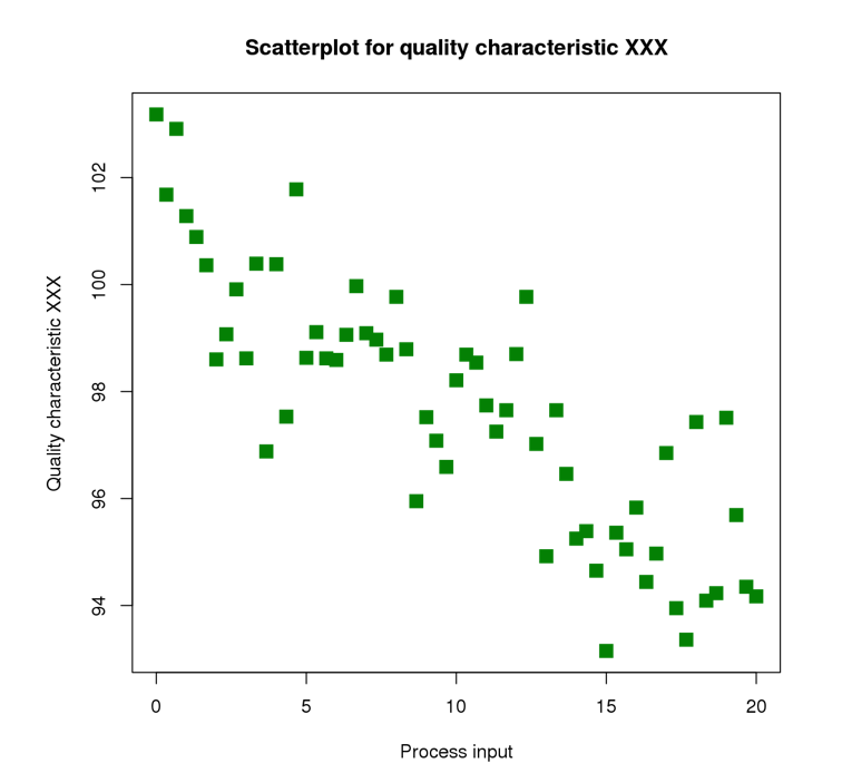
Describing a Scatterplot
Features to Reference:
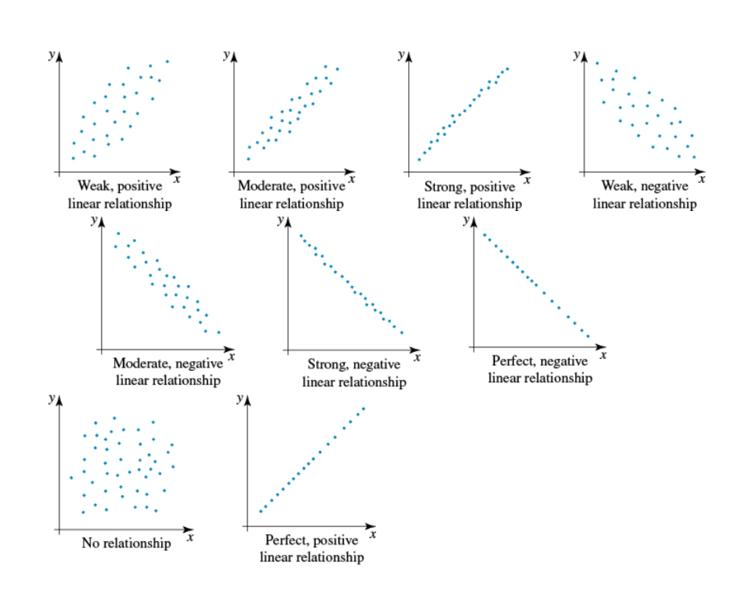
Direction: Positive, Negative, or No Association (random).
Form: Linear or Non-linear (curved).
Strength: Strong, Moderate, Weak.
Reporting Format:
"There is a [strength], [direction], [form] relationship between [response variable, y] and [explanatory variable, x]. There [are/are not] clear outliers."
Strength:
How close the points are to forming a line or curve (Strong, Moderate, Weak).
No association means no strength to analyze.
Outliers:
Points that deviate from the general trend of data.
Reference any outliers and their locations visually.
![<ul><li><p><strong>Features to Reference</strong>:</p><ul><li><p><strong>Direction</strong>: Positive, Negative, or No Association (random).</p></li><li><p><strong>Form</strong>: Linear or Non-linear (curved).</p></li><li><p><strong>Strength</strong>: Strong, Moderate, Weak.</p></li></ul></li><li><p><strong>Reporting Format</strong>:</p><ul><li><p>"There is a [strength], [direction], [form] relationship between [response variable, y] and [explanatory variable, x]. There [are/are not] clear outliers."</p></li></ul></li><li><p><strong>Strength</strong>:</p><ul><li><p>How close the points are to forming a line or curve (Strong, Moderate, Weak).</p></li><li><p>No association means no strength to analyze.</p></li></ul></li><li><p><strong>Outliers</strong>:</p><ul><li><p>Points that deviate from the general trend of data.</p></li><li><p>Reference any outliers and their locations visually.</p></li></ul></li></ul><p></p>](https://knowt-user-attachments.s3.amazonaws.com/6bad6e6e-e22b-4e53-aded-2bf5248bf22d.png)
Correlation Coefficient
Linear Correlation (r):
r value: Between -1 and +1, indicating the strength and direction of a linear relationship.
r closer to ±1: Strong linear relationship.
r closer to 0: Weak or no linear relationship.
Negative r: Negative association.
Positive r: Positive association.
r = 0: No linear association.
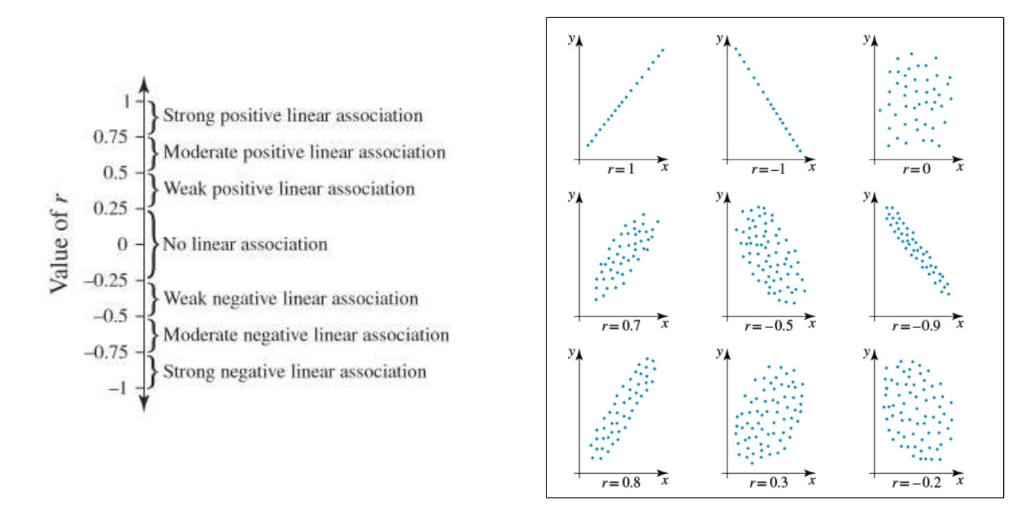
Further Scatterplot Relationships
Using CAS to calculate ‘r’
Input Data:
Enter your data into two columns (x and y values).
Access Linear Regression:
Select Calc → Regression → Linear Reg.
Execute:
Tap Exe.
Tap OK to confirm.
Find the r value:
Look for the r value in the list of results.
Coefficient of Determination (r²)
Range: 0 ≤ r² ≤ 1
Interpretation: Tells us the proportion of variation in one variable that can be explained by the variation in the other.
Use: indicates how well the linear relationship between two variables predicts the value of the response variable (y).
Sample Analysis Template:
"We can conclude from this that [r² as a percentage]% of the variation in the [response variable] can be explained by the variation in the [explanatory variable]."
Correlation coefficient vs coefficient of determination
Correlation coefficient ( r ) | Coefficient of determination (r^2) |
•Strength, direction and form of a linear relationship between -1 to +1 | •Percentage variation in which RV is explained by all EV together |
•Help identify associations or connections between two variables | •Usually between 0 and 1 and used to describe the level of accuracy with which one variable can be used to predict another |
•Does not imply that there is necessarily a cause or effect relationship between them. | •Higher COD = less scattered •Lower COD = more scattered |
•For comparison leave r value to four decimal places unless specified otherwise •For correlation coefficient statement leave to two decimal places unless specified otherwise | •For comparison leave to four decimal places unless specified otherwise •For COD statement leave to two decimal places unless specified otherwise |
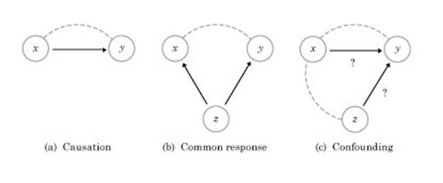
Correlation vs. Causation
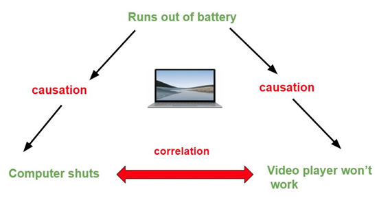
Correlation:
Definition: A statistical measure that defines the strength and direction of the relationship between two variables.
Purpose: Shows that two variables are related but does not explain why.
Key Point: Does not imply causation.
Causation:
Definition: Refers to one event being the result of the occurrence of another event (cause and effect).
Key Point: Causation implies a direct cause-and-effect relationship.
Important Note:
A strong correlation between two variables does not prove that one causes the other.
Example: Smoking may have a high correlation with alcoholism, but smoking is not necessarily the cause of alcoholism. Other factors may explain the relationship.
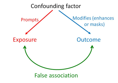
Confounding Factors
Causation | Confounding | Coincidental |
•Both variables respond to changes in unobserved variable •Makes them dependent on each other | A variable which influences both EV and RV and leads to a spurious association. hidden, confounding reasons | There is a strong correlation (𝑟=0.95) between cheese consumption and the number of people who died becoming tangled in their bed sheet. |
Which Graph?
