AP Stats Unit 1 Notes
1/32
There's no tags or description
Looks like no tags are added yet.
Name | Mastery | Learn | Test | Matching | Spaced | Call with Kai |
|---|
No analytics yet
Send a link to your students to track their progress
33 Terms
Individuals
people, animals, or objects of a data set that is the focus; who/what is the data focused on?
2 main types of variables and their definitions
Categorical: values that are category names or labels
Quantitative: values that use numerical values for a measured or counted quantity
How do we represent categorical data in a table form?
Frequency or Relative Frequency tables
Frequency and Relative Frequency tables/graphs
Frequency: shows number of cases in each category
Relative Frequency: gives proportion of percentage of cases in each category
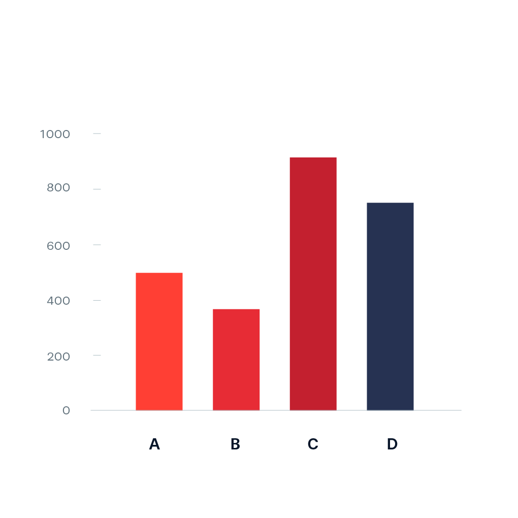
Bar Chart
Used for graphing categorical data, uses evenly spaced apart bars with height displaying frequency amount
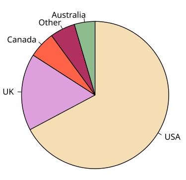
Pie Chart
Used for graphing categorical data, uses sections of a circle to show amount, requires a legend to connect categories and pieces
Almost 3 times the amount of people chose A as B means…
A = 3B,
Discrete variables:
A quantitative variable that can only take on whole, countable numbers for values (no decimals, gaps)
Continuous variables
A quantitative variable whose values are infinite, decimals and whole numbers (no gaps)
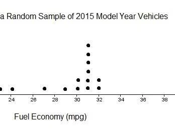
Dotplot:
A graph that displays a quantitative variable, height of dots displays frequency (no dots = 0, 1 dot = 1)
Advantages(same as stem and leaf): shows every individual value, Easy to see shape of distribution
Disadvantage: Can take a long time for large data set
Stem and Leaf plot:
(vertical dot plot in a way), a graph that displays a quantitative variable; numbers on left are tens place and numbers on right are the ones place (44, 46, 47, 49)(key needed to show this); tens place can be split up if need be (must be consistent)
Advantages (same as dot plot): shows every individual value, easy to see shape of distribution
Disadvantages (same as dot plot): hard to make for large data sets

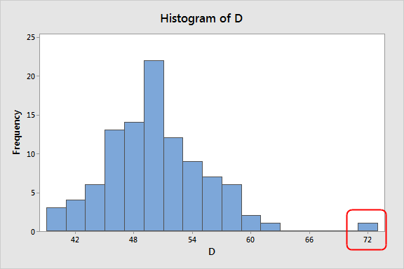
Histograms
(bar chart for quantitative variable), a type of graph for displaying the frequency of a quantitative variable, horizontal distance of bars represents range of values, functions like a bar chart but bars are right next to each other
Advantages: easiest for large data sets, easiest for showing shape of distribution
Disadvantages: doesn’t show every individual value of set
What is the acronym used for describing distributions? And what does each of its letters stand for?
SCOV
Shape- how does it look?
Center- what values happen most?
Outliers- what points are farthest?
Variability- how closely packed or far apart are values?
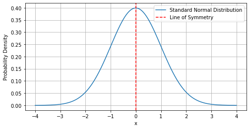
Shape- Symmetric
One peak in the middle and values on left and right are roughly equal, like a parabola
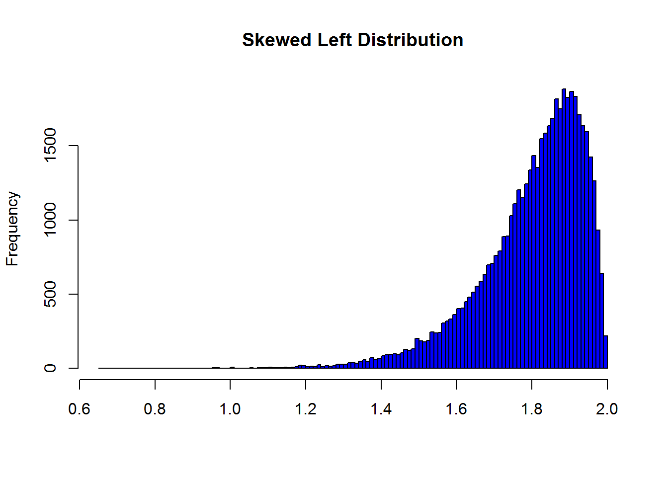
Shape- Skewed Left
When data is more packed on the upper side of the data set, tail is on the left, hump is on the right
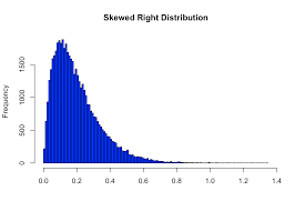
Shape- Skewed Right
When data is more packed on the lower side of the data set, tail is on the right, hump is on the left
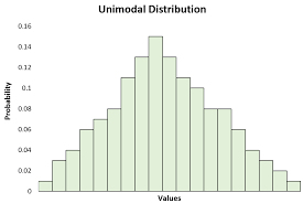
Shape- unimodal
When a graph has one peak of values
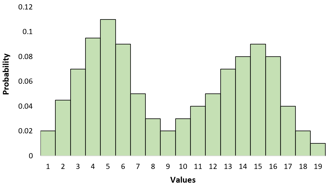
Shape- bimodal
When a graph has two peaks of values
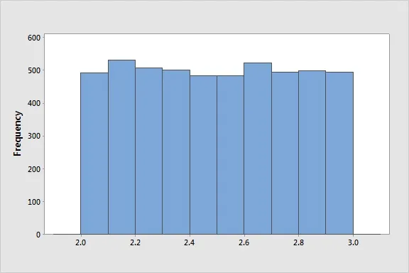
Shape- Uniform
When a graphs values have roughly equal frequencies
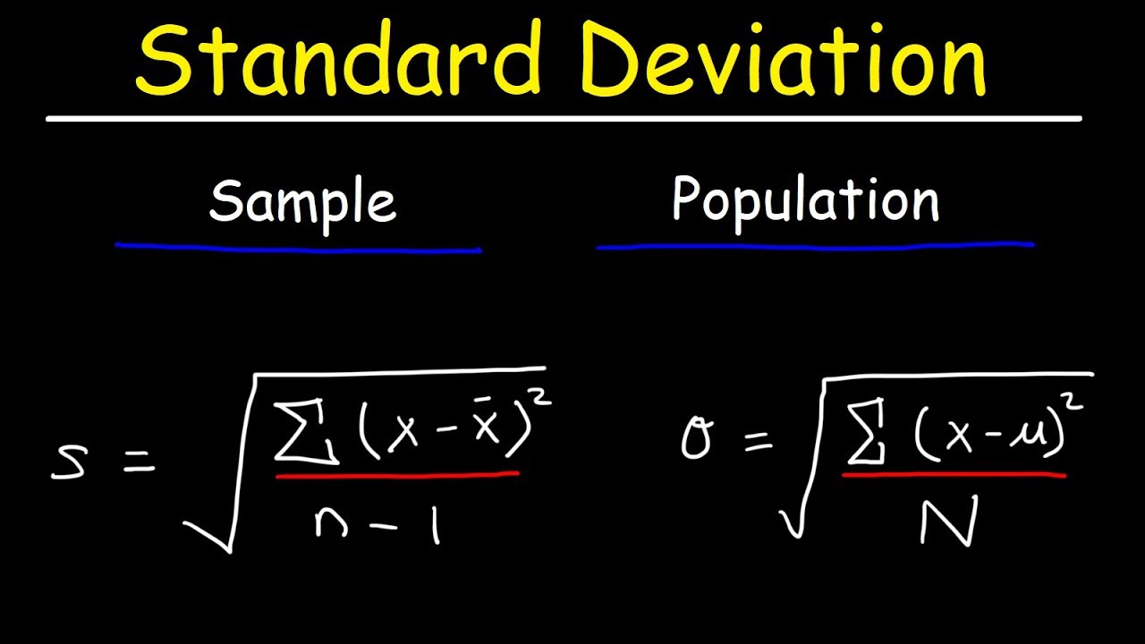
Center- Mean
Mean: the average, found by sum of all values and dividing by n (number of values), heavily affected by outliers and skewness (non-resistant to them), good for symmetric distribution
Center- Median
Median: the middle number, if n= even, the average of the values of ((n/2)’th number and (n/2 + 1)’th number) = , if n= odd, do n/2 and round up = median’th number, resistent to skewness and outliers- perfect for the
Variability- standard deviation
measures the average distance from the mean, (sd)² is variance; “The center typically varies by SD from the mean of (x)
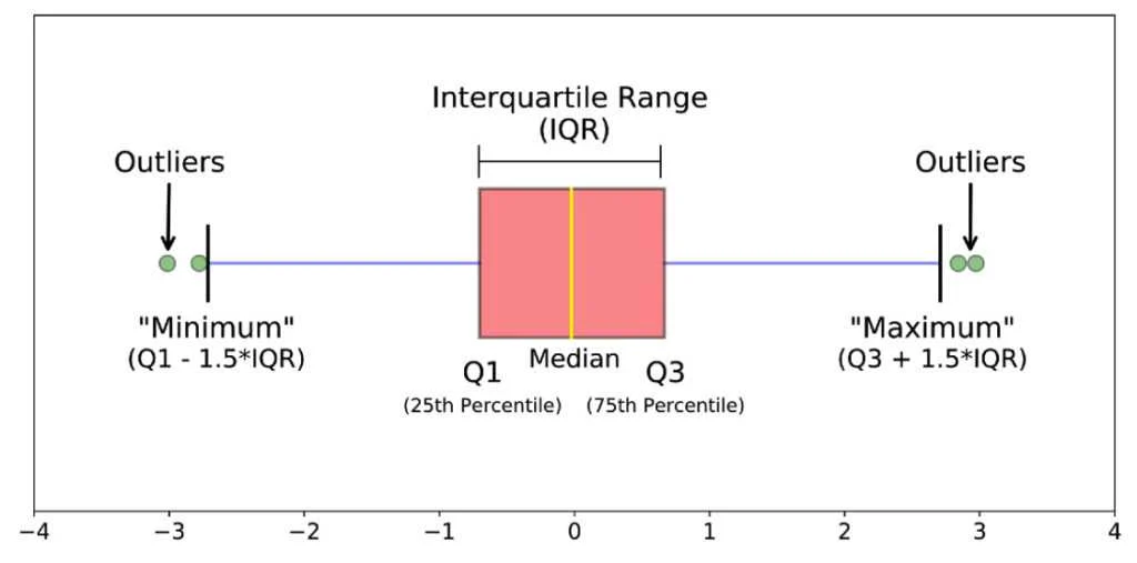
Q1
1st quartile, the median of the values before median of the data set
Q3
3rd quartile, the median of the values after the median of the data set
Variability: IQR
Q3 - Q1, the length of the box in a box plot, higher IQR = Bigger box = more variance
5 number sum
Min, Q1, Median, Q3, Max
1.5 x IQR Method (+ SD version)
Low outliers: x < Q1 - 1.5(IQR)
Low outliers (SD): x < Mean - 2(SD)
High outliers: x > Q3 + 1.5(IQR)
High outliers (SD): x > Mean + 2(SD)
Boxplot
uses 5-number sum, a type of graph used for quantitative variables, box is IQR, bigger box = higher variability = larger IQR
If the line for the median lies in the center of the box, in a roughly equal distance between the Q1 and Q3
the distribution is approximately symmetrical
In a boxplot, when the median is closer to Q1
the distribution is skewed to the right
In a boxplot, if the median is closer to Q3,
the distribution is skewed to the left
Empirical Rule (68-95-99.7 Rule)
If a distribution is approximately normal:
68% of data falls between 1 SD of the mean
95% of data falls between 2 SD of the mean
99.7% of data falls between 3 SD of the mean
Z-score
measure of proportion in a normal distribution:
(value - mean)/(Standard Deviation)