AQA Geography Llandudno Fieldwork
1/50
There's no tags or description
Looks like no tags are added yet.
Name | Mastery | Learn | Test | Matching | Spaced | Call with Kai | Chat |
|---|
No analytics yet
Send a link to your students to track their progress
51 Terms
PHYSICAL FIELDWORK - aim (what did we do + why was it appropriate)
To investigate how sediment characteristics vary on North Shore pebble beach, Llandudno.
beaches have a clear link to the spec
the size of the are is clearly defined and realistic and not too large
the aim is broad enough to allow for investigation but not so broad that it would be impossible to accomplish
sediment characteristics are safe to study
key theory
Pebbles closest to the shore are regularly exposed to the sea. Attrition causes them to become small and rounded.
Largest pebbles are thrown to the back of the beach during storm vents. The sea only reaches these pebbles during the highest tides twice a month and so they are less likely to experience attrition and thus more likely to be large and angular
Location + why it’s appropriate
North Shore pebble beach, Llandudno
Appropriate to the aims - there is a pebble beach,
Easy to access - A55 road and promenade leading to beach, Can get there and back in a day - 1 hr drive,
Large open spaces can accommodate a large group - 65 students in group
Appropriate facilities nearby - toilets at both ends of promenade
Safe - tide extends 200m from shore and tide times can be accessed.
Risk assessment
Danger from the sea – Tidal range is 8m - Visiting during low tide. Always remain 10m from sea
Exposure to cold weather – March weather can be unpredictable - Waterproofs and layers are required in anticipation of bad weather
Slips, trips and falls – pebbles can give wave underfoot - Appropriate sturdy footwear worn
Methodology - Primary Data - What did we do?
Measuring Pebble Size - measure the length of the A axis(longest) of each piece of sediment using a ruler. We will measure to the closest millimetre.
Measuring Pebble Roundness - give each piece of sediment a roundness score using Powers’ roundness index (a score of 1-6). We will compare the sediment directly against the chart and make a judgement in pairs.
Sample - complete 4 transects from shore to high tide mark. Transects are 20m. Take 3 random sediment samples at 10 sites using a systematic sample every 2 metres.
Methodology - Primary Data - Why was this appropriate?
A axis is measurable. It's easy to identify because it's the longest axis. Measuring in mm provides good accuracy which is important as changes from pebble to pebble might only be small. Using a chart for roundness makes subjective judgment more consistent. Systematic sample allows judgment of change over distance. Four transects reduces affect of anomalies. 3 pebbles at each site allows for means to reduce inaccuracies. Total of 120 pebbles is large data set which reduces affect of anomalies.
Methodology - Primary Data - How could it have been improved?
A axis is longest, making sediment seem larger than it really is - measure b and c axis in addition to a axis.
Sediment roundness judgement is subjective and there will be subconscious investigator bias - take photos of sediment and get a second opinion on roundness. Take longer to make decision on roundness.
Issues- unlikely to pick up large boulders
could miss important sections of the beach by using 4 transects,
smallest sediment (sand) may be lost between pebbles and missed
can indicate change in sediment characteristics but cannot explain why
Methodology - Secondary Data - What did we do?
Tide data - used to determine the timing of our visit and ensure the beach is accessible.
OS Map - used to see where the high and low tide marks were in order to ensure the beach was accessible and to locate key facilities and transport routes.
Weather data - used to ensure the location was safe on the day of our study
Methodology - Secondary Data - Why was this appropriate?
Accurate and reliable sources which can be trusted.
Provided information directly specific to our needs
Methodology - Secondary Data - How could this be improved?
The OS map only gave a rough idea of where the mean high and low water marks were and more accurate data would have been useful for planning our transects.
The weather data also gave us an idea of what the weather might be like though this turned out to be quite accurate. In both cases, there was no more reliable source available to provide an improvement
Data Presentation - what did we do?
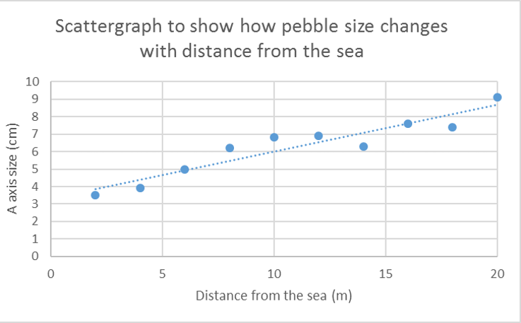
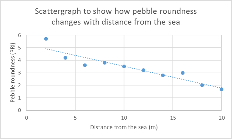
Two scatter graphs to show how mean pebble size and roundness varied. 10 points plotted. Line of best fit drawn. X-axis; distance from the beach (m), Y-axis; pebble size/roundness (cm/Powers Roundness Index)
Data Presentation - why was this appropriate?
Two sets of continuous data
Line of best fit allows us to instantly detect a trend and identify any anomalies that are far from the line
Proximity of points to LOBF helps us identify strength of trends
Allows large volumes of data to be presented neatly
Labelled axis allow us to find the exact values of each point
Data Presentation - how could it have been improved?
Only mean values were displayed. Adding all values would have improved accuracy but would have made the graph more difficult to read
Could have used colours to plot the values for the different transects separately. This would allow us to see if the trend varied from transect to transect
Data Analysis - what did we do?
Mean sediment size approximately trebles from 3cm to 9cm. Mean sediment roundness decreases from 5 (rounded) to 2 (angular)
Data Analysis - why was this appropriate?
Calculating mean reduces impact of anomalies
Line of best fit counts as analysis; see above
Use of quantitative data numerically measures extent of change
Data Analysis - how could this have been improved?
Could use a statistical test such as Spearman’s Rank which would statistically measure and validate the strength of the trend
Conclusion - what did we do?
Sediment characteristics vary with distance from the sea on the pebble beach at North Shore, Llandudno. Sediment size increases with distance from the sea. It approximately trebles in size from approximately 3cm to 9cm. The increase seems to be gradual. Pebble roundness decreases with distance from the sea. It changes from ‘rounded’ to ‘angular’. The change appears to be gradual.
Conclusion - why was this appropriate?
Based on a large sample of data
Based on methods which were well thought-out and generally accurate
Based on mean values which reduced the influence of anomalies
Supported by key theory
Conclusion - how could this be improved?
Measurement of sediment size was based on a axis which is the largest. An improvement in the method would likely lead to smaller values of sediment size and therefore slightly alter the conclusions
Bias in sediment roundness judgment may have led to exaggeration of change. Improvement in method could lead to conclusions which show a less extreme change in sediment size
Evaluation - what did we do?
Overall, study was successful. Improvements in methods could lead to improved accuracy of results and therefore conclusions, but these improvements would only cause small changes.
Evaluation - why was this appropriate?
Clear consideration was given to all parts of the study. A logical sequence of investigation was followed with possible issues highlighted an addressed before implementation
Evaluation - how could this be improved?
Study examines sediment size and shape. Other characteristics could be studied such as geology and orientation of sediment.
Study focuses on only one pebble beach. Further study could examine other beaches
HUMAN/ENVIRONMENTAL - Aim + why it was appropriate
To investigate the impact of tourism on environmental quality in Llandudno
→ Tourism has a clear link to the economic challenges specification. The size of the study area is realistic as Llandudno is a small town and not too large to study in one day. The aim is broad enough to allow for investigation (can look at aspects of environment and regions of the town) but not so broad that it would be impossible to accomplish. Environmental quality is safe to study
Key Theory
Environmental quality includes components such as noise, visual pollution, litter and presence of nature. Tourism can lead to higher levels of pollution and disorder but can also lead to greater investment in the cleanliness of key locations. Areas that have received investment for tourism will have positive environmental quality because money has been invested in making them attractive places to visit. However, the busiest areas might also negative environmental quality at peak times due to litter and traffic.
Location + why is it appropriate?
Llandudno
Appropriate to the aims – there is a range of accessible tourist areas
Easy to access – Good pedestrian access. Within 40 minute drive of the school.
Appropriate facilities nearby – public toilets available within the town and large open spaces for a big group
Safe – appropriate traffic control and good communication facilities
Risk Assessment
Getting lost – study sites were chosen and memorised before the trip. A booklet containing a map and access routes was provided
Conflict with locals – methods were none intrusive and extra care was taken to reduce conflict eg avoid congregating in busy locations
Separation from group – an emergency contact number was provided for anyone who was separated. Regular head-counts were conducted
Methodology - Primary Data - What did we do?
Measuring Environmental Quality – Environmental Quality Survey with Bi-polar scale. At each site a score from -2 to 2 is given to five different aspects of environmental quality; noise, nature, pollution, safety, business. Judgements are made in situ by the investigator.
Questionnaires– questions are asked in order to verify EQS eg directly asking in what ways people have seen tourists impact the environment
Sample – seven sites have been selected using a stratified sample which targets a mixture of tourist and non-tourist areas for comparison
Methodology - Primary Data - Why was this appropriate?
Environmental quality is difficult to measure and is subjective so using a bi-polar scale allows for numerical values to be attached. These are more easy to analyse than words
Scale of +2 to -2 immediately shows whether overall opinion is positive or negative.
Adjectives associated with cores (eg noisy) helped reduce subjectivity by providing a guideline
Making subjective judgement on EQ is quick and easy allowing for large data sets to be collected.
Questionnaire was short and easy to understand
Tick boxes were provided to make qualitative answers more quantifiable and to provide
40 people were given questionnaires in order to provide a range of opinions and reduce impact of anomalies
Stratified sample guaranteed representation
Methodology - Primary Data - How could it have been improved?
Judgement is subjective and possible bias from investigator – could reach judgements as a group of three
Difficult to make comparisons between sites – try to make measurements as objective as possible eg noise could be objectively measured using a digital sound level meter
People don’t always tell the truth on questionnaires – collect more data in order to reduce the impact of these results
People may not be able to recall an accurate answer on the spot for the questionnaire. Give more time to complete the questionnaires and explain and key terms
Sample size (7 sites, 3 tourist locations, 3 residential) is small – use a team of people to ensure more sites can be visited
Lack of tourists on day of study would impact results
Methodology - Secondary Data - What did we do?
OS maps – used to identify different urban environments eg industrial area. Also used to determine accessibility of sites
Google Street View – cross-referenced with maps and used to pilot the sites to test their suitability to the aim
Methodology - Secondary Data - Why was this appropriate?
Accurate and reliable sources which can be trusted.
Provided information directly specific to our needs
Methodology - Secondary Data - How could this have been improved?
The OS map only gave an indication as to the land use of an area eg which areas are popular with tourists and which are residential
The photos provided by Google Street View were not up-to-date and could be misleading.
Data Presentation - What did we do?
A dispersion diagram displaying the total EQS score from a maximum of +10 to minimum of -10 for the 7 sample sites.
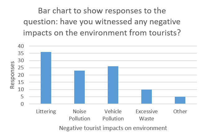
Bar chart to show frequency of responses to questionnaire

Data Presentation - Why was this appropriate?
Dispersion diagram allows us to quantify extent of variance of environmental quality. Labelling the points on the diagram means different urban environments can be located.
Bar chart allows comparison between different aspects of tourist impact on the environment.
Exact frequencies can be read and analysed
Data Presentation - How could this have been improved?
Hard to immediately work out which site is which on the dispersion diagram
Some points are clustered close together which make them hard to read
By only showing the total EQS score, the data does not show variance across different types of environmental quality eg noise v pollution
Doesn’t show proportions – could be converted to show percentage of respondents who had witnessed each behaviour
Data Analysis - What did we do?
The overall spread is significant. Scores range from +10 (highest possible positive score) to -7. This gives an overall range of 17 (maximum value is 20)
The mean score for environmental quality is a low positive score of 1 but there is a large spread from this mean.
Littering is the most frequent impact, 3.5x that of waste
Data Analysis - Why was this appropriate?
Calculating range shows how data varies which is directly relevant to the aim; to investigate how environmental quality varies
Analysing total EQS score gives a broad picture of the overall environmental quality
Having exact frequencies allows direct comparison of impacts so we can quantify how much more frequent on is than others
Data Analysis - How could this have been improved?
Could have analysed individual aspects of the environment eg an area might have a neutral EQS score but have a very low score in one aspect of quality and a very high score in another
Could of used Interquartile range or median score to reduce the impact of anomalies
Could have calculated the proportion of respondents that have witnessed each behaviour
Conclusion - What did we do?
Overall, the environmental quality of Llandudno is positive and there is no direct correlation between EQS and tourism. However, questionnaire suggests many tourist behaviours do have a negative impact on environmental quality
Conclusion - Why was this appropriate?
Based on a representative sample of data
Based on methods which were well thought-out and generally accurate
Based on mean values which reduced the influence of anomalies
Supported by key theory
Conclusion - How could this have been improved?
Comparing scores with others and visiting sites at the same time would have reduced bias and probably provided different scores leading to different conclusions
Visiting on a busier day where tourists presence was felt might give a more accurate reflection of their impact
Evaluation - What did we do?
Overall, study was successful. Improvements in methods could lead to improved accuracy of results and therefore conclusions, but these improvements would only cause small changes.
Evaluation - Why was this appropriate?
Clear consideration was given to all parts of the study. A logical sequence of investigation was followed with possible issues highlighted an addressed before implementation
Evaluation - How could this have been improved?
Study looks at overall environmental quality but could look for further differences between different aspects of the environment eg noise/litter
More could be done to explain the findings such as by using questionnaires
Accuracy
How close a measurement or observation is to the true value.
In fieldwork this relates to using precise equipment and careful methods to reduce errors.
Reliability
The consistency of results when a method is repeated.
If repeating the same measurement under the same conditions gives similar results, the data is reliable.
Representativeness
•How well the data collected reflects the wider area, population, or phenomenon being studied.
Representative data avoids bias — for example, by using an appropriate sample size or sampling method.
Validity
How well the data and methods actually measure what they are intended to measure.
Data is valid if the method is appropriate for the research question and the conclusions logically follow from the evidence collected.
Stratified Sampling
Dividing the study area or population into distinct groups (strata), then taking a proportional sample from each group.
Ensures all important sub-groups are represented.
Example: When surveying land use in a town, divide the town into residential, commercial, and industrial areas, then sample proportionally from each.
Random Sampling
Selecting sample sites or people completely by chance, giving every individual an equal probability of being chosen.
Reduces bias.
Example: Using a random number generator to pick houses to survey in a village.
Systematic Sampling
Choosing sample points at regular intervals across the study area.
Simple and ensures even coverage.
Example: Recording tree species every 10 meters along a transect in a forest.