Visual Arts Y10: Final Exam
1/48
There's no tags or description
Looks like no tags are added yet.
Name | Mastery | Learn | Test | Matching | Spaced | Call with Kai |
|---|
No analytics yet
Send a link to your students to track their progress
49 Terms
Assess
Make a judgment of value, quality, outcomes, results or size
Compare
Show how things are similar or different
Define
State meaning and identify essential qualities
Describe
Provide characteristics and features
Discuss
Identify issues and provide points for and/or against
Explain
Relate cause and effect; make the relationships between things evident; provide why and/or how
Justify
Support an argument or conclusion
Outline
Sketch in general terms; indicate the main features of
Propose
Put forward (for example a point of view, idea, argument, suggestion) for consideration or action
Recommend
Provide reasons in favour
Line
A moving point that can guide the eye, create shape, or suggest movement.
flowing, jagged, smooth, curved, straight, bold, delicate, dynamic, expressive, directional
Shape
A flat, 2D area defined by edges.
geometric, organic, irregular, simple, complex, flat, angular, rounded, abstract
Form
A 3D shape that has depth as well as height and width.
solid, three-dimensional, sculptural, realistic, abstract, bulky, sleek
Space
An element of art by which positive and negative areas are defined or a sense of depth achieved in a work of art.
open, crowded, deep, shallow, negative, positive, foreground, background, perspective, infinite
Colour
What we see as hue, brightness, and strength; gives mood and emphasis.
vibrant, muted, warm, cool, harmonious, clashing, saturated, pastel, bold, soft, complementary
Value
How light or dark something appears, adding contrast and dimension.
Light, dark, gradient, high-contrast, low-contrast, shadowed, highlighted, subtle
Texture
An element of art that refers to the way things feel, or look as if they might feel if touched.
rough, smooth, soft, hard, bumpy, glossy, matte, tactile, simulated, natural, coarse, delicate
Balance
Distribution of visual weight in a work
symmetrical, asymmetrical, radial, stable, uneven, harmonious, formal
Contrast
Differences in elements (colour, shape, texture) to create visual interest.
strong, subtle, dramatic, striking, bold, noticeable, soft, intense, visual tension
Emphasis
Making a part of the artwork stand out to draw attention.
dominant, focal, highlighted, prominent, eye-catching, commanding
Movement
The path the viewer’s eye follows through the artwork.
flowing, directed, dynamic, swirling, diagonal, rhythmical, visual path, guiding
Repetition
Repeating elements (shapes, colours, lines) to create consistency or pattern.
consistent, patterned, recurring, rhythmic, predictable, alternating, repeated, unified
Proportion
The size relationship between elements in a work.
correct, distorted, exaggerated, realistic, balanced, harmonious, scaled, relative
Rythmn
Visual flow created through repeating elements, guiding the viewer’s eye.
regular, irregular, flowing, syncopated, pulsating, visual beat, repeating, patterned
Unity
Harmony of all elements, making the artwork feel complete and cohesive.
harmonious, cohesive, integrated, complete, consistent, balanced, whole, connected
Postmodern Frame
Focuses on art that challenges tradition and stereotypical conventions. Considers the use of technology and mixed media to express modern social concerns and question established normalities. (Appropriated artworks)
Cultural Frame
Explores social and cultural qualities of the artwork. Looks at the context (beliefs, customs, social/political issues of time period) the work was created in and how these were reflected in it/how it affected it.
Structural Frame
Examines the artworks physical qualities, such as composition, materials, and techniques used to compose it. Analyses how these elements are arranged and what signs/symbols were added to communicate meaning/value.
Subjective Frame
Focuses on the personal/emotional aspects of the artwork. The artist expresses their feelings, experiences, or psychological perspective through their creation. Questions how the work makes the viewer feel and what personal meanings it evokes.
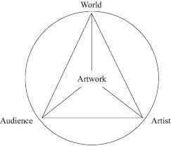
The Conceptual Framework
The Conceptual Framework is a linked set of agencies that assist in the critical analysis of art. They can be discussed as separate entities or by connecting them to meta-frames that are cultural, structural, subjective, and postmodern.
Artwork
Artwork: The actual physical piece of work - conceptual framework explores how it is analysed through 3 different factors.
World
World: The broader social, cultural, political, and historical context in which the work is created and received. Does it reflect aspects of it's respective world?
Audience
Audience: The individuals who experience/interpret the artwork. Their subjective opinions of it.
Artist
Artist: The person or people who created the artwork; reflecting their ideas, experiences, and/or philosophies.
The History of mixed media in art
The use of mixed media—artworks created by combining a variety of materials, textures, and techniques—emerged prominently around 1912, with the development of cubist collages and constructions pioneered by Pablo Picasso and Georges Braque. These early experiments disrupted traditional notions of painting by integrating paper, fabric, and everyday objects into two- and three-dimensional compositions, challenging the boundaries between art and life.
Since then, mixed media practices have grown increasingly popular, particularly in contemporary and appropriated artworks, where artists layer found objects, digital elements, and unconventional materials to interrogate meaning, context, and authorship in innovative ways.
Henri de Toulouse-Lautrec (French, 1864–1901)
Style / Movement: Post-Impressionism, influenced by Japanese woodblock prints (Japonisme).
Mediums: Used mixed media — oil paint, pastels, lithography.
Famous Works: Moulin Rouge: La Goulue (1891 poster), Jane Avril (1893).
Importance:
♥ Revolutionised poster art by merging fine art with commercial advertising.
♥ Bold outlines, flat areas of colour, and dramatic compositions captured Paris nightlife.
♥ Mixed traditional painting with printmaking, blurring “high” and “low” art.
Joost Schmidt (1893–1948) & Bauhaus Art Movement (1919–1933)
Schmidt: German typographer, graphic designer, teacher at Bauhaus.
Bauhaus: Modern art and design school founded by Walter Gropius. Motto: “Form follows function.”
Artworks: Bauhaus Exhibition Poster (1923) — geometric shapes, bright colours, photomontage.
Style: Simple geometric forms, sans-serif type, asymmetrical layouts. Unity of art, craft, and technology.
Importance:
♥ Pioneered graphic design, typography, poster art.
♥ Influenced modern advertising and minimal design.
Roger Broders (1883–1953) – Art Deco Travel Poster Artist (European)
Was a French illustrator & poster artists, best known for his iconic travel posters that captured the spirit of the early 20th-century tourism. Brought to fame in 1920’s-1930’s.
His posters promoted destinations such as the French Riviera, the Alps, and various Mediterranean locales, helping to popularize these areas as luxury vacation spots. His work is widely regarded for it's elegant Art Deco style, vibrant color schemes, and clean, geometric lines.
Work was largely commissioned by French railway companies, particularly the Paris-Lyon-Mediterranée (PLM) railway, which sought to encourage travel across France’s beautiful landscapes.
His work is often associated with the rise of mass tourism in Europe during the interwar period. This era saw the development if railways and automobiles, which made travel more accessible to the middle class. Broders tapped into this growing market. Style / Movement: Art Deco (1920s–30s) - deeply influenced by it. Movement was at it's peak during his time. Posters reflected the movement’s love of clean lines, bold shapes, and vibrant colors. His work is often defines by it's simplicity and elegance. Rather than focusing on people, Broders emphasised the grandeur of landscapes and architecture. Posters featured soaring mountains, sun-drenches beaches, glamorous hotels, and seaside towns, often with a long figure or two, small in comparison to the majestic settings. Colour palette often bright & lively, using contrasting blues and yellows for skies and seas, which rich-vibrant greens for vegetation, giving his posters a lush, dreamlike quality. MINIMAL COMPOSITION (Fforward thinking 4 the time)
Mediums: Lithography poster prints for French railways and tourism.
Artworks: Monaco Monte Carlo (c. 1920s), Côte d’Azur series.
Features: Bold flat colour, sharp lines, simplified but elegant figures. Celebrated luxury travel, glamour, leisure. Posters often commissioned by railway companies to promote European destinations.
Impact: Helped establish a visual vocabulary for modern tourism marketing. His work inspired generations of poster artists and graphic designers, and his posters remain highly sought after by collectors today. Destinations he depicted became associated with leisure and luxury, in part due to his skillful portrayal of them. In modern times, his posters are considered classic examples of both Art Deco design and the travel poster genre. They represent a nostalgic look back at a time when travel was seen as an elegant, sophisticated pursuit.
James Northfield (1887–1973) – Australian Poster Designer & Lithography
Was one of the most highly regarded poster designers working in early/mid 20th century Australia. Has a studio in Melbourne city for 25 years and was a Director at the Art Training Institute of Victoria. Over his career he established any studios across Melbourne; specialised in HAND LITHOGRAPHIC Work. Was a ‘fine artist’. Demonstrated a superior understanding of colour techniques, and his practices greatly contributed to the development of poster production in Australia. His “prolific and innovative” designs are built around excellion composition offset by an atmospheric light which beautifully captures the contrasts in the Australian landscape.
In the 1930’s dubbed the “Golden Age of poster design in Australia”. The rise of fascist regimes in Europe, the Depression, and other social advances, influenced the social, political, and creative concerns of Australia during this decade. During this ‘age’, the three most popular artists Gert Sellheim, James Northfield, and Percy Trompf, were colleagues at the Melbourne Art Training Institude. Their posters combined beautiful illustrations, sans-serif and elegant art deco captions, and were very popular with the public during the depression.
The initial cost of printing lithographic posters was high, however the vibrancy of colour posters were eye catching an affective. These posters were displayed in travel offices and tourist brochures and used for promotion overseas. He manages to capture the rising popularity of tourism in Australia, and government efforts to push it. During WWII, his posters supported the war effort; promoting unity, industry, and national resilience/identity. Showed how Australians were encouraged to value their own country when the nation was considered inferior to others.
Style / Movement: Vintage Australian tourism posters (1920s–50s). Ideas he explored: conceptual strength, modern design (used to show Australian tourist locations were equal to that of Europe & Ameria, beauty of natural Australian world.
Medium: Lithographic posters.
Artworks: Visit Australia, The Great Barrier Reef travel posters.
Features: Idealised images of Australian beaches, wildlife, landscapes. Bright, inviting colours to attract tourists. Combined advertising with national identity.
Importance:
♥ Helped shape how Australia was seen internationally (attractive to tourist through attractive posters [advertisements]
♥ Lithography allowed for cheap, colourful, mass-produced posters.
What is Lithography?
A planographic printing process that relies on the principle that oil and water don't mix.
An image is drawn on a flat, smooth surface, typically a limestone or metal plate, using a greasy substance. A chemical treatment then fixes this image to the surface and makes the non-image areas water-absorbent and ink-repellent. The stone is then dampened with water, inked, and the ink adheres only to the greasy areas, allowing the design to be transferred to paper.
The Bauhaus (1919–1933):
The Bauhaus began with a Utopian definition: “The building of the future”--to combine all arts in an indeal unity. It was a German art, design, and architecture school founded in Weimar, Germany from 1919–1933. It focused on functionality, simplicity, and “form follows function”.
Walter Gropious (1883-1969) was a German-American architect and educator, who founded the Bauhaus. He wanted to break down the barrier between arts and practical design, creating a modern style that was functional, affordable, and suited industrial mass production.
“Less is More" - Quote by Ludwig Mies Van Der Rohe.
Founder of the BAUHAUS - Walter Gropius (1883–1969)
German-American architect and educator. Founded the Bauhaus in Weimar, Germany (1919). Walter aimed to break down the barrier between fine arts and practical design to promote a modern style that was revolutionary- functional, affordable, and suited for industrial mass production. Walter saw the necessity to develop new teaching methods and was convinced that the base for any art was to be found in handcraft: “the school (Bauhaus) will gradually turn into a workshop”. Indeed, artists and craftsman began directed classes and production at the Bauhaus.
Core Principles of the Bauhaus
Unity of art, craft, and technology.
Function over decoration → designs should be simple, practical, and futuristic.
Collaboration between artists, architects, and craftsmen.
Experimental, hands-on workshops exploring materials, form, and function.
Designs were made for mass production using modern materials (steel, glass, concrete).
It is NOT linear. Many changes in dictatorship in Germany, teachers, artistic influence from all over the world, combined with the political situation lead to permanent transformation.
Impact & Legacy
Revolutionised modern architecture, furniture, and graphic design.
Influenced minimalist design, open-plan buildings, and everyday objects.
Spread worldwide after its closure, shaping modern design education.Global view: seen as progressive and radical, though criticised by some for being too formal or rejecting tradition.
Closed in 1933 under pressure from the Nazi Party, which viewed it as too modern and left-wing. Many teachers and students emigrated, spreading Bauhaus ideas internationally.
Art Nouveou (1890-1910)
Art Nouveau, French for "New Art", was a decorative art style characterized by flowing, sinuous lines, organic forms, and nature-inspired motifs like plants, flowers, insects, and feminine muses.
Was a reaction against 19th-century historical styles, seeking to integrate art into everyday life through architecture, furniture, posters, and jewellery. Key features include organic forms, "whiplash" curves, and decorative ornamentation. Emerged predominantly in the late 19th and early 20th centuries, roughly between 1890 and 1910.
Early 1900’s Victorian inspired art nouveau oftened use paler colours, whereas appropriated works from the 1960’s used bright fluro colours predominantly in advertisements.
Sought to embrace nature and create a harmonious unity between art and everyday life.
Advancements in modern technology allowed for the mass production of posters and other graphic design elements, which contributed to the spreading of Art Nouevou aesthetics. Industrial processes facilitated the production of intricate decorative objects and furniture. Urbanization and industrialization led to a growing middle class with disposable income. This change created a demand for decorative objects and interior design.
Henri De-toulose lautrec was one of the artists closely associated with art nouveau
Artists of the Art Nouveou:
Gustav Klimt (1862–1918) – Symbolist: an artist who uses symbols to reveal a message (Austrian)
Belongs to the Art Nouveou period due to his highly ornamental, flowing style, and symbolism. Uses ornate decorative elements with repeated motifs such as the spiral. His work is also distinctive for it's richly interlaced patterns of silver and gold.
He showed his influence from Byzzantine art in his works through appropriated Byzantine aesthetics, transforming women's portraits from religious to erotic representations. His use of gold leaf and stylized backgrounds echoes Byzantine art, creating emotional connections. Comparisons illustrate how Klimt elevated ordinary women to divine-like status in early 20th century Vienna, like art nouveau.
Positive Space
area occupied by stuff
Negative Space
area unnocupied by stuff
ART DECO
Art Deco is an international decorative arts style that originated in France in the 1910s and flourished in the 1920s and 1930s, characterized by bold geometric shapes, symmetry, and rich ornamentation.
It can be seen in architecture, furniture, fashion, and design, and was inspired by the Machine Age, with influences from movements like Cubism, Ancient Egyptian art, and the modernism of Bauhaus.