RMA Week 8: Descriptive Statistics II
1/8
Earn XP
Description and Tags
the rest of the graphs section is too visual - use slides!
Name | Mastery | Learn | Test | Matching | Spaced |
|---|
No study sessions yet.
9 Terms
what are measures of spread and what are they measured by?
how much the scores vary
range
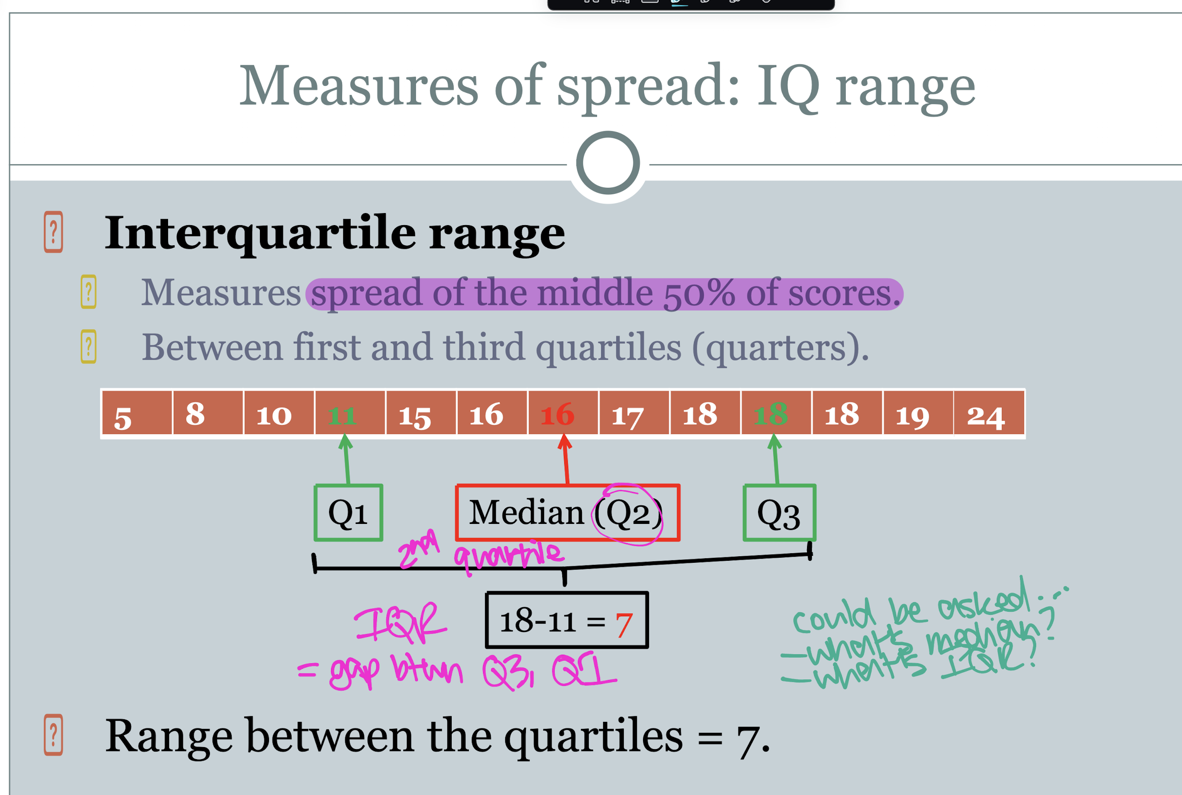
interquartile range (IQR)
standard deviation (SD)
how do you calculate the range
largest number - smallest number
what’s a disadvantage of the range
it tells you nothing about the scores between the minimum and the maximum
what does the IQR do
measures the spread of the middle 50% of scores, between the first and third quartiles.

what is the standard deviation
the measure of variation around the mean.
the typical deviation of the scores in your sample around the sample mean.
gives an indication of what’s happening between the min and max of a data set
the higher the SD…
the larger the spread of the scores
step 1 of calculating the SD
calculate the sample variance.
find the mean
make a table for each value (x) minus the mean
square each value in the table above
sum the squared values
divide the summed, squared scores by the number of numbers -1
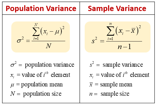
step 2 of calculating the SD
square root the variance
what can graphs be used for?
visual methods of representing data
indicates patterns within data
can be used to decide to how to analyse data e.g. if outliers, use median, if bimodal, check for confounds like gender
illustrate findings e.g. ppt presentation