trinals full reviewer ( psychological Statistics)

0.0(0)
Studied by 0 people
call kaiCall Kai
Locked
learnLearn
examPractice Test
spaced repetitionSpaced Repetition
heart puzzleMatch
flashcardsFlashcards
GameKnowt Play
Card Sorting

1/78

encourage image

There's no tags or description

Looks like no tags are added yet.

Last updated 4:25 PM on 7/22/26
Name
Mastery
Learn
Test
Matching
Spaced
Call with Kai
Chat

No analytics yet

Send a link to your students to track their progress

79 Terms

1
New cards

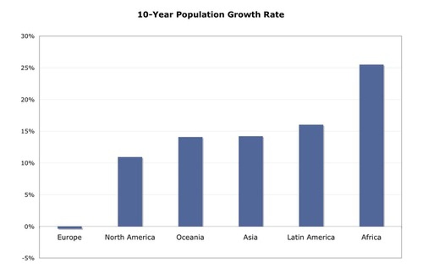
STATISTICS

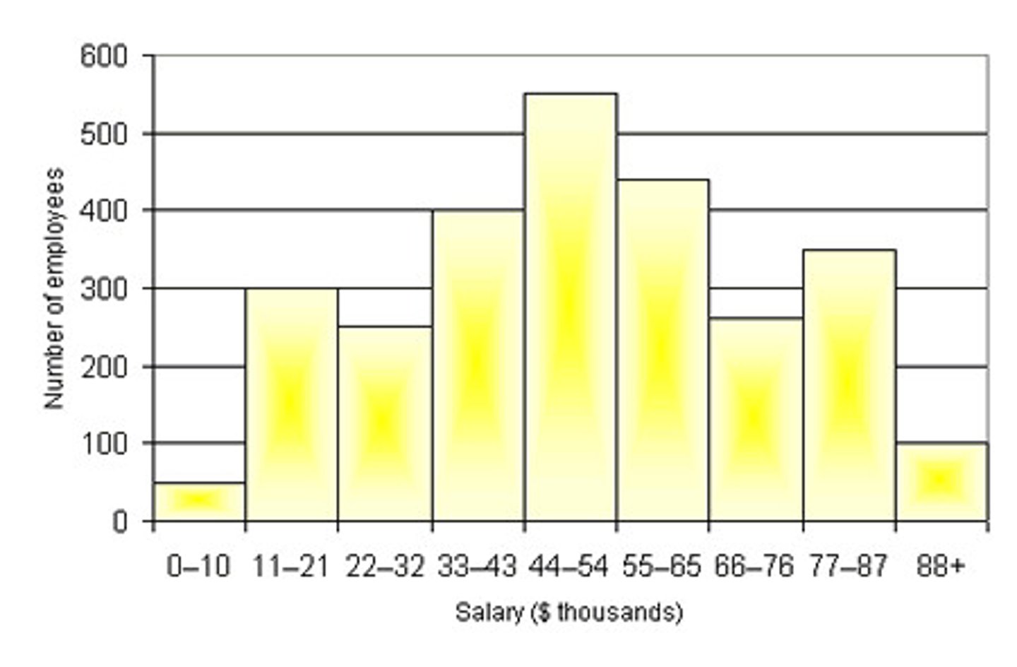
- refers to a range of techniques and procedures for analyzing, interpreting, displaying, and making decisions based on data.

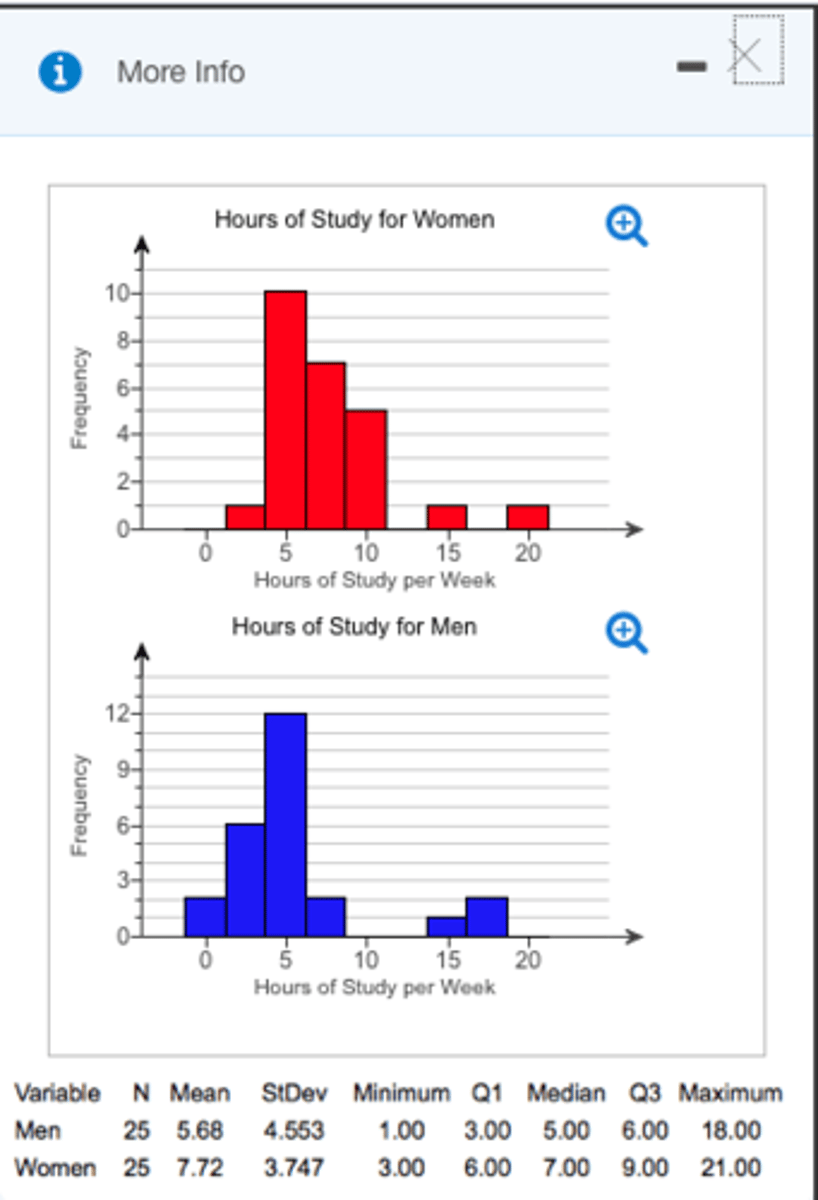
- Numerical facts and figures

- Involves math and relies upon

calculations of numbers

- Relies heavily on how the numbers are

chosen and how the statistics are

interpreted

why study it?

- To organize massive amount of information into a more objective interpretable form

- To properly evaluate the data and claims that bombard you everyday

- To communicate results and research conclusions

- To learn to recognize statistical evidence that supports a stated conclusion
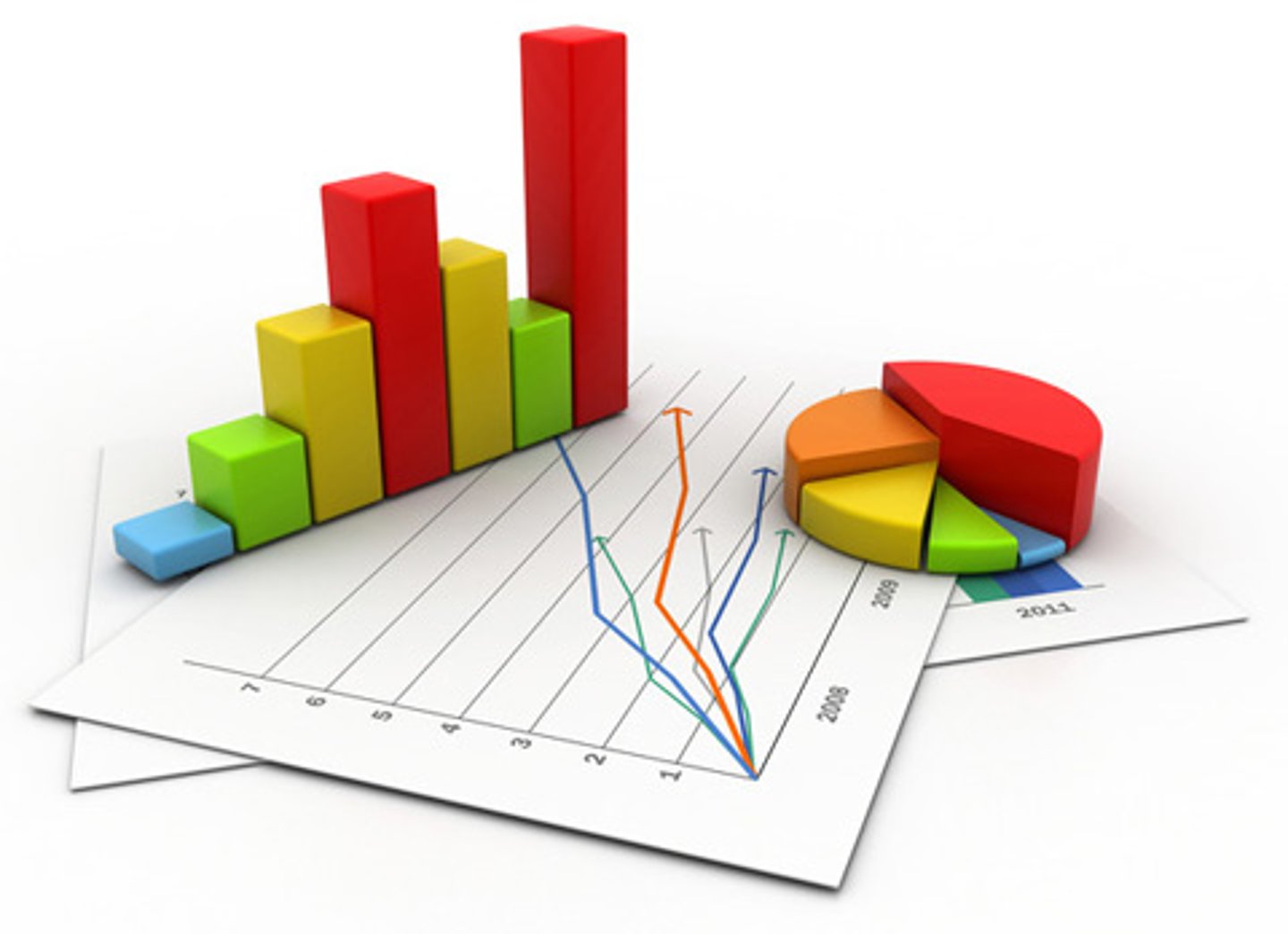
<p>- refers to a <strong>range of techniques</strong> and procedures for analyzing, interpreting, displaying, and making decisions based on data.</p><p>- Numerical facts and figures</p><p>- Involves math and relies upon</p><p>calculations of numbers</p><p>- Relies heavily on how the numbers are</p><p>chosen and how the statistics are</p><p>interpreted</p><p>why study it?</p><p>- To organize massive amount of information into a more objective interpretable form</p><p>- To properly evaluate the data and claims that bombard you everyday</p><p>- To communicate results and research conclusions</p><p>- To learn to recognize statistical evidence that supports a stated conclusion</p>
2
New cards

Descriptive

- provide ways of summarizing the information that we collect from a multitude of sources
<p>- provide <strong>ways of summarizing the information </strong>that we <u><mark data-color="#f4eae3" style="background-color: rgb(244, 234, 227); color: inherit;">collect from a multitude of sources</mark></u></p>
3
New cards

Inferential

- confidence in which we can generalize from a sample to the entire population
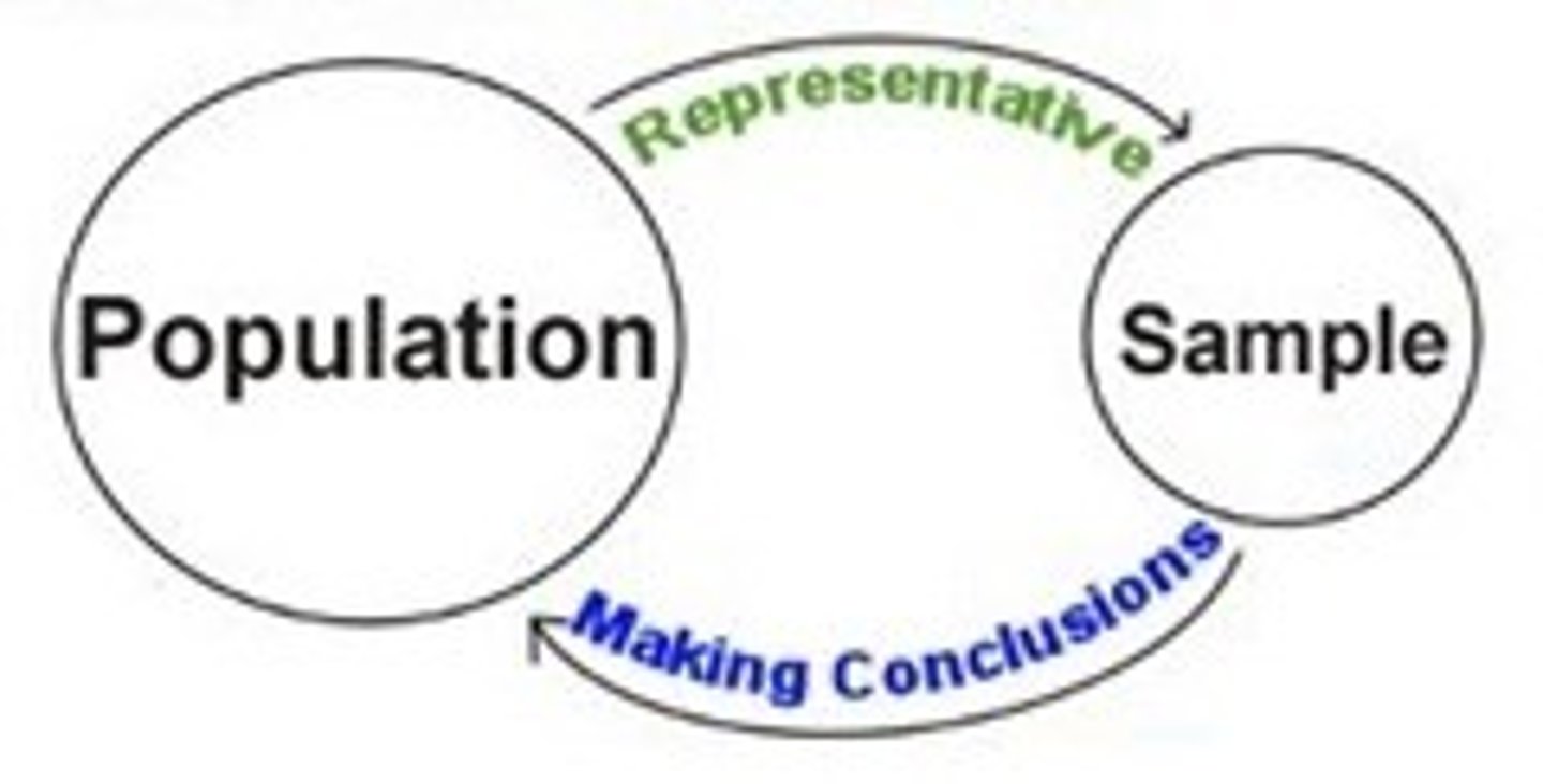
<p>- confidence in which we can <u><mark data-color="#fae9f5" style="background-color: rgb(250, 233, 245); color: inherit;">generalize from a sample to the entire population</mark></u></p>
4
New cards

Data Simplification/Data exploration/Data reduction

- to make sense of large amounts of data that otherwise would be too much confusing
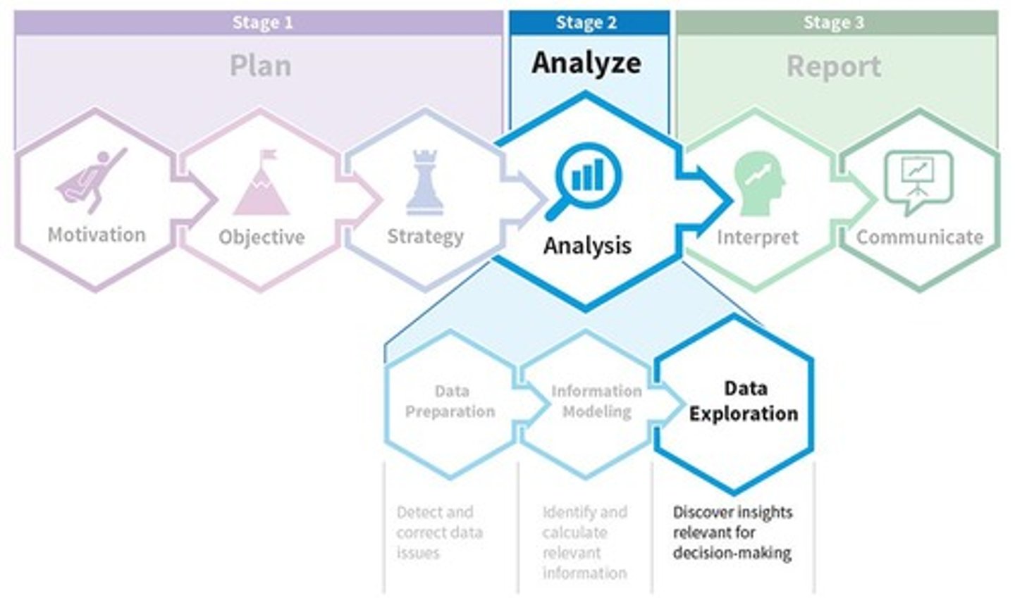
<p>- to <strong>make sense of large amounts of data</strong> that otherwise would be too much confusing</p>
5
New cards

VARIABLE

- Simply a characteristic or feature of the thing we are interested in understanding

- Any concept that we can measure and that varies between individuals or cases
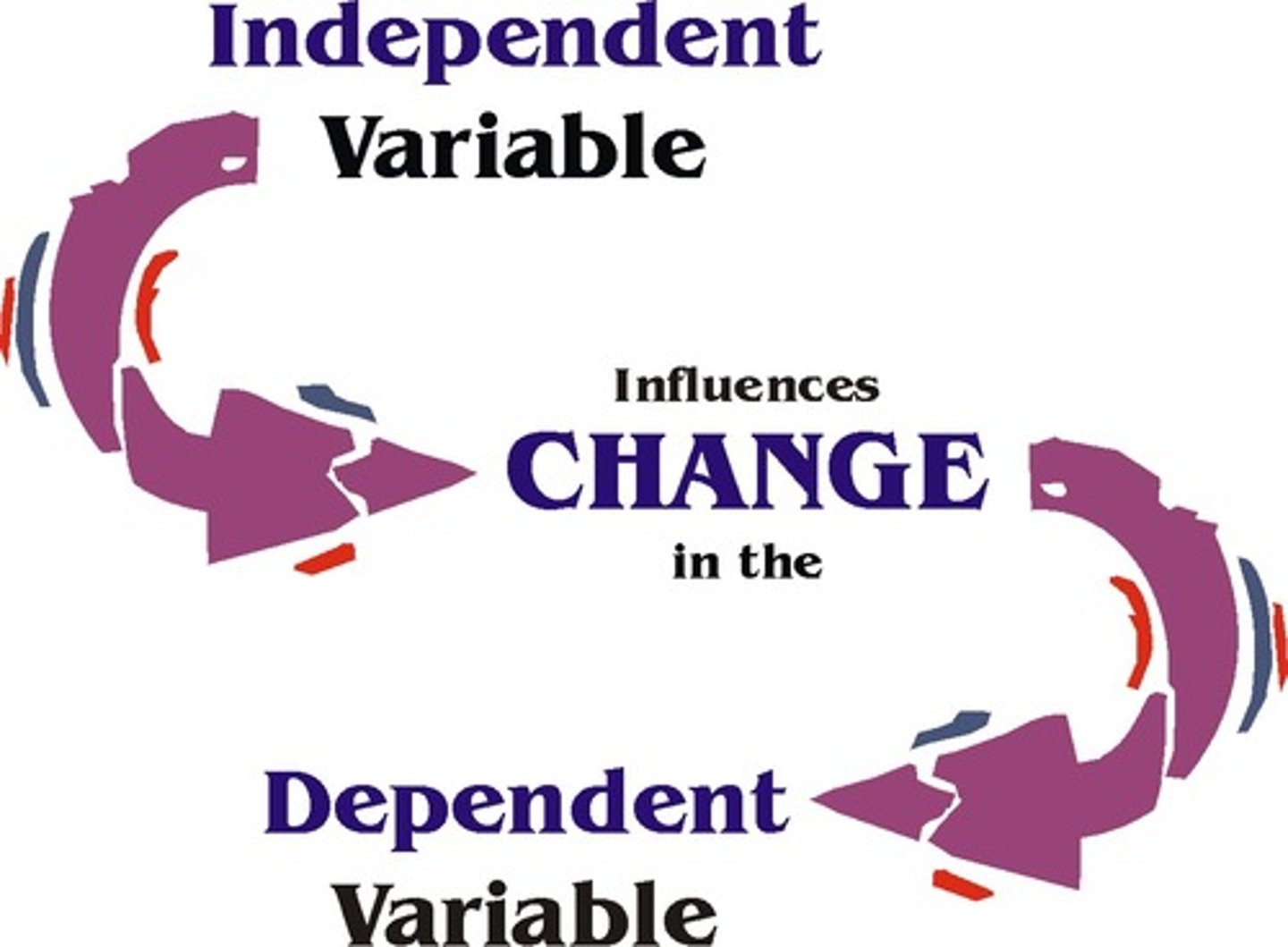
<p>- Simply a <strong>characteristic or feature</strong> of the thing we are i<u><mark data-color="purple" style="background-color: purple; color: inherit;">nterested in understanding</mark></u></p><p>- Any <u><mark data-color="#f1eefc" style="background-color: rgb(241, 238, 252); color: inherit;">concept that we can measure and that varies between individuals</mark></u> or cases</p>
6
New cards

INDEPENDENT

variable is manipulated by an experimenter; cause
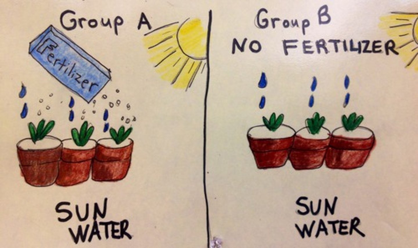
<p>variable is <strong>manipulated</strong> by an <strong>experimenter</strong>; cause</p>
7
New cards

DEPENDENT

effect in variable caused by the manipulation on IV
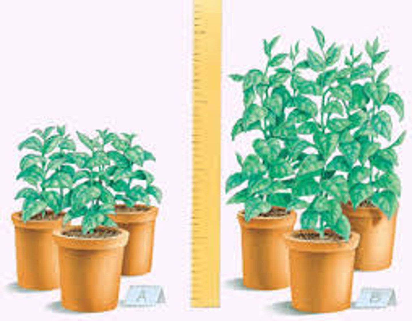
<p>effect in variable caused by the <strong>manipulation </strong>on IV</p>
8
New cards

QUALITATIVE

- express a qualitative attribute; values of qualitative v do not imply a numerical ordering

- "Categorical"
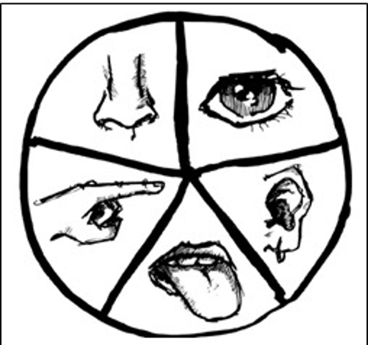
<p>- express<strong> a qualitative attribute</strong>; values of qualitative v do not imply a numerical ordering</p><p>- "Categorical"</p>
9
New cards

QUANTITATIVE

- variables measured in terms of numbers

- Discrete and continuous
<p>- variables measured in terms of numbers</p><p>- Discrete and continuous</p>
10
New cards

DISCRETE

possible scores are discrete points on the scale; countable

<p>possible scores are discrete points on the scale; countable</p>
11
New cards

CONTINUOUS

scale is continuous; infinite
<p>scale is continuous; infinite</p>
12
New cards

OBSERVABLE

can be directly measured or observed.
<p>can be <strong>directly </strong>measured or observed.</p>
13
New cards

LATENT

not directly observed but are inferred from observable variables
<p><strong>not directly observed</strong> but are <strong>inferred </strong>from observable variables</p>
14
New cards

Mediator

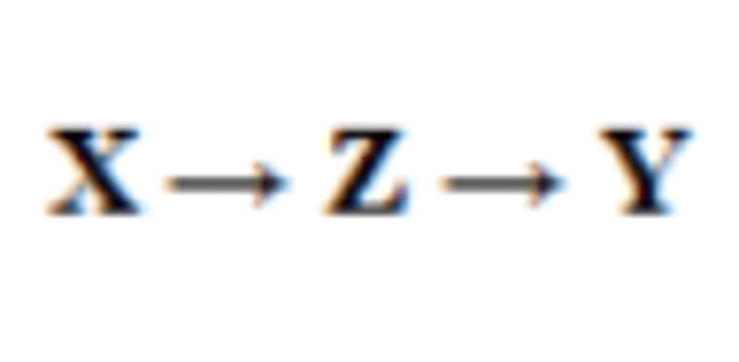
Explains how or why two variables are related.

Think of it as: The "middle step" in the

process.

Mechanism (how or why)
<p>Explains how or why two variables are <strong>related</strong>.</p><p>Think of it as: The <strong>"middle step"</strong> in the</p><p>process.</p><p>Mechanism (how or why)</p>
15
New cards

Moderator

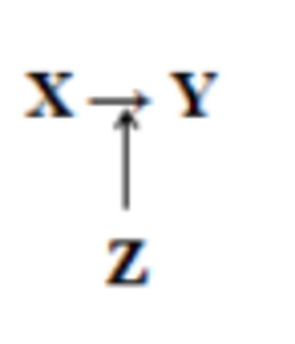
- Changes the strength or direction of the relationship between two variables.

Think of it as: A "switch" or "volume knob" that makes the relationship stronger, weaker, or different

depending on its level.

- Modifier (when or for whom)
<p>- <u><mark data-color="#ffe9e9" style="background-color: rgb(255, 233, 233); color: inherit;">Changes the strength or direction of the relationship </mark></u>between two variables.</p><p>Think of it as: A "switch" or "volume knob" that makes the relationship stronger, weaker, or different</p><p>depending on its level.</p><p>- Modifier (when or for whom)</p>
16
New cards

level of measurement

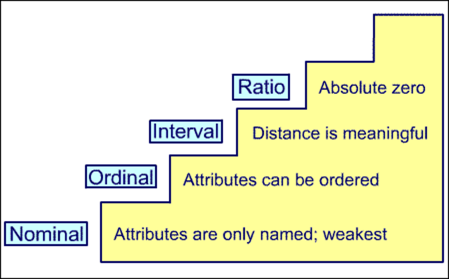
- determines what kinds of statistics are meaningful and valid.

- Using the wrong statistic can lead to

misleading conclusions.
<p>- determines what kinds of statistics are meaningful and valid.</p><p>- Using the wrong statistic can lead to</p><p>misleading conclusions.</p>
17
New cards

(TRUE) EXPERIMENTAL DESIGN

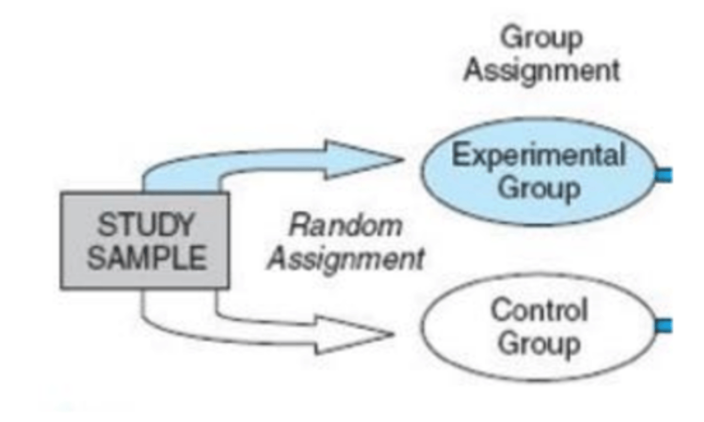
- The use of random assignment to treatment conditions and manipulation of the independent variable
<p>- The use of random assignment to<strong> treatment conditions and manipulation of the independent variable</strong></p>
18
New cards

Random sampling

randomly chosen as samples
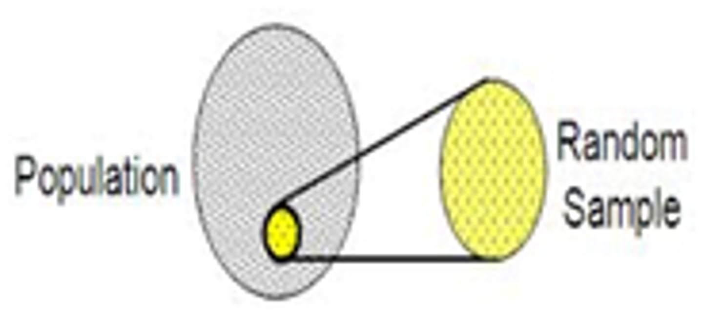
<p>randomly chosen as samples</p>
19
New cards

Random Assignment

sample is randomly assigned to a certain condition
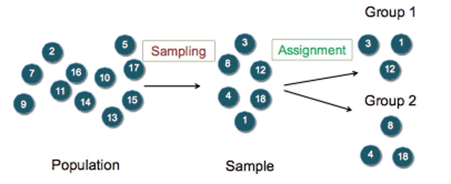
<p>sample is randomly assigned to a certain condition</p>
20
New cards

QUASI-EXPERIMENTAL DESIGN

- Manipulating the IV but not randomly assigning people to groups

Why use this?

- It may be unethical to deny potential treatment to someone if there is good reason to believe it will be effective and that the person would unduly

suffer if they did not receive it

- It may be impossible to randomly assign people to groups
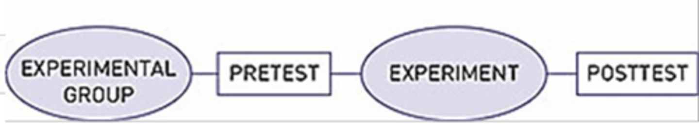
<p>- Manipulating the IV but <strong><u><mark data-color="#ffefe6" style="background-color: rgb(255, 239, 230); color: inherit;">not randomly assigning</mark></u></strong><u><mark data-color="#ffefe6" style="background-color: rgb(255, 239, 230); color: inherit;"> people to groups</mark></u></p><p>Why use this?</p><p>- It may be unethical to deny potential treatment to someone if there is good reason to believe it will be effective and that the person would unduly</p><p>suffer if they did not receive it</p><p>- It may be impossible to randomly assign people to groups</p>
21
New cards

NON-EXPERIMENTAL DESIGN

- Correlational research

- Observing things as they occur naturally and recording our observations as data

- Reflects reality as it actually exists since we as researchers do not change anything

- Becomes a predictor
<p>- Correlational research</p><p>- <u><mark data-color="blue" style="background-color: blue; color: inherit;">Observing things as they </mark></u><strong><u><mark data-color="blue" style="background-color: blue; color: inherit;">occur naturally</mark></u> </strong>and recording our observations as data</p><p>- <u><mark data-color="#e6ebfa" style="background-color: rgb(230, 235, 250); color: inherit;">Reflects reality as it actually exists </mark></u>since we as researchers do not change anything</p><p>- Becomes a predictor</p>
22
New cards

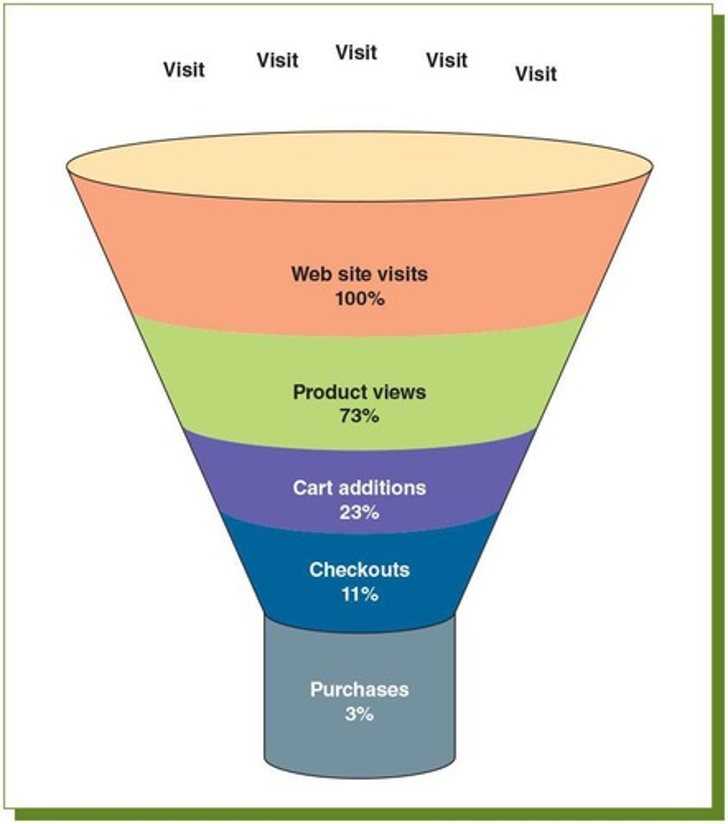
DESCRIPTIVE ANALYSIS

- Numbers that are used to summarize and describe data

- Just descriptive; they do not involve generalizing beyond the data at hand

- It is important to differentiate what we use to describe populations vs. samples
<p>- Numbers that<u><mark data-color="#f0f6e5" style="background-color: rgb(240, 246, 229); color: inherit;"> are used to summarize and describe</mark></u> data</p><p>- Just descriptive; they do not involve generalizing beyond the data at hand</p><p>- It is important to<u><mark data-color="#fefaec" style="background-color: rgb(254, 250, 236); color: inherit;"> differentiate what we use to describe populations</mark></u> vs. samples</p>
23
New cards

Population

- is described by a parameter

- the true value of the descriptive in the population, but one that we can never know for sure
<p>- is described by a <strong>parameter</strong></p><p>- the<u><mark data-color="#defceb" style="background-color: rgb(222, 252, 235); color: inherit;"> true value of the descriptive in the population, </mark></u>but one that we can never know for sure</p><p></p>
24
New cards

sample statistic

- refers to the specific number we compute from the data (e.g. average)

- an estimate of the true population parameter, and if our sample is representative of the population, then the statistic is considered to be a good estimator of the parameter.
<p>- refers to the<u><mark data-color="#f0e5fc" style="background-color: rgb(240, 229, 252); color: inherit;"> specific number we compute</mark></u> from the data (e.g. average)</p><p>- an<u><mark data-color="#f4e5f9" style="background-color: rgb(244, 229, 249); color: inherit;"> estimate of the true population parameter,</mark></u> and if our sample is representative of the population, then the statistic is considered to be a good estimator of the parameter.</p>
25
New cards

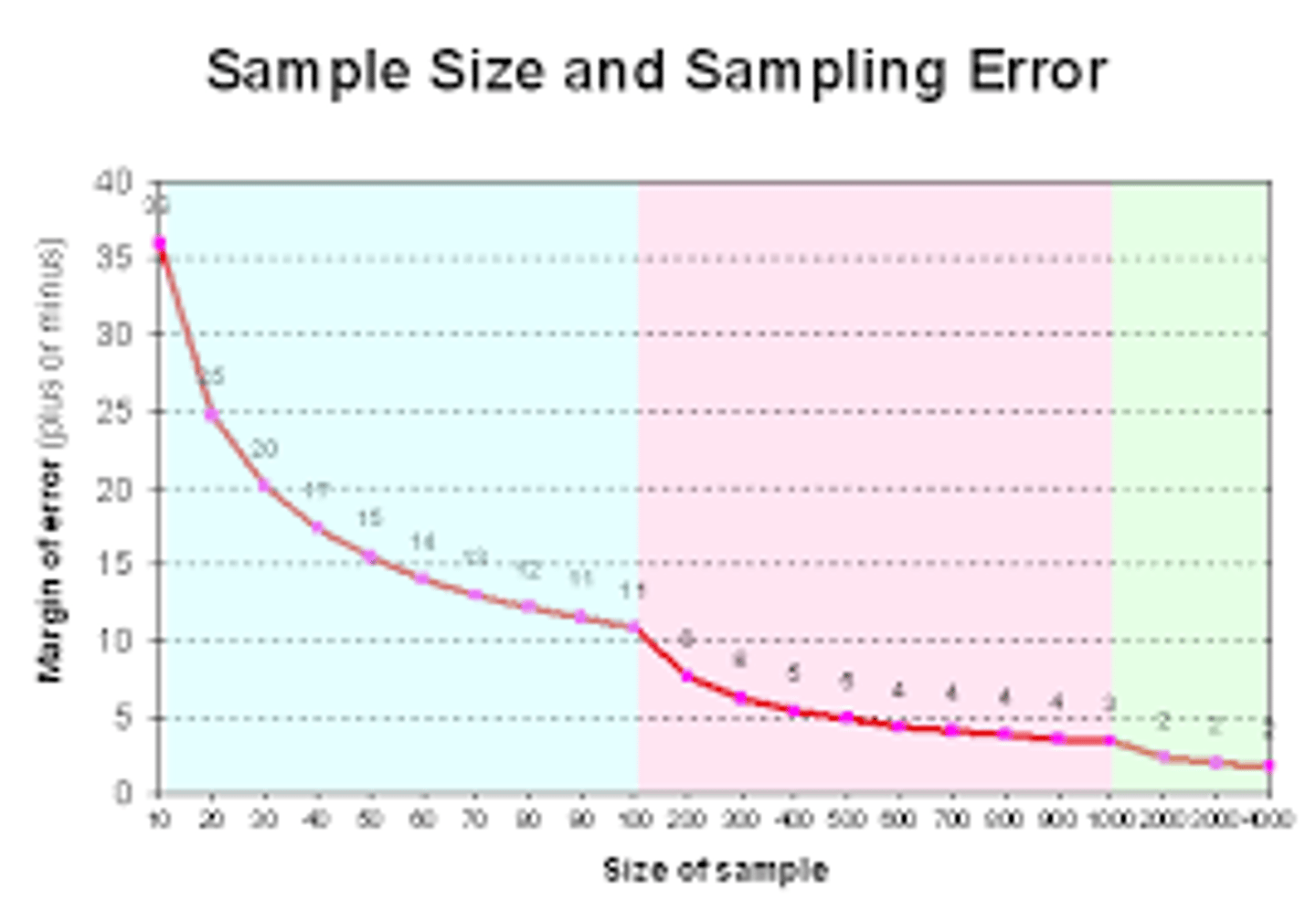
Sampling Error

discrepancy/difference between the parameter and the statistic we use to estimate it.
<p><strong>discrepancy/difference between the </strong>parameter and the statistic we use to estimate it.</p>
26
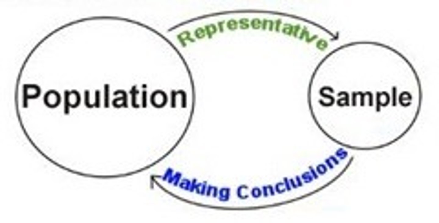
New cards

INFERENTIAL STATISTICS

- shows how our data behaves

- how we generalize from our sample back up to our population

- Correlational, comparative, and predictive
<p>- shows how our data behaves</p><p>- how <strong>we generalize from our sample </strong>back up to our population</p><p>- Correlational, comparative, and predictive</p>
27
New cards

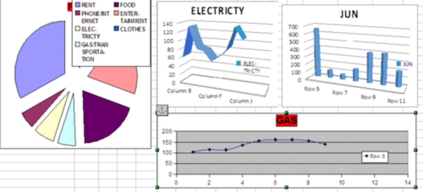
Graphing Qualitative Variables

- No pre-established ordering

- refers to using visual tools to present and describe categorical data that has no pre-established or numerical ordering.

RESEARCH DESIGN ISSUE: allowing participants in your research to give more than one answer to a question.

• Statistics in general do not handle multiple responses very well.

• The totals in a table exceed the number of participants in the research
<p>- No pre-established ordering</p><p>- refers to<u><mark data-color="#f9f6d9" style="background-color: rgb(249, 246, 217); color: inherit;"> using </mark></u><strong><u><mark data-color="#f9f6d9" style="background-color: rgb(249, 246, 217); color: inherit;">visual tools</mark></u></strong><u><mark data-color="#f9f6d9" style="background-color: rgb(249, 246, 217); color: inherit;"> to present and describe categorical data that has no pre-established</mark></u><mark data-color="#f9f6d9" style="background-color: rgb(249, 246, 217); color: inherit;"> </mark>or numerical ordering.</p><p><strong>RESEARCH DESIGN ISSUE:</strong> allowing participants in your research to give more than one answer to a question.</p><p>• Statistics in general do not handle multiple responses very well.</p><p>• The totals in a table exceed the number of participants in the research</p>
28
New cards

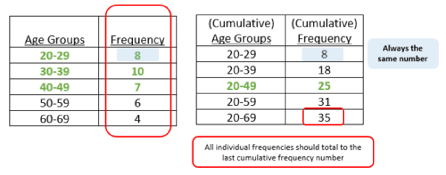
FREQUENCY TABLES

- shows the frequencies of the various response categories

- also shows the relative frequencies, which are the proportion of responses in each category
<p>- shows the <u><mark data-color="purple" style="background-color: purple; color: inherit;">frequencies of the various response</mark></u> categories</p><p>- also <u><mark data-color="purple" style="background-color: purple; color: inherit;">shows the relative frequencies</mark></u>, which are the proportion of responses in each category</p>
29
New cards

PIE CHARTS

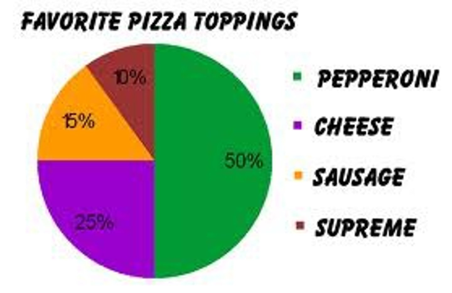
• Each category is represented by a slice of the pie.

• The area of the slice is proportional to the percentage of responses in the category.

• simply the relative frequency multiplied by 100

• effective for displaying the relative frequencies of a small number of categories

DON'TS:

- Too many small slices are identified by different shading patterns, and the legend takes time to decode.

- Don't use it to compare the outcomes of two different surveys or experiments

- Don't label the ___ with percentages if they are based on a small number of percentages
<p>• Each category is represented by a <strong>slice of the pie</strong>.</p><p>• The area of the slice is <u><mark data-color="#d2f2f7" style="background-color: rgb(210, 242, 247); color: inherit;">proportional to the percentage of responses</mark></u> in the category.</p><p>• simply the relative frequency multiplied by 100</p><p>• effective for displaying the relative frequencies of a small number of categories</p><p><strong><em>DON'TS:</em></strong></p><p>- Too many small slices are identified by different shading patterns, and the legend takes time to decode.</p><p>- Don't use it to compare the outcomes of two different surveys or experiments</p><p>- Don't label the ___ with percentages if they are based on a small number of percentages</p>
30
New cards

BAR CHARTS

- can also be used to represent frequencies of different categories

- have a standard space separating them--spaces indicate that the categories are not in a numerical order; they are frequencies of categories, not scores.

THINGS TO REMEMBER:

- The heights of the bars represent frequencies (number of cases)in a category. q Each bar should be clearly labeled as to the category it represents. - Too many bars make bar charts hard to follow.

- Avoid having many empty or near-empty categories, which represent very few cases.

- Nevertheless, if important categories have very few entries, then this needs recording.

- Make sure that the vertical axis (the heights of the bars) is clearly marked as being frequencies or percentage frequencies.

- The bars should be of equal width

- Don't set the baseline to a value other than zero!
<p>- can also be used to <u><mark data-color="#f0f0f7" style="background-color: rgb(240, 240, 247); color: inherit;">represent frequencies of different categories</mark></u></p><p>- have a standard space separating them--spaces indicate that the categories are not in a numerical order; they are frequencies of categories, not scores.</p><p><strong>THINGS TO REMEMBER:</strong></p><p>- The heights of the bars represent frequencies (number of cases)in a category. q Each bar should be clearly labeled as to the category it represents. - Too many bars make bar charts hard to follow.</p><p>- Avoid having many empty or near-empty categories, which represent very few cases.</p><p>- Nevertheless, if important categories have very few entries, then this needs recording.</p><p>- Make sure that the vertical axis (the heights of the bars) is clearly marked as being frequencies or percentage frequencies.</p><p>- The bars should be of equal width</p><p>- Don't set the baseline to a value other than zero!</p>
31
New cards

Y-axis

shows the number of observations in each category.
<p>shows the <strong>number of observations</strong> in each category.</p>
32
New cards

COMPARING DISTRIBUTIONS

To compare the results of different surveys, or of different conditions within the same overall survey
<p>To <strong>compare</strong> the results of different surveys, or of different conditions within the same overall survey</p>
33
New cards

horizontal format

- It is useful when you have many categories because there is more room for the category labels.

simplified explanation: turning that entire chart sideways! Instead of climbing up toward the sky, the bars grow sideways from left to right like cars zooming down a racetrack.
<p>- It is <u><mark data-color="#daf4f1" style="background-color: rgb(218, 244, 241); color: inherit;">useful when you have many categories</mark></u> because there is more room for the category labels.</p><p><strong>simplified explanation</strong>:<strong> </strong>turning that entire chart sideways! Instead of climbing up toward the sky, the bars grow sideways from left to right like cars zooming down a racetrack.</p>
34
New cards

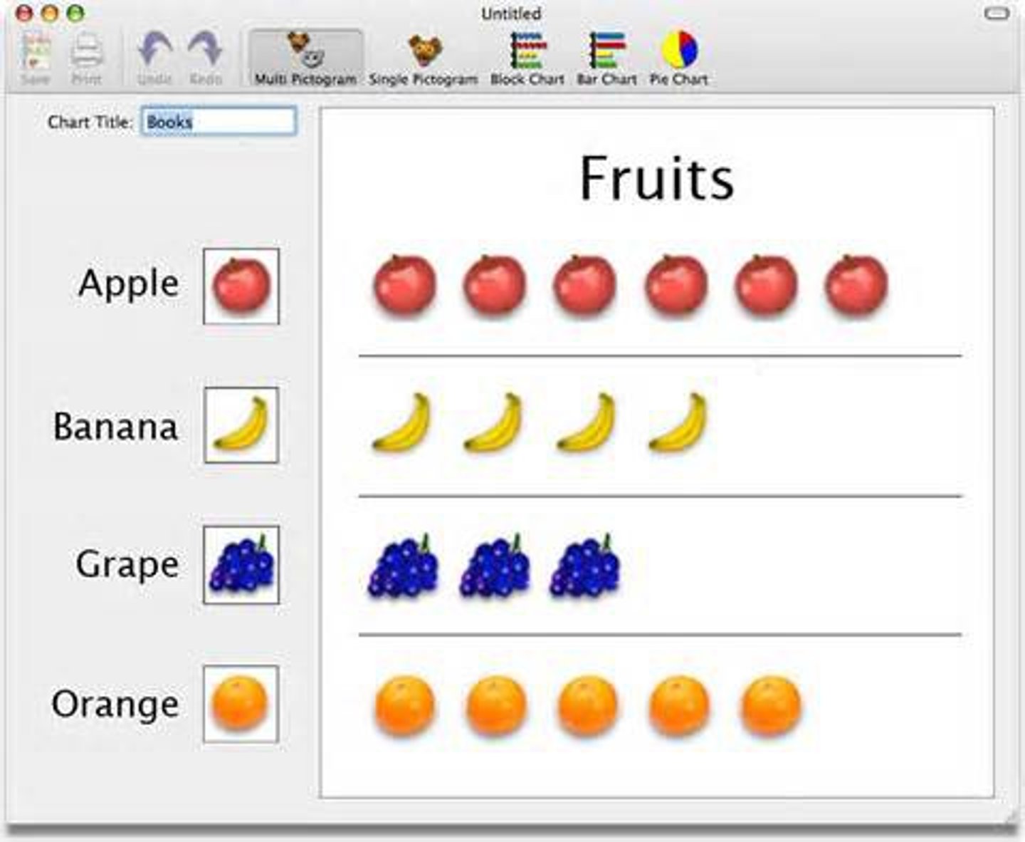
pictogram

It is a type of chart that uses meaningful images or little drawings instead of normal colored bars to show amounts.

For example, instead of a plain blue bar showing how many apples were sold, a pictogram might stack up drawings of actual apples.
<p>It is a <u><mark data-color="#fde6ff" style="background-color: rgb(253, 230, 255); color: inherit;">type of chart that uses meaningful images or little drawings </mark></u>instead of normal colored bars to show amounts.</p><p>For example, instead of a plain blue bar showing how many apples were sold, a pictogram might stack up drawings of actual apples.</p>
35
New cards

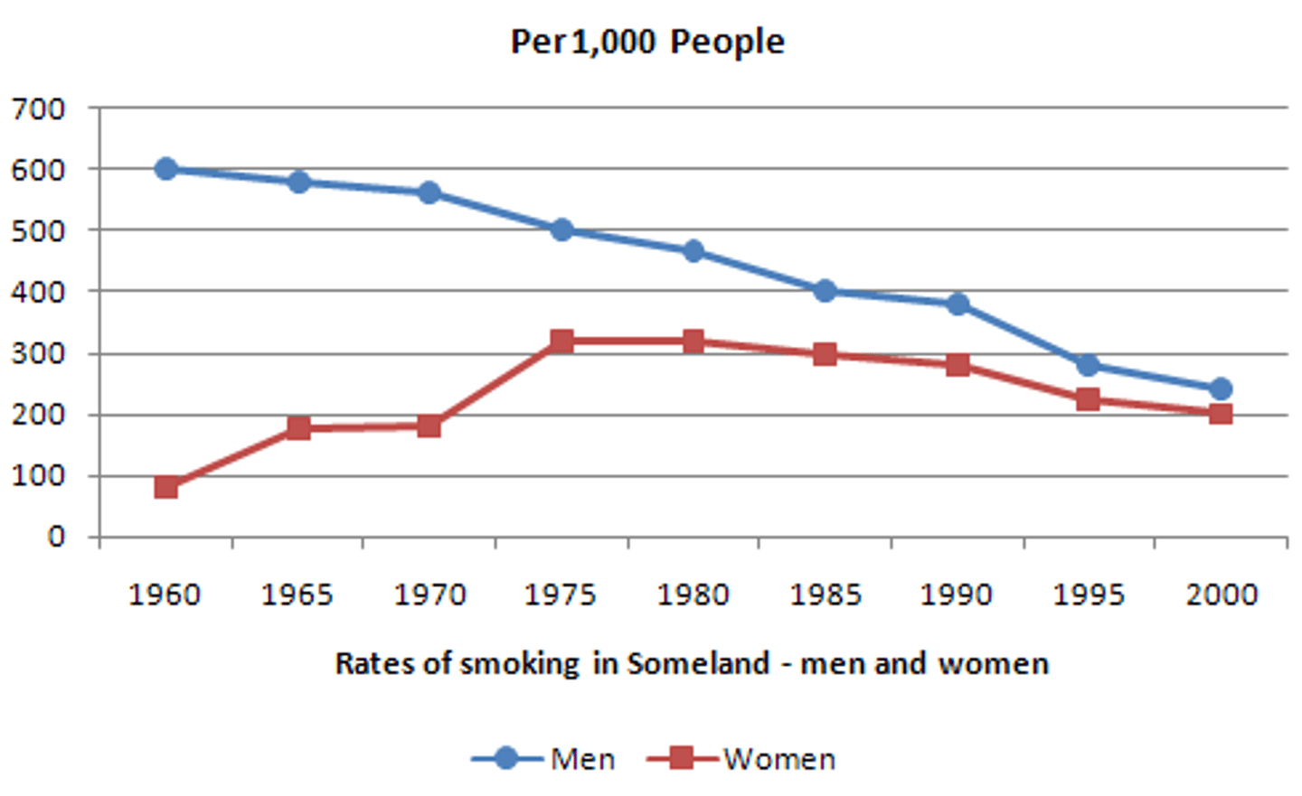
Line graph

bar graph with the tops of the bars represented by points joined by lines (the rest of the bar is suppressed)
<p>bar graph with the tops of the bars represented by points joined by lines (the rest of the bar is suppressed)</p>
36
New cards

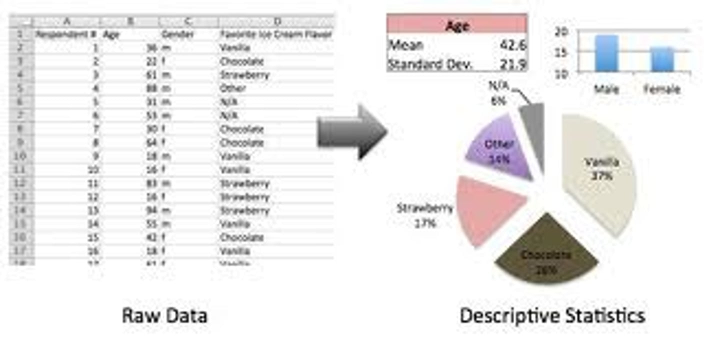
Descriptive statistics

- They are, by and large, relatively simple visual and numerical techniques for describing the major features of one's data

simplified explanation: It is a set of simple visual techniques (like drawing a colorful chart) and numerical techniques (like finding the average) that help you describe the major features of your massive pile of information.
<p>- They are, by and large, relatively simple visual and numerical techniques for <strong><u><mark data-color="#f0e1fa" style="background-color: rgb(240, 225, 250); color: inherit;">describing </mark></u></strong><u><mark data-color="#f0e1fa" style="background-color: rgb(240, 225, 250); color: inherit;">the major features of one's data</mark></u></p><p>simplified explanation: It is a set of <strong>simple visual techniques</strong> (like drawing a colorful chart) and numerical techniques (like finding the average) that help you describe the major features of your massive pile of information.</p>
37
New cards

QUANTITATIVE VARIABLE

- Variables measured on a numeric scale

Example: height, weight, response time, subjective rating of pain, temperature, score on an exam
<p>- Variables measured on a <strong>numeric scale</strong></p><p>Example: height, weight, response time, subjective rating of pain, temperature, score on an exam</p>
38
New cards

STEM DISPLAYS

arranged as a column to the left of the bars; represents the tens digits (e.g. 3 stem = 30 to 39)
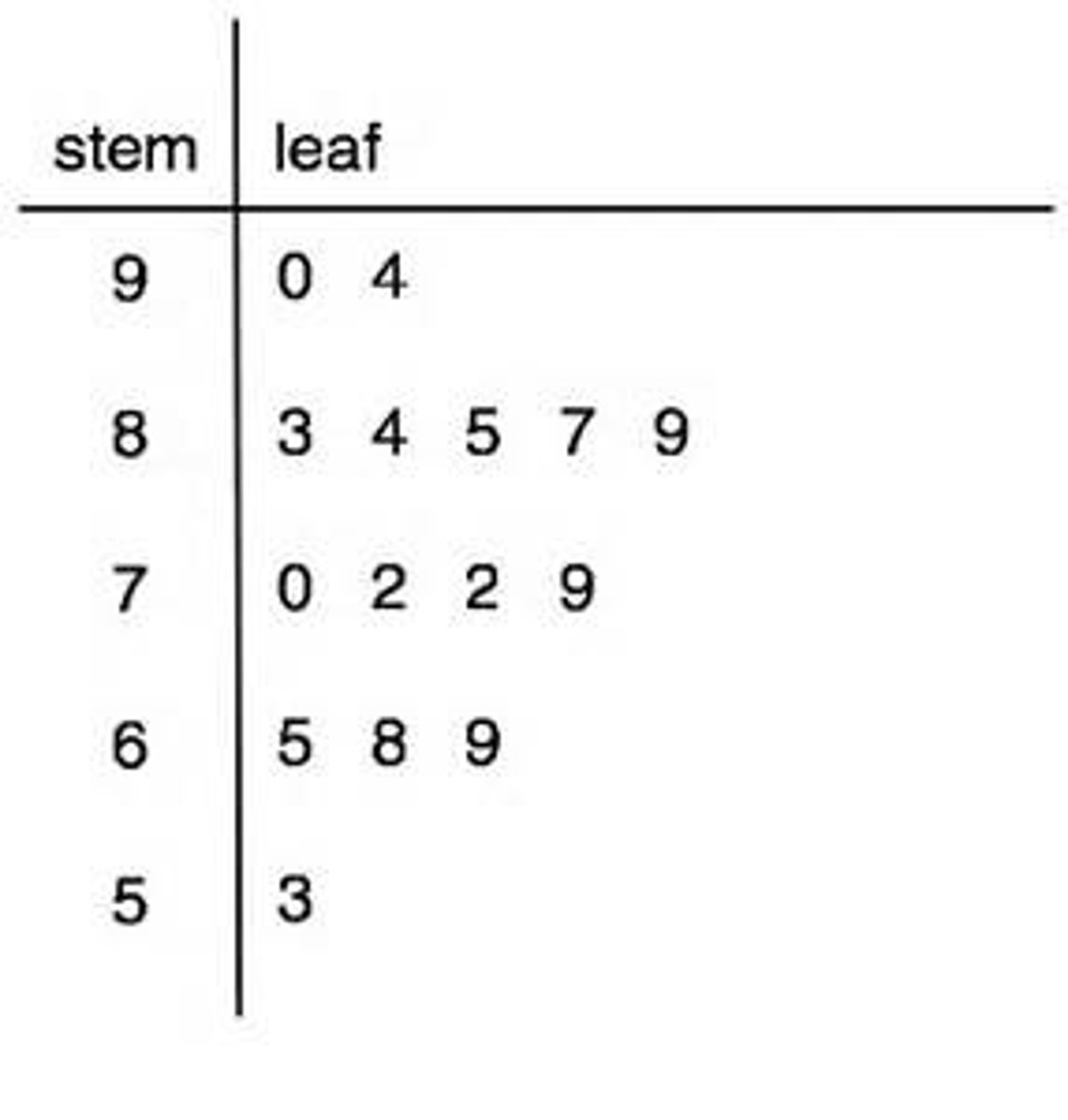
<p>arranged as a <strong>column to the left of the bars</strong>; represents the tens digits (e.g. 3 stem = 30 to 39)</p>
39
New cards

LEAF DISPLAYS

- Numbers to the right represent the ones digits

- Every leaf in the graph, therefore, stands for the result of adding the leaf to 10 times its stem.

Purpose: to clarify the shape of the distribution; the precise numbers can be determined by examining the leaves
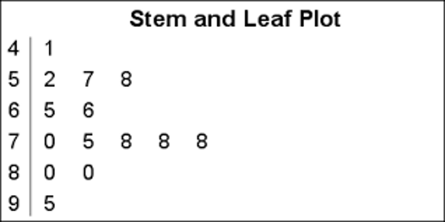
<p>- Numbers to the <strong>right</strong> <u><mark data-color="#f2f7e0" style="background-color: rgb(242, 247, 224); color: inherit;">represent the ones digits</mark></u></p><p>- Every leaf in the graph, therefore, stands for the result of adding the leaf to 10 times its stem.</p><p><strong>Purpose:</strong> to <u><mark data-color="#fdfbe1" style="background-color: rgb(253, 251, 225); color: inherit;">clarify the shape of the distribution;</mark></u> the precise numbers can be determined by examining the leaves</p>
40
New cards

STEM AND LEAF DISPLAYS

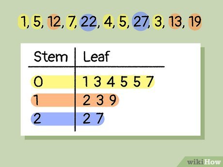
- Best-suited for small to moderate amounts of data (up to 200 observations)

- We can make our figure even more revealing by splitting each stem into 2 parts

- Splitting depends on the exact form of your data: if rows get too long with single stems, you can try splitting them into 2 or more parts

- they are placed back to back along a common column of stems: "Back-to-back stem and leaf display"

- Easy to graph when:

- data are whole numbers

- All numbers are positive

- Data with decimals can be rounded to 2-digit accuracy
<p>- Best-suited for <strong>small to moderate amounts of data</strong> (up to 200 observations)</p><p>- We can make our figure even more revealing by <strong>splitting each stem into 2 parts</strong></p><p>- Splitting depends on the exact form of your data: if rows get too long with single stems, you can try splitting them into 2 or more parts</p><p>- they are <u><mark data-color="green" style="background-color: green; color: inherit;">placed back to back along a common column of stems: </mark></u>"Back-to-back stem and leaf display"</p><p>- Easy to graph when:</p><p>- data are whole numbers</p><p>- All numbers are positive</p><p>- Data with decimals can be rounded to 2-digit accuracy</p>
41
New cards

Test Anxiety Questionnaire

(Scores range from 10 - 50)

Low: 10 - 19

Moderate: 20 - 35

High: over 35
<p>(Scores range from 10 - 50)</p><p>Low: 10 - 19</p><p>Moderate: 20 - 35</p><p>High: over 35</p>
42
New cards

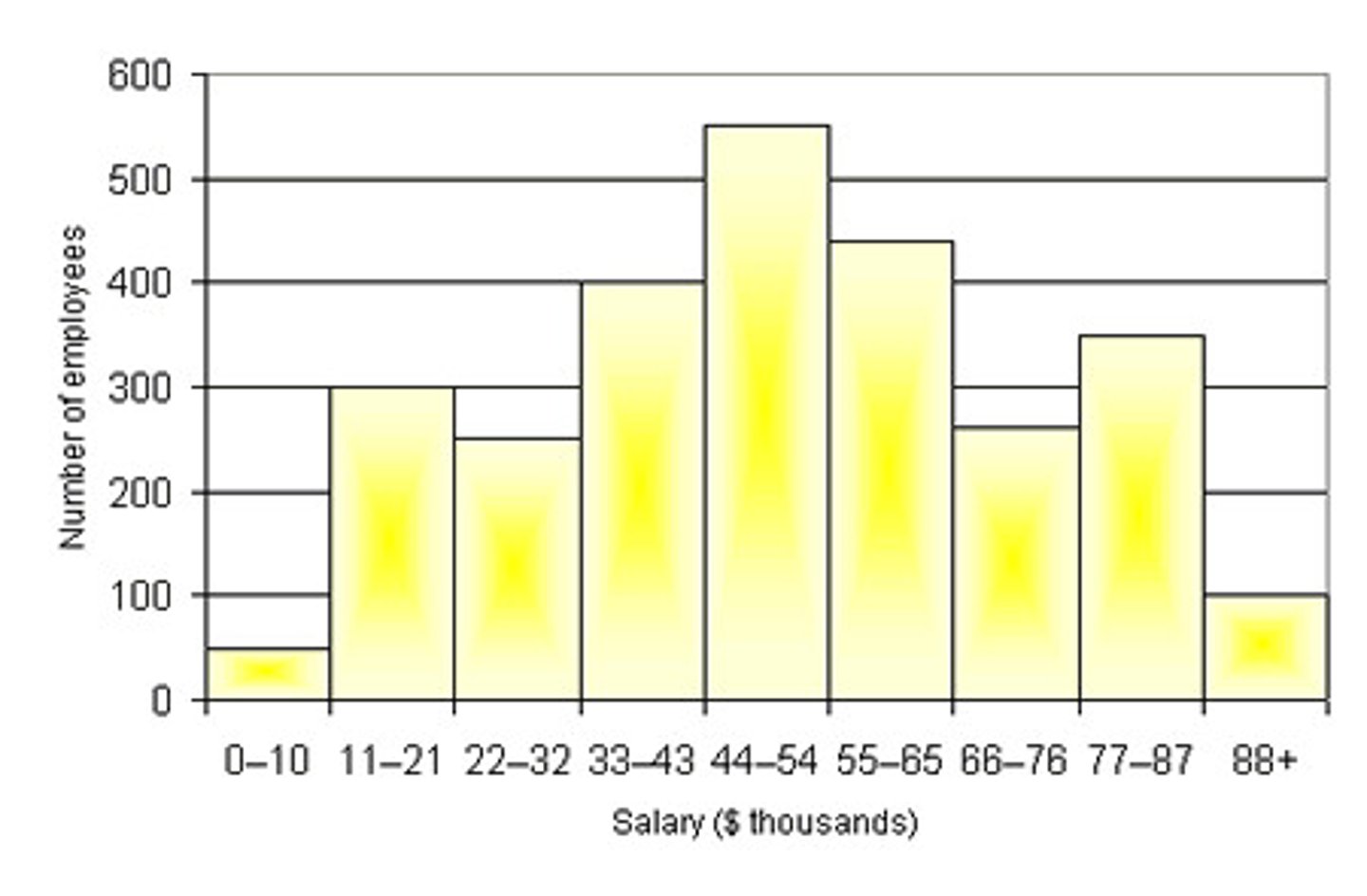
HISTOGRAMS

- Used for displaying the shape of the distribution of a quantitative variable.

- It groups data into class intervals (bins) and represents the frequency (or relative frequency) of data within each interval using adjacent bars.

- Best-suited for large amounts of data

- can also be used when the scores

are measured on a more continuous scale, such as the length of time (in milliseconds) required to perform a task.

When to Use It:

- Best-suited for large data sets (typically more than 20-30 observations).

- Useful for identifying distribution shape, such as normality, skewness, or multimodality.

- Can be used for both discrete and continuous quantitative variables.
<p>- Used for <strong>displaying the shape of the distribution</strong> of a quantitative variable.</p><p>- It <strong>groups data into class intervals (bins</strong>) and represents the frequency (or relative frequency) of data within each interval using adjacent bars.</p><p>- Best-suited for large amounts of data</p><p>- can also be used when the scores</p><p>are measured on a more continuous scale, such as the length of time (in milliseconds) required to perform a task.</p><p>When to Use It:</p><p>- Best-suited for large data sets (typically more than 20-30 observations).</p><p>- Useful for identifying distribution shape, such as normality, skewness, or multimodality.</p><p>- Can be used for both discrete and continuous quantitative variables.</p>
43
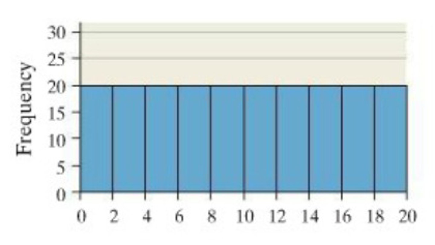
New cards

class frequencies

- In a histogram, are represented by bars.

- Height of each bar corresponds to its class frequency.
<p>- In a histogram, are <strong>represented by bars</strong>.</p><p>- Height of each bar corresponds to its <strong>class frequency</strong>.</p>
44
New cards

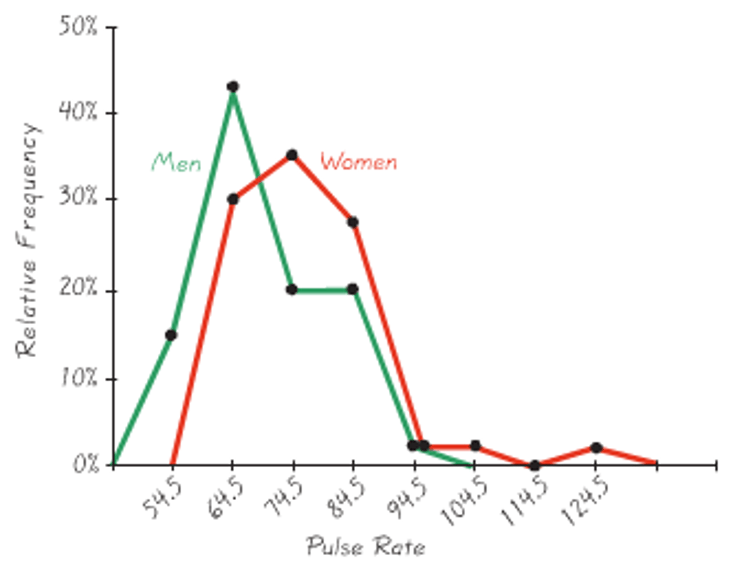
FREQUENCY POLYGONS

- Same purpose as histograms, but are especially helpful for comparing two or more distributions.

- Also a good choice for displaying cumulative frequency distributions (or trends in grouped data)

- are useful for comparing distributions

- Achieved by overlaying the frequency polygons drawn for different data sets

- Also possible to plot two cumulative frequency distributions in the same graph.

- Shows data distribution

- X-axis: class midpoints,

- Y-axis: frequencies

- Always uses straight line segments

- Comparing grouped frequency data
<p>- Same purpose as histograms, but are<strong> </strong>especially <strong>helpful for comparing two or more distributions.</strong></p><p>- Also a <u><mark data-color="#ecdcf1" style="background-color: rgb(236, 220, 241); color: inherit;">good choice for displaying cumulative frequency distributions </mark></u>(or trends in grouped data)</p><p>- are useful for <strong>comparing distributions</strong></p><p>- Achieved by overlaying the frequency polygons drawn for different data sets</p><p>- Also possible to plot two cumulative frequency distributions in the same graph.</p><p>- Shows data distribution</p><p>- X-axis: class midpoints,</p><p>- Y-axis: frequencies</p><p>- Always uses straight line segments</p><p>- Comparing grouped frequency data</p>
45
New cards

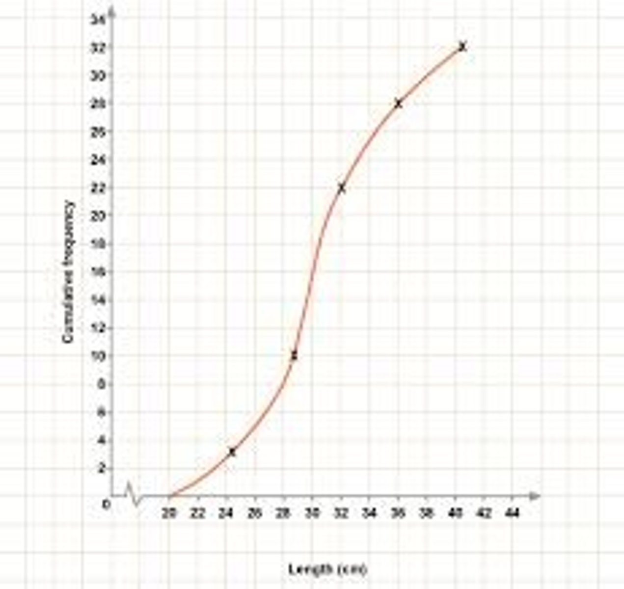
Cumulative Frequency

- Y-axis values represent not the individual class frequency

- Helps to visually identify medians, quartiles, and percentiles.

- The final point always shows the total number of observations.
<p>- <u><mark data-color="#fafce6" style="background-color: rgb(250, 252, 230); color: inherit;">Y-axis values represent </mark></u>not the individual class frequency</p><p>- Helps to <strong>visually identify</strong> medians, quartiles, and percentiles.</p><p>- The final point always shows the total number of observations.</p>
46
New cards

PERCENTILES

- are based on cumulative frequency, indicating the value below which a given percentage of data falls.

- indicates the score below which a given percentage of scores fall.

- Commonly used in standardization tables of psychological tests and measures

- Describe a person's standing compared with the set of individuals on which the test or measure was initially researched

- Quick method of expressing a person's score relative to those of others.

Example:

- 90th percentile = the score is greater than or equal to 90% of the distribution.

- Neuroticism score is 90th percentile = person is more neurotic than about 90% of people
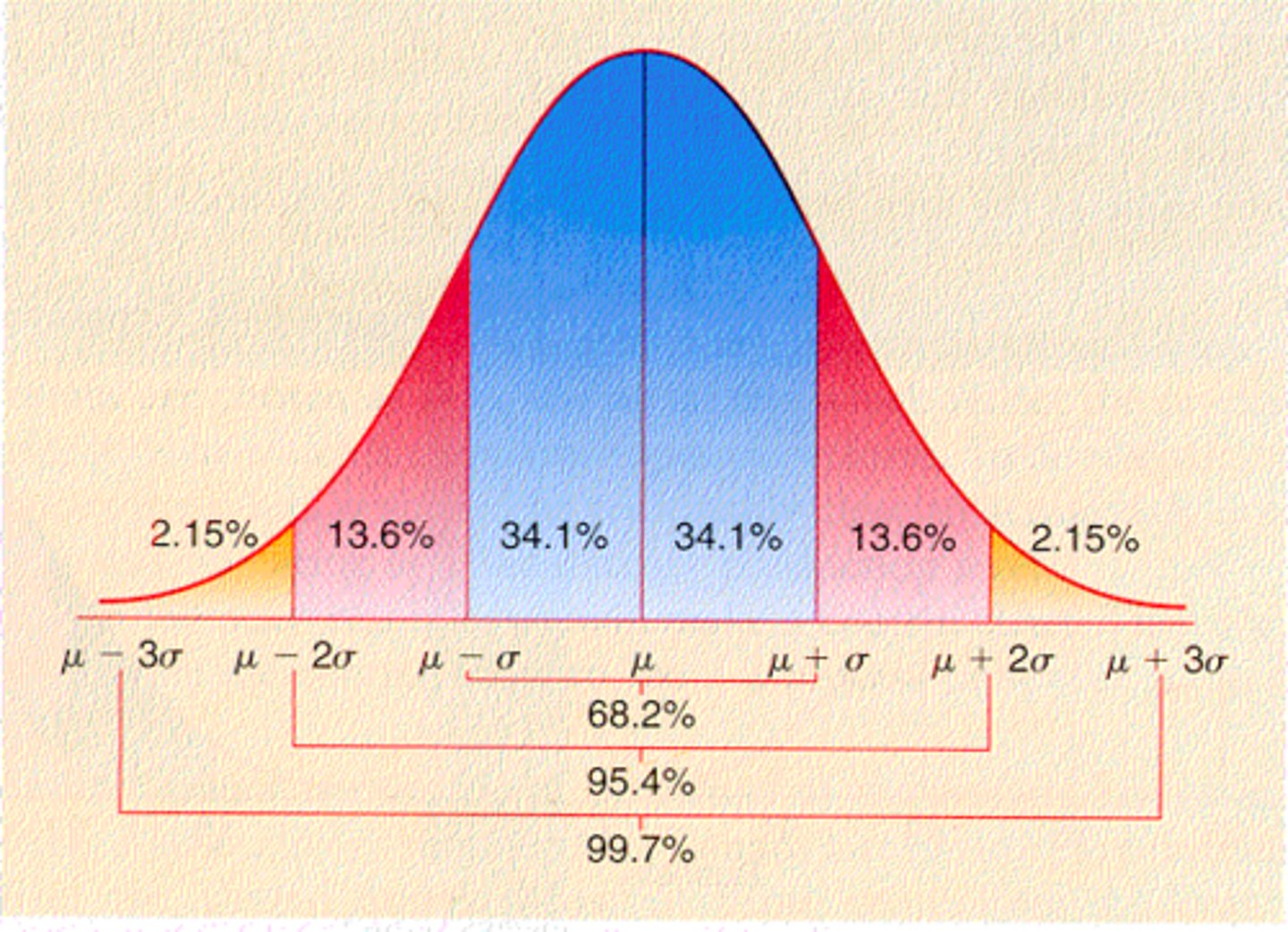
<p>- are <strong>based on cumulative frequency,</strong> indicating the value below which a given percentage of data falls.</p><p>- indicates the score below which a <strong>given percentage of scores fall</strong>.</p><p>- Commonly used in standardization tables of psychological tests and measures</p><p>- Describe a <strong>person's standing compared with the set of individuals</strong> on which the test or measure was initially researched</p><p>- Quick method of expressing a person's score relative to those of others.</p><p>Example:</p><p>- 90th percentile = the score is greater than or equal to 90% of the distribution.</p><p>- Neuroticism score is 90th percentile = person is more neurotic than about 90% of people</p>
47
New cards

BOX PLOTS

- Box-and-Whiskers Plot

- Provide a visual summary of a distribution's central tendency and spread.

- Highlight the median, quartiles, and potential outliers.
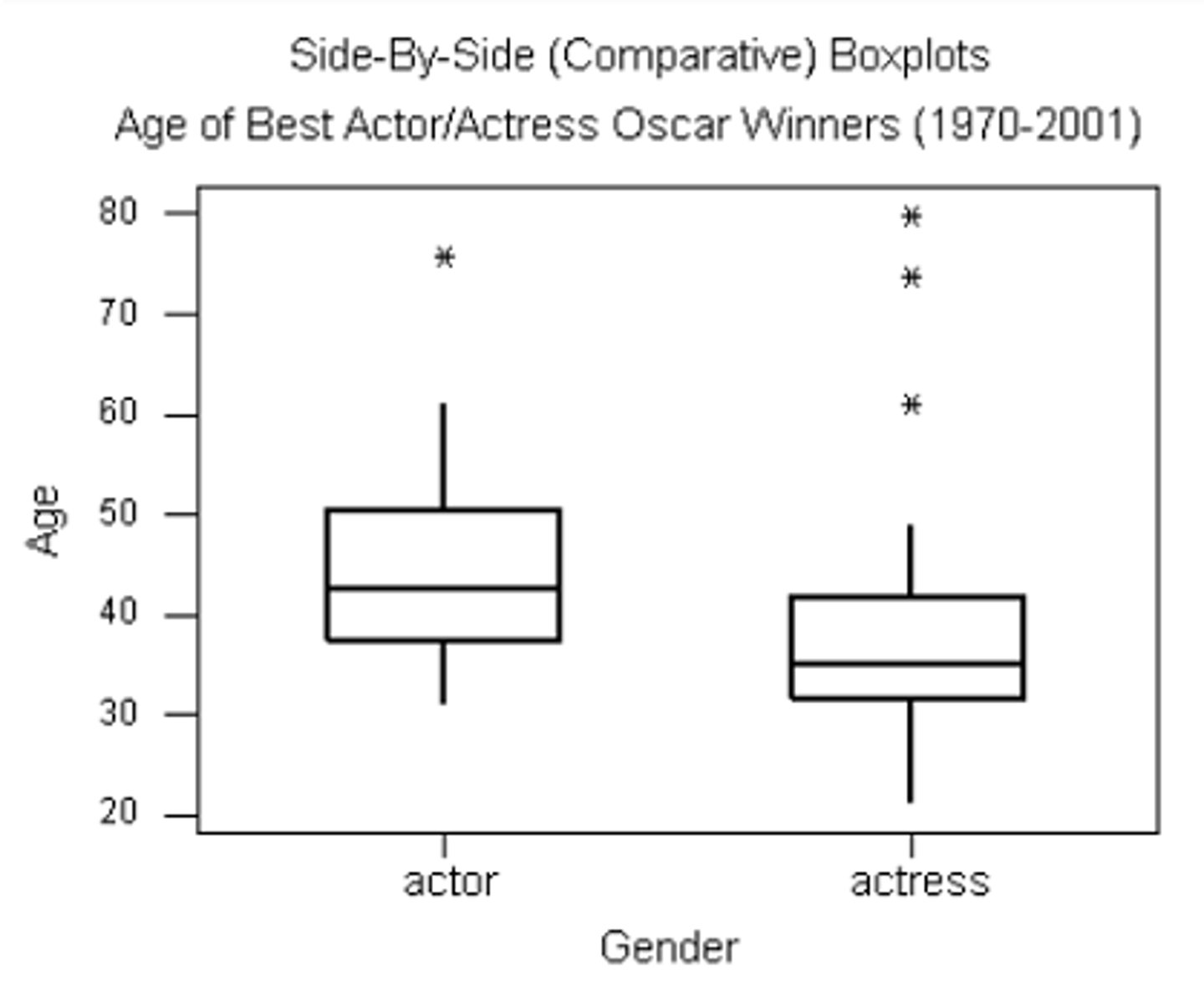
<p>- Box-and-Whiskers Plot</p><p>- Provide a <strong>visual summary of a distribution's central tendency</strong> and spread.</p><p>- Highlight the median, quartiles, and potential outliers.</p>
48
New cards

positive skew

Longer whisker on the top

49
New cards

negative skew

Longer whisker on the bottom

50
New cards

positively skewed

If mean > median

51
New cards

LINE GRAPH

- Are appropriate only when both the X- and Y-axes display ordered (not qualitative) variables

- Generally better than bar charts when comparing changes over time

- Shows trends over time

- Both axes are ordered variables

- Can be smooth or segmented

- Time-series data
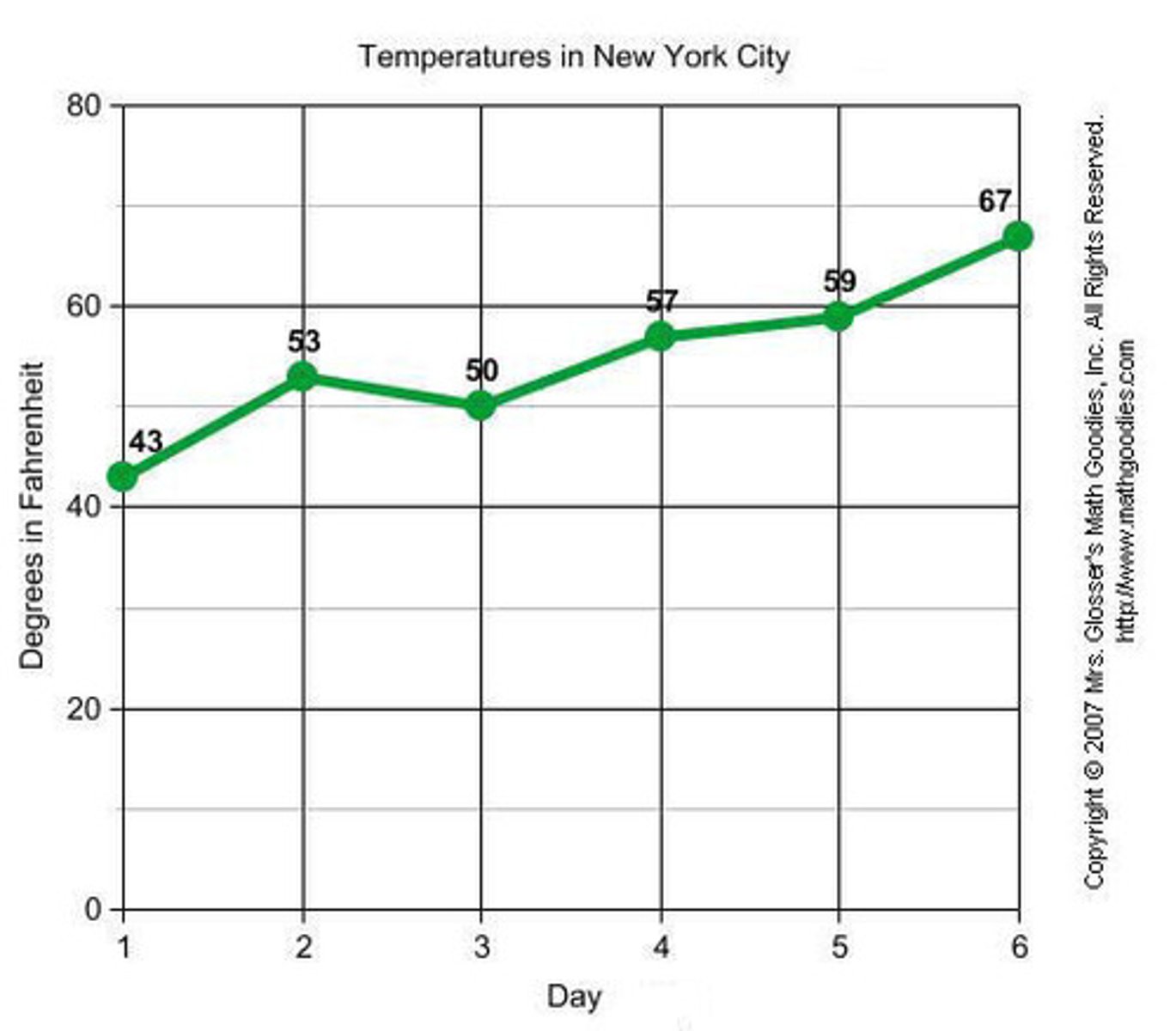
<p>- Are appropriate only when both the <strong>X- and Y-axes display ordered</strong> (not qualitative) variables</p><p>- Generally better than bar charts when comparing changes over time</p><p>- Shows trends over time</p><p>- Both axes are ordered variables</p><p>- Can be smooth or segmented</p><p>- Time-series data</p>
52
New cards

SHAPE OF A DISTRIBUTION

- Guides the choice of analysis.

- The overall pattern of data when plotted (e.g., histogram).

Why it matters in psychology:

- Guides choice of statistical measures.

- Helps detect unusual patterns (e.g., extreme anxiety scores).

- Influences the validity of statistical tests.
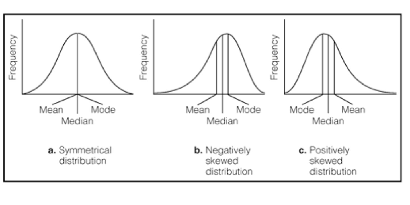
<p>- <strong>Guides</strong> the choice of analysis.</p><p>- The <strong>overall pattern of data</strong> when plotted (e.g., <strong>histogram</strong>).</p><p></p><p><em>Why it matters in psychology:</em></p><p>- Guides choice of statistical measures.</p><p>- <u><mark data-color="blue" style="background-color: blue; color: inherit;">Helps detect unusual patterns</mark></u> (e.g., extreme anxiety scores).</p><p>- <u><mark data-color="blue" style="background-color: blue; color: inherit;">Influences the validity</mark></u> of statistical tests.</p>
53
New cards

Symmetry

- Are both sides mirror images?

- Skewness = 0
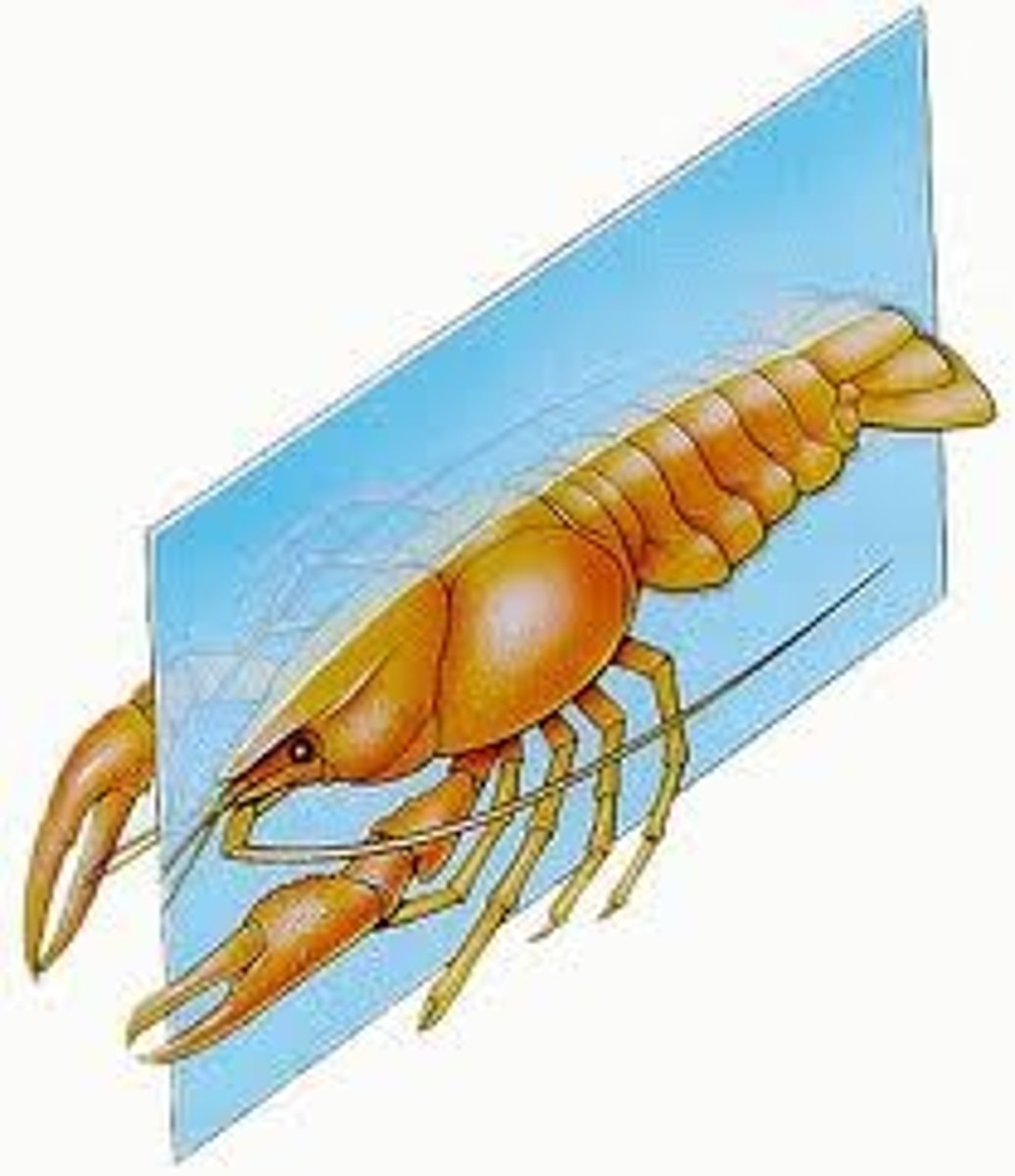
<p>- Are <strong>both sides mirror </strong>images?</p><p>- Skewness = 0</p>
54
New cards

Skewness

- Is one tail longer than the other?

- The degree of asymmetry in a distribution.

- It affects the placement of the mean, median, and mode.

- reveal data characteristics.
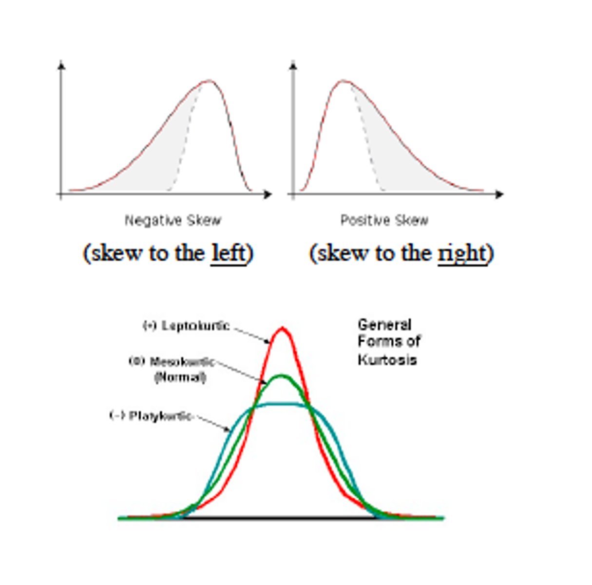
<p>- Is <strong>one tail longer</strong> than the other?</p><p>- The<strong> degree of asymmetry</strong> in a distribution. </p><p>- It <u><mark data-color="red" style="background-color: red; color: inherit;">affects the placement </mark></u>of the mean, median, and mode.</p><p>- reveal data characteristics.</p>
55
New cards

Kurtosis

- How peaked or flat is the curve?

- reveal data characteristics.

- Describes "peakedness" and "tailedness" of a distribution.
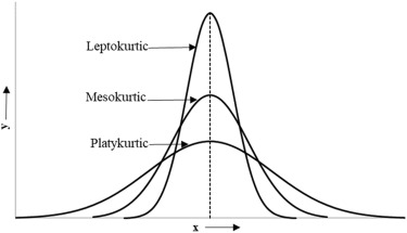
<p>- How <strong>peaked or flat </strong>is the curve?</p><p>- <strong>reveal </strong>data characteristics.</p><p>- Describes<strong> "peakedness"</strong> and <strong>"tailedness" </strong>of a distribution.</p>
56
New cards

SYMMETRICAL DISTRIBUTIONS

- A distribution where left and right halves are mirror images.

- Rare in real-world psychological data but many are approximately symmetrical.

Psychology Example:

IQ scores in the general population are approximately symmetrical, making the mean, median, and mode nearly equal.
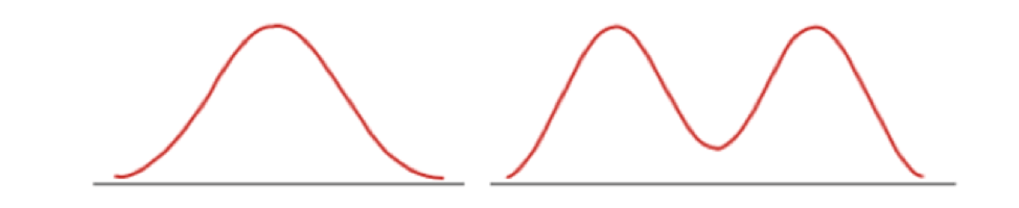
<p>- A <u><mark data-color="#e7ffdc" style="background-color: rgb(231, 255, 220); color: inherit;">distribution where left and right halves</mark></u> are <strong>mirror </strong>images.</p><p>- <strong>Rare in real-world psychological data</strong> but many are approximately symmetrical.</p><p><strong>Psychology Example:</strong></p><p>IQ scores in the general population are approximately symmetrical, making the mean, median, and mode nearly equal.</p>
57
New cards

Normal distribution

is the classic example.
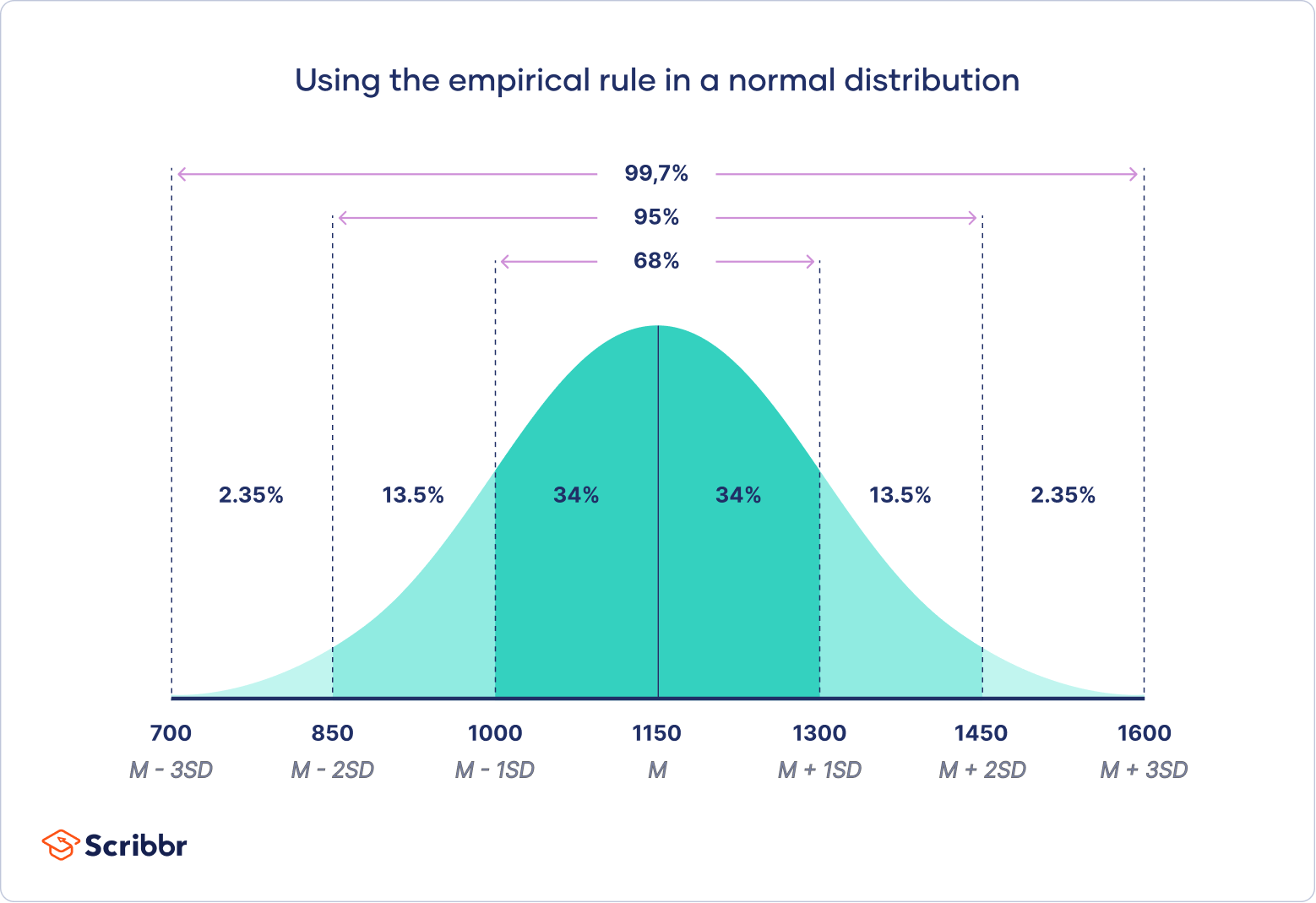
<p>is the <strong>classic example</strong>.</p>
58
New cards

BIMODAL DISTRIBUTIONS

- A distribution with two distinct peaks.

Why it matters:

- Indicates the presence of two subgroups or underlying processes.

- Average (mean) may not represent either group well.

- Potential for overlooking important insights.

- Requires a much more sophisticated measure.

Psychology Example:

Stress levels among hospital staff may show one peak for nurses and another for doctors.
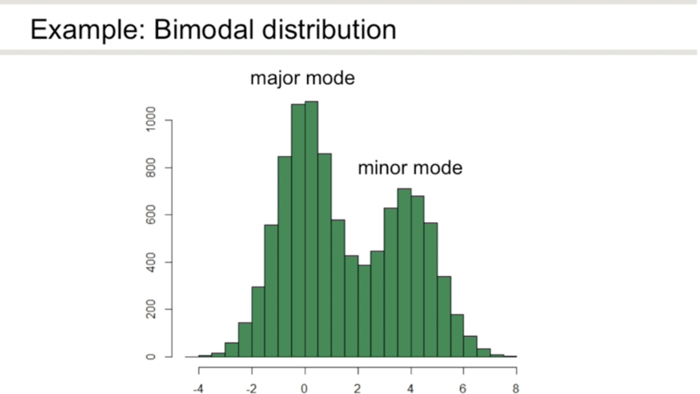
<p>- A distribution with <strong>two distinct peaks</strong>.</p><p><strong>Why it matters:</strong></p><p>- Indicates the <u><mark data-color="green" style="background-color: green; color: inherit;">presence of two subgroups or underlying processes</mark></u>.</p><p>- Average (mean) may not represent either group well.</p><p>- Potential for <u><mark data-color="green" style="background-color: green; color: inherit;">overlooking important insights</mark></u>.</p><p>- Requires a much <u><mark data-color="green" style="background-color: green; color: inherit;">more sophisticated measure</mark></u>.</p><p><strong>Psychology Example:</strong></p><p>Stress levels among hospital staff may show one peak for nurses and another for doctors.</p>
59
New cards

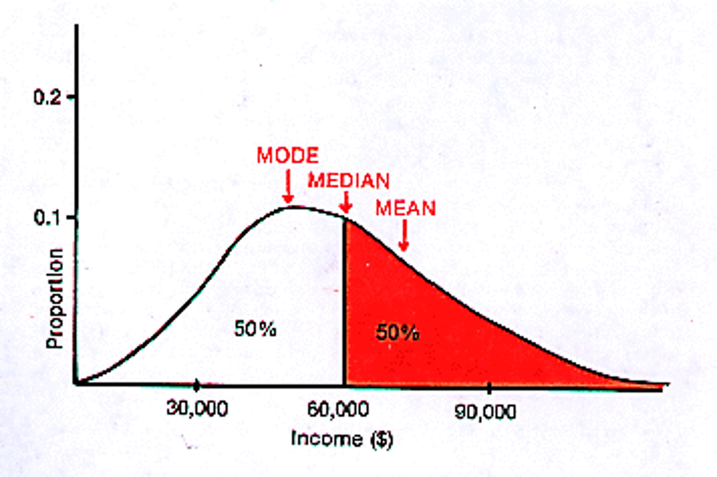
Positive skew

→ tail to the right.

- Tail on the right is longer.

- Mean > Median > Mode.

- Often caused by extreme high values.

- Skewness > +0.4

Psychology Example:

Therapy wait times — most clients start quickly, but a few wait months.
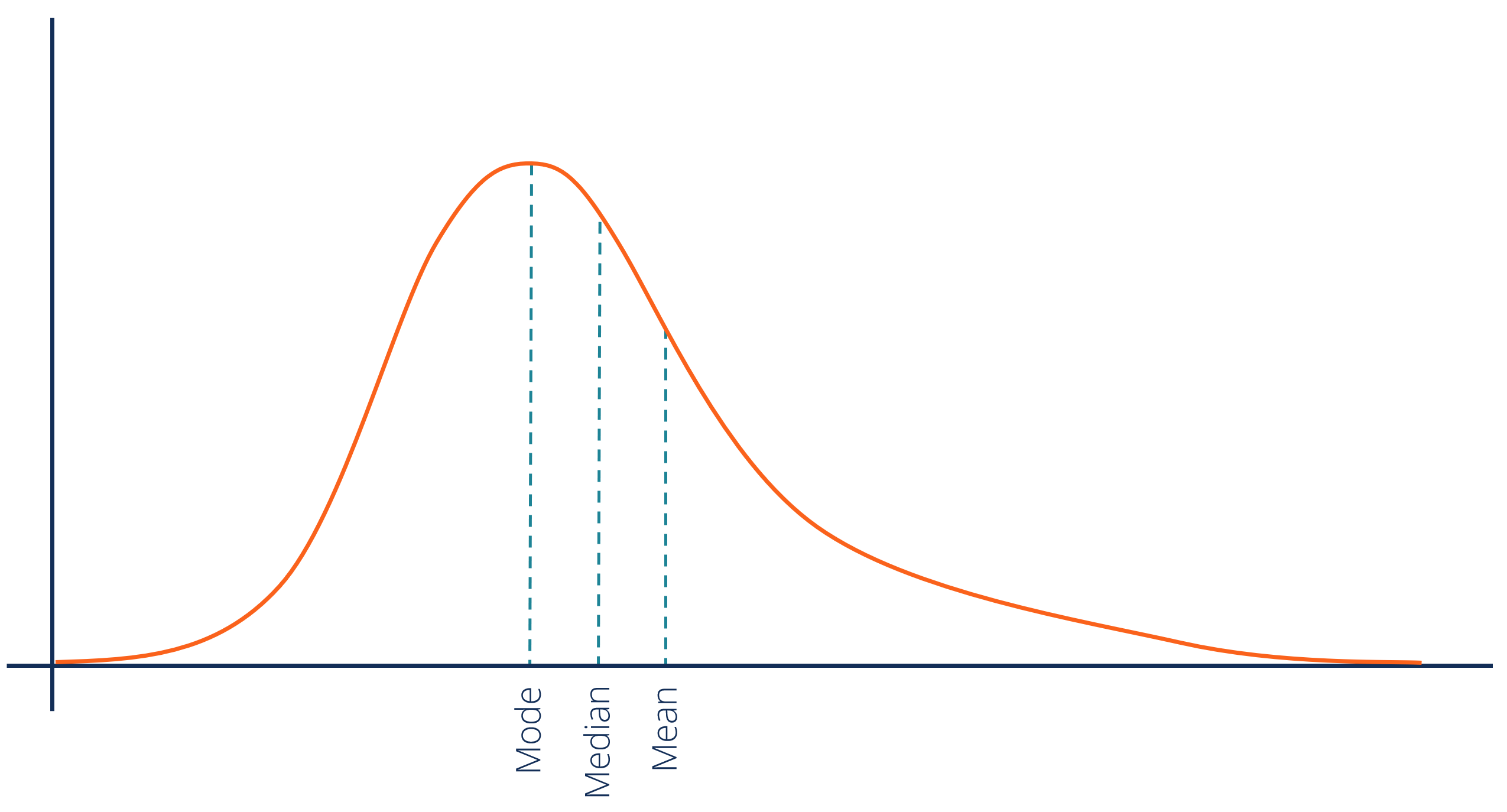
<p>→ tail to the <strong>right</strong>.</p><p>- Tail on the<strong> right is longer</strong>.</p><p>- Mean &gt; Median &gt; Mode.</p><p>- Often caused by <strong>extreme high values</strong>.</p><p>- Skewness &gt; +0.4</p><p><strong>Psychology Example:</strong></p><p>Therapy wait times — most clients start quickly, but a few wait months.</p>
60
New cards

Negative skew

→ tail to the left.

- Tail on the left is longer.

- Mean < Median < Mode.

- Often caused by extreme low values.

- Skewness < -0.4

Psychology Example:

Memory recall scores in older adults — most score high, but a few with impairments pull the tail left.
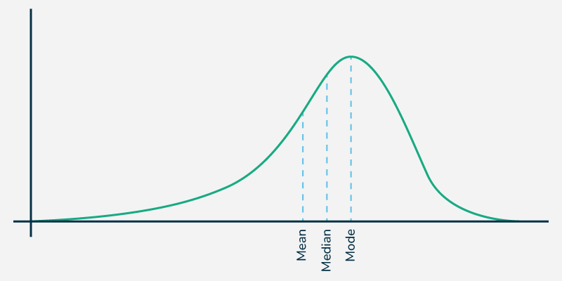
<p>→ tail to the <strong>left</strong>.</p><p>- Tail on the <strong>left is longer</strong>.</p><p>- Mean &lt; Median &lt; Mode.</p><p>- Often caused by <strong>extreme low values</strong>.</p><p>- Skewness &lt; -0.4</p><p><strong>Psychology Example:</strong></p><p>Memory recall scores in older adults — most score high, but a few with impairments pull the tail left.</p>
61
New cards

Approximately Symmetrical

−0.4 ≤ Skewness ≤ 0.4

62
New cards

Excess kurtosis

(common in software)

63
New cards

Leptokurtic

- (steep curve)

- Tall peak, heavy tails (more outliers).

- Higher risk of extreme values.

- Kurtosis > 0

Example:

Test anxiety scores in a highly competitive school — most cluster tightly, but some extreme cases exist.
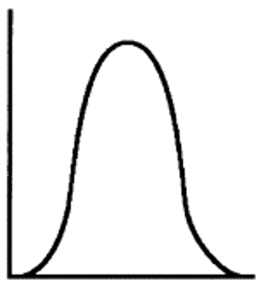
<p>- <u><mark data-color="#cfefde" style="background-color: rgb(207, 239, 222); color: inherit;">(steep curve)</mark></u></p><p>- <strong><u><mark data-color="#d6efde" style="background-color: rgb(214, 239, 222); color: inherit;">Tall peak</mark></u></strong><u><mark data-color="#d6efde" style="background-color: rgb(214, 239, 222); color: inherit;">, heavy tails (more outliers).</mark></u></p><p>- <strong>Higher risk</strong> of extreme values.</p><p>- Kurtosis &gt; 0</p><p><strong>Example:</strong></p><p>Test anxiety scores in a highly competitive school — most cluster tightly, but some extreme cases exist.</p>
64
New cards

Mesokurtic

- (normal curve)

- Moderate peak, moderate tails.

-Shape similar to normal distribution.

- Kurtosis = 0

Example:

Height distribution of adult males.
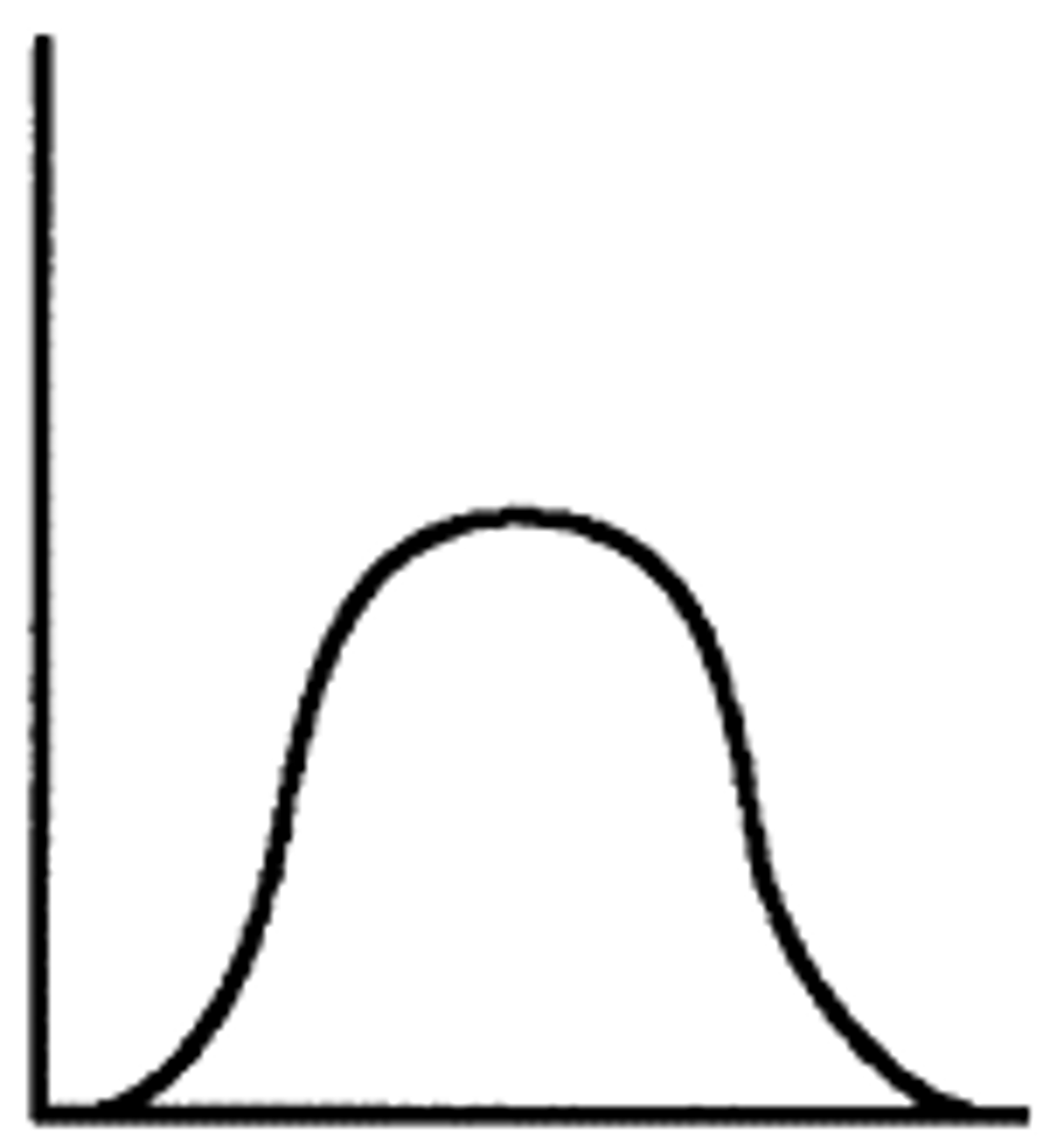
<p>- <mark data-color="#e9f4cd" style="background-color: rgb(233, 244, 205); color: inherit;">(normal curve)</mark></p><p>- <strong>Moderate peak</strong>, <strong>moderate tails</strong>.</p><p>-Shape similar to normal distribution.</p><p>- Kurtosis = 0</p><p><strong>Example:</strong></p><p>Height distribution of adult males.</p>
65
New cards

Platykurtic

- (flat curve)

- Flat peak, light tails.

- Fewer extreme values.

- Kurtosis < 0

Example:

Satisfaction survey where responses are more evenly spread.
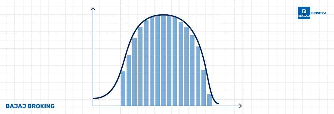
<p>- <strong>(flat curve)</strong></p><p>-<u><mark data-color="blue" style="background-color: blue; color: inherit;"> Flat peak, light tails</mark></u>.</p><p>- <strong>Fewer </strong>extreme values.</p><p>- Kurtosis &lt; 0</p><p><strong>Example:</strong></p><p>Satisfaction survey where responses are more evenly spread.</p>
66
New cards

CENTRAL TENDENCY

- refers to the statistical measures that identify the central point or typical value of a dataset.

- It summarizes data by identifying a representative score around which other values cluster.
<p>- refers to the statistical measures that identify the<strong> central point </strong>or <strong>typical value</strong> of a dataset.</p><p>- It <u><mark data-color="#fbffed" style="background-color: rgb(251, 255, 237); color: inherit;">summarizes data by identifying a </mark></u><strong><u><mark data-color="#fbffed" style="background-color: rgb(251, 255, 237); color: inherit;">representative score</mark></u></strong><u><mark data-color="#fbffed" style="background-color: rgb(251, 255, 237); color: inherit;"> </mark></u>around which other values cluster.</p>
67
New cards

Mean

- pulled toward tail in skewed data.

- Is the average of a dataset.

- Sum of all of the scores in the distribution divided by the number of scores

68
New cards

Median

- more stable in skewed data.

- The middle score of a set if the scores are organized from the smallest to the largest.

- When there is an odd number of scores, it is still simply the middle number.

- When even numbers, it is still the mean of the two middle scores.

- When there are numbers with the same values, each appearance of that value gets counted.

69
New cards

Mode

- The most frequently occurring value in the dataset

- stays at the peak.

- Only measure that we can use on qualitative or categorical data as well as numerical score data

- A dataset can have one mode, more than one mode, or no mode at all.

70
New cards

Bimodal or multimodal distribution

- several modes

71
New cards

Outliers

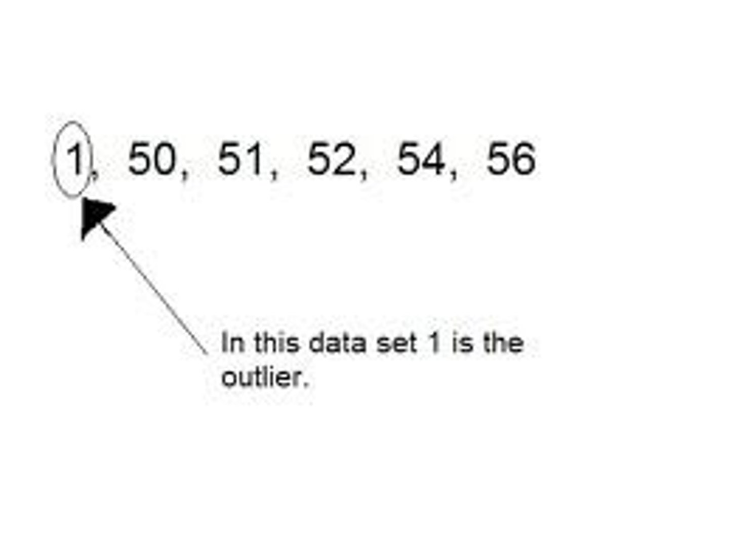
- can represent rare but significant cases or errors.

- must be handled carefully in psychology.
<p>- can<strong> represent rare</strong> <u><mark data-color="#e6e7fc" style="background-color: rgb(230, 231, 252); color: inherit;">but significant cases or errors.</mark></u></p><p>- must be handled carefully in psychology.</p>
72
New cards

Extreme outliers

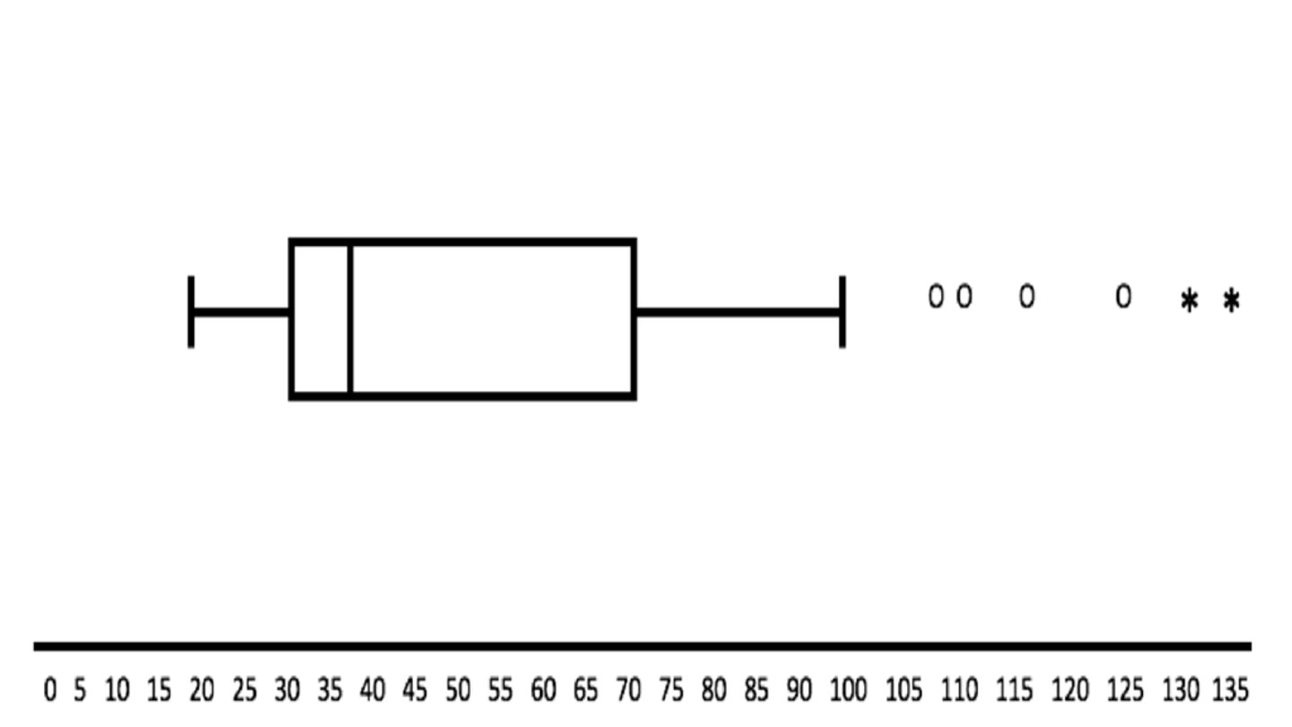
are identified in much the same way but the interquartile range is multiplied by 3 (rather than 1.5)
<p>are identified in much the same way but the<u><mark data-color="#f1e7fa" style="background-color: rgb(241, 231, 250); color: inherit;"> interquartile range is multiplied by 3 </mark></u>(rather than 1.5)</p>
73
New cards

SPREAD/VARIABILITY/DISPERSION

- How "spread out" or clustered a group of scores is?

- are developed which include the extent to which each of the scores in the set differs from the mean score of the set.

74
New cards

measures of variability

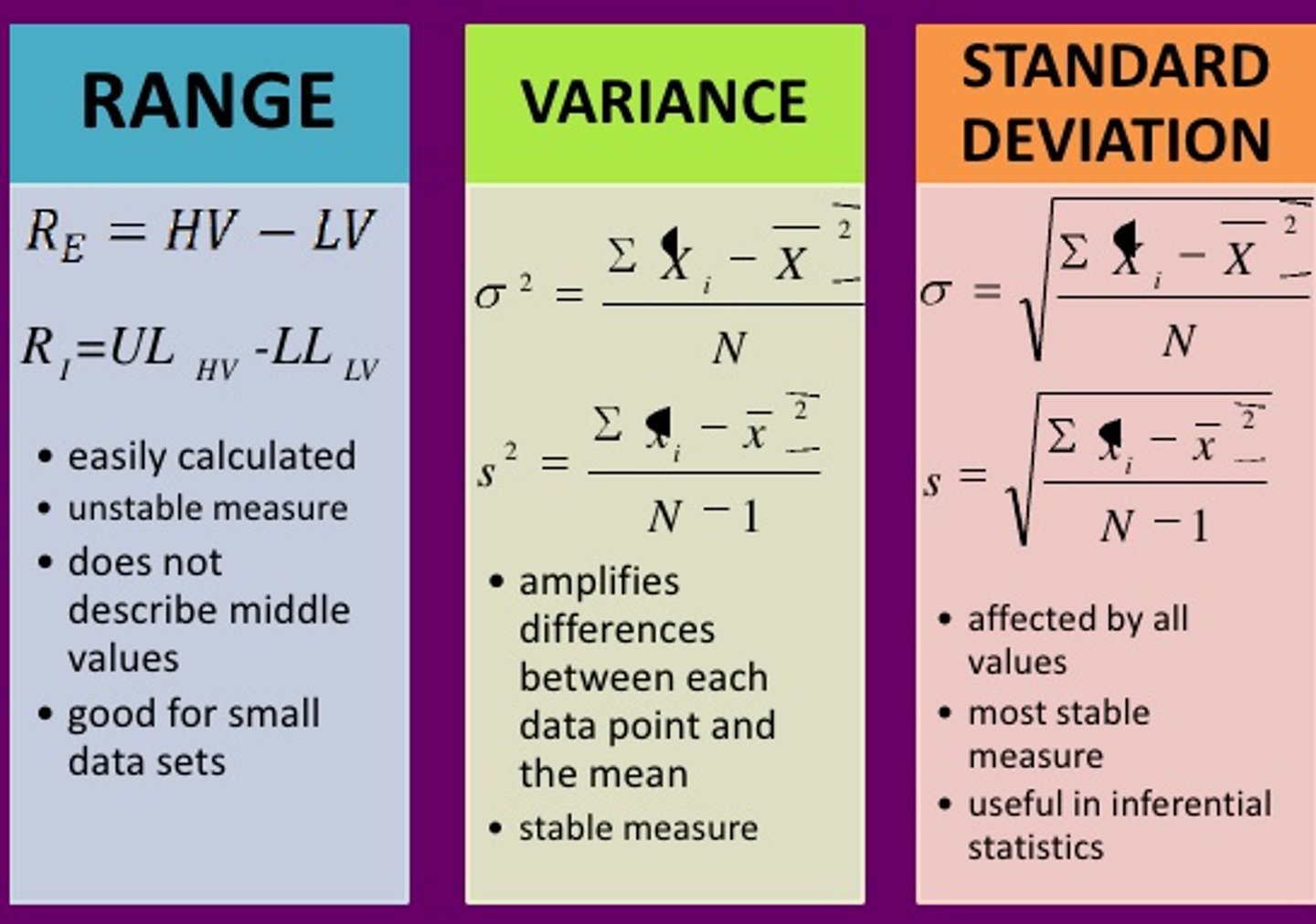
describe how scores in a given dataset differ from one another
<p><u><mark data-color="#f0fbec" style="background-color: rgb(240, 251, 236); color: inherit;">describe how scores in a given dataset </mark></u><strong><u><mark data-color="#f0fbec" style="background-color: rgb(240, 251, 236); color: inherit;">differ</mark></u><mark data-color="#f0fbec" style="background-color: rgb(240, 251, 236); color: inherit;"> </mark></strong>from one another</p>
75
New cards

VARIANCE

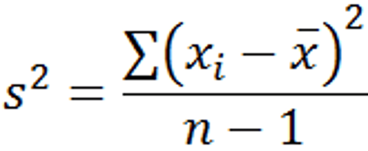
Calculated like the mean deviation, but we square each deviation from the mean before summing the total of these squared
<p>Calculated like the mean deviation, but we<u><mark data-color="#f3d9df" style="background-color: rgb(243, 217, 223); color: inherit;"> square each deviation from the mean before summing the tota</mark>l</u> of these squared</p>
76
New cards

STANDARD DEVIATION

To get back to the original units (e.g., seconds, scores), you take the square root
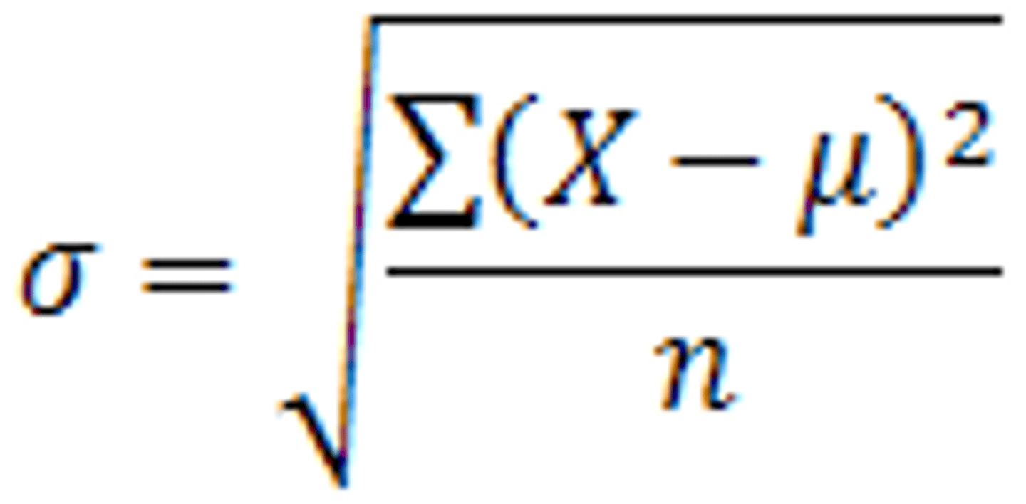
<p>To<u><mark data-color="#f3f6c9" style="background-color: rgb(243, 246, 201); color: inherit;"> get back to the original units </mark></u><strong>(e.g., seconds, scores)</strong>, you take the square root</p>
77
New cards

Low variance

→ most participants have very similar reaction times.

78
New cards

High variance

→ some are very fast, some are very slow

→ might indicate different strategies, attention issues, or outliers.

79
New cards

Estimated variance

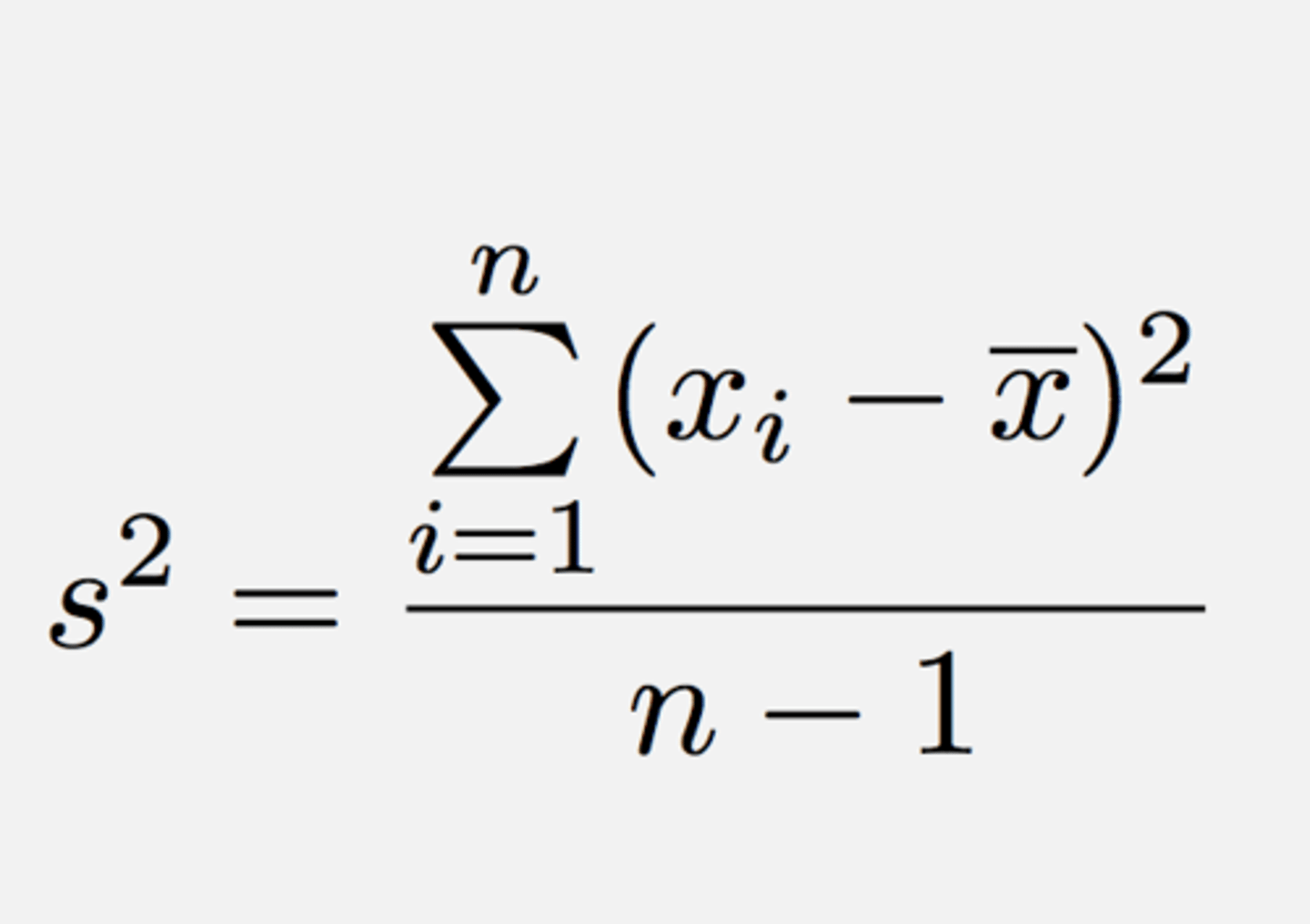
is your best guess of the variance of the population if you only have the data from a small set of scores.



