Graphic Design Comprehensive Exam
1/89
There's no tags or description
Looks like no tags are added yet.
Name | Mastery | Learn | Test | Matching | Spaced |
|---|
No study sessions yet.
90 Terms
communicates quickly and clearly, balances type and image seamlessly, evokes emotion and atmosphere, stands out in a visual crowd
what does a great festival poster do?
use color, imagery, and rhythm to evoke mood
how can you create an emotional connection through a poster?
use composition, motion, or rhythm to build energy; keep it dynamic and bold
how can you build anticipation through a poster?
use hierarchy to guide the eye naturally, keep type legible from a distance
how can you communicate clearly through a poster?
visual/verbal synergy
the cooperative action of words and pictures used together to create a gestalt meaning that together their meaning is greater than the sum of the individual parts on their own
hierarchy
using scale, weight, and placement to control reading order
composition
arranging elements so they feel intentional and balanced
rhythm
using repetition and alignment to create flow
graphic resonance
a term borrowed from music — it refers to reverberation, tone, and subtle emotional quality. In design, it describes how meaning lingers through the expressive relationship between type, image, and form.
acts as a vehicle for communication, sales tool
what are the basic functions of a letterhead?
8.5” x 11”
us letterhead standard size
2” x 3.5”
us business card standard size
4.125” x 9.5”
us #10 envelope standard size
commercial, squareback, policy
types of envelopes
address, phone numbers, web and social media addresses
letterhead secondary type
9 pt
what size should letterhead secondary type be?
logo, name and occupational title, personal contact info, mailing address of company, business phone number, website
what should a business card include?
vertical, horizontal, short fold vertical, short fold horizontal, z-fold, tent fold, gate fold, book fold
what are the different kinds of business cards?
logo, mailing address, business phone number, website
what should be included on the letterhead writing sheet?
soft returns
what should you use instead of pilcrows to break up paragraphs in a writing sheet?
name, address, greeting
what does a writing sheet start with?
logo, company address, website
what should be included on an envelope?
reserved for postal barcodes
why should you not include any text or design in the bottom .625” of an envelope?
converted envelope
a custom-sized or specially designed envelope, or any type of envelope not available in an envelope manufacturer’s standard line. these are generally only economical for large print runs.
white
what is the most common paper color for letterhead?
100% cotton
what is the highest quality paper available for letterheads?
watermark
an image or pattern built into the paper during manufacturing, often showing the paper company’s brand
volume
creating a sense of depth or space
dominance
guiding the viewer’s eye toward focal points
level of excitement
setting mood, energy, or intensity
temperature
shifting perception through warm or cool tones
symbolic value
carrying meaning through cultural or emotional associations
audience, budget, character of company, cultural associations, trends
key considerations for choosing color
hue
the name by which we identify color
value
the degree of lightness or darkness of a hue
saturation
measure of a color’s purity or brightness
primary colors
red, yellow, and blue
secondary colors
green, orange, purple
tertiary colors
red-orange, yellow-orange, yellow-green, blue-green, red-violet, blue-violet
complimentary
colors opposite each other on the color wheel
split complementary
one hue and the two hues on either side of its direct complement
analogous
next to each other on the color wheel
monochromatic
one hue in several different values
RGB
additive colors; red, green, and blue
CMYK
subtractive colors; cyan, magenta, yellow, and black
Pantone Matching System
precise matching system that provides thousands of formulas, ensuring a brand’s color looks the same across presses, papers, and even different print shops.
tint
made by adding white to a hue
shade
made by adding black to a hue
transparency
determines how much of the underlying background is visible behind a color
rich black
adding small percentages of the other three inks (C, M, and Y) to deepen and intensify the black appearance, resulting in a darker, more robust tone
simultaneous contrast
describes how colors change in appearance when placed next to other colors—especially their opposites. This effect makes hues appear more vibrant and distinct, which is why it’s such a powerful tool in design
simultaneity
the fusion of unlike elements—such as word and image—so they exist or occur at the same time. In logo design, simultaneity allows visuals and text to work together as a unified idea
denotation
the literal or primary meaning of a word or image—what it directly represents
connotation
the ideas, emotions, or associations a word or image suggests beyond its literal meaning
mark and name
what are the two basic parts of a logo?
mark
conveys tangible or intangible information about the company, product, or service through symbolism
name
the typographic portion of the logo, designed to clearly communicate the name of the brand
tagline
short catchphrase that adds clarity and helps define the company
icon series
a group of logos, spot illustrations, or symbols that work together as a unified set. they should be visually related through style and proportion—and conceptually connected through theme or idea
conceptual unity
sharing an idea, theme, or story—whether it’s a cultural reference, environment, or humorous twist
correspondence
ensures the parts relate to one another in form, rhythm, and meaning—so the set works as a whole
line, shape, space, value, texture
elements of design
balance, repetition, emphasis, unity, variety
principles of design
consistency
builds trust and legibility—through shared line weight, shape language, and proportion
variety
keeps the viewer engaged—through changes in pose, action, or small details
unity
makes your icons legible, professional, and recognizable. It comes from shared traits—line weight, proportions, and theme—paired with small, intentional differences
graphic design
a process for communicating a message with precision, clarity, and interest. It combines visual elements—like type, image, and layout—to create communication that is both effective and engaging
object → compound path → make
how do you make a compound path?
curvature tool
what should you use to make curves in illustrator instead of the pen tool?
creating visual concepts and developing layouts/production designs
a graphic designer has what two main jobs?
gestalt
perceiving the whole of a design to be greater than the sum of its parts; applying principles to create a unified design
type
treat ___ as image, as though it is just as important
2
use ___ typefaces maximum
eye
measure with your _____
hierarchy
show one thing first and establish _________
changes the contrast and tone of certain colors through simultaneous contrast
how does printing on colored paper change your ink colors?
CEOs
monarch stationary is generally reserved for ____
faint
the watermark on a letterhead design should be _________ on the front of the writing sheet
90%
what percentage of letterhead is printed on white paper?
3,000
there are over _____ different shades of white paper available
livable, usable, available, blendable
secondary type should be…
optical character recognition
what does OCR stand for?
a zip code is a code assigned to each area where mail can be received, and the extra four numbers act as a more specific delivery route
what is a zip code + four?
it can cause machine reading issues for the OCRs automatic sorting machines use
why is it not a good idea to make an envelope black or a dark color?
invisible characters can be triggered with command + alt + i and show specific characters that show the spaces, paragraph breaks, and soft returns in a group of text; they’re helpful for seeing where errors in body copy may lie
what are invisible characters and why are they helpful?
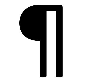
paragraph/hard return
can you identify this hidden character?
soft return/forced line break
can you identify this hidden character?

space
can you identify this hidden character?

date, address, salutation, introduction, body, closing, signature
7 parts of a business letter