Chapter 1: Investigating Data Distributions
1/57
Earn XP
Description and Tags
Investigating data distributions.
Name | Mastery | Learn | Test | Matching | Spaced | Call with Kai |
|---|
No analytics yet
Send a link to your students to track their progress
58 Terms
Types of Data: Categorical (Qualitative) Data
Variables that represent qualities or groupings. Data that cannot be measured in the form of numbers and sorted into categories. Descriptive, interpretation-based.
Types of Data (under Categorial Data): Nominal Variables
Used to group individuals according to a particular characteristic (there is no clear order to the categories).
E.g., Colour of Hair, Nationality, Eye Colour, Name, ID)
Distributed into distinct categories and defined categories
Types of Data (under Categorial Data): Ordinal Variables
Data values that can be used to both group and order individuals according to a particular characteristic (include an order to the categories).
Cannot take an average of and can include numerical values!
E.g., Year, Postcode, Bankcard number, 1st/2nd/3rd
Types of Data: Numerical (Quantitative) Data
Variables that represent quantities and can be expressed in numerical values. Commonly used in statistical manipulation. Numbers-based, countable.
Types of Data (under Numerical Data): Discrete Variables
Countable, has an end.
Whole numbers, decimals/fractions (integers) (if there is a specific set, e.g., halves or quarters)
E.g., Number of _, total students in a class
Types of Data (under Numerical Data): Continuous Variables
Infinite, cannot be counted with an end.
They are infinitely divisible units collected by measuring (increasing level of accuracy)
Decimals, fractions, and whole numbers.
E.g. Height, weight, capacity, temperature, rates, time, etc.
Variables and data types
Depending on the working of the question, some variables can be numerical or categorical.
Tip: If you take the average of the data, does it have any real meaning?
If yes, it is numerical, and if no, it is categorical.
Conversion of one type of data to another
Numerical:
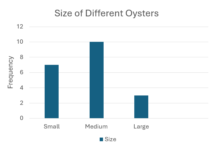
A fisheries inspector records the lengths of 40 cod.
⬇⬆
Categorical:
A fisheries inspector sorts the 40 cod into small, medium, and large size fish.
Univariate data vs Bivariate data
Univariate Data:
Analysing data on a single variable at a time
Explore each variable in data set separately.
Describe centre and spread
Examples:
Histograms
Stem-and-leaf plot
Box and whisker plot
Dot Plotthe data
Pie Charts
Bivariate Data:
Analyse two variables
Explain the cause and relationship (comparison) between an independent and dependent variable.
Examples:
Scatterplots
Stacked bar charts
Line Graph
Frequency Table: Definition
Lists the values of variables in a dataset and how often they occur.
Recorded as:
Number Frequency: How often a value occurs.
Percentage Frequency: Percentage of times a value occurs.
Frequency Table: Calculation
Frequency (Number) = How often a value occurs
Percentage Frequency (%) =
(How often a value occurs / Total number of values) × 100%
Bar Charts
Compares items either among categories or over time.
Components:
Y-axis: Labelled as frequency or percentage frequency.
X-axis: Labelled with the given variable.
Bars:
Height represents frequency or percentage.
Drawn with gaps to show distinct categories.
One bar = one category.
Intervals: Use equal increments.
Title: Clearly describes the data.
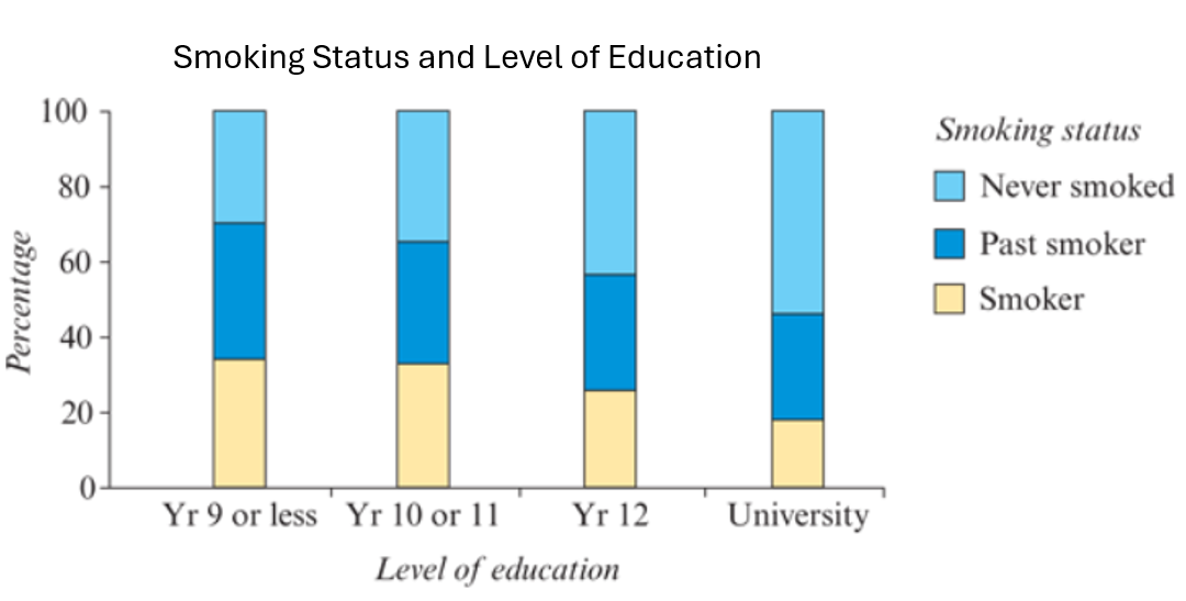
Segmented Bar Chart
Variation of a bar chart showing composition over time.
Bars are stacked, with segments representing different categories.
Segment lengths reflect frequencies; total height gives overall frequency.
Include:
Title
Equal y-axis intervals
Legend/Key to identify segments
Colors/patterns for clarity
Percentage Segmented Bar Chart
A bar chart where segment lengths represent percentages.
Total bar height is always 100%.
Features:
X-axis: Variable being compared.
Y-axis: Percentage (%).
Include Title.
Use a key/legend to code and identify segments.
BIVARIATE Categorical data - Segmented bar chart
Used to chart two categorical variables. An extended version of single segmented bar chart.
Writing a Report Describing Categorical Data
Context: Summarise data collection and number of individuals.
Dominant category (mode): State frequency or percentage (or state if no mode exists).
Order & Importance: Rank categories and their relative importance.
Other Frequencies: 2nd highest and lowest frequency categories.
Recommendations: Suggestions and further analysis needed.
Note: It is important to use descriptive words relating to the frequency and different categories.
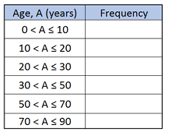
Numerical Univariate Data - Grouped frequency table
Use " - <*" notation to create non-overlapping class intervals.
Typically, 5 to 15 intervals are used.
Example: 0 - <10, 30.0 - 34.9.
Ensures data is grouped without overlap.
*The upper boundary is not included, ensuring no overlap between intervals.
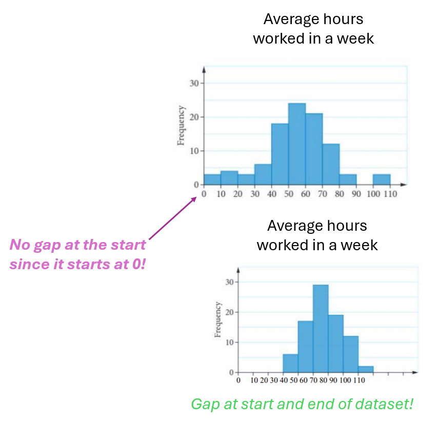
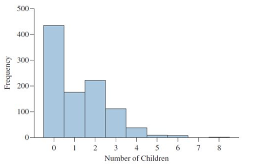
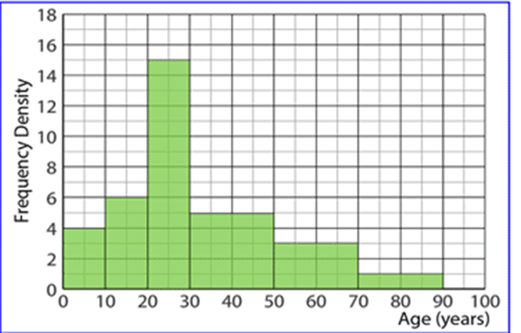
Numerical Univariate Data - Histogram
Y-axis: Frequency (count or percentage).
X-axis: Values of the variable, with each bar corresponding to a data interval.
Bars have no gaps between them (unless data starts at zero).
The title must be included.
Shows the distribution of a single variable.
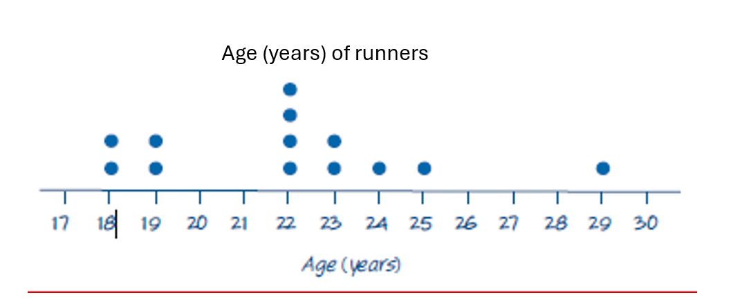
Numerical Univariate Data - Dot plots
Similar to a histogram but uses dots for each data point.
Suitable for discrete numerical data and small datasets (<20 data points).
The title must be included.
Ideal for visualising individual data points.
No y-axis, but dots must be evenly spaced to provide the same visual effect as a y-axis.
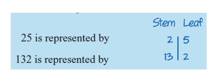
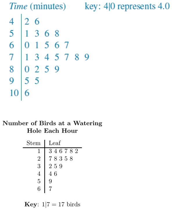
Numerical Univariate Data - Stem-and-leaf plots
Three types:
Standard stem-and-leaf plot
Split stem
Back-to-back stem-and-leaf plot
Structure:
Stem: Leading digit(s)
Leaf: Trailing digit (always singular)
Key must always be included for clarity.
Standard Stem and Leaf Plot
Suitable for up to 50 data points.
Key: Must include units and help interpret the diagram.
Title: Must be included.
Aim to have between 5 and 10 class intervals.
Split stems: Data range (e.g., 0-4) uses one stem, and the next range (e.g., 5-9) uses a second stem.*
Asterisk (*): Indicates the second split stem.
Advantages:
Retains original data values.
Shows shape, outliers, centre, and spread of the distribution.
*e.g., 1 | 0, 1, 2, 3, 4 for data points 10-14 and 1* | 5, 6, 7, 8, 9 for data points 15-19.
Summary – Univariate data Display
Categorical Distribution | Numerical Distribution | |
Table | Frequency table | Grouped Frequency Table |
Chart | Bar Chart (Percentage) Segmented Bar Chart – max 5 categories | Histogram (N > 40) Stem and Leaf Plots (N < 50) Dot Plots (N<20) Box Plots (seen next year) |
Numerical univariate Data – Histogram
Frequency Table vs Group Frequency Table (Discrete / Continuous Distribution)
Discrete Distribution:
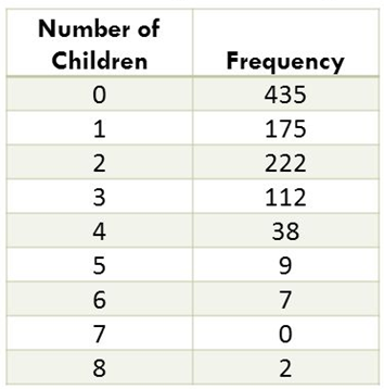
Continuous Distribution:
Interpretation of Categorical Variable Distribution
Qualitative data that is classified, not quantified.
Descriptive Measures: numbers used to describe data sets.
E.g., Measures of central tendency: Mean (ordinal), median (ordinal), mode
Examples:
Tables: Frequency tables or percentage frequency tables.
Graphs: Bar charts or segmented bar charts.
Analysing Categorical Variable Distribution
State Total Frequency (Sample Size): Include the total number of observations and different categories/options.
Identify Modal Category: Mention if significantly larger than others.
Percentage Frequencies:
Provide for the modal category.
Optionally include others if relevant.
Focus on Key Categories: Avoid listing all when many exist.
Use Descriptive Terms: Clearly interpret trends or patterns.
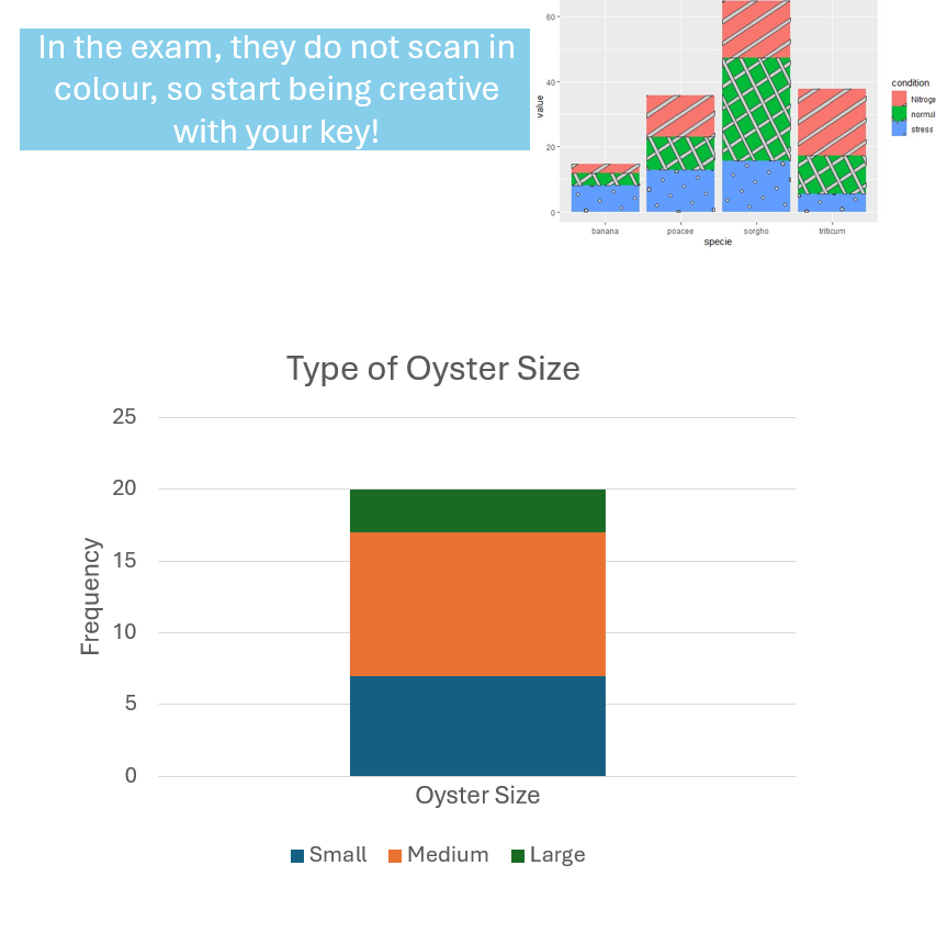
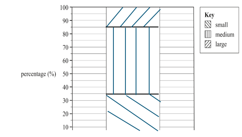
Example: The type of oyster sizes of 20 oysters were classified as “small”, “medium” or “large”. The majority of 50% oysters were found to be of medium size. Of the remaining oysters, 35% were found to be small and 15% were found to be large.
Interpreting Univariate Numerical Data - SOCS
In any analysis of univariate numerical data, you must make specific mention of 4 key features:
Shape
Outliers
Centre
Spread
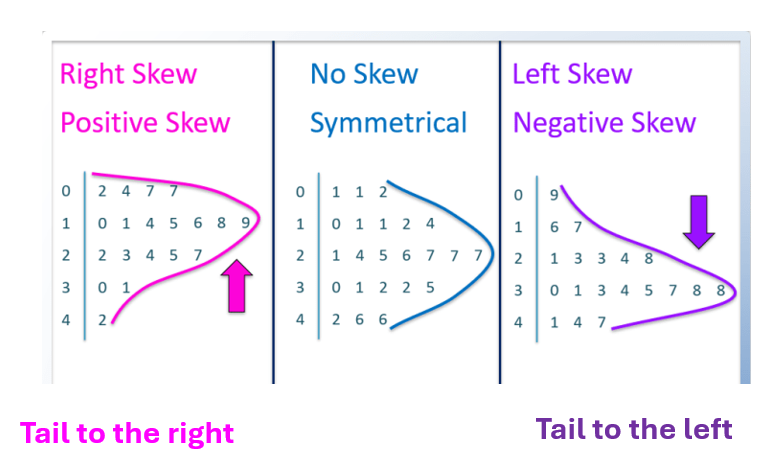
Key features of a histogram - Shape
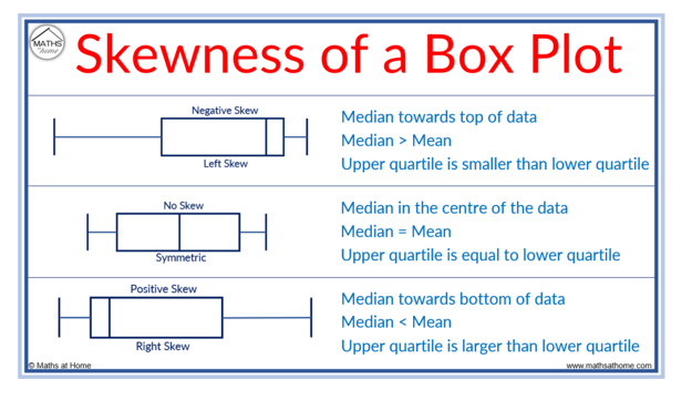
Negatively Skewed (-ve): tails to the left towards -ve direction, mean < median.
Positively Skewed (+ve): tails to the right towards +ve direction, mean > median.
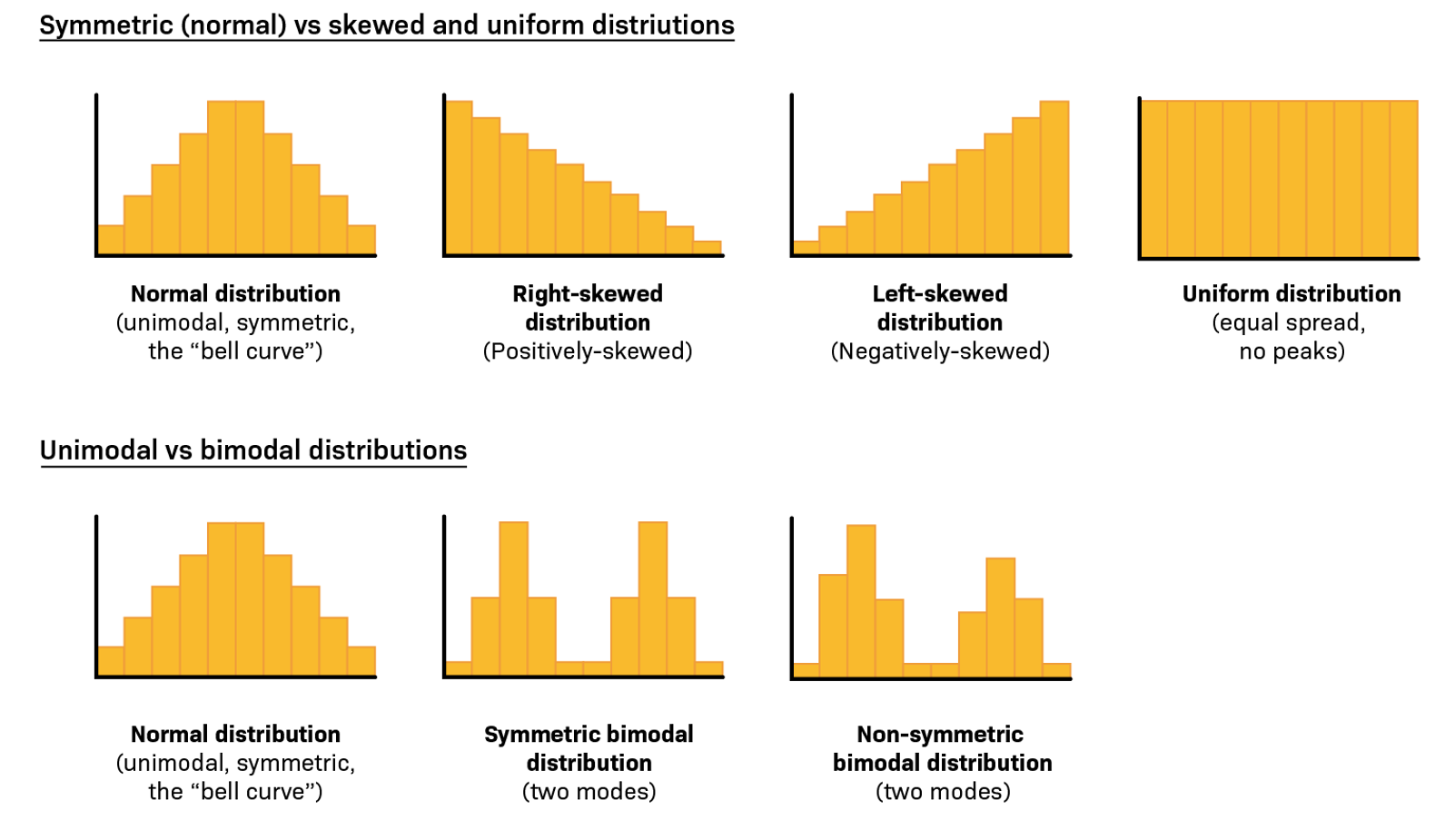
Key Features of stem-and-leaf plot: Shape
Tip: Rotate your book 90° to determine where the tail of your data is moving towards!
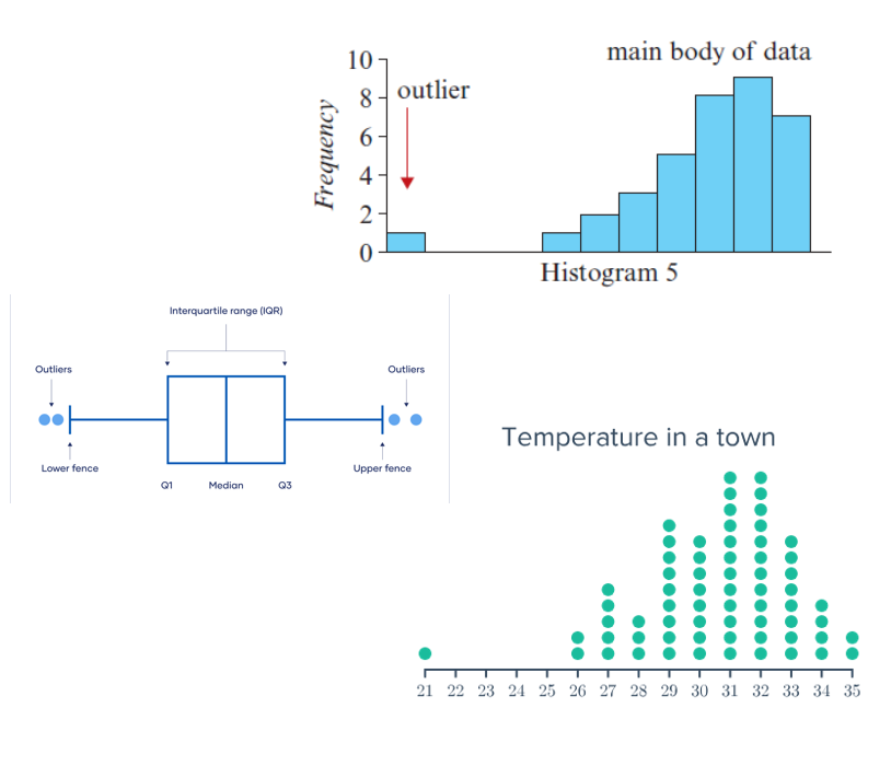
Key features of a histogram - Outliers
Definition: Data values that deviate significantly from the main dataset (typically high/low).
Possible Causes:
Experimental error
Indication of novel/unique data
Extreme or "freak" values
Effects on Measures:
Not Affected: Mode, median
Significantly Affected: Mean, range
Outliers Test
Step 1: Determine the Median (Q₂)
Q₂ = (n + 1) / 2
Step 2: Identify Q₁ and Q₃
Split the data into halves (below and above the median).
Use (n + 1) / 2 within each half to find Q₁ and Q₃.
Step 3: Calculate IQR
IQR = Q₃ - Q₁
Step 4: Perform Outlier Test
Lower Bound: Q₁ - 1.5 × IQR
Upper Bound: Q₃ + 1.5 × IQR
Any values outside these bounds are outliers.
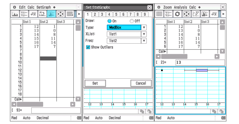
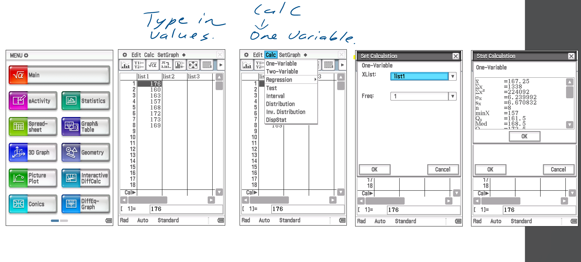
CAS: Outliers Test
Using the Statistics mode:
Enter values into "list 1"
Enter frequencies into "list 2"
Set the graph Type to "MedBox" with "Show Outliers" selected.
Press Set
Analysis → Trace (Show outlier)
Key features of a histogram - Centre
Median Class: The category containing the middle position.
Mean: Average; use only when data is symmetrical and outlier-free.
Modal Class: Category with the highest frequency;
Relevant only when one category significantly stands out.
Median class is usually more useful for describing the center.
CAS: Center
Set Variables:
List 1: Variable (x-axis), rename to description.
List 2: Frequency (y-axis).
Run Calculation:
Go to Calc → One-Variable.
Set Xlist to the data column.
Set Frequency:
1 for single-column data.
Second column for grouped data.
Click OK.
Show Results:
Go to Calc → Display Stat.
Key features of a histogram - Spread
Range: Largest value - smallest value
Use when no outliers.
IQR: Q₃ - Q₁
Use when data is skewed or contains outliers.
minX: Smallest data point in data
maxX: Largest data point in data
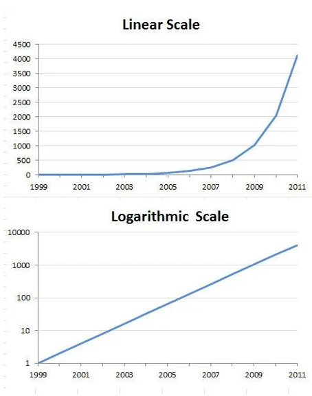
Purpose and application of logarithmic scales to display data
Purpose:
Fit curves to non-linear relationships by applying a logarithmic function, making the data closer to a straight line.
Analyze large ranges of values in a compact form.
Respond to skewness in large data sets.
Applications:
Compress larger x-values by changing the scale to log₁₀(x).
Display data with wide ranges or exponential growth/decay.
Replace each x-value with its logarithm.
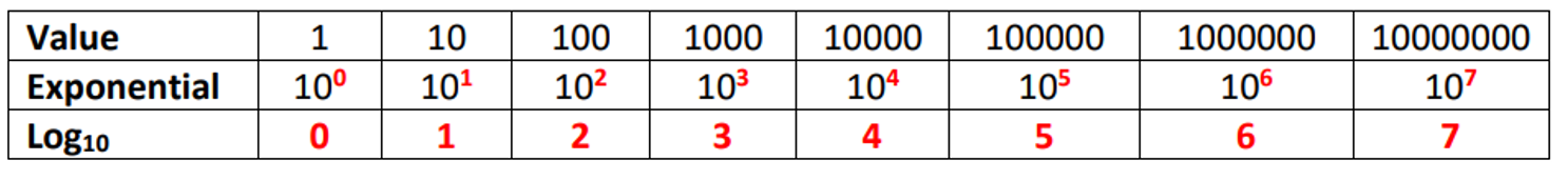
Equation: log₁₀(x) = b, then 10ᵇ = x
Example: log₁₀(8) ≈ 0.9, since 10⁰.⁹ ≈ 8.
Properties of Log10(x)
If x > 1, then log₁₀(x) is positive.
If 0 < x < 1, then log₁₀(x) is negative.
If x ≤ 0, then log₁₀(x) is undefined.
If x = 1, then log₁₀(x) is zero.
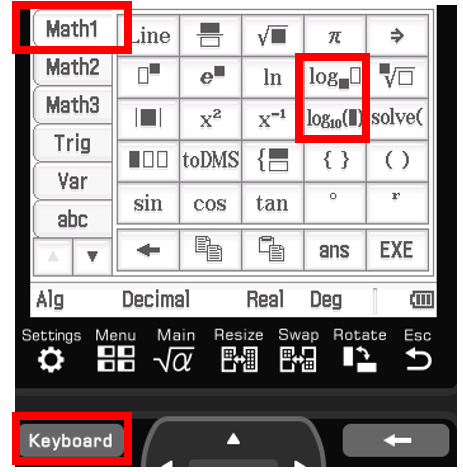
CAS: Logarithm
Logarithm of 45:
log₁₀(45) ≈ 1.653
Use CAS: log(10, 45).
Find number for log = 2.7125:
log₁₀(x) = 2.7125, solve for x.
x ≈ 515.
Use CAS: solve(log(10, x) = 2.7125, x) or 102.7125
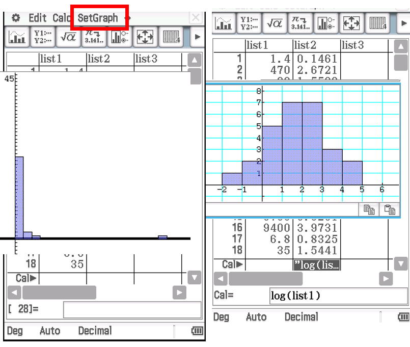
Constructing Histograms on CAS (Inc. Log)
Open Statistics mode.
Enter data into List 1.
Go to SetGraph:
Turn Draw to On.
Set Type to Histogram.
Choose Xlist as List 1.
Set Freq to 1.
Press Set.
Select the Graph button for the histogram.
In the Set Interval box:
Set Hstart to the given value.
Set Hstep to the given value.
——————————————————- Log ⬇
In List 2, go to the last cell (Cal).
Type log(List1) in the calculation window.
Create a new Histogram:
Set Xlist to List 2.
Keep Freq as 1.
The histogram will display with bars starting at Hstart, increasing by Hstep per bar.
Five-Number Summary
Minimum Score: Lowest score.
Q1: 25% of data is below.
Median (Q2): Midpoint, 50% of data is below.
Q3: 75% of data is below.
Maximum Score: Highest score.
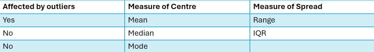
Median Properties and Use
Not affected by outliers.
Applied to ordinal, discrete, and continuous data.
Use when distribution is skewed or non-normal, or data is ordinal
Formula: Median = (n+1)/2th position.
Odd Data: Middle value.
Even Data: Average of two middle values.
Example:
Data: 2, 9, 1, 8, 3, 5, 3, 8, 1 → Ordered: 1, 1, 2, 3, 3, 5, 8, 8, 9 → Median = 3.
Data: 10, 1, 3, 4, 8, 6, 10, 1, 2, 6 → Ordered: 1, 1, 2, 3, 4, 6, 6, 8, 10, 10 → Median = 5.
Mean Calculation & Usage
Formula: x̄ = Σx / n
Use: Data with equal intervals, symmetric distribution, no outliers.
Sensitive to: Outliers in skewed data.

Mean v.s. Median: Better measure of centre
Median: Better for skewed data or with outliers (based on order, not values).
Mean: Best for symmetric data with no outliers, gives average value.
Summary of Advantages/Disadvantages of measures of central tendency
Benefits | Disadvantage | |
Mode | •Quick and easy to compute •Useful for nominal data | •Poor sampling stability |
Median | •Not affected by extreme scores | •Somewhat poor sampling stability |
Mean | •Sampling stability •Related to variance •Provides characteristic of distribution | •Inappropriate for discrete data •Affected by skewed data •Less reliable when distribution is skewed or contains outliers |
Mode
Most common value in a data set.
Types: Unimodal, Bimodal, Trimodal, Multimodal.
Can be used for both qualitative and quantitative data.
Not affected by outliers, but may be close to extreme values, making it a weak measure of centre.
Range
Definition: Measure of the maximum spread.
Formula: Range = Largest Data Value - Smallest Data Value.
Note: Affected heavily by outliers, making it an unreliable measure of spread in skewed data.
Interquartile Range (IQR)
Definition: Measures the spread of the middle 50% of data values.
Note: Divides data into quarters.
Advantage: Generally not affected by outliers, making it more reliable than the range.

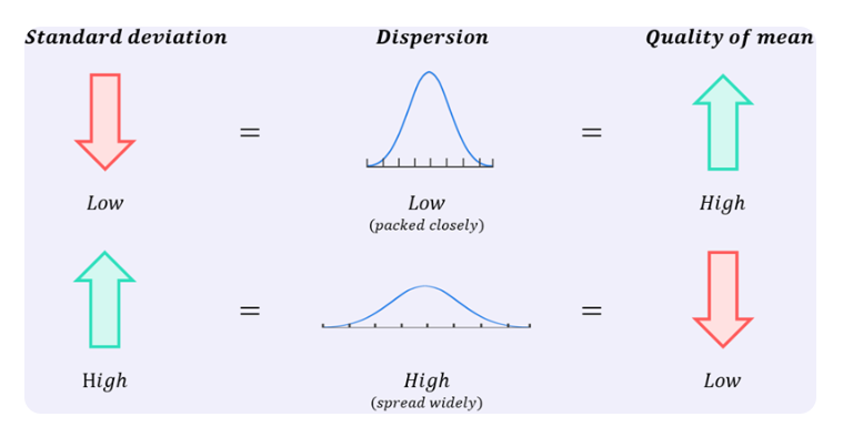
Standard Deviation (s)
Definition: Measures the spread of data around the mean (how far values are from the mean value).
Low SD: Data points are close to the mean.
High SD: Data is spread over a wider range of values.
Formula: s = √(∑(x - x̄)² / (n - 1))
x - x̄: Deviation
∑(x - x̄)²: Sum of squared deviations
Note: Without squaring, the sum of deviations equals zero.
Sensitive to Outliers
CAS: Finding Values
Choice of Spread
Median (M): Use Interquartile Range (IQR) for spread.
Mean (x̄): Use Standard Deviation (SD) for spread.
Box Plot
Median: Splits data into two equal sections (50% above, 50% below).
Quartiles: Split each 50% section into halves, creating 25% sections.
IQR: The box represents 50% of data, from Q1 to Q3.
Boxplot Components:
Number Line: Equal intervals.
Title: Represents the measured variable.
Quartiles: Vertical edges of the box.
Median: Vertical line inside the box.
Whiskers: Lines extending from the box.
Dots: Outliers.
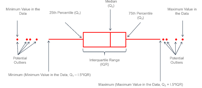
Fences and Outliers + Relating Box Plot to Shape
Fences: Used to identify outliers in data.
Lower Fence: Q1 - 1.5 × IQR.
Upper Fence: Q3 + 1.5 × IQR.
Outliers: Data points outside the fences, denoted by open circles.
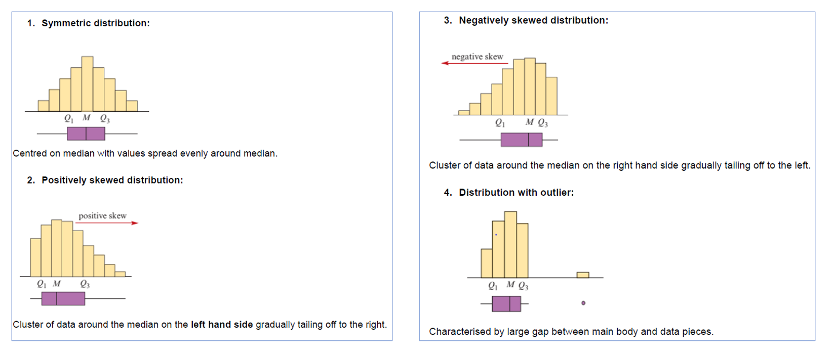
Steps for Skewness in Box Plots
Ignore outliers.
Measure the minimum value → median distance;
Measure the median → maximum value distance;
Use formula: (Highest distance - lower distance)/lower distance.
See which one is more. If higher more, positively skewed; if lower more, negatively skewed; if almost the same, then symmetric.
Boxplot Analysis: SOCS
Shape | Data set creates in a graph (i.e skewness) |
Outliers | Extreme values |
Centre | Median measurement of the center (outlier resistant) |
Spread | IQR and range |
Sample Prompt for a single box plot: The distribution is (state shape) and (state whether there are outliers present). The distribution is centred at (state the median), the median value. The spread of the distribution, as measured by the IQR, is (state IQR) and, as measured by the range (state range).
Note: If the question states units, include them.
For example: Age (years), time (hours), pulse rate (beats per minute).
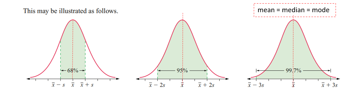
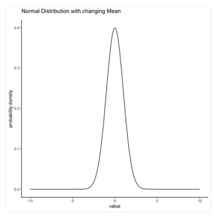
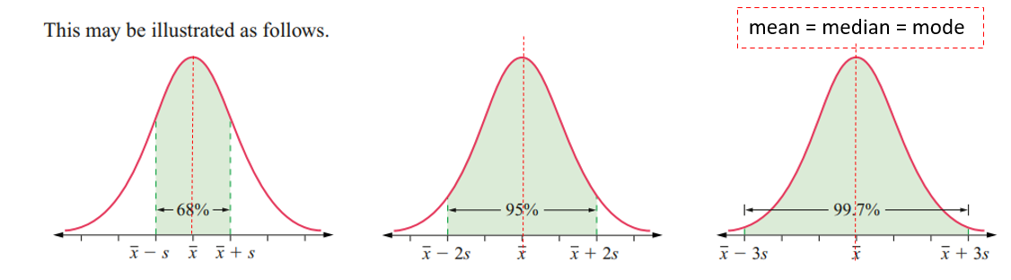
Normal Distribution
Definition: Data is evenly spread in a bell-shaped curve around the mean.
Properties:
50% of data is above and below the mean.
Symmetric about the mean.
Width is approx. 3 standard deviations from the mean.
Shape and size determined by mean and standard deviation.
Example: Height, blood pressure, measurement errors.
Type: Continuous data.
Mean in Normal Distribution
Position: Center of the bell curve.
Characteristics:
Maximum density of observation (highest point of the curve).
Mean = Median = Mode.
Shifting the mean moves the curve left or right.
Behavior: Data clusters around the mean in a normal distribution.
Empirical Rule (68-95-99.7 Rule)
68% of observations are within 1 standard deviation (x̄ ± s).
95% of observations are within 2 standard deviations (x̄ ± 2s).
99.7% of observations are within 3 standard deviations (x̄ ± 3s).
Z - Score and Standardization
Definition: A z-score represents how many standard deviations a data point is from the mean.
Formula:
z = (x - x̄) / s
Where:x = data value
x̄ = mean
s = standard deviation
Interpretation:
Positive z-score: Data point is above the mean.
Negative z-score: Data point is below the mean.
Z-score of 0: Data point is at the mean.
Uses:
Standardize data across distributions.
Compare relative positions of data points.
Calculate the area under the curve for a given z-score.
Examples:
Z = 2: 2 standard deviations above the mean.
Z = -3: 3 standard deviations below the mean.
Standard Z-Scores to Actual Values
Formula:
x = (z * s) + x̄
Where:x = actual data value
z = z-score
s = standard deviation
x̄ = mean
Interpretation:
To find the actual score (x) from a standard score (z), multiply the z-score by the standard deviation (s) and then add the mean (x̄).Example:
If the mean is 50 and the standard deviation is 5, and the z-score is 2, the actual score is:
x = (2 * 5) + 50 = 60