excel tings
1/25
There's no tags or description
Looks like no tags are added yet.
Name | Mastery | Learn | Test | Matching | Spaced |
|---|
No study sessions yet.
26 Terms
What is nominal data?
Definition: Data that represents categories or names with no order or ranking.
Key Characteristics:
Used for labeling variables.
No mathematical meaning (you can’t sort, add, or subtract them).
Examples: gender (male, female), hair color (black, blonde, brown), country (USA, Japan, France).
What is ordinal data?
Definition: Data that represents categories with a specific order, but the differences between ranks are not measurable.
Key Characteristics:
Shows ranking or order.
You can say one is higher/lower, but not how much higher.
Examples: satisfaction rating (satisfied, neutral, dissatisfied), education level (high school, bachelor’s, master’s).
What is interval data?
Definition: Numeric data with equal intervals between values, but no true zero point.
Key Characteristics:
You can add and subtract values meaningfully.
No absolute zero, so ratios (like "twice as much") are not meaningful.
Examples: temperature in Celsius or Fahrenheit, dates on a calendar.
What is ratio data?
Definition: Numeric data with equal intervals between values, with a true zero point.
What is central tendency? What are the 3 measures?
Central tendency refers to the idea of identifying the center or typical value in a set of data. It's a way to describe what is "normal" or "average" for a group of numbers.
Mean, Median, Mode.
What is the mean?
Mean (Average)
Add up all the numbers and divide by how many numbers there are.
Best used when data doesn’t have outliers.
Example: (4 + 6 + 8) ÷ 3 = 6
=AVERAGE
What is the median?
The middle value when the numbers are ordered from smallest to largest.
If there's an even number of values, it's the average of the two middle ones.
Good for skewed data or when there are outliers.
Example: In [3, 5, 9], the median is 5.
=MEDIAN
What is the mode?
The number that appears most frequently.
There can be more than one mode, or no mode at all.
Example: In [2, 4, 4, 6], the mode is 4.
Mode works well for non-numeric data, not affected by outliers.
=MODE
What is spread? What are the 4 measures?
Spread (also called dispersion) refers to how much the values in a dataset vary or how spread out they are around the centre (like the mean or median).
In simple terms, spread tells you how consistent or inconsistent the data is.
Two datasets can have the same mean but very different spreads.
Helps you understand variability, risk, or uncertainty in data.
Range, Standard deviation, Inter-quartile range, Variance
What is the range?
The difference between the highest and lowest values.
Example: If values are [3, 7, 10], the range is 10 − 3 = 7.
Easy to calculate, but affected by outliers.
=MIN, =MAX
What is inter-quartile range?
The range of the middle 50% of the data.
IQR = Q3 − Q1 (where Q1 = 25th percentile, Q3 = 75th percentile).
More resistant to outliers than the regular range.
=QUARTILE
What is variance?
The difference between the values and the mean, square the difference, and then find the average of the squared values
Gives an idea of how far numbers are from the mean, but in squared units.
=VAR
What is standard deviation?
The square root of variance.
Measures average distance from the mean in the same units as the data.
A small standard deviation means values are close to the mean; a large one means they're spread out.
=STDEV
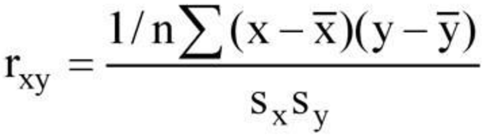
Explain Pearson’s product-moment correlation coefficient (parametric): r
Type: Parametric (assumes data is interval/ratio and normally distributed)
What it measures:
The strength and direction of a linear relationship between two continuous variables.
Assumptions:
Both variables are normally distributed
Relationship is linear
No significant outliers
Data is interval or ratio scale
In excel: =PEARSON(array_1, array_2)
What the result tells you:
r = 1 → Perfect positive linear correlation
r = -1 → Perfect negative linear correlation
r = 0 → No linear correlation
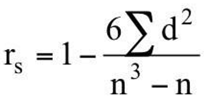
Explain Spearman’s rank correlation coefficient (non-parametric) rs
Type: Non-parametric (does not assume normality or linearity)
What It Measures:
The strength and direction of a monotonic relationship (as one increases, the other tends to increase or decrease — not necessarily in a straight line).
Formula:
If no tied ranks: (view image)
Interpretation:
Same as Pearson’s r:
rs= +1 perfect positive rank correlation
rs= −1 perfect negative rank correlation
rs= 0: No rank correlation
Assumptions:
Ordinal, interval, or ratio data
Relationship is monotonic (not necessarily linear)
Can handle non-normal distributions and outliers
How do you calculate this in excel?
1. Enter your data
Let’s say you have:
Variable X in cells A2:A10
Variable Y in cells B2:B10
2. Rank the data
Use Excel’s =RANK.AVG()function to assign ranks:
In column C, rank X values:
=RANK.AVG(A2, A$2:A$10, 1)In column D, rank Y values:
=RANK.AVG(B2, B$2:B$10, 1)
(The “1” means ascending order. Use “0” for descending.)
Fill both formulas down the column.
3. Calculate the Pearson correlation of the ranks
Now, use the =PEARSON() or =CORREL() function on the rank columns:
=PEARSON(C2:C10, D2:D10)=PEARSON(C2:C10, D2:D10)
This gives you Spearman’s rank correlation coefficient (rs).
Interpretation of rs:
rs = +1 → Perfect positive monotonic relationship
rs = -1 → Perfect negative monotonic relationship
rs ≈ 0 → No monotonic relationship
Notes:
Spearman’s rs is used when data are ordinal or not normally distributed.
It assesses monotonic relationships (not necessarily linear).
If there are ties,
RANK.AVG()handles them correctly by assigning average ranks.
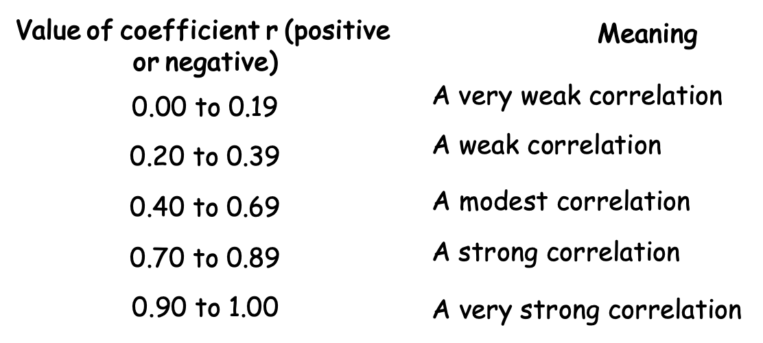
Explain strength of correlation values
Explain regression analysis
Regression analysis is a statistical method used to understand the relationship between variables — especially how one variable (dependent) changes when another variable (independent) changes.
In simple terms: it’s about predicting one thing from another.
Key Components:
Dependent Variable (Y): The outcome you're trying to predict (e.g., test score).
Independent Variable (X): The factor you think influences or predicts Y (e.g., hours studied).
Simple Linear Regression (1 Predictor)
This is the most basic form of regression, with one independent variable:
Y= a+bX+ε
Y = predicted value (dependent variable)
a = intercept (where the line crosses the Y-axis)
b = slope (how much Y changes for a 1-unit change in X)
X = independent variable
ε = error (difference between actual and predicted values)
Goal: Find the best line (regression line) that minimises the errors between predicted and actual values.
Multiple Regression (2+ Predictors)
Used when you have two or more independent variables:
Y = a+b1X1+b2X2+⋯+bnXn+ε
Each bi shows the effect of Xi on Y, controlling for other variables.
Why Use Regression Analysis?
Prediction: Forecast future outcomes (e.g., sales, grades, prices).
Explanation: Understand how much one variable affects another.
Control: Isolate the impact of one variable while holding others constant.
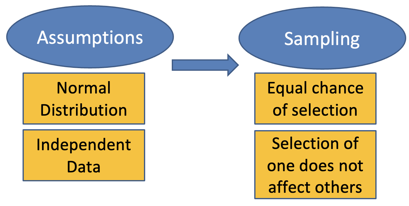
What are the assumptions of regression analysis?
Assumptions of Linear Regression (important to check):
Linearity: The relationship between X and Y is linear.
Independence: Observations are independent.
Homoscedasticity: Constant variance of errors.
Normality of errors: Errors (residuals) are normally distributed.
No multicollinearity (in multiple regression): Predictors aren’t too highly correlated.
How do you calculate regression in excel?
Select Regression from the Data Analysis ToolPak: Data tab -> Data analysis group.
If group does not appear as an option, install it as follows: File -> options -> add-ins -> in manage box select Excel add-ins -> click go -> check box by Analysis Tool Pak -> OK.
Select the appropriate y and x variable ranges (remember that y is the variable that you want to Predict, i.e. the dependent variable).
If your input data ranges include variable names, tick the Labels box and set the significance (i.e., confidence) level to 99%.
Choose Output Range (to output the results on the same spreadsheet), and define your output range by entering a worksheet cell reference where you want to place the results.
Tick the Residuals, Residual Plots and Line Fit boxes.
Hit the OK button.
What are the key stats that are outputted?
Key Statistics in the Output:
Multiple R:
The correlation coefficient between the observed and predicted values.
A value close to 1 or -1 indicates a strong linear relationship.
R² (R-squared):
Represents the proportion of variance in the dependent variable (Y) explained by the independent variable(s) (X).
A value close to 1 means a good fit.
Adjusted R²:
Adjusts R² for the number of predictors, providing a more reliable measure for multiple predictors.
F-statistic and Significance F:
Tests the overall significance of the regression model.
A high F-statistic and a low Significance F (typically < 0.05) indicate a good model fit.
Coefficients (Intercept and X Variable):
Intercept: Predicted Y when X = 0.
X Variable: Slope, showing how much Y changes for a 1-unit change in X.
A p-value < 0.05 indicates the coefficient is statistically significant.
Standard Error:
Measures the precision of the coefficient estimates. Smaller values mean more accurate predictions.
Example:
Multiple R = 0.95: There’s a strong positive linear relationship between X and Y.
R² = 0.90: The model explains 90% of the variation in Y.
Slope = 0.75: For each 1-unit increase in X, Y increases by 0.75.
P-value for X = 0.002: The relationship between X and Y is statistically significant.
What are inferential statistics?
Assessing populations from samples.
What are the 5 steps of statistical tests?
A statement of the null hypothesis, and research hypothesis [which sets 1 or 2 tailed]
Set the level of risk – Statistical Significance (alpha value);
Select the appropriate statistical test [checking assumptions] and compute the test statistic value
Find Critical Value from published tables (or EXCEL)
Accept or reject the null hypothesis [to interpret data]
What are null and research hypotheses?
A hypothesis is a testable statement or prediction about a relationship between variables. In statistics, we use two types:
1. Null Hypothesis (H₀)
Definition: The null hypothesis states that there is no effect, no difference, or no relationship between the variables.
Purpose: It serves as the default or starting assumption in a statistical test.
Example:
“There is no correlation between hours studied and exam score.”
(H₀: ρ = 0)
2. Research Hypothesis (H₁ or Ha)
Definition: The research hypothesis (also called the alternative hypothesis) proposes that there is an effect, a difference, or a relationship.
Purpose: It is what the researcher aims to support.
Example:
“There is a positive correlation between hours studied and exam score.”
(H₁: ρ > 0)
How do you decide if your test is one or two tailed?
One-Tailed Test
Use it when you are testing for a result in one specific direction (either increase or decrease).
Example:
“I think the new drug will increase recovery speed.”
→ You're only interested if it's better, not worse → one-tailed.Hypotheses:
H₀: μ ≤ μ₀
H₁: μ > μ₀
(or the reverse if testing for a decrease)
Two-Tailed Test
Use it when you're testing for any difference, regardless of direction.
Example:
“I think the new drug will have a different effect (could be better or worse).”
→ You're checking for any change → two-tailed.Hypotheses:
H₀: μ = μ₀
H₁: μ ≠ μ₀
Simple Rule of Thumb:
Ask: “Do I care which direction the effect goes?”
Yes → One-tailed
No, any change matters → Two-tailed
Explain correlation coefficient
The correlation coefficient is a statistical measure that describes the strength and direction of a relationship between two variables.
Key Points:
Symbol: Usually denoted by r (for Pearson correlation coefficient).
Range: Always between -1 and +1.
r = +1: Perfect positive correlation — as one variable increases, the other increases in a perfectly linear way.
r = -1: Perfect negative correlation — as one variable increases, the other decreases in a perfectly linear way.
r = 0: No linear correlation — there's no predictable relationship between the variables.