N5 Graphic Communication (copy)
0.0(0)
0.0(0)
Card Sorting
1/45
Earn XP
Description and Tags
Study Analytics
Name | Mastery | Learn | Test | Matching | Spaced |
|---|
No study sessions yet.
46 Terms
1
New cards
extrude
allows you to take a simple 2d shape and pull it out into a 3d object
2
New cards
revolve
Allows to revolve half of a profile/shape around a central axis, making it into a cylindrical feature.
3
New cards
shell
Hollows out a solid 3D model to create a shell.
4
New cards
dimension
adds sizes to a drawing
5
New cards
chamfer
used to angle corners
6
New cards
fillet
used to round corners
7
New cards
workplanes
set planes where you can draw 2d sketches that allow you to build your model from the ground up, side to side, or front to back.
8
New cards
true shapes
this is used to show the actual shape a surface, when it is difficult to see because of the angle of the surface or position of the surface on an orthographic drawing.
9
New cards
sectional drawings
Sectional views are used on drawings to show the inside details of an object more clearly than hidden detail can. They are also used on sectional assemblies to show clearly, how component parts of a product fit together.
hatching lines are always at 45°
hatching lines are always at 45°
10
New cards
exploded drawing
an exploded view shows the separate parts that make up an assembly. the parts are arranged in line to help identify how they would fit together.
shows how the parts should be assembled and in what order.
shows how the parts should be assembled and in what order.
11
New cards
input devices that create digital files
scanner
handheld scanner
graphics tablet
keyboard
mouse
handheld scanner
graphics tablet
keyboard
mouse
12
New cards
benefits of digital sketches
easier to modify
can be used for illustrative purposes
can be easily used for testing and/or simulation
speed of production
can be electronically shared
saves on materials
allows for remote working
can be used for illustrative purposes
can be easily used for testing and/or simulation
speed of production
can be electronically shared
saves on materials
allows for remote working
13
New cards
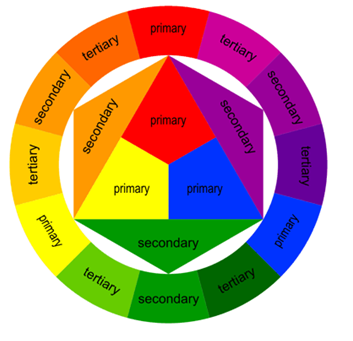
contrasting colours (colour wheel)
contrasting colours occur when colours at the opposite side of the colour wheel are used together. contrasting colours are bold and create an exciting mood/feeling.
ex. red & green
ex. red & green

14
New cards
harmonising colours
harmony is created when colours close to each other on the colour wheel are used together. harmony is easy on the eye and creates a feeling of peace.
ex. yellow and orange together create a warm relaxing image.
ex. yellow and orange together create a warm relaxing image.

15
New cards
tints/shades of colour
tints and shades create greater colour options by adding white and black to colours.
• ex. adding WHITE to blue gives TINT of blue
• ex. adding BLACK to blue gives a SHADE of blue
• ex. adding WHITE to blue gives TINT of blue
• ex. adding BLACK to blue gives a SHADE of blue
16
New cards
preliminary graphics (stage 1)
• initial stages of graphic design, rough and introductory work. thumbnail sketches which are small rough sketches.
• dont take long and give an immediate representation of your work.
• allows you to develop a whole range of ideas quickly and which allows you to build on and expand your designs.
• dont take long and give an immediate representation of your work.
• allows you to develop a whole range of ideas quickly and which allows you to build on and expand your designs.
17
New cards
production graphics (stage 2)
• has to convey certain pieces of information which would be of use to someone like a technologist, engineer, architect, etc.
information provided:
• dimensions, moving parts, cross section, weight, material selection, etc.
forms:
• orthographic drawings, sectional views, exploded views, assembly views, perspective, isometric, sections, stepped sections & cut aways.
• drawings are usually produced on AutoCAD or other cad packages
18
New cards
promotional graphics (stage 3)
• used by sales and marketing departments of companies. product or design is displayed and advertised.
forms:
• posters, leaflets, flyers, displays.
effectiveness:
• must attract consumers attention and make them want to look at it.
links:
• linked with features elements and principles of desk top publishing
forms:
• posters, leaflets, flyers, displays.
effectiveness:
• must attract consumers attention and make them want to look at it.
links:
• linked with features elements and principles of desk top publishing
19
New cards
line
used to divide up a layout or connect other elements. varies in thickness and in colour.
20
New cards
shape
creative use of shape can grab a reader's attention. shape can help organise a layout. shape be organic, or abstract.
21
New cards
texture
physical refers to the roughness or feel of the paper being used.
visual refers to textures such as wet/water, metal, stone, etc from an image.
visual refers to textures such as wet/water, metal, stone, etc from an image.
22
New cards
size
the relationship of items can be emphasised by size. the most important features are often the biggest creating dominance.
23
New cards
colour
the most effective element on the page. colour creates moods and excitement to engage the reader.
24
New cards
value
value deals with colour tones. darker colours have more value and therefore stand out more ot the reader.
25
New cards
mass
all items on a page have mass. a bold heading has more mass than a small heading. mass can catch the reader's attention and allow the design to ensure key features of images stand out.
26
New cards
balance
symmetrical/asymmetrical layout of a page. symmetry creates a formal page whereas asymmetry can create an exciting informal and unusual page.
27
New cards
contrast
contrasting colour and shapes can be used to make items stand out to create excitement.
28
New cards
dominance
items with greater emphasis stand out catching the readers eye and dominating the publication.
29
New cards
unity
careful positioning of items and good use of colour can make items on a page feel unified. this makes the page easier to follow and makes the whole page work as one item.
30
New cards
alignment
allows you to align text/graphics to the left, centre and right of a page ensuring that pages dont seem random.
31
New cards
whitespace
leaving areas of a layout free from text or graphics draws the reader eyes to the areas containing text and graphics. it allows the readers eyes to rest in busy layouts.
32
New cards
rhythm
allows a reader's eye to flow through page from beginning to end easily. this ca achieved through good use of shape layout balance alignment and colors.
33
New cards
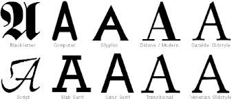
typefaces
serifs: format fonts that create an elegant formal design for a publication
sanserifs: texts without flicks that are informal and normally used in modern publications or web page design.
sanserifs: texts without flicks that are informal and normally used in modern publications or web page design.

34
New cards

A thick, dark continuous line
Outline.
35
New cards

A thin, lightly drawn coninuous line
Construction line.
36
New cards

A thin broken line
is used to show hidden edges.
37
New cards

A thin chain line (long dash, dot, long dash)
shows a centre line.
38
New cards

A thin double dash chain line
used to indicate a fold line on a development.
39
New cards

A thin chain line with thick edges
shows where an object is sectioned. It is known as a cutting plane.
40
New cards

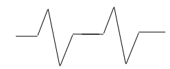
Continuous thin irregular
Limits of partial or interrupted views.
41
New cards

Continuous thin with Zig Zags
Limits of partial or interrupted views.
42
New cards

Thin 45 degree
cross hatching lines show the cut surface produced by a cutting plane. Used in sectional drawings.
43
New cards

Indicates Radius.
44
New cards

Indicates Diameter.
45
New cards

Indicates a Square section.
46
New cards

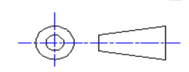
The Third Angle Projection Symbol is added to drawings to explain its layout. You will
commonly see this in Orthographic drawings, showing that the drawing is laid out using an Elevation, End Elevation and Plan.
commonly see this in Orthographic drawings, showing that the drawing is laid out using an Elevation, End Elevation and Plan.