Architecture History II - Exam 3
1/84
Earn XP
Description and Tags
LSU - ARCH 2008 - 2025
Name | Mastery | Learn | Test | Matching | Spaced |
|---|
No study sessions yet.
85 Terms
Abstraction
Taking the most central features of that thing and rendering it in a simple way, removal of the insignificant towards engagement with an essense. Stick people drawings are representations of human figures that can still be recognized as a human because of abstraction.
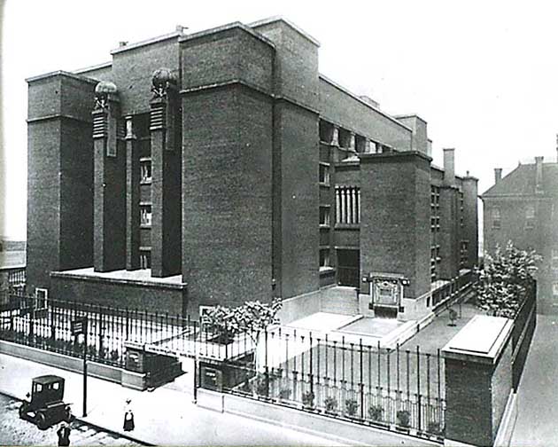
Larking Building, Buffalo, 1904 by Frank Lloyd Wright
Martin was a business manager of Larking Building and hired Wright to build his house as a test to see if they wanted him to design the larger office building. This was the first building in US that was completely sealed from the environment with circulating filtered and clean air because it was located in a factory district where surrounding air wasn't really clean. It was torn down a while ago, but a Spanish Romero is making 3D digital reconstructions of Wright's unbuilt designs, called “Hooked on the Past”.
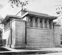
Unity Temple, Oak Park, 1907 by Frank Lloyd Wright
This was a worship space built for Utilitarian church in Oak Park, outside of Chicago. This was the first time an architect used concrete for the primary material for a significant building. Concrete had been used in factories but never appropriate for use as an architectural element. This gives a sense of strength, serving as refuge from the busy city around it. The simple expressive form where one gets a sense of a singular volume of space inside. Wright created an interior space that was unprecedented, a small space where you can see everyone’s face. This was because he believed the face of god is in your neighbors, celebrating the gathering of the community, rather than pointing to something beyond with a spire. The building itself is trying to facilitate its purpose as best as it can, meaning its design is driven by function.
Looking at the column, it is very clearly expressed. He sees that column as being a visual distraction from the act of seeing the faces of the community together. He doesn't need that insertion of the authority of power. All the decorative things going on keeps your eye moving, so you are always engaging with the interior worshiping space. All under a skylight so it is flooded with light. All kinds of different ways to read affiliations, associations, and patterns depending on who is sitting where. The use of geometry with lines and planes is a use of abstraction we saw in a slightly more restrained way in the Martin House.
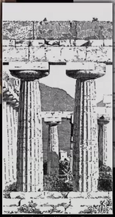
The Doric “Basillica” at Paestum.
Shows you what it is doing and translating its function into something you can feel. Taking a symbolic form that translates its activity in a way that you can feel it’s stable and comforting.
Palais Stoclet, Brussels, by Josef Hoffman, 1906-16
Radical departure from historical Palace. Focusing on mass and line so that the edges of the form are emphasized to see a symphony of lines.

Goldman Shop in Viena by Loos in 1898
Lines everywhere, taking place of the expected ideas of furnishings. Loos goes on to be one of the influential figures in the sterile look of European modernism, the roots of International style.
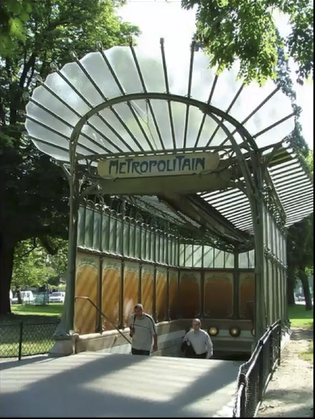
Paris Metro entries by Hector Guimard, 1900-1913
Lines creating a sense of movement to pull you into the station by gathering your attention.
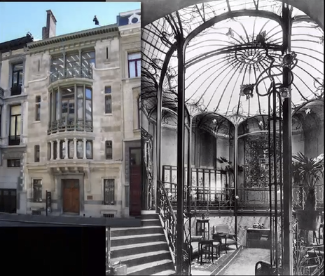
Hotel Tassel in Brussels by Victor Horta, 1893
Use of lines in a poetic way. On the interior, the fluid nature of the stair and a sense of movement with the human figure walking down the stair and the stair bending and curving to go her way, and the way the railing annotates and assists that so you feel the figure walking down the stair. The ornamental pattern on the floor and ceiling tells you how and where to go, so your activity is supported and validated in a way that has very little counterpart in the ancient world.
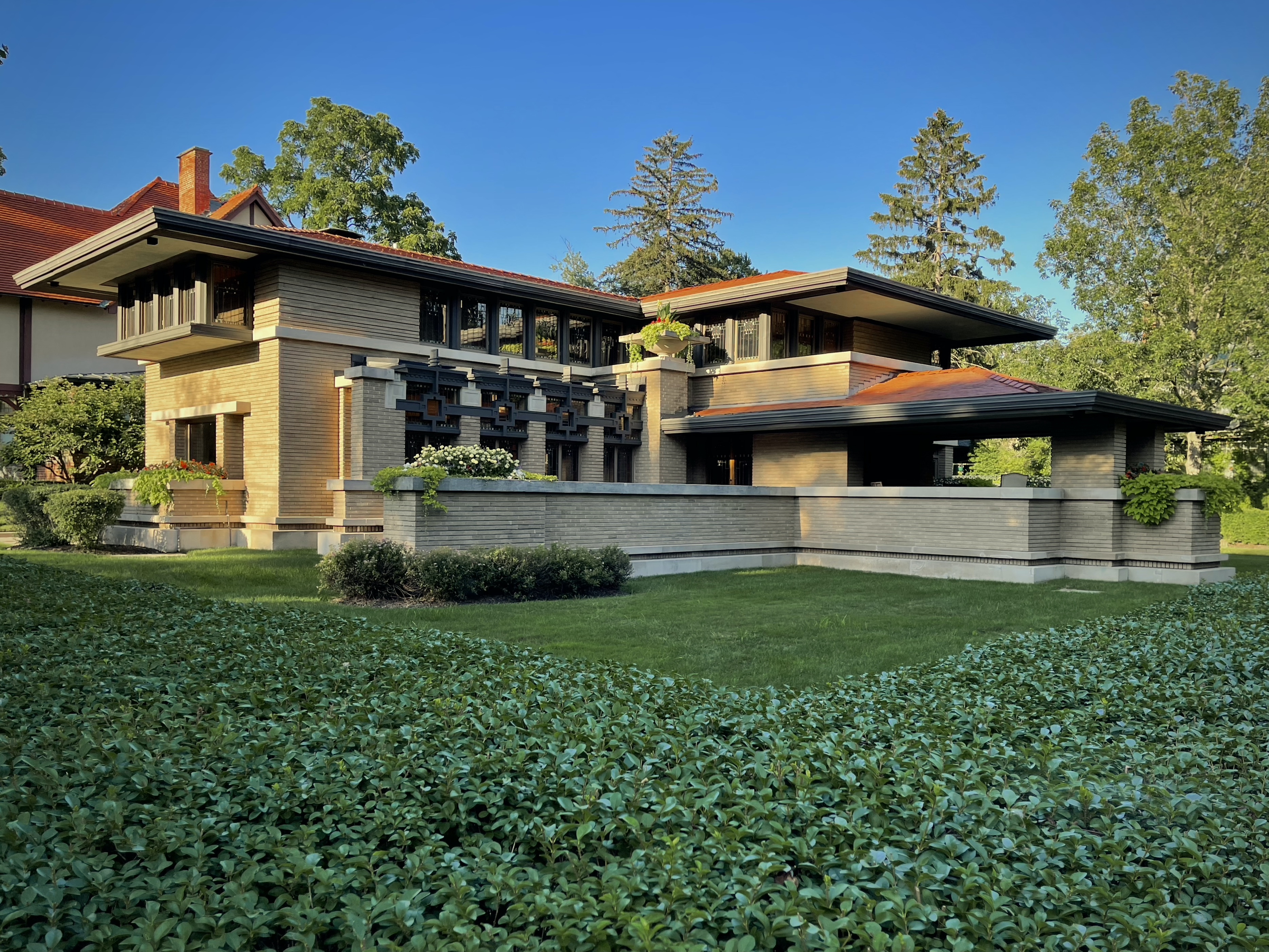
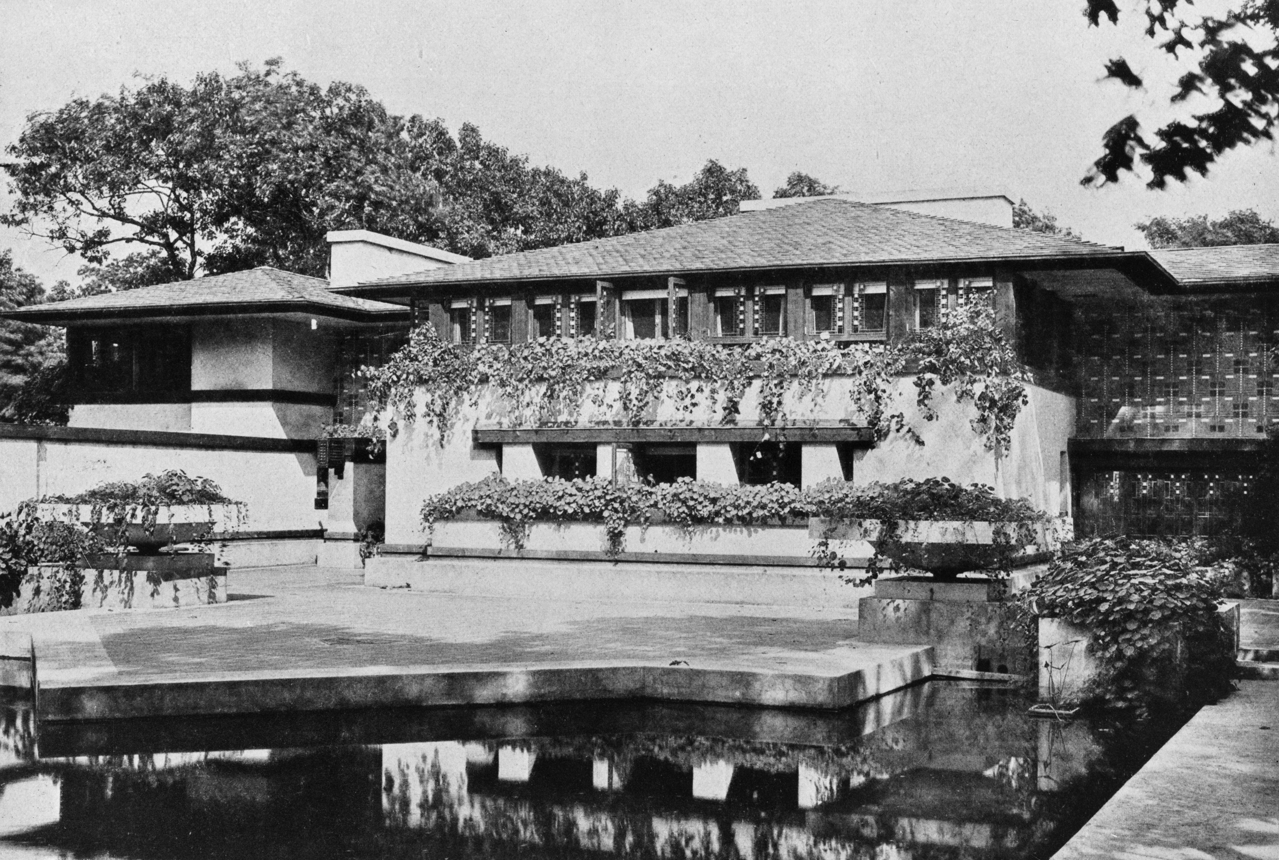
Meyer May House, 1909 by Frank Lloyd Wright
The leaded glass windows dissolve what you see outside, creating a perceptual window that blurs the outside and inside in ways that you reach for.
Coonley House, Riverside, 1909 by Frank Lloyd Wright
He uses abstraction not with line, but with pattern and mass. Patterns of color, tile, and ornamentation everywhere around the house. Not a clear idea of where it is and where it isn't. Where it begins and where it stops. All this is the use of abstraction to engage your perceptual apparatus and creation of understanding.
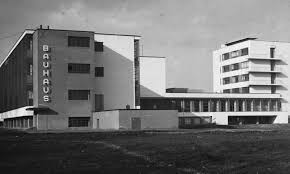
Bauhaus, 1925 by Walter Gropius
Bauhaus is an architecture school in America that has very different teaching ideology than the Ecole des Beaux Arts in Paris, France. The Bauhaus pulls away from certainty in permanent values, instead finding value in the activities you perform. As through there was a universal nature and character in the human experience and its teachings are rooted in geometry, primary ideas of color, and logical relationships. The Bauhaus design itself ignores the surrounding context and environment, instead focusing on dissolving parts that cannot be explained by one single view. Gropius uses industrial materials composed asymmetrically to pull your eye to one direction or another, suggesting there is something around the corner. Where he doesn’t use reinforced concrete, he pulls the wall completely away from the structure, allowing for a curtain wall to go up all three floors. He also pulls the whole building off the ground so the studios appear to hover and dematerialize. The understanding of columns holding weight becomes irrelevant in this case. Gropius also uses the glass windows in different ways, creating an operative grid in every combination you can think of.

Berlin Turbine Factory by Peter Behrens
He's made a classical temple made of reinforced concrete and steel structure filled with industrial machinery and activity, rather than statues of classical gods. Making an architectural image that fits into the mythology of the importance of modernizing society bringing electricity to society as a step forward. They designed everything electric that would be needed by the German people as they moved into this new world.
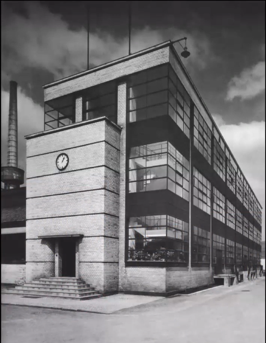
Fagus works in Leine, Germany, by Gropius, 1913
Gropius was hired to add administrative offices on an existing shoe factory. He covers steel and reinforced concrete with brick veneer which he articulates by pushing in a course every few feet to give a look of rustication as if its made by larger pieces. He also pulls out a large window wall, which comes to be known as a curtain wall. The envelope has multiple things going on including the steel concrete framed building inside, the window system pulled from the wall, and the heavy entry. Gropius cloaked the outside of the building in what can be read as a brick veneer, a stable wall. Even though he removed so much of the wall that it is no longer seen as a supportive element. The window system is pulled out 3-4 inches from where the exterior columns are brick clad. This plays into the idea of interior open space of the building as a solid basis for expression. The grid system moves across the entire facade because of the blank steel pieces continuing the window patterns. The openness spanning between floor is a character of post-modern architecture. The stair climbing up displays a unification of verticality, something not found in older architecture systems. Gropius uses simple almost brute elements to construct the facade. He doesn’t try to hide the steel, and when taken together with the window system so you can see another dimension. This grid begins to take a symbolic role without losing the brute ordinary character. The limitless grid provides a structure for human activity.
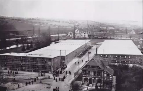
Steiff Factory, 1903
A factory made of steel framing and glass walls where they make stuffed animals. Unlike most buildings we have looked at, this one doesn’t spire to be intentionally meaningful.
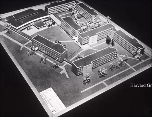
Harvard Graduate Center, 1949
Walter Gropius started a firm called the Architect’s Collaborative when he moved to the US after the Nazi’s took over the Bauhaus. The firm designed a complex of dormitories for Harvard’s grad school.
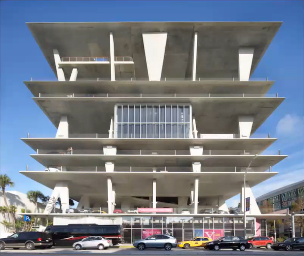
Parking Garage by Herzog and deMuron
This structure is an example of innovative use of concrete. With steel and wood, you can see the design logic because of the vertical and horizontal members that come together to uphold the structure. This is different with concrete because it takes whatever shape you make the form and works structurally because of the steel reinforcing it. This innovation opened up a whole world of expressive possibilities apart of modern architecture.
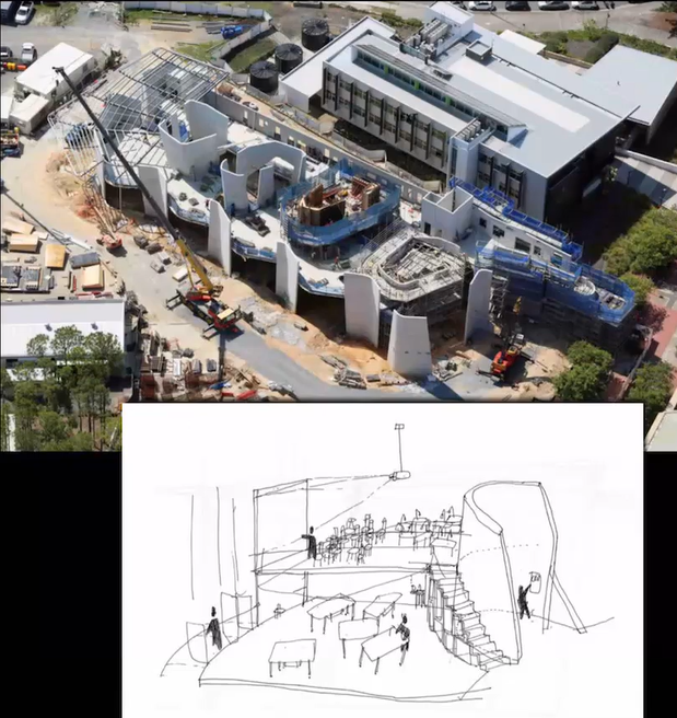
Abedian School of Architecture by CRAB STUDIO
Crab Studio used the pedagogical activities that take place as an element that repeats as you go through the building. They were looking for an expressive form that facilitates the functionality and brings a sense of life to it because of the concrete.
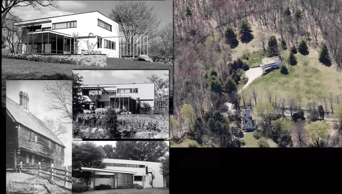
Walter Gropius House in Lincoln, Massachusetts, 1937
When designing his own home, Gropius created an open flowing ground floor with bedrooms on the second floor. The decking that faces west for the sunset over the pond in the distance. He added a screen porch for breakfast. He uses open flowing space with lots of plate glass on interior.
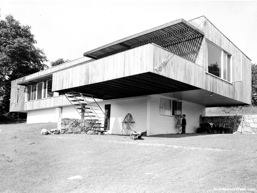
Marcel Breuer House in New Canan, 1947
Breuer came to the US with Gropius and worked at Harvard for a while before opening his own firm. He created a collection of really innovative modern houses mostly made of wood. These houses set the stage for mid-century modernism.
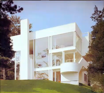
Smith House in Darien, CT by Richard Meier, 1967
Meier worked as an apprentice in Breuer’s office and picked up the tradition expressed in many of his houses. The tongue and groove wooden slats to make a plane is a prime example of him using his teachings from Breuer. The house configured as an object, but one side of the wall you proceed through to gain access to the ocean and shore. All of Meier’s work is clearly diagrammed so you can see the logical relationship between the parts.
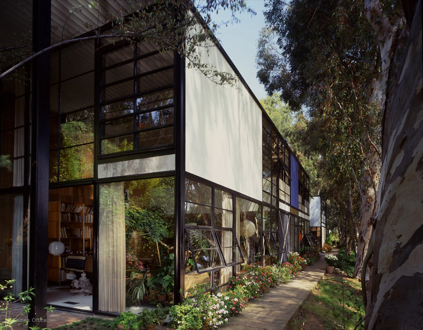
Charles and Ray Eames House in Pacific Palisades, 1949
The Eames built their own house out of industrial parts for very little cost. This house becomes an expression of the casualness of American lifestyle through the freedome of choice, completely different than European concepts of architecture.
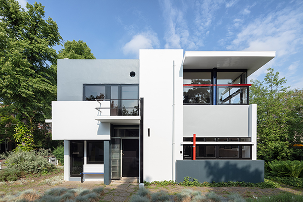
Shroder House in Utrecht by Gerrit Rietveld, 1924
Instead of going back to a language of pure crisp geometry inspired by Greek forms, Rietveld uses pure geometry, color, and shape as compositional elements. The Shroder House is completely devoid of any historical reference, instead leaning to push the Cartesian system to its limits. The second floor of this two story private house has a number of moveable partitions so people can divide rooms in various ways, becoming an expression of the flexibility and possibility of three dimensional Cartesianal space. His sketches isn’t easily identifiable as a house or even a building, but depicts an exploration of the tensional dynamics of forms in relationship to one another as they start to engage one another or create subgroups.
This relationship is similar to Gropius Bauhaus and Wright’s Taliesin. In the Bauhaus, two planes stand in tensional relation to one another, the way every facade of the building is asymmetrical to pull your eye in one direction or another suggesting forms around the corner. Wright’s Taliesin similarly plays with tensional relationships, but in the context of the natural world. The Shroder House stands alone and claims its value in the way it explores and reveals the potential of a three dimensional intellectual system.
Brick Country House by Mies van der Rohe
This unbuilt design also represents the exploration of compositional tension. Without any site or reference to the natural world, Mies plays into the intellectual relationship.
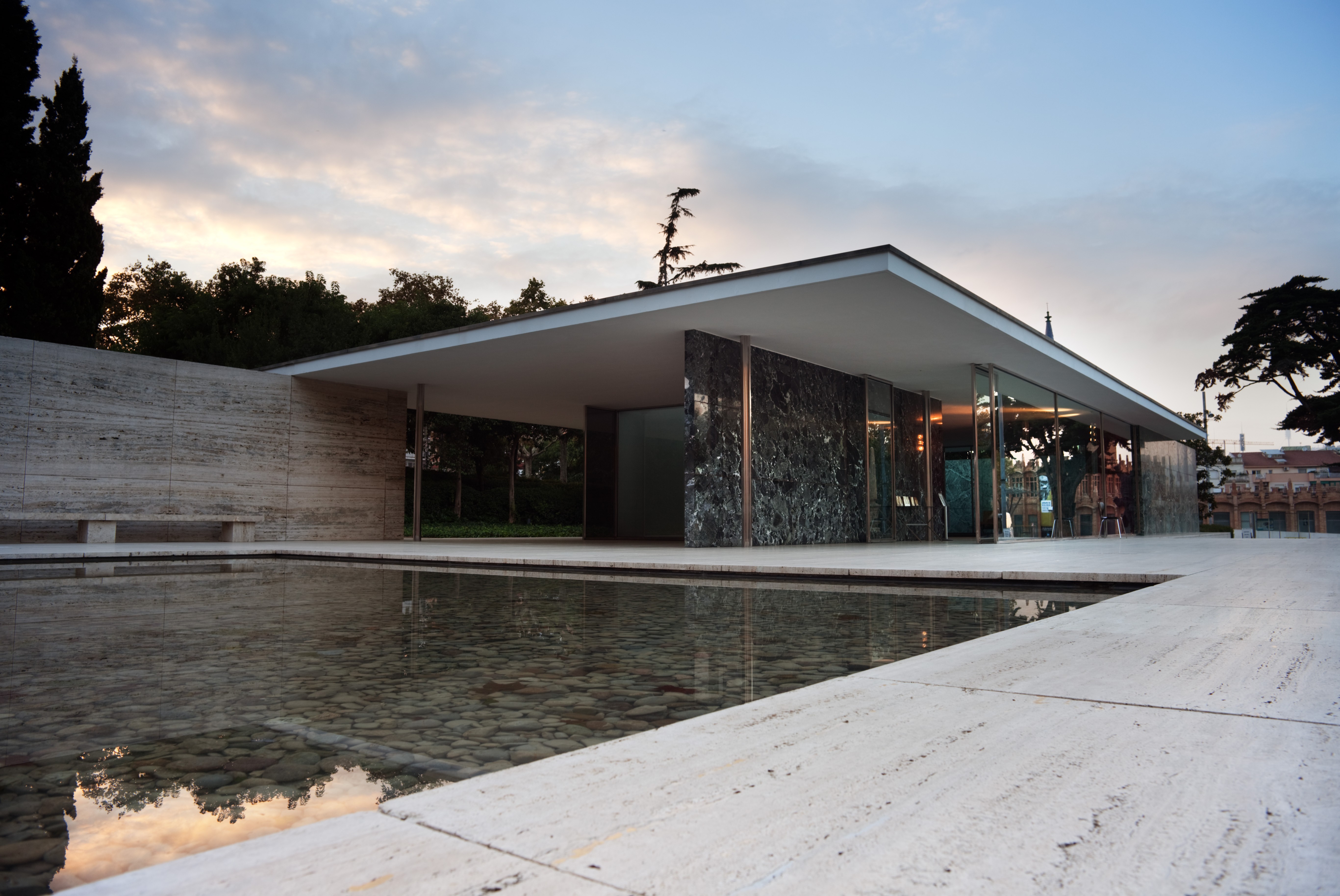
Barcelona Pavilion by Mies van der Rohe in 1929
This pavilion technically has no program, but is meant to be a representation of the German government. People can wander freely without any scheduled activities, meaning Mies had complete programmatic freedom to do what he wanted. The wall planes, roof planes, and base are all abstracted geometric elements before they take on any architectural significance. Moving through the space allows the elements to take on significance. The heaviness of the base is opened up and provides a sense of stability and strength that becomes an important reference to how the roof floats in. Mies plays into the notion that god is in the details and creates simplicity where the work lies. He creates something that is elegantly simple rather than casually simple. The delicacy of the window pane with a thin steel mullion system that is hardly noticeable. The large reflecting pool plays with light during the day while the series of smooth marble slabs mimics its reflection. A large statue dances in the pool of water, bringing a reference to the human form and giving the complex of sense of scale and character. The entire time, Mies plays with the structural grid, a bearer of intrinsic value. He uses the pattern of the grid on the paving, walls, and steel structural system of columns. His unique cruciform columns are covered in chrome, so it fractures and reflects light, seeming to carry no real weight. Similar to the Shroder House, Mies’s Barcelona Pavilion takes an intellectual system to its limits.
Tugendat House in Bruno by Mies van der Rohe, 1930
On the main living floor, you see a grid of columns, and a continuous enormous glass window that frames the life of the family in terms of the group of trees that you see as it drops down into the valley. The view of the house from the street is very quiet and austere, one would drive by and hardly notice. The conventional symbols of domesticity aren’t recognizable, including the garage. The whole thing is organized diagonally folding back towards the site. As you approach the terrace, the front door is found around a curving glass walls that pulls you in. This curvature is continued inside with the spiral stair that unwinds and lets you out on the other side of the diagonal line, representing a transition from the cognitive world of the city to the living space that envelopes this beautiful natural site. Mies uses the same chrome columns as in the Barcelona Pavilion, so they seem to disappear. All of the pieces of glass crank down into the floor, so you are perched above the beautiful valley. This house shows how one might use this compositional system to create a certain attitude about life and the natural world.
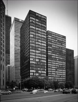
Lake Shore Towers by Mies van der Rohe in 1948-50
Mies uses steel I beams along the outside, about 8 inches deep, running up the entire side of the building. They are subtle and not seen from further away, but are visible as brute steel from closer up. From a distance, the towers are seen as elegant and uniform, using the Cartesian elements of the steel frame as an organizing element. At the same time, the scale of this is really important. The canopy that Mies incorporates is huge, its heaviness and elegant floating expression contradicting each other. On one side of the building is meeting and interacting with the grid of the city, while the other is with the glory of the space and sky above Lake Michigan. Overall, the building system creates a complex pattern with the tall rectangle divided into a series of horizontal lines. The vertical is powerfully emphasized, but broken apart by horizontal elements. Mies creates a conceptual weaving of horizontals broken by more verticals to create windows. The building is a dialogue between ground and sky and horizontal and vertical as a way of shaping our feelings towards those things.
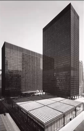
Chicago Federal Center by Mies van der Rohe, 1960-74
Two tall federal office buildings against one another with a large post office before it. The 24 feet ceilings in the post office display the amplitude of the possibilities of public space. Outside the post office is a large plaza that opens the space of the city so that one sees the giant corporate office buildings and the expression of the surrounding grid. He highlightings the grid and its representations in terms of corporate power, money, wealth, and intentionality that created Chicago. When you see pictures of the interior, the ceiling grid has especially large recessed can lights. The lights are carefully proportioned in their size, distance from the human scale, distance apart, and relation to the huge sheet of glass. The ceiling becomes the dominant floating thing that caps your vision and leads you out into the plaza, allowing you to see this big, monstrous buildings.
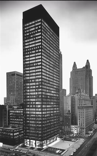
Seagram Building in New York by Mies van der Rohe, 1958
The Seagram Building is an office building that sits on Park Ave in New York City. This building represents Mies’s adaptation of designing around New York’s zoning codes that limit the square footage you can build on any lot to floor area ration to encourage developers to leave open space. These zoning codes caused many buildings in NY to look the same, with a 125 ft line, since developers were trying to maximize the square footage within zoning code restrictions. Instead of placing his building right at the property line, Mies pulls it back to create a public plaza, then allowing the building to rise. The plaza became a public space for park avenue, with fountains and benches. Many architects have copied this example of a high rise building.
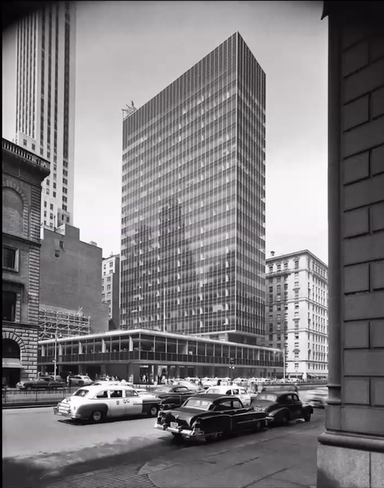
Lever House by Skidmore, Owing, and Merril, 1952
The Lever House plays on Louis Sullivan’s Wainwright building, where the massing was designed in relation to the program and environment. A bank sits on the bottom floor with rental spaces going up. The shiny coverings on the steel and crisp reflected glass symbolize the technological prowess of the US after WWII. In addition, the Lever made soap, so they wanted a squeaky clean image of their business.
Modernism
The tension between empiricism and rationalism is essential to the development of modernist architecture. Empiricism suggests that your own experience is a crucial part of the story, while rationalism assumed the answers were already out there, hidden somewhere.
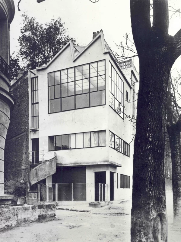
Ozenfant Studio-House by Le Corbusier, Paris, 1922
This studio house was designed for and with a cousin of Corbusier’s in Paris. On the upper floor is a painting studio, suggesting the flexibility of program while stepping away from the historical precedents. With large expansive windows for natural light, the painting studio has a beautiful sense of light above the city, looking at the horizon. A small ladder leads up to a private writing room sitting very seclusive and darker. This house embodies symbolic objectivity, the interest in ordinary, industrial materials. The factory window is plain and simple, but used without any attempt to cover it up, something radically different from a traditional dwelling. The scale of the grid and structure, in both cases, the structure is used to suggest a higher metaphysical order. Corbusier worked creatively in reinforced concrete - even more brute, rough, and rude than steel. They are merely a tool for something else going on.
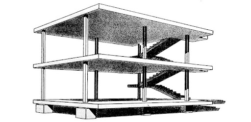
“Dom-ino” House: a foundational architectural concept showcasing a prefabricated, modular system using reinforced concrete.
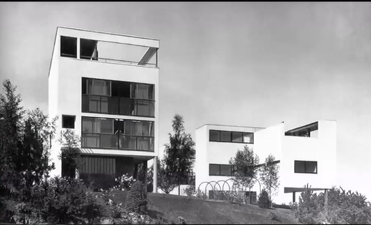
Weissenhof Estate, Stuttgart 1927
Mies and Corbusier participated in an expedition of modern housing.
The "Citroen House" by Corbusier is vertically organized and completely devoid of ornament. The structure is visually separated from the ground, lifted on columns so it seems to float. The multitude of glass on three sides allows views, taking the all the experiential aspects of a wealthy house, and reorganizing them in a simple, affordable form. All made out of concrete, rough texture of concrete. In his earlier houses he would plaster over the concrete to give it a whiteness, covering the materiality of the concrete. Very similar to Brunelleschi in San Lorenzo to cover the materiality of the masonry and led to an appreciation of the ideas. The staircases are clustered towards the one wall with a view, while all the other rooms of significance in the house have a view looking out over the landscape. On the top floor is a private garden, giving you the earth back.
Les 5 points d'une architecture nouvelle, Le Corbusier, 1926
(The Five Points of Architecture)
The pilotis elevating the mass off of the ground
The free plan, achieved through the separation of the load bearing columns from the walls subdividing the space
When you aren't relying on walls to support the ceiling or a second floor, walls become choices, not necessities.
The free façade, the corollary of the free plan in the vertical plan
All of a sudden the façade can be whatever you want it to be. The whole language we have looked at now is about the perception of gravity.
The long horizontal sliding window
Tall vertical windows are a part of traditional architecture because you can't make them super wide structurally.
The roof garden, restoring the area of ground covered by the house.
Reclaiming ground plane on the roof
Villa Stein near Paris by Le Corbusier, 1927
To represent this house, Corbusier posed a photo as though it is a painting to show you these objects in relation to one another. Flatness of villa front, but dissolves as you go inside. The back is more dissolved with a two story terrace and balconies at different levels. Many of the rooms in the house open to the balcony in different ways so the interior spaces are open and engaging with the sky so the flatness here is a presentation of order. The Cartesian system becomes a suggestion for the possibility of movement and interaction. Proportional studies with diagonal lines showing the relationships between planes and windows. Corbusier spent much of his life working on the Modulor, an attempt to bring into useful reconciliation the two great proportional systems used in western architecture - the golden section and the root two of the diagonal of the square. Each side of this follows proportional system. He wanted to find a useful system in relation to human needs. He was a painter founding a movement known as purism. He depicts things as layers of one another, showing how to establish order in Cartesian space without relying on historical precedent but looking at experiential possibilities.
Villa Savoye, 1930 by Le Corbusier
Because Le Corbusier followed Empiricism, the idea of giving up on preconceived models and historical eclecticism, he had an enormous amount of freedom. At the same time, this freedom challenged him to do everything himself and create order from his own architectural language. He uses the Cartesian ordering system, as well as the inspiration from nature, but not as immediate as Wright. Not the present nature found when you step outside, but the perfection of an idealized nature. His Villa Savoye disengages with nature by showing platonic, pure geometry and falls squarely in tradition with Palladio's Villa Capra.
When Corbusier was young, he took a walking tour of Europe and camped on Acropolis. His drawing of the revelatory moment you walk through Propylaea and see the Parthenon through the columns. He was amazed by the power of the experience. He was trying to update the architectural language of Greece and adapt it to the modern needs and world without historical needs and associations.
The Villa Savoye is made of reinforced concrete and hollow clay tile, the exact the same construction method as Atkinson and the rest of the quad, but covered in white plaster, so none of the materials are apparent. His architectural drawings are very simplistic and highlight the idea - a sweeping movement of the automobile. It sits as idealize form like the Palladio with views all around. Once you get up to the top, you see over the trees and see the river valley, an idealized version of nature. His simple sketch shows you driving out of Paris, and you drive back, on a tether or rubber band to the city.
The ground floor is shaped by its relationship to the automobile so that the turning radius of the car is dramatized by the curve of the glass walls. Ridges in the gravel driveway create a centripetal force that throws your eye to the distant view, creating a beautiful condensation of meaning. Going inside, the drive from the city and the curve of the automobile is transformed into a rising vertical that takes you up to the next level of the building in the form of a rising spiral staircase. There is a long, slowly rising ramp that you can see daylight streaming in as a destination that pulls you in. The visitor’s experience is very important, we saw a sketch where Corbusier is working through the plan, all three levels at the same time, and exploring one's experience of the different places and moments inside the house. The Villa Savoye was his summer house, with pristine sunlight for several months. The inside-outside relationship is very important, since the entire wall of the living room slides, leaving half of the building can be opened up to the outside. Planned well for solar orientation, last few minutes of sunlight on the top floor. He's turning the building inside out, engaging the landscape in every way. At the end of the ramp, there is a hole in the wall and a little vista. He draws an idealized ancient landscape with a temple making reference to an older idea of nature as an idealized thing. The whole building bringing your experience of the automobile, transforming, and giving it to the sky.
City for 3,000,000 project by Le Corbusier
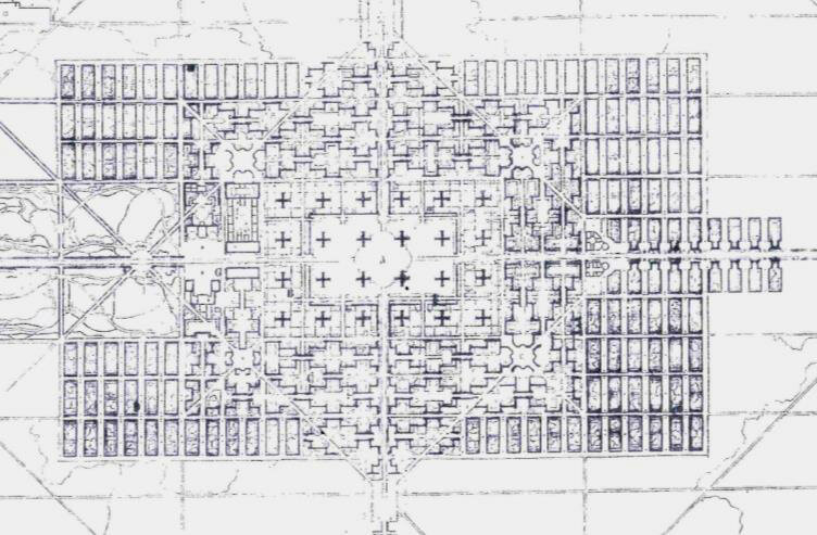
Corbusier was trying to give conceptual order to the possibilities of city planning in a way that was transformative in Europe. He realized the modern world was different in cities than ancient European ones, not carving out open space but building the urban world in space already open. His drawing was not so much an urban form but a list of possibilities so that the grid containing roadways and infrastructure can be used so you get 3-4 different scales of buildings that can be distributed in various ways.
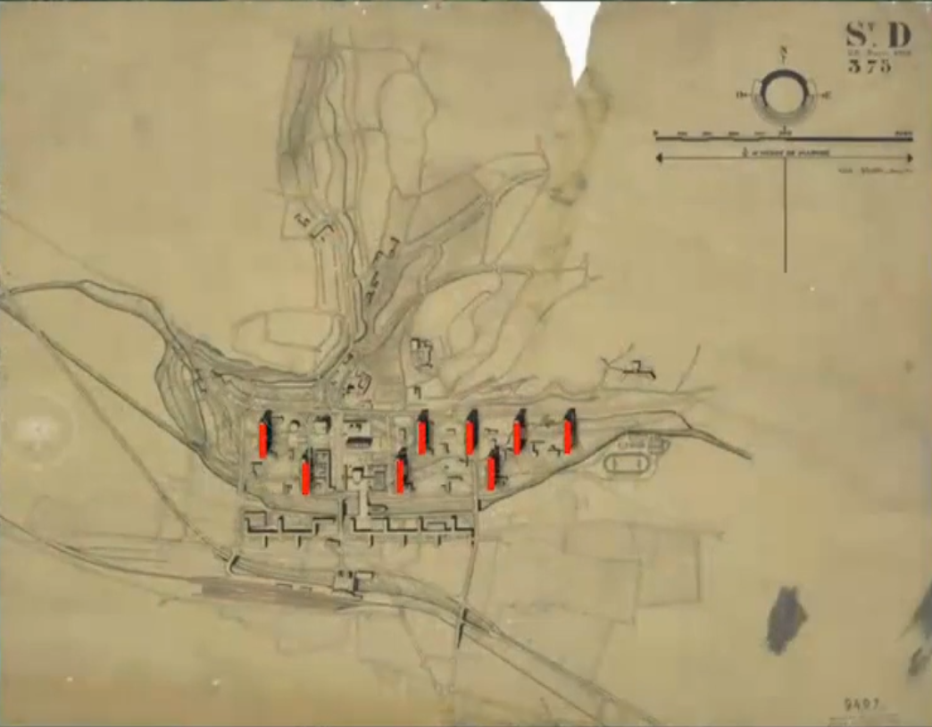
St. Die City Plan by Le Corbusier in 1945
He was asked to do after WWII. He takes this set of possibilities from the city of 3 million and adapts it to the local context, leaving the church and significant older buildings. He's trying to dramatize the sense of the landscape around it at a grand scale. The figure ground map of the city reverse, one of the first to come up with this idea.
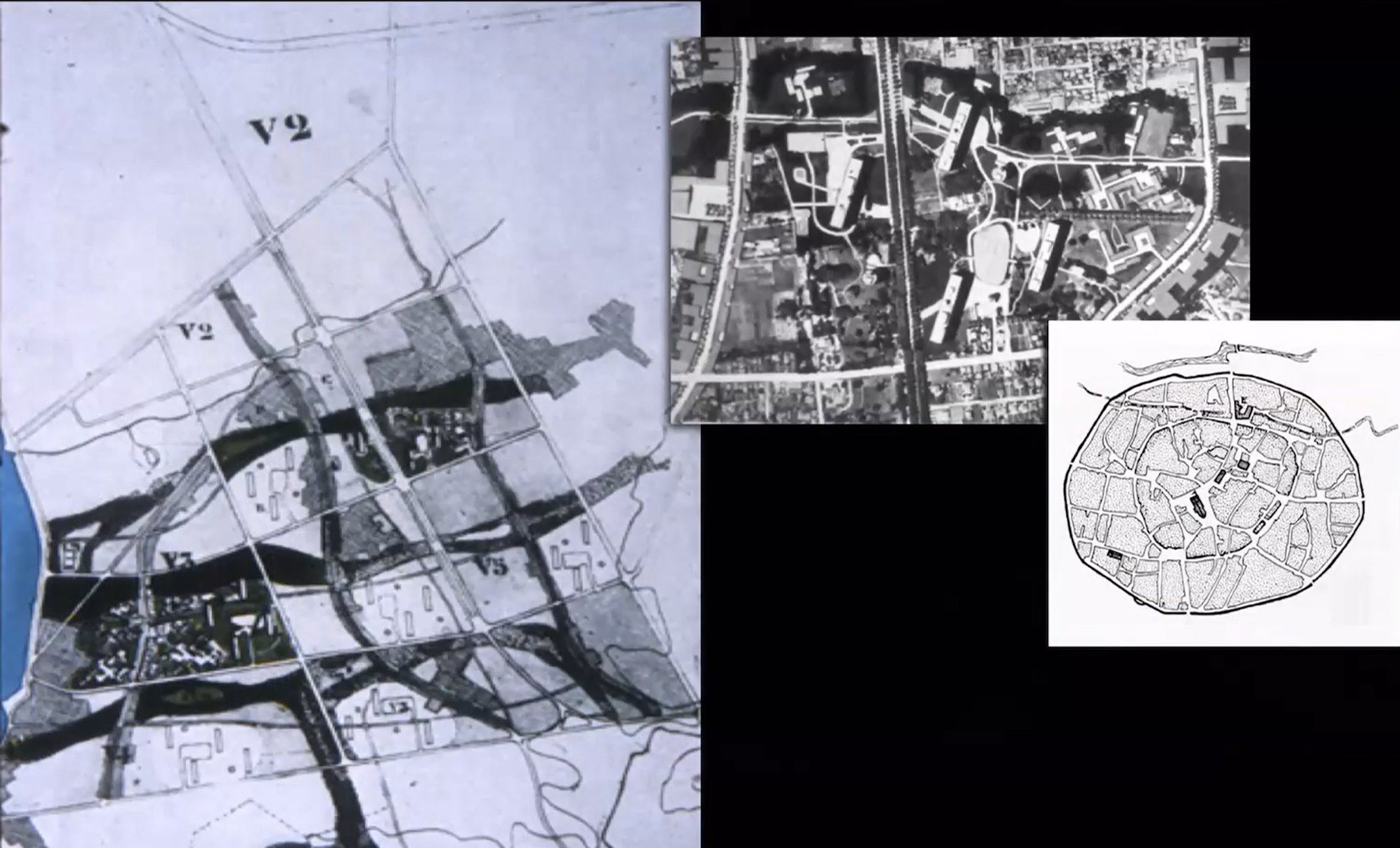
Master Plan for Marseilles by Le Corbusier
Corbusier came up with a brilliant plan that segregates transportation networks to walking paths and limited access superhighways. He creates a series of parts that come up from the ocean. He also opens up some neighborhoods for large collective housing with space for parks. He ultimately creates a plan where every kid in the city would walk from house to ocean and other houses in the city through neighborhoods without crossing heavy traffic. Every apartment in the building has two stories and view with windows on both sides to the ocean so they have a clear breeze that blows through.
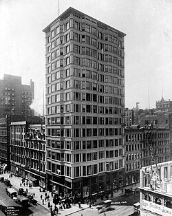
Reliance Building in Chicago by Burnham, 1895
Burnham and Root were partners, but when Root died young Burnham hired other people to take Root's place. Wright was offered the job but he didn't want to design Neo-Classical style. Root did drawings for another steel framed high rise in Chicago, the Reliance Building. The people that replaced him took it in a different direction in terms of its expression. The pattern of window glass and the bays, which is similar but better with sheets of glass and more frank expression of the steel construction. The ventilation windows lays the foundation for what comes to be known as the Chicago window before there was AC in these kinds of buildings. They went back to using heavy historical ornamentation in glazed terracotta that protects the steel structure from heat and fire. The glazing of it has a gothic look that Root had been moving away from.
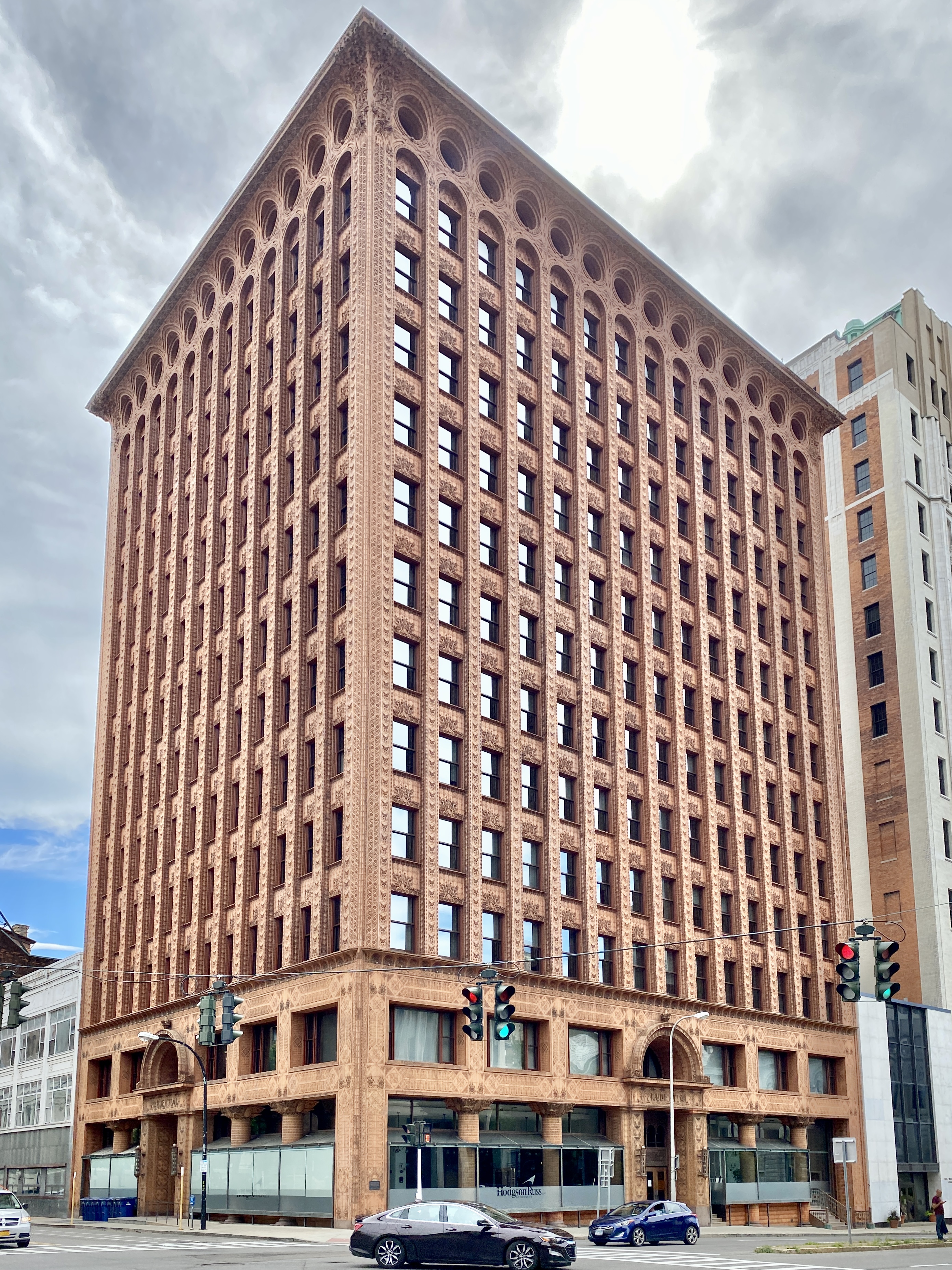
Guaranty Building in Buffalo by Adler and Sullivan, 1896
Sullivan did another high rise similar to Wainwright Building, also steel framed covered in terracotta for fire protection, but the terracotta is very heavily patterned and expressively ornamented. Every square inch of the exterior that isn't glass is decorated. The terracotta is very cheap because the slip is poured into a reusable mold. Ornamental scheme was unprecedented. He was trying to find an expression of the forces and feelings one would have in viewing and using this building. Sullivan's career took a bad turn before the turn of the century. He disappeared from the scene for a while, but in the 20s he came back and designed a series of banks beautifully ornamented. He published a book about the role of man's creative power. Full of illustrations of ornament, how geometry becomes a structure life can use. Kind of a manual for creating your own ornamental patterns.
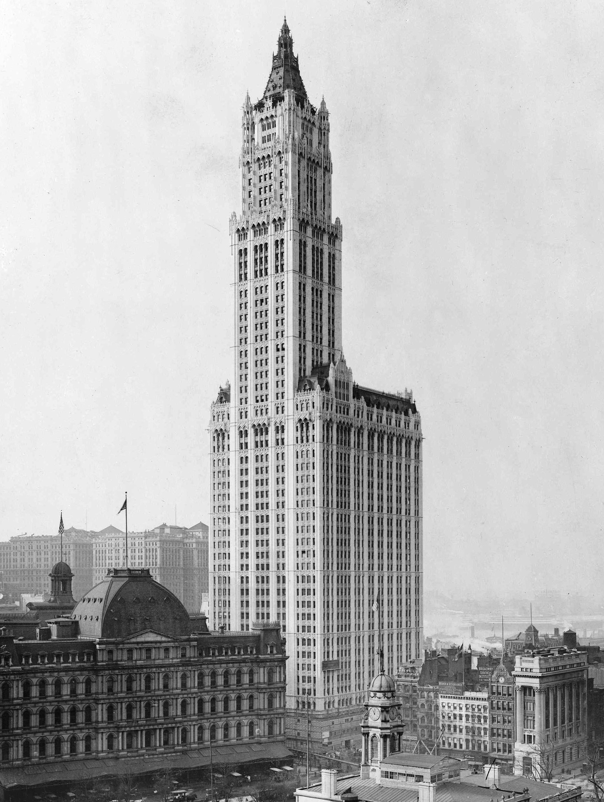
Woolworth Building in New York by Cass Gilbert, 1913
The Woolworth building is very big and tall, following earlier buildings by suppressing the horizontal lines and emphasizing the vertical lines. It’s covered in white terracotta that is heavily gothic in its ornamentation. That kind of patterning on the surface of suppressed horizontal and emphasized vertical was common to gothic cathedrals. In the context of the cathedral, the idea was to pull your eye into the stories of the vault depicting the bible, where the stained-glass is used as an inspirational device. It really was a feat in its day, and announced that although Chicago may be building high rise buildings, NY was the capital of high rise buildings. The Woolworth building also shows a radical change in scale beginning to occur. Not too many years later, the Equitable building was also built in Manhattan.
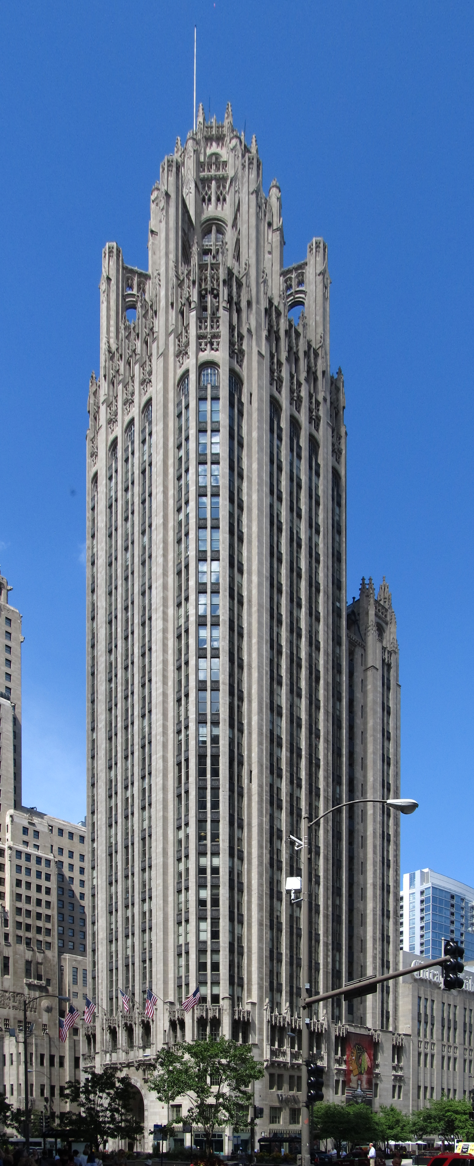
Tribune Building in Chicago by Raymond Hood, 1925
Hood won an international competition to design the headquarters for the Tribune newspaper. He designed a building determinately and expressively gothic, turning away from organic form. The North wall of the ground floor has a display of hundreds of little pieces of stone taken from significant historical monuments all around the world.
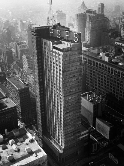
Philadelphia Savings Fund Society (PSFS) by Howe and Lescaze in 1932
Lescaze partnered with an older firm in Philadelphia to do an unusual building, one of the first international style high rise building in the US. It didn't have a lot of impact at the time because it was finished right as the depression hit. The building is built to make money from leasing the floors. The bank has the prestige and wants to take advantage of that, and so the building appears to be all about them. They didn't want to give up the commercial opportunities on the ground floor, so they raised the banking floor up from the street, with a whole bank of escalators inviting you up to the piano noble. It was a 2-3 story height space, when you walk in doors there. Meant to appear that it is the base of the building. One thing Lescaze does that becomes significant in later work is he separates the rental floor from the services like stairways, mechanical equipment, and bathrooms. He pulls that all to the back so the floor plates can be completely rental and divided up into multiple ways. He treats those two masses of the building differently, one organized with the horizontal suppressed so vertical pulls your eye up. They are pulled off to allow a pattern that the lever house duplicated. The lack of ornamentation and functional expression we see in the Monadnock Building. In typical high rise, all the services are in the center, forming a structural core in the building.
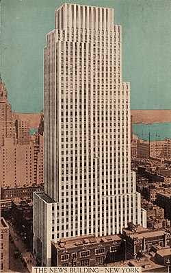
Daily News Building in New York by Raymond Hood, 1930
The rising vertical and suppression of horizontal so your eye is pulled up becomes a major feature of this building. The notion of the setbacks, in ways typical of a gothic church tower. His design responds to zoning code, but also he puts the elevators in groups. If every elevator stops at every floor, it could take hours to get up and down in the building. Some of the elevators stop at floors 1-10, the next from 20-30, until the top floor. This idea becomes common to facilitate movement in the building. Once you take away the elevator, there's more space, so they shrink the size of the building that much and keep the same square footage of leasable space per floor as the building climbs up. It becomes a functional expression of the way the building is put together. This is part and parcel as the ornamentation scheme starts to reflect the art deco notion. The number of verticals on the exterior is multiplied so not every one is a column. Even the horizontals are suppressed and made a different color so they don't stand out, to emphasize the verticals.
McGraw Hill Building in New York by Raymond Hood, 1930
Hood did another building where he disguised the verticals. He couldn't suppress them because he needs them structurally. He buries them in the window frames and emphasized the horizontal floor in a blue-green terracotta tile. A very different, if related, kind of expressive exploration.
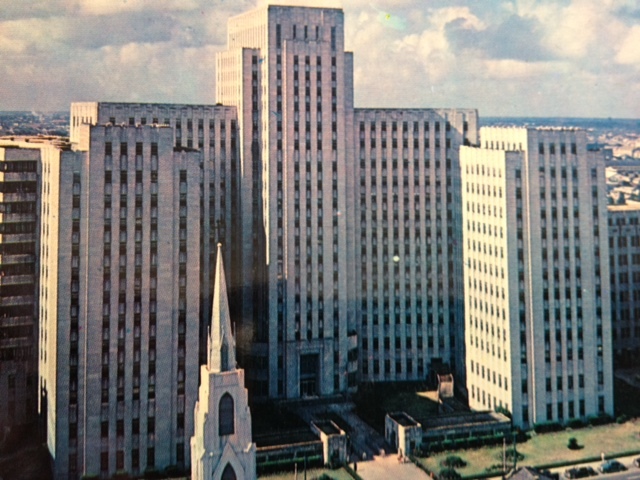
Charity Hospital in New Orleans by Weiss, Dreyfous and Seiferth in 1939
Art Deco
The art deco, in an effort to make a modern expression, it abandons historical ornamentation but keeps the basic aesthetic foundation, Albertian sense of mass and body as a representation of a whole, the notion of bilateral symmetry. The art deco becomes an interesting transitional work. American architects didn't follow Wright's lead after Taliesin, it's not until Fallingwater and early 1940s when he comes back with work responding to European moderns that he gets back into the influential picture.
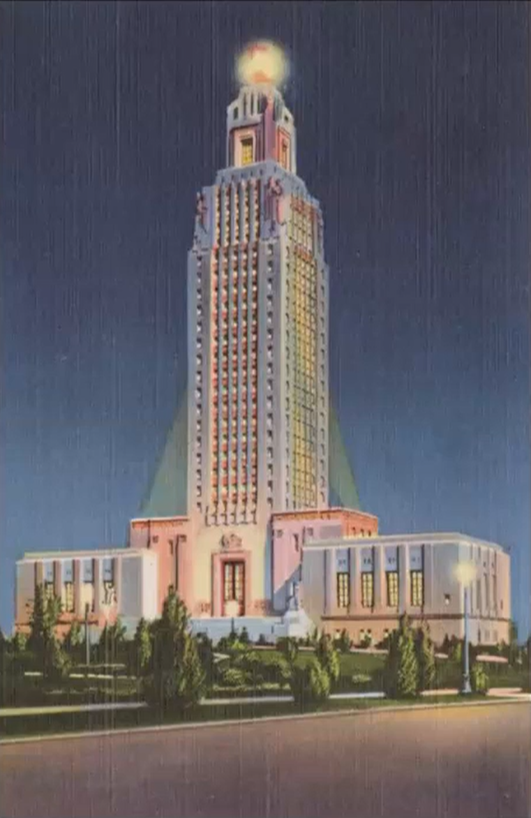
Louisiana Capitol by Weiss, Dreyfous, and Seiferth in 1932
The Louisiana State Capitol has a spectacular sculptural program that speaks to the symbolic interests and experience of people in Louisiana. The building itself is bilaterally symmetrical, hierarchical in organization. All the attributes of classical form making are still there. Copied from Nebraska Capitol.
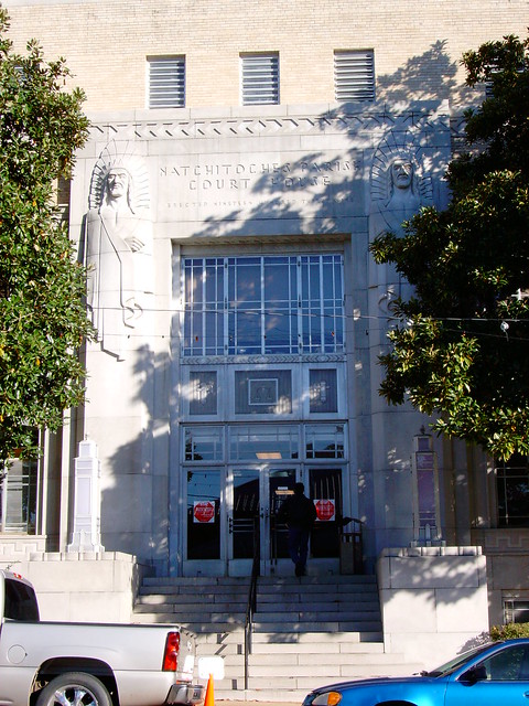
Natchitoches Courthouse, 1939 NO ARCHITECT? CHECK LECTURE!!!
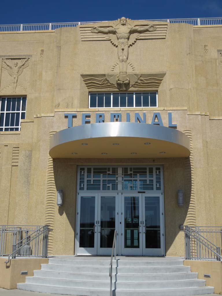
Shushan Airport in New Orleans by Weiss, Dreyfous, and Seiferth in 1934
Being one of the first modern airports in the world, the architects struggle to represent air travel in the form of the building. Unlike the modern airports later designed by Saarinen, this building is still wedded to Neo-Classical sense of form and order and uses ornamentation with flying people on trims and mural to represent air travel. The idea of the whole and hierarchal organization gives a stability and presence that doesn’t work well with the expressiveness of airports.
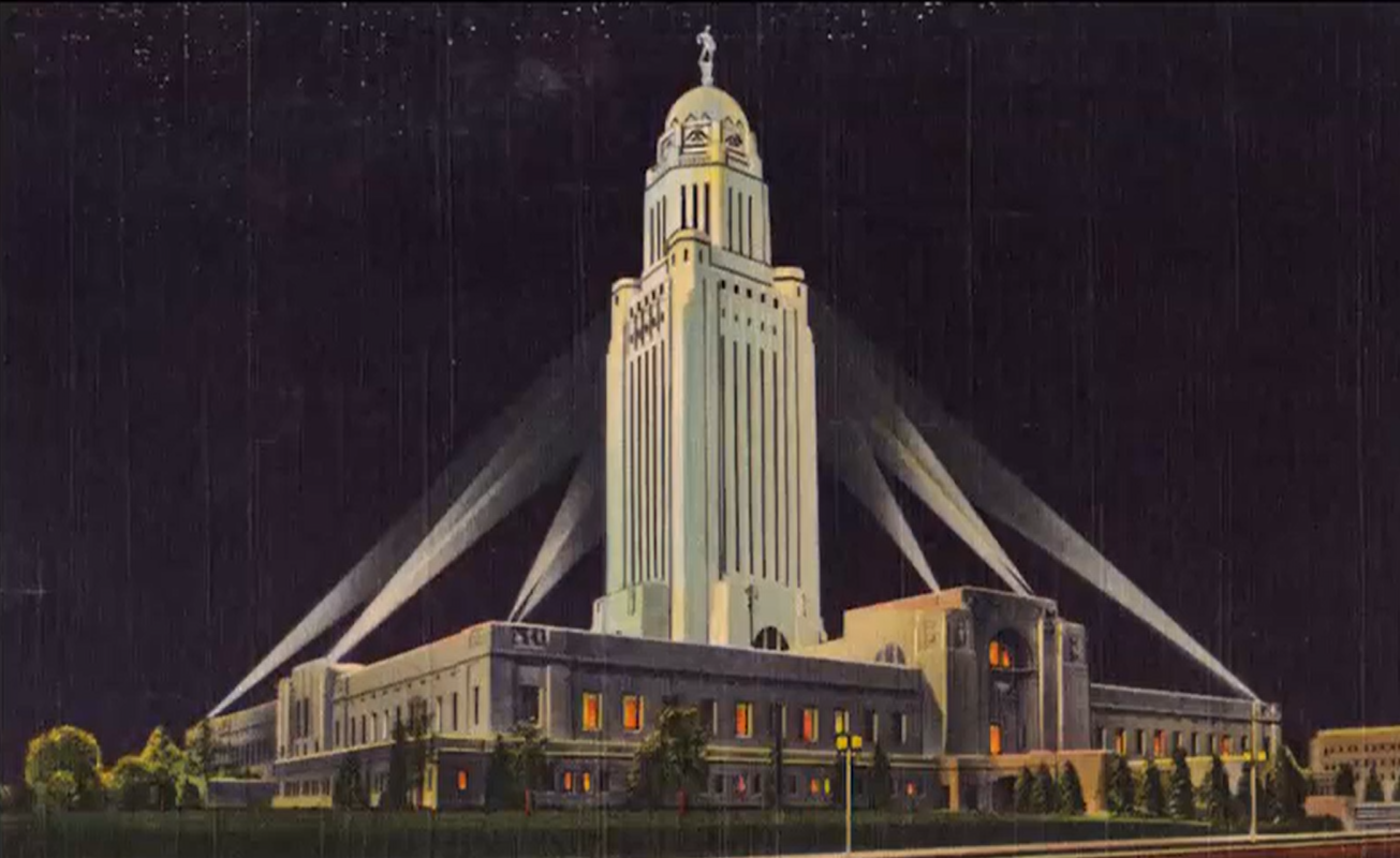
Nebraska Capitol by Bertram Goodhue in 1924
Art deco style
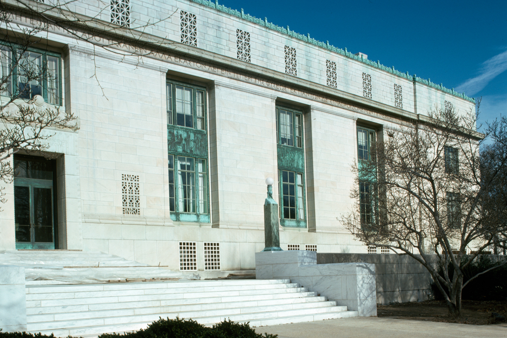
National Academy of Science by Goodhue, 1924
This is an austere, toned down example of the art deco style. This was also the kind of architecture used by the national socialist party in Germany, all of Albert Steer's buildings for Hitler a version of this art deco style being done at the same time Huey Long was doing it in the US.
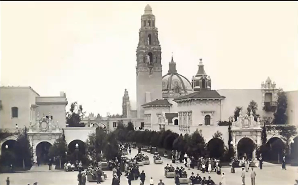
The Panama - California Exposition in San Diego by Goodhue, 1915-17
Done in Spanish Baroque style only there for a number of months before it got torn down and moved.
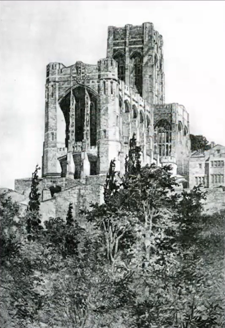
Westpoint Chapel by Goodhue in 1910
North of NYC by the Hudson, beautiful landscape, delightful little chapel, fully gothic in its expression but built with steel as a modern building behind the scenes.
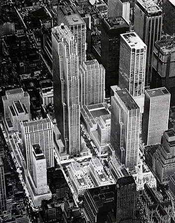
Rockefeller Center by Harrison and Hood (et al), 1933-39
The Rockefeller Center is a variety of different buildings all working together to create a sense of a whole. Near St. Patrick’s along 5th Ave, they create an open space that may have inspired Mies’s Seagram Building. In the entry, the buildings turn in different directions and seem to engage to create a dynamic sense of urban space that play with things around them. The step back is the expression of where the elevators rise and cut back, similar to the Daily News Building by Hood. The vertical abstraction and mass pulled away from 5th Avenue so you don't get the conflict that Wainwright is trying to separate, you see one thing as you walk around, but after you go through and come upon the skating rink and courtyard, the space opens up in this giant leap upward in the sky in an inspirational rise towards the heavens. This complex of buildings stands as a high point of mid-century American architecture in relation to the art deco.
Greek Teminos
A sanctuary where you open a space in the chaos of the natural world to allow the divine or rational to manifest itself. Presupposes that order and meaning isn't to be found in the natural world but another source we make room for.
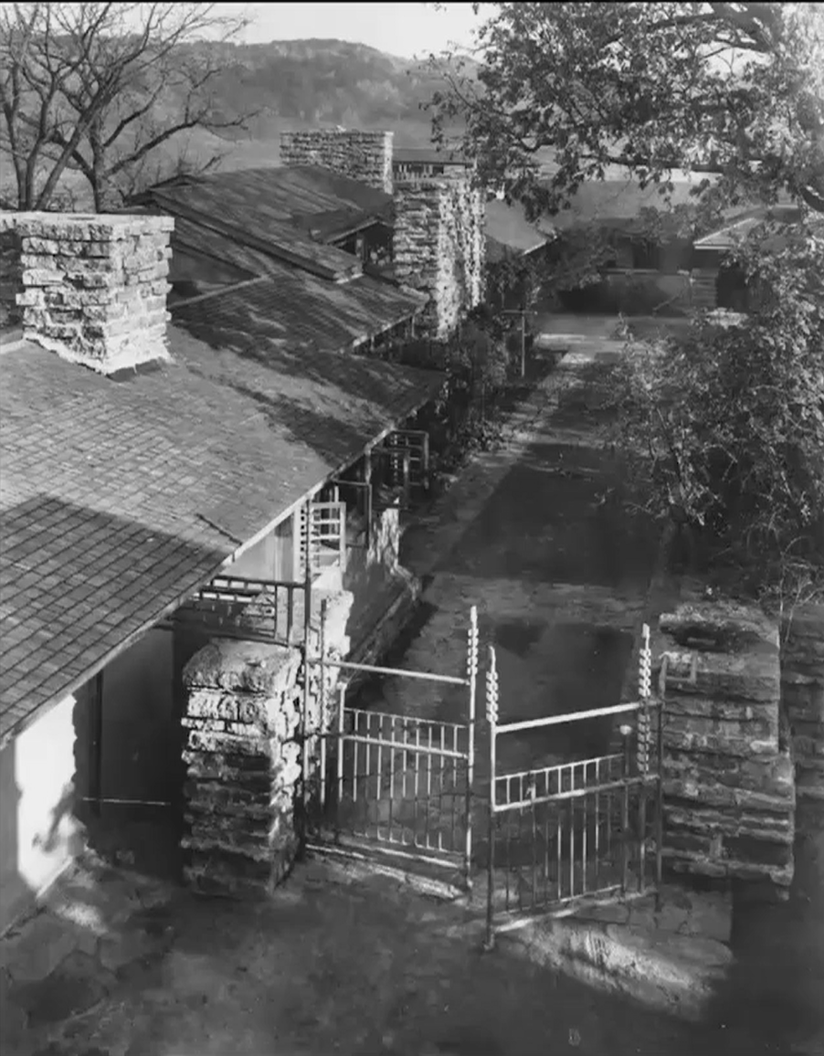
In Taliesin, Wright’s search for order and meaning takes a new direction. He knew by then that a house shouldn't be ON the hill, but OF the hill. Putting a house ON the hill means there is an inherit separation. OF the hill means its conception, pattern of use, somehow engages the specific hill and the things it offers. There are so many things going on that the perception of the building as a singular body becomes more and more difficult. It is harder to differentiate where the natural form ends and the house begins. Not just an abstract formal exercise, but Taliesin is meant to create a lasting impression at different scales of a natural place. To weave those into your daily life so as you determine the meaning of the building, you are always reaching out and bringing in parts of the environment to that compositional frame.
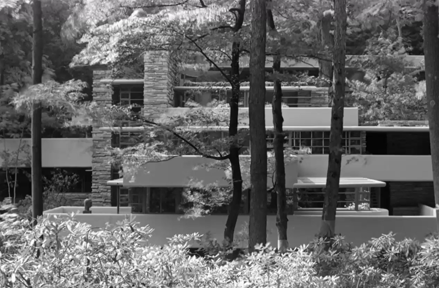
Kaufman House “Fallingwater” at Bear Run by Frank Lloyd Wright, 1935
Frank Lloyd Wright’s Fallingwater is the most famous example of finding value and meaning in how we understand the natural environment. Though the iconic view accentuates the overlapping strong horizontal concrete elements, the view you experience when approaching the house looks almost camouflaged. He uses horizontal concrete and masonry walls composed of overemphasized horizontal pieces as a framework for interpretation. Though he is playing with horizontal and vertical elements, he’s much more interested in engaging with the environment than the Cartesian grid as a source of order. To follow the name, the waterfall serves as a compositional datum of the house. The house moves around the waterfall without a calm center or pattern of organized order. The house has no symbolic front door, but a series of skinny openings through rough stone that bring you to the front door. The first space you encounter upon entering is a small cubby space with a coat closet, desk, and telephone. A couple steps in and you are pulled across the room by the view to the terrace above the waterfall while the valley goes on and you see the sky. A continuous enveloping stone walls hinted at is constantly moving, shaping, and creating opportunities for physical interaction. Wright uses built in furniture for a unified expression with the architecture. The shelves interact with the stone wall in strong horizontal movements. The stone hearth sits off to the side while the stairway diagonally across the room takes you down to the stream that pushes over the edge of the waterfall.
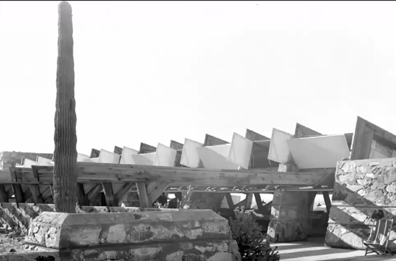
Taliesin West in Scottsdale by Frank Lloyd Wright, 1938
Wright believed that in the desert, most of your work as an architect is done for you because you see evidence of the patterns and processes of nature at work shown in the geological layering of the strata and the erosion of it. Ancient and ongoing processes in the matrix of geometric order, showcasing both the horizontal and the vertical. In response to the natural order of the desert, Wright built Taliesin West as a winter house on a mesa slowly climbing the hillside. The canvas panels and open spaces articulate a very different architectural language than Taliesin that can be invented with organic form.
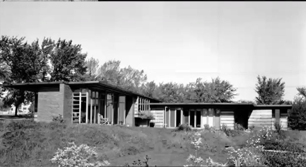
Jacobs House in Madison by Frank Lloyd Wright, 1967
The Jacobs House was a part of a larger series of houses called the Usonian House Project. Wright uses a kit of parts while shrinking the house down to one story, something unusual in the US at this time. The diagonal entry leads to a vista out across the landscape. The street side of the house is very closed and private while the other is very textured, active, and full of glass. The open side pulls its sense of value from your engagement with this particular landscape and the experience of living in the space with these views. The Jacobs House is also through of as product of the industrial age - concrete floor slab with heating coils inside it, brick masses, plywood based walls with cypress siding inside and out, windows, and flat roofs.
Pope House in Falls Church by Frank Lloyd Wright, 1939
With the entry under the cantilever carport, the Pope House pulls you in before dropping into a living room with the kitchen and dining off of it. The living space opens on two sides to an outdoor space under a large tulip tree outside. Living room and office corridor are all glass open to swimming pool, so the outside activities brought into and become part of the daily activities of the house. With the compositional system at work here, you go in with the floor drop while the ceiling rises. Again, the notion of multiple overlapping incomplete frames of reference that create exciting experience.
George Sturges House in Brentwood by Frank Lloyd Wright, 1939
Each of Wright’s houses reacts to the landscape in a different yet creative way. The George Sturges House was built on a site that wouldn't sell in a Colonial Neighborhood. Wright wraps a vista on the porch with complete privacy from the street, while all the rooms in the house open to a wonderful view of the Pacific Ocean.
Johnson Wax Administration Building in Racine by Frank Lloyd Wright, 1938
At the same time as many other houses, Wright was asked to design the Johnson Wax Administration Building. He wanted to make the office building open to the natural environment, but they wanted him to build it in the middle of the factory, which wasn't an environment conducive to the kind of thing he usually does. Instead, he closes it in like the space of Unity Temple, creating a gathering for working activity under the shared skylight. Automobile comes across landscape, and the horizontal of automobile is transformed into the rising sense of aspiration we have talked about, similar to his work at the Villa Savoye. He used to call the automobile a horizontal elevator that would take the city to the country and helped to establish a new standard of space measurement whereas you drive through the countryside you get a sense of the regional landscape you couldn't easily get before and how do you bring that new sense into the design of houses.
The red brick gives a sense of enclosure, but as you get in the columns seem to rise. Instead of getting bigger as they go down, the columns get smaller as though they are pulling you up. Reinforced concrete columns have brass pins that connect them to the foundation. The secretarial pool is frequently interpreted as an inspirational space that tries to bring value to the daily work you are doing, almost like a secular cathedral where the productive relationship between you and the group is what allows the creative work to flourish.
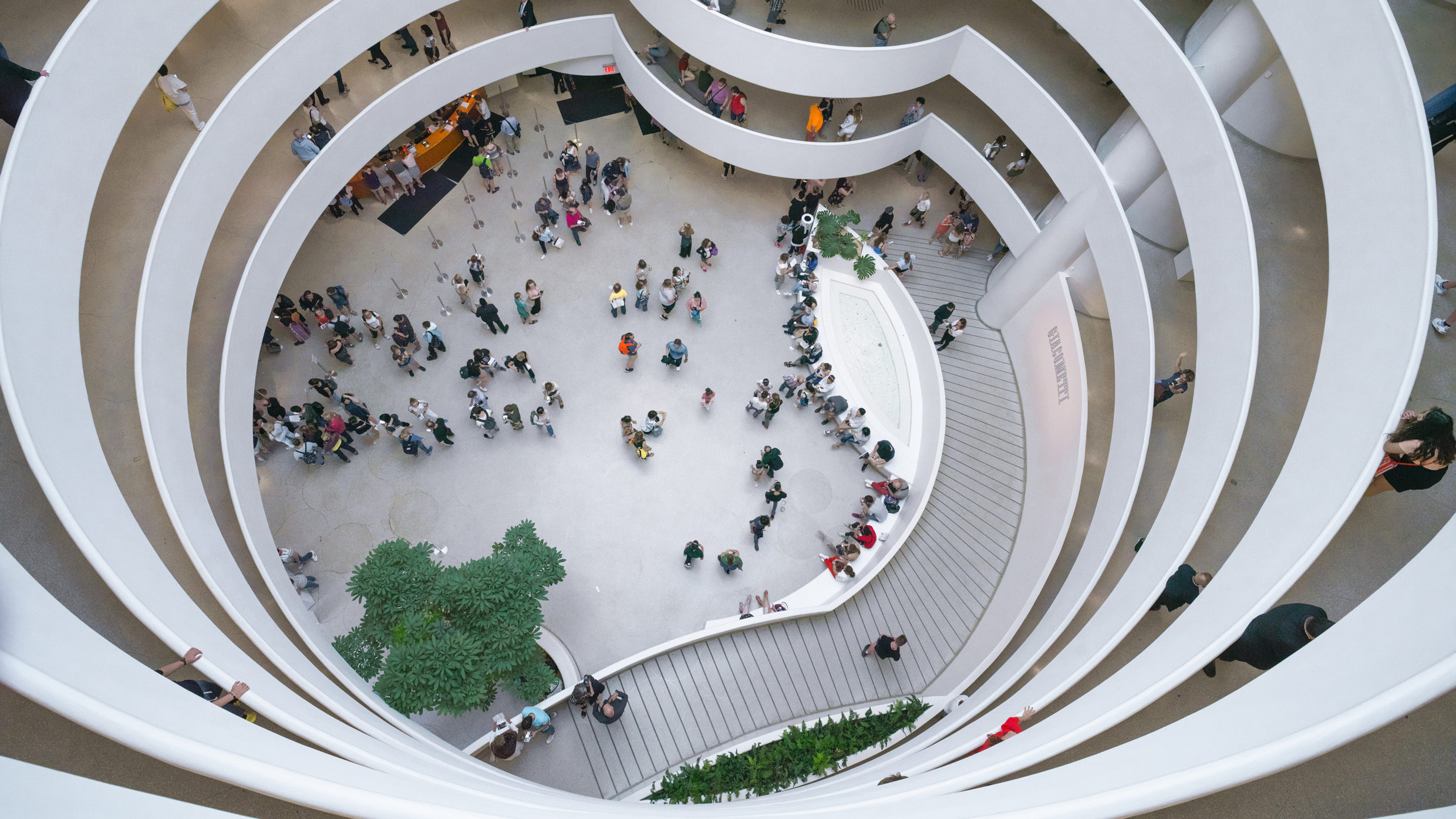
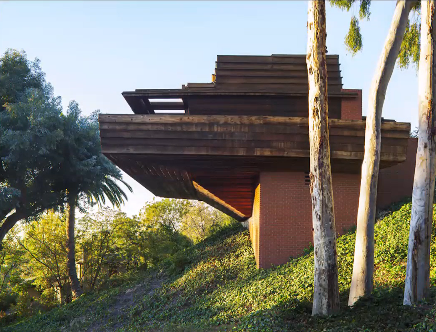
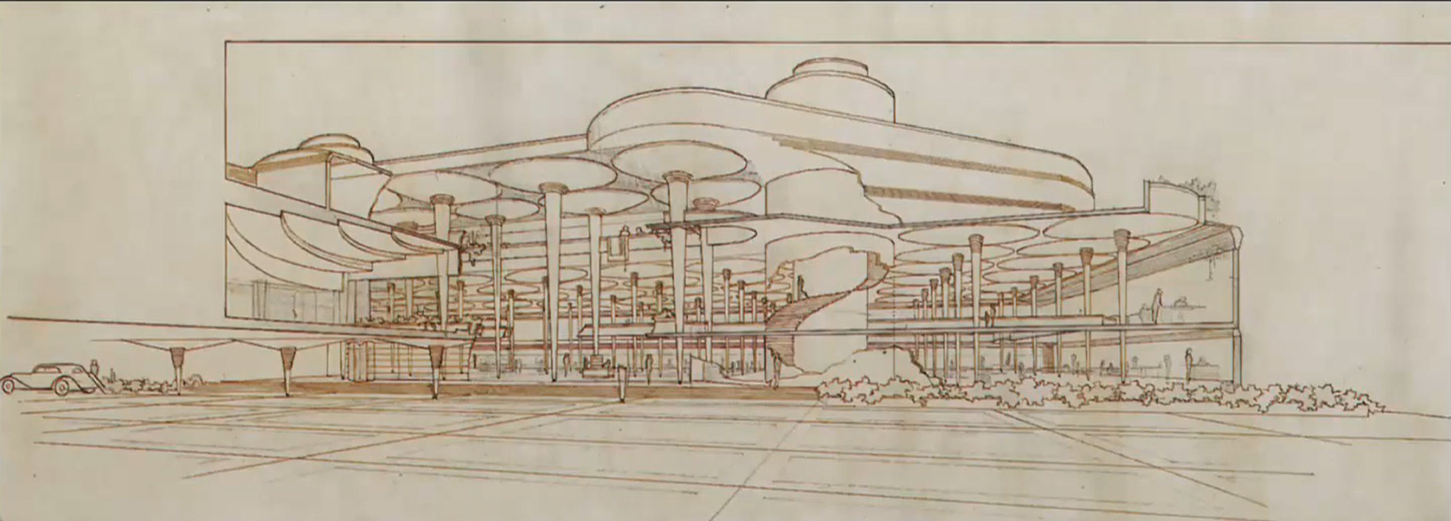
Guggenheim Museum in New York by Frank Lloyd Wright, 1943-59
The Guggenheim was meant to be a museum of non-objective art: forms that don't aspire to be representation of things in the natural world, but present abstract relationships as a framework for your own emotional interpretation. He uses theh square and circle frames of reference, things we’ve seen museums use this kind of thing before: the Altes Museum's Rotunda as symbol of universality facing the street, though Wright's references go further back. He takes an ancient temple in Iraq that represents those two symbols in a different cultural context and inverts it. You are invited in through an elevator to the top, and drift down the galleries on the interior, viewing the artwork and looking across the space to see all the other members of the community viewing artwork as well, a similar experience to Unity Temple but in an artistic framework. When you finish, you come out on the street as a more informed citizen. This museum has been used for many kinds of exhibitions over the years, creating new expectations of what a modern museum can be.
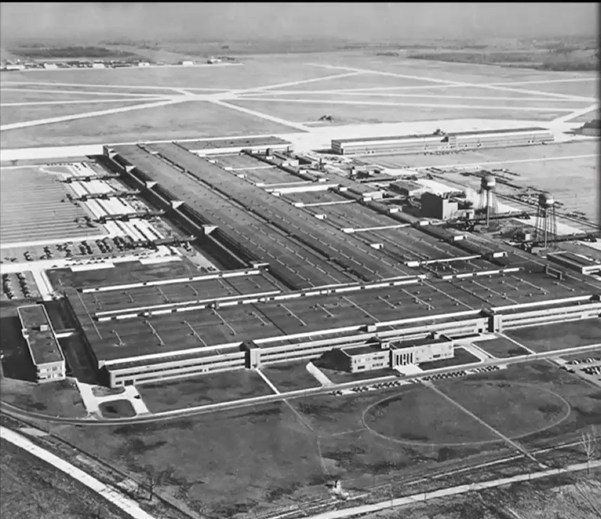
Willow Roy B 24 Bomber Factory by Albert Kahn near Detroit
The US was part of the arsenal of democracy, meaning they were producing B24 bombers and sending them to Britain in the late 1930s. The British were losing them faster than America could send them, so Henry Ford’s son approached FDR with an offer to increase the production time if they used the assembly line. FDR accepted the offer and the production time increased from one bomber per week to one bomber per hour. The Willow Roy factory was one of the major factories in the war effort and built practically overnight.
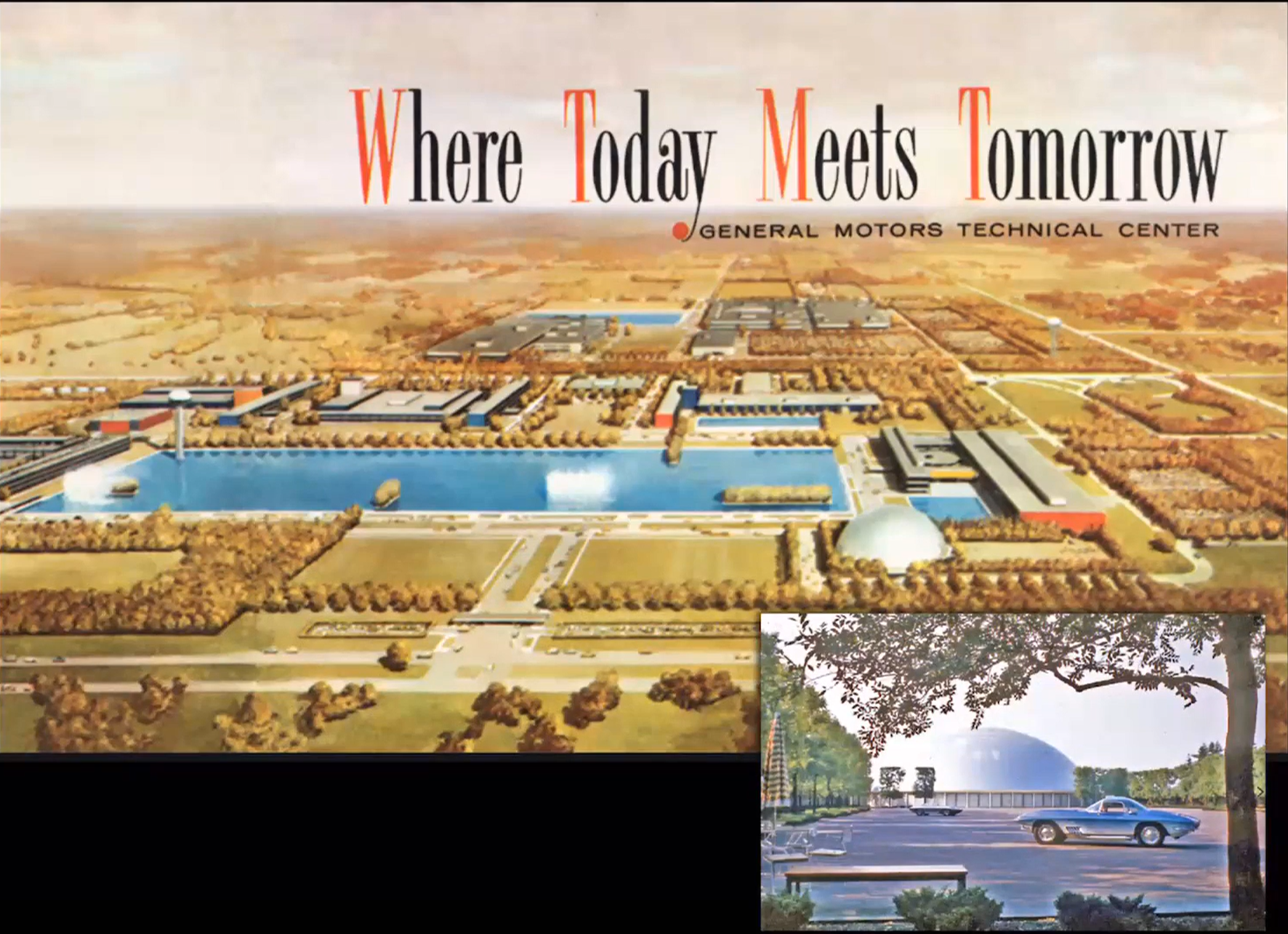
General Motors Technical Center in Detroit by Eero Saarinen, 1955
Both Eero and his father entered the design competition for this large complex, but Eero won the competition. Eero designed an amazing complex built of glass and polished steel for emphasis. The entire thing spreads across the landscape but brings a focus to the central area with a pond, where it serves as a water source in case of a fire. The water tower is polished and glowing, while the dome in the showroom reflects the sky, making an aspirational statement. The complex unfolds as you drive around it. No singular ground level image could explain the scope and character of this thing, you need the arial view to get an idea of the expansiveness of the whole. Saarinen was influenced by Bauhaus ideas of unified arts, using different color glazed tile on the ends of buildings to be easily identified because they were very similar with steel frame and glass walls. He further differentiated between the building with distinct expressive entry sequences and colorfully imagined stairways. The spiral stair held up by polished steel rods expressed a sense of fluidity and movement, transitioning the horizontal of the automobile upward. The cafeteria is widely copied around the world, including LSU’s Union. With glass on three sides, featured artwork and furniture, all the interior colors and textures are coordinated to make a whole work of art. This was also the first large scale demonstration of the modern corporate office system. All the offices have this open planning idea, steel, glass, modular ceilings and featured wooden walls. Though the dome originated in a religious context, the dome in this showroom is used to display the next year’s automobile models. Overall, Saarinen uses polished steel and water to reflect the sky as a source of potential and aspiration in a more secularized view.
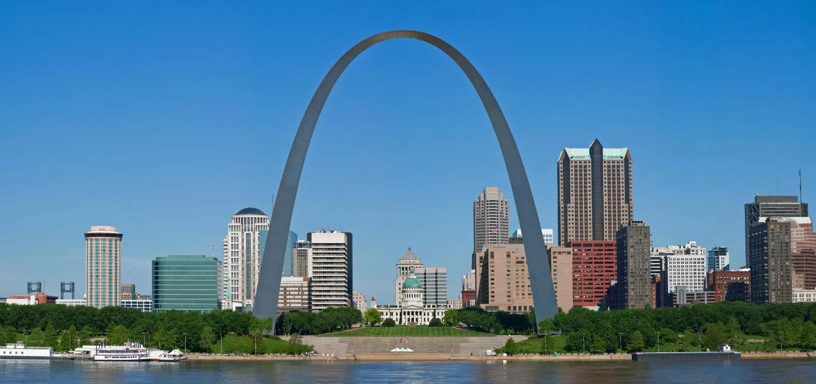
St. Louis Arch by Saarinen, 1965
Eero Saarinen entered the competition for a monument in St. Louis, and his 700-foot tall design won. The expressive, abstract nature of his arch is unprecedented. The scale was meant to be a national monument as a symbol of the role of St. Louis as a gateway to the western expansion of the country. Saarinen designed an ingenious rotating elevator tram system bringing you up to the observation deck, as it climbs up the capsules turn so you are always on a level floor. This strong expression of power and overcoming gravity would not be possible without reinforced concrete. Scope and character of this beautiful construction photo, the sides wanted to fall into each other, the keystone piece slipping into place.
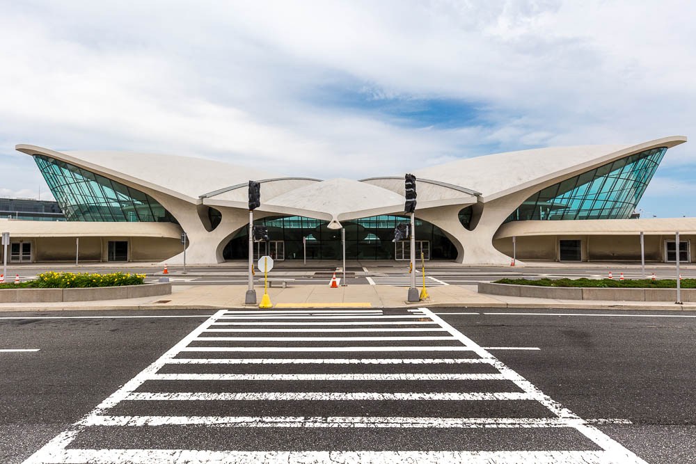
TWA Terminal by Eero Saarinen in 1962
This was an incredible, daring work that dazzled the public, and was all designed and constructed without computers. He built a lot of models to study the function and structure of the airport’s distinct birdlike shape. The posture of wings, beak, and claws suggests flight. The success of the design is an example of the remarkable expressiveness of reinforced concrete as a modern material. By the early 60s, many airports had issues getting planes close to the terminal without making the building a mile long. Saarinen solves this by creating bridges that go out to satellite terminals.
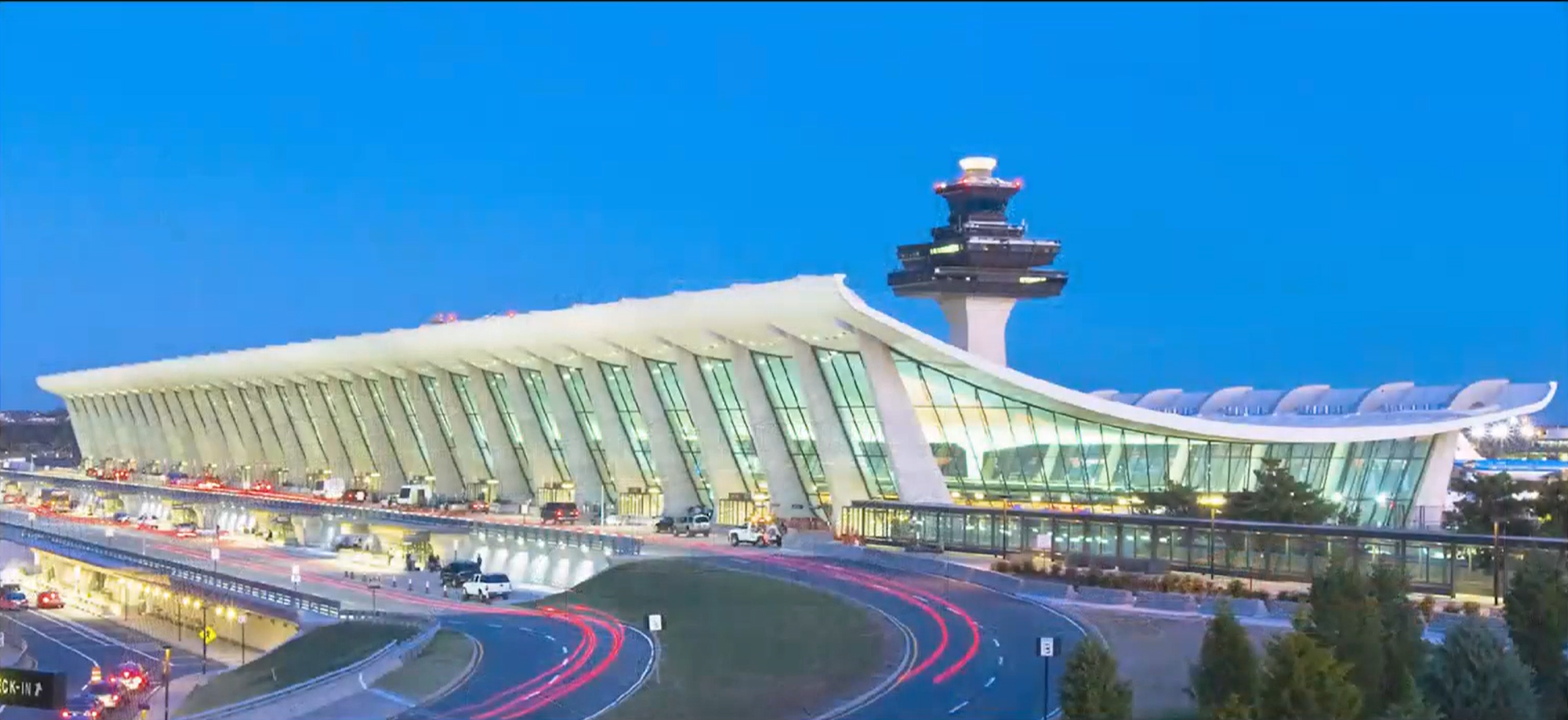
Dulles International Airport near Washington by Saarinen, 1962
This airport was meant to be the major international airport for people coming into the US. It represents a remarkably fluid expressive message as a white, temple like building on green fields. Saarinen strived to make the most efficient airport, making flows fluidly without interrupting each other. Every aspect of the Dulles Airport was functionally determined, then a remarkable expressive move was made with the perception of a hanging canopy. Steel cables and concrete panels framed one open space so that the idea of flight, continuity, and this object reaching into the sky was powerful. Saarinen also invented mobile departure lounges that brought you to the airplane, eliminating most of the walking. Though they hoped it would become a standard thing, but it never really took on. This airport is very different than many of the other buildings we have looked at, especially towards the beginning of the semester because it finds meaning and value in the functioning of human activities, not human types.
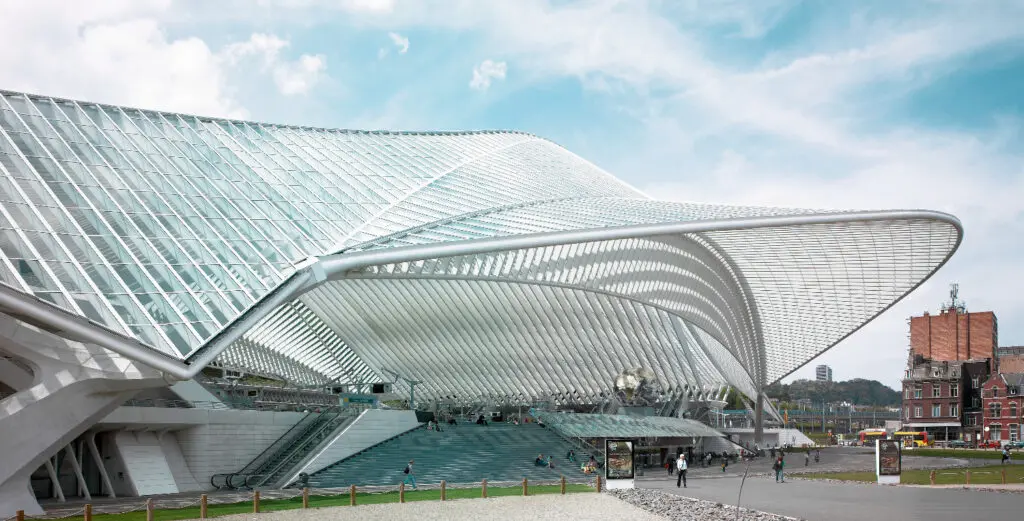
Liege-Guillemins Station in Belgium by Santiago Calatrava, 2009
Also done in reinforced concrete that takes some of the expressiveness from Eero Saarinen's airports and continues to use it.
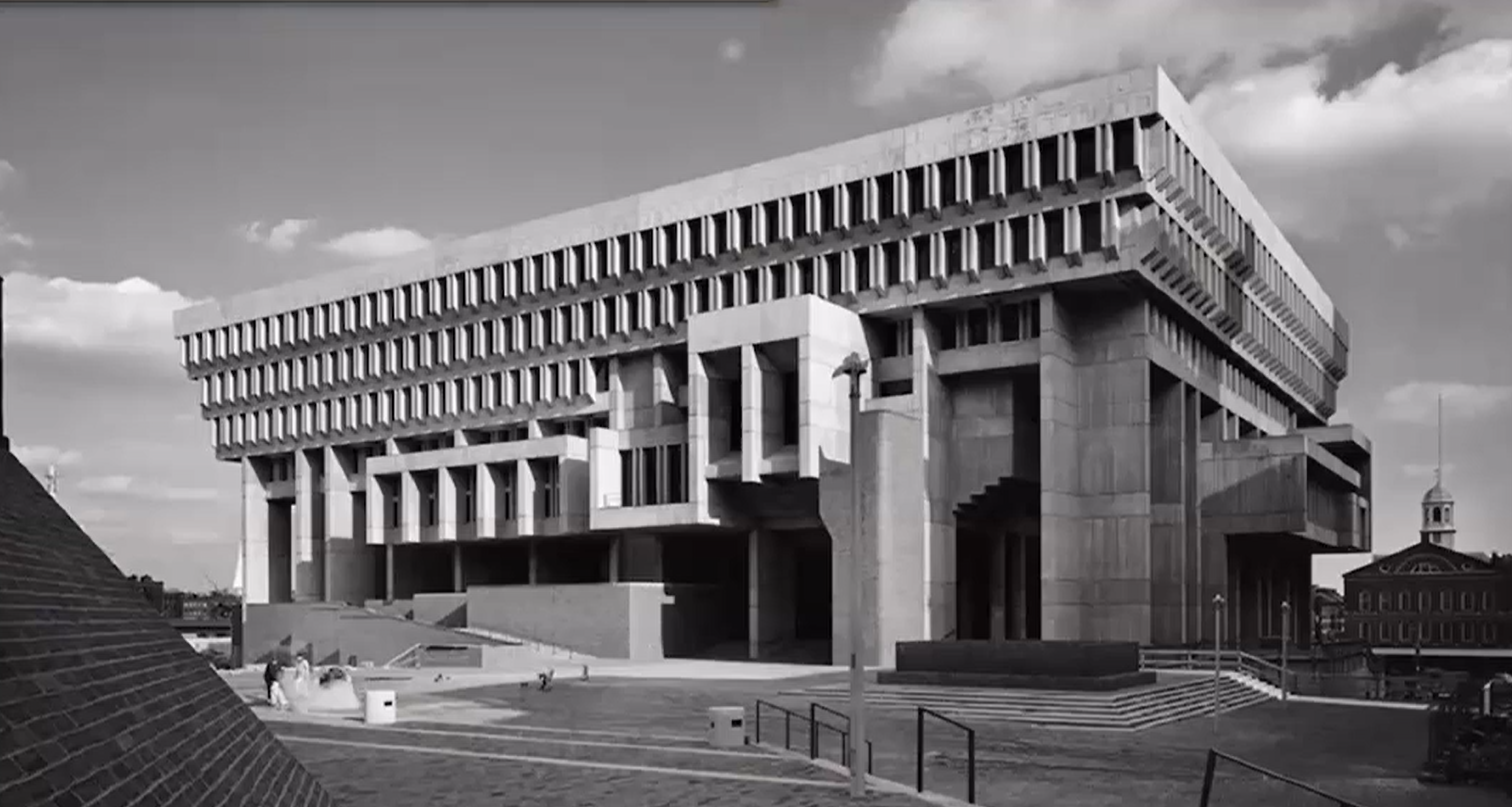
Boston City Hall by Kullman and McKinnell, 1968
The Boston City Hall is an important building in terms of monumentality. Result of urban design and renewal, where there was a 'slum clearance' in the late 1950s to make way for public works. This remarkable building is the result of competition entry in early 1960s and the first time a local government bought into the expressive patterns of modern architecture. Architects and people knowledgeable in the visual language of modern architecture really admire its work, though the local community of Boston never liked it because they don't understand what it means. Right above the entry base is council chambers with offices along the side and mayor's office on the other side while the necessary bureaucracy is lifted up. As you go in on third floor, going down into to pay your bills to government services. One of the powerful potentialities of modern architecture, is that because they reject the foundation of historical types gives great expressional freedom, the danger is it might not be understood.
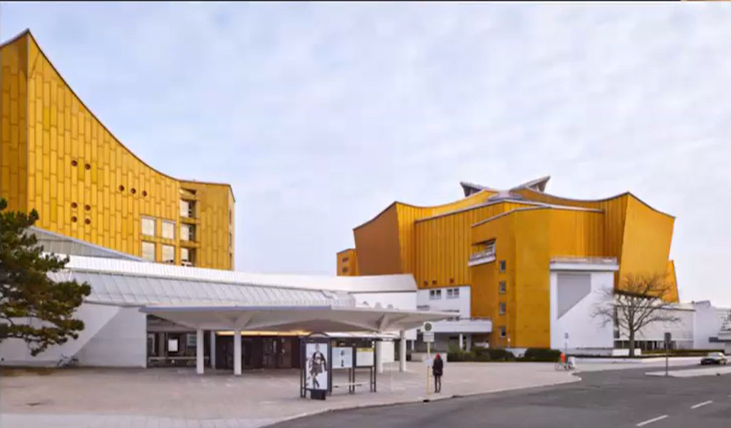
Berlin Philharmonic by Hans Schroun, 1963
Schroun designed a remarkably organic performing room that everyone copies. He’s taken a huge concert hall and lifted it up with the lobby below. Everyone stands around in the lobby with cocktails for an hour or so, socializing while the orchestra is getting ready. The chimes start to go off to tell you to take your seat, and it becomes this beehive of activity, people moving in all directions climbing to their entries to the performing room. If you are already inside the room, you see people fill the room from all different entries around. The dispersal is the context for the action for the gathering. The only level space is the stage pulled out, while everything else is moving and the audience is wrapped around it.
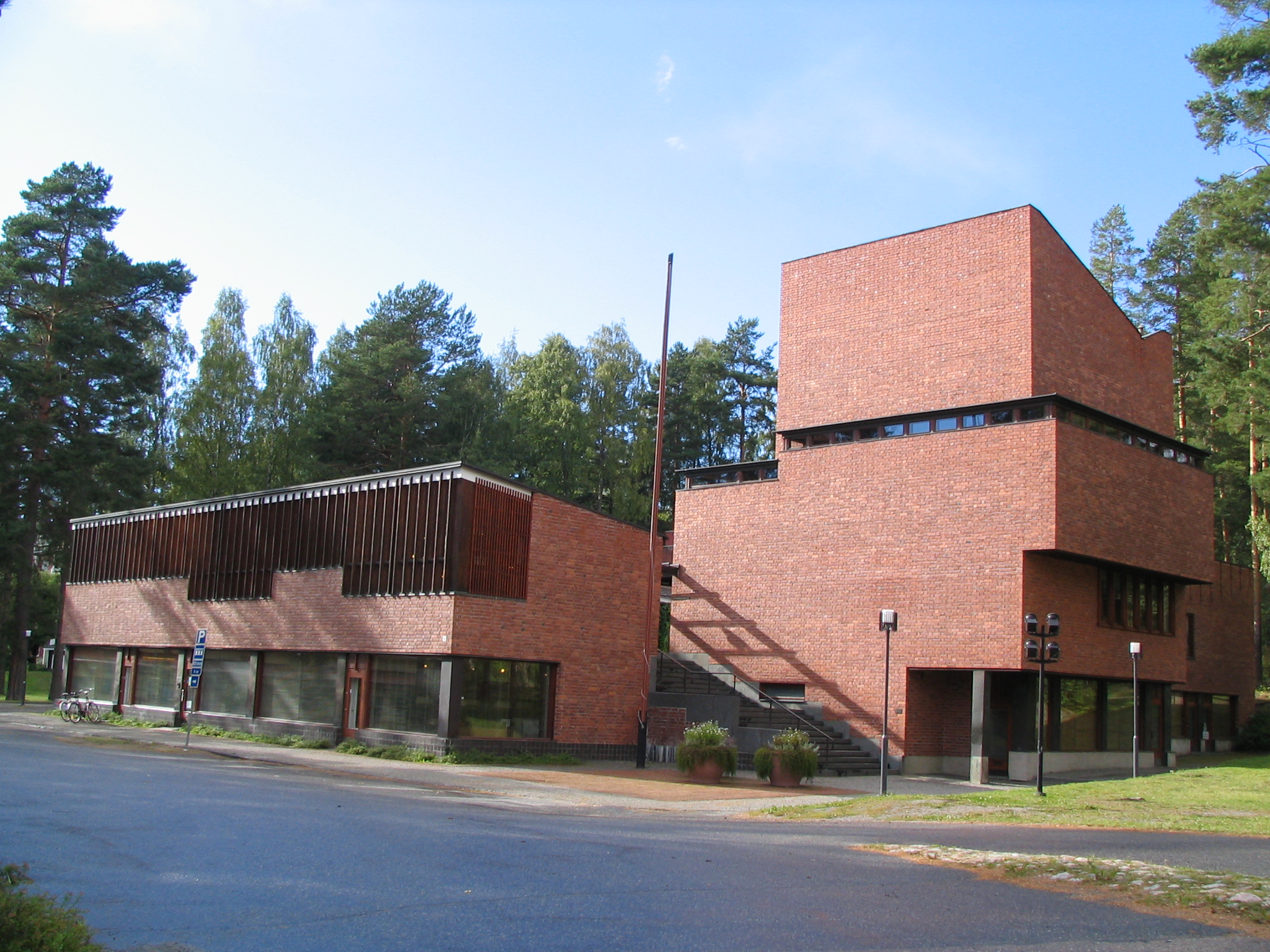
Saynatsalo Town Hall by Alvar Aalto, 1951
The Saynatsalo Town Hall is in a very small town, kind of spread out in an evergreen pine forest. The building has many features and faces, but also projects a sense of unity, almost as though it’s a rebuilding of a little Italian hill town. It has a main level plan, the piano noble, where the deliberative chamber is the functional focus of the building rising up in a dramatic way. There are two sets of stairs, one more organic and playful with grass, the other more organized and orthogonal that leads you up to the governmental functions which surround the courtyard.
Small brick building easily constructed. How is it that all the various pieces serve the different functions yet evokes a sense of community and participative identity? The idea of three-dimensional spatial manipulations that we have been talking about have to do with the Bauhausian notion of universal space as itself having itself a value. Versus Wright was working where the idea of manipulations in three dimensional space become a tool for providing activity and connecting the activity to whatever values you can find in the natural landscape. That way it squarely fits closer to the Wrightian organic way of thinking about it.
The cross section through the building shows the 3 story form.The ground floor has a whole series of commercial rental spaces scattered about that you approach from the sides, helping to create a commercial downtown area in association with the town government. The offices on the ground floor have large glass windows on facing the parking to represent transparency and invitation. Over everything, the tower rises and is adapted to the natural climb in interesting ways. The main stairway leads you up to the courtyard. The first thing you see is a door on the left leading to the public library. The courtyard and surrounding trees before you get under the pergola where you encounter the front door of the town hall. Its hidden so you work up to it and discover it as a participatory activity, something found in older towns in Europe. The town hall part of this works on this main floor, with a large reception area and a series of offices surrounded on two sides by a glass corridor. The brick floors encourage you to move into and through the public space. Built in seating allows the space to feel almost residential and informal. Always looking back down over the courtyard so every office has a relationship to the courtyard, creating a unified casual experience that changes as the sun sweeps across the sky.
Aalto also multiplied the vertical rhythm of the window frames so they seem to fit in with the pattern of the fir trees surrounding the place. Almost collage like effect of the different elements. Going back to look at St. Oswald's church with all the identifiable parts going into creating a whole. You see how far that organic idea has come. There are private apartments in the main floor, currently an airbnb. The town allows a collection of visitors as a part of the community, so the town itself shows hospitality to visitors. The public library with south facing large window wall that floods the single room with light. The bookshelves are arranged with the thoughtful use of auxiliary lighting to provide extra light just on the large shelves of books.
The idea of the government itself happens on a higher level, so that from the lobby a stairway leads you up and around. Again, as light changes during the day, the forms are animated through the windows. The climb up the hallway to the chamber is itself an experience. A warm connection to brick and sunlight, in Finland where much of the year is white and snowy, the warmth of the brick is much more than a visual phenomenon, but an enriching experience shared with the community.
Provides a sense of the functions, and an instrumentality to help bring value and fulfillment to your participation in the public sphere. The chamber where city council meetings are held has an inventive truss that makes a suggestion of all the community members working together to hold up the weight. An interpretive organic form. The idea of architecture bringing meaning to the public sphere has come a long way in this 500 years or so. From the Palazzo Vecchio standing up in the public square, asserting itself and claiming a sense of value with a vertical reference. Its objectivity, strength, assertiveness, all representing the institution of town government.
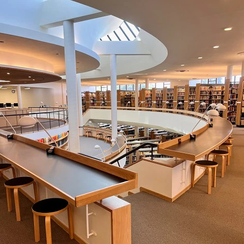
Mt. Angel Abbey Library by Alvar Aalto
Aalto built two buildings in the US. One is a dormitory in MIT, the other is a library outside of Portland, Oregon. Willamette valley is a very fertile and luxurious natural environment known for its production of grapes and wine. This Monastery sits on a hill in a pastoral landscape, almost like the Acropolis. As you walk through the quad, you hardly notice Aatlo’s building in relationship to the other buildings. It's much more modern and organic, taking a quiet posture on the quadrangle, especially in the presence of the large, neoclassical buildings. As you get close, it opens up gently with a long glass wall under a sheltering canopy. The canopy has small openings in it, so the light comes through. Steel cruciform columns with polished wood give it a comforting feel, not assertive, and reflecting the order of the grid above it. The canopy reaches out to bring down the scale of your involvement. The lobby space gives access to small conference rooms and an auditorium accessible through a hall. Through another set of doors through a forum off of the main information desks, that area projects into a beautiful multistory space with dramatic skylights. A completely unexpected explosion of space leading your attention to the dramatic vista and peaceful landscape beyond.
From the librarian's vantage point, you can see every bookshelf in the building and everyone moving through on both floors. As you climb the stairs, the handrailing loops around the columns, bringing you around the curve and leading you further. Juxtaposition of details, furnishings, and spatial operations all woven together to create a delightful community experience.
The quality of light is both surprising and dramatic, especially as the sun moves across the sky. North facing light brought in against a white bank that spreads and diffuses that light evenly across this entire space. At night, uplighting into that duplicates the effect so that the indirect light fills the room at night as well.
The library encourages you to participate in the activities it’s built for, making them as pleasant and productive as it can. There are comfortable spaces to retreat to and study carols on the walls so you have privacy. Overall, the functional pattern and expressive form gives you access to wonderful views tying it all together.
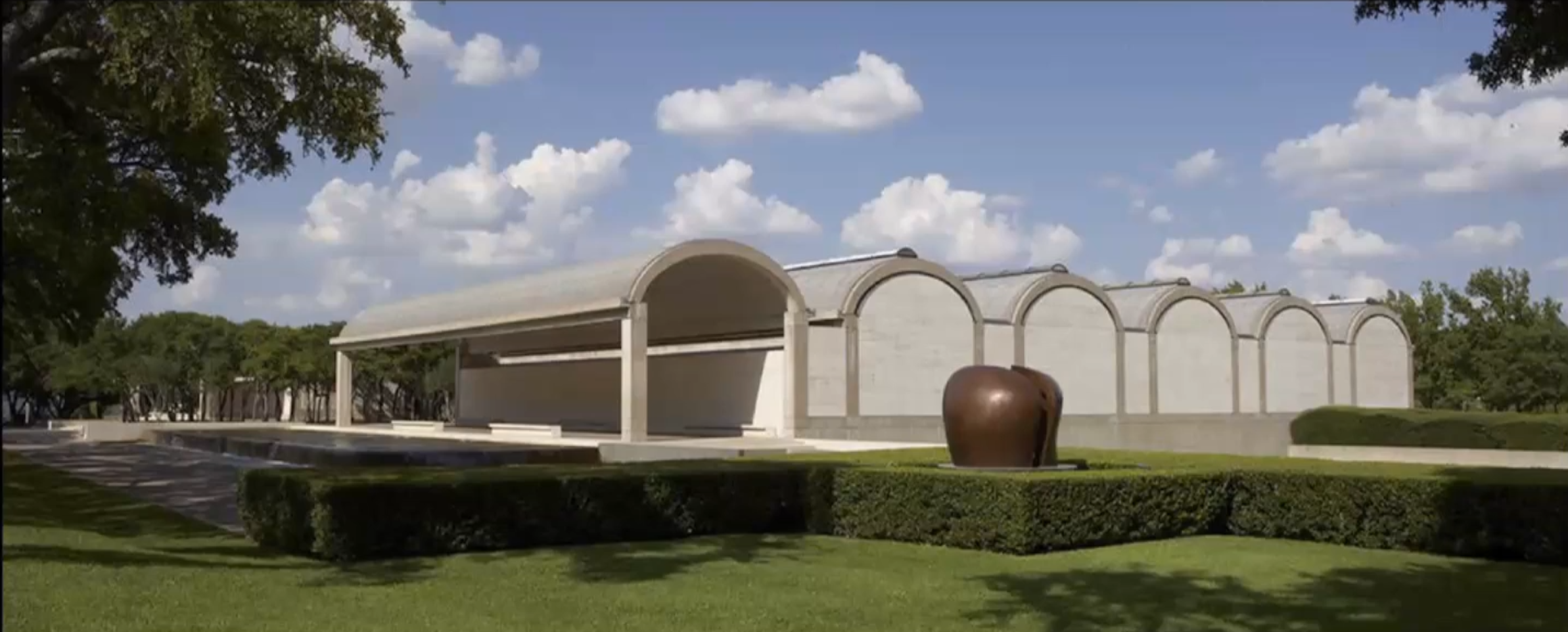
Kimbell Art Museum in Fort Worth by Louis Kahn, 1972
The Kimbel Art Museum is a unique, two-story building that one can enter from the rear from the parking lot on the lower floor. The main entry is at the top floor, where all the galleries are, from a park that was created for the museum. Kahn is known in some ways for bringing an interest in history and historical form back into modern architecture. The Europeans had turned away from historical typologies and overt historical references that became the keystone of how one practiced architecture in the past. Kahn shows that we can draw lots of meaning and useful form from history while also having an architecture that is also inventive.
As you walk around the square, you come upon the walkways that lead to the museum, to the two-story form. As you come around a largely symmetrical form, you don't see doors or signs, but a comfortable, shaded spot with benches that invites you to come in out of the sun and provide a point of access. You start to notice the fountains on either side, a polished black stone that rises up to a certain level, perfectly level so the water cascades evenly off all four sides into a drainage area. Several things happen, you hear the sound of the water, so it starts to wipe away the traffic noise. The water evaporates into the air, so as you step into the shade the cooling effect is amplified, giving a sense of relaxation and calming. In the afternoons, the light bounces off the moving water and ripples across the walls and vaults, presenting a delightful effect of lighting. Instead of making the entrance to the building a wall with a door, so from one step you go completely inside to outside, he's shaping that transitional experience and bringing you into the experience gradually. As you get to the end of that walkway into the shade along the water, it stops. The paving stops and you walk on crushed rock towards a bosque of trees. As you step onto the gravel, it's not a clear door, but a grove of trees as the welcoming symbol. You hear the gravel crunch as you walk, engaging all of your senses. It's not clear where to go, one side has a large park, and an opposite walkway straight ahead. A very different way to invite you into a museum than we have seen before.
As you walk through the bosque, eventually you see a reflective surface, the mirroring of this glass wall, not doors. You see shadows and mirroring of the glass wall showing you the bosque. Once you get up the long, gracious flight of stairs, the pattern of light changes, and you see through the glass into the lobby and the door.
One of the first things you notice about this building is the arch because there are very few arches in modern architecture at this time. The arch works with two sides that lean together, with a keystone holding it up from caving in. The Roman arch looks like half a circle, but functionally it’s two halves. Gothic arches are pointed, working the same. As you see that in the back of your mind you think of the structure, but that arch is the end of a 70 foot long concrete beam going in the other direction. The structural order of the building is interwoven with the spatial order of the building. Your reading of how the forms deal with gravity and create opportunity is also there in the beginning, the grid of the bosque creating another kind of perceptual reference. You step into the building along the long side of one of those modules. You are brought in from the sidewalk through the module in a linear way, but brought between galleries in a transverse way, suggesting both patterns of use are there. Kahn pioneered the use of beautifully crafted concrete, careful attention to color and texture in almost all of his buildings. In an art museum, light is very important. Our eyes have evolved under the light of the sun, that is the light they function best in and that we see most clearly in, but sunlight has a damaging effect on art forms, so it’s hard to get both. You want natural light to make objects clearer, but you don't want to damage them. The two sides of the arch don't meet, the light streams into that gap. The curving form of the vault and fixtures hang down determine what percent of light is okay to let come into the space. In the aluminum sheeting, they made a mesh of holes that would let that much light in. The rest of it is shiny and polished, reflecting on the curved surface. The room is primarily naturally lit, as you walk through it when a cloud goes over the sun you feel it.
The museum is organized in long linear galleries. At the end of these, he holds the wall back from the ceiling so you see the arch. It's easy to understand how this gallery provides you an opportunity to organize and exhibit how flexible it is, moving along the structure. When you turn counter to it, you see through all the galleries. The lower point between the arches is used to anchor the flexible walls, so every time you go the interior layout is transformed to best suite the exhibit's experience. The spatial richness of this allows artists to use this building to set up specific exhibitions and provide contemplative downtime before you move into the next to shape that sequence is virtually endless.
Kahn follows the bilaterally symmetrical and hierarchical pattern of historical forms, but using the grid in a much more flexible way. As you wander around, you come upon little courtyards. If you go at the right time of year, the Texas rose petals filter the sunlight, creating a wonderful relaxing, contemplative experience.
Instrumentality
The depiction of agency and buildings as tools to facilitate a particular activity as suggestively or positively as possible to bring value to a particular activity.
Symbolism and Monumenality
Monumental architecture, characterized by its scale, permanence, and often grand design, transcends its functional purpose to convey specific meanings and evoke emotions. Symbolism, in turn, is the language of meaning embedded within the structure, using architectural elements and forms to communicate ideas and values.
Post Modernism
It represents a mistrust of grand narratives and exploring and testing on your own. Not listening to those who claim to have an understanding of the ultimate meaning of life.
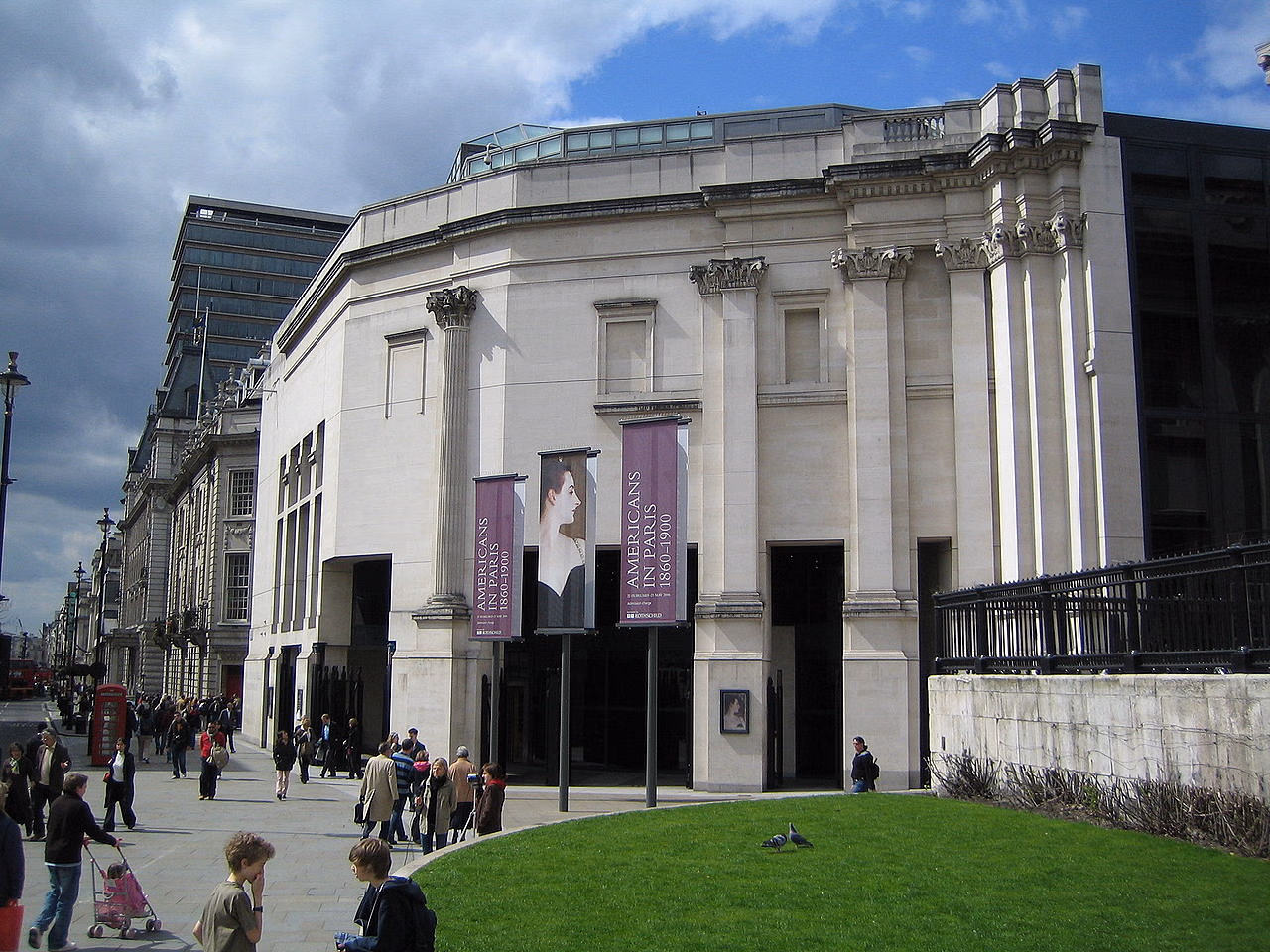
Sainsbury Wing of the National Gallery, 1991 by Venturi and Denise Scott Brown
The National Portrait Gallery on the axis of the street. The gallery is where the nation memorializes figures of the past, so it is full of a lot of pictures. It’s a Neo-Classical building following precedents we have been talking about. Presents itself as a singular whole though it has bilateral symmetry, hierarchy in more extensive ways with many pieces along the façade so that you can get a building 2-3 stories tall, but stretched along the whole length of the square, creating a proper frame for the symbolism there. The National Gallery started as a relatively narrow affair, formally organized, but has been expanded and added to over the centuries. A mixture of different kind of galleries as you wander through.
The Sainsbury wing sits off to the side, when they built it, they reorganized the circulation and took away the stairs from the middle that functioned as the museum's main entrance. As you approach it, there's no obvious way to get in, but it doesn't take you long to notice the voids occurring on the addition. If they don't discreetly show you stairways and doors, at least they show you the possibility of exploration, inviting you that way. It picks up the scale and entablature line of the existing building, taking the existing elements of historical building, but the pieces dissolve and unravel to create inviting portals. The jumble of neoclassical form that maybe overstates the language, when it hits the curve and begins to open up and break down. As you move around the Sainsbury wing, it changes. Every 30-40 feet, there's a different architectural style going on. It begins to blend itself with the buildings around it as you move around the building. The demeanor, character, and architectural language changes as you move around the building. The rear presents itself as a plain façade with a one limestone plaque reading "The National Gallery." Venturi and Denise Scott Brown differ to the authority of the crown and the program of the National Gallery and to the presence of historical style as an emblem of that authority but then they suggested other sources of value and meaning as you go through. The idea that the building was not presenting itself as a formal aspect of this system, but forming itself to the streetscape.
Venturi's Parti Sketch of axis of original building in relation to the new axis. The original grand entrance continues through, but becomes a secondary axis because it is the transverse axis that you are drawn into as you climb the stairway. Glass wall along the stairway that opens your view up to the throng of tourists and the life of the street and square. A grand stair leads up to the major galleries so you enter the gallery along that long axis, the older building itself becomes an entry spot. Venturi created a very unusual spatial sequence, focusing, and collapsing of the space to frame a view of a tryptic on the wall at the end of the space. He uses a beautiful gray stone, similar to Brunelleschi’s at San Lorenzo. The columns on either side of the openings are distorted and unique from his invention. The columns usually support an entablature as the base of the arch, but the passageway is more narrow and diminishing.
A common theme in Venturi's buildings is the exterior form does one thing while the interior plan does another, and the difference is made up by the poche. It throws attention on your experience as the thing that assembles the pieces on your imagination, on your ability to interpret the whole from a set of dispersed parts. It highlights your role and experience. It questions the blind allegiance to any authority, looking to alternate sources of value.
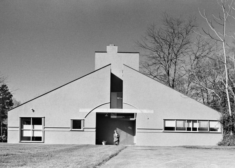
Mother’s House by Venturi, 1964
This building depicts shelter in terms of formal meaning systems we have talked about. The gable roof is cracked, and the chimney is off center. Both larger and smaller windows, but everything asymmetrical. The entry depicts a diffused icon of humanism, with the circle mostly there and the square in the center as a void for the entryway. The inside is a very comfortable house, but discombobulated. You enter under the square into a hallway by the stair bringing you into the living room with a visible outdoor porch. Under the stair is a large ceremonial fireplace with bathrooms and bedrooms tucked behind. Nothing is symmetrical, but all the pieces you would use comfortably there. Everything she wanted in a house, but all the pieces bent and don't align. The stairway slips up to the second floor, where a large bedroom and balcony overlook the backyard. The symbol or form of the hearth isn't the source of value, but the patterns of use of it. Almost as though he depicts the pieces off kilter on purpose to emphasize their use is more important than their organization.
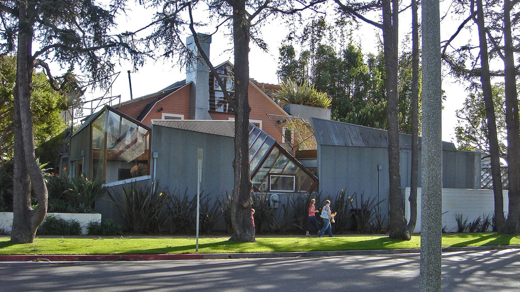
Frank Gehry House in Santa Monica by Gehry, 1978
Located outside of LA, Gehry renovated an existing house by wrapping a wall around part of it. He added a kitchen in this space and opened up the house to the environment in new ways. The addition completely refuses to follow traditional standards of conventionality and form. The skylights prioritize the views and light over the form of the skylight. Gehry took out much of the framing wall, leaving the open studs to create a sense of flow through the experience more similar to modern convention of space than 1930s. Rough feel with elegant, expensive furnishings. He is creatingn a spatial feeling that resists your ability to create a sense of the whole.

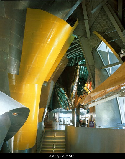
Guggenheim Museum in Bilbao by Gehry, 1997
Gehry’s Guggenheim in Bilbao talks about movement and emphasizes the spectacle of entertainment. The building looks like it’s moving the entire time, like an incomplete form in the process of shaping itself. The curves gesture to the mountains on the edge of town, bringing them down to your experience. Exterior slick reflective forms made of stone and metal with curving glass walls answers the call for a structural order, but in a way that doesn't follow traditional patterns of rationality. Gehry is making an allusion to life and living forms, a building that seems to be moving when it is sitting still. It almost presents itself as a school of fish clustering around with reflections changing your perception of it, resisting any concrete condensation of the form. The atrium inside follows this excitable experience with a series of different patterns of materials. The idea of unity, order, and wholeness as a foundation is where we started with the square and the circle, relating the architectural forms to symbolic universes apart of our culture. Suggesting the unity of the space reaches beyond its walls. The idea of the telescoping orders, that columns in the building slowly pull your attention skyward through different layers. This value is changing towards the experience, not the forms. Not the particular message or symbolism, but the overall experience that you are in charge of depicting the value of the architecture.
Experience Music Project in Seattle by Gehry, 2000
Forms that mimic fish seeming to be squiggly away.