Visualizing Data with Charts and Graphs - Chapter 2
1/24
Earn XP
Description and Tags
Vocabulary flashcards covering key terms related to frequency distributions and data visualization (both quantitative and qualitative) from Chapter 2.
Name | Mastery | Learn | Test | Matching | Spaced |
|---|
No study sessions yet.
25 Terms
Ungrouped data
Raw data that have not been summarized or organized into classes; observations listed individually.
Grouped data
Data that have been organized into logical groupings (class intervals) and assembled into a frequency distribution. (example: age ranges 20-29, 30-39, etc.)
Frequency distribution
A summary of data showing class intervals and the frequencies (counts) in each interval.
Class interval
A defined range of values used to group data in a frequency distribution (e.g., 1–under 3).
Class midpoint (class mark)
The value halfway across a class interval, calculated as the average of the interval’s endpoints.
Frequency
The number of observations that fall within a given class interval.
Relative frequency
The proportion of the total observations that fall in a given class (frequency divided by the total).
Cumulative frequency
The running total of frequencies through the classes in a distribution.
Range
The difference between the largest and smallest observations in a data set.
Histogram
A chart with contiguous rectangles representing frequencies for class intervals; x-axis shows intervals, y-axis shows frequencies; can be drawn with a distribution curve on top.
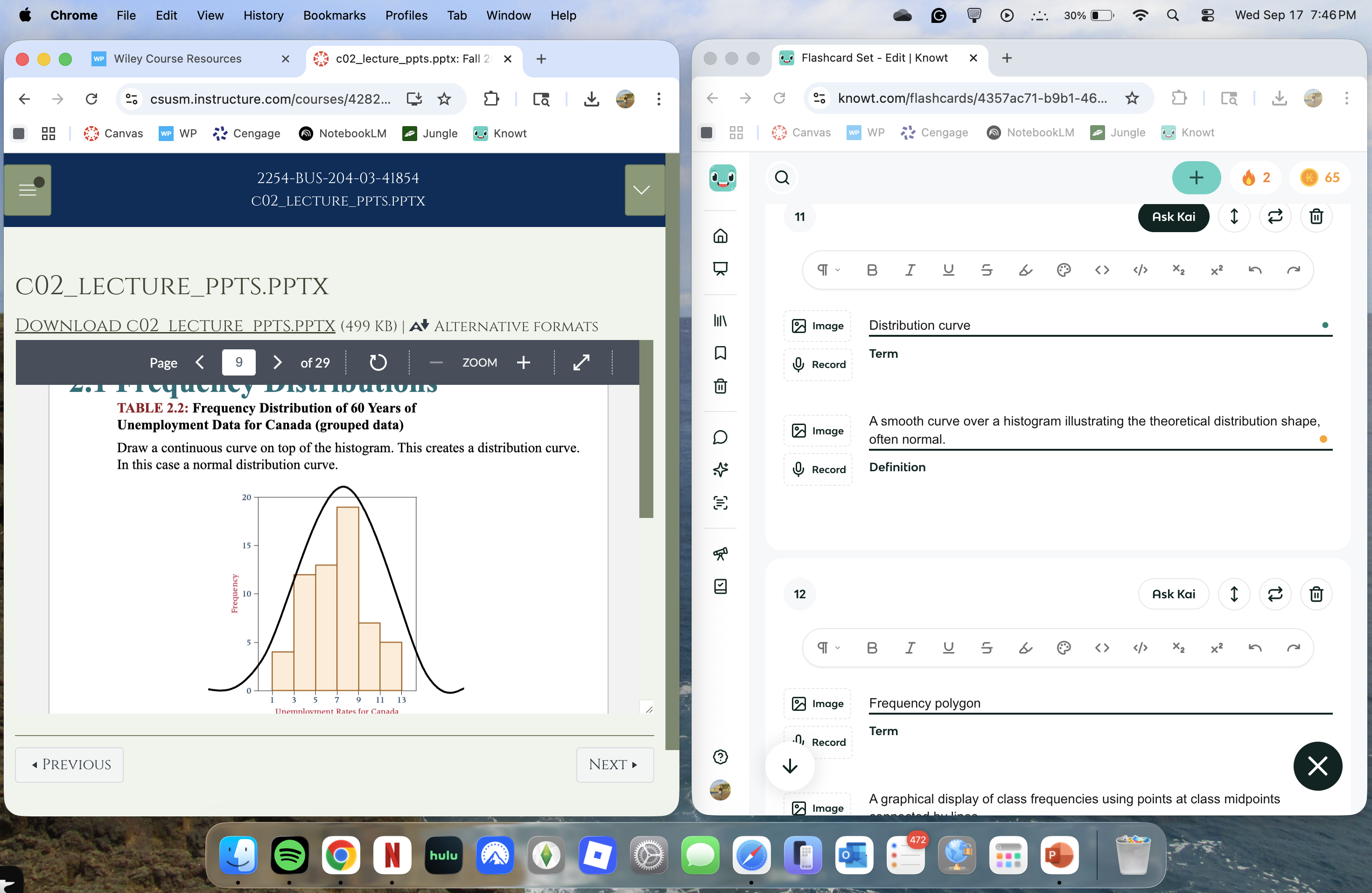
Distribution curve
A smooth curve over a histogram illustrating the theoretical distribution shape, often normal.
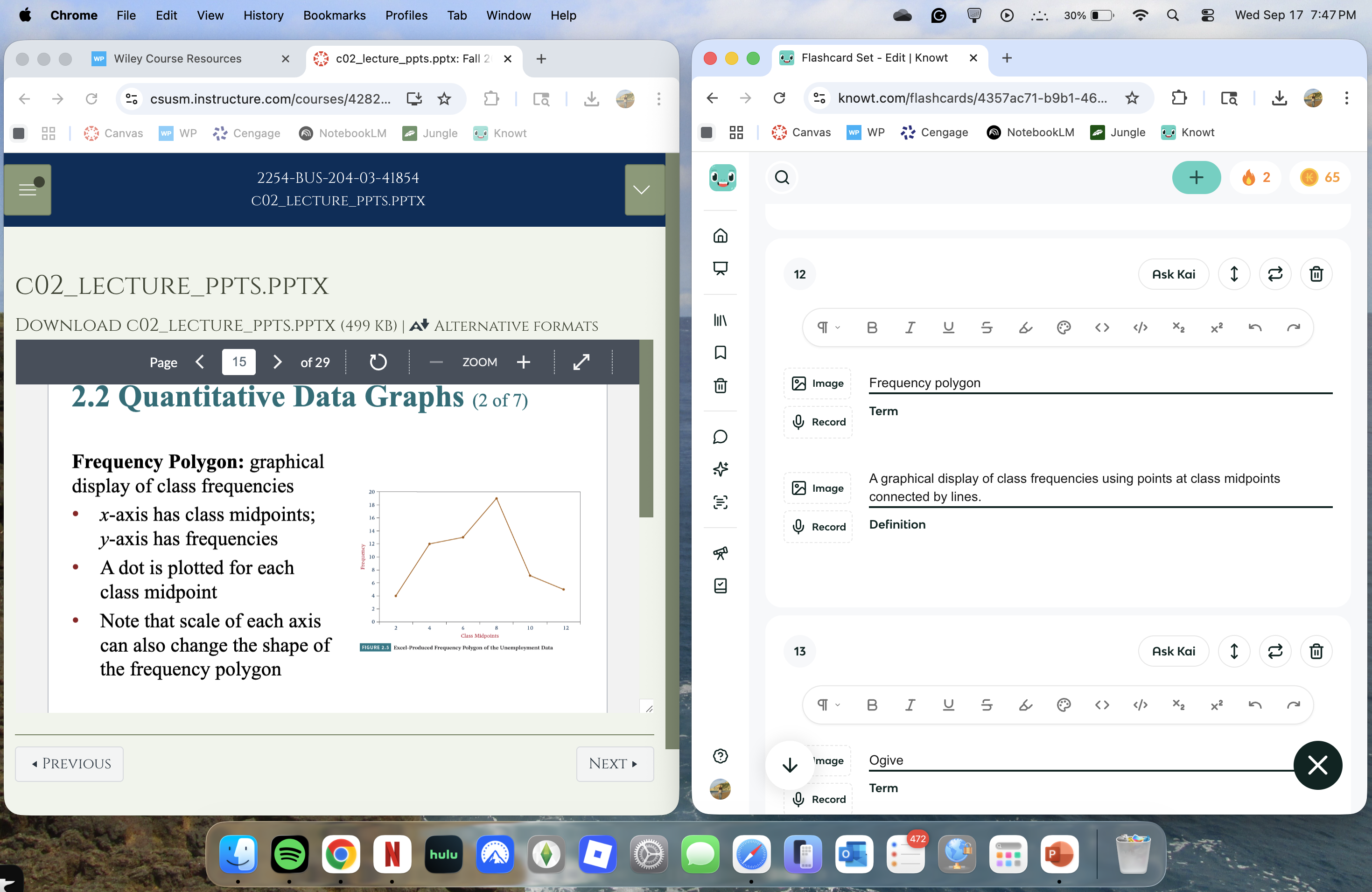
Frequency polygon
A graphical display of class frequencies using points at class midpoints connected by lines.
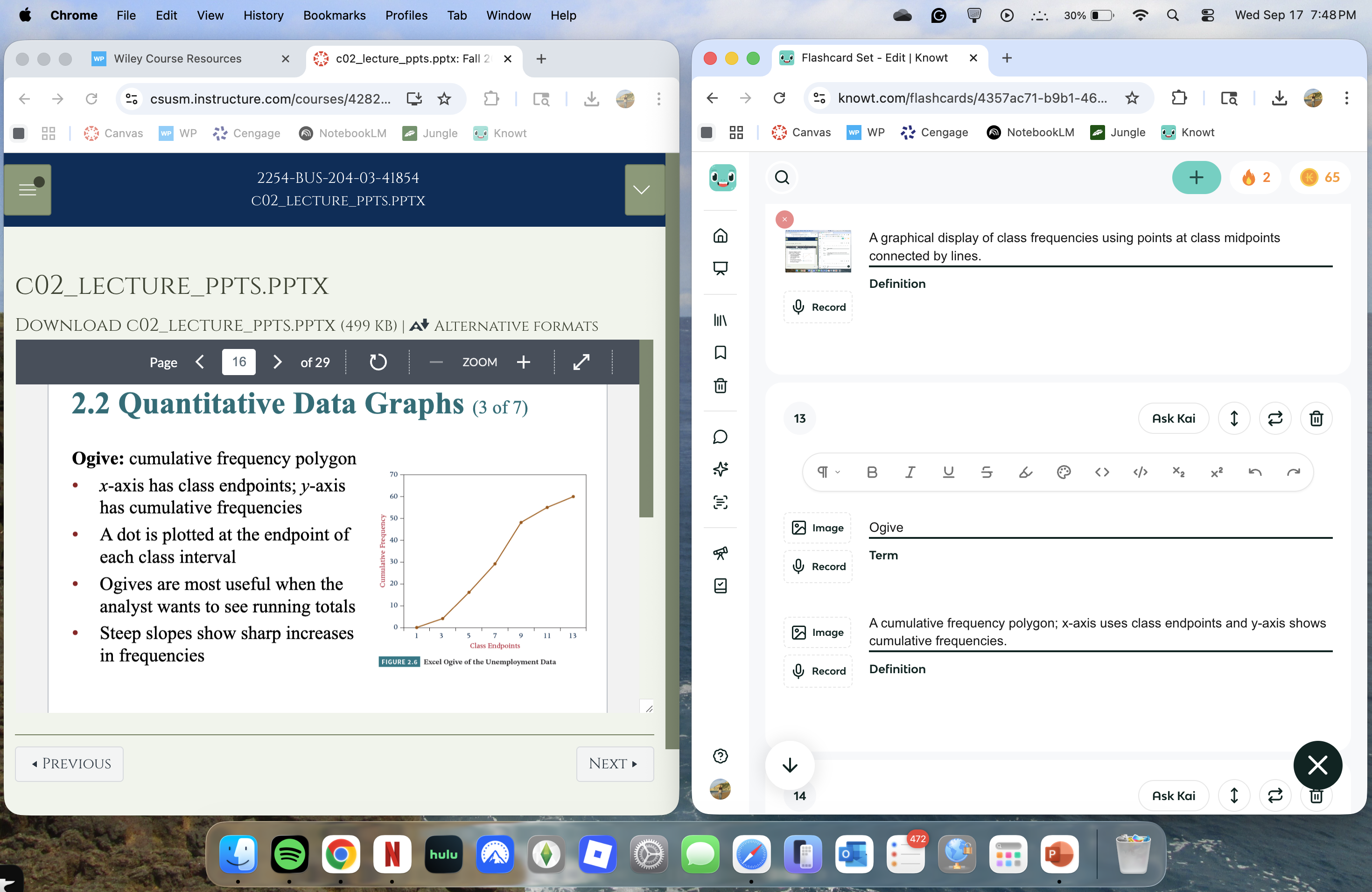
Ogive
A cumulative frequency polygon; x-axis uses class endpoints and y-axis shows cumulative frequencies.
Dot plot
A plot where each data value is represented by a dot; identical values stack vertically to show distribution and gaps.
Stem-and-leaf plot
A plot that splits digits into a stem (left) and a leaf (right); preserves original data while showing distribution.
Bar graph (bar chart)
A chart with bars representing categories; can be horizontal or vertical, used for qualitative or categorical data.
Pareto chart
A vertical bar chart that ranks categories from most to least frequent and often includes an ogive showing cumulative frequency.

Pie chart
A circular chart where the whole represents 100% and slices represent proportional shares; angles are proportional to the data and sum to 360 degrees.
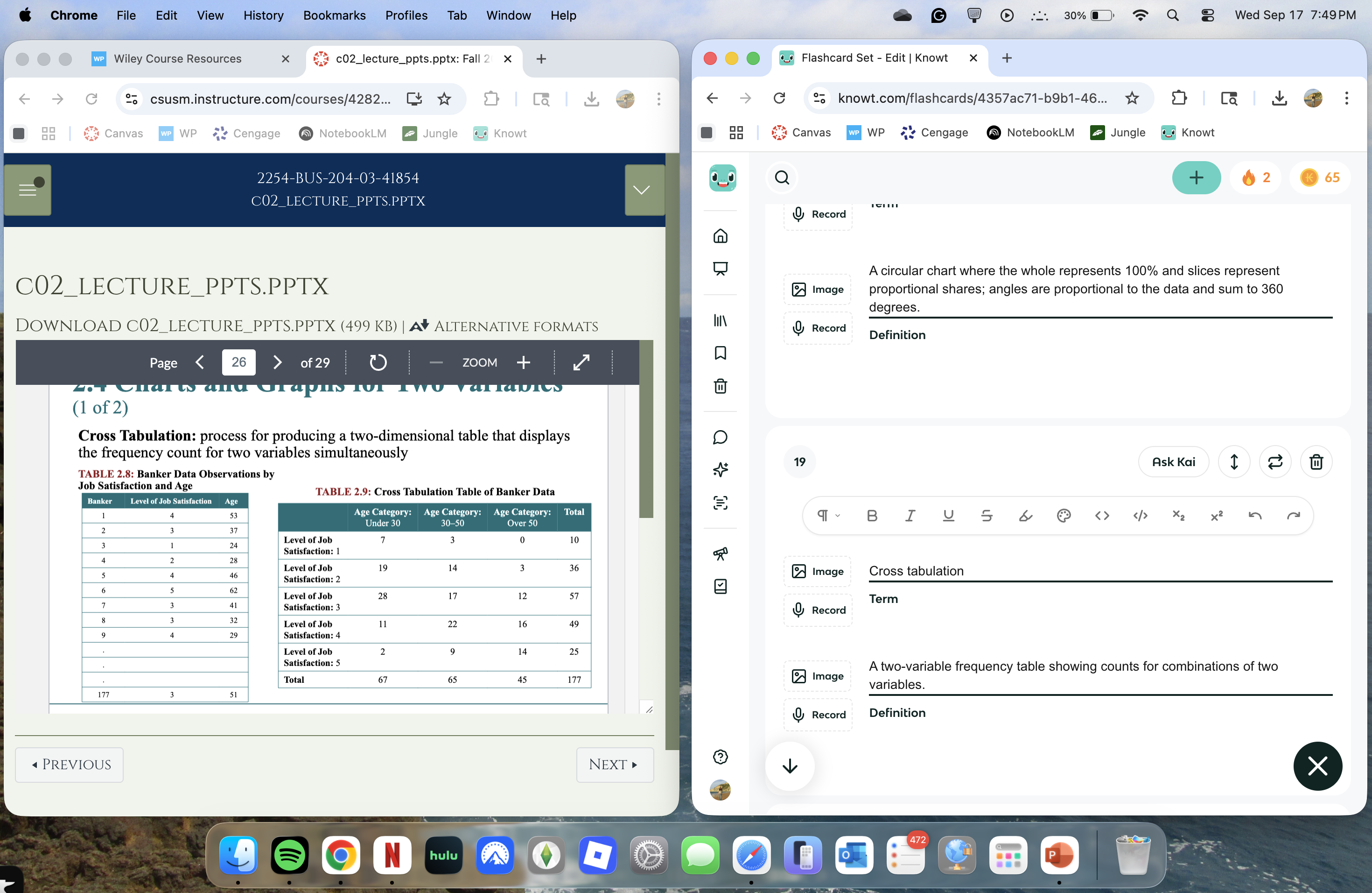
Cross tabulation
A two-variable frequency table showing counts for combinations of two variables.
Scatter plot
A two-dimensional graph of paired numerical values used to assess possible relationships between variables.
Time series data
Data collected over time at regular intervals; visualized with a line chart to identify trends or directions.
Line chart
A chart that connects data points with a line, commonly used to display time series data.
Trend
The general direction in which data move over time in a time-series analysis.
Rotation to histogram
The process of converting grouped frequency data into a histogram by plotting class intervals against frequencies.
Number of classes (bins) rule of thumb
Choose between 5 and 15 classes (bins) when constructing a frequency distribution to balance detail and clarity.