ISDS CHAPTER 2 TABULAR AND GRAPHICAL METHODS
0.0(0)
0.0(0)
Card Sorting
1/21
Earn XP
Description and Tags
Study Analytics
Name | Mastery | Learn | Test | Matching | Spaced |
|---|
No study sessions yet.
22 Terms
1
New cards
What is frequency distribution?
A table that organizes the observation of a variable into categories or intervals and records the number of observations that fall into each category or interval
2
New cards
How does frequency distribution for categorial variables work?
Raw data is categorized in a well-defined way. Simply count the number of observations in each category
3
New cards
What are 2 frequency distribution for a categorial variable?
A bar chart and a pie chart
4
New cards
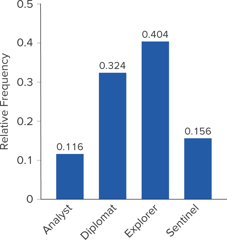
What is a bar chart?
A graph that depicts the frequency or relative frequency of each category of a categorical variable as a series of horizontal or vertical bars, the lengths of which are proportional to the values that are to be depicted
5
New cards
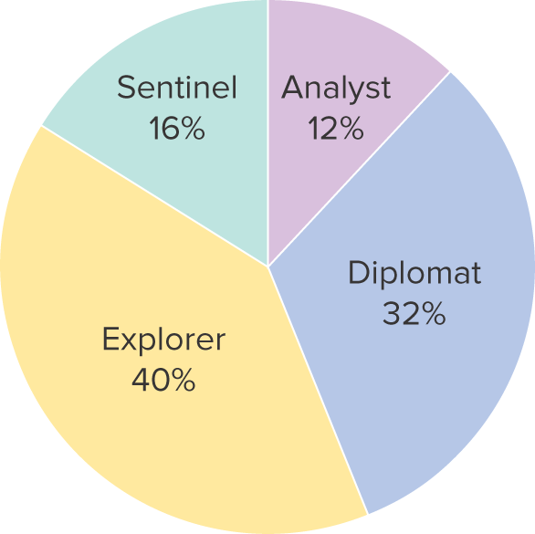
What is a pie chart?
A segmented circle whose segments portray the relative frequency of each category for a categorical variable
6
New cards
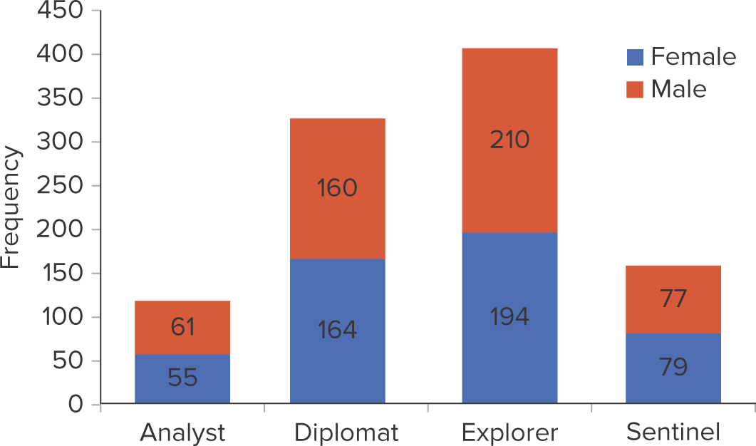
What are 2 frequency distribution used to summarize the relationship between 2 categorical variables
Contingency table and a stacked column chart
7
New cards
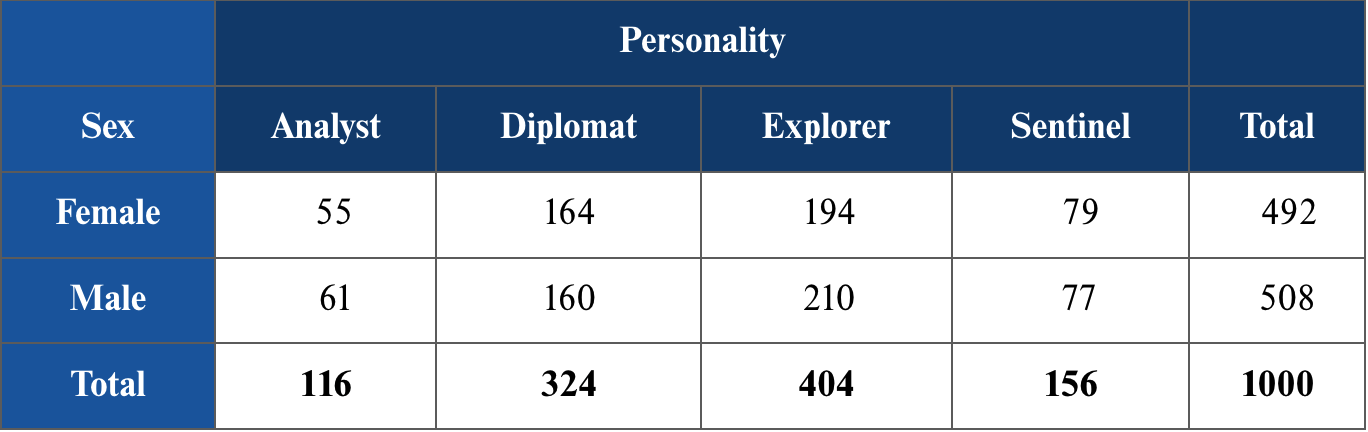
What is a contingency table?
Table that shows frequencies for two categorical variables, x and y, where each cell represents a mutually exclusive combination of the pair of x and y observations
8
New cards
What is a stacked column chart?
Graph of a contingency table; depicts more than one categorical variable and allows for the comparison of composition within each category
9
New cards
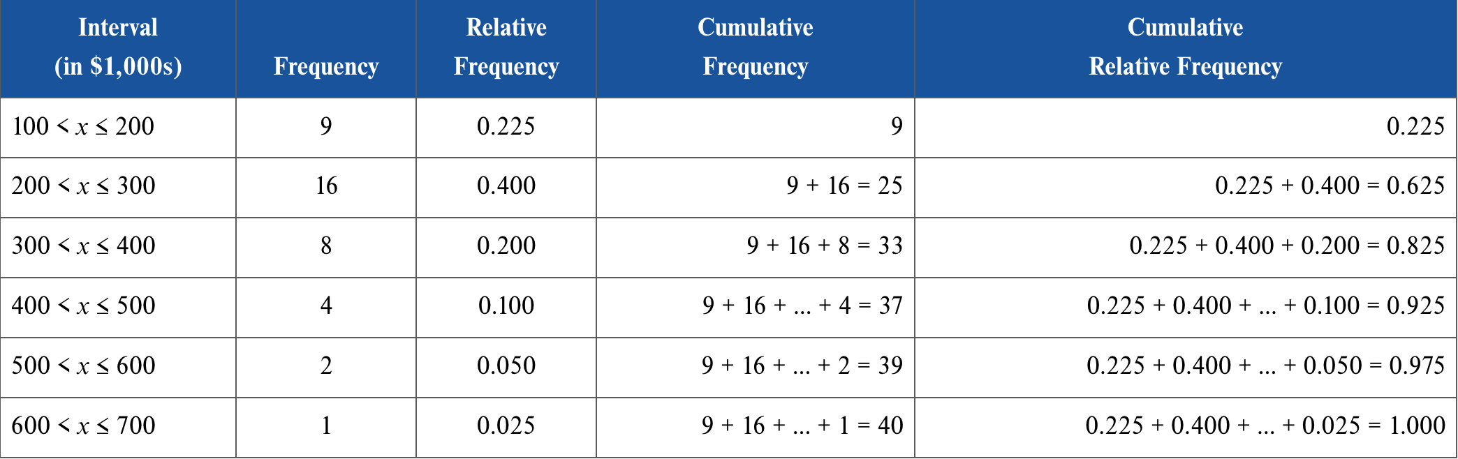
How does frequency distribution for numerical variables work?
Non-overlapping intervals are used to divide data and records the number of observations that fall into each interval. The total number of intervals in frequency distribution usually ranges from 5 to 20
10
New cards
What equation is used to find the width of each interval?
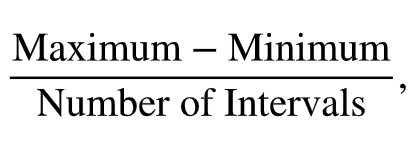
11
New cards
What is frequency?
The amount of observations that occur in an interval
12
New cards
What is relative frequency?
relative frequency records the proportion (or the fraction) of observations that fall into each interval; frequency/total # of frequency. Useful to measure data of different sizes

13
New cards
What is cumulative frequency?
Cumulative frequency record the number of observations that fall below the upper limit of a particular interval
14
New cards
What is a cumulative relative frequency?
Cumulative relative frequency records the proportion (or fraction) of observations that fall below the upper limit of a particular interval

15
New cards
What graphs are used for frequency distribution of numerical variables?
Histogram, polygon, and ogive
16
New cards
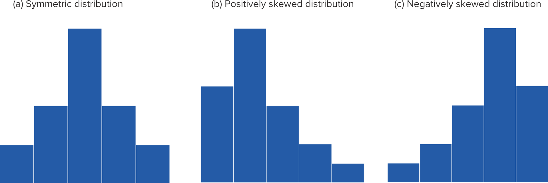
What is a histogram?
A series of rectangles where the width and height of each rectangle represent the interval width and frequency (or relative frequency) of the respective interval. Histogram can have 3 shape distributions: symmetrical, positively skewed, and negatively skewed
17
New cards
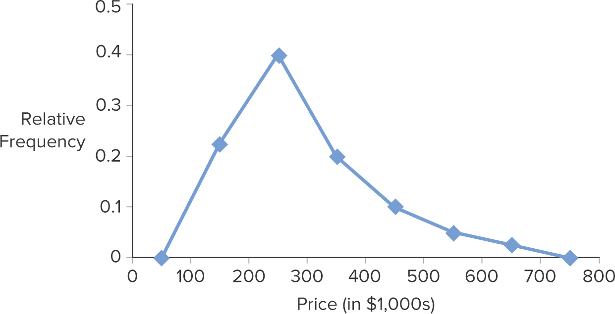
What is a polygon?
Connects a series of neighboring points where each point represents the midpoint of a particular class and its associated frequency or relative frequency. You can find the midpoint from sum of interval/2
18
New cards
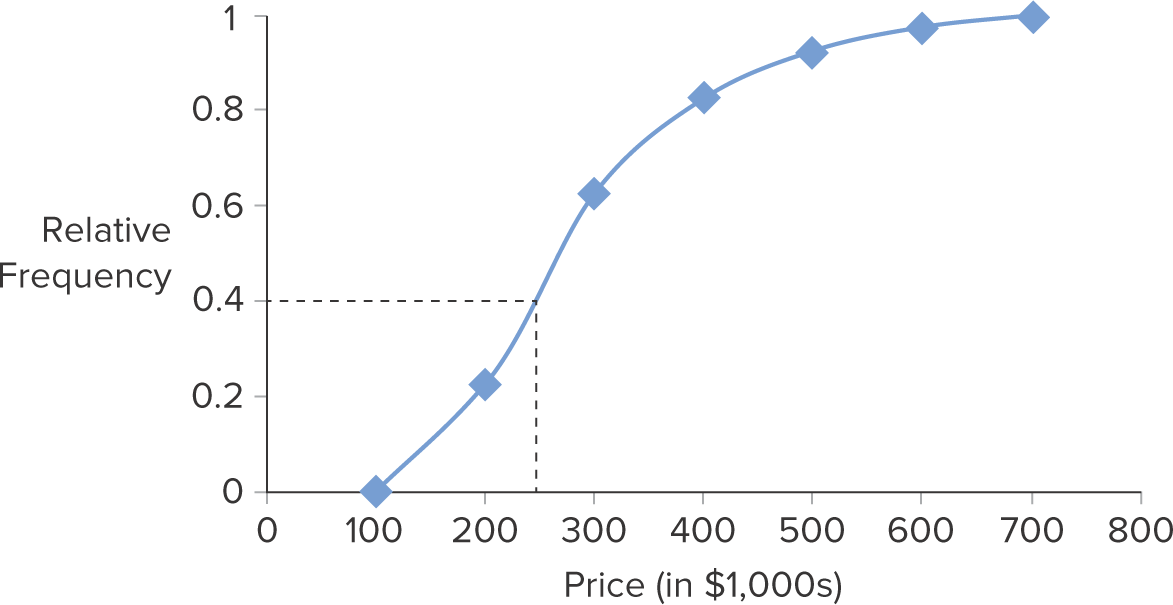
What is an ogive?
Connects a series of neighboring points where each point represents the upper limit of a particular interval and its associated cumulative frequency or cumulative relative frequency
19
New cards
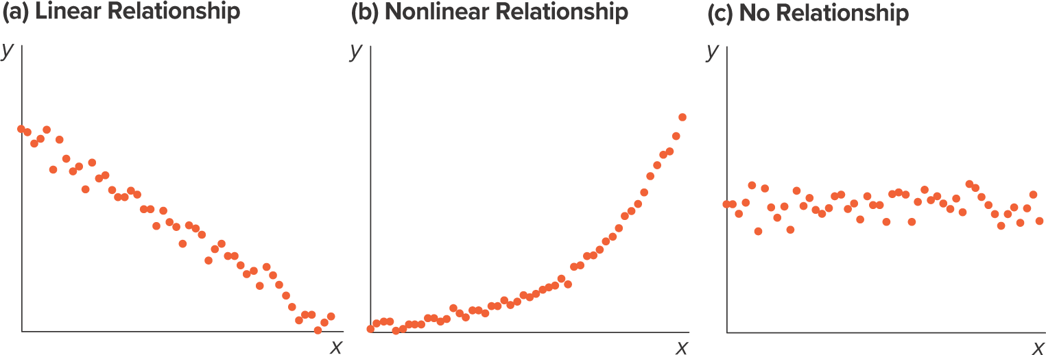
What is a scatterplot?
A graphical tool that shows the relationship between 2 numerical variables. Each point in the diagram represents a pair of observations of the two variables
20
New cards
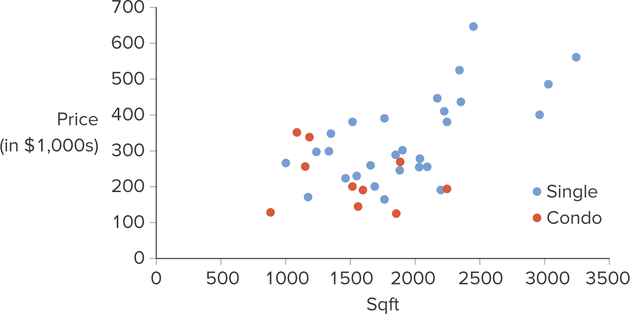
What is a scatterplot with categorial variables?
A scatterplot with the addition of a categorial variable to explore more relationships between data. Points are color coded to categorize them
21
New cards
What is a line chart?
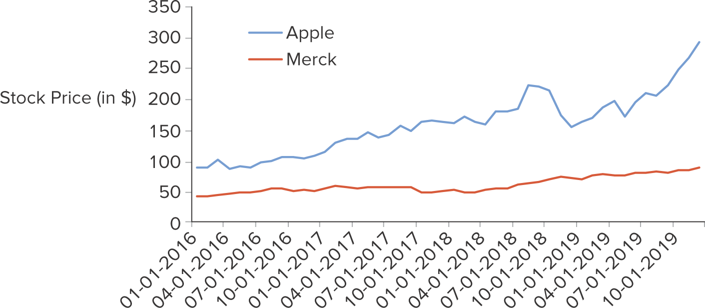
A line chart connects the consecutive observations of a numerical variable with a line. It tends to be used to track changes of the variable over time
22
New cards
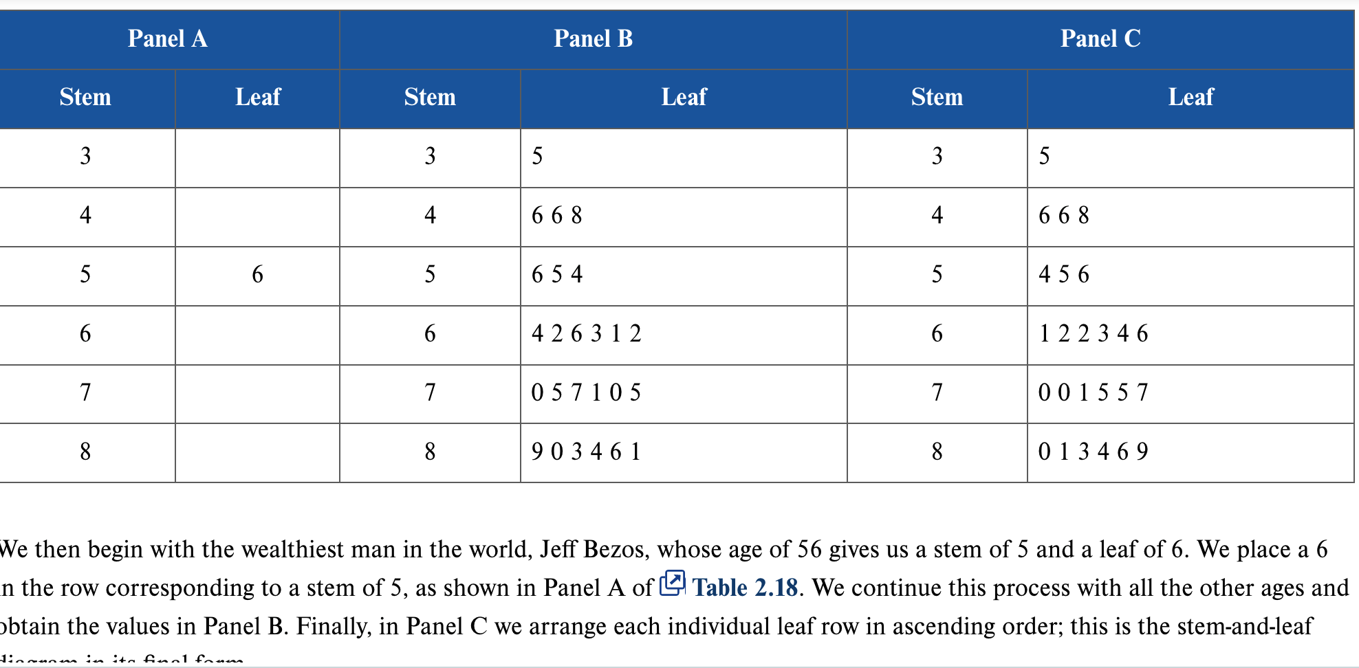
What is a stem and leaf diagram?
A diagram that separates each observation of a numerical variable into 2 parts: a stem, which consists of the leftmost digits, and the leaf, the last digit. It gives an overall picture of where the observations are centered and how they are dispersed from the center.