Stocks
1/33
There's no tags or description
Looks like no tags are added yet.
Name | Mastery | Learn | Test | Matching | Spaced |
|---|
No study sessions yet.
34 Terms
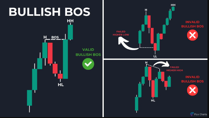
Flux: Bullish BOS
A bullish BOS is found by locating a low higher than the previous low (a higher low, HL) then a high higher than the previous high (a higher high, HH).
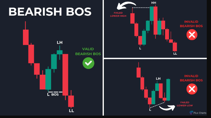
Bearish BOS
A bearish BOS is found by locating a high lower than the previous high (a lower high, LH) then a low lower than the previous low (a lower low, LL). This indicates a reversal in price where sellers are dominating the market, leading to a downward trend.
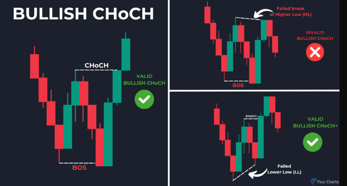
Bullish CHoCH
A bullish CHoCH is formed when a low (L) occurs, followed by a lower high (LH), then a lower low (LL), and finally, a higher high that breaks the previous lower high. This pattern indicates a potential reversal in the trend toward bullish momentum.
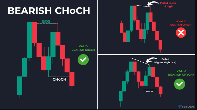
Bearish CHoCH
A bearish CHoCH is formed when a high (H) occurs, followed by a higher low (HL), then a higher high (HH), and finally, a lower low (LL). This indicates a reversal in price where buyers are losing control, leading to an upward trend.
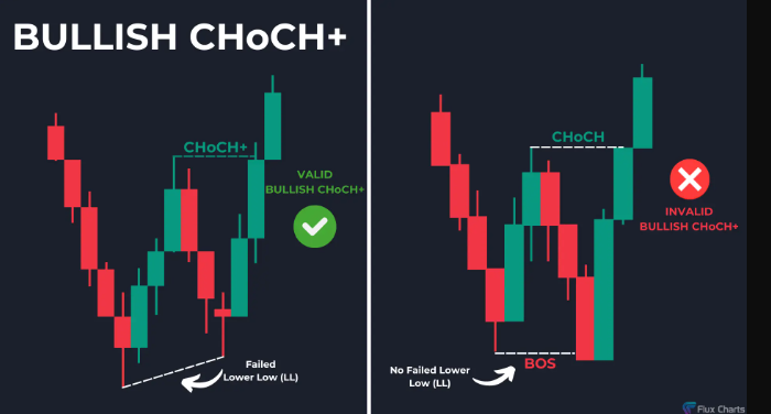
Bullish CHoCH+
A bullish CHoCH+ is formed when a low (L) occurs, followed by a lower high (LH), then a failed lower low (LL), and finally, a higher high (HH) that breaks the previous lower high. This pattern indicates a stronger bullish reversal and momentum.
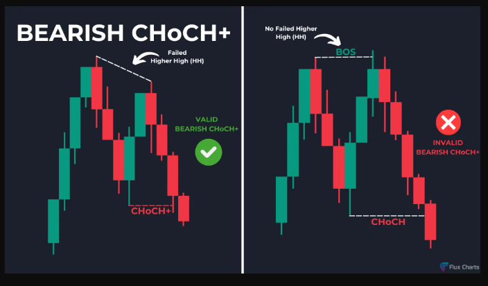
Bearish CHoCH+
A bearish CHoCH+ is formed when a high (H) occurs, followed by a higher low (HL), then a failed higher high (HH), and finally, a lower low (LL) that breaks the previous higher low. This pattern indicates a stronger bearish reversal, suggesting that sellers have regained control.
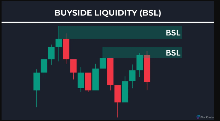
How to Identify Buyside Liquidity (BSL= resistance levels are Horizontal trendlines)
Swing Highs
A swing high is when price makes a high and is followed by a lower high.
Previous Day High (PDH)
PDH is important because it represents the highest price reached in the previous trading session, making it a key reference point for traders to assess market strength and potential reversal zones.
Previous Week High (PWH)
PWH is important because it reflects the highest price level achieved during the entire week, making it a critical benchmark for identifying potential resistance, trend continuation, or reversal points in the broader market context.
Previous Month High (PMH)
PMH is important because it marks the peak of price action over a longer timeframe, serving as a significant level that can influence market sentiment and provide insight into the strength of an ongoing trend. If this level is broken or fails to hold, it could be an early sign of a market reversal.
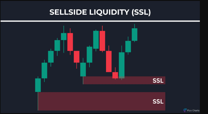
How to Identify Sellside Liquidity (SSL= support levels are horizontal trendlines)
To identify Sellside Liquidity (SSL) levels, mark out the following levels on your chart:
Swing Lows
A swing low is when price makes a low and is followed by a higher low.
Previous Day Low (PDL)
PDL is important because it represents the lowest price reached in the previous trading session, making it a key reference point for traders to assess market strength and potential reversal zones.
Previous Week Low (PWL)
PWL is important because it reflects the lowest price level achieved during the entire week, making it a critical benchmark for identifying potential resistance, trend continuation, or reversal points in the broader market context.
Previous Month Low (PML)
PML is important because it marks the lowest area of price over a longer timeframe, serving as a significant level that can influence market sentiment and provide insight into the strength of an ongoing trend.
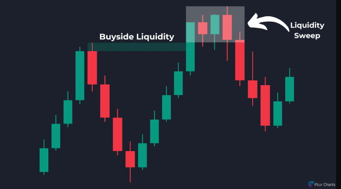
Buyside Liquidity Sweep
In this example, buyside liquidity is the key level to watch. Price shoots above this level, consolidates, and comes back down below the level. This is considered a sweep of liquidity and you should now have a bearish bias in the market or look for short trade opportunities.
A buyside liquidity sweep occurs when price rises above a defined resistance level, consolidates, and then falls back below, indicating potential exhaustion and forming a basis for bearish market sentiment or short trade setups.
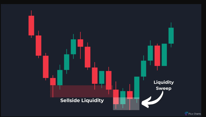
Sellside Liquidity Sweep
In this example, sellside liquidity is the key level to watch. Price goes below this level, consolidates, and comes back up above the level. This is considered a sweep of liquidity and you should now have a bullish bias in the market or look for long trade opportunities.
A sellside liquidity sweep occurs when the price dips below established support levels, indicating a sweep of liquidity. Traders should consider a bullish bias or seek long trade opportunities following this pattern.
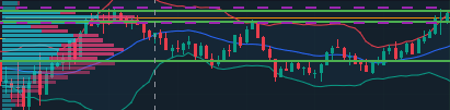
Fixed Range Profile (5min Trading View)
A Fixed Range Profile is a volume profile tool that displays the amount of trading volume over a specified price range and time period. It helps traders identify key support and resistance levels based on historical price action and volume distribution. (The green lines are on the white lines and between the shaded and unshaded areas, indicating the range where volume occurred.
RSI (30min)
The relative strength index (RSI) is a momentum indicator used in technical analysis. RSI measures the speed and magnitude of a security's recent price changes to detect overbought or oversold conditions in the price of that security.
-An asset is usually considered overbought when the RSI is above 70 and oversold when it is below 30.
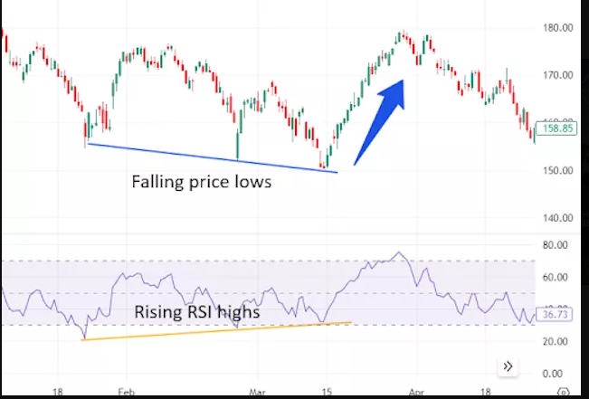
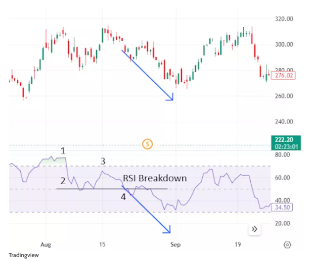
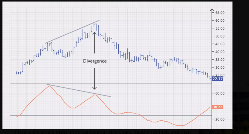
RSI Divergence
As you can see in the following chart, a bullish divergence was identified when the RSI formed a series of higher lows as the price formed lower lows. This was a valid signal, but divergences can be misleading when a stock is in a stable long-term trend. (and vice versa)
RSI Swing Rejections Bullish
This signal is called a swing rejection. A bullish swing rejection has four parts:
The RSI falls into oversold territory.
The RSI crosses back above 30.
The RSI forms another dip without crossing back into oversold territory.
The RSI then breaks its most recent high.
As you can see in the following chart, the RSI indicator was oversold, broke up through 30, and formed the rejection low that triggered the signal when it bounced higher. Using the RSI in this way is very similar to drawing trend lines on a price chart.
RSI Swing Rejections Bearish
A bearish swing rejection also has four parts:8
The RSI rises into overbought territory.
The RSI crosses back below 70.
The RSI forms another high without reaching overbought territory.
The RSI then breaks its most recent low.
The following chart illustrates the bearish swing rejection signal. As with most trading techniques, this signal will be most reliable when it conforms to the prevailing long-term trend. Bearish signals during downward trends are less likely to generate false alarms.
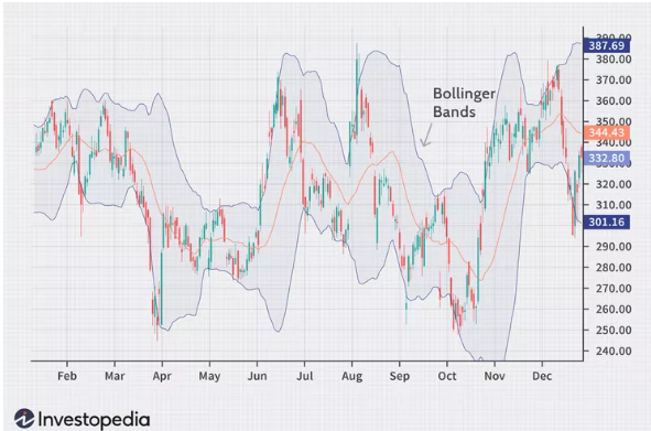
Bollinger Bands (5min Trading View an 15min webull)
Bollinger Bands Cheat Sheet | ||
|---|---|---|
Bollinger Band Action | What This Indicates | Potential Reaction |
Upward middle band | Indicates an uptrend | Buy or hold long positions |
Downward middle band | Suggests a downtrend | Sell or hold short positions |
Narrow bands (squeeze) | Less volatility; potential for significant price move | Prepare for a breakout; consider entry points |
Price touching or moving outside the upper band | Potentially overbought (poised to fall in price) | Consider selling, shorting, or tightening stop-loss orders |
Price touching or falling outside the lower band | Potentially oversold (poised to go up) | Buying or tightening stop-loss orders |
Price bounces off the lower band | The upper band becomes a potential exit point if the trend reverses | Consider taking profits or setting up a trailing stop-loss |
Price touches the upper band | The lower band becomes a potential target if the reversal occurs | Consider taking profits or setting a trailing stop-loss |
Price rebounds from upper or lower bands toward the middle band | Potential buying or selling opportunity, especially in ranging markets ("Bollinger Bounce") | Enter long or short positions; set stop-los |
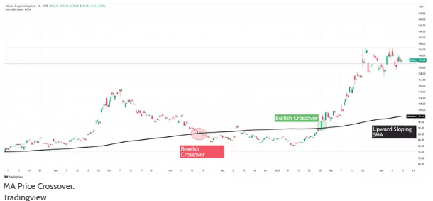
MA’s Price Action Cross over
(Bollinger mid Band 20 sma 15min and 5min trading view)
Price crossing over a moving average could provide a signal in itself, one of a trend reversal or continuation. A bullish crossover occurs when the price moves above a moving average, signaling potential upside momentum. A bearish crossover happens when the price drops below a moving average, indicating a possible downtrend.
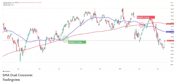
MA’s Cross Over
(-15 minute ema 9/21 cross over major
-5 min 50/200 crossover major (15min confluence 10/50), 1 min 50/325, 30 min 10/50)
The dual moving average strategy involves a short-term MA crossing a longer-term MA. For some traders, this alone can serve as a buy or sell signal, indicating the start or end of a trend.
When the short-term average moves above the long-term average—say, the 50-SMA crosses above the 200-SMA—it's called a golden cross and signals the start of a possible uptrend. Conversely, a death cross happens when the 50-SMA crosses below the 200-SMA, indicating a downtrend.
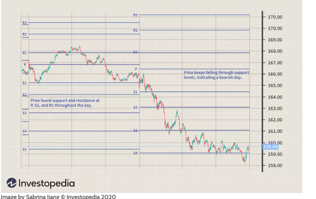
Pivot Points (5min tradingview)
-Pivot points are used to predict price support and resistance levels in the next session.
These support and resistance levels are used by traders to determine entry and exit points, both for stop-losses and profit-taking.
Generally, it is seen as a bullish sign if a stock or commodity opens at a price above its previous pivot point. It is a bearish sign if it opens below its previous pivot point.
-Pivot points can be used in two ways. The first way is to determine the overall market trend. If the pivot point price is broken in an upward movement, then the market is bullish. If the price drops through the pivot point, it is bearish.
The second method is to use pivot point price levels to enter and exit the markets. For example, a trader might put in a limit order to buy 100 shares if the price breaks a resistance level. Alternatively, a trader might set a stop loss at or near a support level.
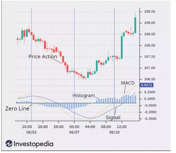
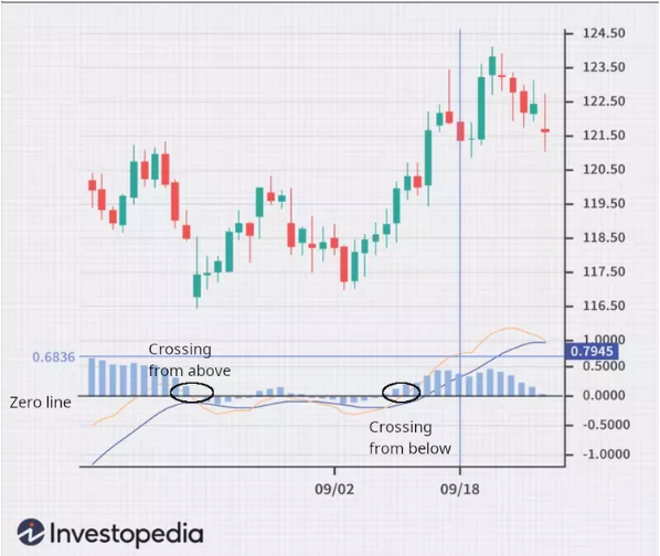
MACD Histogram (all times)
The MACD histogram is a visual representation of the difference between the MACD and its nine-day EMA—not highs and lows. The histogram is positive when the MACD is above its nine-day EMA and negative when the MACD is below its nine-day EMA. The point on the histogram where momentum is zero is the zero line.
If prices change rapidly, the histogram bars grow longer as the speed of the price movement—its momentum—accelerates and shrinks as price movement decelerates
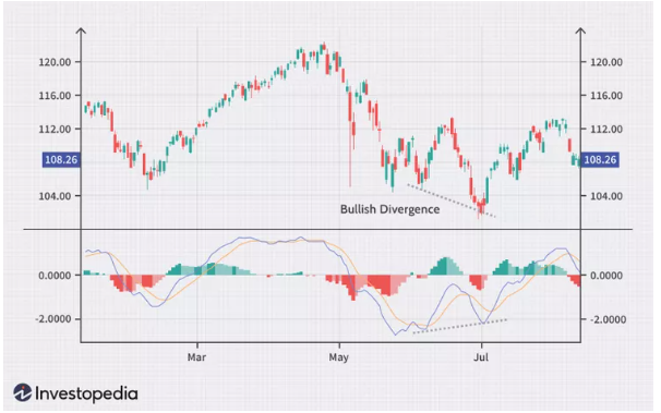
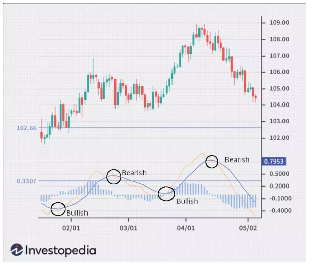
MACD Trading Divergence Bullish
A bullish divergence appears when MACD forms two rising lows that correspond with two falling lows on the price. This is often a valid bullish signal when the long-term trend is still positive.
Some traders will look for bullish divergences even when the long-term trend is negative because they can signal a change in the trend, although this technique is less reliable.
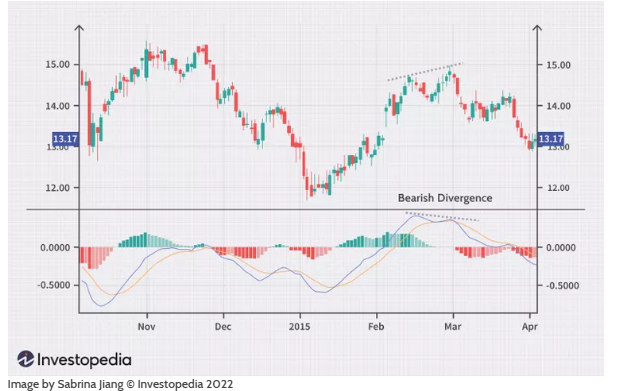
MACD Trading Divergence Bearish
When MACD forms a series of two falling highs that correspond with two rising highs on the price, a bearish divergence has been formed. A bearish divergence that appears during a long-term bearish trend is considered confirmation that the trend is likely to continue.
Some traders will watch for bearish divergences during long-term bullish trends because they can signal weakness in the trend. However, it is not as reliable as a bearish divergence during a bearish trend.
MACD Zero-Cross Strategy (1 min with bullish candle pattern)
When the MACD crosses from below to above the zero line, it is considered a bullish signal. Traders generally take long positions when this occurs. If it crosses from above to below the zero line, it is considered a bearish signal by traders. Traders then enter short positions to take advantage of falling prices and increasing downward momentum.
MACD Crossover Strategy (15min)
A crossover occurs when the signal and MACD line cross each other. The MACD generates a bullish signal when it moves above its own nine-day EMA and triggers a sell signal (bearish) when it moves below its nine-day EMA.
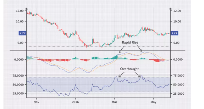
RSI + MACD = Example of Rapid Rises or Falls
When MACD rises or falls rapidly (the shorter-term moving average pulls away from the longer-term moving average), it signals that the security is overbought or oversold and may soon retrace to normal levels. Traders often combine this analysis with the RSI or other technical indicators to verify overbought or oversold conditions.
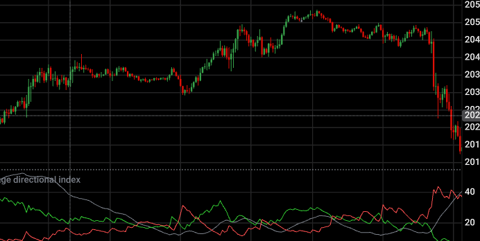
ADX (confluence)
Traders use the ADX to assess the strength of a trend. The ADX also helps determine whether the market is trending or range-bound.
Generally, ADX values below 20 indicate a non-trending or sideways market, suggesting that range-bound strategies are more effective. However, as ADX moves between 20 and 25, it signals a possible trend formation, and traders should watch for further confirmation.
When the ADX rises above 25, it confirms a strong trend, making trend-following strategies like moving average crossovers more viable. Once ADX climbs above 50, the trend is very strong. But at these levels traders should exercise caution as the market may be overheated, and corrections may be more likely.
-The ADX is most useful when paired with the +DI and -DI lines, which indicate the direction of the trend. For example, if +DI crosses above -DI and ADX is above 20, it suggests an uptrend is forming and is an ideal time to consider a long position. Conversely, if -DI crosses above +DI with ADX rising above 25, a strong downtrend is forming
ADX Value | Trend Strength |
0-20 | Absent or Weak Trend |
25-50 | Strong Trend |
50-75 | Very Strong Trend |
75-100 | Extremely Strong Trend |
ADX Momentum (pic left) and Divergence (pic right)
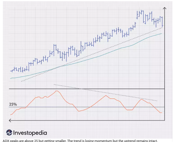
Momentum:Increasingly higher ADX peaks mean trend momentum is increasing. Increasingly lower ADX peaks mean trend momentum is decreasing. Any ADX peak above 25 is considered to still be registering a strong trend, even if it is a lower peak.In an uptrend, price can still rise on decreasing ADX momentum because overhead supply is eaten up as the trend progresses. Knowing when trend momentum is increasing gives a trader the confidence to let profits run instead of exiting before the trend has ended. However, a series of lower ADX peaks is a warning to watch prices and manage risk. (confluence)
The ADX can also show momentum divergence. When price makes a higher high and ADX makes a lower high, there is negative divergence, or non-confirmation. In general, divergence is not a signal of a reversal, but rather a warning that trend momentum is changing. It may be appropriate to tighten the stop-loss or take partial profits.
Any time the trend changes character, it is time to assess and/or manage risk. Divergence can lead to trend continuation, consolidation, correction, or reversal (confluence)
ADX and Crossovers
The ADX is useful in confirming crossovers of the +DI and -DI lines. For example, if the +DI (green) crosses above the -DI (red), indicating upward movement, an ADX reading above 25 could be used to confirm a strong trend, and therefore entry into a long position. Likewise, if the -DI crossed above the +DI an ADX reading above 25 can confirm a short entry.
Note that some traders use an ADX reading of 20 to confirm a trade entry on a crossover of the +DI and -DI lines. This can mean entering trades earlier, but can also result in more false signals. It's up to each individual trader to determine what best suits them.
ADX and Breakouts
The best trends rise out of periods of price consolidation. Breakouts are not hard to spot, but they often fail and end up being a trap. But the ADX can help confirm a breakout. When it rises from below 20 to above 25, for example, a strong trend has been established and is likely to be sustained. On the other hand, if the ADX remains below 25, it likely indicates a false breakout, and if it remains below 20, it's even more likely to be a false breakout.
Traders can also use the ADX to monitor the continuation of trends, with a rising ADX possibly signaling that it's time to add to a position or adjust stops higher.
During periods of consolidation, a low ADX shows that the market is resting, but as the ADX begins to rise, it can signal an impending breakout. But it's important to beware a rising ADX below 20—while it indicates that price movement is gathering strength, it hasn't confirmed a trend. Moreover, for added reliability, a rising ADX with increased volume provides strong evidence of a proper breakout with momentum.
By strategically using ADX during breakouts, traders can boost confidence in their setups, manage risks effectively, and focus on high-probability trades
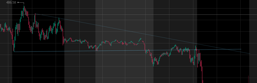
Trend Lines (15min)
Types of Trendlines:
Uptrend Line – A line drawn connecting higher lows in an upward movement, indicating bullish momentum.
Downtrend Line – A line connecting lower highs in a downward movement, showing bearish momentum.
Horizontal Trendline (Support & Resistance) – A flat line marking levels where price tends to bounce or reverse (Low/higher lows and Highs/lower highs)
How to Use Trendlines:
Support & Resistance: Price often reacts to trendlines by bouncing off them or breaking through.
Breakouts: When price moves beyond a trendline, it may signal a trend reversal or continuation.
Confirmation: The more times price touches a trendline without breaking it, the stronger the trend.
EMA Strat
Major: 15 min ema cross (diagonal trendlines), 15 + 1hr MACD cross, 1 minute MACD zero cross + 5min ema cross (look at histo momentum),
Confluence: Cross price action crossovers wait gor next candle(15min 21ema and use 30min 21 as support or resistance with BB 5 min), MACD divergences 30 min + 5/15min crosses, R and S price action breakouts (pivots volume, BSL/SSL, trendlines, volume profile, ema’s become resistance and support)
SMA Strat
Major: 5 min 50/200 & 1min 50/325 sma cross, 30min 10/50 sma cross, 5/30 min BB 20 sma price action cross over (cross over with diagonal trendlines)
Confluence: R and S price action break outs (pivots volume, BSL/SSL, trendlines, volume profiles 5min, all sma’s), RSI over’s-bought/sold rejections 30min, ADX 1/15 min (adx and DI’s)
Javi strat
RSI 30-70
9EMA; cross action
FVG: restest all times said
supply and demand
time: daily (high and low of closing on daily ), 4hr, 2hr, 1hr (maybe)(bias), 15/5 entry
area of interset is arintereste
GAPs: daily gaps 4hr 2 hr
trendlines 3 taps
note read trading in the zone
Stop Loss and Take profit
15 (more room), 5 min (mild) and 1min (tight)
Set on high and lows