PCP 7 - inferential statistics
1/18
Earn XP
Description and Tags
confidence intervals,process of statistical significance , describe graph relationships,linear lines of best fit and how to convert between non-linear and linear using logarithms
Name | Mastery | Learn | Test | Matching | Spaced |
|---|
No study sessions yet.
19 Terms
What are the confidence intervals usually used in statistics ?
90% of sample means lie within ± 1.64 standard errors of the
population mean
• 95% of sample means lie within ± 1.96 standard errors of the
population mean
• 99% of sample means lie within ± 2.58 standard errors of the
population mean
What does it mean at a 95% confidence level ?
that we are 95% confident that the sample mean we have collected is going to be within +- 1.96 standard errors of the population mean
standard error is dependent o sd , size of sample
if there is less variability , larger sample size = decreased confidence interval
Example question -
A sample of 106 measurements of the concentration of an active ingredient was taken. The mean result was 61.6 mg/mL and the standard deviation was 10.9. Calculate the 95% confidence interval assuming the data originated from a normal distribution.
step 1- calculate standard error
Standard error = standard deviation / square root sample size
𝑆𝐸𝑀 = 10.9/√106 = 1.059
step 2 - apply equation
95%
upper value = 61.6+ (1.96×1.059)
lower value= 61.6 - ( 1.96×1.059)
step 3 - state the findings
95% confidence level interval between 59.5 and 63.7
What is the meaning of statistical significance ?
the likelihood that a relationship between 2 or more variables is caused by something other than chance
determine this using hypothesis test
What are some examples of a test statistic that could be used ?
this is dependent on the type of data used , the type of question being asked , the type of data being analysed and the number of datasets involved in the study
for parametric data ( testing means ) :
z test, t (student’s) test, analysis of variance
For non-parametric data:
Chi squared, Goodness of fit, Mann-Whitney
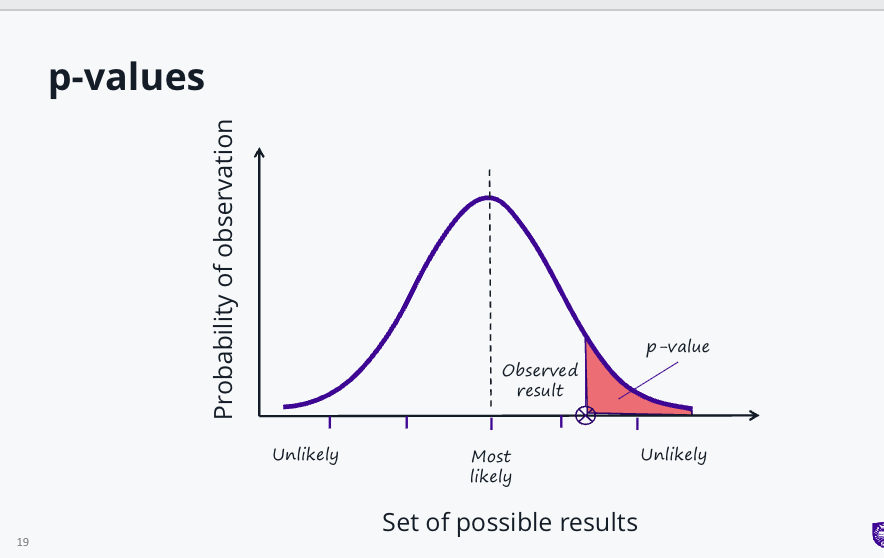
How do you report statistical significance ?
use a p - value
a p-value is the probability of obtaining the result of a test assuming the null hypothesis is correct
p-value lies between 0 and 1
smaller p-value = stronger evidence to support the alternative hypothesis( what we believe
p-value of 0.05 indicates there is less than a 5% chance of seeing these results if the null hypothesis is correct
What are the 2 main categories of graphs used to present scientific data ?
graphs used to show the distribution of data ( histograms )
graphs used to show the relationship between variables ( eg,scatter plot )
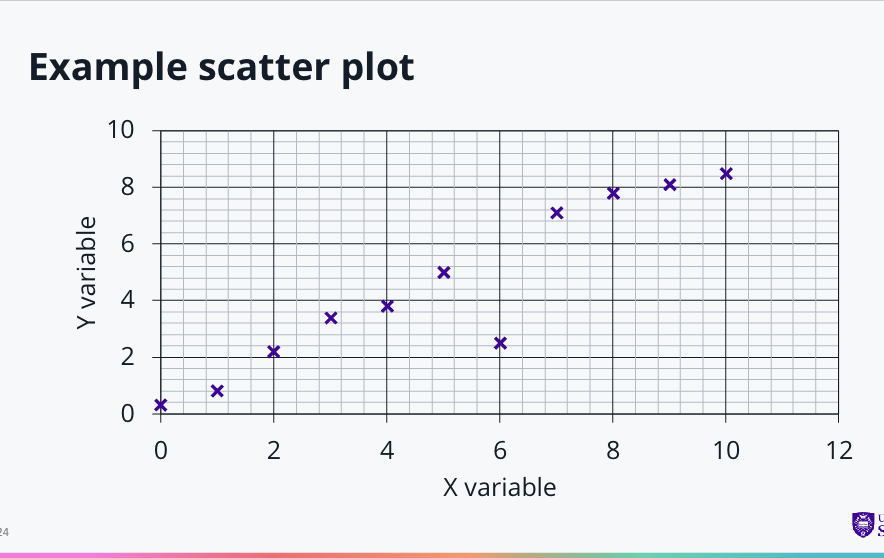
When do you use a scatter plot ?
A scatter plot graph is used when we want to investigate a relationship
between two variables.They are a good way to spot outlying results and trends in our data.
Data should be plotted as discrete points rather than connecting them together as a continuous line.
A trendline can be plotted afterwards to illustrate the relationship
(known as linear regression).
How do you decide what variable goes on each axis ?
The independent variable should go on the x-axis (horizontal) – this is the factor that is controlled in an experiment (i.e. the experimenter will change)
The dependent variable should go on the y-axis (vertical) – this is the one that is being observed or measured.
What is correlation ?
The distribution of data points giving us an indication of the relationship between variables
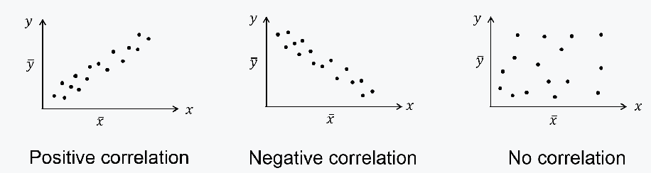
How can we measure correlation ?
The Pearson’s Product Moment Correlation Coefficient
(PMCC) can be used to measure the degree of association between variables.
• It is denoted by the symbol r
• And is measured on a scale from +1 to -1
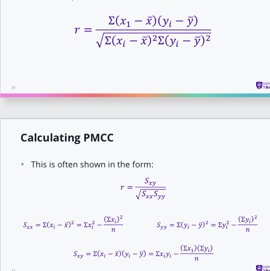
How do we calculate PMCC?
The correlation coefficient, r, is a measure of how far away
each data point is from the mean:
how do you use excel or google sheets to collect data ?
• We can use Excel or Google Sheets to calculate the PMCC
1. Enter the x and y values in two columns in the Spreadsheet.
2. Highlight the data and select ‘insert scatter graph’
3. Right click on one of the data points on the scatter graph and select ‘add trendline’
4. Select ‘linear’ and check the boxes for ‘display equation on chart’ and ‘display R-squared value
on chart’
• Note, this gives the r2 value so you will need to take the square root to get PMC
when can you describe the relationship as linear ?
when the r value /pmcc indicates a high correlation - straight line
What is the equation of a straight line ?
𝑦 = 𝑚𝑥 + 𝑐
• Where c is the intercept on the y-axis and m is the gradient of the line.
• The gradient can be calculated from the change in y values divided by the change in x values.
What is regression ?
correlation - between both variables either way
regression - the regression of y on x , line of best fit
What is regression line and how is it determined ?
The line of best fit (regression line) is positioned to minimise the distances between the data points and the line.
The method of least squares is used to find the equation of the line.
The vertical distance between a data point and the line represents the experimental error (ε).
The sum of the squared errors is minimised to find the optimal line position.
In Excel, this line is created by selecting “Add Trendline.”
How do we convert non-linear functions into a straight line graph ?
Method for linearization- take logs
𝑦 = 𝑘𝑥^𝑚
log 𝑦 = log( 𝑘𝑥)^𝑚
log 𝑦 = log 𝑘 + log (𝑥^𝑚)
log 𝑦 = log 𝑘 + 𝑚log 𝑥
How do you linearize using natural logs ?
𝐶𝑡 = 𝐶0𝑒−𝑘𝑡
ln 𝐶𝑡 = ln 𝐶0𝑒−𝑘𝑡
ln(𝐶𝑡) = ln(𝐶0) − 𝑘𝑡 ln(𝑒)
ln(𝐶𝑡) = ln(𝐶0) − 𝑘𝑡