OMIS 1050 WEEK 3
1/60
There's no tags or description
Looks like no tags are added yet.
Name | Mastery | Learn | Test | Matching | Spaced |
|---|
No study sessions yet.
61 Terms
What is data visualization?
visual data representation study
What is data visualization’s use?
visually convey data / info
What is grouped data?
unsummarized data
What is a grouped data synonym?
raw data
What is grouped data?
frequency distribution data
What is frequency distribution?
data interval & frequency summary
What is the only allowable nominal data calculation?
count variable value frequency
What is a frequency distribution table?
category & count table
What is a relative frequency distribution table?
category & proportion table
What is a relative frequency synonym?
proportion
What are the frequency distribution graphical display techniques?
bar chart
pie chart
What is a bar chart?
graph
parallel bars with proportional frequency length
What is a pie chart?
graph
circle divided into slices with proportional frequency size
What is the most important interval/ratio graphical method?
histogram
Why is the histogram a powerful graphical technique?
summarize interval data
explain probability
What is a histogram?
graph
value range display broken into group
What are histogram uses?
graph large quantitative data set
get initial data distribution overview
What is on the histogram x-axis?
class interval
What is on the histogram y-axis?
frequency
What is OGIVE?
cumulative frequency polygon
What is on the OGIVE x-axis?
class endpoint
What is on the OGIVE y-axis?
cumulative frequency
Where are dots plotted on each OGIVE class?
endpoint
When is OGIVE’s use?
see running total
What is Sturges’ Rule?
class number guide summarizing data
What are the Sturges’ Rule formulas?
1 + 3.3(log n)
1 + (ln n)/(ln 2)
What is the range formula?
max value - min value
What is the class width formula?
range / class number
What does Excel call classes?
bins
What is the Excel bin value?
max class value
What does a histogram skewed left look like?
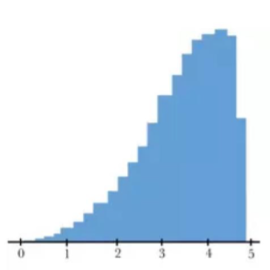
What does a symmetric / unimodal histogram look like?
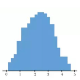
What does a histogram skewed right look like?
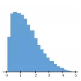
What does a uniform histogram look like?

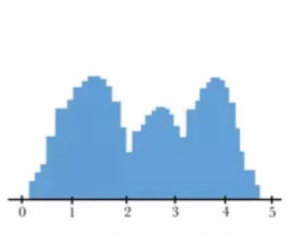
What does a bimodal histogram look like?
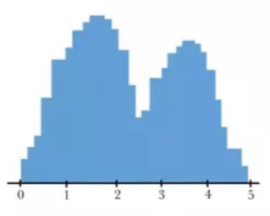
What does a multimodal histogram look like?
How do you create an Excel histogram?
Data → Data Analysis → Histogram → select data set in “Input Range” & select bin set in “Bin Range” & toggle “Chart Output”
How do you remove Excel histogram gaps?
Select a bar → Right click → Press “Format Data Series” → bring “Gap Width” to 0%
What is the keyboard shortcut to paste a column in a new worksheet?
Enter
What function returns the set amount?
=COUNT
How do you classify bins when creating an Excel histogram the long way?
FROM | TO |
MIN | MIN + class width |
{previous TO cell} | {previous TO cell} + $class$width |
What is a 2 nominal variable chart method?
cross-tabulation
What is cross-tabulation?
process producing 2D table displaying 2 variable frequencies
What are some 2 nominal variable graph methods?
clustered bar chart
stacked bar chart
3D bar chart
side-by-side pie chart
scatter plot
What is a scatter plot?
2D graph plotting 2 numerical variables
What is a scatter plot’s use?
examine possible variable relationship
What is on the scatter plot x-axis?
independent variable
What is the scatter plot y-axis?
dependent variable
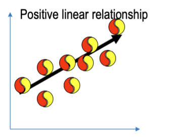
What does a scatter plot with positive linear relationship look like?
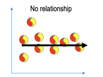
What does a scatter plot with no relationship look like?
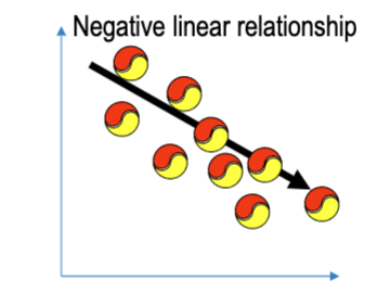
What does a scatter plot with a negative linear relationship look like?
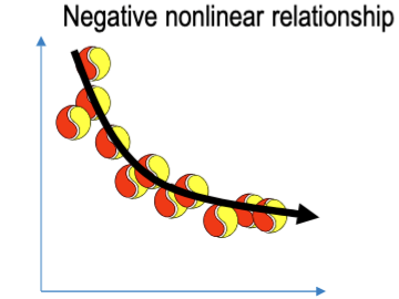
What does a scatter plot with a negative nonlinear relationship look like?
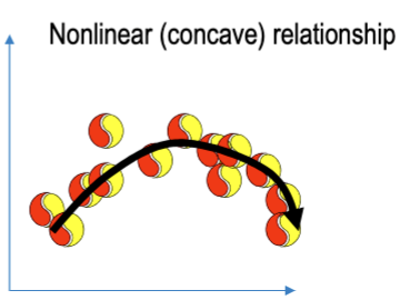
What does a scatter plot with a nonlinear concave relationship look like?
True or False: Negative nonlinear relationships can be concave.
True
True or False: Nonlinear concave relationships have to be positive.
False
What is time series data?
data gathered at intervals over time
What is the easiest way to visualize time series data?
line chart
How do you create an Excel histogram the short way?
Select column → Insert → Statistical Chart → Histogram
What’s the disadvantage of creating an Excel histogram?
might have incorrect class width / quantity
How do you create an Excel scatter plot?
Select columns → Insert → X Y (Scatter) Chart → Scatter
How do you create an Excel time series graph?
Delete date label → Select columns → Insert → Line Chart → Line