Typography exam question bank 2
5.0(1)
Studied by 4 peopleCard Sorting
1/99
There's no tags or description
Looks like no tags are added yet.
Last updated 12:43 PM on 6/18/23
Name | Mastery | Learn | Test | Matching | Spaced | Call with Kai |
|---|
No analytics yet
Send a link to your students to track their progress
100 Terms
1
New cards
In plain TEX code groups are enclosed within...
\- parentheses
\- square brackets
\- braces
\- percent signs
\- parentheses
\- square brackets
\- braces
\- percent signs
braces
2
New cards
Which is not a character ligature?
\- W
\- 1
\- þ
\- %
\- W
\- 1
\- þ
\- %
þ
3
New cards
Which of the following statements is false?
An italic font may contain glyphs that are always cursive.
4
New cards
Which typeface was among the first bold styles?
\- Bembo
\- Helvetica
\- Times New Roman
\- Clarendon
\
\- Bembo
\- Helvetica
\- Times New Roman
\- Clarendon
\
Clarendon
5
New cards
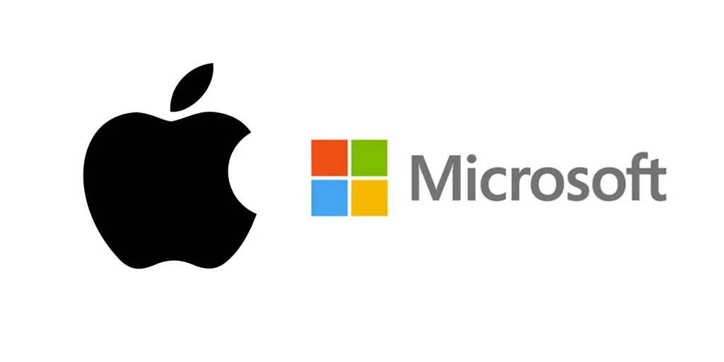
TrueType fonts were first developed by:
\- Apple & Microsoft
\- Linotype
\- Adobe
\- Monotype
\- Apple & Microsoft
\- Linotype
\- Adobe
\- Monotype
Apple & Microsoft (they developed against Adobe’s high-cost licensing of Type 1 fonts)
6
New cards
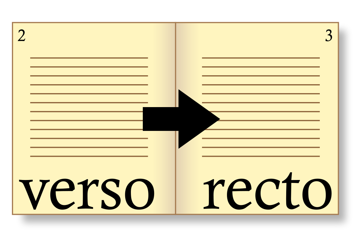
In an European book, which page carries an even page number?
the verso
7
New cards
METAFONT is related to which typesetting system?
TEX and LATEX
8
New cards
In which case is negative leading handy?
\- when the point size is very small
\- in the case of a text with many diacritics
\- when a text is typeset with many descending glyphs
\- in the case of titles set in all capitals
\- when the point size is very small
\- in the case of a text with many diacritics
\- when a text is typeset with many descending glyphs
\- in the case of titles set in all capitals
in the case of titles set in all capitals
9
New cards
Which is true of “expert” font sets?
word processors may have hyphenation problems with them
10
New cards
What is wrong with this sentence? He said “she went to school in the ‘80- ‘90s.”
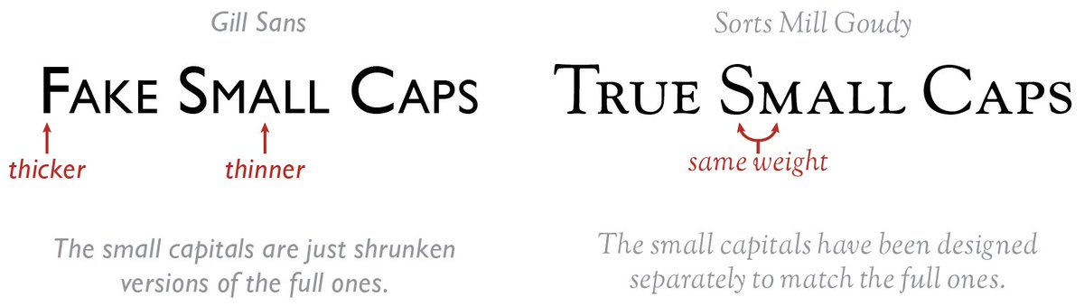
the direction of the apostrophe before the digits
11
New cards
Which of the following is part of the front matter in an English book?
copyright notice
12
New cards
What is the difference between a bibliography and a reference list?
A reference list contains only documents explicitly referred to.
13
New cards
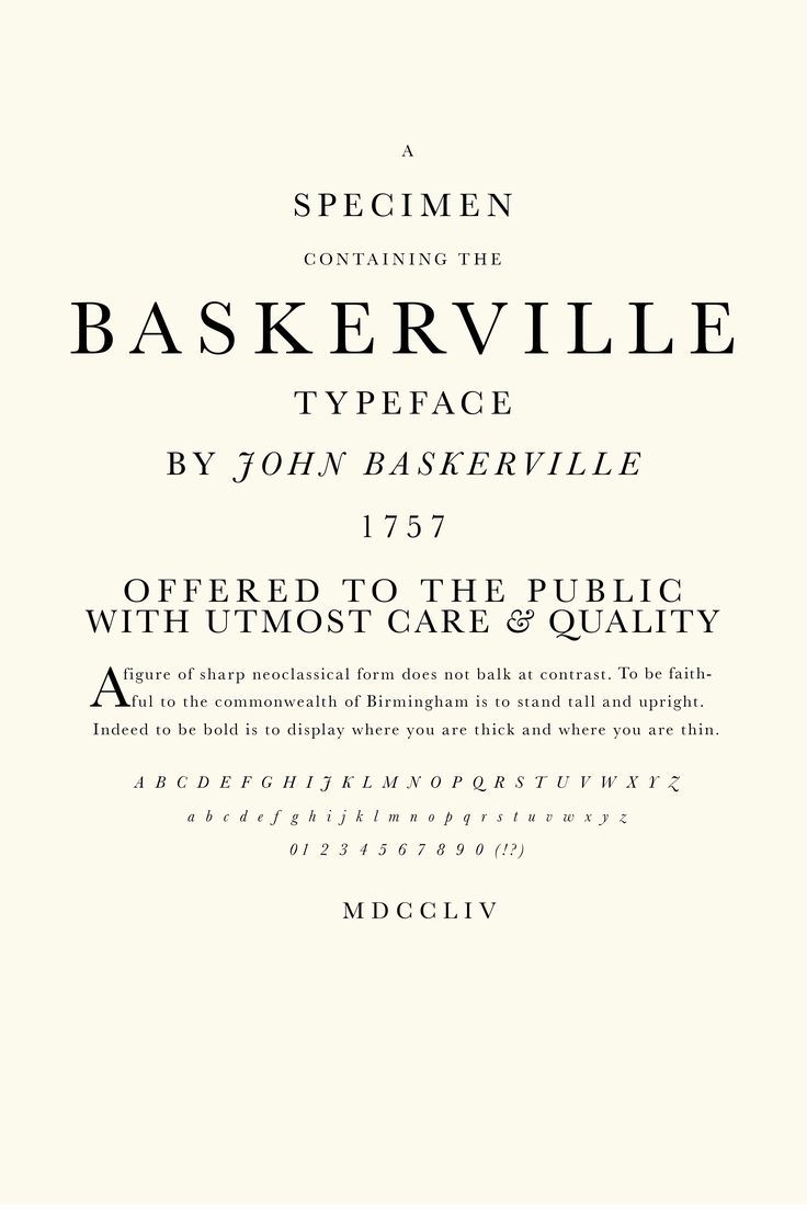
Which person can be associated with the Neoclassical typeface style?
John Baskerville
14
New cards
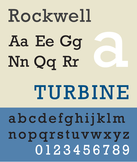
Which is a slab serif type?
Rockwell
15
New cards
Which should have an en-dash?
a) a 2-year-old dog
b) -12C
c) Bill Clinton 1992-2000
a) a 2-year-old dog
b) -12C
c) Bill Clinton 1992-2000
only c. → Bill Clinton 1992-2000
16
New cards
Which of the following font styles have hypermodulated strokes?
Romantic/Didone type
17
New cards
For large, complex documents with scientific text (maths formulas), it is recommended to use...
non-WYSIWYG typesetting systems, like TEX / LATEX.
18
New cards
Which is a stylistic ligature?
ffi
19
New cards
Out of the following four, which is the heaviest font weight?
\- black
\- book
\- Demibold
\- fat
\- black
\- book
\- Demibold
\- fat
fat
20
New cards
Which digital font format is drawn from an array of dots?
bitmap fonts

21
New cards
Which of the following glyphs has a vertex? V-Y-G-a
V

22
New cards
Who is the author of the typesetting system TEX?
Donald Knuth
23
New cards
What is scriptio continua?
text without interword spaces
24
New cards
If you had to design information signposts (i.e., station names for the subway, direction signs, etc.), which of the following typefaces is the most recommended for such a purpose?
HELVETICA
25
New cards
Subsetting embedded fonts in PDF files is useful for…
inhibiting full font extraction from PDF files.
26
New cards
What is a drop cap?
the first letter of a paragraph set in a larger size fitting within the margins
27
New cards
...refers to the reader’s ability to easily recognize letterforms and the word forms built form them.
Legibility
28
New cards
Which of the following is most likely to contain a blind folio?
a page where a chapter begins
29
New cards
The ... is a space grid that is available for the design work of glyphs in digital font design.
em square
30
New cards
Seriffed letters were typical of
ancient Roman letters.
31
New cards
Which are the font parameters along which typefaces vary?
family, style, shape, weight, width, and size
32
New cards
Which string does not contain a stylistic ligature?
Himfy
33
New cards
Which diagramme represents the historical development of note types?
marginal note < footnote < endnote
34
New cards
What kind of ligatures existed before the invention of the printing press?
character ligatures only
35
New cards
Where should a publisher turn to for an ISBN or ISSN?
the National Széchényi Library (OSZK)
36
New cards
What is typographically wrong in the following example: “The word vér ‘blood’ contains a voiced labiodentals approximant.”
The linguistic data is not italicized
37
New cards
Which statement is true?
WYSIWYG technology does not encourage users to specify document structure.
38
New cards
Which command must be the very first in the source of a LATEX document?
\\end{document}
39
New cards
Which item exemplifies a serial (or Oxford, or Harvard) comma?
1) apples and pears, pins and needles
2) apples, pears and kiwis
3) apples, pears, and kiwis
4) none of the above
1) apples and pears, pins and needles
2) apples, pears and kiwis
3) apples, pears, and kiwis
4) none of the above
3) apples, pears, and kiwis
40
New cards
What is wrong with the following definition of tracking: “The measure of the overall spacing between characters in a passage of text.”
nothing
41
New cards
Which number is the ISBN of a book published in Hungary?
963 9166 68 5
42
New cards
Which word contains a tilde?
Assunção
43
New cards
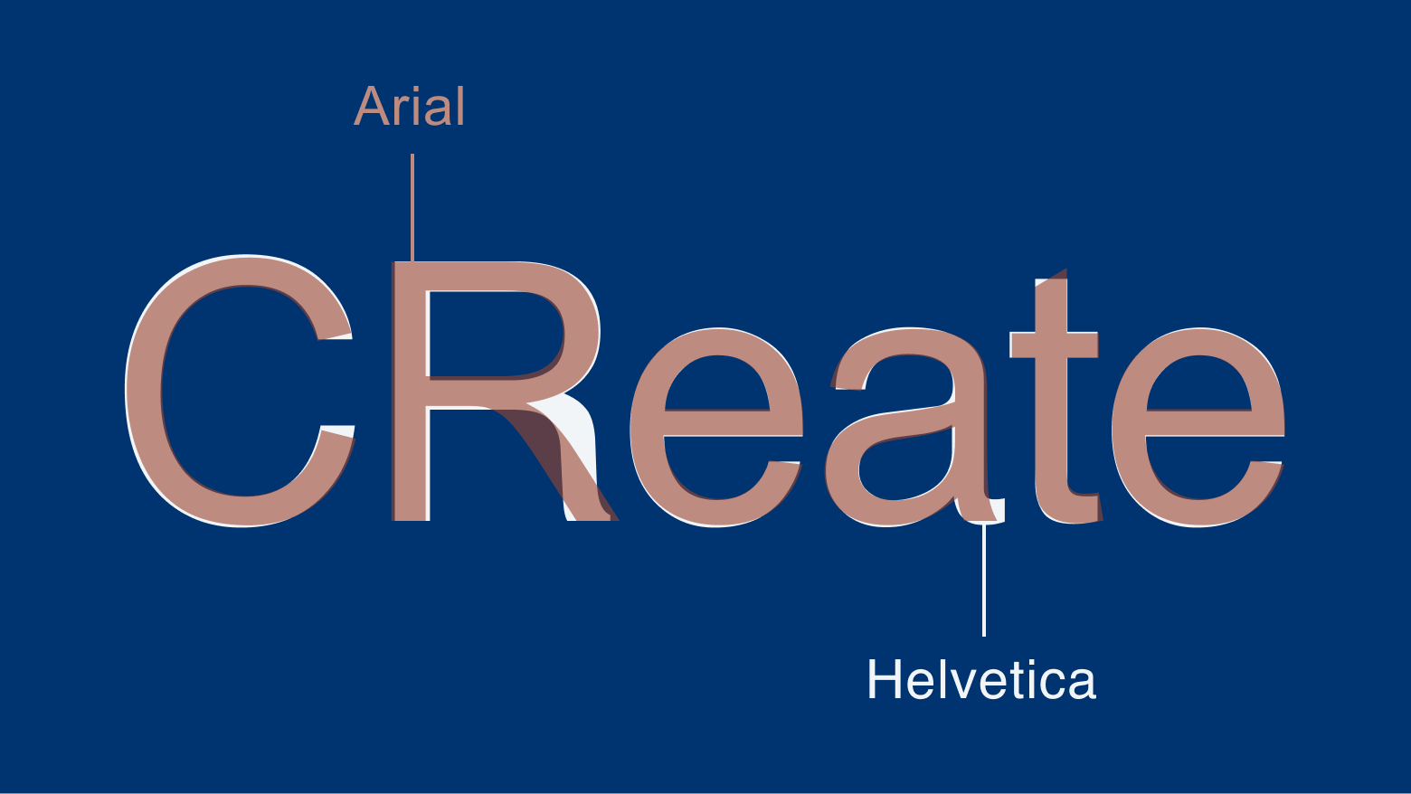
Arial resembles which font the most?
HELVETICA
44
New cards
Why are usually newspapers typographically problematic?
large type size and narrow columns create colour and readability problems
45
New cards
Which should have an em-dash?
a) pages 22—28
b) Donald—the duck
c) the suffix —ing
a) pages 22—28
b) Donald—the duck
c) the suffix —ing
b) Donald—the duck
46
New cards
Which paper size is common in the USA and Canada?
letter size
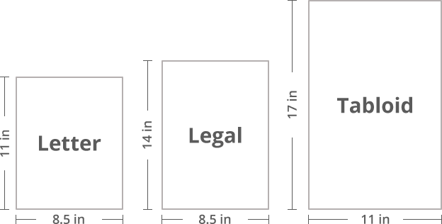
47
New cards
Which of the following statements is true?
The first mention of technical terms can be set in small caps
48
New cards
The caron has more than one glyphs. Which is not a caron?
ğ
49
New cards
In the font name Univers ‘Condensed’, ‘Condensed’ refers to font
width
50
New cards
Which is typically not alphabetized?
\- the glossary
\- the contents
\- the subject index
\- the bibliography
\- the glossary
\- the contents
\- the subject index
\- the bibliography
the contents
51
New cards
Anti-aliasing refers to…
the addition of gray pixels at the edges of glyph outlines to make them more legible at low screen resolutions.
52
New cards
Which of the following is most unlikely to contain a blind folio?
- the title page
\- the appendix
\- the half title
\- the copyright page
- the title page
\- the appendix
\- the half title
\- the copyright page
the appendix
53
New cards
In Hungary, in the colophon the length of a book is given in…
A/5 PRESS SHEETS
54
New cards
Which word contains an ogonek?
Walęsa
55
New cards
Monospaced fonts…
have all their glyphs in a bounding box with the same width.
56
New cards
Kerning refers to…
the targeted adjustments of space between specific glyph pairs.
57
New cards
What is the recommended setting of the abbreviation for the word “personal computer”?
small cap
58
New cards
One of the following does not characterize the TEX / LATEX typesetting system. Which one?
they contain automated ligature and kerning algorithms (?) (Q27 - DSC4046)
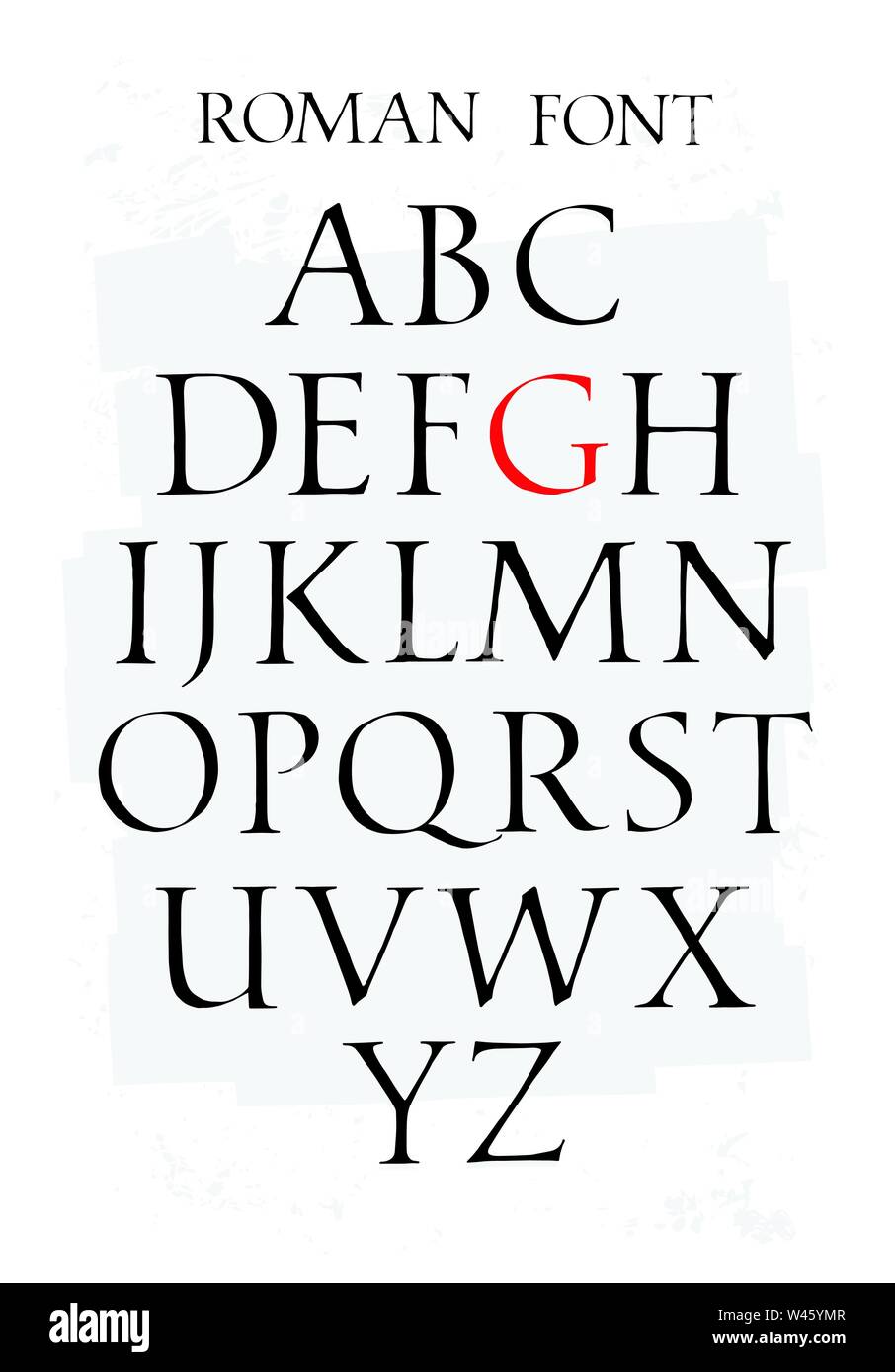
59
New cards
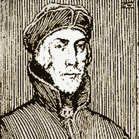
The typeface on the right is classified as...
Romantic/Modern →
60
New cards
If the page proportion is 1: ϕ (golden ratio), it produces
narrow pages
61
New cards
Which writing system is considered to be the basis of the Greek and Roman alphabets?
Phoenician

62
New cards
What is “font I.D. conflict”?
When there are two or more fonts with the same identity number on a computer system
63
New cards
Which of these sizes is optimal for setting text for chapter titles in a regular document?
“display” size
64
New cards
Seriffed letters were introduced by…
the Romans
65
New cards
Which of the following persons is credited with the first purely Renaissance Roman typeface?
1) Nicolas Jenson
2) Giambattista Bodoni
3) Johannes Gutenberg
4) Robert Slimbach
1) Nicolas Jenson
2) Giambattista Bodoni
3) Johannes Gutenberg
4) Robert Slimbach
Nicolas Jenson
66
New cards
Which is not a lowercase-uppercase pair?
1) ť\~Ť
2) ð\~Đ
3) đ\~Đ
4) ø\~0
1) ť\~Ť
2) ð\~Đ
3) đ\~Đ
4) ø\~0
**4) ø~0**
The capital is rounder!! The capital letter is NOT a slashed zero!! “the slash of a slashed zero usually does not extend past the ellipse (except in hasty handwriting).” /Wikipedia/
→ BUT the slash of the capital DOES extend!!
The capital is rounder!! The capital letter is NOT a slashed zero!! “the slash of a slashed zero usually does not extend past the ellipse (except in hasty handwriting).” /Wikipedia/
→ BUT the slash of the capital DOES extend!!
67
New cards
Which was the first punctuation mark in European writing?
the interpunct
68
New cards
In an European book, which page carries an EVEN page number?
the verso

69
New cards
Which of the following refers to solid leading?
\- 12/14.5 pt
\- 12/10 pt
\- 122/12 pt
\- 13/20 pt
\- 12/14.5 pt
\- 12/10 pt
\- 122/12 pt
\- 13/20 pt
12/10 pt
70
New cards
...fonts acquired the name ‘Egyptian’ due to England’s preoccupation with the archaeological discoveries taking place simultaneously in Egypt.
\- Serif
\- Sans Serif
\- Slab Serif
\- Woodtype
\- Serif
\- Sans Serif
\- Slab Serif
\- Woodtype
Slab serif
71
New cards
If you had to typeset a book on neoclassical architecture (like the “federal” style of the USA), which of the following typefaces would you employ in order to be the most historically “faithful” to this art period?
\- Garamond
\- Caslon
\- Baskerville
\- Centaur
\- Garamond
\- Caslon
\- Baskerville
\- Centaur
Baskerville

72
New cards
What is font metrics?
1) the optimal size of a font for a given measure
2) data about the glyphs in a digital font (e.g., width, kerning, position of the baseline, ascender, x-height etc.)
3) the collective term for typographical units
4) the collective name of the four traditional point size series (caption, text, subhead, display)
2) data about the glyphs in a digital font (e.g., width, kerning, position of the baseline, ascender, x-height etc.)
73
New cards
What is a widow line?
the last line of a paragraph with a page/column break right before it
74
New cards
One of the attributes below does not belong to the secondary font features. Which one?
\- style
\- size
\- shape
\- width
\- style
\- size
\- shape
\- width
style
75
New cards
What is an expert set font?
A companion font set that contains special ligatures, true small caps, old style digits, etc.
76
New cards
Which of the following is true of the ISO “A” series of paper size?
Each folding produces the same proportion.
77
New cards
Which of the following is false concerning movable type?
1) Gutenberg’s 42-Line Bible was printed with it.
2) It is an invention attributed to Nicolas Jenson.
3) Each character is cast in lead so that it can be used multiple times.
4) It is a printing invention developed in the 15th century.
1) Gutenberg’s 42-Line Bible was printed with it.
2) It is an invention attributed to Nicolas Jenson.
3) Each character is cast in lead so that it can be used multiple times.
4) It is a printing invention developed in the 15th century.
2) It is an invention attributed to Nicolas Jenson.
78
New cards
When several master designs are created for a typeface at various point sizes, they are also called...
\- relative sizes
\- optical sizes
\- absolute sizes
\- optimal sizes
\- relative sizes
\- optical sizes
\- absolute sizes
\- optimal sizes
optical sizes
79
New cards
Which is not a character ligature?
\- ß
\- æ
\- &
\- Q
\- ß
\- æ
\- &
\- Q
Q
80
New cards
Which is a false statement?
1) Parentheses inherit the style of the text they enclose.
2) Punctuation marks after a word in italic are also italic.
3) A suffix normally inherits the font style of its stem in English typography.
4) The plus sign (+) is not normally italicized within an italic text.
1) Parentheses inherit the style of the text they enclose.
2) Punctuation marks after a word in italic are also italic.
3) A suffix normally inherits the font style of its stem in English typography.
4) The plus sign (+) is not normally italicized within an italic text.
A suffix normally inherits the font style of its stem in English typography
81
New cards
Which typeface style has been very popular in mathematical typesetting?
1) Renaissance types, like Garamond
2) “geometrical” types, like Futura
3) “Modern” types, such as Computer Modern and Bodoni
4) Mannerist types, like the typefaces of Robert Granjon
1) Renaissance types, like Garamond
2) “geometrical” types, like Futura
3) “Modern” types, such as Computer Modern and Bodoni
4) Mannerist types, like the typefaces of Robert Granjon
3) “Modern” types, such as Computer Modern and Bodoni

82
New cards
A(n) ... is an exaggerated gap in the shape of a letter that is created with the assumption that the gap will plig with ink.
\- ink well
\- descender
\- slab serif
\- ascender
\- ink well
\- descender
\- slab serif
\- ascender
ink well
83
New cards
Which is the right weight sequence?
thin < light < regular < demibold < heavy < black
84
New cards
Which of the following is considered to mark the beginning of written language?
\- phonogram
\- ideograph
\- syllabary
\- pictograph
\- phonogram
\- ideograph
\- syllabary
\- pictograph
pictograph
85
New cards
When a digital font is not linked to any particular type of printer or computer operating system, it is said to be...
1) a raster image processor
2) bitmap
3) device independent
4) pixel independent
1) a raster image processor
2) bitmap
3) device independent
4) pixel independent
device independent
86
New cards
How many styles has a basic but full font family got?
\- only one
\- 2
\- 4
\- in modern digital fonts, basic families must have more than 4 styles
\- only one
\- 2
\- 4
\- in modern digital fonts, basic families must have more than 4 styles
4
87
New cards
Which of these measures usually affects the “subjective” size of a font the most?
\- the baselineskip
\- the set width
\- the bounding box
\- the x height
\- the baselineskip
\- the set width
\- the bounding box
\- the x height
the x height
88
New cards
In which case is hanging indentation least usual?
\- footnotes
\- reference lists
\- first paragraph of a section
\- dictionary entries
\- footnotes
\- reference lists
\- first paragraph of a section
\- dictionary entries
first paragraph of a section
89
New cards
Which of the following is the most suitable for beamer presentations?
\- TNR
\- Futura
\- Didot-type fonts
\- Verdana
\- TNR
\- Futura
\- Didot-type fonts
\- Verdana
Verdana
90
New cards
91
New cards
The original Palatino was designed by..
Hermann Zapf
92
New cards
Which typographic style was the first to introduce a heavy application of stylistic ligatures?
Mannerism
93
New cards
How can we identify fake small caps (from true small caps)? Fake small caps…
have narrower vertical strokes
94
New cards
Realist letterforms...
usually have oblique italics.
95
New cards
The stretch and shrink maximum, a limit set by typesetting programs within which word spacing looks OK, is called…
tolerance
96
New cards
Text colour depends on
1. the design of the typeface
2. vertical spacing (leading)
3. horizontal spacing (letter and word spacing)
4. all of the above
\
1. the design of the typeface
2. vertical spacing (leading)
3. horizontal spacing (letter and word spacing)
4. all of the above
\
all of the above
97
New cards
What is considered to be the optimal number of characters in a line in a single column textblock?
1) 20-30
2) 40-50
3) 60-70
4) 90-100
1) 20-30
2) 40-50
3) 60-70
4) 90-100
60-70 (the ideal number is 66)
98
New cards
Which is the odd one out?
\- dieresis
\- trema
\- umlaut
\- caret
\- dieresis
\- trema
\- umlaut
\- caret
caret (the other 3 marks the SAME glyph: Ä)
99
New cards
What is the difference between B5 and B/5?
1) B5 refers to trimmed stock size, B/5 is a standard stock size
2) B5 refers to trimmed stock size, B/5 is a standard textblock size
3) B/5 refers to trimmed stock size, B5 is a standard block size
4) nothing, they are just notational variants
1) B5 refers to trimmed stock size, B/5 is a standard stock size
2) B5 refers to trimmed stock size, B/5 is a standard textblock size
3) B/5 refers to trimmed stock size, B5 is a standard block size
4) nothing, they are just notational variants
B/5 refers to trimmed stock size, B5 is a standard block size
100
New cards
Which of the following styles fits “humanities” texts (e.g., on literature, history) the most?
\- Bodoni type
\- Renaissance
\- Futura-type
\- capital quadrata
\- Bodoni type
\- Renaissance
\- Futura-type
\- capital quadrata
Renaissance