ISOM 475 Final
0.0(0)
Studied by 1 person Call Kai
 Learn
Learn Practice Test
 Spaced Repetition
 Match
Match Flashcards
 Knowt Play
Card Sorting
1/101

Earn XP
Description and Tags
102 Terms
1
New cards
Tufts definition of data viz
An effective way to describe, explore, and summarize a set of numbers
Analyzing and communicating statistical information (Tufte)
Analyzing and communicating statistical information (Tufte)
2
New cards
Purposes of Data Visualization (Explore vs Explain)
Data scientist to data: visualization to explore
Confirm and analyze
Data scientist to reader/viewer
Visualization to explain
Inform and persuade
Confirm and analyze
Data scientist to reader/viewer
Visualization to explain
Inform and persuade
3
New cards
Visual analytics:
Visual analytics: the process of critical thinking enabled by interactive data visualizations
4
New cards
5 traits of good data visualizations
Show the data variation, not the design variation
Make large sets of data coherent
Communicate insights and complex ideas with clarity, precision, and efficiency
Use simple but effective designs
Tell the truth about data
Make large sets of data coherent
Communicate insights and complex ideas with clarity, precision, and efficiency
Use simple but effective designs
Tell the truth about data
5
New cards
Good Visual Perception cues
Understanding without training (intuitive)
Cross culture validity
Hard wired
Cross culture validity
Hard wired
6
New cards
How visual perception works
Neurons extract features involuntarily →
Assembly of information into the significance (patterns) and object identification →
Visual working memory (3 chunks) with active conscious attention
Assembly of information into the significance (patterns) and object identification →
Visual working memory (3 chunks) with active conscious attention
7
New cards
Gestalt Principals
Principal of proximity: perceive objects close together as a group
Principal of similarity: group objects together that look similar
Principal of enclosure: objects appear to belong together when they are enclosed within a boundary
We naturally perceive open, incomplete, and unusual forms as closed, whole, and regular
Principal of continuity : We perceive objects as belonging together, as a part of a single whole, if they are aligned with one another or appear to form a continuation of one another
Principal of connection: The perception that objects that are connected as part of the same group
Principal of similarity: group objects together that look similar
Principal of enclosure: objects appear to belong together when they are enclosed within a boundary
We naturally perceive open, incomplete, and unusual forms as closed, whole, and regular
Principal of continuity : We perceive objects as belonging together, as a part of a single whole, if they are aligned with one another or appear to form a continuation of one another
Principal of connection: The perception that objects that are connected as part of the same group
8
New cards
Pre-attentive attributes
processing occurs below the level of consciousness at a high speed and is tuned to detect specific visual attributes
Form
Color
position
Form
Color
position
9
New cards
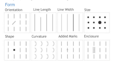
Pre-attentive attribute: Form
Length, width, shape, orientation, size, enclosure
10
New cards
Pre-attentive attribute: Color
Hue, Value, Intensity
11
New cards
Pre-attentive attribute: Position
Relative and absolute and motion
Spatial positions can show relationships and group membership
When animation is used, aim for motion in the range of 0.5 to 4 degrees/second of a visual angle (Rule G6.30)
Spatial positions can show relationships and group membership
When animation is used, aim for motion in the range of 0.5 to 4 degrees/second of a visual angle (Rule G6.30)
12
New cards
Rules of thumb for how people perceive charts
We don't go in order
We see first what stands out
We see only a few things at once
We seek meaning and make connections
Correlation does not imply causation
We rely on conventions and metaphors
We see first what stands out
We see only a few things at once
We seek meaning and make connections
Correlation does not imply causation
We rely on conventions and metaphors
13
New cards
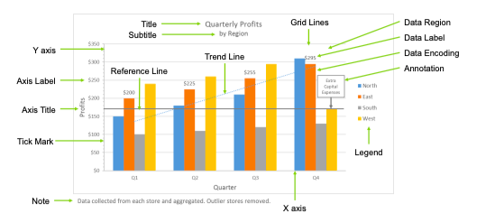
Common components of a chart/graph
14
New cards
Scatterplot
2 continuous variables
Set symbols at maximum distinction, and make them differ by both color and shape
Maximize the distance of the color wheel with categorical variables
Set symbols at maximum distinction, and make them differ by both color and shape
Maximize the distance of the color wheel with categorical variables
15
New cards
Line Graph
Two continuous variables with one being time
Use for trends over time
Use for trends over time
16
New cards
Pie Chart
1 continuous and 1 categorical
17
New cards
Bar Chart
1 continuous and 1 categorical
Glyphs/marks: symbols meant to represent a numerical attribute or entire, representing through the use of our building blacks of form, color, position, and motion
Use small, closed shapes to represent data entities
Use the color, shape, and size of those shapes to represent attributes of the entity
Can be used to show time series
Stacked bars
Diverging bars
Glyphs/marks: symbols meant to represent a numerical attribute or entire, representing through the use of our building blacks of form, color, position, and motion
Use small, closed shapes to represent data entities
Use the color, shape, and size of those shapes to represent attributes of the entity
Can be used to show time series
Stacked bars
Diverging bars
18
New cards
Histogram
One continuous variable
can be used with multiple categories
can be used with multiple categories
19
New cards
Distributions
Stem and leaf plot
Histogram
Boxplot
Violin Plot
Histogram
Boxplot
Violin Plot
20
New cards
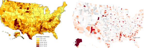
Cloropleth
Maps with color
use of color to represent the distribution of standardized variables values using pre-defined boundaries (e.g. countries)
Loses gradient subtly - the phenomenon of interest may respect boundaries
Explains via familiar units
use of color to represent the distribution of standardized variables values using pre-defined boundaries (e.g. countries)
Loses gradient subtly - the phenomenon of interest may respect boundaries
Explains via familiar units
21
New cards
Heat Map
use of color to represent quantitative value imposed upon an area/location (vs. leveraging predefined boundaries ‘agnostic; to the mapped values)
22
New cards
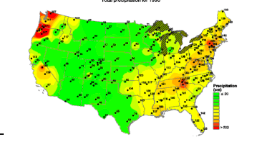
Isopleth
a quantitative value used to impose isolines (constant value)
23
New cards
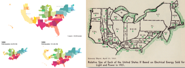
Cartogram
Use of size of predefined units (states) to represent the distribution of variable values
topology(unit relationships) maintained
Explains via familiar units
topology(unit relationships) maintained
Explains via familiar units
24
New cards
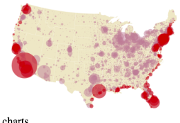
Shape Map
Length of diameter vs area of a circle
25
New cards
Tree Map
use of color and form (area) to represent two quantitative values
May also use (relative) position to represent nested/hierarchical data
Precision is not important
Boxes represent entities
Better for large data sets where the smallest category is still relatively significant
May also use (relative) position to represent nested/hierarchical data
Precision is not important
Boxes represent entities
Better for large data sets where the smallest category is still relatively significant
26
New cards
Principals of Graphical evidence (Tufte)
1. Graphical excellence is the well-designed presentation of interesting data – a matter of substance, statistics, and design.
2. Graphical excellence consists of complex ideas communicated with clarity, precision, and efficiency.
3. Graphical excellence is that which gives to the viewer the greatest number of ideas in the shortest time with the least ink in the smallest space.
4. Graphical excellence is nearly always multivariate.
5. Graphical excellence requires telling the truth about the data.
2. Graphical excellence consists of complex ideas communicated with clarity, precision, and efficiency.
3. Graphical excellence is that which gives to the viewer the greatest number of ideas in the shortest time with the least ink in the smallest space.
4. Graphical excellence is nearly always multivariate.
5. Graphical excellence requires telling the truth about the data.
27
New cards
Purpose of EDA
EDA summarizes the main characteristics of a data set, typically w visual methods
Used primarily for seeing what the data can tell us beyond and prior to formal modeling (“model free evidence”)
Used primarily for seeing what the data can tell us beyond and prior to formal modeling (“model free evidence”)
28
New cards
Common measures of continuous/numeric variables
1. estimates of location
2. estimates of spread
3. estimates of shape
2. estimates of spread
3. estimates of shape
29
New cards
Estimates of location
Mean
- Most commonly used for average
- All values weighted equally
Median
- Median splits the data into the upper half and lower half
- Not sensitive to extreme values
- 50th percentile
Mode
- an estimate for discrete and categorical data
Can be bi-modal or multi-modal
- Most commonly used for average
- All values weighted equally
Median
- Median splits the data into the upper half and lower half
- Not sensitive to extreme values
- 50th percentile
Mode
- an estimate for discrete and categorical data
Can be bi-modal or multi-modal
30
New cards
Outliers and trimmed mean
Percentiles tell us the value at which that percentage of observations falls below
Interquartile Range = difference between the 75th and 25th percentiles (middle 50% of data values)
IQR is often used to find outliers
Q1-1.5 IQR or above Q3 + 1.5IQR
Deciles- percentiles in 10% increment
Outliers are not inherently invalid and erroneous
Must determine if outliers are bad
Interquartile Range = difference between the 75th and 25th percentiles (middle 50% of data values)
IQR is often used to find outliers
Q1-1.5 IQR or above Q3 + 1.5IQR
Deciles- percentiles in 10% increment
Outliers are not inherently invalid and erroneous
Must determine if outliers are bad
31
New cards
Estimates of spread
Absolute deviation
variance
standard deviation
variance
standard deviation
32
New cards
Absolute Deviations
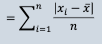
Mean absolute deviation: mean of the absolute deviation from the mean for all observations
Median absolute deviation: median of the absolute deviation from the median for all observations
Median absolute deviation: median of the absolute deviation from the median for all observations
33
New cards
Variance
Average of the squared deviations from the mean in a database

34
New cards
Standard Deviation
- Expressed in the same units as the data
- The Square root of the variance
- S = √Variance
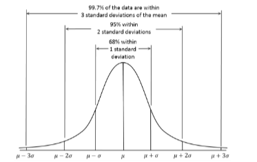
- Standard deviation in normally distributed data
- The Square root of the variance
- S = √Variance
- Standard deviation in normally distributed data
35
New cards
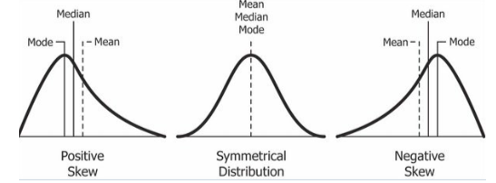
Estimates of Shape
Skewness
36
New cards
Histogram template
Bar height: represents frequency or probability of bar range
Bar width: represents a range on the value axis, uniform across all bars
Bar width: represents a range on the value axis, uniform across all bars
37
New cards
Empirical (cumulative) Distribution Functions
Kernel density plots
density plots
density plots
38
New cards
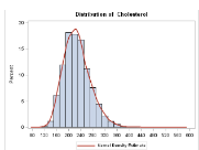
Kernel density plots
Based on the declared “bandwidth: the kernel function is used to estimate the density of each band. Then all density estimates are added together
39
New cards
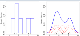
Density Plot
Probability scale: Proportion of given value in population
Curve Height: Estimated probability of corresponding value occurring
Area: Total area under curve equals one
Value axis: value displayed for a single, continuous variable
Curve Height: Estimated probability of corresponding value occurring
Area: Total area under curve equals one
Value axis: value displayed for a single, continuous variable
40
New cards
Tukeys 5 Number summary
Location and spread:
Minimum observation
Lower quartile
Median
Upper quartile
Maximum observation
Minimum observation
Lower quartile
Median
Upper quartile
Maximum observation
41
New cards
Quartile-Quartile Plot (Q-Q)
Compare continuous variable to a theoretical distribution (normal Distributions)
- Plots the quartiles of your variable against the quantiles of a theoretical distribution
- If the points follow the 45-degree line, the quantiles match and distributions are similar
- Can be used to compare two distributions
- Plots the quartiles of your variable against the quantiles of a theoretical distribution
- If the points follow the 45-degree line, the quantiles match and distributions are similar
- Can be used to compare two distributions
42
New cards
Numeric-Numeric Comparisons
Scatterplots give insights for numeric-numeric comparisons
“Casual” relationships (linear and non-linear)
Associations
Outliers and groups of outliers
Clusters
Gaps
“Casual” relationships (linear and non-linear)
Associations
Outliers and groups of outliers
Clusters
Gaps
43
New cards
How to show conditional relationships
Small multiples of scatterplots help us see if relationships are conditional
44
New cards
Scatterplot template
Similar to time series designs but X axis is a second continuous variable that is not time
Y-axis: usually a single, dependent variable
X-axis: values displayed for single variable
Cannot be time
Y-axis: usually a single, dependent variable
X-axis: values displayed for single variable
Cannot be time
45
New cards
Correlation
Linear correlation coefficient (persons correlation_ measures the direction (positive or negative) and the degree (strong or weak) of the linear relationship between two sets of quantitative values
All values fall between -1 and +1
- 0 = no linear correlation
- +1 = perfect positive linear relationship
- -1 = perfect negative linear relationship
The greater the magnitude of the value, the stronger the relationship
All values fall between -1 and +1
- 0 = no linear correlation
- +1 = perfect positive linear relationship
- -1 = perfect negative linear relationship
The greater the magnitude of the value, the stronger the relationship
46
New cards
T-stastistic
T- statistic: is the correlation coefficient statistically significant
47
New cards
R Squared
Square of persons correlation coefficient
If trend is negative sloping, add a - sign
If trend is negative sloping, add a - sign
48
New cards
Reading correlation
The value of correlation indicates the strength of the linear relationship
The value of the slope does not indicate the strength of the relationship, but tells you the response to a one-unit increase in the predictor
Correlation coefficients do not apply directly to non-linear relationships
The value of the slope does not indicate the strength of the relationship, but tells you the response to a one-unit increase in the predictor
Correlation coefficients do not apply directly to non-linear relationships
49
New cards
Plots for accessing correlation
Rugs (strip plots of histograms) add distributional information to scatterplots
Ex. NFL combine
Contour plots help highlight relationships when the dataset is large and dense
Ex. NFL combine
Contour plots help highlight relationships when the dataset is large and dense
50
New cards
Numerical-categorical Comparisons Purpure
With one numeric and one categorical variable, its typically about comparing distributions
51
New cards
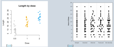
Strip Plots/ Dot plots
simplest way to show numeric by categorical data
52
New cards
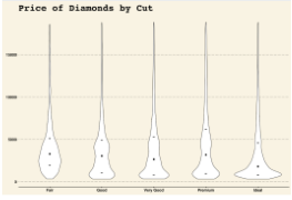
Violin plots
display distribution shape
53
New cards
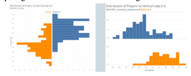
Butterfly charts and Histograms
Comparing numeric variables across two categories
54
New cards
Small Multiples
numeric-categorical comparison
55
New cards
Dot plots
Effective way to compare single numeric values of summary stats across categories
56
New cards
What to do with two categorical variables
simple bar plots of multiple categorical variables show where the data observations occur
- Mosaic plots: an alternative way to show occurrence in categorical data combinations. They provide quick information about where the data lies, but making comparisons is harder
- Simple frequency table:
especially when color is used to highlight differences
- Mosaic plots: an alternative way to show occurrence in categorical data combinations. They provide quick information about where the data lies, but making comparisons is harder
- Simple frequency table:
especially when color is used to highlight differences
57
New cards
Purpose of EDA
Summarize the main characteristics of a data set using visualization
Suggest hypotheses about the causes of observed phenomena
Assess assumptions on which statistical inference will be based
Support the selection of appropriate statistical tools and techniques
Provide a basis for further data collection through surveys or experiments
Suggest hypotheses about the causes of observed phenomena
Assess assumptions on which statistical inference will be based
Support the selection of appropriate statistical tools and techniques
Provide a basis for further data collection through surveys or experiments
58
New cards
Nominal Comparisons
nominal/categorical comparisons: displays a set of discrete quantitative values so they can be easily read and compared
- Box and Wisker plot: comparing distributions across categories
- Cleeveland dot plot
- Box and Wisker plot: comparing distributions across categories
- Cleeveland dot plot
59
New cards
Time Series
A series of quantitative values that show how something changed over time
Useful when ur quantitative message includes: change, rise, increase, fluctuate, grow, decline, decrease, or trend
Time is always the horizontal access and vertical is the quantitative scale
Vertical bars: emphasize individual values or compare categories of values, rather than the overall pattern
Effective when emphasizing individual values
not good for overall trend?
Useful when ur quantitative message includes: change, rise, increase, fluctuate, grow, decline, decrease, or trend
Time is always the horizontal access and vertical is the quantitative scale
Vertical bars: emphasize individual values or compare categories of values, rather than the overall pattern
Effective when emphasizing individual values
not good for overall trend?
60
New cards
Stacked bars:
Discrete points in time
Useful if there are subcategories and the sum of the subcategories is meaningful for your quantitative message
Useful if there are subcategories and the sum of the subcategories is meaningful for your quantitative message
61
New cards
points only graph
values where collected at irregular intervals of time of there is little short term up and down fluctuation in values
Not good for overall trends
Not good for overall trends
62
New cards
Lines (or points with lines)
pattern of change through time
The line implies continuous data, and the line between dots may not longer be appropriate depending on the context
When data is collected irregularly, a line is not good as it may indicate there is a trend that isnt really there
The line implies continuous data, and the line between dots may not longer be appropriate depending on the context
When data is collected irregularly, a line is not good as it may indicate there is a trend that isnt really there
63
New cards
Step chart
implies steady change from point A to B.
Works with population or stock prices
gwim_step()
Ggplot2
Works with population or stock prices
gwim_step()
Ggplot2
64
New cards
Violin plot/vertical box plot
how distribution changes over time
65
New cards
Linear trend line fits data with
the best line using least square regression
66
New cards
LOESS curves
reforms multiple local regressions that place higher weighting on closer points
No priori model
No simple regression function to describe the trend
Large a makes a smoother model
Overfitting may be an issue
No priori model
No simple regression function to describe the trend
Large a makes a smoother model
Overfitting may be an issue
67
New cards
Rankings Basics
Use one axis for categorical items and use the other axis for a quantitative scale
Bars are most often preferred
Except when the scale dosent begin at zero- then use points
Sorting is key in effectively communicating
Highlight highest values - sort descending
Bump chart:
Comparing rankings over time
Bars are most often preferred
Except when the scale dosent begin at zero- then use points
Sorting is key in effectively communicating
Highlight highest values - sort descending
Bump chart:
Comparing rankings over time
68
New cards
Part to whole
how individual values that make a whole of something compare to each other and the whole
Rate, percent, percent of total, share, accounts for X percent
No pie graphs- use single stacked bar charts
Rate, percent, percent of total, share, accounts for X percent
No pie graphs- use single stacked bar charts
69
New cards
Proportions by category
bar chart
stacked bar
stacked bar
70
New cards
Hierarchical proportions
Tree maps
71
New cards
Proportions over time
Stacked bar chart
72
New cards
Deviation designs:
show how one or more sets of quantitative values differ from a reference set of values
plus/minus, variance, difference, relative to
Deviation with time series
plus/minus, variance, difference, relative to
Deviation with time series
73
New cards
Purpose of Interaction
Give control to the user
Guide the user through your story
Handle too much data or too many variables
Allow for data exploration and new question
Can be more fun and engaging
Guide the user through your story
Handle too much data or too many variables
Allow for data exploration and new question
Can be more fun and engaging
74
New cards
Definition of visual information seeking mantra
Overview, zoom and filter, then details on demand
75
New cards
5 most common interaction
sorting
filter
highlighting
details on demand
zoom/pan
filter
highlighting
details on demand
zoom/pan
76
New cards
Filter
- Reduces the data viewed to a subset
- Filters data based on any info in the connected data, not just currently displayed
- Give a visual to remind reader that the filter is present
- Allows multiple graphs to be linked such that filters apply across graphs
- Allow data to be filtered rapidly using controls such as:
- Sliders, check, boxes, view actions
- Allows user to directly select and remove items from a graph
- Provide ability for complex logic with multiple features
- Filters data based on any info in the connected data, not just currently displayed
- Give a visual to remind reader that the filter is present
- Allows multiple graphs to be linked such that filters apply across graphs
- Allow data to be filtered rapidly using controls such as:
- Sliders, check, boxes, view actions
- Allows user to directly select and remove items from a graph
- Provide ability for complex logic with multiple features
77
New cards
Highlighting
Highlights a subset of data by selecting from lists of categorical items
Should highlight subset but have whole graph still visible
Brushing: when a user selects items in the visualization with an input device (mouse) which can then be highlighted or used as a filter
Should highlight subset but have whole graph still visible
Brushing: when a user selects items in the visualization with an input device (mouse) which can then be highlighted or used as a filter
78
New cards
Details on demand
Provides an easy means to view details related to an item in a visualization when needed
Provides an easy means make details disappear from view when they are no longer needed
Common approaches:
Tooltips
Linked cross tabs
Provides an easy means make details disappear from view when they are no longer needed
Common approaches:
Tooltips
Linked cross tabs
79
New cards
Zoom/Pan
Take a closer look at a specific section of a graph
Provide the means to directly select and zoom in 1 click (+zoom out)
Provide the means to directly select and zoom in 1 click (+zoom out)
80
New cards
Directed interaction
question, view., insight
81
New cards
Exploratory Interaction
view, question, view, insight
82
New cards
Musts of interactive graphs
assume nobody will see tooltip
very few people click on anything
focus on the needs of the audience, not the aesthetics
very few people click on anything
focus on the needs of the audience, not the aesthetics
83
New cards
Fews definition of Dashboards
A visual display of the most important information needed to achieve one or more objectives, consolidated and arranged on a single screen so the information can be monitored at a glance
84
New cards
Dashboards are:
Visual
Display the information needed to achieve specific objectives
Fits on one computer screen
Monitor information at a glance
Present information using small, concise, direct and clear display media
CustomizedD
Display the information needed to achieve specific objectives
Fits on one computer screen
Monitor information at a glance
Present information using small, concise, direct and clear display media
CustomizedD
85
New cards
Dashboards are not
A display that is primarily used for data exploration and analysis
A portal
A scorecard
A report that people use to look up specific facts
A portal
A scorecard
A report that people use to look up specific facts
86
New cards
Why use a dashboard:
Maintaining situation awareness
Performance monitoring process
- Update high-level situation awareness
- Identify and focus on particular items that need attention
- Update awareness of this item in greater detail
- Determine whether action is required
- If action is required, access additional information that is needed, if any, to determine an appropriate response
- Respond
Performance monitoring process
- Update high-level situation awareness
- Identify and focus on particular items that need attention
- Update awareness of this item in greater detail
- Determine whether action is required
- If action is required, access additional information that is needed, if any, to determine an appropriate response
- Respond
87
New cards
Common Dashboard mistakes
Exceeding the boundaries of a single screen
Supplying inadequate context for the data
Displaying excessive detail
Expressing measures indirectly
Choosing inappropriate media of display
Introducing meaningless variety
Providing different graphs for variety rather than true medium
Using poorly designed media
Encoding quantitative data inaccurately
Arranging the data poorly
Ineffective highlighting of whats important
Clustering the screen with useless decoration
Misusing or overusing color
Designing an unappealing visual display
Supplying inadequate context for the data
Displaying excessive detail
Expressing measures indirectly
Choosing inappropriate media of display
Introducing meaningless variety
Providing different graphs for variety rather than true medium
Using poorly designed media
Encoding quantitative data inaccurately
Arranging the data poorly
Ineffective highlighting of whats important
Clustering the screen with useless decoration
Misusing or overusing color
Designing an unappealing visual display
88
New cards
Dashboard Design Principles
See the big picture
Focus in on the specific items of information that need attention
Quickly drill into additional information that is needed to take action
Focus in on the specific items of information that need attention
Quickly drill into additional information that is needed to take action
89
New cards
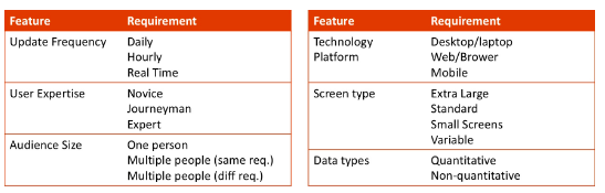
Fundamental Dashboard Usage requirements
90
New cards
Dashboard design best practices
Organize information to support meaning and use
Maintain consistency to enable quick and accurate interpretation
Put supplementary information within reach
Make the experience aesthetically pleasing
Choose meaningful colors
Subdued over bright
Off-white background
High resolution images
Legible font
Alight content and follow good layout principals
Expose lower-level conditions
Prevent excessive alerts
Keep viewers in the loop
Accommodate real-time monitoring (when needed)
Maintain consistency to enable quick and accurate interpretation
Put supplementary information within reach
Make the experience aesthetically pleasing
Choose meaningful colors
Subdued over bright
Off-white background
High resolution images
Legible font
Alight content and follow good layout principals
Expose lower-level conditions
Prevent excessive alerts
Keep viewers in the loop
Accommodate real-time monitoring (when needed)
91
New cards
Ideal charts for dashboards
Bullter graphs
Bar Bullet
Dot plots
Line graphs
Slope charts
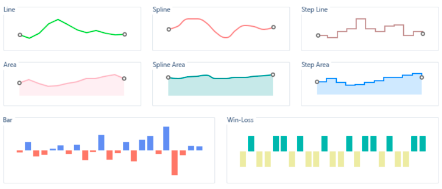
Sparklines (see image)
Box-plots
Spatial maps
Heat maps
Treemaps
Bar Bullet
Dot plots
Line graphs
Slope charts
Sparklines (see image)
Box-plots
Spatial maps
Heat maps
Treemaps
92
New cards
Analogous colors
colors next to each-other on color wheel
93
New cards
Complimentary colors
opposite from eachother on color wheel
94
New cards
Split complementary
colors that are adjacent to the opposite on color wheel
95
New cards
Triad color pallet
3 colors in a triangle pattern on color wheel
96
New cards
Tetratic color palette
form a rectangle on color wheel; 2 sets on complementary patterns
One main color, 3 accent colors
One main color, 3 accent colors
97
New cards
Color Identifiers
RGB: 0-163
Hex code: #00FFA3; 00 = red value, FF = green value, A3= Blue value
HSL: Hue (degree), saturation (%), lightness (%)
CMYK: 0-1; cyan, magenta, yellow, black
Hex code: #00FFA3; 00 = red value, FF = green value, A3= Blue value
HSL: Hue (degree), saturation (%), lightness (%)
CMYK: 0-1; cyan, magenta, yellow, black
98
New cards
color variable relationships
Sequential pallets for ordinal values or unidirectional continuous values
Diverging pallets for bidirectional categories or continuous variables with positive and negative values
circular / categorical pallets for nominal categories
Diverging pallets for bidirectional categories or continuous variables with positive and negative values
circular / categorical pallets for nominal categories
99
New cards
Font Sizing
1 pica = 12 points
1 inch = 72 points
12 points = 16 pixels
1 pica= 16 pixels
1 inch = 72 points
12 points = 16 pixels
1 pica= 16 pixels
100
New cards
Kerning (font spacing)
adjusting the spacing between characters