LESSON 3: GRAPHING QUANTITATIVE VARIABLES
 Call Kai
 Learn
Learn Practice Test
 Spaced Repetition
 Match
Match Flashcards
 Knowt Play
1/14

There's no tags or description
Looks like no tags are added yet.
Name | Mastery | Learn | Test | Matching | Spaced | Call with Kai | Chat |
|---|
No analytics yet
Send a link to your students to track their progress
15 Terms
QUANTITATIVE VARIABLE
- Variables measured on a numeric scale
Example: height, weight, response time, subjective rating of pain, temperature, score on an exam
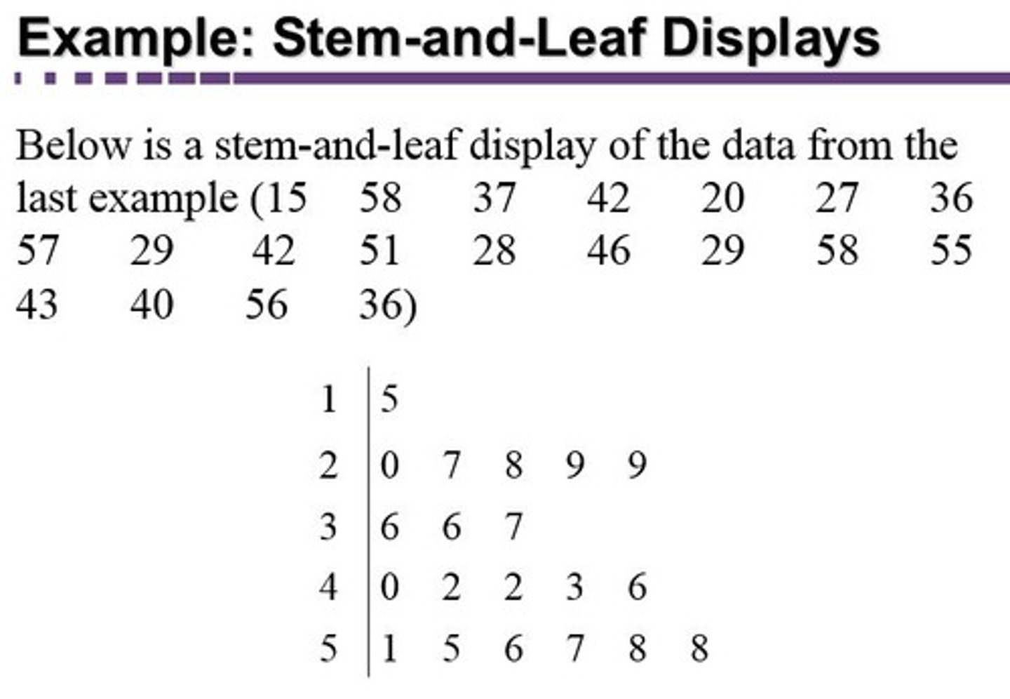
STEM DISPLAYS
arranged as a column to the left of the bars; represents the tens digits (e.g. 3 stem = 30 to 39)
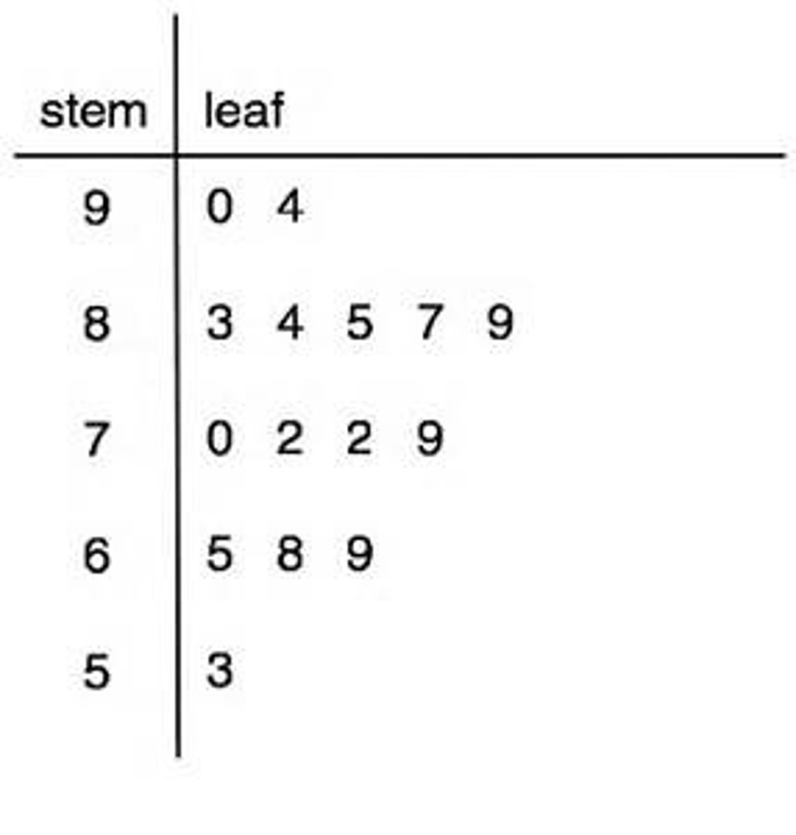
LEAF DISPLAYS
- Numbers to the right represent the ones digits
- Every leaf in the graph, therefore, stands for the result of adding the leaf to 10 times its stem.
Purpose: to clarify the shape of the distribution; the precise numbers can be determined by examining the leaves
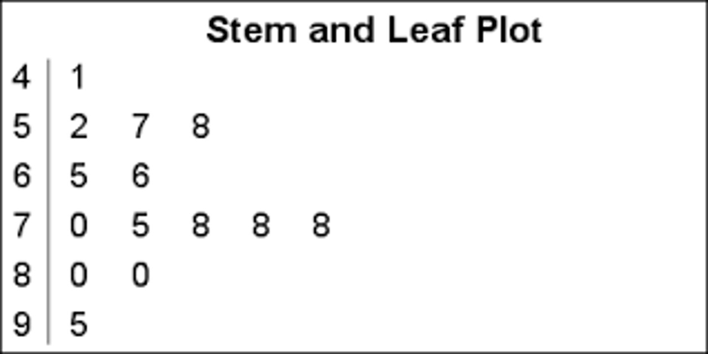
STEM AND LEAF DISPLAYS
- Best-suited for small to moderate amounts of data (up to 200 observations)
- We can make our figure even more revealing by splitting each stem into 2 parts
- Splitting depends on the exact form of your data: if rows get too long with single stems, you can try splitting them into 2 or more parts
- they are placed back to back along a common column of stems: "Back-to-back stem and leaf display"
- Easy to graph when:
- data are whole numbers
- All numbers are positive
- Data with decimals can be rounded to 2-digit accuracy
Test Anxiety Questionnaire
(Scores range from 10 - 50)
Low: 10 - 19
Moderate: 20 - 35
High: over 35
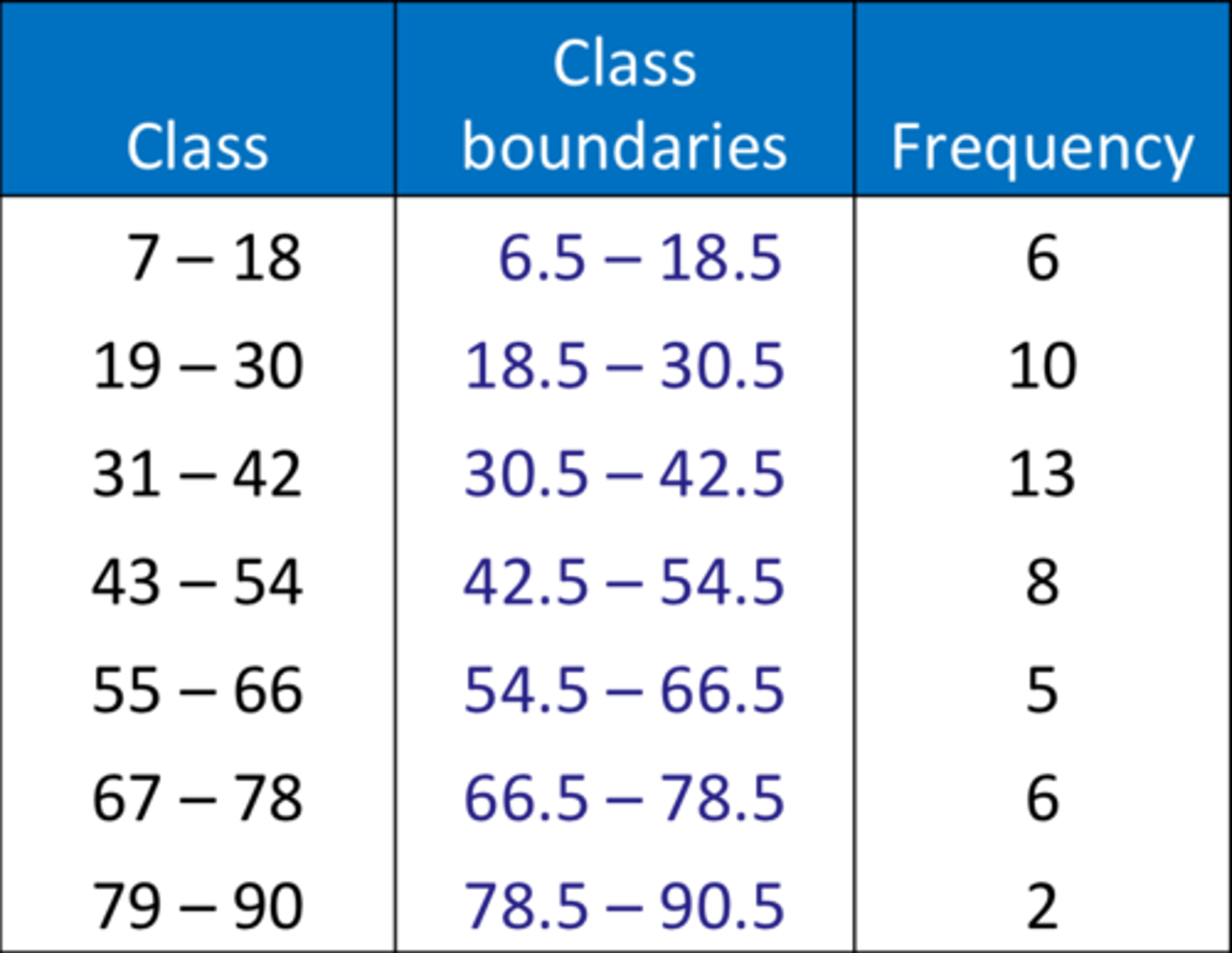
HISTOGRAMS
- Used for displaying the shape of the
distribution of a quantitative variable.
- It groups data into class intervals (bins) and represents the frequency (or relative frequency) of data within each interval using adjacent bars.
- Best-suited for large amounts of data
- can also be used when the scores
are measured on a more continuous scale, such as the length of time (in milliseconds) required to perform a task.
When to Use It:
- Best-suited for large data sets (typically more than 20-30 observations).
- Useful for identifying distribution shape, such as normality, skewness, or multimodality.
- Can be used for both discrete and continuous quantitative variables.
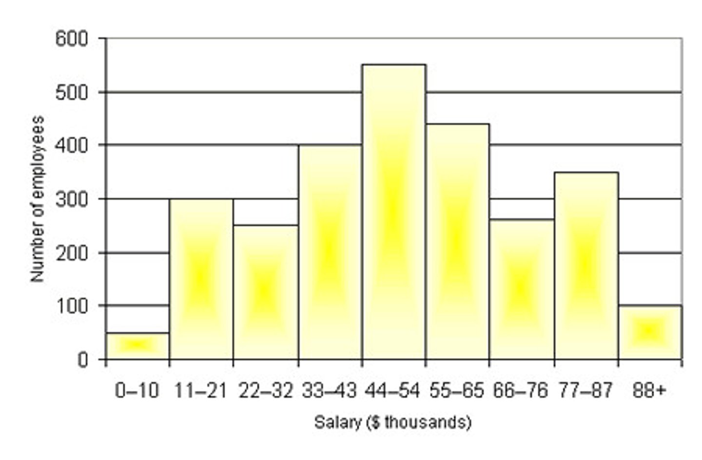
class frequencies
- In a histogram, are represented by bars.
- Height of each bar corresponds to its class frequency.
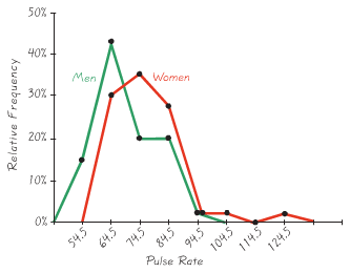
FREQUENCY POLYGONS
- Same purpose as histograms, but are
especially helpful for comparing two or more distributions.
- Also a good choice for displaying cumulative frequency distributions (or trends in grouped data)
- are useful for comparing distributions
- Achieved by overlaying the frequency polygons drawn for different data sets
- Also possible to plot two cumulative frequency distributions in the same graph.
- Shows data distribution
- X-axis: class midpoints,
- Y-axis: frequencies
- Always uses straight line segments
- Comparing grouped frequency data
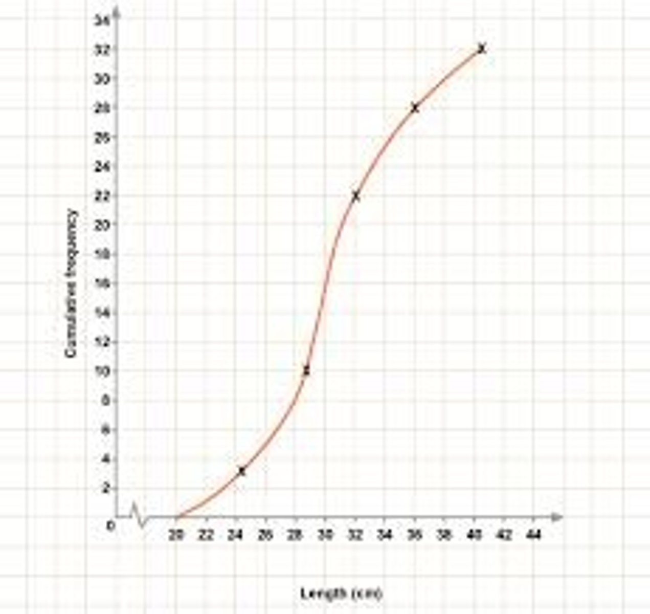
Cumulative Frequency
- Y-axis values represent cumulative frequency: not the individual class frequency
- Helps to visually identify medians, quartiles, and percentiles.
- The final point always shows the total number of observations.
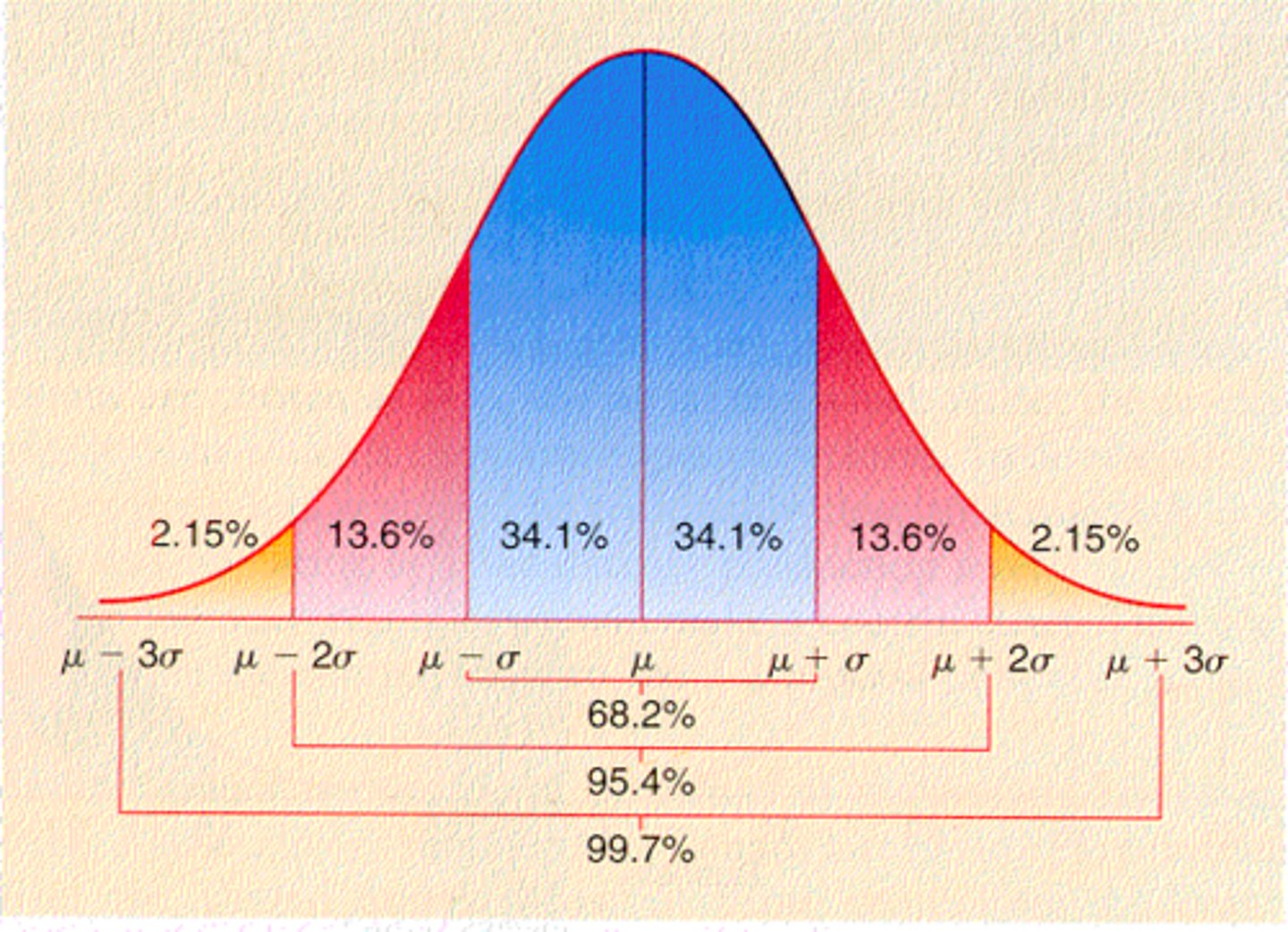
PERCENTILES
- are based on cumulative frequency, indicating the value below which a given percentage of data falls.
- indicates the score below which
a given percentage of scores fall.
- Commonly used in standardization tables of psychological tests and measures
- Describe a person's standing compared with the set of individuals on which the test or measure was initially researched
- Quick method of expressing a person's score relative to those of others.
Example:
- 90th percentile = the score is greater than or equal to 90% of the distribution.
- Neuroticism score is 90th percentile = person is more neurotic than about 90% of people
BOX PLOTS
- Box-and-Whiskers Plot
- Provide a visual summary of a distribution's central tendency and spread.
- Highlight the median, quartiles, and potential outliers.
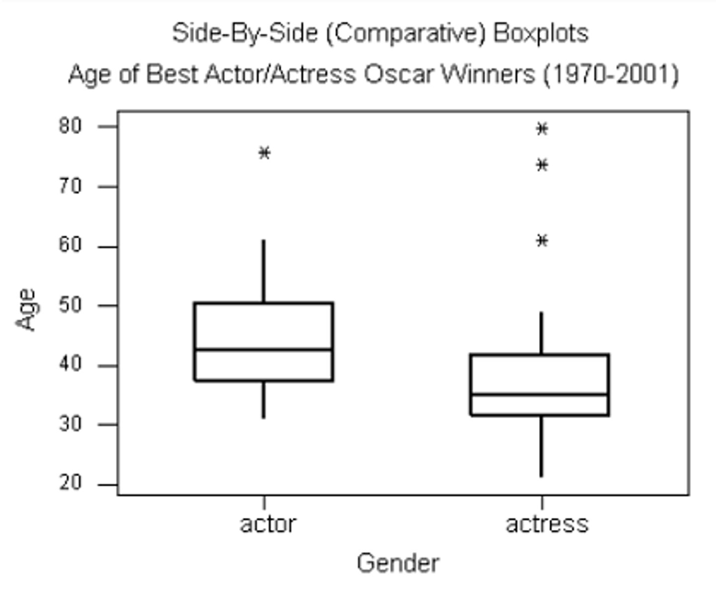
positive skew
Longer whisker on the top
negative skew
Longer whisker on the bottom
positively skewed
If mean > median
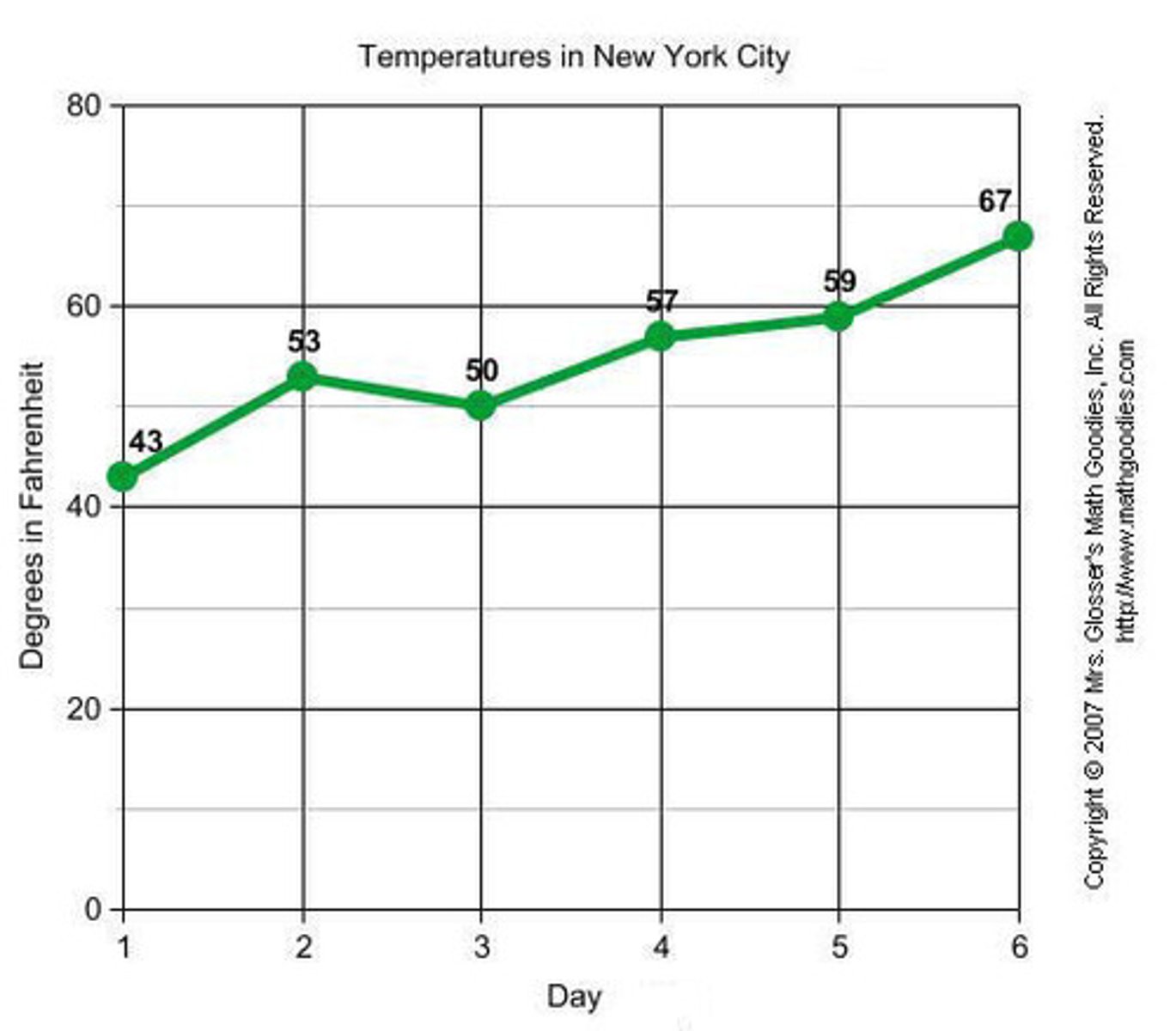
LINE GRAPH
- Are appropriate only when both the X- and Y-axes display ordered (not qualitative) variables
- Generally better than bar charts when comparing changes over time
- Shows trends over time
- Both axes are ordered variables
- Can be smooth or segmented
- Time-series data