Map Projections and Types of Maps - Video Notes
1/16
Earn XP
Description and Tags
A set of vocabulary-style flashcards covering map projections and map types presented in the video notes. Each card defines a key term or concept.}
Name | Mastery | Learn | Test | Matching | Spaced |
|---|
No study sessions yet.
17 Terms
Map projection
A method for representing the Earth's curved surface on a flat map, which causes distortions in shape, distance, size, and direction.
Distortion
Changes that occur when a spherical surface is projected onto a flat map, including shape, distance, area (size), and direction.
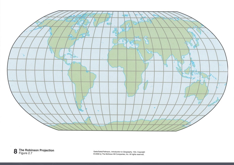
Robinson projection
A compromise projection that shows land-water proportions realistically and preserves overall shape near the poles, but distorts direction and distance.
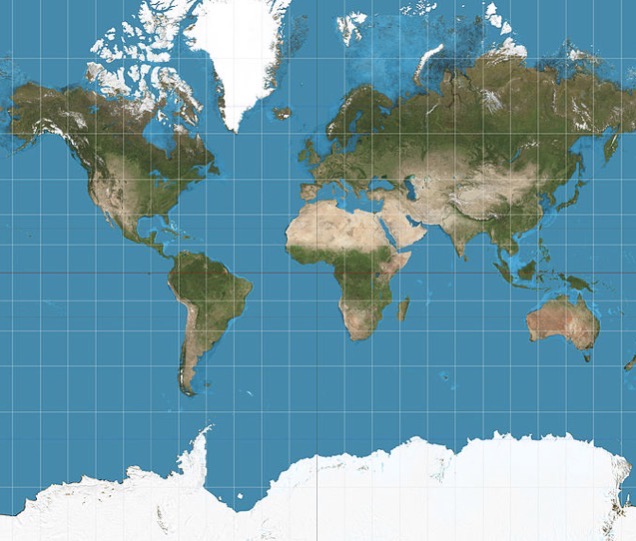
Mercator projection
A navigation-focused projection that preserves direction, with increasing distortion of size toward the poles; the high latitudes appear much larger.
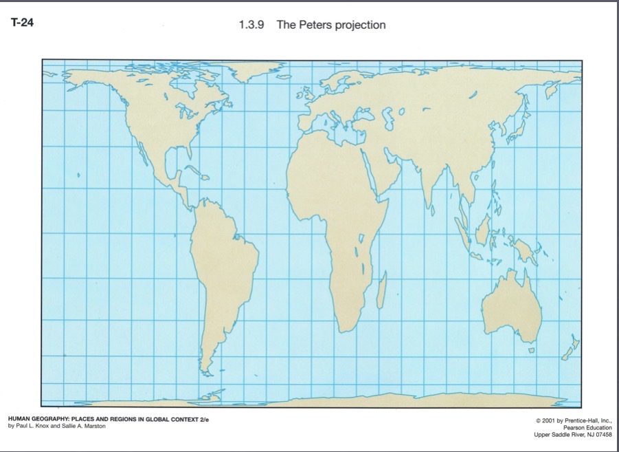
Gall-Peters projection
An equal-area projection emphasizing accurate land area; released in 1974, based on a 1800 design, making the southern hemisphere appear larger and poles stretched horizontally.
Fuller projection (Dymaxion)
Buckminster Fuller’s map projection that places the world on a polyhedral (Dymaxion) surface to minimize distortion of shapes and areas.
Sinusoidal projection
A pseudocylindrical projection in which meridians are drawn as sinusoidal curves; often used for world maps and can be equal-area.
Isoline maps
Maps that use lines connecting points of equal value (isopleths) to show continuous data, such as annual sulfate deposit levels.
Thematic maps
Maps designed to emphasize a specific theme or subject, such as disease distribution or population data.
Proportional symbols
A thematic mapping technique where symbol size is proportional to the data value (e.g., AIDS cases in Africa).
AIDS cases in Africa (proportional symbols)
An example of using proportional symbols to show the number of AIDS cases in Africa.
Africans as a percentage of AIDS cases (proportional symbols)
An example of proportional symbols showing the share of AIDS cases that are African by country.
Dot maps
Thematic maps that use dots to represent occurrences or quantities at specific locations.
Choropleth maps
Thematic maps in which areas are shaded or patterned according to data values or categories (e.g., calorie supply levels).
Daily calorie supply (choropleth)
Choropleth example showing daily calorie supply as a percentage of requirements across regions.
Located charts
Thematic maps that place small charts at specific locations to display data by place (e.g., percent urban population in the Caribbean).
Percent urban population, Caribbean (located charts)
An example of a located chart showing urban population percentage by country/area in the Caribbean.