MATH 2970: Exam 1 (Data Science)
 Call Kai
 Learn
Learn Practice Test
 Spaced Repetition
 Match
Match Flashcards
 Knowt Play
1/48

There's no tags or description
Looks like no tags are added yet.
Name | Mastery | Learn | Test | Matching | Spaced | Call with Kai | Chat |
|---|
No analytics yet
Send a link to your students to track their progress
49 Terms
Four Phases of a Statistical Investigation
1) Posing a Question
2) Collecting Data
3) Analyzing Data
4) Interpreting Results
Posing a Question
Consider context questions and explaining variability (tolerant for a variety of answers)
Collecting Data
Consider sampling and measurement
Analyzing Data
Analyze attributes of data.
1) Center — Mean, Median, Mode
2) Dispersion — Range, IQR, MAD
3) Distribution Shape — Shape of Graph
4) Relationship (association) — How closely on variable changes the other (bivariate)
Interpreting Results
Answering questions through data
Why should teachers teach data science?
1) Getting to know your students
2) Every student participates regardless of ability
3) There is no right answer (answers can vary)
4) Data makes learning engaging and interesting
Statistical Questions
Questions in which data can be collected and responses involve data that can vary.
1) There needs to be a specific answer?
2) Is there more than one way to answer the question? (can’t be a fact)
Categorical Data
Nominal — no set order
Ordinal — set order (class/sibling rank or birth order)
Numerical Data
Discrete — Whole #s (integers too)
Continuous — Accurate to a place value (decimal/fraction)
Activities that provide data
Observational Study — gather data and take measurements on changes (observing patients)
Simulation — create a false situation, run scenarios, observe what happens
Survey — choose a subset of population and get input
Experimental Study — set up treatments (sometimes called a placebo) and have control groups
Valid
Means the population is being represented as accurately as possible
Reliable
Means the population data is consistent (repeatable with multiple measurements)
Population
Everyone is included. Ex: Census
Most accurate but never completely accurate because the population changes (DIFFICULT)
Sample
Subset of the population (Survey, Observation, Simulation, Experiment)
Depends on the bias, representation (validty), randomness, and sample size

Picture Graph
Represents data with images or symbols for easier interpretation

Bar Graph
Represents data from different categories for comparison
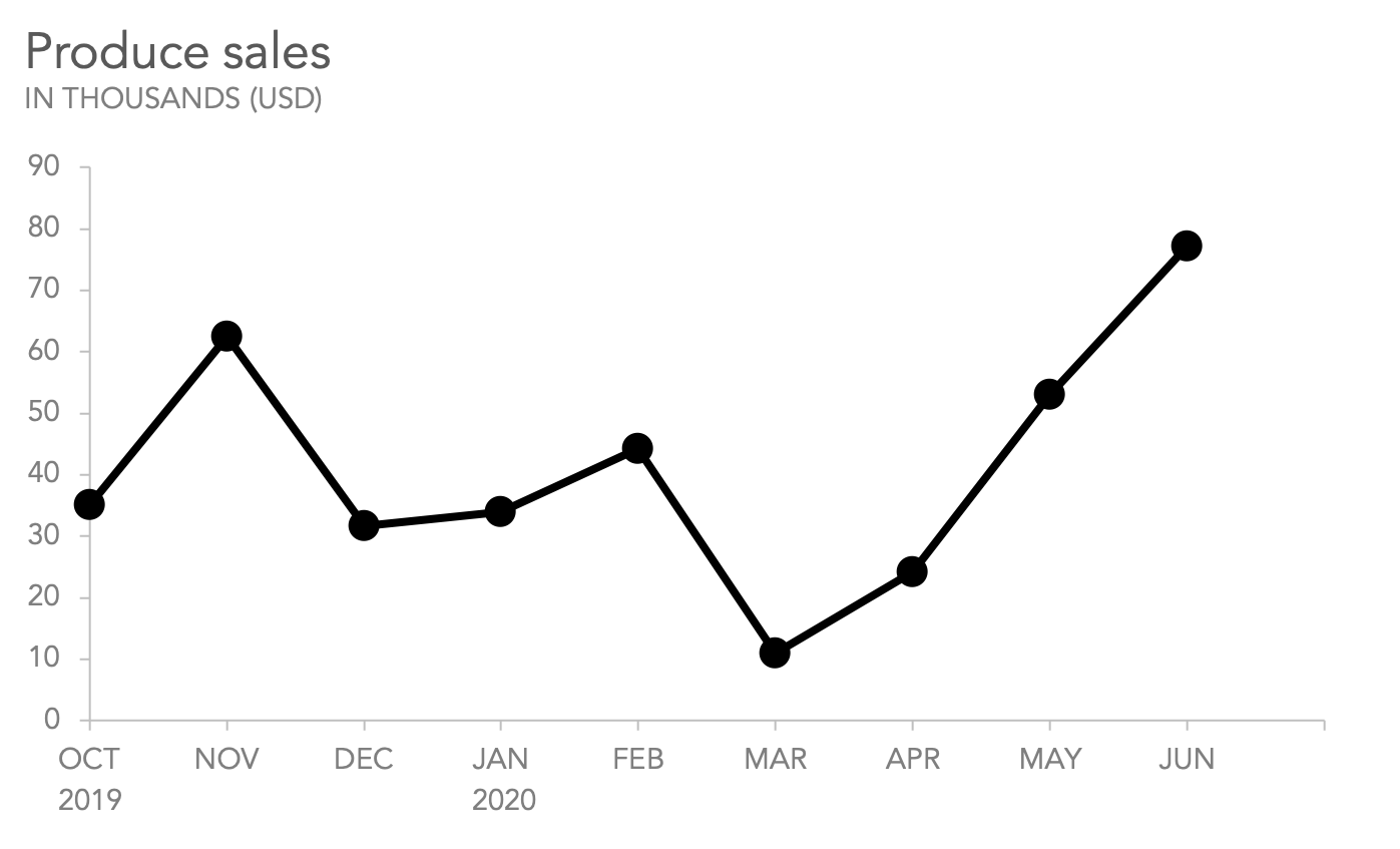
Line Graph
Shows changes and trends in data over continuous period of time
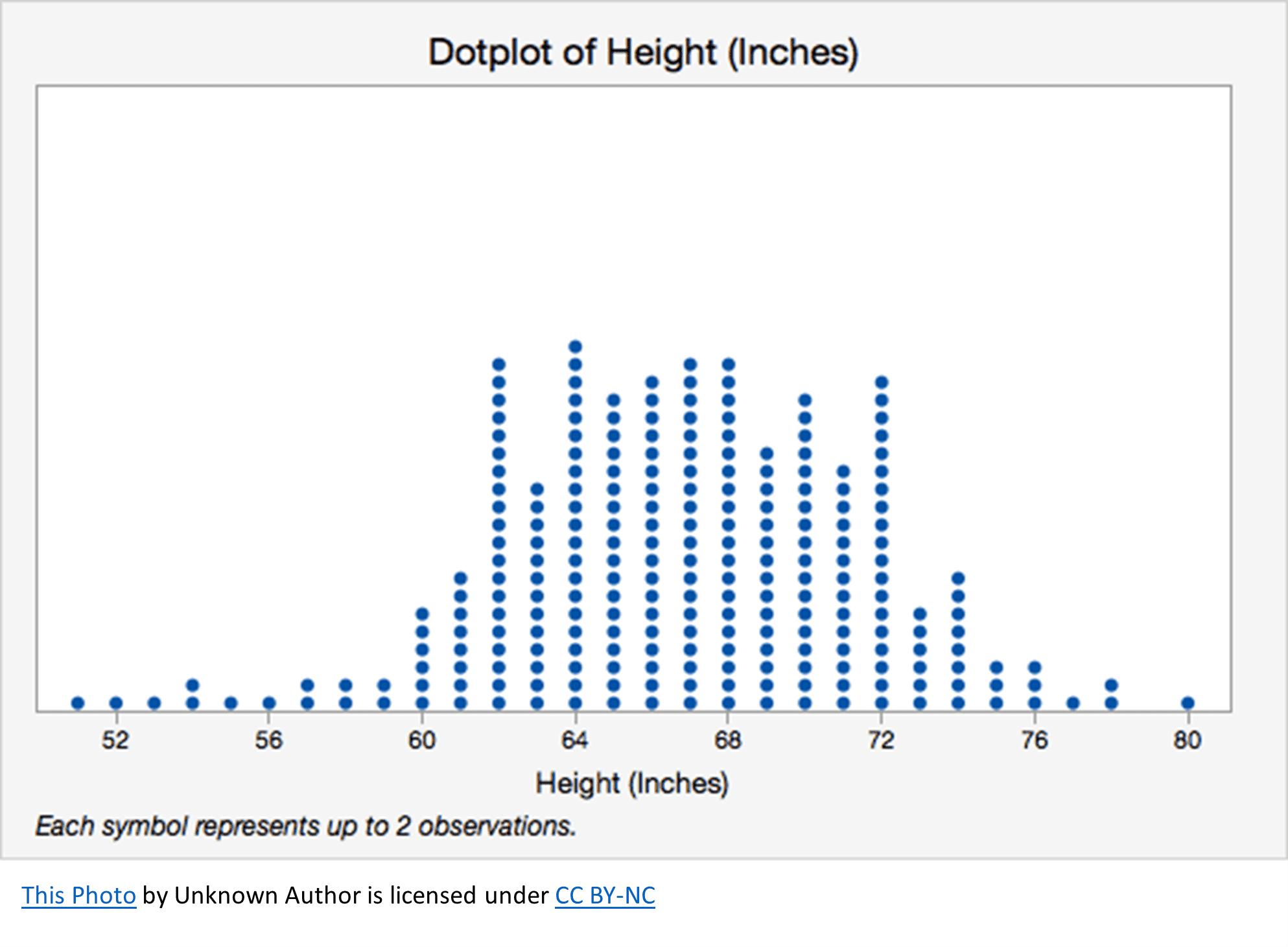
Dot Plot
Displays a distribution with “dots/points” above a number line to show distribution shape, center, and variability.
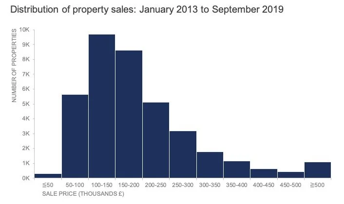
Histogram
Represents the distribution of a continuous variable by showing the data from least to greatest within intervals which are sometimes called “bins”. (Has connected bars)
Cut off ←
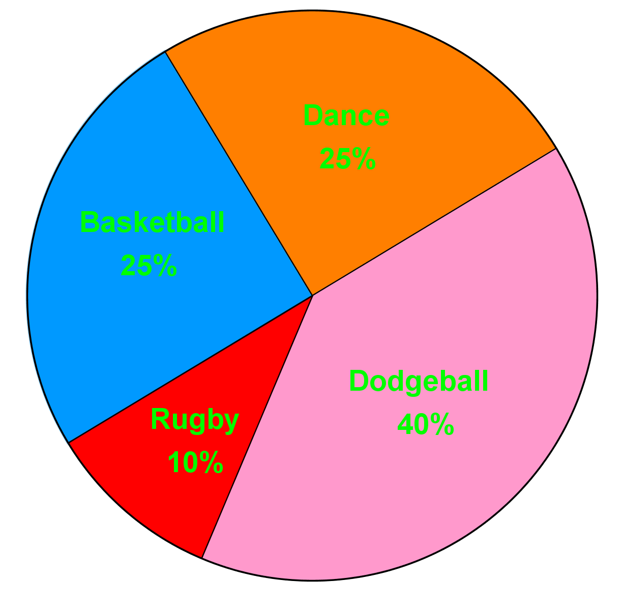
Circle Graph
Show proportions of a whole, represented as percentages or fractions. (pie chart)
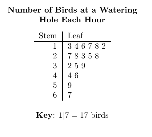
Stem and Leaf
Displays a distribution of numeral data with the look of a bar graph

Box Plot
Shows distribution of a data set using the minimum, Q1, median, Q3, and the maximum. Shows the range and interquartile range and can help identify outliers.

Frequency Table
Chart that organizes data so you know how often each value occurs. (Tally Chart)

Scatter Plot
Shows the relationship between two numerical variables using x and y axis to identify trends, outliers, and possible correlation.
Positive, Negative, or Weak relationship.
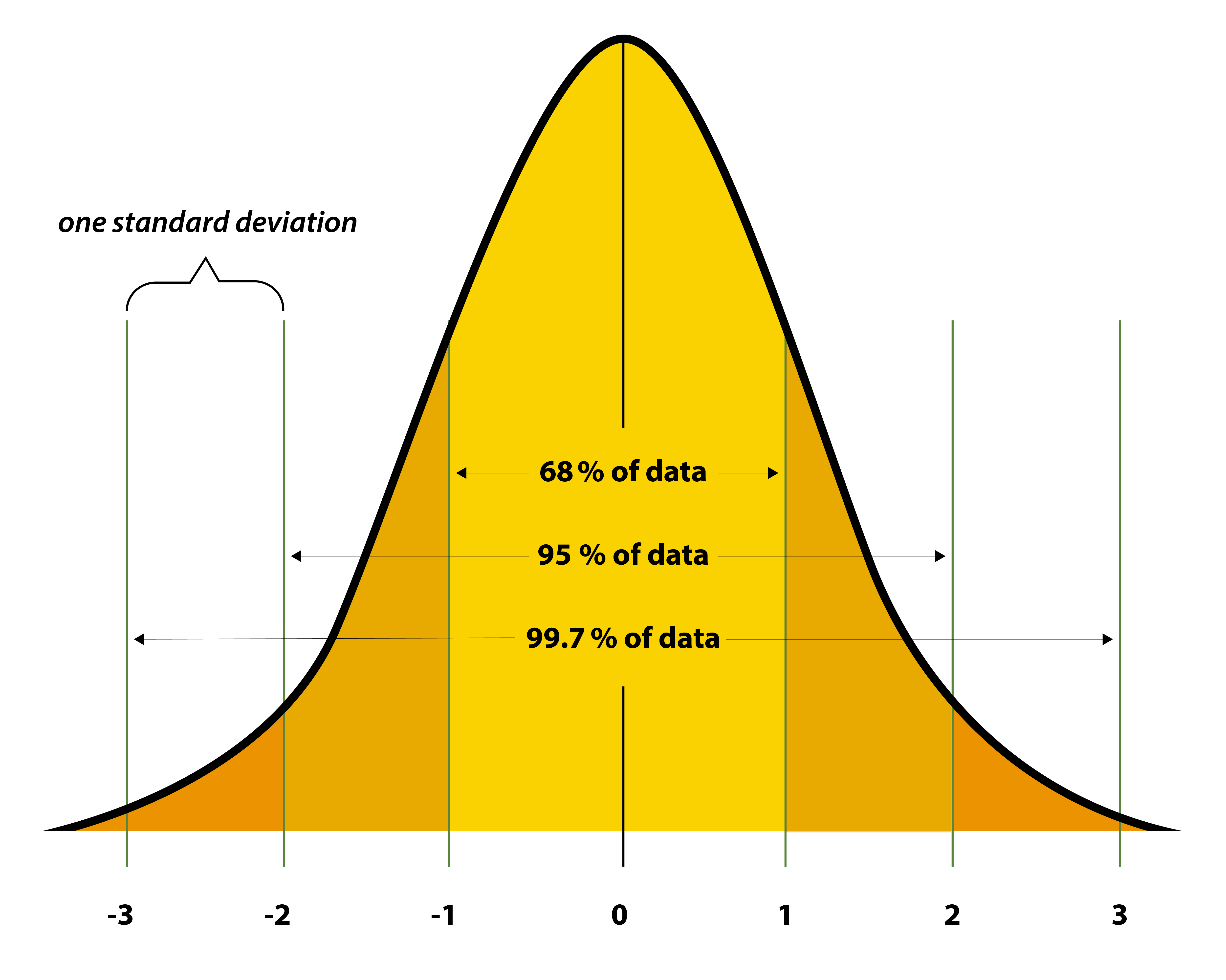
Normal Bell
Doesn’t touch bottom (x-axis)
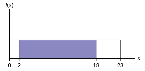
Rectangular (Uniform)
No change in data
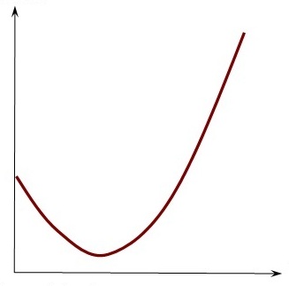
J-Shape
Exponential Growth (keeps going)

Reverse J-Shape
Exponential Decay (keeps going)

Right Skew
Tail is on right
Outlier on right

Left Skew
Tail is on left
Outlier on left
Measures of Center
Mean, Median, and Mode
“Typical” means any type of measure of center.
Mean
Average.
Add them all up and divide by number of how many you have.
Do not use if skewed/have outliers. Means goes toward tail.
Relies on numerical data.
Median
Middle — order least to greatest.
Use median in skewed data — more accurate measure of spread for it.
Relies on numerical data.
Mode
Most - # that appears the most.
Often occuring.
Only one that can be used in categorical data.
Measure of Dispersion
Measure of how spread out data is in a numerical set.
“Varies” means any types of dispersion or deviation.
Low Dispersion
Data points cluster tightly around the center.
Predictable, consistent data.
Important: Food and Behavior
High Dispersion
Data points are scattered far from the center.
Volatile, unpredictable data.
Important: Identifying high or low level academic or behaviors
Range
Highest - Lowest
Interquartile Range
Box Plots — Q3 - Q1
Don’t worry about outliers here.
Mean Absolute Deviation
MAD. Mean and the absolute value of how far it is from each value, added all up, and divided by total numbers of numbers.
Don’t use when there’s outliers.
How far the values are from the mean, on average.
X Axis Variable
Input, independent, or predictor variable
Y Axis Variable
Output , dependent, or response variable
Least Squares Line
When relationship is linear in a scatter plot, it can be described with a Graphed Straight Line: Line of Best Fit, Best-Fit Line, Trend Line, Regression Line, or Least Squares Line.
Dots distributed evenly on both sides of the line.
Used to determine relationship: positive (as one variable increases, the other variable also increases), negative (as one variable increased, the other variable decreases), weak or none (there is no clear direction to the points, they appear randomly placed)
Correlation
A measure of how strongly 2 variables move together, showing a pattern, also called an association.
Coefficient of Determination
r
measures the strength and direction of a linear relationship between two quantitative variables.
WEAK: 0 to 0.25
MODERATE: 0.25 to 0.70
STRONG: r > 0.70
Probability
Likelihood that something will happen
Ranges from 0 (no chance) and 1 (the event will definitely happen)
favorable outcomes/ total outcomes = probability
to compute a probability of something not happening, you can subtract the probability from 1
Calculating the outcomes of a lottery without replacement
For example: Power Ball — to win the person’s ticket must match all 5 white balls (1 to 69) and the red powerball (1 to 26).
69 × 68 × 67 × 66 × 65 × 26 = 3.5 × 10^10
1 / 3.5 × 10^10 is the probability of winning powerball jackpot.
Nobody can buy 35 billion tickets — not enough time or money.
Number of people who buy tickets does not change the probability of winning.
Interpreting Percentiles
A ___ percentile means that ___ percentage of the observation are equal or less .
Ex:
Your kid is in the 65th percentile which means they scored better than 65% of the kids who took it.
80th percentile of standardized test, they scored as well or better than 80% of the students who took the same exam.
Percentiles are ordinal — they show rank and compare.
Interpreting Mean and MAD
On average, ___ is ___.
The data values are ___ units away from the mean, on average.