Looks like no one added any tags here yet for you.
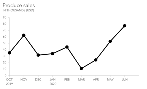
Line Graph
A graphical representation of data that uses points connected by lines to show trends over time. It is commonly used to display changes in values or quantities.
Example: The line graph illustrates/shows the trend of...
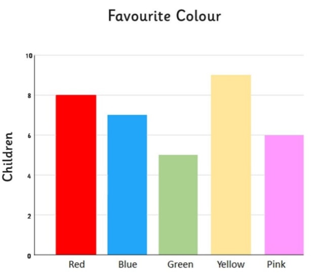
Bar chart / Bar graph
A graphical representation of data using rectangular bars to show the frequency, count, or value of different categories. Each bar's length or height is proportional to the represented value.
Example: The bar chart compares the number of...
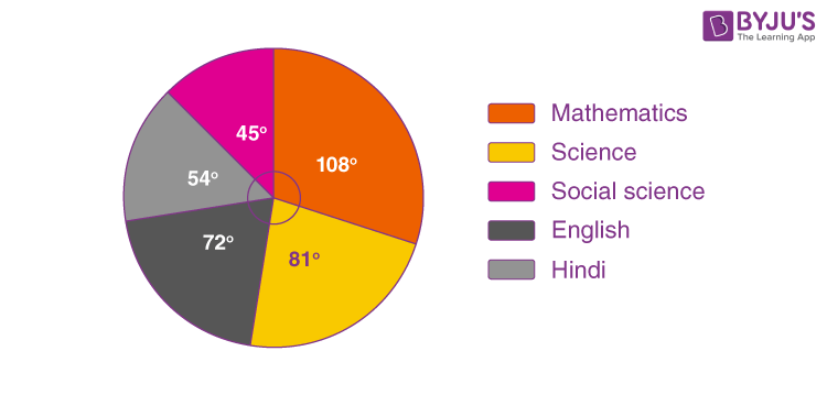
Pie chart
A circular statistical graphic divided into slices to illustrate numerical proportions. Each slice represents a category's contribution to the whole, making it easy to compare parts of a dataset.
Example: The pie chart represents the proportion of...
Table
A systematic arrangement of data in rows and columns, used to organize and display information clearly. Tables are commonly used in research and presentations to summarize data.
Example: The table provides data on...
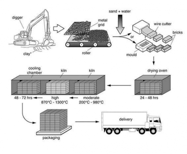
Process diagram
A visual representation that outlines the steps or stages in a process, often using shapes and arrows to show the flow of information or tasks. Process diagrams are useful for illustrating workflows and improving understanding of complex procedures.
Example: The process diagram shows the stages of...
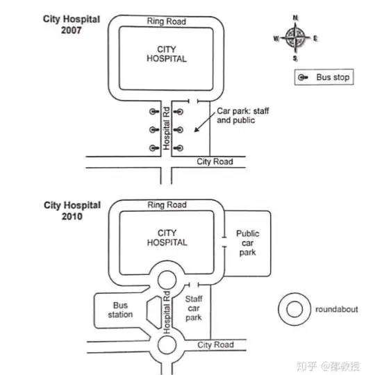
Map
A visual representation of an area, depicting geographical features, landmarks, and spatial relationships. Maps are essential tools for navigation and understanding the layout of regions.
Example: The map depicts the changes in...