PSYC2063 WEEK 2
 Call Kai
 Learn
Learn Practice Test
 Spaced Repetition
 Match
Match Flashcards
 Knowt Play
1/23

There's no tags or description
Looks like no tags are added yet.
Name | Mastery | Learn | Test | Matching | Spaced | Call with Kai | Chat |
|---|
No analytics yet
Send a link to your students to track their progress
24 Terms
WHY GRAPHS ARE USEFUL
Graphs help us simplify information while highlighting important ideas
Graphs help us communication information quickly
Cost = some information is inevitably lost
GRAPH TERMINOLOGY
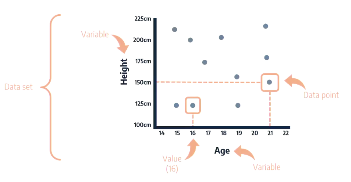
NUMERICAL DATA
Represents an amount of something
Discrete = counted, not measured
Continuous = measure, not counted
CATEGORICAL DATA
Items are assigned to labelled categories
Nominal = categories can be rearranged
Ordinal = categories have order
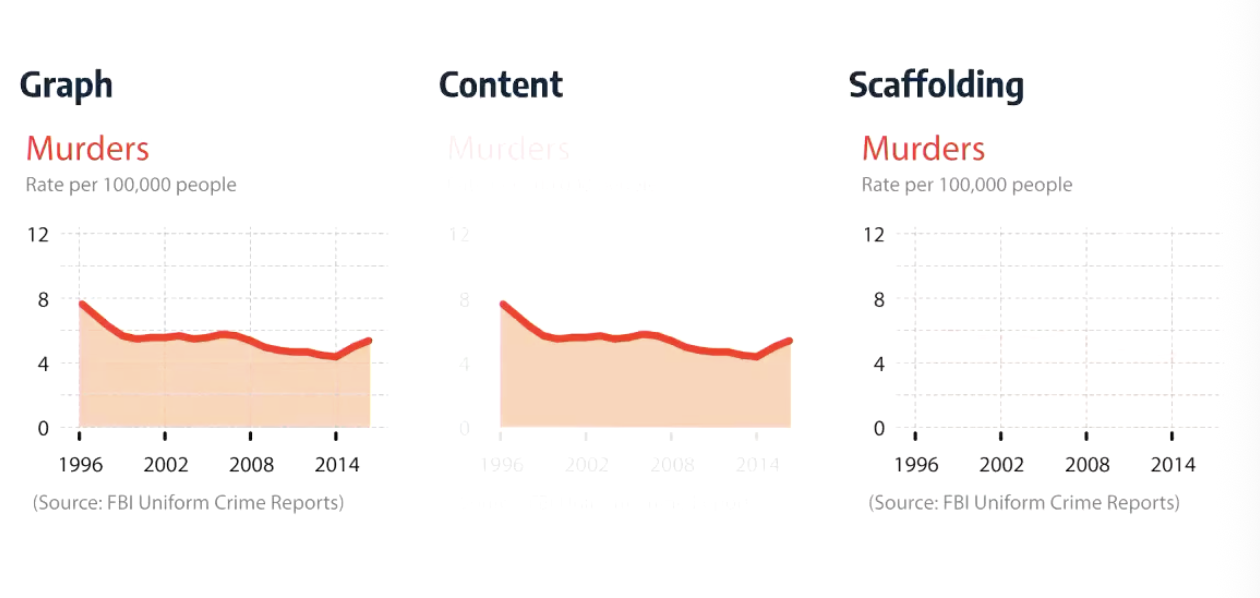
CONTENT VS SCAFFOLDING
VISUAL ENCODINGS
Properties of graphs that vary according to the data.
Length/height
position
area
angle
colour hue
colour shade
shape
width/thickness
LENGTH/HEIGHT
The length/height of the data visualisations varies in proportion to the underlying data
POSITION
The position of each dot on x-axis corresponds to y-axis
AREA
Ex. Area of bubble/segment proportional to population in each county
ANGLE
Ex. Pie chart - the angle of each segment is proportional to % of world population
The slope of each line segment is proportional to the rate of change between data points
COLOUR HUE
Different colours to represent different variables
COLOUR SHADE
Intensity of colour to show variation
SHAPE
Different shapes represent different variables
WIDTH/THICKNESS
Line width proportional to number of values per variable
GOOD GRAPH GUIDELINES
Sensible axes
complete data
consistent scale intervals
consistent bin sizes
principle of proportional ink
SENSIBLE AXES
In bar graphs, dependent variable axis should start at zero
In line graphs, dependent variable axis shouldn't start at zero
Graphs being compared should have same axes
COMPLETE DATA
If data is available for multiple scale points, it should be included
CONSISTENT SCALE INTERVALS
Axes should have consistent intervals between scale points
CONSISTENT BIN SIZES
When data is grouped in categories (bins), they should be equally sized
PRINCIPLE OF PROPORTIONAL INK
When a shaded region is used to represent data, the size of the shaded region should be directly proportional should be directly proportional to the data
GRAPH INTERPRETATION
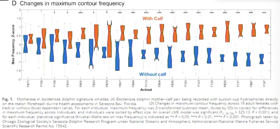
Red = with calf, Blue = without calf
X axis = individual dolphins
Y axis = frequencies
Dolphins use a higher pitch voice when their with their calf vs without
TUTORIAL GRAPH 1 INTERPRETATION
G : B = number wines receiving a maximum score of Gold and a minimum score of bronze (gold, silver or bronze)
G : NA = number wines receiving a maximum score of Gold and a minimum score of not placing (gold, silver, bronze, fourth or below)
G : S = number wines receiving a maximum score of Gold and a minimum score of silver (gold or silver)
Other : did not score a gold
If wine was to receive gold it is most likely to not place again
47% scored gold at least once
This is not reliable results/scoring of the wines
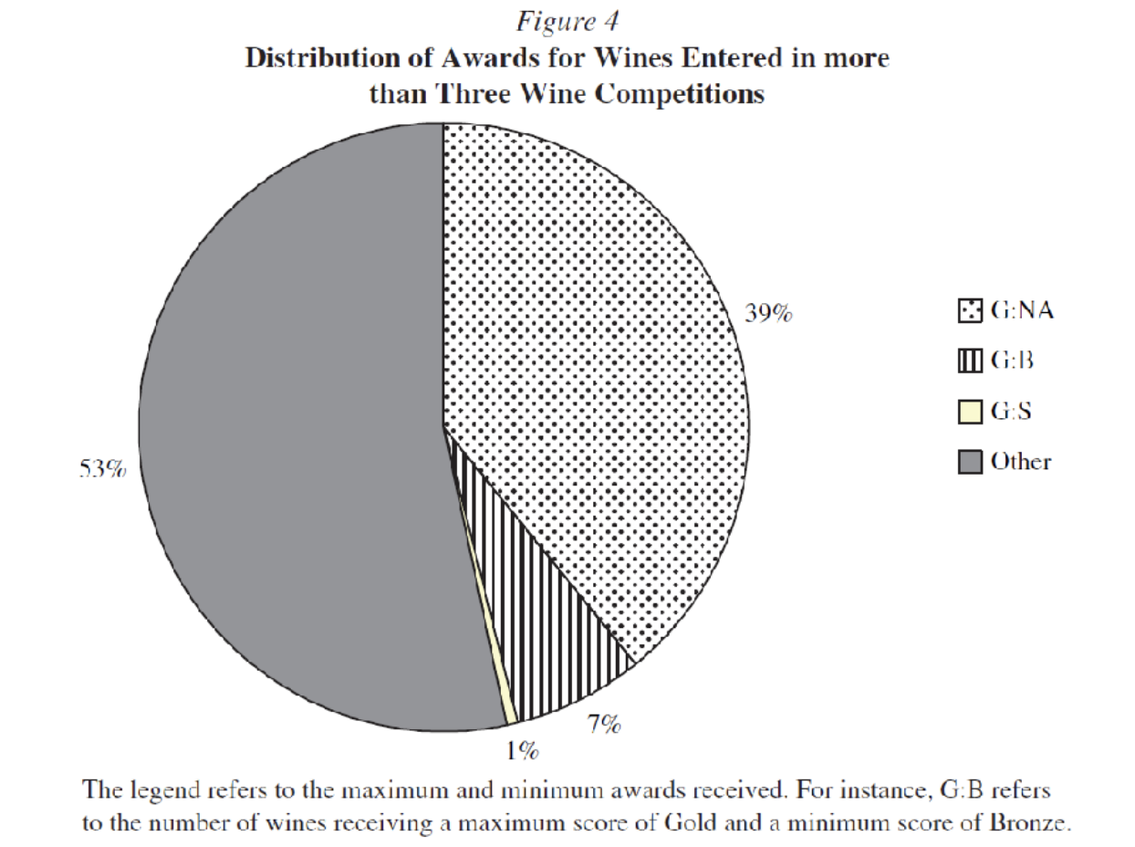
TUTORIAL GRAPH 2 INTERPRETATION
How consistently the wines place across all competitions
0.33 is highest correlation between SC and GH (this is small still)
Average correlation is around 0.1 which is very low
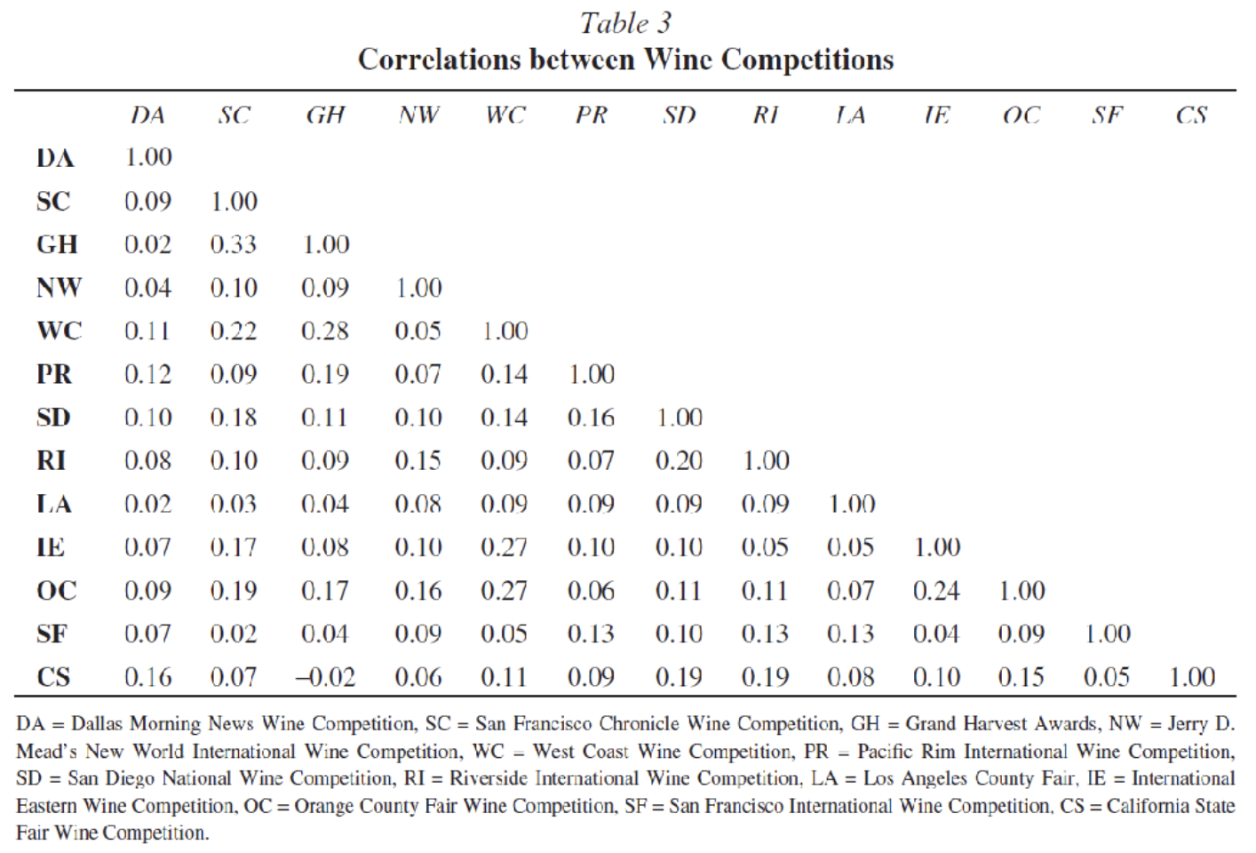
TUTORIAL GRAPH 3 INTERPRETATION
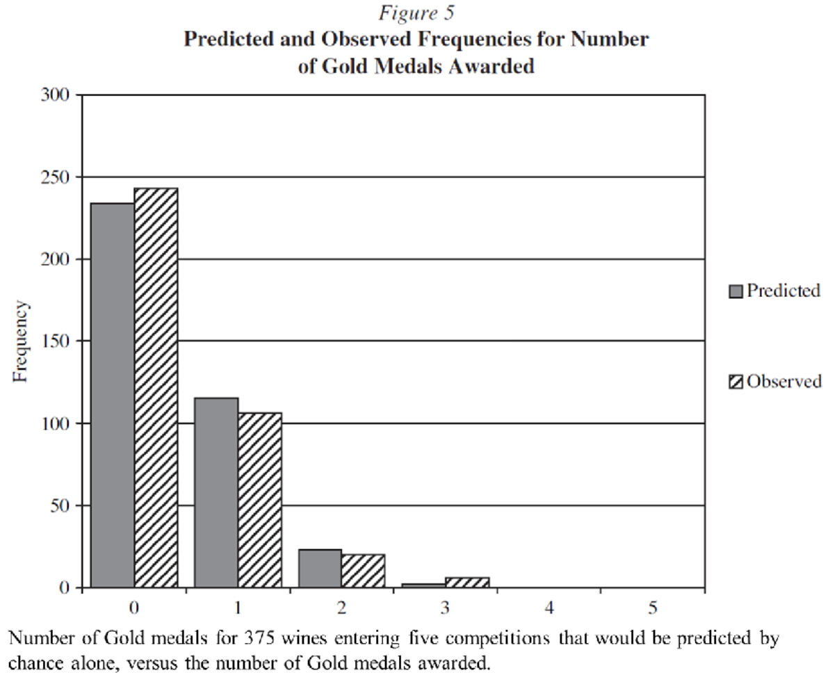
Predictions are similar to observed
Predicted that gold medals awarded will not be consistent over 5 competitions
Since predictions were by chance alone, that means the observed winnings are no better than chance
Non-significant graph (no significance bars but make decision)